Hello, kind readers.
Some of you may already be scratching your head with today’s headline about PPG’s Color of the Year 2021.
What on earth do I mean? Beige is the new beige.
Well, you’re about to find out.
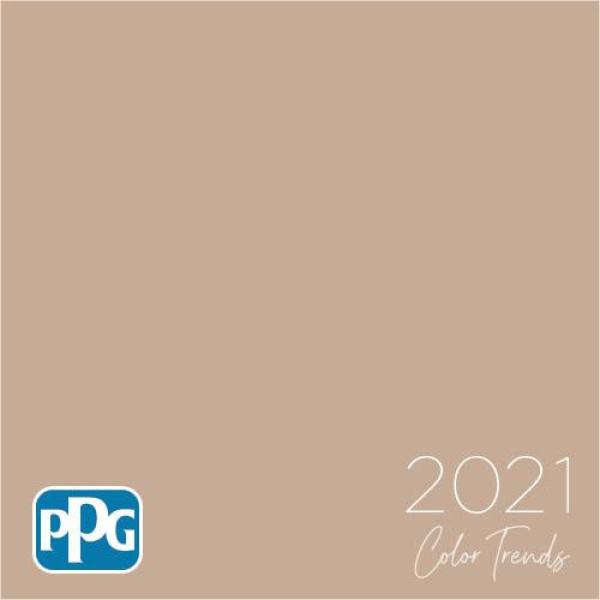
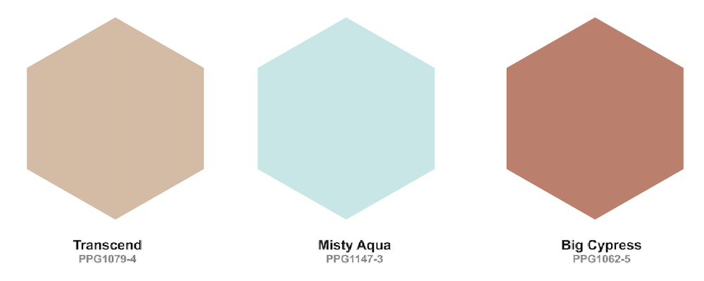
“Transcend,” is PPG’s Color of the Year 2021.
It’s a lovely name for a paint color. To me, it evokes something ethereal and airy.
Dee Schlotter, PPG senior color marketing manager, architectural and industrial coatings, said in a statement.
“This organic and hopeful palette represents what we have been longing for after decades of overstimulation and overconsumption – simplicity and restfulness.”
(side note: My Grammerly says that the above quote is a hard to read sentence. Ya think?)
Okay, I guess. I mean sure. However, they said that we needed to rest and relax when Pantone came up with the baby Boy (Serenity) and Girl (Rose Quartz) twins five years ago.
And, yes, we all know that it’s marketing bullshit. I mean, we’ve been resting for six months now.
However, when I hear the word transcend for the Color of the Year 2021, I am thinking of something that’s a whisper of color; ethereal. Oh, wait, I already said that.
And, a color that’s calming and soothing, right?
Let’s take a look-see what they came up with, okay?
“Embrace nostalgic neutrals, simple comforts: ‘Be Well’ 2021 Palette of the Year
Softened hues serve as release for [the] over-stimulated, weary consumer.”
~ PPG
Okay, the sentiment sounds kind of okay, I guess. But I don’t feel any kind of release for my weary bones. This color, as I see it, is looks more like a pile of cat gromitz than anything remotely zen.

Oh, did I disturb you? My sincere apologies. I forgot that you’re eating your French toast while reading.
However, I’m just reporting what I’m seeing. But, fine, I’ll soften it a little because the color is also a DEAD RINGER for L’Oreal’s “True Match” pressed powder in their shade they call natural.
Here, you can see for yourself.
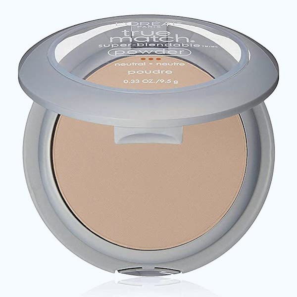
Haha. That’s pretty outrageous. But, I think I figured out how they came up with the color.
I bet Dee dropped her compact of pressed powder.
Who has done that, raise your hand? I know. It’s so upsetting when that happens. It’s just like when you bang your front tooth on a mug of coffee.
Did I really do that?
However, we all know what happens to the compact of pressed powder when it falls to the floor.
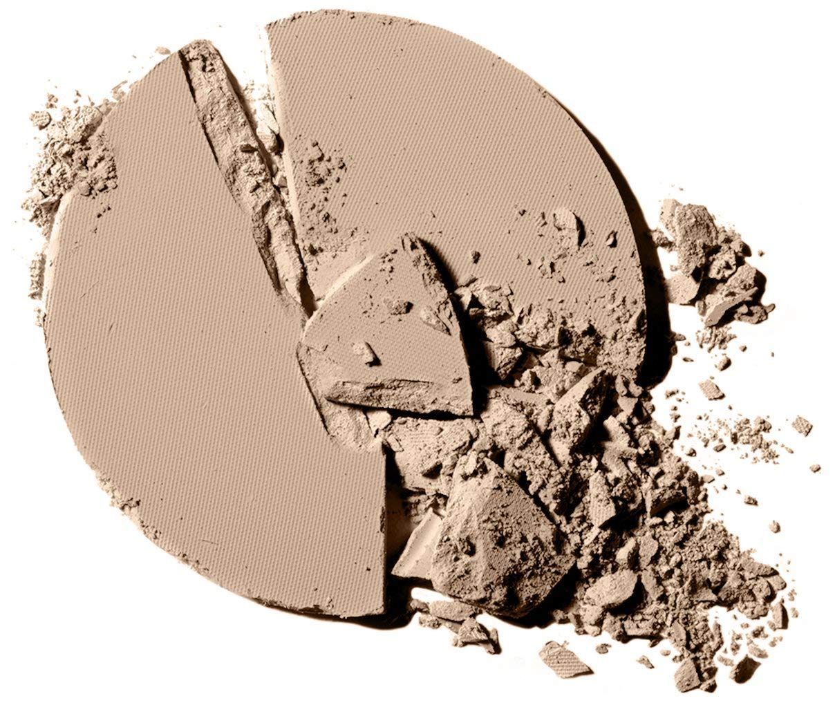
Yeah, and it’s always one with plenty of powder left in the compact.
I’m positive that she scooped up the remnants of her powder and ran right over to PR and said, “Here, this is the color of the year 2021, now leave me alone.” That has to be it because there is nothing restful about this color. Although, it does make me close my eyes. But, only because I can’t stand looking at it!
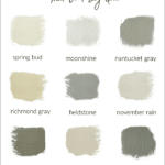
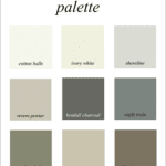
However, I just needed to make sure it’s not just me. So, I googled, “most soothing paint colors.”
And, when I hit the images tab, this is what popped up.
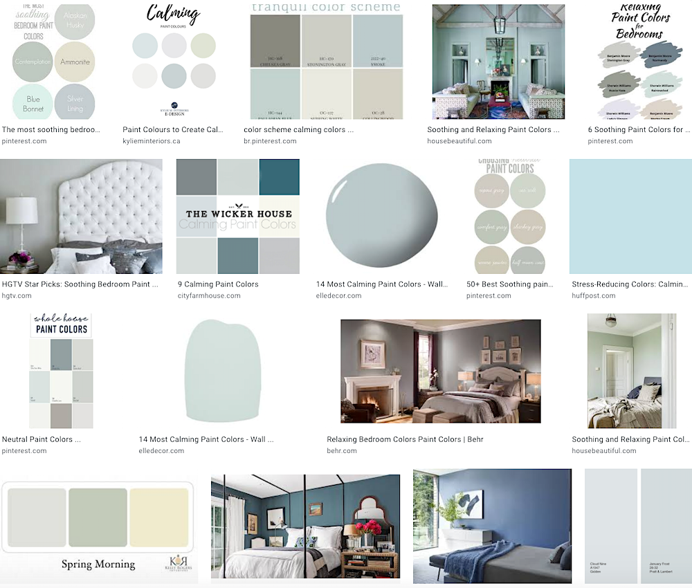 Right? Cool colors that mimic the sky, water and grass are the most soothing. I don’t see any weird shades of pinky beige
So, essentially what they are saying is “beige is the new beige.”
Well, I’m not buyin’ it. I didn’t buy it the first time and even less so, now.
But, there’s more color of the year 2021 craziness.
It’s the two other colors PPG decided to pair with Transcend.
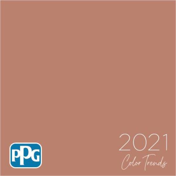
Big Cypress
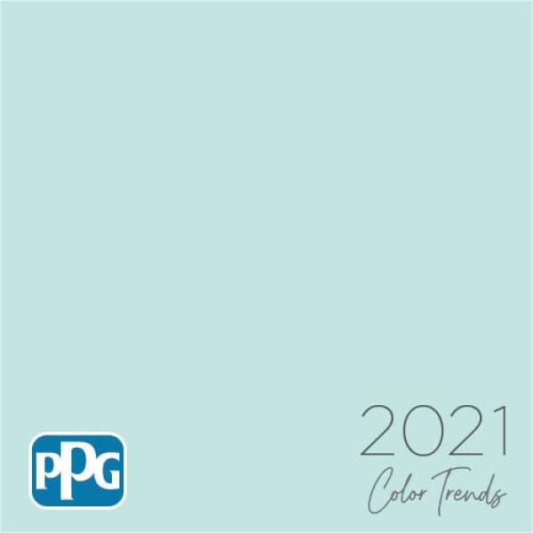
And, misty aqua.
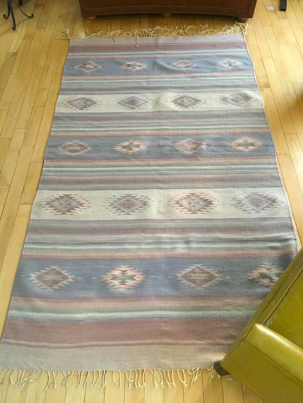
Now, misty aqua is not a bad color. In fact, it is very close to one of the Laurel Home collection’s colors Dolphin’s Cove.

Benjamin Moore, Dolphin’s Cove
There is no Laurel Home color that is the same as Big Cypress.
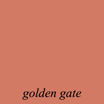
The closest one is Benjamin Moore Golden Gate 033. But, Golden Gate has far more life to it.

Ahhh… Golden Gate is making me think of the last trip I took to San Francisco at the end of February. It feels like it was a decade ago.
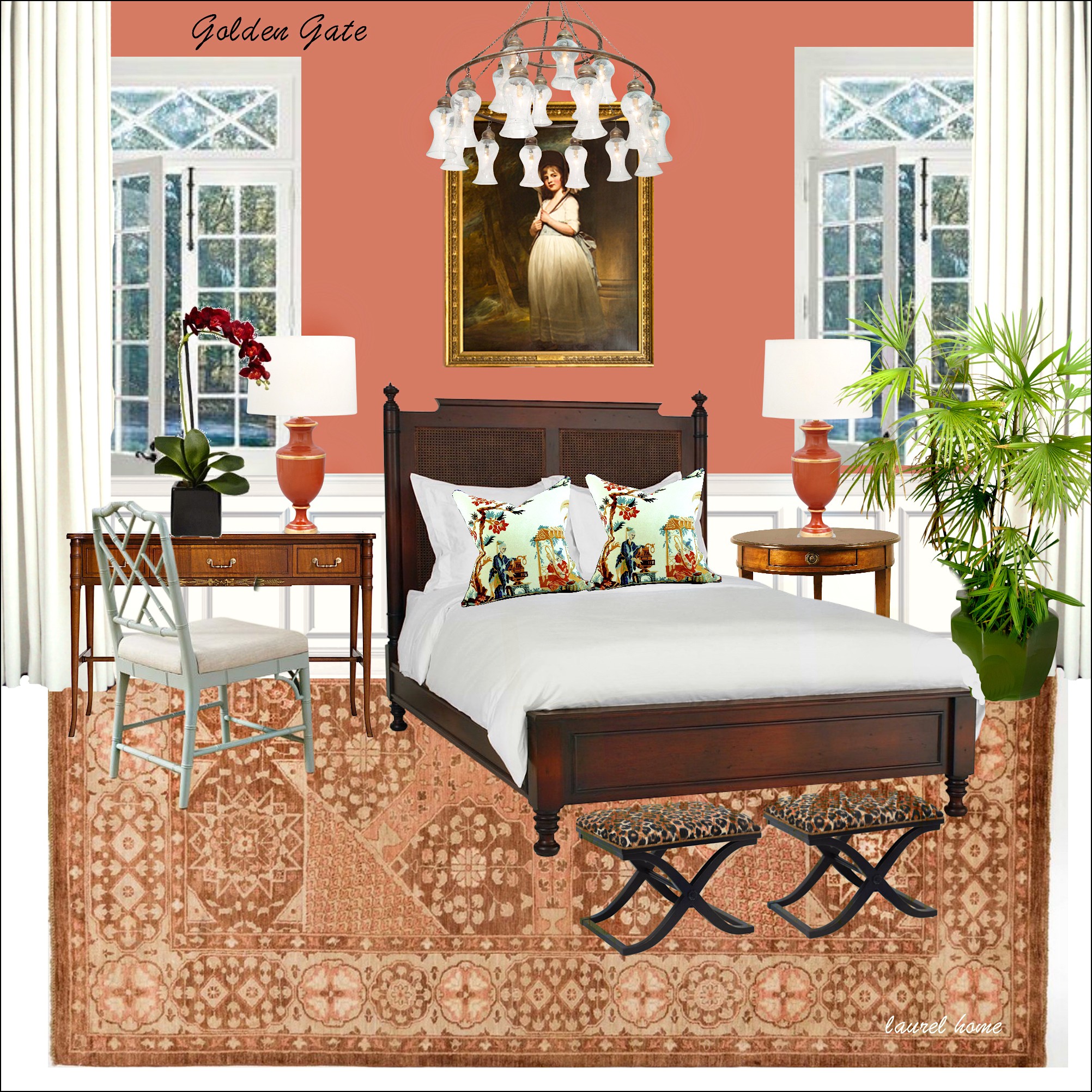
One of 40 mood boards from the Laurel Home Paint and Palette Collection.
However, let’s go back and look at all three PPG color of the year 2021 colors, together.
Oh man, this is like Ramada Inn circa 1984. I can’t deal.
But sure. I have an open mind. (sometimes.) Let’s see how they are using this palette in fake, real life.
ummmmmmm… Like Austin Power says, “It’s not my bag, baby.”
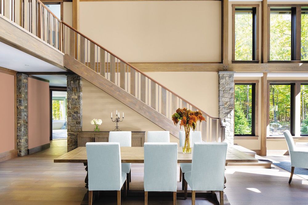
I’m very much trying to wrap my mind around this tired, banal-looking color scheme. She said we need to relax, not die of boredom, if I’m not mistaken.
If you want to see more horrid interiors, go to their website. One of my favorite yucks is the kitchen with the neon BRIGHT white cabinets, which clash horribly with the counters, which clash even worse with the paint color. It’s awful.
Below are some artifacts from the 80s to hopefully make my point.
Remember these? haha
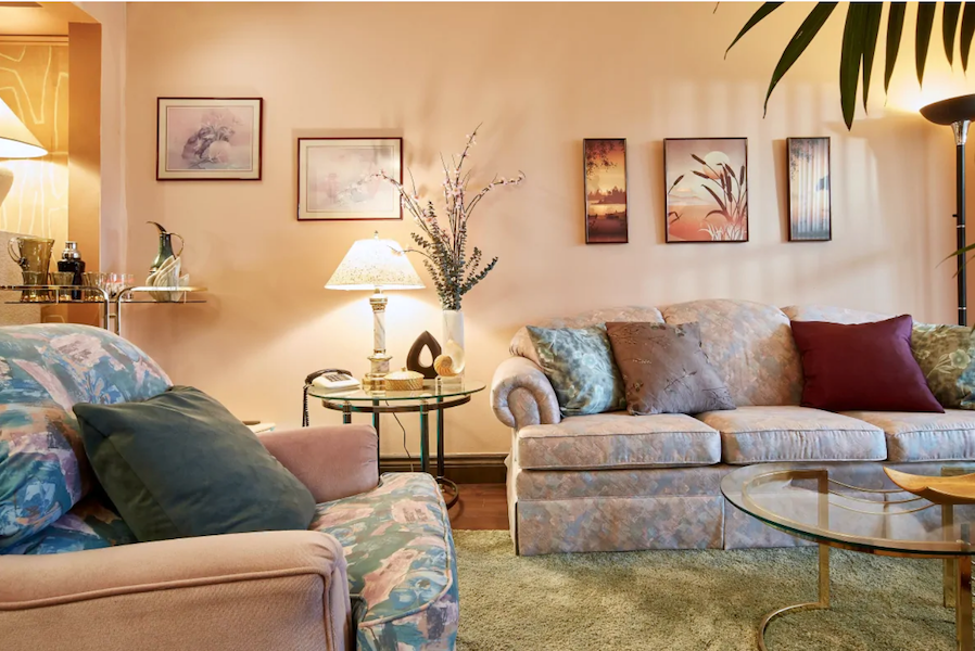
And, above and below a couple of pics I found from the 80s using similar colors.
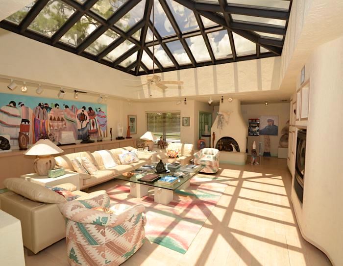
You know, this dusty palette was terrible the first time around. If we’re stressed out, why would we go back to that?
Is that a giant spider on the ceiling?
It’s okay if you like these colors. But, please remember that most of us don’t.
It’s like some people look fabulous with gray hair, but most of us don’t. :]
But, remember when the director of marketing was talking about the need to go back to neutrals for more calm in our lives?
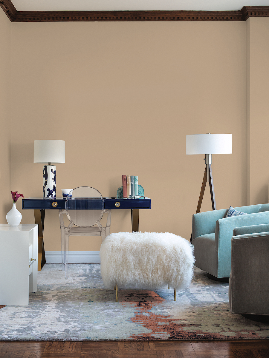
Well, I took a look at the online brochure on PPG’s website, and here are a few images from it.
Yes, this is very soothing and calm;
especially all put together as they are, like mutant strands of DNA.
very calm.
very, very calm. Cheer up, sweetiepie. You’ll graduate from high school– one day.
 Electrocution by paint
What do you guys think of all of this? I’m looking forward to hearing your comments.
***
In the meantime, I’m still searching for a new home. I got distracted for a spell. But, I’m back at it now.
My favorite homes in Boston are millions of dollars and way beyond my reach.
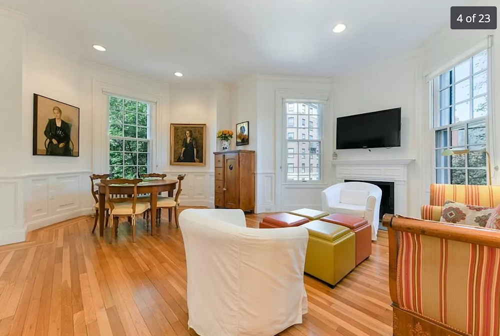
One home I found about a week ago, is very pretty. Lovely light. There’s one working fireplace in the living room. And, central air conditioning! 1100 square feet, two bedrooms, high ceilings, and big windows.
Divine!
Well, except for the recessed downlights. But, they could be removed.
However, there’s no outdoor space and no parking.
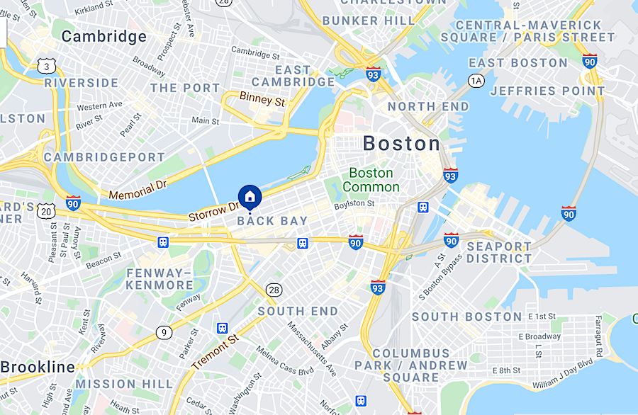
But it is in an excellent location in the heart of Backbay on Gloucester St.
By the way, a lot of places do having parking spots.
In addition, outdoor space, even a balcony, is on my wish list. However, it’s not as important as a working fireplace. Those of you who live with the long northeastern winter will understand. I’ve missed having one these years in Bronxville.
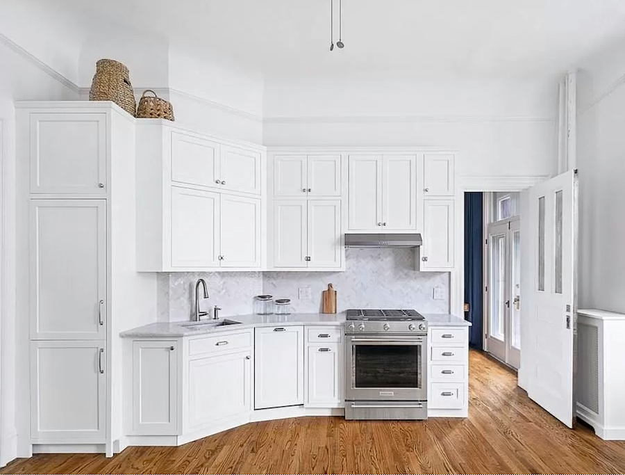
The kitchen even has white cabinets all the way to the ceiling!
Just one problem. And, it’s a doozy, so hang onto your hat!
In fact, it even ties in quite well with the color of the year 2021 nonsense.
That’s because whoever renovated this kitchen is undoubtedly related to PT Barnum.
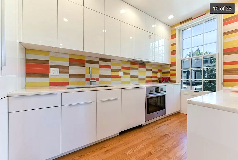
Have you ever???
But not only do we have the most psychedelic tile God ever created, but we also have THE shiniest euro-style (and totally wrong for this classical place) cabinetry.
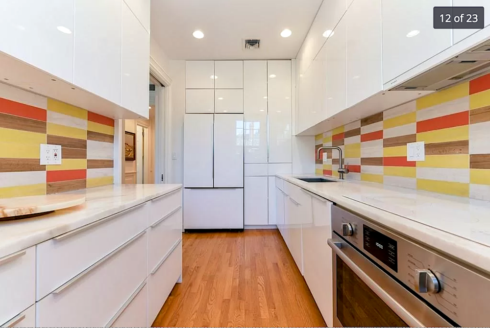
And, a lot of it.
The kitchen, itself is fine. There’s lots of counter space for me to make a mess on. lol And, there’s more storage than I know what to do with. Plus, there’s that huge window which I love. So many kitchens in Boston do not have windows.
Now, would it be possible to fix this baby without spending a lot of money I don’t have? lol
Well, yes. But, it would still probably be about 20k+. I could have a contractor paint – EVERYTHING. Yes, you can. You can even paint the tile.
Yes, the cabinets could be SANDED, and then they could apply a 3/4″ picture frame moulding to mimic panels. Then, comes the painting. They would need to be primed, sanded lightly, and then paint, sand, paint, sand, paint, sand, and seal. This is a labor-intensive process.
Or, the doors could come off and be sprayed.
I had this done years ago in my old home that had melamine cabinets.
Another option I could explore would be refacing. I might even be able to get it sponsored. But, I don’t know. I don’t have much luck with that sort of thing because I have no balls; no balls at all.
I wonder if I could rent some?
However, all of this is a moot point because this place is at the tippy top of my price range. And, I don’t want to move into a place with a big project like that. Also, the bathrooms and bedroom closet need some work.
If I was considering this place, I wouldn’t be showing it to y’all!
It just boggles my mind that with all of the gorgeous options, THIS is what they chose.
OH! One more. Just one more.
Sleep is so vastly over-rated. That is, until the next morning, when I feel like crap. But, I’m having fun!
This next place is doubly frustrating.
I love SO much about it. It is an architectural gem with THE most charming little balcony ever. But, at the corner of a busy intersection. No bueno. Oh, I could filter out the sounds and the polluted air.
But, here’s the problem again.
It’s the bloody kitchen.
What on earth do you mean, Laurel? That kitchen is gorgeous!
Yes, I agree with you, 100%. It is gorgeous. And, this should be what the kitchen looks like in the Gloucester St. apartment.
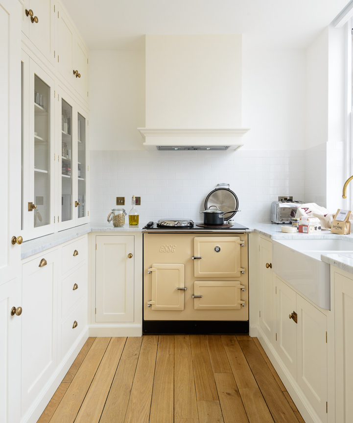
Or, this one from DeVOL Kitchens. Something like that. I could also see Lotte Meister’s kitchen in the Gloucester Street apartment, as well.
Just one very big problem.
This kitchen is IN the not-very-big living room.
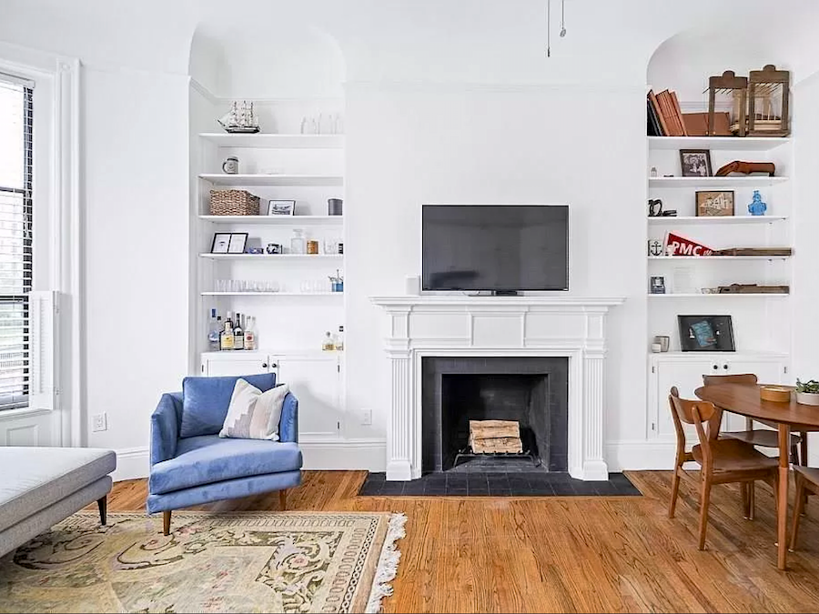
Yes, just opposite the perfectly proportioned fireplace is where the kitchen lives. Yuck. Believe me. (I know that you do.) I spent HOURS trying to figure out a way to make a separation. And, I do believe if I were designing this kitchen from scratch, that would’ve been possible. But, alas, the way it is now, I don’t think it is possible.
Please check it out in the link. I adore that balcony off the room with the blue curtain.
There’s another place in the south end.
I’m not going to give you the listing because I keep coming back to it. It is as sweet as can be. What I love about this place is the entrance.
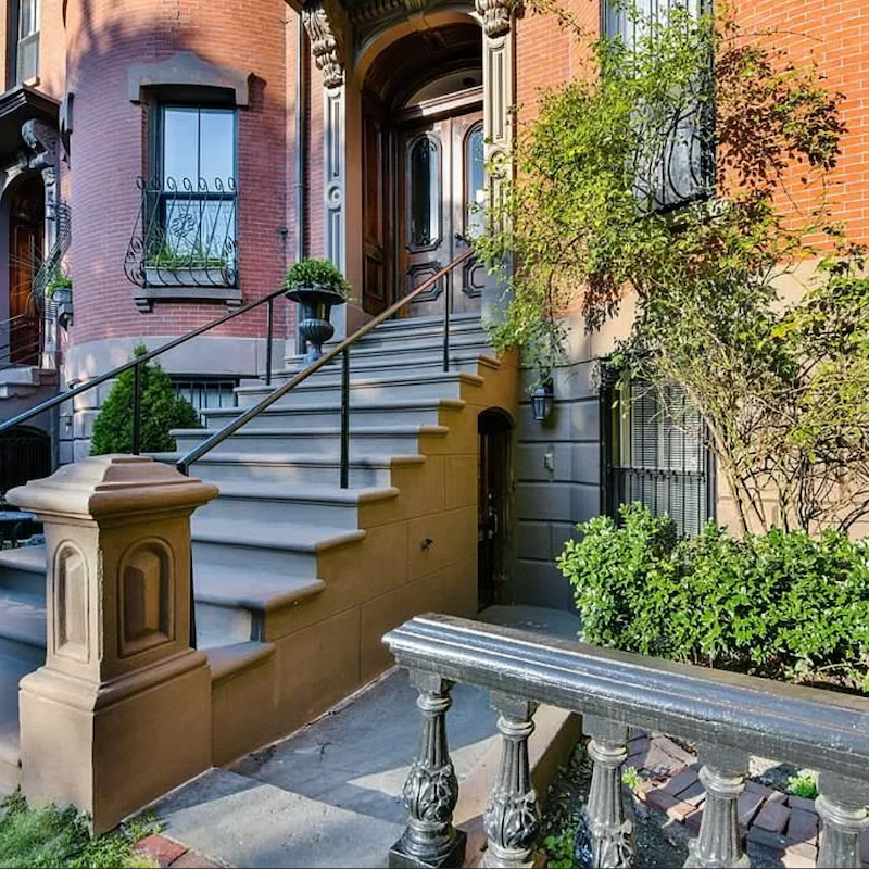
Oh my! See that little black door under the steps. That’s it! So, there’s a little walkway and then a mud room. And, then, this entrance!
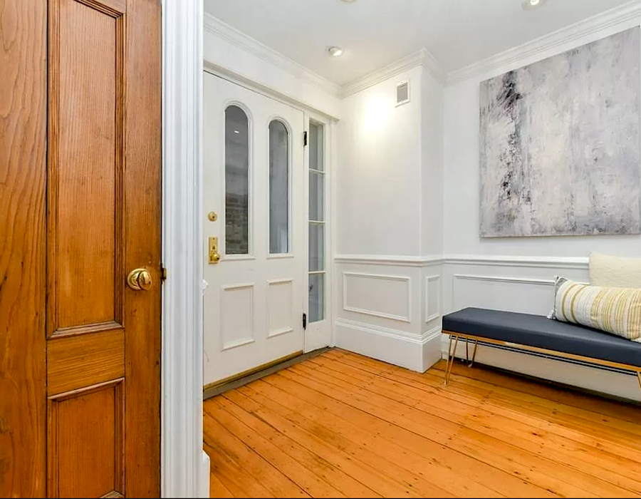
Isn’t this entry wonderful?
But the ceiling looks to be only eight feet. It might be a couple of inches over that. But, I really do want at least a nine-foot ceiling. And, it’s just about 150 square feet too small. Plus, there doesn’t appear to be AC and I hate window air conditioners if I can avoid them. And, the fireplace is only decorative. Of course, I might be able to make a fake fire.
And, there is a parking spot, outside the bedroom. haha
Oh, I could keep going and going…
Can I get paid to look at gorgeous homes and write about them?
Wait. I kind of am! haha.
Hope you enjoyed all of that.
I don’t hate ALL COTYs of the year. In fact, it’s been a while since I have.
In addition, beige can be wonderful IF it’s done right. I wrote a post about that here.
And, also here in the death of the boring beige living room.
xo,

PS: Please check out the newly updated HOT SALES. There are some sensational sales going on this weekend!
Related Posts
 Gray Walls? The Perfect Color Palette To Make Them Sing
- What They Didn’t Tell You About The Best Yellow Paint Colors
- 15 Serene Green Paint Colors Not Called Green
- Here it is! A Palette For No-Fail Paint Colors
- Have You Seen These Incredibly Romantic Paint Palettes?
- Laurel, Why Does My Decorating Look So Awful?
- A Secret for Creating A 25 Color Whole House Color Palette