Thanks so much for all of your great comments and suggestions for Sunday’s post about dark house colors.
So, today, I was cleaning out my email and found a kind message I had inadvertently over-looked from mid-July. I had already decided to write about some of the most common home painting mistakes. Coincidentally, this email shared examples of some of the most common home painting mistakes I am talking about here. (please note that emails are usually edited and anonymous)
Dear Laurel
This is just a quick note to say that of all the blogs out there about top paint colors; I love yours the most.
And, I’m laughing because I have 22 samples of paint on a wall in my kitchen right now. (#3) Although, they are not all for the kitchen. But still. I’m kind of embarrassed to admit that.
Our painter of 15 years confessed we are number two on the list for indecisiveness and, driving ourselves crazy with lots of colors.
However, I’m happy to report that we were beaten out by a man who has 19 colors. And, that’s just for one room! Thankfully, we have only a few colors per room.
In addition, there are at least five or six at shades of white trim paint that we have used over the years in various parts of the house. (#14)
Also, it made me feel so much better to learn that you also had a bad case of “pondering white.”
I think your articles made me see the light of some of the home painting mistakes I’ve made.
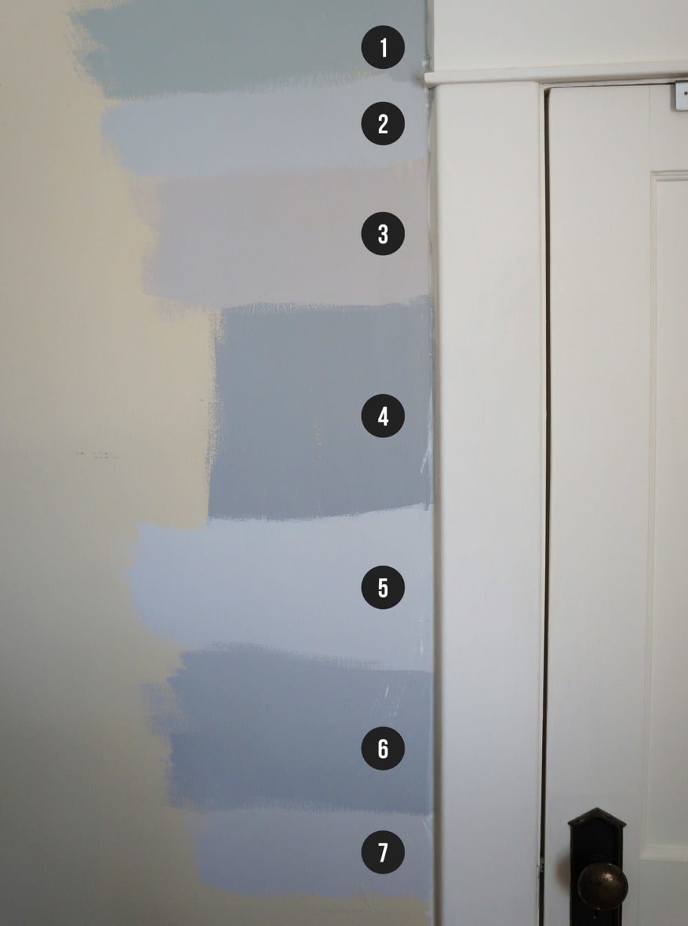
Laurel, I loved this post, where you used Benjamin Moore Shoreline in your small bathroom. It looks like the perfect shade of pale gray. And, so I painted an entire column in our living room with it. (#4) However, my husband vetoed it as he felt that Shoreline is too light. Oh well. Thanks for all.
Robbie
***
Okay, thanks so much to Robbie for her timely note.
In case you’re wondering what the numbers are in Robbie’s email, they correlate to the mistakes we’re about to discuss.
So, let’s dive in and go over the 12 most common home painting mistakes.
I fully understand these mistakes because I’ve made most of them myself. haha. And I want to save you at least some of the pain, and stress. It doesn’t have to be that way.
Home Painting Mistake #1
- Not testing the paint extensively in the room it’s going in, before painting.
Yes, the color looked fabulous in your friend’s home, in the store, on TV, on your computer, or in a magazine. It is ALWAYS a mistake to choose a paint color based on seeing it somewhere other than your room. You need to see the color in your space.
No two rooms have the exact same lighting. And believe me when I tell you that I’ve seen some wacky things, over the years. Therefore, the color that you see elsewhere may look ENTIRELY different in your room. I guarantee that it will, with 99% certainty.
For more info about the proper way to test paint colors, please look here.
Home Painting Mistake #2
- That is not looking at the paint chip in any direction except flat up against the wall or ceiling.
Never look down at a paint sample. And, do not prop it up against the wall. That isn’t the color. The only way to look at a paint sample is FLAT against the wall.
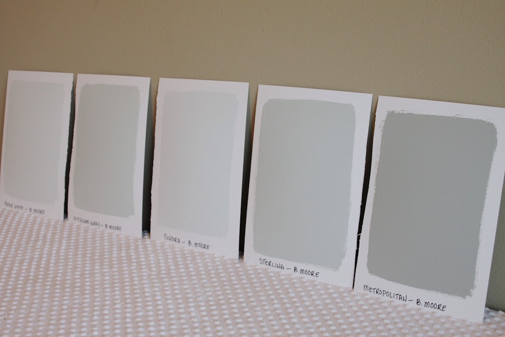
Home Painting Mistake #3
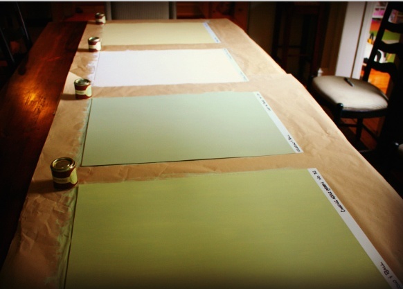
Is viewing multiple colors together.
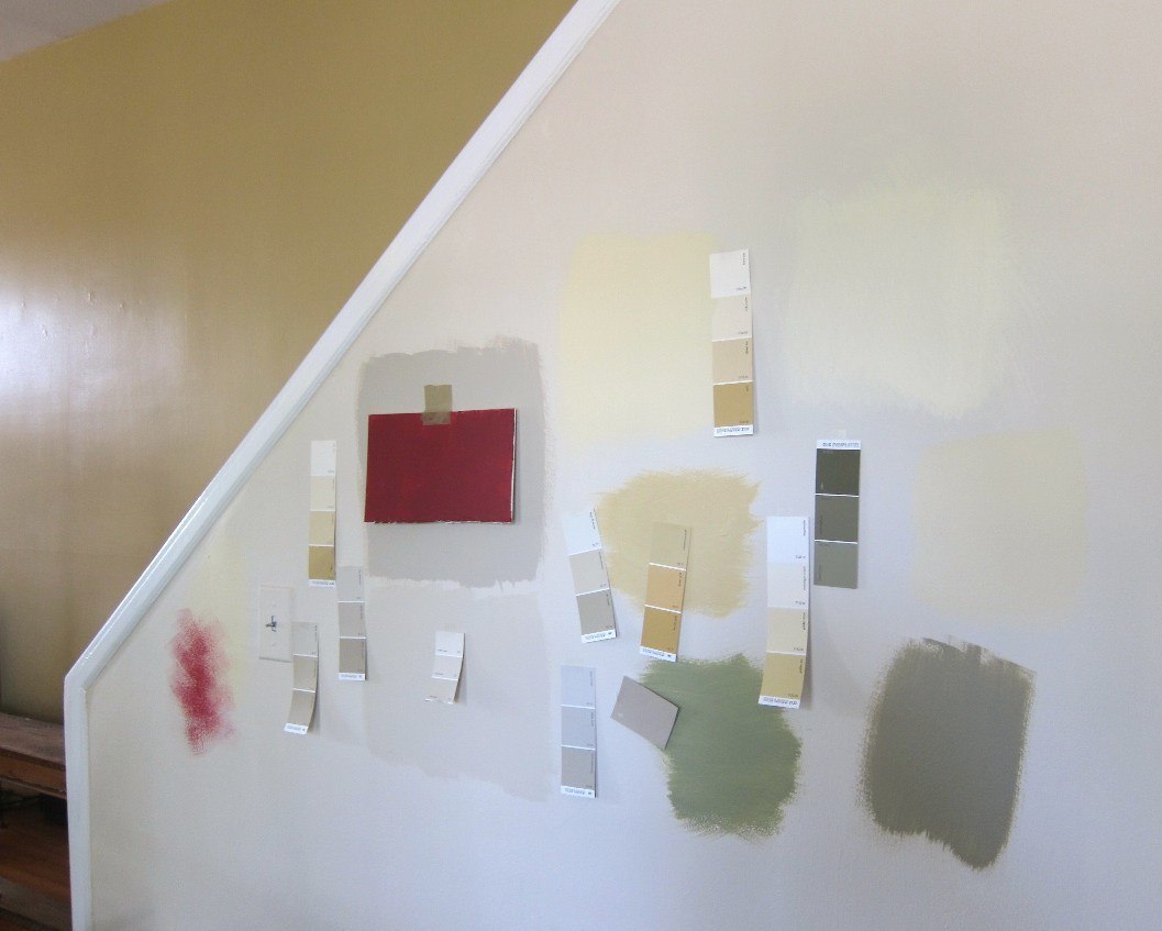
Like this
 or this
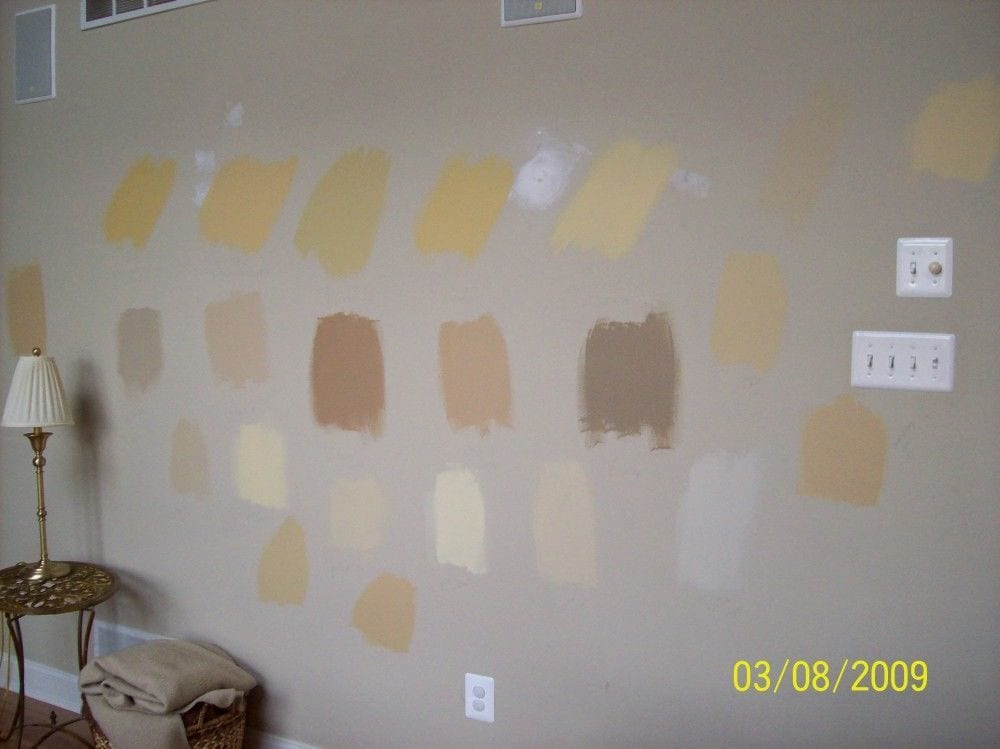
or this
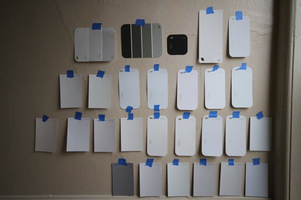
So bad. #confusing at best.
It’s impossible. The colors will affect the adjacent samples skewing the color.
Oh, believe me. I can obsess with the best of ’em. This brings back painful memories when I, too, was pondering white. Go here for the only six shades of white I’ve ever used.
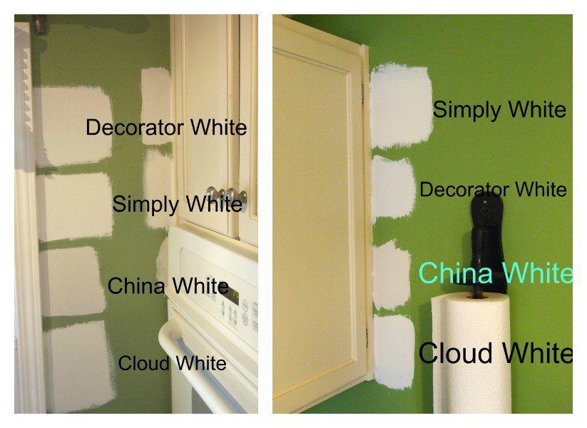
And, this? Not only do we have the confusion of too many shades of white paint, the samples on top of bright green walls. I realize that you may have a situation like this. There are a couple of things you can do.
- One, if you’re going to paint very soon, just have the walls primed. They’ll need to be anyway.
- If that’s not possible, then use larger pieces of white cardboard behind your paint samples.
- Or, if there’s a room with white walls adjacent to the one to be painted, you can view the colors there. But, view your paint samples ONE AT A TIME!
Home Painting Mistake #4
Not moving the samples around the room.
And, I mean ALL over the room. High, low, and every wall and in different lighting situations, as well; sunny, cloudy, morning, evening, and night.
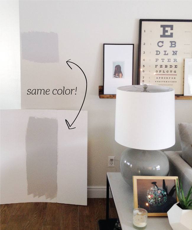
And to further make my point. Here’s the proof.
But the wall is where it’s going, so why not paint it on the wall Laurel? And which one is “right?”
Well, in this case, probably neither. The sample needs to be FLAT against the wall. And you need to make it two coats. And it should be against a white background. At least, they made the poster board.
That’s what you should do. You make large samples like this and put them flat against the wall. Then, you need to move the sample around because:
You could put your sample right on top of a reflection from a green tree and think that you’re getting a beautiful warm gray, when in reality, what you’re going to be getting over-all is a not-so-nice cool purple. You need to look at the colors on all the walls and high, low and in between. And please… no lights on, at first. Then, you can turn on the lights.
Also, pay close attention to the corners. Colors tend to be more intense in the colors in some lighting situations.
In addition, Robbie painting her column Shoreline, is another part of this same mistake. Something I’ve discovered over the years is that colors out in the middle of the room tend to look lighter. So, unless it’s the column and only the column that’s going to be that color, use a separate sample taped flat against the wall.
What about those peel and stick on paint samples?
That’s a great idea if you don’t want to make a mess. I would still paste them on top of a piece of poster board and tape that sample to the wall. Otherwise, it’ll be challenging to keep moving the self-sticking samples around the room.
Let’s move on.
Home Painting Mistake #5
- You’re worried that the color is too intense, and then you order it at 50% or some other percentage.
The thinking here is that the color will be half as “strong?” No. It’ll be another color. Now, it might be a lovely color. But why drive yourself even more nuts? I would try to find another color first. But, if you want to experiment, then fine. But, just know that you cannot make a color 50% lighter by adding more of the base color.
Home Painting Mistake #6
- Painting the trim “WHITE.”
Sounds easy, right? All whites are the same, right?
Well, no, most of you know that there are many variations of white paint. Otherwise, you wouldn’t be pondering it.;] But, if you are a novice at decorating and painting, you may not yet realize that all whites are not created equal.
Here’s the problem. The color that Benjamin Moore calls “white” is actually a very, very pale gray in some lights.
In a north-facing room, their plain white is most likely going to look dingy and drab, most likely. North-facing rooms do better with medium to darker shades with warm undertones. Or for white trim, one with warm undertones, like Cotton Balls oc 122.
I won’t kid you, north-facing rooms are not easy, and there can be other factors, so my best advice is to experiment if you’re not getting the color that you want. For more great colors with north-facing rooms, go here.
Home Paint Color Mistake #7
- Believing that to “brighten” a dark room, you should paint it as white as possible.
See above. :]
Home Painting Mistake #8
- Painting the ceiling— “ceiling white.”
I never specify that color because, again, it can go gray, and usually, the ceiling looks grayer than the walls, to begin with. That is unless you want the ceiling to be a pale gray. For one of my favorite posts about ceiling paint colors, go here.
And, you might also enjoy this post talking about problem ceilings.
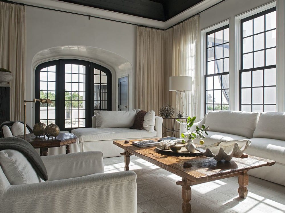
How dramatic is this! It’s a beach house with a black ceiling. Sounds wrong, except it’s anything but. Don’t be afraid to play up your room’s features. And by the way, painting a ceiling darker will make it appear higher.
Home Painting Mistake #9
- Not considering the color of the floors in relation to the walls.
Do your floors have orange, yellow, red undertones. That’s something to consider.
Home Painting Mistake #10
- Not considering what your furniture is going to look like.
I’m sure that’s obvious except that sometimes we forget to look at the big picture.
Home Painting Mistake #11
- Not doing an adequate prep job.
Here’s a post which gives 20 terrific tips on what you need to do to paint a room properly.
Home Painting Mistake #12
- Not paying attention to the color as it relates to the rooms around it.
One room is electric blue. The next one is purple, then orange, then greige. Next thing ya know… out comes the plastic table-cloth. haha!
Home Painting Mistake #13
- Finding an expensive paint and thinking that you can just go to the Off-Brand paint store and get a perfect match.
NO COMPUTER MATCHING!
Buy the paint from the company that manufacturers it, if possible. Computer matching is a crapshoot at best. And I don’t care what your painter says. He’s going to try to tell you how fabulous it is and that it works.
Well, sorry; it usually doesn’t work. If he’s still insisting and won’t back down, I’d be very suspicious. Chances are, he’s going to use an off-brand and sell it to you at a premium price. It does happen. :[
This one’s not necessarily one of the home painting mistakes, just something to consider
- Just going with the same old, same old. White trim. White ceiling. Linen White walls.
zzzzzzz
Have you ever considered painting the room all one color? It’s a wonderful look. In fact, with sloping ceilings, especially, I love to use one color everywhere.
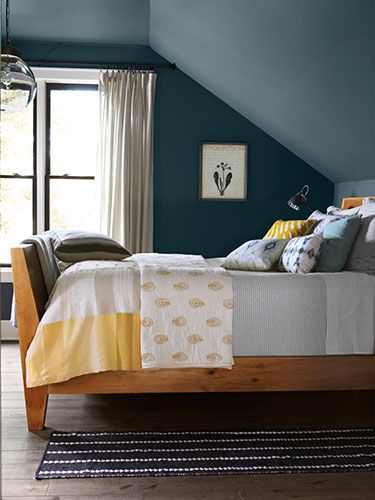
Here’s a beautiful example of what I’m talking about in this charming attic room that would be perfect for a boy or a guest room.
For more examples of walls and trim painted the same color go here.
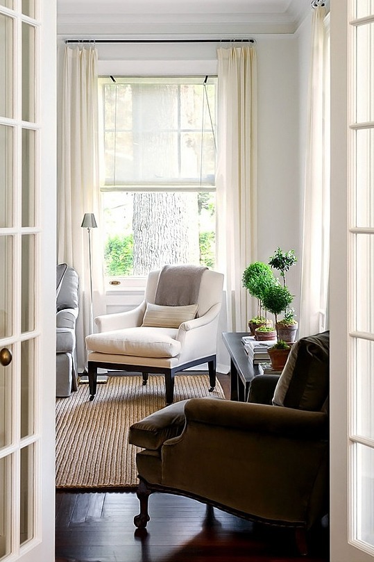
I adore white on white.
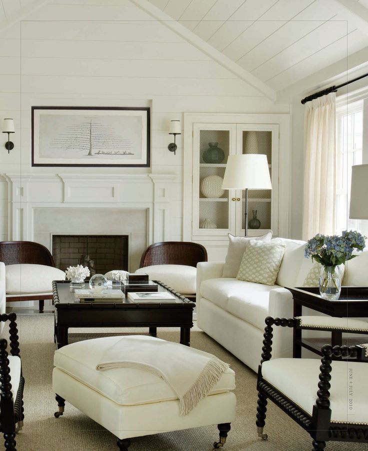
I love how serene and quite these rooms are. There is no need for the trim to “pop.” I’m not even sure why anyone would want their trim to “pop.” Of course, it can contrast, but it doesn’t have to. That’s my point.
Home Painting Mistake #14
You are using more than two shades of white for the trim throughout your home.
Robbie said that she used six different shades of white paint for her trim in the house. I recommend trying to avoid this, if possible. The most I have ever done is two shades of white. But, usually, it’s only one shade of white for the trim.

please pin to your Pinterest boards for reference
Well, I hope that talking about these home painting mistakes will save you time, trouble, and stress. Do you have any painting mistakes we can all learn from? If so, please share them in the comments.
Oh, and if you’re confused about your paint sheen please check out this post.
xo,

PS: Please check out the newly updated HOT SALES!
- Serena & Lily has put all of their beds and bedding on sale.
- And, also there’s information on the Nordstrom Anniversary Sale Early Access, which is starting this Thursday, August 13th, 2020.
Related Posts
 Is it Antique Furniture OR is it a Reproduction?
- Perfect Architectural Proportions – The No-Fail Formula
- A Virtual Kitchen Design And The Results Are Stunning!
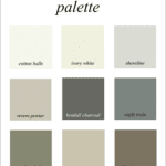
- Here it is! A Palette For No-Fail Paint Colors
- An Exquisite Kitchen Restoration Has Charm To Burn
- The Guaranteed Way To A Beautiful Room (It’s Not The Wall Color)
- A $10,000 Kitchen Design Mistake – Part I & 2