Hi Everyone,
I’m so glad you enjoyed Sunday’s post about Liz’s lovely home in Florida.
And, guess what? She read the post and wrote me back with a few more photos. Her home is very lovely.
However, get this. She USED to have a lot of red and gold but wants to keep things neutral now.
But, what does “neutral” mean?
Well, today, we are going to go over what I think makes for the best neutral color scheme. However, this one is really two posts in one. And, what the hell. It’s summer. But, I have done some judicious editing and will save that one for Sunday.
Hold on; I see that Sue has a question.
Laurel, a couple of weeks ago, you shared some of your Dream Home plans with us. Are you going to continue with that?
Actually, I am. But, I’m still recuperating from last week’s Historic Deerfield post. I imagine that some of you are too! haha.
However, I’m glad you brought that up, Sue. And, that’s because I’ve been thinking about my dream home, a lot. And, the direction my life might be going in the future.
As I imagine a lot of us have been doing during this time of the great pandemic, I’ve been exceptionally introspective.
Since mid-May, when I arrived in Massachusetts, I’ve been thinking a lot about houses and where I’d like to live. However, this is to be continued…
We need to stay focused on the topic of my favorite neutral color scheme. Ack. I’ve been on prednisone for 10 days. (but am now tapering off, thank God!) I am sure it’s contributing to even more than the usual rambling, lol, I frequently subject you guys too. Please forgive me.
The Best Neutral Color Scheme.
Frankly, I would just spend my time looking at Gerald Bland’s and Steve Cordony’s Instagram accounts. And, Steve has a gorgeous website too. (I will be linking to those later because Steve is the star of the show today.)
However, that’s really all you need to do.
Good night.
Now, I’m going to have dinner with my son and watch TV.
No, not really. Well, we are having dinner and will watch a little TV.
However, you guys know that I wouldn’t just say, “go look at somebody’s rooms, goodnight.”
I’ve given this a lot of thought and over-all, if someone said to me, “Laurel, you have to pick just ONE color scheme, what would it be?”
And, I would say without skipping a beat, it would be a neutral color scheme.
But, again, what IS a neutral color scheme?
Here is my definition. Or, maybe it’s really more of a manifesto about what goes into a neutral color scheme.
A neutral color scheme devoid of saturated colors such as red, orange, blue, purple, yellow, and toxic-waste shades of green. A neutral color scheme is tied into the earth. It can be light and bright and dark and dark as night.
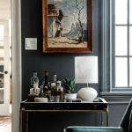
For me, at the heart of a great neutral color scheme is the color WHITE.
I’ve written much on the topic, everything from ceiling to floor, furniture, fabrics. White is my favorite color.
Yes, color.
However, when we are talking about a neutral color scheme, we are working with an entire home, not just one room. Some of the spaces might not have any white. Or, at least, very little white. In fact, some small spaces might be quite dark.
The next necessary color in a neutral color scheme is black.
After black, is brown.
And, then, every earthly shade of green there is. It’s like the Historic Deerfield post; all shades of green from the deepest forest to an olive-y-chartreuse veering on gold.
And, then in small concentrations are more of the earth tones. These range from a quiet celadon (pale, muted aqua), to olive greens, tan, cream. And, dark grays that lean towards green, brown and teal. It’s like a forest.
It’s the colors of the earth, the trees, grass, sky, water. That is the best neutral color scheme, in my opinion. It’s already been done for us.
Plus, in our interiors, a great neutral color scheme has small amounts of gold and/or brass.
Metals are usually also in black. And, of course, there can be bronze, silver, and nickel, as well.
But, these are for neutral rooms on land where there ARE trees and grass, shrubs, etc.
If your neutral room is by the ocean, it will have paler colors, most likely that mimic the color of the sea. But, for now, let’s stick to the land.
Laurel, aren’t you going to show us your dream home in Stockbridge?
You know, I was, but it needs to wait now, until Sunday. Otherwise, I will not sleep, and you’re going to be cross with me.
We need to stay the course with our neutral color scheme.
However, Laurel’s dream home IS going to be in this color scheme.
What’s interesting, is that my last home was also in this neutral color scheme.
I never got tired of it. Assuredly, I would’ve decorated the new place in the same colors. But, I decided to do something else, as the walls were already yellow.
In fact, the inspiration for my old home, I’ve mentioned before, was from Victoria Hagan’s incredible place in the Hamptons. That’s the New York Hamptons. haha.
Folks, can you tell when this place was decorated?
Well, I can’t. Therefore, I’m presuming you can’t either. There is nothing here that does not stand the test of time.
Would you like to take a guess?
This home was decorated over 25 years ago.
I’ll let you chew on that, for a sec.
I first saw this lovely back in 1995. There was the most gorgeous spread in Metropolitan Home. I stared at those images for HOURS. I was so captivated by the Henry Calvin linen cause draped over its lining, that I did the same treatment for at least a dozen clients. And, I used the same fabric as linen sheer Roman Shades in our townhouse in northern Westchester County.
It was about that time I became obsessed with small amounts of this color.
And, variations of it.
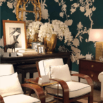
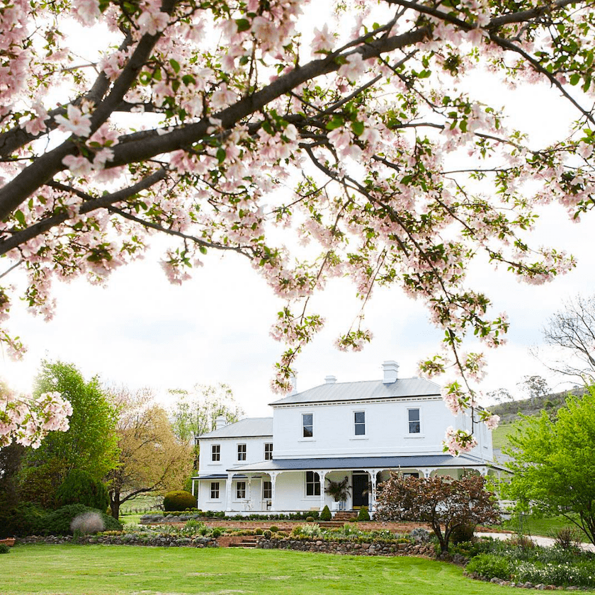
And, now, to illustrate and inspire, I’m going to share some of the most gorgeous images of Steve Cordony’s incredible Australian Home known as Rosedale Farm.
However, it didn’t always look like this. Nosiree.
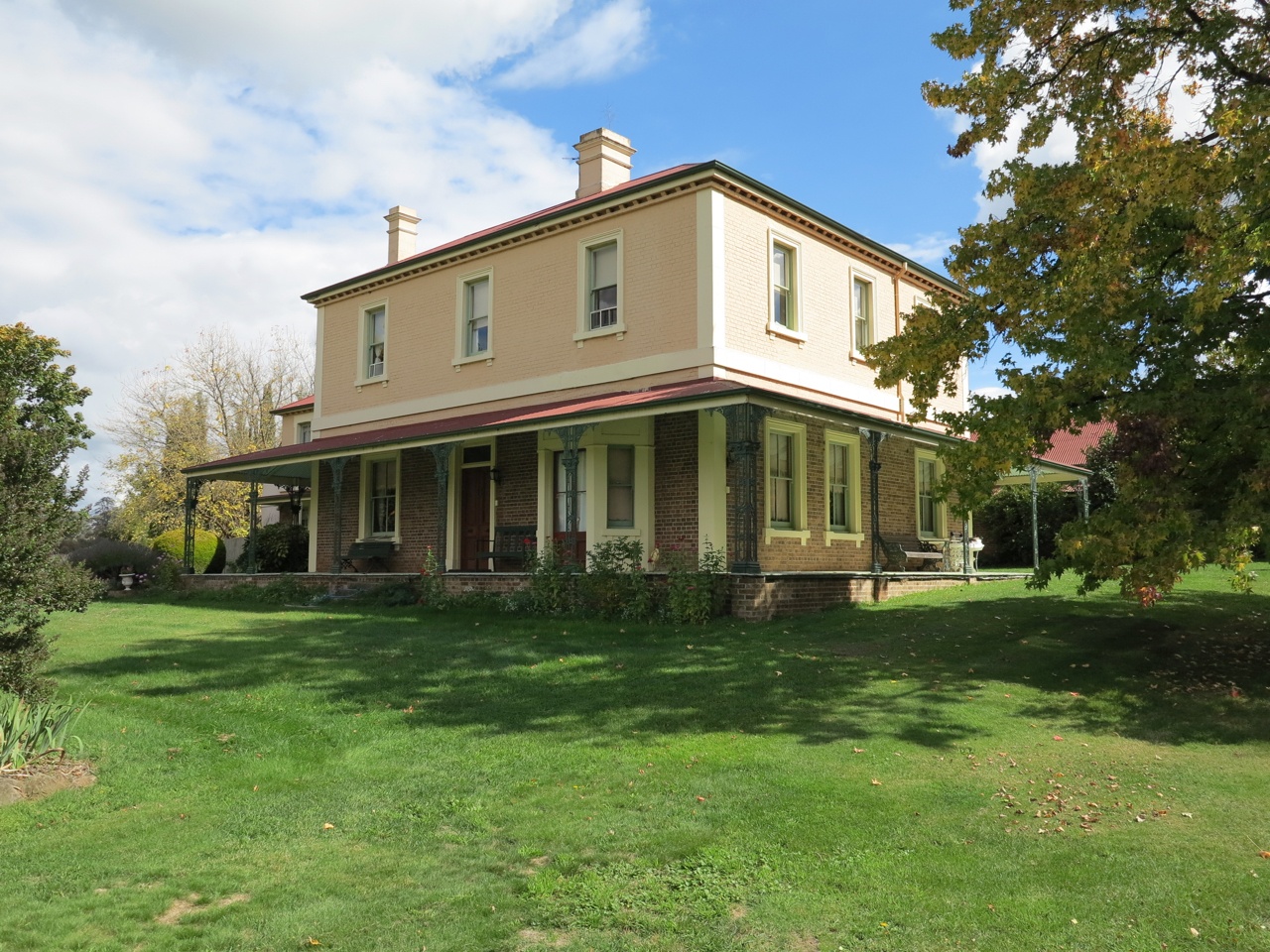
Here’s what the Rosedale Farm looked like a few years ago, before Steve and his partner, Michael Booth, got their genius hands all over it.
And, here’s just a little hint of what it looks like now. I will be linking to more later on. Like another power duo in England, Ben Pentreath (interiors) and Charlie McCormick (exteriors), Steve does the interiors and Michael the exteriors.
This image is about 2 years old.
So, who is Steve Cordony?
He is a young and exceptionally talented interior designer. But he earns his living as one of the foremost stylists on the planet. And, he is known for having Styled Ralph Lauren’s Flagship showroom, which you can see here.
Now, it’s time to go inside the house.
As you can imagine, the inside before matched the outside.
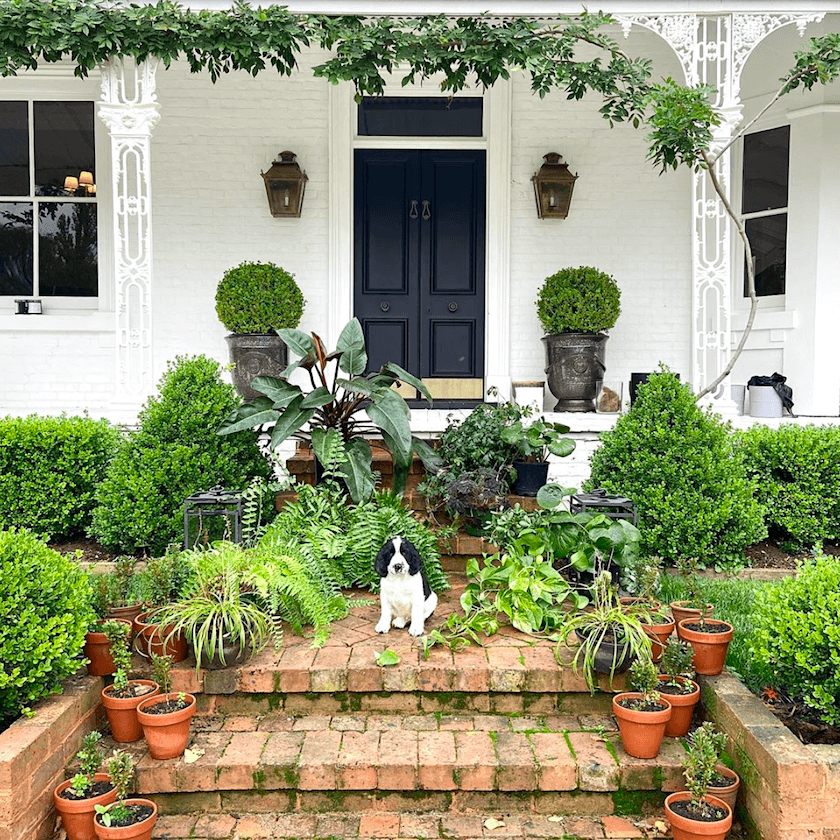
Not only did Steve paint all of the walls white, but he also added the appropriate dentil and other crown mouldings. As well as other applied mouldings.
I’ll bring you in gently.
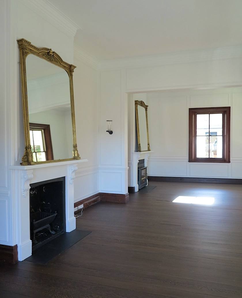
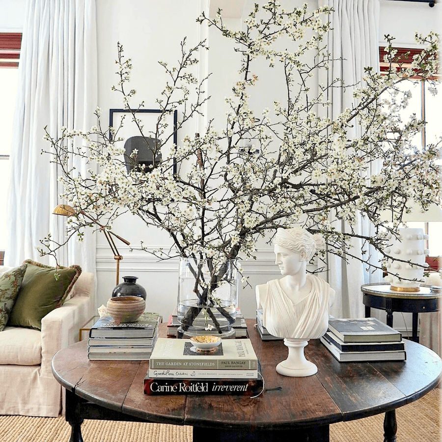
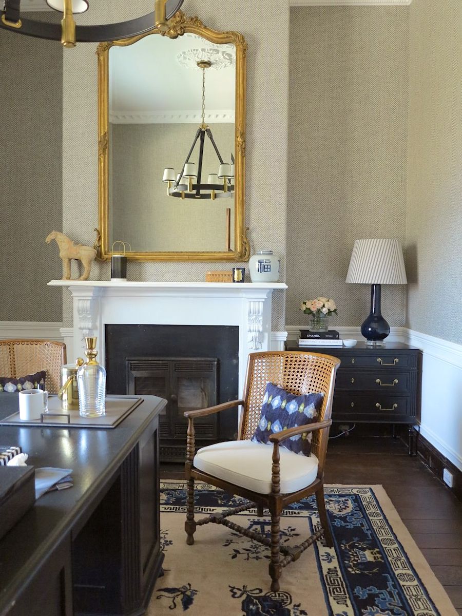
Like my dream home in Stockbridge, MA, which you have yet to see, this incredible beauty is filled with fireplace mantels. Above is the double-sided parlor. All that’s been added are those incredible mirrors and sconces.
And, coming up soon, is my collection of furnishings in a big, beautiful widget.
Please note, that my paint collection was created in 2015-2016. I had not heard of Steve back then.
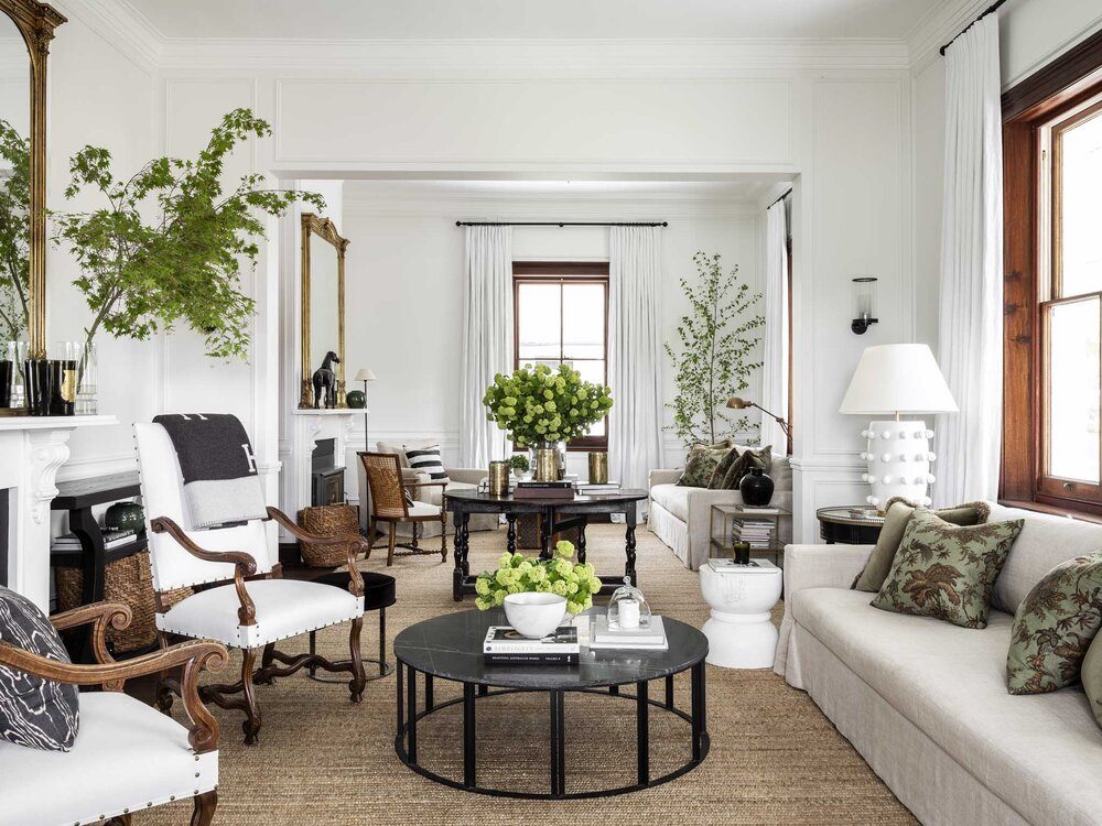
And, there she is.
Now, here’s the thing. The furniture except for the sofas and center gateleg table and lamps are like a revolving door of change.
One of the things I love most about Steve’s decorating is his fantastic knack for editing. AKA: RESTRAINT.
However, you know, and I know that in Rosedale Farm, we have an architectural gem with I’m guessing 12′ ceilings, huge windows, fireplaces, mouldings.
This is the Paulina Porizkova of living rooms. Oops, sorry. Parlors.
Ummm… Did I say where Rosedale Farm is? I do see that I casually mentioned it earlier. But, yes. It’s in Orange, New South Wales– Australia.
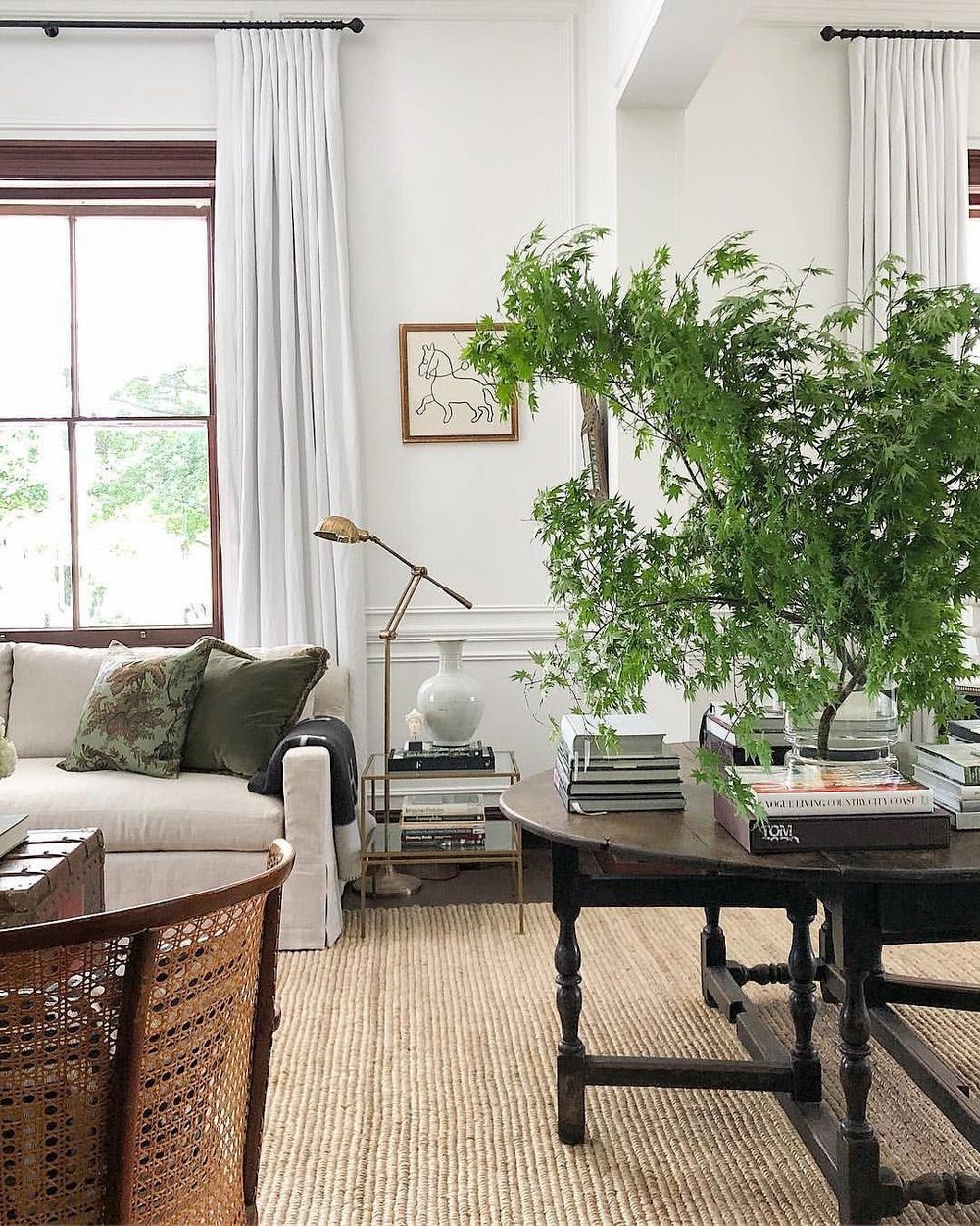
Below are a few more shots of the living room with the perfect neutral color scheme.
I will also begin to interject the corresponding colors. The colors in the paint collection can serve as wall colors. Or, they could be the color in the curtains or a pillow. Or, maybe there’s a small box. That sort of thing. Just because they are paint colors doesn’t mean that they are all going on the wall or on a piece of furniture.
 Okay, let’s begin our neutral paint colors, and of course, we’ll start with the white walls.

Herb Garden (like all of the beautiful leaves Steve uses)
First of all, it is IMPOSSIBLE TO SAY WHAT SHADE OF WHITE A WALL IS FROM AN IMAGE.
However, this does appear to be a beautiful crisp shade of white. It is unlikely to be Benjamin Moore. I don’t have the foggiest. Plus, Steve is in AUSTRALIA. Think the light isn’t different there? Of course, it is. After, all they’re standing upside down. ;] Yeesh!

Chantilly Lace
However, if I were going to pick my favorite, crisp white, it would be Benjamin Moore Chantilly Lace.

Decorator’s White
This color is reminding me of the gorgeous, almost celadon shade vase on the end table.
As needed, black is used in small amounts throughout the room.
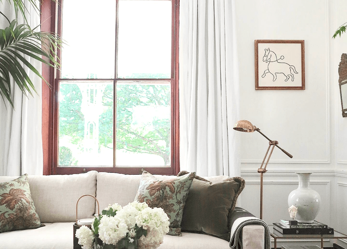
I bet you want to know what the print is on the pillows. Right? Some of you, I’m sure, could blurt it right out. I, too, recognized it instantly. And, I knew it was from Schumacher and I knew that I would remember the name, the second I saw it.
So, I jaunted over the Schumacher website.
And, blimey, I couldn’t find it. It’s there, but my search terms didn’t pull it up.

However, I did a search using a tiny image of the fabric. And yes, I found it that way.
That’s the Laurel-method for finding anything on the internet. It’s outlined in the back of Laurel’s Rolodex as a bonus chapter.

Copely Gray hc-104
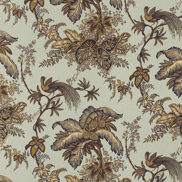 Schumacher Coconut Grove in the aqua-tan colorway. You can get it here.


Quiet Moments

Carter Gray

Steve’s styling is so deceptively simple. But, I think it comes from having the right ingredients and the right eye. It’s a skill worth developing, for sure!

Brown Horse
 Yes, that’s a Louis Vuitton vintage steamer trunk. And, guess where I found about a dozen of them? On Etsy! Isn’t that nuts? You’ll find one of them in the widget, below, as well. They are not inexpensive.

Timson Green
Timson is a little deeper than Oregano.

Even though there are lots of greens in my neutral color scheme, the green is usually an accent color. Please remember that the concentration of colors in any color scheme is never equal.
 Many people have inquired about the incredible rug. Steve is so incredibly gracious on his Instagram account. I have read that the custom rug was fabricated in India. Oh, and they needed to use the bulldozer to get it up onto the deck. It looks to be made of jute.
Carter Gray

Chimichurri *
*means that this color is not in the LH paint collection.
Above are some of the colors from the neutral color scheme is a gorgeous antique painting. This is another source on Etsy and is linked to in the widget you see in a bit. (unless you skip ahead) ;]

Newburg Green
Above, is another incredible shot from Gerald Bland. I think we must’ve been separated at birth. lol

Duxbury Gray*
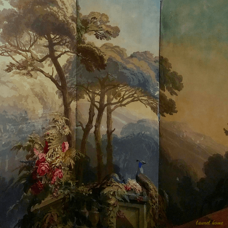
Part of my antique Zuber screen I purchased in New Preston, CT in 2001.

Chestertown Buff hc-9
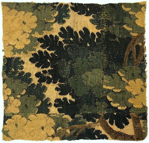
I found this remnant of a 17th-century tapestry in a fabulous shop on Etsy. You’ll find the link in the widget. Also, there are some ready-made pillows with new fabric.
I always love a touch of a verdure tapestry in neutral color scheme rooms.
Well, most any room. Those of you who own the paint and palette collection will see a lot of these gorgeous tapestry pillows on many of the mood boards.

Salamander*
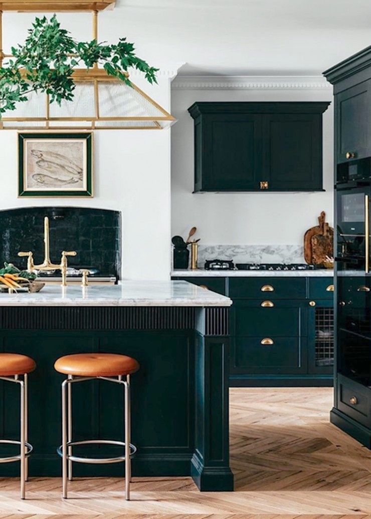
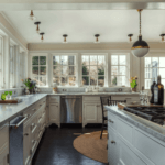
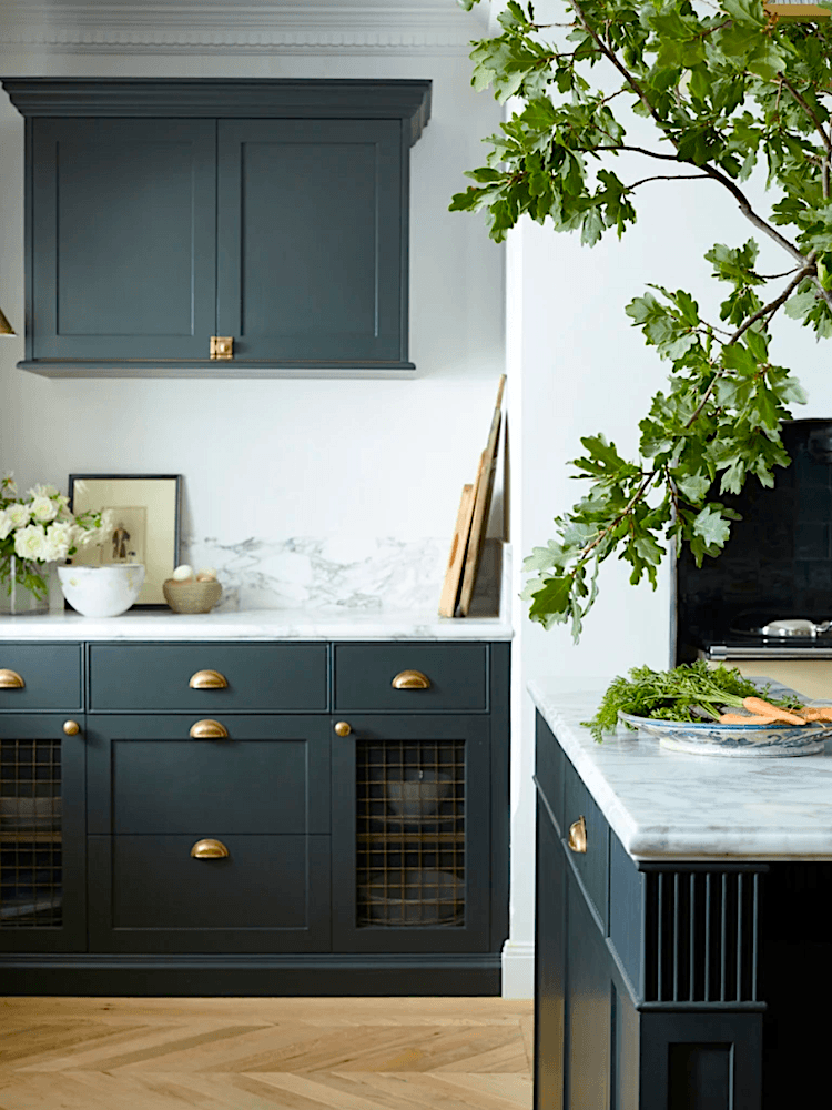
There has been a lot of press over Steve’s new kitchen. Please check this out to see how it looked before.
Here’s what’s funny. Well, to me, anyway. In my research, I found a quote from Steve:
“I wanted the kitchen to be a mix of classic American elegance and Shaker style.”
It struck me as so ironic since I’m often posting English kitchens. I guess we always think that something foreign is more exotic. But, great design is great design. It doesn’t matter where it is. I see a lot of similarities between his kitchen and those of the incredible Jean Stoffer we were looking at a few weeks ago.

black forest green pm 12*
The best neutral color scheme, here with wonderful gold curtains, is in his master bathroom.
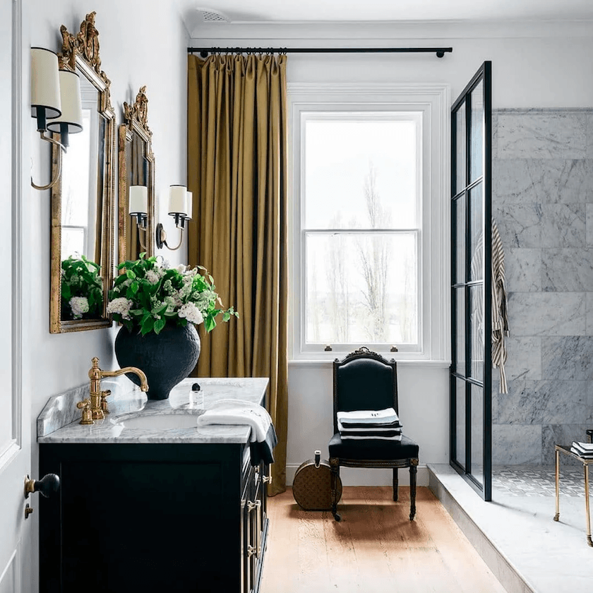
The sconces are from Visual Comfort. They are not in the widget because the image was HUGE, and it bugged me. Capitol Lighting as the best prices on Visual Comfort. You can get the entire line here.

Steve Cardony is going to be teaching a master class on October 24th and 25th, 2020. I don’t know if it’s full or not. It sounds like it’s going to be incredible!
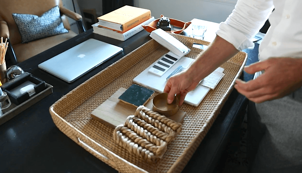
If you’d like a preview, please check out this video, where he shows how he derives inspiration and makes mood boards.
So, does Steve veer from this very neutral color scheme?
Yes, but, discreetly and also, still in keeping with neutral.
 He incorporates small amounts of blue in his office.
And, then, the dining room has the most glorious wallpaper mural I’ve ever seen.
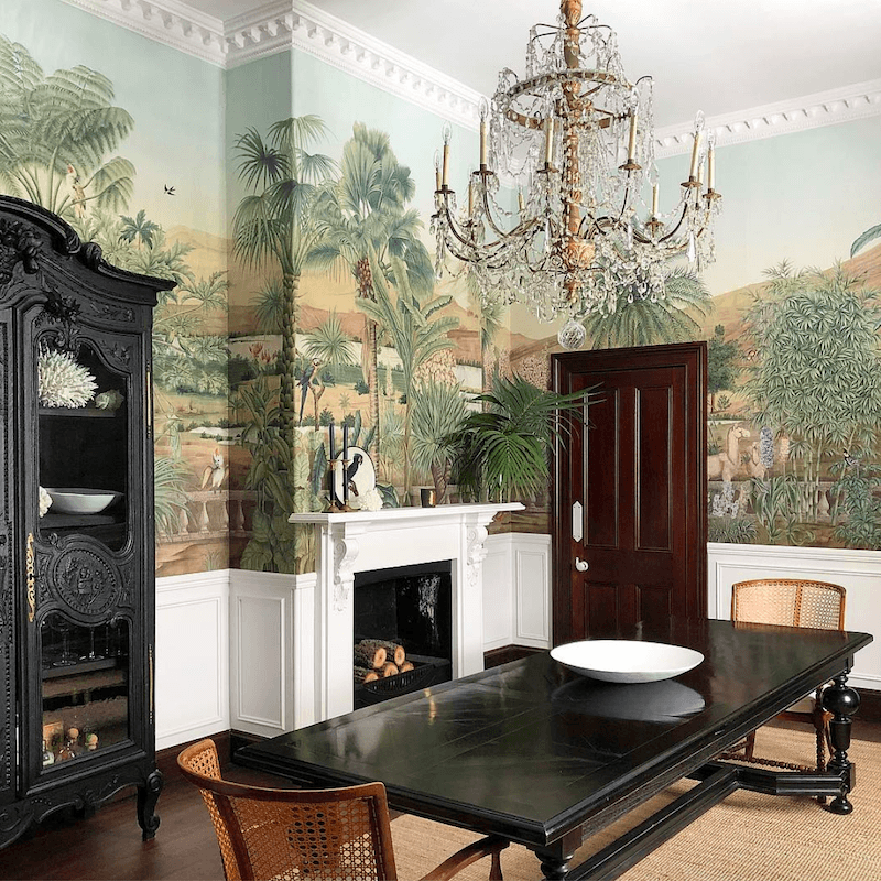
The dentil crown moulding is new. But, doesn’t it look like it was there all along? It should’ve been.
 Thank you so much, Steve, for your brilliant designs, photography, and endless inspiration!
I’m a fan, and I know that y’all will be, too!
One last view of Steve’s gorgeous double-parlor looking in the other direction. Yes, I adore the brown trim. We’ll talk more about it on Sunday.
Please follow Steve here:
This link will take you to an update from 2018 on the progress of Rosedale Farm. You’ll see lots of before and after photos.
I am excited to see where Steve’s career takes him, as it’s clear that his great star is only just beginning to rise!
xo,

PS: If you’d like to see a follow up post about how to get Steve Cordony style and in some cases for less money, please go to this beautiful post.
Related Posts
 Beige Decor — How To Make It Go From Boring To Sensational!
- Gray Walls? The Perfect Color Palette To Make Them Sing
- 12 No-Fail Classic Kitchen Cabinet Colors
- High-Low Ralph Lauren + Decorating’s Most Dreaded Words
- The Secret For A Cheap, Chic Kitchen Refresh
- A Novel Way To Get Priceless Art Masterpieces For Cheap
- Little Known Ways To Score Free Furniture (or nearly free)