Dear Laurel,
First off, I’ve become a HUGE fan recently! Your articles are not only informative but so much fun to read because I feel like I’m listening to myself speak
I’ve been taking some notes on some questions I have been wanting to ask you but don’t want to blow you up with too much information at once (I tend to do that ).
Essentially, I just repainted our whole downstairs in fresh new grey/greige colors using Behr paint colors:
- Dove for the foyer
- Grey Mist for the small fireplace wall
- Dolphin Fin for the rest of the great room/kitchen.
That’s because I thought it’d make our dark floors pop. And, I also think that gray walls are going to be better for resale. But, now I’m not sure. It looks awfully blah.
And, the previous beige/brown colors (above) were making the home feel too dark.
We’re probably going to start thinking about selling in the next year to 3 years so I figured it’s time.
My first struggle is establishing a color scheme.
Forgive me, but it shouldn’t be your first struggle.
Your first struggle is coming up with a decorating plan (that’s the post that tells you how to do it!) It’s okay. I will repeat myself as often as necessary.
Of course, coming up with a color scheme is part of the plan. And, I’m not just picking on you Syd. Almost everyone does this. They just go out and think, “oh, I’ll paint the walls____ color.” But, then, there’s no consideration to what else is going on.
And, 95% of the time, that is going to make your life more difficult than it already is.
I’ve been thinking beiges and maybe greens and yellows.
Thank you, Syd. You just gave me an idea for a color scheme.
However, I can’t bring myself to commit to anything. (hence the wall decor and “junk” still sitting around waiting to be put back). Usually, I like to start with curtains because I love having the curtains as a focal point.
But, part of me wants to find another focal point. Can you tell how wishy-washy I am? Haha!
I’ve come to fully appreciate how difficult this is. And, I’ll be grateful for any guidance you can give me and your other readers, Laurel. Thank you so much!
***
Thanks again, Syd.
Ya know, someone once interviewed me for an article she was working on. It was about paint colors for interiors. And, she asked me what I thought about gray wall colors.
I told her that gray walls are actually very classic. Well, something like that.
So, a few weeks later, the article came out. And, with the article came a photo of a room; it’s a room that utilizes a lot of gray, alright, but not in a way I find pleasing. Plus, it’s not the best photo.
Of course, I didn’t realize that they would be choosing the image to represent my words. Oh well.
The problem with gray, and we’ve talked about this before is that folks tend to get carried away with it. And, the room becomes very one-note and dull. Add in those white LED lights; along with a lot of bloated transitional furniture… Well, you get it.
So, for today. I’ve put together three gorgeous color schemes for gray walls.
Per usual, the best laid plans… I wrote that 10 hours ago. And, since then except for a couple of potty breaks and quick texts with friends… I’ve been WORKING.
What I’m trying to say is I only did one color scheme for you today. (Actually, now yesterday. haha)
But, but, but. I did three mood boards. Three colorful mood boards to go with the gray walls.
In addition, if you go and look at Sunday’s room colors post again or for the first time, is another great option.
What’s kind of funny is that the post title is about “gray walls.”
But, this is the deal when working with gray walls.
They don’t all have to be gray. And, that goes for an open floor plan, as well.
Of course, I can’t see everything going on. And, that might be another post.
However, talked about what to do in this recent post about open concept floor plans. And, this concept is also demonstrated beautifully in Melissa Tardiff’s kitchen/keeping room renovation.
(Designed by the incredibly talented Nancy Keyes)
Oh, and we talked about it as well in this post where a lovely reader’s entry is currently part of the living room.
But, the concept is to make small walls to create a separate space.
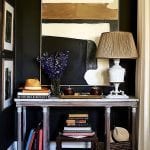
One thing I spent a good hour doing was matching up the Behr Dove Wing to the closest Benjamin Moore color I could find.
 Above is Behr’s Dolphin Fin

Benjamin Moore Nimbus 1465
Not sure why I wasted my good time with that. I guess it’s just my brand of crazy. haha
The closest Laurel Home Collection color is Balboa Mist 1548
There are also two other Behr colors that Syd used.
 Gray Mist for the fireplace wall.
 And, Behr Dove for the entry.

The closest Benjamin Moore color is Balboa Mist 1549. Balboa is a hair deeper than the one above it,

Classic Gray 1548. Both, are part of the Laurel Home Essential Paint Collection.
Okay, I need to address a few things before we get started on a color scheme for our gray walls.
One. I know that we’ve all been told (ad nauseum) to paint our home with gray walls for resale.
That’s crap.
Of course, you can paint the walls gray. Please see these two posts for some of my favorite gray rooms done super well.
The Best Benjamin Moore Warm Gray Paint Colors
The Best Benjamin Moore Cool Gray Paint Colors
OR, you can paint some of the walls gray, if it suits your design style.
But, there are dozens of tasteful COLORS you can also use, that might be the better choice.
You should see the monstrosities some of my clients have purchased here in Westchester County. I mean, hideous isn’t the word. And, they bought those train wrecks! (and, for an obscene amount of money, usually.)
Of course, move-in ready is desirable.
But, if you have some color or wallpaper that’s tastefully done. I believe that it can help you sell your home. Here’s more on my philosophy of how to home stage your home for resale.
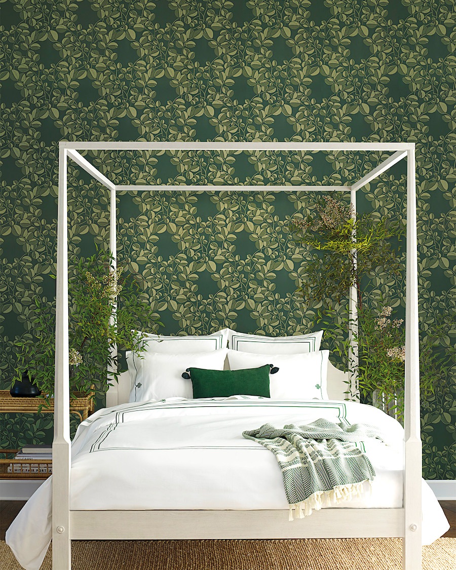
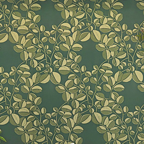
When Syd mentioned green and yellow, I immediately thought of this beautiful new wallpaper at Serena & Lily. It’s called Valley.
However, before I continue, I need to address a few issues.
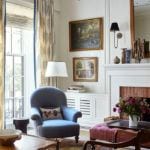
First, is if Syd doesn’t change anything architecturally, I would just paint everything ONE color. Right now, it’s really one space. There is a room to the left of the entry. I would love to see that one closed off with French doors.
Buyers will love that, because they’ll see it as a possible spare bedroom for guests. Or, at least a more private space. Right now, it’s a kind of an all-purpose room/office.
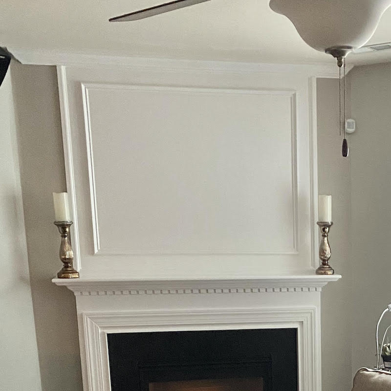
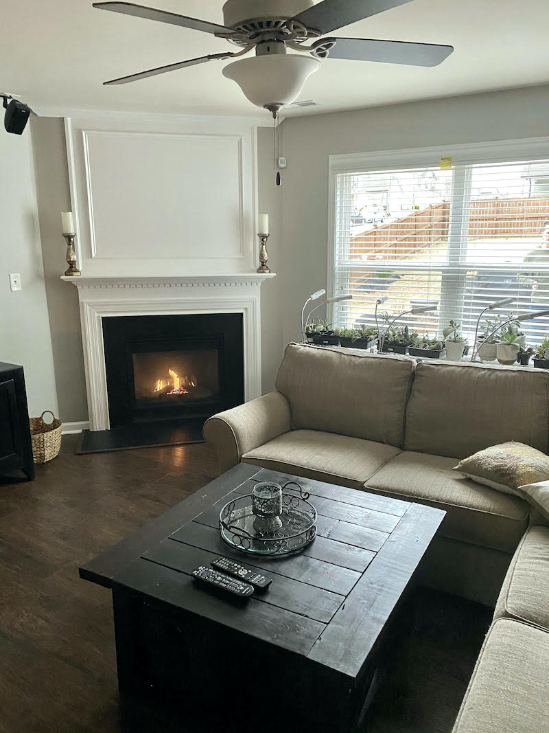
I would move the candle sticks in a few inches. I don’t like to put things on the overhang of the mantel. Sorry to be so picky. :]
But, the bigger problem is that the mantel itself and over-mantel are very lovely.
(learn perfect mantel proportions here.)
However, that crown at the top, is not right. Ideally, I’d love to see that crown go all the way around the room. However, short of that, this is a crown for the over mantel. Therefore, it should act the same as it does on a piece of furniture. (see below)
Alright, it’s time to look at my ideas via my mood boards.
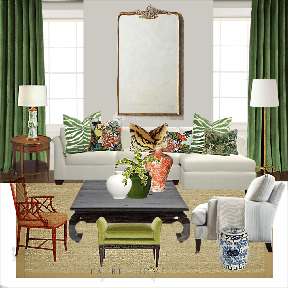
I am going to begin with the dining area, because this is the jumping off point for my color scheme.
This might not work for Syd’s home which I realize sounds lame. It would take a lot of separation which might not be possible. But, it definitely would be possible for other people.
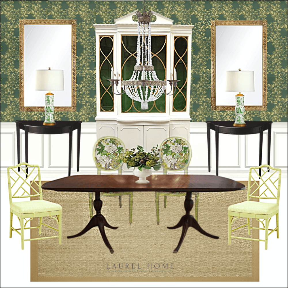
Again, this is a little formal for Syd’s home. I fully realized that after I saw more of her home. But, it was too late. For the oval back chairs, I chose a brand new colorway for Schumacher’s iconic Chiang Mai Dragon.
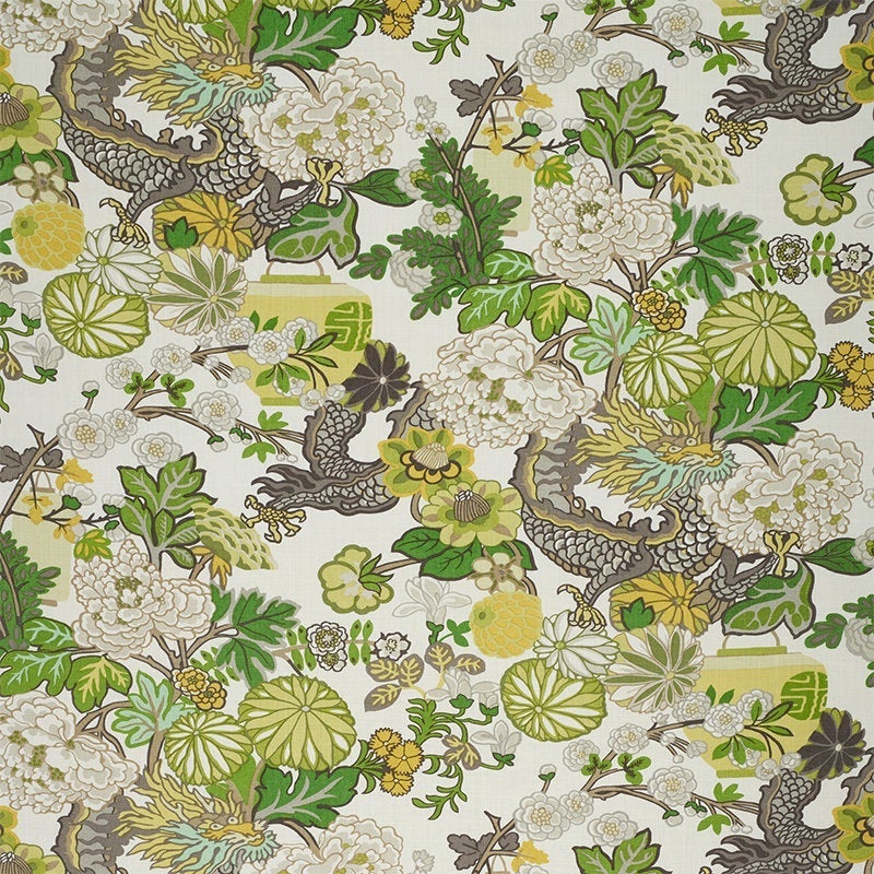
Chiang Mai Dragon in Citrus
You can purchase Chiang Mai Dragon here and also see all of the other colorways. (scroll down to the bottom to see the newest colorways)
Or, you can have a custom pillow made here at a new (for me) pillow source on Etsy, Trendy Nest.
For more terrific sources for custom throw pillows at reasonable prices, click here.
Bringing the image down again.
Many of these items are vintage pieces I found a while back.
However, please check out the vintage Hot Sales page. I am continuously adding new pieces and wonderful sources for vintage home furnishings. There are a couple of wonderful dining room tables. And, that source has dozens more. In addition, there happen to be a couple of Chinese Chippendale fretwork chairs very similar to these. Oh, and there’s a set of oval back chairs.
You can find the black demi-lune tables on the main Hot Sales page. It is in the first One King’s Lane widget. And, you’ll also see the same table in a natural wood finish. I love both. But, it’s good to keep in mind, that a black accent is welcome in any room. And, it’s the one thing that is sometimes missing that would make the difference.
I find this to be especially true in those mono-toned transitional rooms with gray walls and furnishings. Just my thoughts.
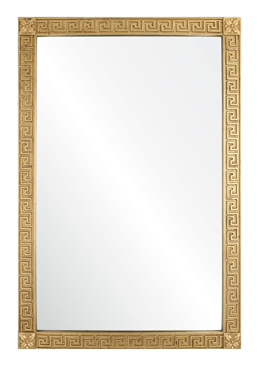
Unfortunately, the wonderful Barclay Butera mirror has been discontinued. Bummer!

However, Phillips Scott manufactures this similar mirror.
Phillips Scott is one of my favorite sources in Laurel’s Rolodex. You’ll find Phillips Scott in the back with the 36 sources I can’t live without. Well, when I was taking clients. It does get updated.
They do custom work too! So, it might be possible to get those little corner plinths, for instance; not sure. But, they definitely do custom finishes. And, will give you a strike-off so that you’ll know what you’re getting.
Please note that Phillips Scott is a trade resource. However, if you’re interested in their wonderful home furnishings, I’d give them a call to see if there’s a retail source or designer near you who sells the line. They’re super nice too!
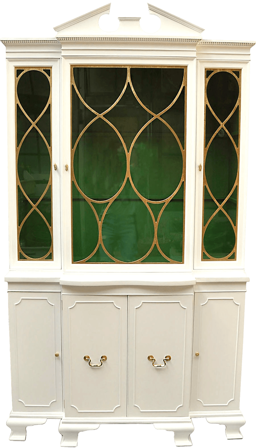
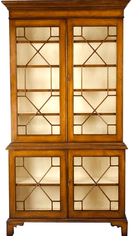
I found this vintage piece years ago, online. I’m sure that it’s no longer available. But, it gives a great idea of how one can update an old mahogany piece.
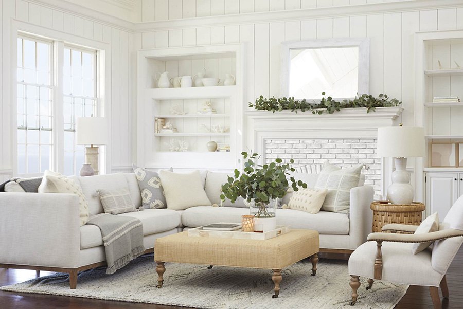
Time to move on to the living/family room.
Again, this is a conceptual board.
Syd did tell me in another email that the sectional is too large for the room. And, for the purposes of this post, I am not concerning myself with the layout. Of course, it’s important, but at the initial time of writing, I did not have enough information.
Just know that when you make your plan, the actual floor plan is where i begin my design.
FYI, while these posts do give a lot of information, there is only so much that can be said.
***However, for a far more comprehensive guide; (much of the information is not anywhere on this blog.) please also consider purchasing my new 333 Hard to Find Rules & Tips You Need to Know Guide. It’s only $49.00 (for the time being) and over 200 pages filled with my best advice.!*** (please note this is a PDF file that gets downloaded to your computer.)***
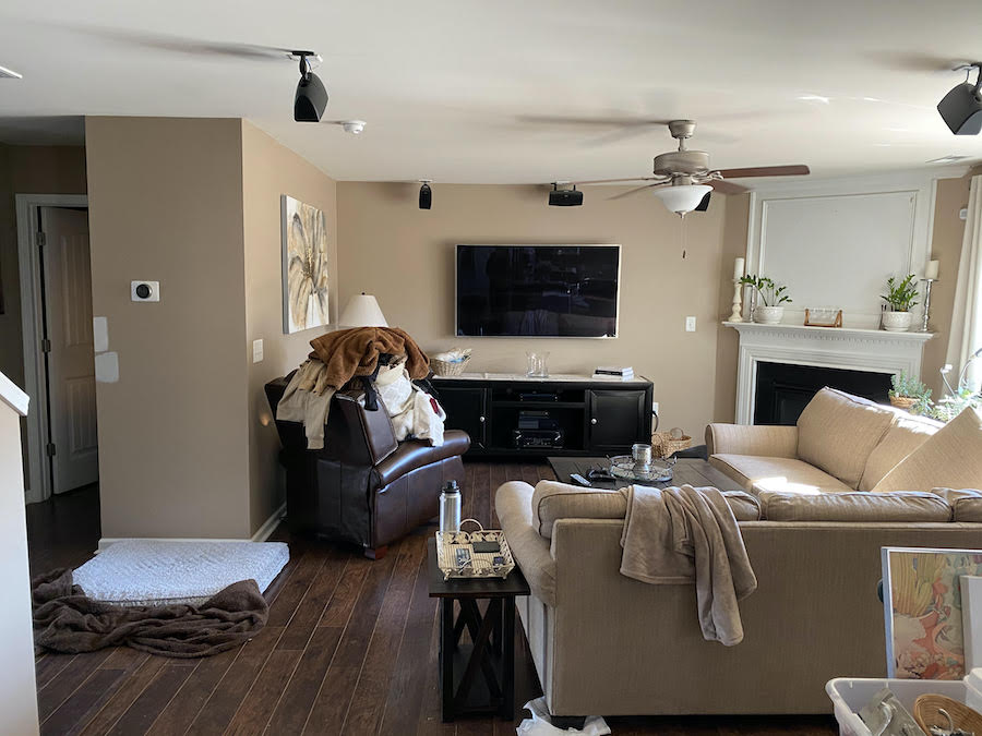
Before, I go on, I want to show you third board which is the TV wall. There’s a reason for my madness.
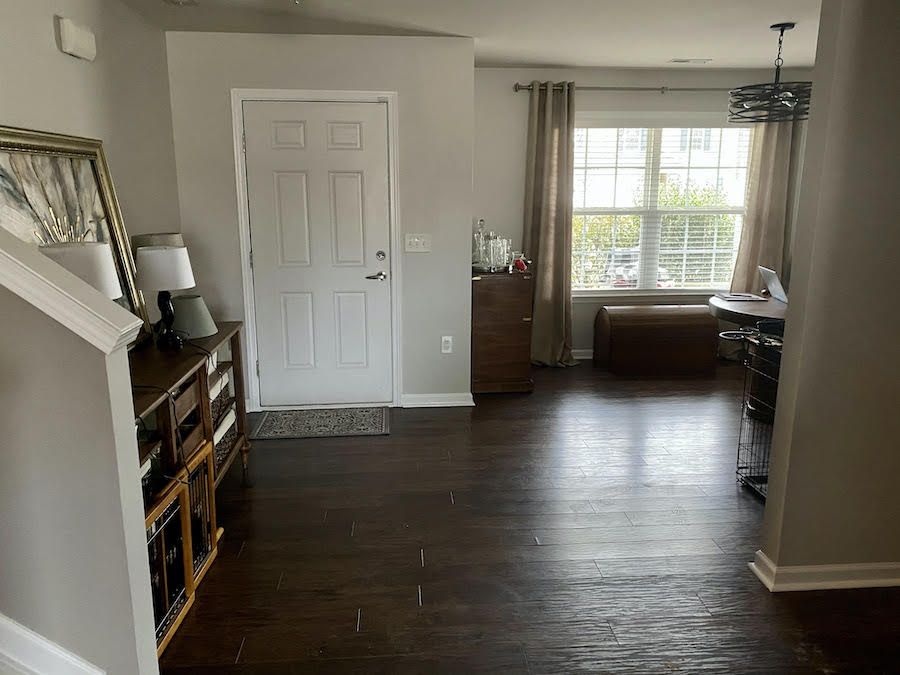
Before.
Remember how Syd is trying to figure out her focal point?
Well, usually, the focal point is the fireplace. However, this one is on an angle. I had the same sitch in my old townhouse. Corner fireplaces do present a problem.
However, the fireplace wall should probably still be the focal point.
Therefore, we have to make the TV wall “disappear.”
Remember how we made the TV disappear in this small living room?
Well, we can do something similar here.
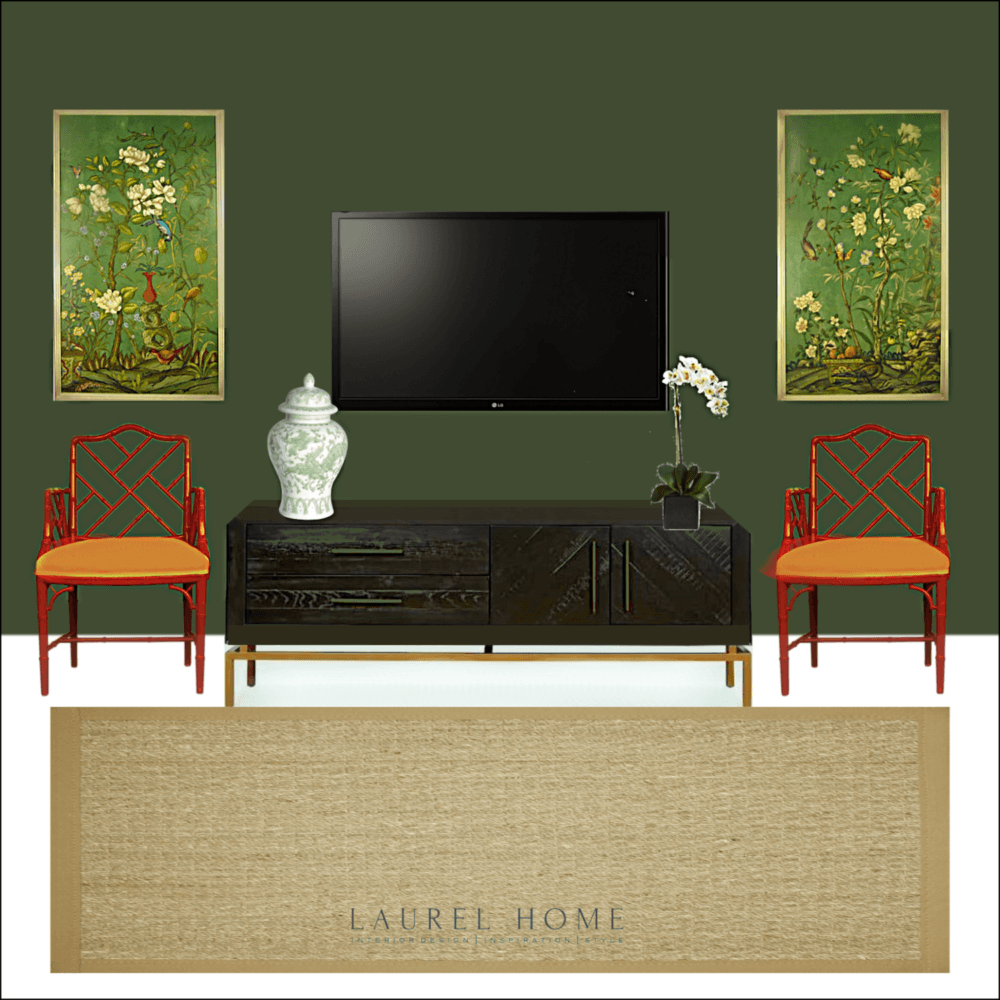
Isn’t that better? Please say yes even if you hate it; just kidding.
But, now that I’ve had some rest, I realize that it might be a little too much better. haha. It’s more clear that this wall is the focal point. The thing is, the fireplace is on an angle. Can both be focal points?
Yes, I think so, but this one is obviously the star of the show, as it stands. The fireplace cannot compete with this.
However, if we did some prints that had less color and if the chairs were white. Then, we could put a smashing piece of art over the fireplace. There are always options.
The point is… that you are THINKING about the entire space before you do anything. And making a PLAN.
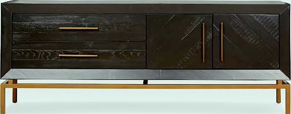
The media console I used for this vignette is from West Elm.
So, do you just do an an accent wall with the Colonial Verdigris, Laurel? I thought that was a no-no.
You can absolutely do an accent wall. It is never a no-no if there’s a good reason. Making the TV and console disappear is a good reason. :] But, if you go back up and look at the living room. Where the dog bed is, that’s where I would add a small wall. Just to say, “This is where the entry ends and now we are entering the living room.”
But, Laurel. Syd wants a light bright room.
I realize that, but this house is never going to be light and bright. There isn’t nearly enough natural light. But, the lighting does need work and that will be addressed later on. (Sunday)
However, getting back to the walls (before you guys kept interrupting me,) I promise you, if you put up the walls to give the spaces some separation; once it’s done you will:
1. can’t believe it wasn’t always that way.
2. wish you had done it a lot sooner.
Therefore, since there isn’t a lot of wall space in the living room, then I would just paint the entire room the dark green.
So, let’s bring our living room with gray walls down again.
The small sectional is from Williams-Sonoma Home.
However, if you don’t already know, Serena & Lily has all of their gorgeous custom upholstery on sale. That’s sofas, loveseats, chairs, ottomans, benches and beds. And, they have my favorite small-scaled sectional. You can see it in the second widget on the hot sales page (in blue)
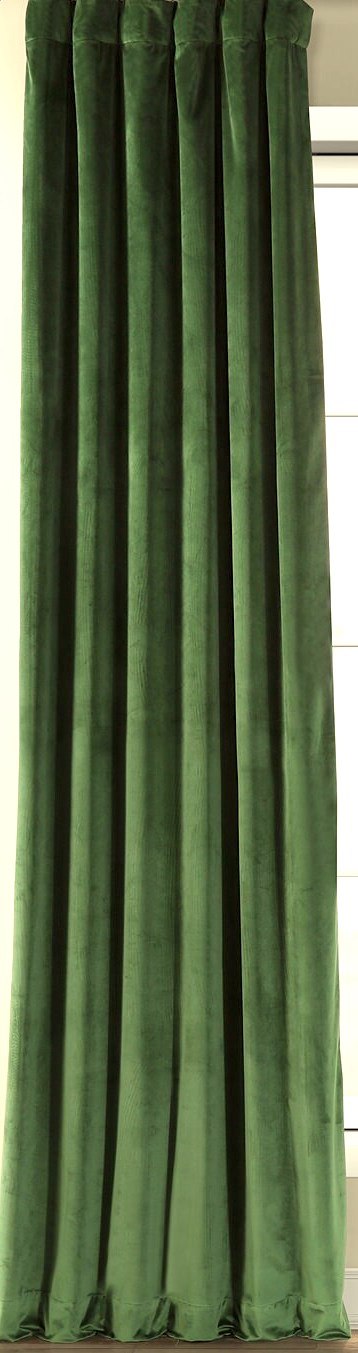
The velvet curtain is from half-priced drapes. I believe that you can get samples from them.
If we keep the walls dark green, I might do a white linen or some other fabric for the curtains.
Below is a mini widget with six pillows. I could not find the cool zebra stripe. But, it’s from Quadrille; unless it’s discontinued.
You can click on any image to go to its source.

Something I hope you’ll find interesting.
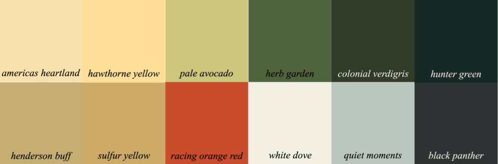
Above is one of the Laurel Home Paint and Palette Collection palettes. I wasn’t looking at the Chiang Mai Dragon pillow. But see how close the colors are? Frankly, I don’t remember if I was using this pillow for inspo or not when I created this palette.
However, using a piece of fabric like this one from F Schumacher is an easy way to come up with a whole house palette.

Click here for 50 of my favorite Etsy vendors.
What’s cool is that in the paint palette collection are other palettes that one can mix and match with the one above. I have put them in palette families and stated which ones work together. No fail! And, yes there are palettes with warm gray in them that go with these colors.
And, now, I’m going to leave you with something to think about while your pondering gray walls and all of this COLOR put together!
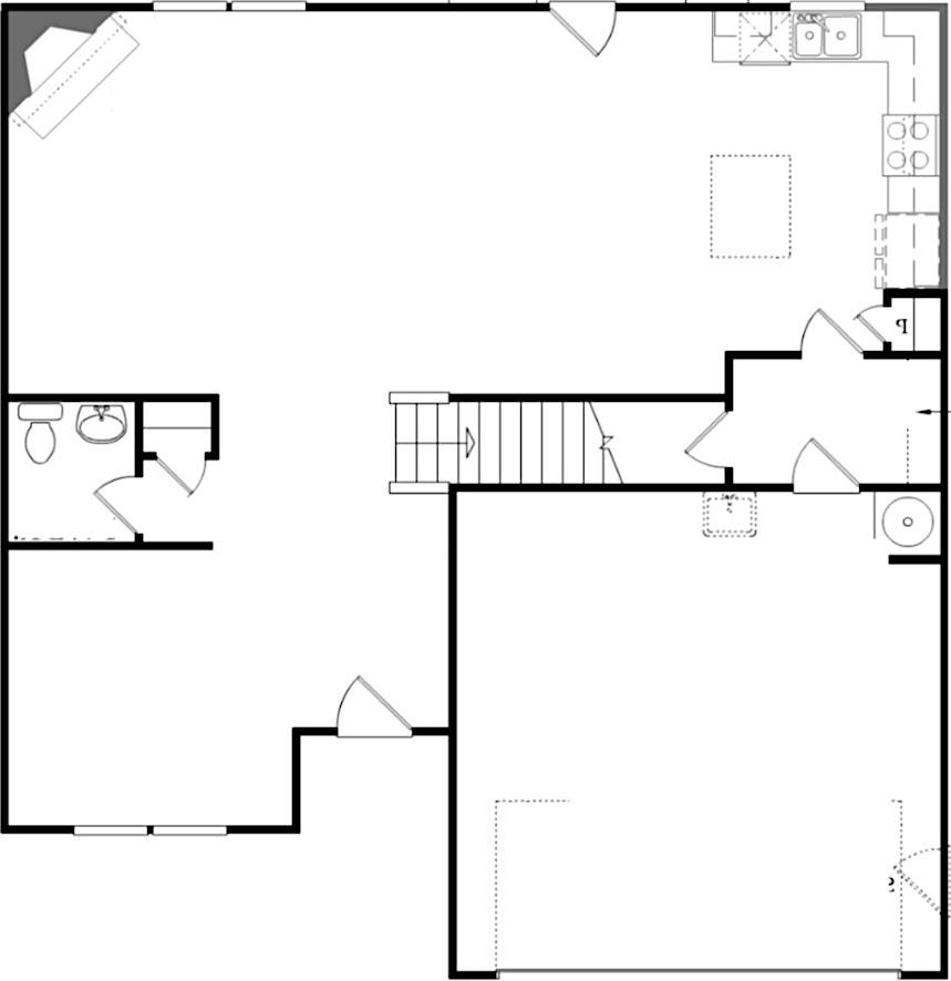
Late last night, I received Syd’s floor plan.
Well, I’ve spent the last four hours working it out.
For Sunday, I’m going to share what I came up with. And, I might make one more board.
But… what this will show is how essential it is to have a plan. And, with that a scale drawing of your space. While much of what I’ve done will work, yes the dining room is too formal, but that is really the chandelier and mirrors.
Of course, you may try to come up with your own plan,
***But, please don’t share it yet.***
That is your homework assignment; if you’re interested in homework. :]
I will be “here” on Sunday, but I am leaving on Friday for the Design Influencer’s Conference (formerly Design Blogger’s Conference) in San Francisco.
xo,

Please check out the newly updated HOT SALES!
Related Posts
 Small Living Room Decor -Should It Be Pale or Dark?
- Creating A Chic, Cosy Home Library-Best Colors, Lighting and Furniture
- Easy (and affordable) Ways To Fix A Boring Room
- 20 Stunning Lifestyle Instagram Feeds You Must Follow
- Fear Not The Big Living Room Wall – Help is Here!
- Can This Boring Bland Living Room Be Saved?
- Common Mistakes Folks Make With Their Small Kitchen