I just received an email from Sandra who’s struggling with her paint color to go with her red-toned laminate floors.
Dear Laurel,
So pleased I found your blog; I love so many of the ideas. And, the humorous comments are so much fun to read.
My issue is that we purchased an older home in Montreal with paprika colored laminate floors (not an easy color to work with). Hence, I desperately need your help for my walls. I’m thinking of doing a creamy warm white to offset the red in the flooring.
Laurel, I was also thinking about maybe a warm grey paint color. But the BM color I selected turned out to be a cool gray paint color which goes quite blue.
It did not look blue on the chip.
[Please read how to select your paint colors so you don’t make a hideous mistake]
Oh, and just in case, you think that changing the laminate floor is a good idea.
It would be for someone else, perhaps. But, we only put it in five years ago. So, it’s staying.
Any advise for me? (I realize it would have to be a blog post)
Thanks,
Sandra
***
This sounds interesting. So, I asked Sandra to send in a few photos of the rooms with the laminate floors. Of course, this was with the view of possibly using this info for a blog post.
She was game and sent in a few photos so that I could see what’s going on.
Immediately, I could see that Sandra made a mistake that we all make.
She began redecorating her room without a plan. Please go here for easy-to-follow 12 step decorating plan that works every time.
Although, I don’t know her exact thinking, it appears that she just jumped in and went with a color that’s different from what she has. But, it looks like she wasn’t thinking of the room as a whole.
This is in no way faulting her. 99% of you who are not professionals do this. Your room designs are completely ad hoc. And, sometimes, it works out. But often, you find yourself, you know.
Painted into a corner! Sorry, I know I say this every now and then. And, every time I apologize for the platitude.
Now, the truth is, I have no idea what Sandra has in the way of furniture, except for two pieces of cream colored upholstery with a slightly green cast.
OR, at least that’s how it looks in the photo.
Please note that the furniture may appear to have a greenish cast because the red in the floors will automatically bring out any small amount of its complimentary. The opposite of red, is of course, green. For a review of the color wheel, please go here where we talk about analogous color schemes.
Okay.
My first thought was– Can we simply change the floor color?
Well, not with a laminate.
Not unless we wish to paint the floors white. And, that’s a possibility. But, I don’t think that’s going to work for Sandra. Please remember that any floor can be painted. We just talked about painting a ceramic floor in this post about a kitchen refresh.
But, here’s the thing.
People sometimes confuse laminates with engineered floors. (for a post that talks extensively about hard floors, go here.)
While both products are laminated onto either plywood or a particle board;
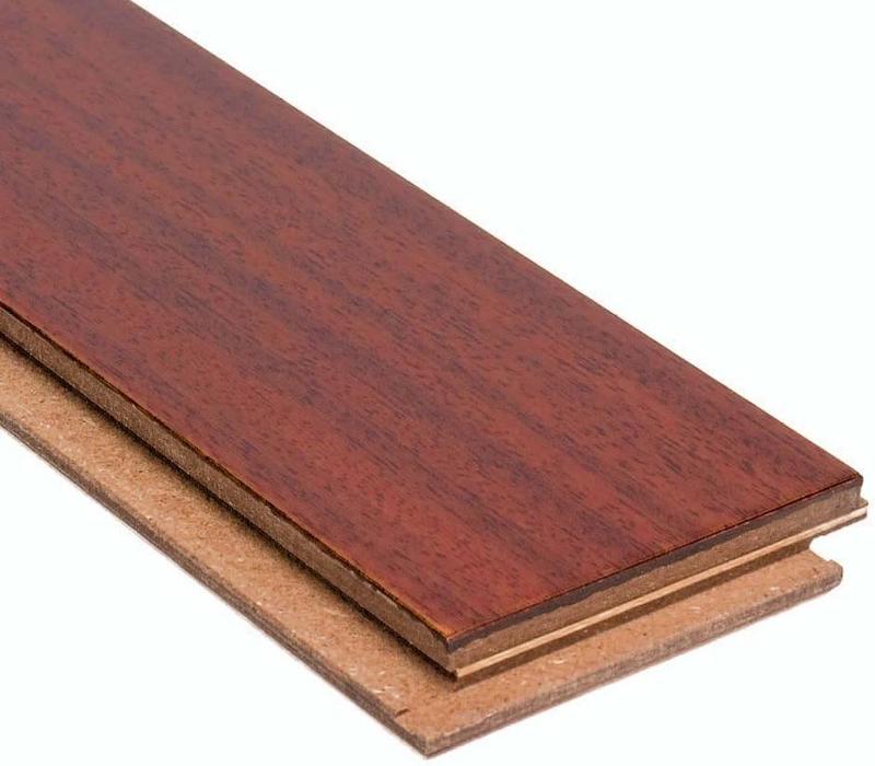
an engineered hardwood floor has a layer of real hardwood on top. The thickness of this layer can vary. But, usually, it can be sanded once or twice and be refinished.
A laminate floor, however, is usually particle board with a photo of a hardwood floor laminated onto that and then a plastic film layer over that.
So, obviously, that can’t be refinished.
For a superb article which goes into greater depth about the difference between laminate floors and engineered wood floors go to this post on flooringinc.com. They also list the pros and cons which I think are very helpful.
Can we re-stain a laminate floor?
Well, it might be possible to make it darker, however, you are going to cover up the aluminum oxide protective coating. Of course, you can put a poly over it. However, I’m not sure if I would do this. Since laminate floors are relatively cheap, it makes more sense to just change the floor.
But, Laurel? Would you really recommend a laminate floor?
Yes, in some situations.
And, some of the laminate floors, these days look quite nice.
Of course, if you don’t like the color of your laminate floor, and changing the floor is an option for you, that is a great place to start.
Another very helpful post I wrote a while back talks about ways to fix wood stain that came out too red without having to totally refinish it.
This will work only on real wood or engineered wood. I would not try it on a laminate floor. I think it’s a recipe for a big bloody mess. Of course, if you have some left over samples of your laminate floor and wish to experiment, that is what I would do.
Okay, now that we’ve got that out of the way.
Later, I received some more information from Sandra that is helpful for me to understand what is going on.
The paint currently on the walls is Barren Plain 2111-60
But, it looks too blue for my taste, Sandra said.

Benjamin Moore Barren Plain 2111-60
Please notice how it looks bluer in the photo than it does in the image from Benjamin Moore.
The last two pictures were on the walls a few years ago.
That color went nicely with the floors.
However, my goal is to brighten up the place.
No matter what the color ends up being, it will be a Benjamin Moore color. I do not want any blue or yellow undertones. What I envision is something fresh. And, also very warm almost creamy.
But, you are the expert.
[Thanks, but not in the way you might be thinking. I can only guess at what color might look good if I am not there.]
Some colours Sandra wrote that she is considering are:
Dove white
Swiss coffee
Dove wing
White blush
Ivory white
Classical grey
***
Thanks so much for all of that Sandra.
I want to be very careful not to sound like I’m picking on Sandra. So, please note, that I have made more MISTAKES in this business than there are days in the year. And, some of them have cost me dearly. So, if I see something, I’m going to say something in the interest of all of us avoiding making costly mistakes.
One thing I noticed in the above list is that two colors are not named correctly.
Although, some of the colors DO have different names in Canada.
But, Dove White should be White Dove oc-17
There is another color, Dove Wing 960 which is a very nice off-white. It would be very possible for a busy clerk in a paint store to misread Dove White as Dove Wing.
 Above is Dove Wing
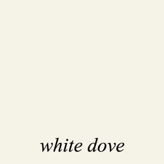
As you can see, Dove Wing is a fair amount darker than white dove.
To help avoid disasters that can happen when the name is written incorrectly, (or number) I include both the color number AND name. That way, if I spazz out and invert the numbers, which don’t match the name, someone will hopefully catch it. And then, inquire which one I met. Yes, it’s happened to me a couple of times.
Classical Gray should be Classic Gray. This is such a detailed oriented business; it used to drive me nuts.
Now, it’s time to dig in. Again, this is a lovely home. My job is to work with what we have and
“make it work.”
Right now. I am pretty much forgetting everything Sandra said. haha. But, we’ll circle back, later on.
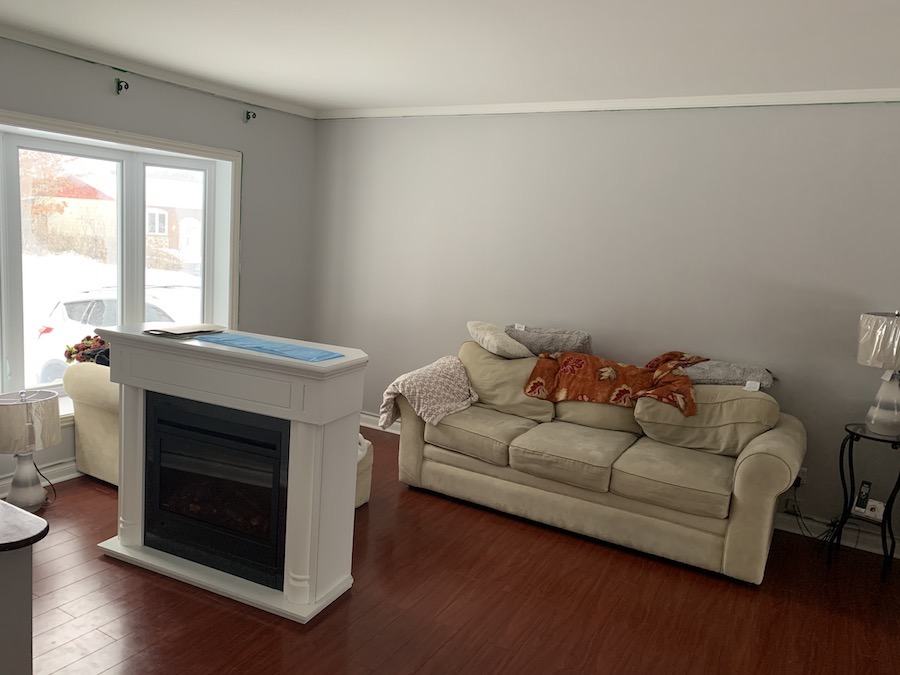
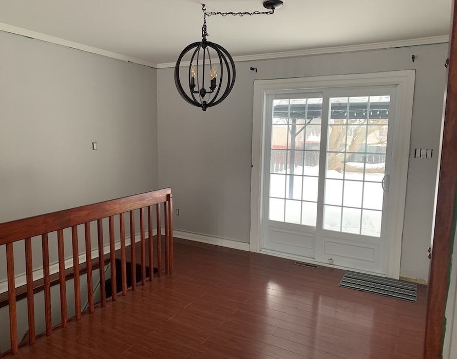
This is the current wall color throughout the main living space. Again, it is Benjamin Moore Barren Plain 2111-60.
Here’s what’s freaky about this color. It certainly looks cool to me. At least in Sandra’s living room. But, as you can see, if you scroll back up; there’s a heavy snow cover up north. In addition, I believe the images were taken in the morning and the window is west facing. All of those things are making this color go as cool as possible.
But, the crazy thing is that this is actually a very grayed down YELLOW.
Yes, I KNOW! I told you it was freaky crazy. But, here’s the proof.
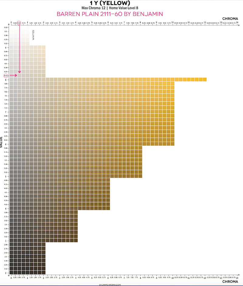
via Camp Chroma Benjamin Moore Barren Plain 2111-60
So, how come it looks blue? It looks blue because to make gray we add white to black. And pure white has a lot of blue in it. Plus, the lighting in the room, snow cover, other furnishings.
But, IMO, this color is not a good fit with the floors.
Sandra wants WARMTH.
And, I think her instincts are right on the money; I agree with that completely.
However, here’s where she and most people mess up. She’s put her focus on the walls and the walls are not the issue.
It’s everything else. First. When we’ve figure out everything else, the wall color is not as difficult. There are dozens of colors that will look good in here. But, all factors need to be weighed in.
The primary issue that I see that we need to first focus on is that red-toned laminate floor.
And, it is not going anywhere. So, we have to work with what we’ve got.
I’ve probably said this before, but my son had a music teacher, in high school,. A jazz music teacher. Charlie Lagond. Awesome musician! And, I’ll never forget one time Charlie said, with a wink:
“If you play a wrong note; play it again and it won’t be wrong.”
Well, it is exactly the same in interior design. If you have a color you don’t like. Make MORE of it, and it’ll become a neutral.
What?
I know, but please hear me out.
The worst thing you can do is have a lot of its opposite (complimentary) color.
So, before I do anything else, I want to bring in more warmth. I want to bring in MORE of those rusty reds and other warm colors. And, the place to begin is on the FLOOR.
Therefore, I went in search of a great Oriental area rug. Actually, I went over to Overstock and they have a TON of gorgeous rugs on sale. I selected four possibilities which you can see below in the small widget. If you click on any of them, you’ll go to that page on Overstock.
I want a rug with that warm, rusty-red. A big rug to cover a good amount of the floor. I would have other coordinating rugs to cover other areas of the laminate floors.

We could also do a large seagrass rug and layer a small Oriental rug over it.
As for the wall color.
Now, that we have a basic idea of a rug, we can use that as a jumping off point.
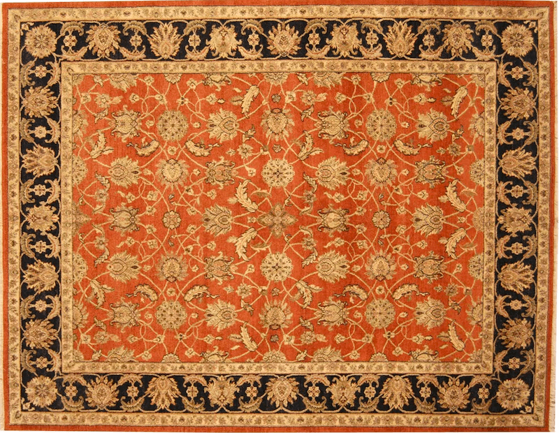 I like all of them, but I decided to work with this one.
I do like the toasty tan color. However, I agree that it could be lighter.
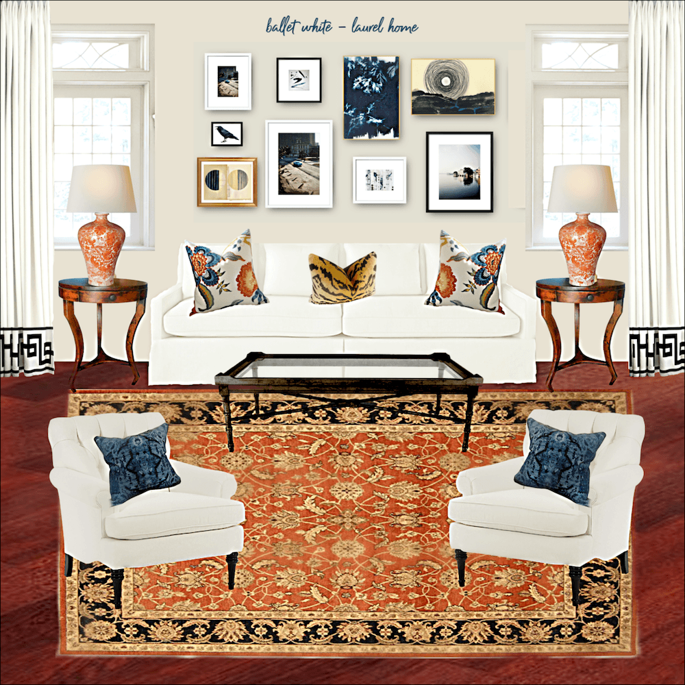
So, for now, I went with Ballet White. Ballet White is one of the 144 colors in the curated Laurel Home Essential Paint Collection. It is sold together with the Palette Collection which includes 40 palettes using the colors and boards and home furnishings.
Ballet white will look like a light khaki in the room.
I think. But, I really don’t know for sure. I would make samples of three or four colors.
And, it would look terrific with White Dove oc-17 and other Benjamin Moore off-whites for the trim color. Did you know that for all 144 colors in my collection, I put in the trim colors that should look the best.
But, here’s another thing.
I can’t see where all of the walls begin and end. But, I would paint the kitchen a different color than the living room. If you need help with a space that’s too open, please check out this recent post.
Maybe a warm red.
There are some beautiful corals and warm reds as well as ballet white in the Laurel Home Paint and Palette Collection.
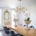
This room is reminding me of the Gentleman’s Gray palette I created back in 2016 for the Laurel Home Ultimate Paint Palette Collection that comes with the Essential Paint Colors..
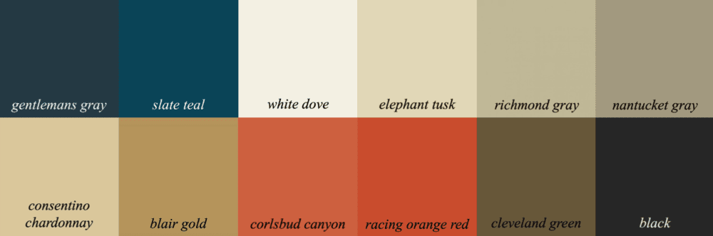
While ballet white is not in this specific palette. It is part of a “palette family” that I group together in the paint guide. Any color in the palette family is good with the rest of the colors in that family.
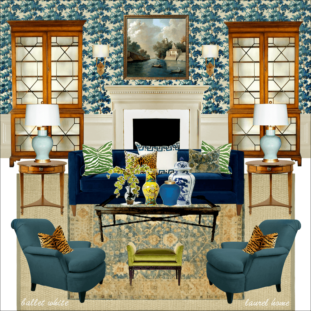
Above is a bonus board I created using ballet white oc-9. Do you see how this room could be in the same home as the other board? There is also another paint palette, in the same family, that goes with this room.
Wouldn’t it be nice if human family members all got along that well? ;]
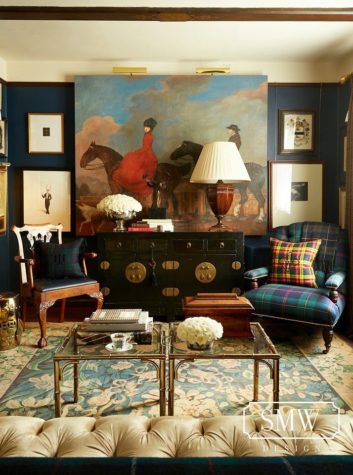
Scott Meacham Wood did a room with this same palette. It’s a classic color palette, I think. You can have a room be more blue, more red, gold or neutral. Or, put the focus on different colors in the palette and/or palette families in adjoining rooms.
For more of the Gentleman’s Gray color Palette please check out this link
That’s one way to build a color scheme. And, my guides will give you a ton of inspiration.
For this home, I zeroed in on the “problem child.” (assertive floor color)
It’s the whiny child that’s not going to stop whining. If you can figure out the core issue to the whining, they usually stop.
That is, unless they’re my children. But, that’s another story. ;]
While I was looking through the HOT SALES, I noticed that there are lot of furnishings which go with this color scheme. And, of course, they’re all on sale!
One thing that’s very important.
And, that’s if you’re using LED lighting, to use a warm LED light to mimic incandescent lighting. It is fine if some of you prefer the stark white. But, for me, it makes me crazeeeeee. To read more about what kind of LED bulbs to get, please check out this post about living room lighting rules.
And for hundreds of other rules, if you have not already, please consider getting 333 Rules & Tips You Need to Know Guide.
Well, I hope that helped address part of my design process. And, gave you some direction for choosing your paint colors.
Just know. I never START with the wall color. (unless I absolutely have to)
I start with the GIVENS in the home.
If the givens aren’t working and can be changed, then we can explore that.
Sometimes changing one thing; for instance like the floors in this kitchen, can make a tremendous difference.
xo,

Please check out the newly updated Hot Sales
Related Posts
 The Trick To Mixing Modern and Traditional Furniture
- My North Facing Room Paint Color Is Driving Me Bonkers!
- The Perfect Shade Of White Wall Paint For Oak Trim
- 20 Breathtakingly Gorgeous Ceiling Paint Colors and One That Isn’t
- Common Mistakes When Choosing The Best Pale Blue Paint
- Quick-Start Interior Design Guide 2019 – Plus News!
- Love Me A Warm Color Scheme But Is It Going To Look Dated?