

Recently, I received this real “dear laurel” letter from Kim. And, she’s dealing with a bossy builder in a builder’s home.
Dear Laurel,
I’ll cut to the chase because I know you are a VERY busy lady.
haha. yeah… very busy. ;]
I’ve looked through your blog posts trying to see if there are any design “rules” as far as how to deal with a bossy home builder. You know; strong-arming and telling you where you’re allowed to place items over a fireplace mantel. Like, is it even any of his business?
Actually, no, it isn’t. ;]
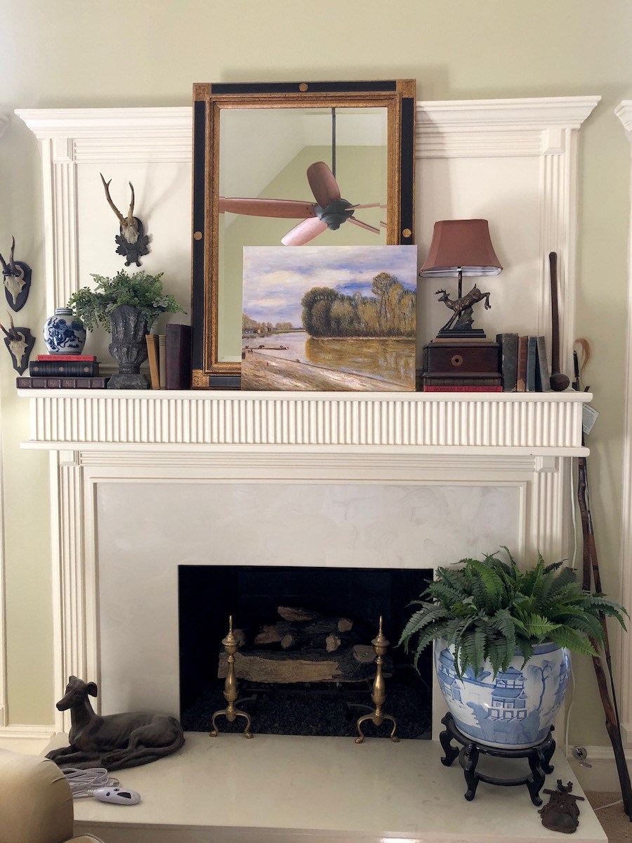
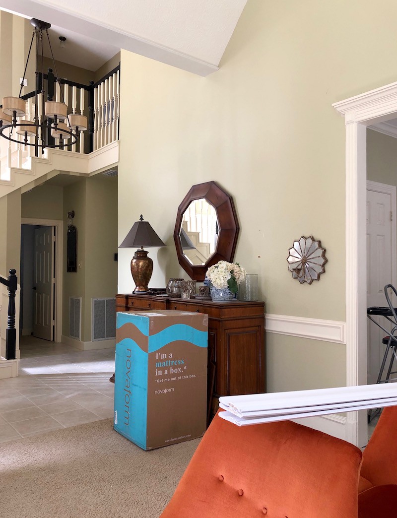
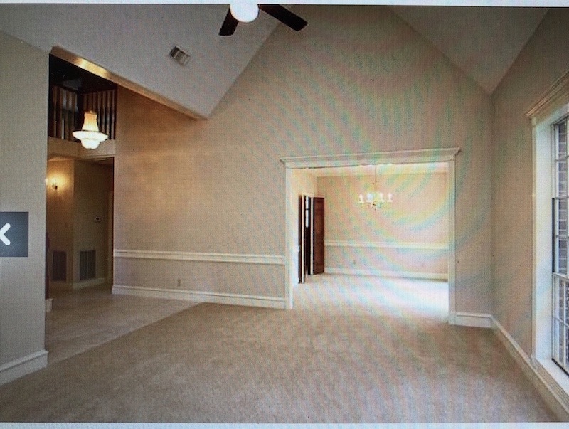
As you can see, they trimmed the area out above the mantel. While I like all the trim in this room, I don’t know how you’re supposed to address this kind of situation (this is why the rectangular mirror is just leaning against the trim.
No way to hang anything unless you keep it within the trim.
ugh.
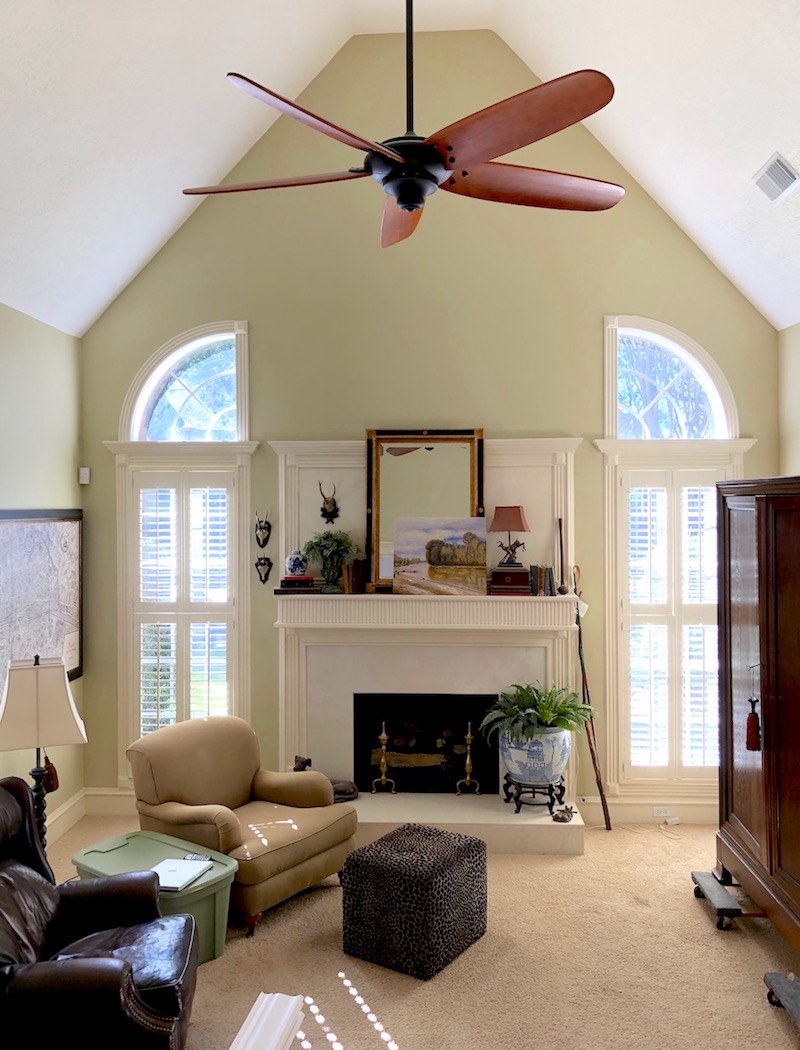
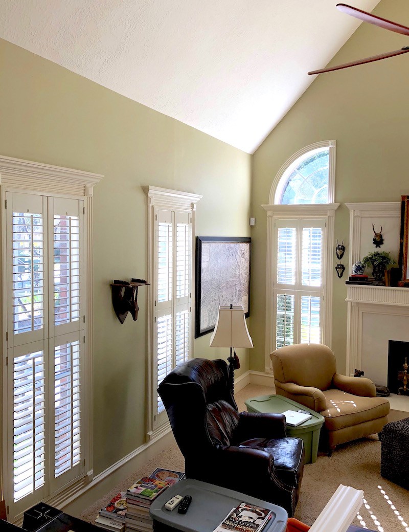
And yes, there are the cringe-worthy half circle windows above the windows and the 82 foot ceiling and the expanse over the fireplace. ARRGGHHHHH!!!!!
Are there rules for this, as well?
I’ve lived in this house for 8 years and still don’t know what to do with that ugly expanse. I did read the blog post you did about painting walls and ceiling in same color in this situation. And, I painted these walls and the ceiling in 2012. Laurel, let me tell you; I rented scaffolding from Home Depot. It was a JOB!
And I know, the dreaded ceiling fan. But I live in Houston. LOL
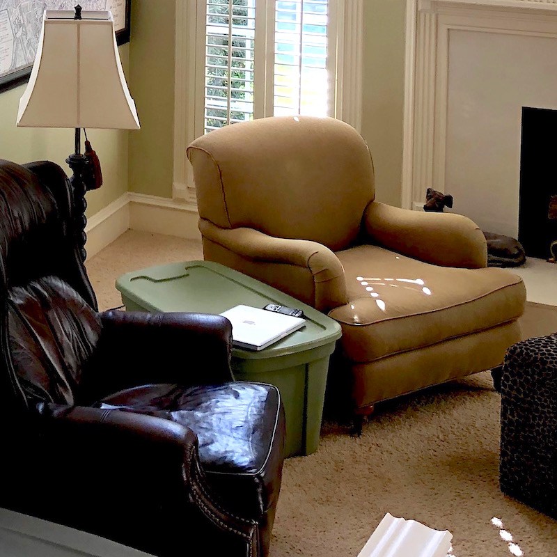
Ignore the furniture and the rubbermaid coffee table.
Why? I love all of it, because it’s real!
Oh, and the stained rug.
More real. Brava! ;]
Most of our furniture has been in storage for the past 3 years because we were supposed to have wood floors put in upstairs and then, downstairs 3 years ago.
The wood came and it looked nothing like the sample [uh huh] so I sent it back. And, we decided to renovate two upstairs bathrooms before the floors went in….
Thus, the beautiful rubbermaid coffee tables. And, stained carpet.
No worries. I get it.
Sorry, this email turned into a novel. Hoping you can direct me to a post if there is one. Thanks, Laurel!
Kim
***
Hey guys. Bossy builder – once again?!?!?
Fine. Fire his arse.
Sorry, I’m so sick of this. And believe me, they boss me around sometimes too.
Okay, I decided to post this because these issues plague so many of us.
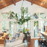
First of all; over-all, this is a very lovely home! But, per usual, there are some common bossy builder home things going on. But, really, nothing at all hideous.
See? Very nice room!
However, I have never said that I dread ceiling fans.
And, I’m not picking on Kim. It’s just that I’ve heard this over and over again and I keep trying to set the record straight.
I ONLY dislike certain fans that you can see in this post. And, there are some fans that I very much do like! In fact, I had the loveliest BIG ceiling fan in my gorgeous room when I stayed at my friend, the lovely and talented Deborah Main’s Airbnb in Austin, TX in October. The first night it was HOT. But, the AC made the room FREEZING. So, Deb kindly turned it off for me and I turned on the fan and MAN, it was sublime.
You folks in the south, please stop GLOATING! ;] I get it now. I REALLY get it. Not only did that baby keep the room at the perfect Laurel temperature, (72.13) ;] it made the most soothing soft, whooshing sound. I slept so well.
However, back to Kim and more that she had to say about her bossy builder home.
Hi Laurel,
It’s me, Kim P again. You probably don’t remember me because I know you are totally over-run with emails.
yep.
But, I’m the one who emailed you and asked if you had done a blog post about over-mantel mantels because that’s the issue I have along with the very tall vaulted ceilings.
You told me to send you some better pics of the space.
If you don’t remember, the email was from November 24 titled “Front Fireplace Pics”. Maybe “bossy home builder” will jog your memory.
I left his part in here, because I can’t tell you how much I appreciate this. It is impossible for me to keep all of the emails and comments straight. So, please yes, if I ask you to send me something, please remind me, even if it’s the next day. And, please don’t be offended if I don’t remember. I’m not paying attention to your name, only your room. haha
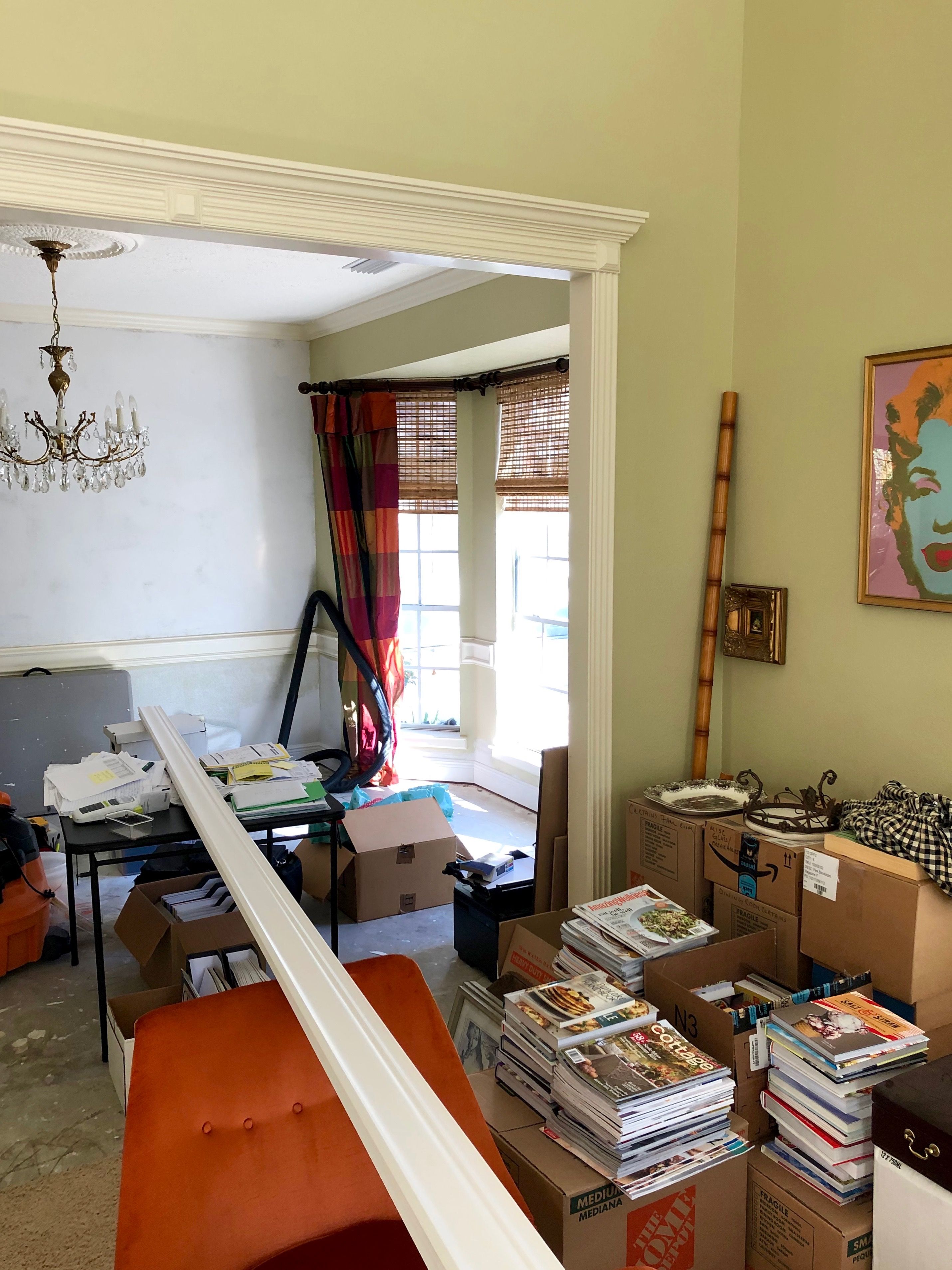
OK, because I am totally inept at techie stuff, I’m sending you pictures in separate emails because that’s the only way I know how to do it.
I hope it isn’t overload, but I’m just not sure how else to do it. As I told you, our stuff has been in storage for 3 years so the room is a mess.
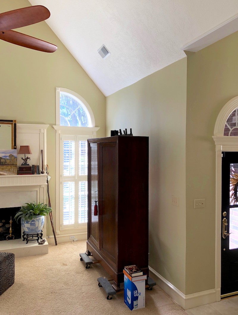
The only thing in this room that belongs in here is the tall armoire.
SO, what I’m going to do is send you pics of the room today, just how it is, mess and all, and hopefully, I’ve gotten them a little straighter this time.
Those of you, who’ve sent me pics know what a nutjob I am, how particular I am about images being straight. I can straighten them some and always do. But, it helps if they are as straight as possible beforehand. I do not care about the mess in your room. The messier, the better. lol But, please, send me straight pics. haha
I’m also sending you the realtor pics before we moved into the house. And then I’m sending you some pics of the room with furniture so you can get an idea of how the room is normally set up.
I hope you don’t get lost!!! hahahaha! And I hope you’re staying warm up there!!! It looks beautiful! Would you believe it’s 75 here today!!
Do you have to rub it in? ;]
Thank you so much, Laurel,
Kim
Thanks again Kim. I’m going to post the rest of the images and make a few comments. And, then, what I’d like to do for today is open it up to you guys.
As most of you know, I’m busy banging out the rest of the 333 Hard To Find Rules and Tips Guide You Need to Know. And, I daresay that you’re going to love the finished guide!
I’m going to have Part II (Dining Room, Bedroom rules and Windows Treatments) ready for the Saturday/Sunday post. Oh, and there’s also a HUGE glossary of window treatment terms!
Those who have already purchased the guide, will automatically receive a whole new and complete guide.
Also, If you order any of my products (Laurel’s Rolodex, The Paint and Palette Collection, or Six Figure Income Blogger), or any combo of the above between now and the 30th of December, 2019, you will receive a FREE copy of the guide!
***
Okay, back to Kim’s home. And, guys, I shouldn’t have to remind you, like a kindergarten teacher, but please be mindful that this is SOMEONE’S home. She’s in the middle of renovating and yes, it’s not how it normally is.
What we are to concern ourselves with is the architecture, primarily.
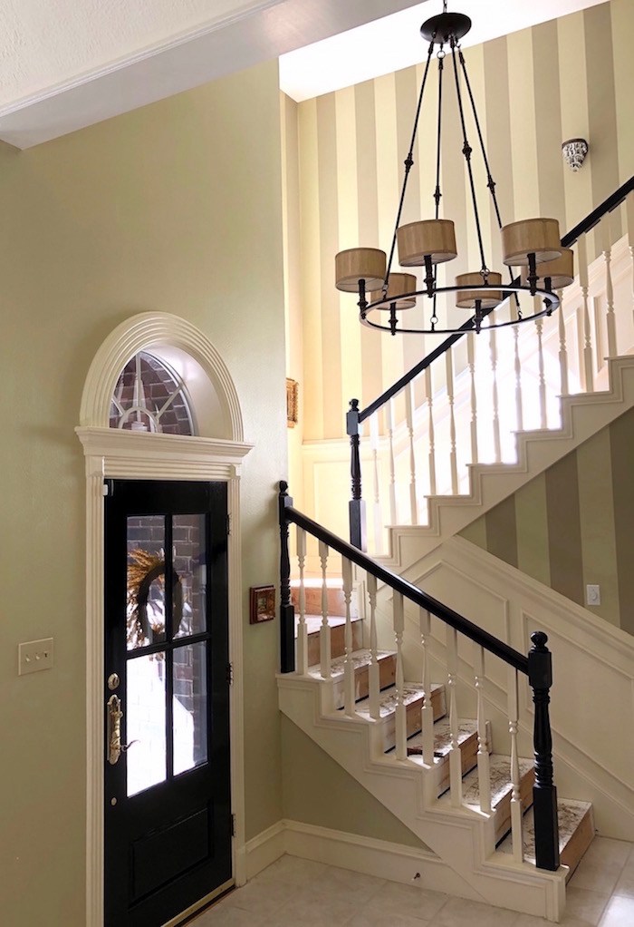
Actually, I love this part of the house. Love the black accents. And, the striped wallpaper. Great scale for the chandelier.
The wall color is reminding me a lot of my kitchen Benjamin Moore –Pale Avocado.
Of course, it’s also one of my Laurel Home Paint Collection colors. It’s one of those colors that always looks great, but is a little difficult to describe because it’s not quite green, or gold or yellow, but a combo of all of them.
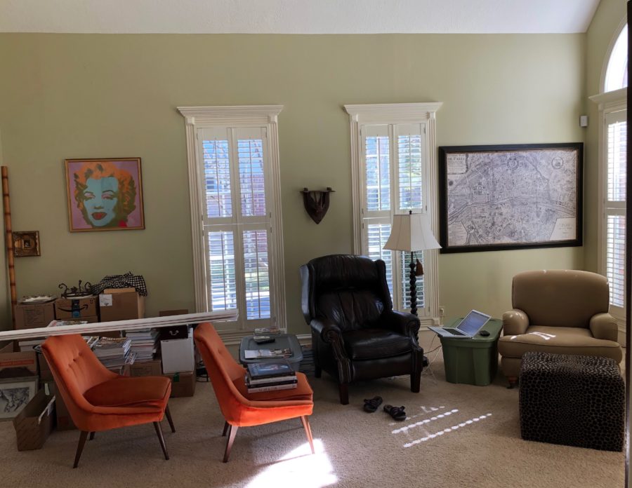
I love the windows. I don’t want to get too picky about the moulding, but the plinth blocks in the corner are a little eccentric. They don’t have to be the classic rosette, but they are protruding too far. And, I find the crown a little too large.
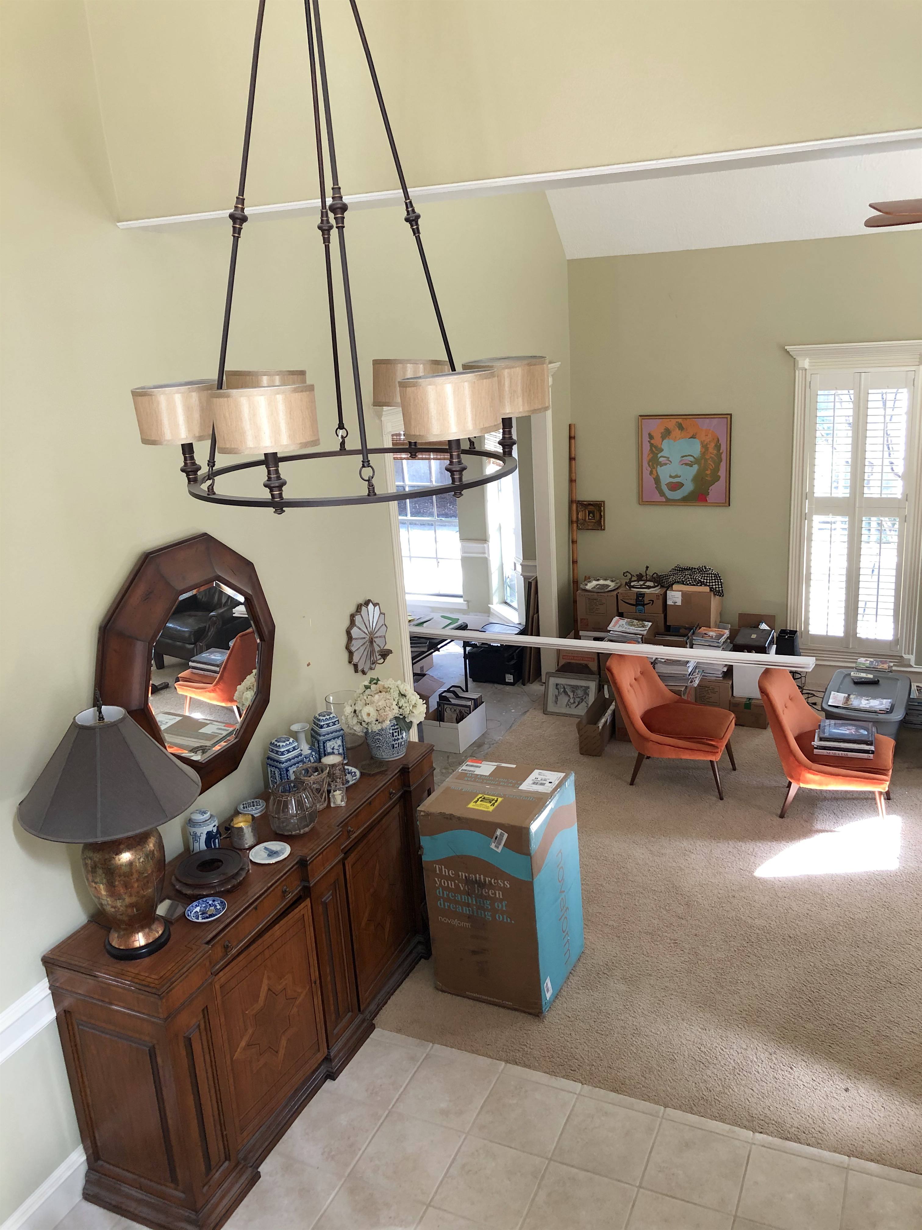
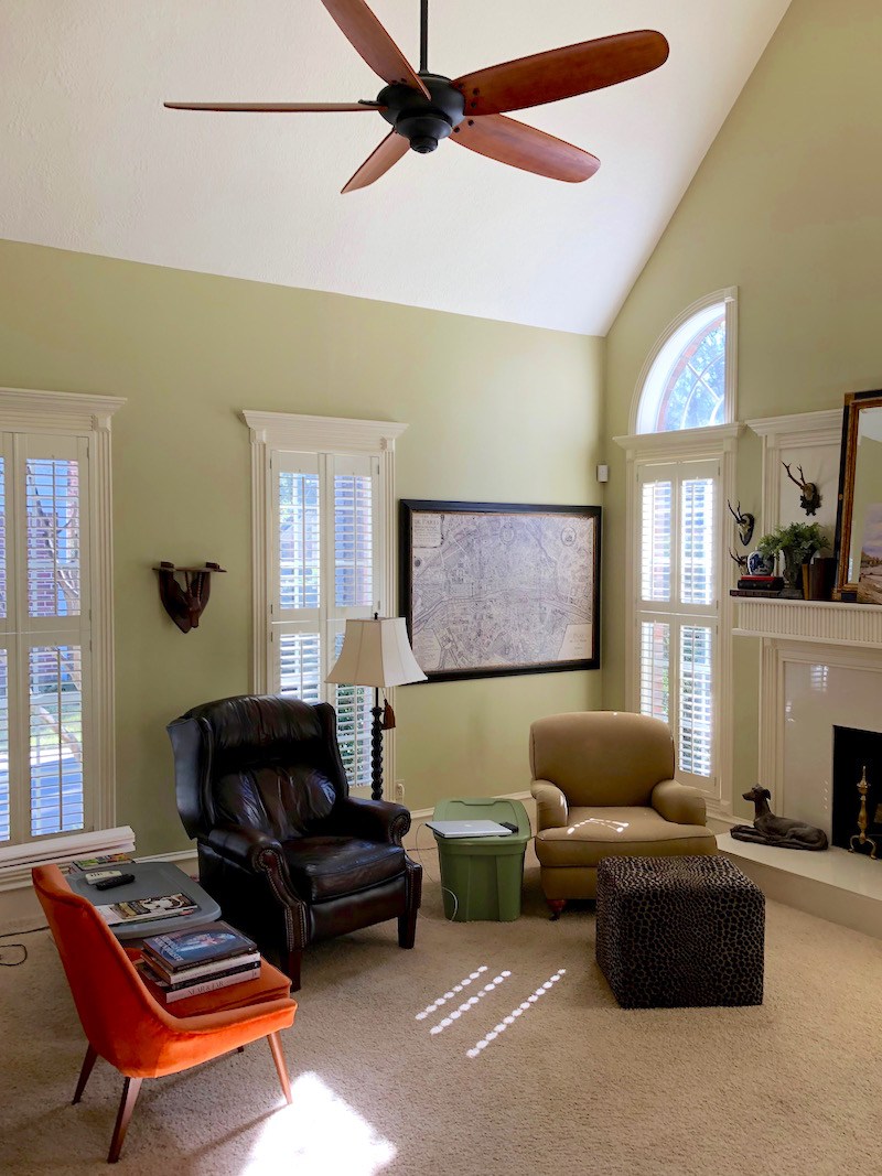
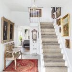
Bird’s eye view of the entry looking into the great room. Please note how the entrance “bleeds” into the living room. I truly believe that an entrance should be just that. This is not a small house. There’s no reason for it to be this open.
The entry. Please remember that the carpeting IS going and a hardwood floor is coming in. I would extend that into the entry. It’s Houston, not Toronto.
Let’s talk about that fireplace mantel and surround for a sec.
That bossy home builder needs to CHILL-ax!
The styling is really lovely, but perhaps a tad cramped if I’m being super picky. I would maybe eliminate the books on the left and one or two books on the right. Styling is difficult! Love the mirror and the painting!
As for the over-mantel and the mantel, itself, I would rip it out and start over.
Yeppers, I would. This is the focal point of the entire room and frankly, it sucks. It doesn’t suck with a purple passion, but it still sucks. So put that in your pipe and smoke it up your… you sassy, bossy home builder!
Doesn’t it feel great to take back control of your own home? Please don’t let anyone boss you around. Not even me!
However, you can see for yourself what I’m talking about by reviewing this post which discusses proper mantel proportions, etc.
Looking into the dining room, this is obviously, a room in transition. I would do the draperies on the bay window like we did in this home a few years ago.
I don’t know. Now, I want to rip off those crowns too. We went over window and door casings here. And, you will find links to some gorgeous examples. None look like this.
Okay, and now I have some real estate pics, from before Kim moved in eight years ago.
And, what I’m going to do is just some fantasizing. I don’t know if any of it is possible, even. But, it might be.
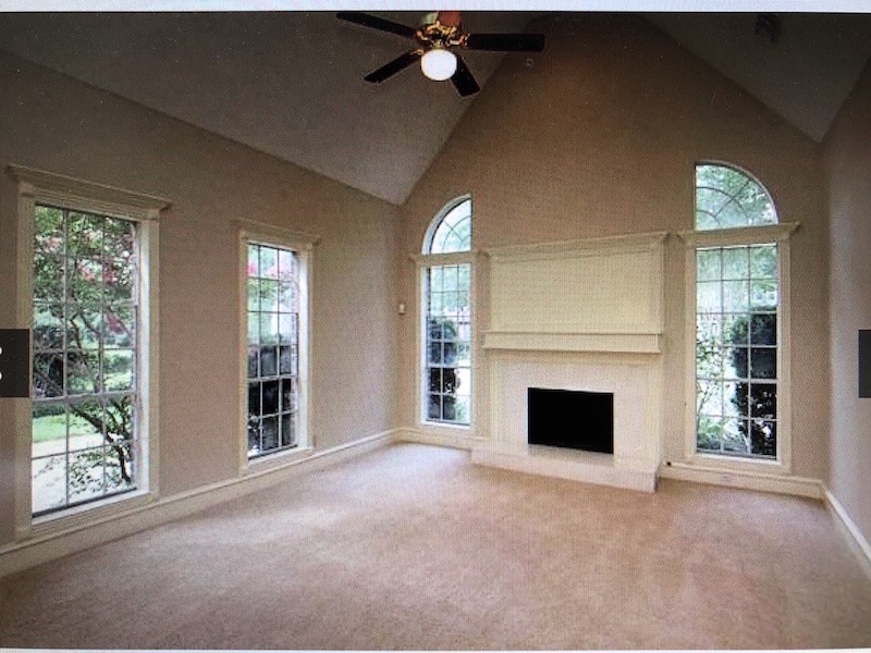
I would cover up those silly windows. You can still keep them on the outside. We’ve done that on at least two occasions when we needed wall space. And, then, cover them up on the inside. No one will know. There, I don’t know about you, but I’m feeling much better. :]
Now, about the ceiling issue. I am guess that the ceiling height where the pitch begins is at ab out 10 feet. I realize that this is quite rad. But, how about we just put in a ceiling.
Maybe with some shallow beams or coffers. Love that.
 Then, I would extend the wall by the front door, about two feet so that the front door isn’t IN the living room! And, then I would do a two foot wall on the opposite side where the carpet meets the tile.
Now, we have an entrance AND a living room. And, we don’t have to paint everything the same color.
For the dining room; I would extend the wall on the right by about two feet. And, take away about one foot of wall on the left. The dining room opening needs to only be about 5 or 6 feet wide. Then, maybe add a pair of French doors. But, that’s only optional.
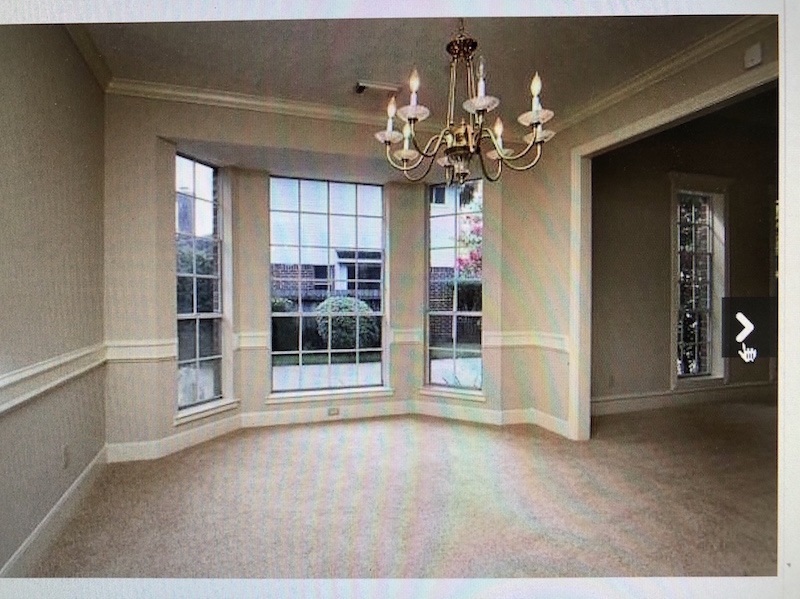
By extending the walls, we could actually put a chest on each side and a lamp.
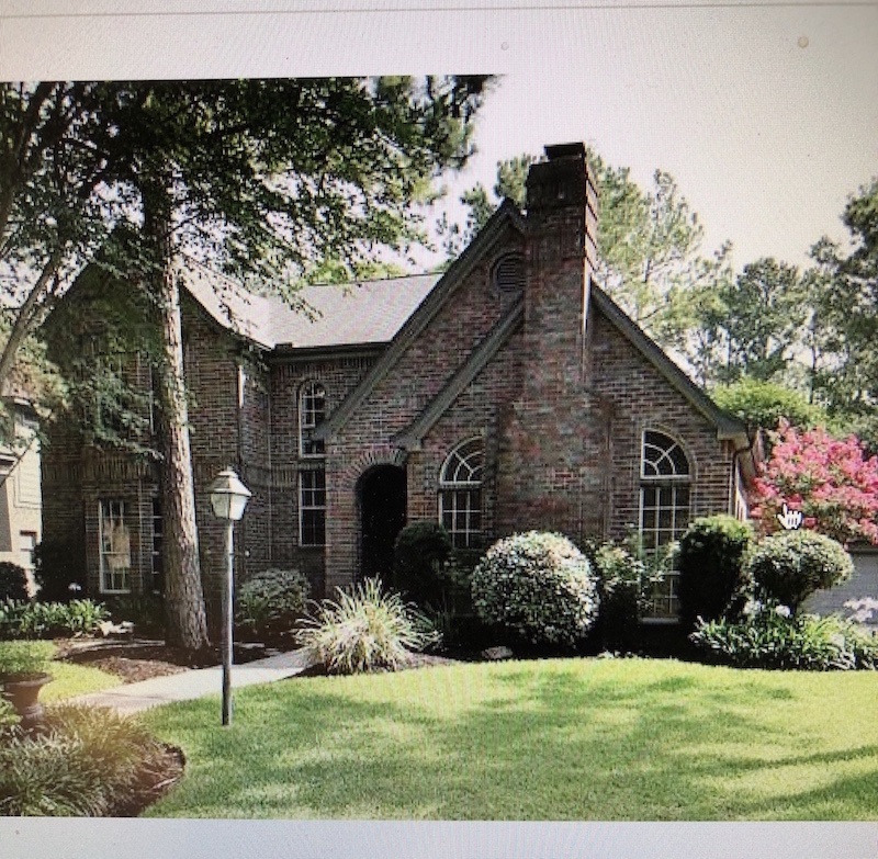
Lovely exterior. Actually, I think they did a great job of making that brick look genuinely old. However, the tell that it is not, are those silly windows.
They are absolutely screaming out 1998!
In an ideal sitch, I would’ve made all of the windows a little wider and put transoms over them, but that would be too much to do that now with the masonry.
What do you guys think? I think that I have talked waaaaaay more than I intended!
However, let’s not let a bossy home builder dictate what is good design. Of course, some home builders do wonderful work. I want to be clear on that.
Wow! Only 15 more days until Christmas! Is that crazy or what? But, you still have time to order online for the holidays.
Melissa has added a lot of new things to the holiday gift guides. And has also updated the hot sales.
Plus, if you’re strapped for a gift or even if you’re not strapped, the new 333 Rules Guide would make a wonderful gift! To do that, when you go to order, just click on the gift box icon. You’ll be able to add your recipient’s name, email address and the exact time you’d like them to receive their gift. How cool is that.
Thanks Everyone!
xo,

Related Posts
 Can A Cramped Vacation Home Become A Full-Time Home?
- The Perfect Shade Of White Wall Paint For Oak Trim
- Sophisticated Twin Beds – 20 Ideas For Grownup Bedrooms
- The Wood Stain Color Is Too Red After Poly. Can It Be Fixed?
- Some Of Your Recent Interior Decorating Questions Answered
- The ONE White Trim Color That Works Every Time
- Hubs Wants a Say In the Home Decor, Because It’s His Home Too?


32 Responses
Thanks for the comments, Jan. Tomorrow we will be starting our wall to separate the entry from this room. I’m planning on painting the walls in the living room to match the ceiling, which is BM mayonnaise. The entry is staying green with the stripes. Too much work to change it out and I LOVE the green anyways. Black will be staying. I’ve moved the entry buffet onto the dining room back wall and it fits just fine. TV will stay in the tall armoire in living room. I despise looking at tvs. I already have a black English barley twist cabinet that serves as a bar under Marilyn. Thanks for your comments!
Really pretty home!!
To echo other suggestions: first remove the overmantel moldings and the large flat chair railing in the hallway and in the dining room to create smooth walls that allow more decorating options.
Next consider painting it all in a wonderful white which would conceal and blend all of the window moldings and the giant air grates. I would paint the door and all of the stairway in white too.
Yes — here in the state of Texas we do need ceiling fans! But try to find one in white that would blend into the white ceiling!
Try switching the buffet to the wall in the living room and just place the TV on top! The place the tall cabinet on the tile in the entry – and turn it into a bar!
If anyone is still out there, hello all, and thank you for all your comments and suggestions. And thank you, Laurel, for your help. The comment that stuck out to me most was that the majority of you say to rip out the mouldings over the top of the windows. Interesting. That never has bothered me and I’ve always quite liked it. But, maybe it’s because I’ve always come from homes with zero trim around the windows and we’ve always had to add it ourselves. My favorite suggestion is to put a ceiling in to bring it all down but that isn’t in the budget. We actually had talked about putting in short walls by the entry to define the space, as Laurel suggests. The reason we didn’t end up doing that is because I’m pretty sure my buffet would have nowhere to land. The dining room is pretty small and I think the buffet is too deep to go on that back wall. I know someone suggested putting it in the bay but I’m not keen on seeing the back of that thing every time I drive up. The bay isn’t long or deep enough to house it, anyway. I’m considering reworking the trim over the mantel. Just not sure how to design it or how far up to take it. I got to thinking about a couple of peoples suggestion to paint the ceiling the same green as the walls in hopes of making the space disappear. And then a couple of others suggested painting everything creamy white. I like that idea, as well. It’s easy enough to repaint. I’d add color with a rug. I have LOTS of furniture that belongs in here but it’s all in storage. I sent Laurel pics of the room with how I have it set up with the furniture but the pics were kinda grainy and dark. The armoire houses a tv so that stays put on that wall. Susan C Davis sent me a link to a house with beams. We’ve also thought about doing this. Just haven’t been able to figure out how to do it. But love this idea. Right now, the plan is to measure the depth of the buffet to see if I can put it there. If so, then build out the walls to define an entry. In the dining room, I have 4 curtain panels that mount inside the bay. I did it that way because the windows are UGLY. No trim on them. I have a wing back chair that goes at that end of my dining table so it blocks the view of the driveway. I’m still wondering whether to paint the ceiling green or, if I’m able to extend those walls by the entry, paint the living room creamy white and leave the entry green. The stairwell is actually painted stripes that my husband and I did. It does look like wallpaper, though. I’d love to cover the circle windows on the inside. Never thought of that. I wish I had. They are trimmed out now because my husband trimmed them for me – inside and out. It was JOB getting the wood to bend. I’d hate to ask him to cover up his handi work now. But that would’ve been a fabulous idea! And easy to drywall those up. Back to the dining room. Some people suggested taking all of the chair rail off. I was thinking about that, too. Depending on how I do the wallpaper in here. Stumped on that. Would you all believe I have another room in this house that’s in the back that has the tall ceilings like this room. Only back there, I have a brick fireplace that goes all the way to the ceiling. Although it may look like this is an “open concept” house. It’s really not. LOTS of separate rooms. The only thing open is the entry to this room. But if I could figure out that buffet, then I may be able to close this living room off. Thank you for all your suggestions. I’ve got some figuring to do. And sorry for rambling. I just typed as things came to mind. It will be awhile before all of this is accomplished, but I will try and post back. Thanks y’all! And thank you so much, Laurel.
Hi Kimberly,
I love the idea of painting the living room all a creamy white. My idea of changing out the dining room opening with the small walls closing up the entry somewhat, would allow two chests, instead of the one buffet. And, they could live in the living room. There seems to be plenty of room on that side of the wall. Maybe the buffet could go somewhere else like the brick fireplace room.
Always difficult when I’m not actually standing there. And, also working from an actual scale drawing. Right now, I’m still only guessing based on the photos. I wouldn’t normally do that because photos can be quite deceiving.
Also, just so you know, for this job, we just did the buffet in the window and really, you don’t notice it unless you’re trying to notice it. It also gives some privacy.
Margie – I’m in northwest Houston. So do you have the half circle windows, too? I’m guessing your fireplace configuration is totally different than mine. Do you also have the same thing going on in the back family room? – more tall, arched ceilings? Back there, I have a brick fireplace that goes up to the the ceiling. That room hasn’t been easy, either.
Hi everyone! It’s Kim, the owner of this house. I just wanted to drop in and say I’ve read all of your comments but haven’t had the time to digest everything yet. I’ve been busy with a sick grand baby, but when I get home I’ll have more time to take it all in. Thank you for all your comments! And especially thank you to the one and only, Laurel!
Thank you Kim, for allowing me to dissect your lovely home!
Oh, I kind of love the weird trim! I have a more minimal, sort of funky style but I would just arrange the three horns on there as if it were a canvas, asymmetrically, then maybe balance with just the plant on the mantle or something.
I agree about covering the windows. One of our bathrooms has a “door to nowhere” for now (forever?) because we drywalled over it on the other side but left the door in the bathroom because of the tile.
So interesting. I live in this house too, in northeast Houston. But without the bossy mantle…
Create a ceiling at the 10 ft level–never, never would have thought of that. It’s brilliant. Combined with repositioning the opening to the dining room and adding some wall to create a true entryway, it would correct the points and angles that don’t line up. I’m on the autism spectrum, and I can tell you that the off-set nature of that part of Kim’s house would drive me mad. I need a certain amount of symmetry to feel comfortable.
I, too, like the black in Kim’s entry. The builder got a lot of things right, but there should be some things included in every house, and he didn’t get that right. I would replace the spindles and the newel post–they’re mass produced and seem as “off” to me as the quarter round windows. Otherwise, the house could be from the 1930s. I can see why Kim bought it–there’s a lot of charm about the place and a certain graciousness we from the South enjoy about our homes. It’ll be gorgeous when Kim finishes. I hope she shares some photos with us when she has it the way she wants it.
Lovely home with a lot of potential. I have no problem with the high ceilings, but I would paint the ceilings and walls the same color. As far as the quarter round windows, you could sheet rock over them and that would solve the interior issue. The exterior of that home is beautiful. Could you put up rectangular fake shutters over the quarter round windows to hide them? I have noticed in new homes that sometimes the builder will put up shutters to have the appearance of a window in order to balance out the exterior features.
I would keep it simple….put a short curtain bar with a pleated drape panel in cream faux silk on either side of the fireplace at the top of the window trim and then put an arched window frame mirror in between. Then one gorgeous landscape painting on the mantle.
I really got a chuckle out of this as the crazy choices builder’s make when it comes to trimming out a house NEVER cease to amaze (and create business for) me. One suggestion I would add would be to change out the HUGE vents that adjacent to one another in the entry hall for some decorative vents, like something from Reggio Register. Hard to believe that those two giant vents had to be so close to each other, it looks like something you would see on a factory floor. And thanks for all you do to help us see the humor in things Laurel, happy holidays!!!
Kim
You have a beautiful home. Like most of us, we have areas which need some tweaking. Since you mentioned your big DIY paint job, you’re obviously a hands-on kinda gal. So, to save your back and your wallet, here’s what I recommend:
The heavier lifting-architecture:
-Remove that panel and molding above the fireplace. You and your fireplace will breathe a giant sigh of relief.
-Remove crown from living room windows
-Remove chair rail from entry wall
-Stain a 12” outer edge of dining room floor and cover with seagrass, just until your hardwoods are installed.
Let’s not leave your wallet out of the fun-
Furnishings:
-Look into custom-cut sea grass to cover your entire living room floor and entry (one piece), as a unifier until you install your hardwoods.
-Move the buffet from the entry to your dining-room bay window. Doing so, will provide serving space, an area for additional lighting at night and, most importantly, cover your driveway from view.
-Move your armoire to the wall between the far left living room window and dining area.
-Just to the side of the front door, place a small round entry table or, on the cheap, a pressboard table covered with a throw or floor-length table covering. A plant on a small stand or a small architectural screen would provide separation between entry and living room.
-Move your vintage map print to entry wall. If you wish, you can flank it with two (2) scones.
-Get a second chinoiserie planter for the left side of your hearth. Take advantage of your great natural light and be the envy of your friends by using real plants. I might recommend a peace lily. They’re low maintenance, filter the air and practically tell you when they’re thirsty.
-Speaking of natural light, (with your southeast-facing liv room-I’m guessing?), I would remove shutters from windows-sorry! You might be able to reuse them on the other side of the house. They look to be similar in size. In their place, I would install, as high as possible, outside-mounted lined woven shades on the thinnest of metal rods, making sure to mount them just under ceiling but balanced with windows flanking fireplace. Doing so, covers the arched windows up top and tricks the eye by elongating the windows to show off your vaulted ceiling.
-Flank the fireplace with chairs and floor lamps for “cozying up” with your ample collections of books. For safety’s sake, I might place them close to your raised hearth, as shins and toddlers always seem drawn to those sharp corners. Add in a sofa and now we’re talking symmetry, which is what your living room is all about.
Let’s move on to art.
-Gotta love Marilyn! However, I think she was, like your print-both with their modern leanings-meant for another place and time; perhaps an office or a bedroom. Well, maybe not a bedroom, on second thought. 😉
-Between living room windows, vertically hang both of your petite gilded framed art pieces (the one by Marilyn and the one right of front door)
-Above mantel, hang large trumeau, large vertical art or if necessary, your flat screen tv with a starburst above it.
-For wall right of fireplace, you can hang a trumeau or large mirror (if you didn’t above fireplace) with smaller pieces on either side or simply create a gallery wall.
Thanks to both you and Laurel for letting us stretch our creative
muscles with a walk through your lovely home. Good luck! I do hope you’ll you update Laurel with photos of your completed project. Who can resist a good before and after story?!
I’m a retired designer…never had problems with the GC being bossy..it was the subs!! For instance, the tile guys always wanted to TILE OVER everything! The hardwood guys wanted to do wood everywhere…I learned quickly to quietly thank them and ignore their suggestion…the worst was when they’d take the homeowner aside while I wasn’t there and “discuss” their GREAT ideas with her! Errrr. Nice to be retired! Love reading your blog and not having to deal with all these issues anymore!
Laurel I LOVE your suggestion to extend the walls! I also love the color combination of the green and creamy off-white trim in Kim’s house, and her styling.
I want to comment on what a couple people have commented on- the high ceilings. It is a myth that high ceilings allow heat to rise and therefore reduce AC costs. The bottom line is that high ceiling creates a lot more room volume, and more volume means the AC unit has to work harder/longer to cool the space. There will be air exchange between lower (cooler) and higher (warmer) air in the room, for example as the warmer air cools and falls or the cooler air warms after the AC cycle ends. It looks like there’s two air registers on the ceiling, so air is certainly being moved around the height of the room. If the ceiling is lowered, the room will be more easily (read-cost effectively) cooled during the summer. (I’m not slamming all high ceilings- some are very beautiful- just that heating/cooling alone is not a good reason to keep one).
I think the house is lovely and removing the over-mantle would be the best idea I think, though extending it would also work. The trims look vaguely victorian-ish but I could be wrong. But instead of putting in a flat ceiling maybe installing some beams and filling the space between them with shiplap and painting them some nice white would look good too? Just a thought. BTW, I love that blue and white pot next to fireplace.
Many good ideas here, but so much of it depends on the budget. I’d probably prioritize adding the little walls Laurel suggested to give the spaces some much-needed definition. Next up would probably be removing the overmantle trim (or, as some suggested, extending it). While I’d love to see the window casings fixed, the chair rail removed or updated, etc., I’m wondering if a more budget-conscious solution might be to paint everything – wall, trim, and ceiling – a nice creamy white color. That would help the trim fade away a bit, rather than calling attention to itself.
While I know I’m in the minority, personally I love vaulted ceilings (at least when done well), and I’d look into ways to work with it that suit the house rather than boarding it up.
This is a lovely home and has great potential. Laurel, I like your suggestions about making a real foyer, creating a smaller entrance to the dining room (love interior French doors!), and putting in a ceiling. I wonder if this a reflection of the dissatisfaction and frustration with the ubiquitous OPEN CONCEPT? One tiny suggestion: I would place the mirror somewhere else in the room. I see this done a lot, but over the fireplace, they only reflect the ceiling and maybe a fan or light fixture. And I know I’m in the minority on this, but I’m glad to see no flat-screen TV there!
I agree with everything Laurel said. Getting rid of the trim on the fireplace, lowering the ceiling etc, covering the half circle windows, etc. will make this home look completely different and I think Kim would love it. It would also be worth the effort on resale (I’m a Realtor). And, it will be so much easier to execute a furnishings design.
Laurel’s suggestions are so good; addition of/extending walls was not on my radar! Rather than changing window trim, could she use curtains to mask trim (budget saver)? Maybe as part of covering quarter-round windows and pulling out mantel thing, she could extend fireplace surround to the ceiling (cover entire wall even!) using white painted wainscotting? After looking at house, another came to mind and I’m providing the link so perhaps Kim can take a look for inspiration. Namely, I wonder if she could do beams without changing ceiling. This house is maximalist but I do think, rather beautiful! https://www.zillow.com/homedetails/3057-Sterling-Rd-Mountain-Brk-AL-35213/976958_zpid/?
Since I am one who does much of the work needed by myself instead of with contractors,I agree with your suggestions, Valerie. The plants in front of the windows is a good fix instead of the cost and trouble of drywalling. Perhaps some blinds would also work there. I also agree with your comment about high ceilings in the south, I would just have the living room ceiling painted the same as the walls and it would tend to disappear. Removing the trim over the mantle alone would help, even if the whole mantle wasn’t redone. Laurel’s ideas about extending the walls in the entrance are spot on, added before the hardwood goes in. I think I could live with the crown over the windows, once the ceiling is painted. There needs to be a visual separation between foyer and living room, (furniture and paint) and that big map is moved from the corner. It is a lovely space though, Kim, and I didn’t miss that your painted it yourself. Good work.
Two inexpensive edits:
– paint the ceiling the same avocado color as the wall to make it disappear.
-turn the mirror atop the mantel sideways and restyle it with some of the owners lovely things. (it will fit — I just measured the photo with my nail file ;o)
I think the exterior of this house is lovely, but agree that the half and quarter round windows aren’t appropriate for the style of the home. The house itself seems scaled and proportioned nicely.
As for the interior trim — I’d take off the window crowns, plinth blocks, and the trim above the mantle shelf. The chair rail is rather odd too, so I would replace that as well. (I know, $$$)
I agree with Laurel’s suggestion to extend the walls to define the spaces better. But rather than dropping 5he ceiling to a flat 10 foot ceiling, which would impact the HVAC ducting, how about creating a tray ceiling instead?
Love the idea to square up the rooms with changes to wall sizes & openings. Also, putting in a ceiling! Some friends did this very thing to fill in their overly large 2-story living room. Had enough space to make a theater room above. In this case it may not create quite that much gain, but even storage space would increase function & real estate square footage.
This is a lovely home! You can tell Kim has great taste from her furniture and accessories. But the builder did go nuts with the molding and the curved windows! The plantation shutters look fabulous in the living room, especially on the ones flanking the fireplace. I think if you changed out the fuggly molding & mantle above the fireplace (was it supposed to frame a flat screen?) the windows there would be okay. By placing two tall plants in front of them you could draw the eye lower, away from the curved tops. I also agree about removing crown molding above all the windows, if possible.
Until you get the hardwood floors in (do any new walls right before if you go for that idea), you might place another tall plant, like a big fern, to the left of the front door to create some sense of separation between the foyer and the LR. On the opposite wall, instead of the long buffet, you cold place a smaller table that would just fit on the tile side and a chair (perhaps one of the orange ones?) on the carpet side, again, making more definition of the two spaces. A small area rug would also help define it as a foyer.
An area rug on top of the carpet in the LR would add color (pick up the blue from your China collection with little bits of orange?) and also help define the space and hide the stains.
The beautiful buffet could where the big armoire currently is, or on the long wall in the dining room. The map could go above it, as it looks a little crowded where it is. The mirror currently over the buffet might fit over the smaller table in the foyer (I think I counted 4 squares, or 4 ft of room), or where the map was. The tall mirror over the mantle is gorgeous; it could remain on the rehabilitated mantle or be another option for the foyer table, as it would be a nice focal point across from the front door and would help deal with the tall ceilings. But it might be too big for the smaller table; you’d have to play. The drapes Laurel suggested are perfect for the DR, they’d add a note of serenity and would dress it up while waiting for the new floors.
I do like the lowered ceiling idea, but living through the chaos, not to mention the cost, would discourage me. Forgive my New England ignorance, but don’t the tall ceilings let more of the heat rise to keep things cooler?
Finally, no judging on the table & stains: anyone who has animals has dealt with stained carpet! I have a hideous thing between 2 chairs in my LR, just to be able to put my coffee on until I find the right table! Best of luck on finishing your space to your taste!
The home is really lovely and I appreciate someone who is being “real” and showing us that we all don’t live in magazine styling. If your lovely reader wants a quick fix to the mantle problem, my suggestion is she can either do one of two things. She can extend the over-mantle as someone suggested up to the windows or she can remove it all together. If she removes it, it eliminates a lot of unnecessary trim and doesn’t box her in in terms of styling. This would be my suggestion. It’s a fairly easy fix that would require a bit of spackling, sanding and paint.
Meant to say that I agree with Liz Palmer’s assessment!
I agree, and it would make the curved windows make more sense. I would also get rid of the crown moulding at the top of each side window. It is breaking up the length of the side window in a weird way. Integrating the moulding on top of the panel over the mantel with the curved window might be tricky though.
I won’t even comment on this house. Not my taste. I’m not a fan of formal homes with dining rooms and all the mouldings and trims, etc. I just wanted to comment on the ceiling fan you liked at an Airbnb. I may have 3 of the fans you mentioned. They are called Big Ass fans and there is a setting that you can make them sound like the wind swooshing. That would be the only sound they make (if you wanted it). Otherwise, there is absolutely no noise from them at all. You can turn them on/off, speed up, slow down all from an app. We love them!
More wide windows… is it a some kind of a rule or a personal preference? I’m wondering this as sometimes I’m thinking about what makes old house new and classic and fresh. I mean sometimes there is great architecture but it looks antique and not in a good way. The same applies to flea market finds. Sometimes they’re so old and I want to add a marble top on top of chest of drawers and then I’m afraid to do something wrong. Old doors at ebay looks just old like granny old. It there a way to make things look current or we suppose to use them as it is? Bad explanation though, I’m sorry.
Lovely home, crazy builder. He could have taken the silly (IMO) panel over the mantel all the way up to the top of the curved windows, making it look more like a designed element. Could that be an affordable solution? Looking at the horizontal tangent of the 3 pieces of crown moulding across the wall, would put me over the edge.