Ahhh, now that we are well into October, it always feels appropriate to bring out one of the most misunderstood, but actually awesome colors.
ORANGE!
I say misunderstood because orange is often thought of in negative terms. We discussed why a while back in this post.
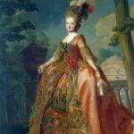
And, in another old post, we can see that one of the most classical colors is actually orange!
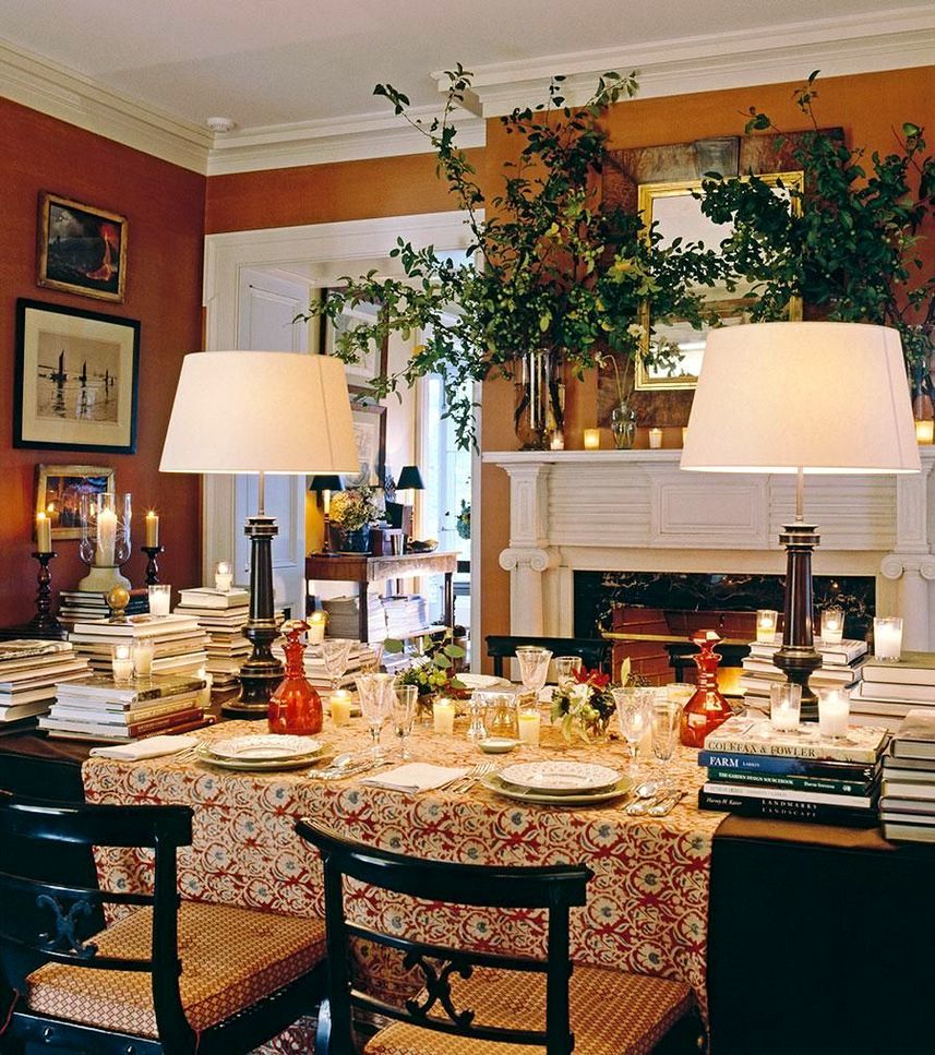
However, the truth is that orange as a wall color makes for a beautiful, warm, back drop.
The lighter, more yellow shades positively glow at night. It’s a delicious color in a dining room. However, I am going to share many places and ways to use orange. And, by the end of the post, I hope that those of you who dislike this color, may begin to feel differently about it.
Even as an accent color, orange paint colors and furnishings are a welcome and refreshing note in an otherwise banal color scheme.
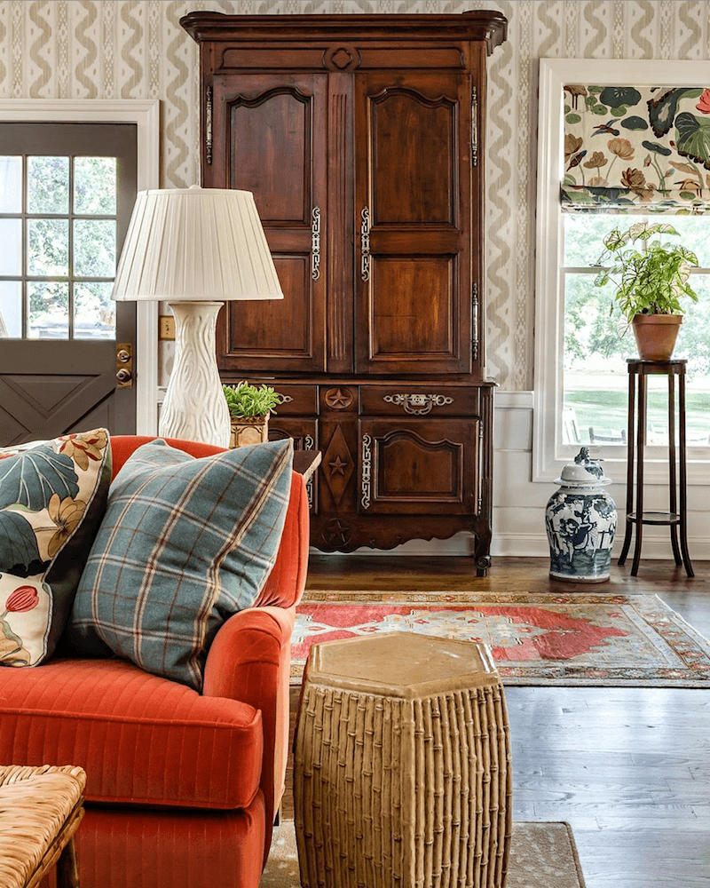
In addition, for all of you “orange haters,” it is very likely that you are already living with copious amounts of the color. Not all, but most wood tones are some variation of orange or its baked-in-the-sun-cousin, brown or rust. A favorite post featuring paint colors that look great with wood trim.
Orange adores its compliment which is blue, if you don’t already know that.
For one of my favorite posts on this magnificent marriage of colors made in heaven, click here.
The primary two companies are Benjamin Moore and Sherwin Williams. In secondary roles (but not secondary colors!) are Farrow & Ball and Pratt & Lambert.
These are all wonderful paint companies.
Kudos goes to Sherwin Williams for the tenacity it took to break through the Benjamin Moore monopoly! And for good reason. SW has a tighter more consistent line, over-all than BM. While the latter has many, many exquisite colors, there are too many duds, IMO. And, since Sherwin Williams has an exceptional collection of orange paint colors, I’m including them, as well.
Please don’t ask me about other brands. I am not familiar with all of them.
However, the numerous fan decks and some 3,500 Benjamin Moore colors is the reason I created the Laurel Home Paint Collection. And, I feel that sticking with one brand would be in everyone’s best interest.
It’s confusing enough with just one brand!
But, the paint and pallet collection is a wonderful tool to help you choose colors. Of course, I’m a little biased. ;] However, there is so much information in these guides that you can’t find anywhere else. And, I share which are the best trim colors for each color in the collection.
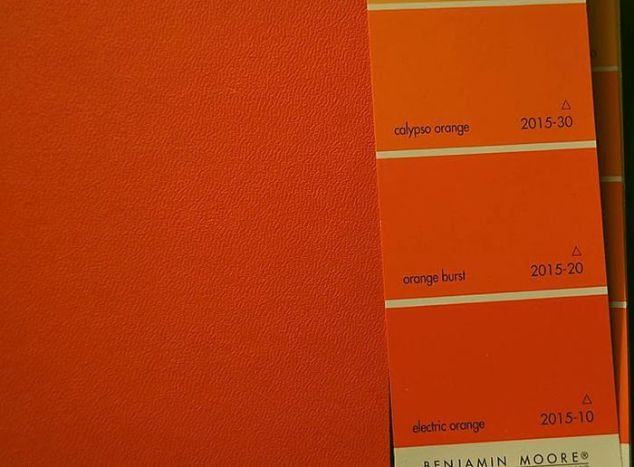
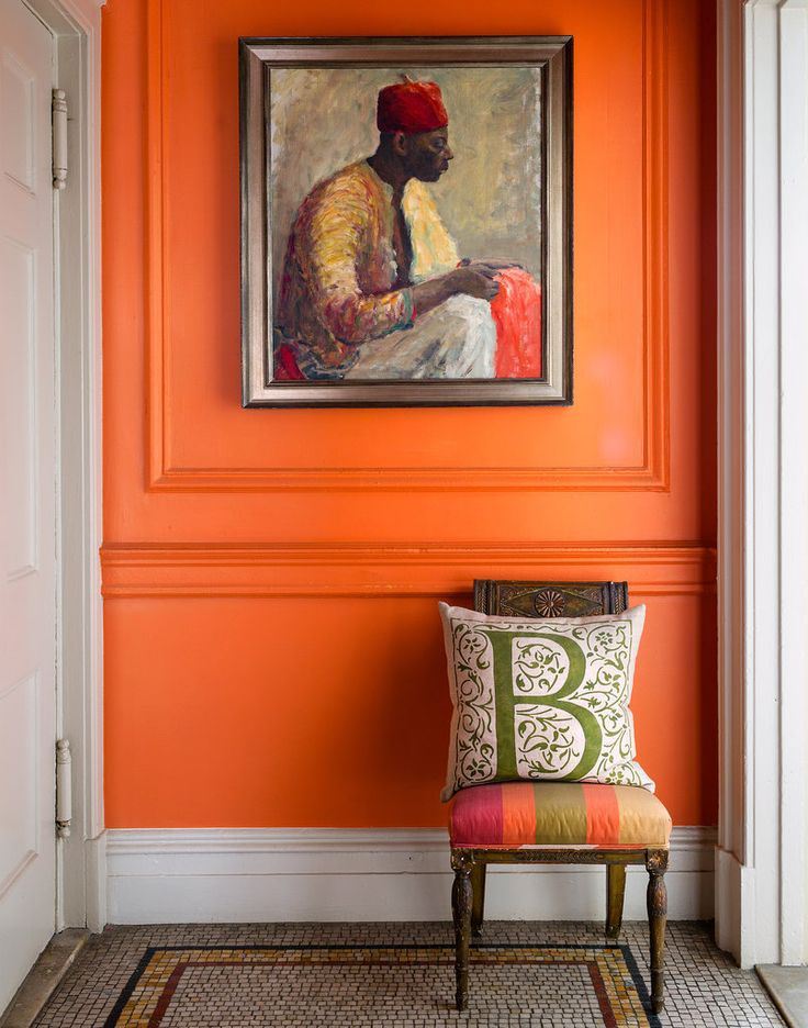
Someone tried to match up a Benjamin Moore orange paint chip with a Hermes handbog. The electric orange is pretty close. It’s actually REALLY bright!
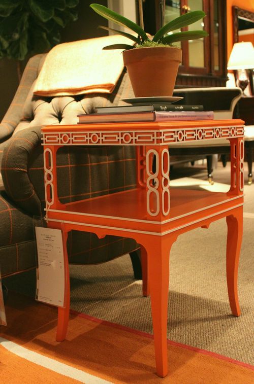
Love this chinoiserie end table which Alexa Hampton designed several years ago for Hickory Chair.
Now, that we’ve established just how cool, historical, classic and rich orange is, let’s get on with the point of this post which what are some of the best shades of orange paint to use on our walls. And, also, other ways to use orange in our rooms.
At the end of the post will be a shopping widget of home furnishings that will bring this vibrant color into your homes.
So, what are the best shades of orange wall paint?
*********
20 {GREAT} SHADES OF ORANGE WALL PAINT
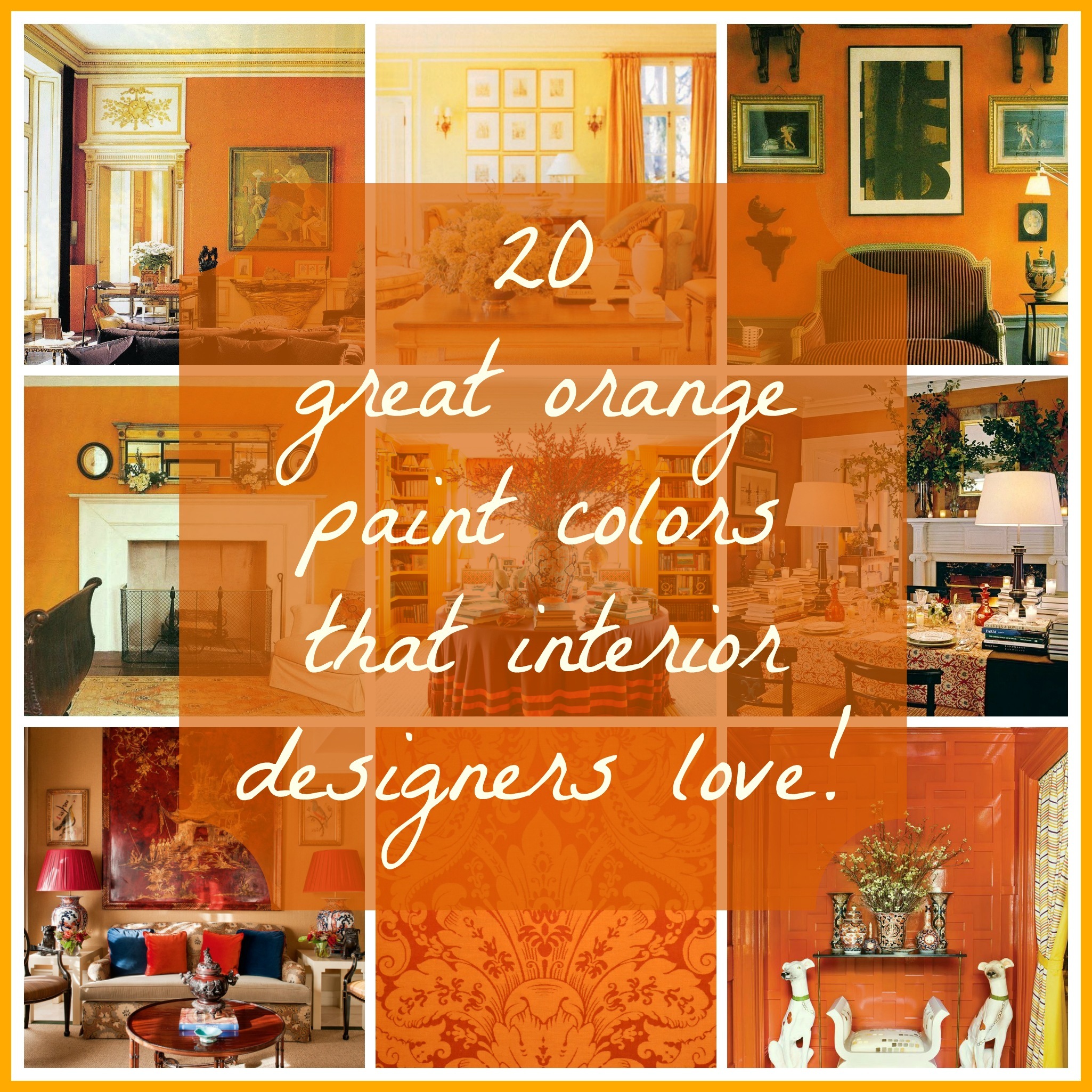
please pin this graphic to your pinterest boards for reference
*Before we begin, one important note*
The colors represented in the photos may or may not actually be painted the color they are representing. However, it really doesn’t matter because how many times have you seen a color in a magazine that looks nothing like what they say it is? Therefore, I chose images with great design that look close to the color I am talking about. In addition, some of these images are very recent and some were done years if not decades ago. Orange as we saw in the last post is timeless and forever.
Therefore, what I always say is this. If you love a color that you see in a photo, it matters not what it is in real life. Just match what you see.
We discussed this in a recent post.
In addition some of these images depicting the best shades of orange paint and furnishings are from clippings I’ve been saving for years. I love that. Because if something I saved 25 years ago still looks current, then to me, that is the very definition of timeless.
Let’s start with pale and work up from there.
This is a warm, wonderful, pale, pale warm, tawny peach. Farrow & Ball’s colors are always wonderful as they are made from complex formulas adding to their richness.
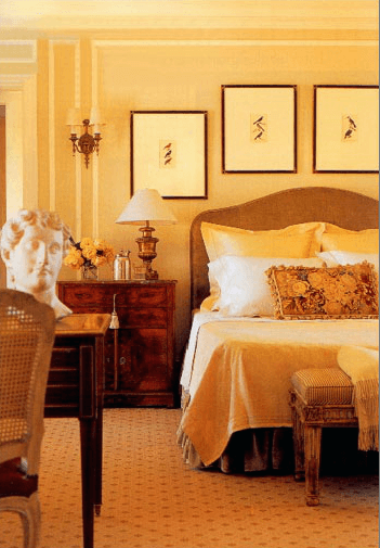
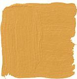
BENJAMIN MOORE PALE DAFFODIL 2017-60
This is a warm beautiful pale orange that glows like candle light.
The next two images are by one of my design idols, Stephen Shubel whose work I’ve admired since the 1980s. His blend of antiques with casual elements and soft, blushy colors has distinguished him his entire career.
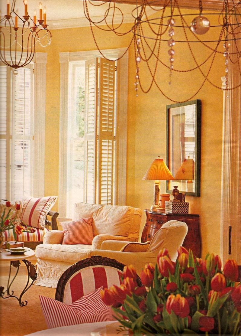
This is a room from the early 90s. I remember because I cut it out. And then, I used that chandelier for a couple of jobs. It’s really cool!
In fact, you can see it here, in a dining room I did in 2003.
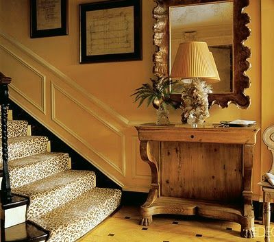
via – thelordedward.tumblr.com – David Hicks entry London
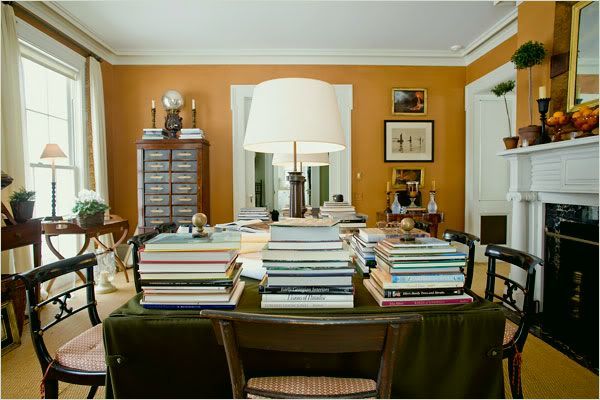
BM SEMOLINA 2155-40
Semolina is veering on yellow and a very cool, well warm, modern color. Totally fabulous for a “night room.”
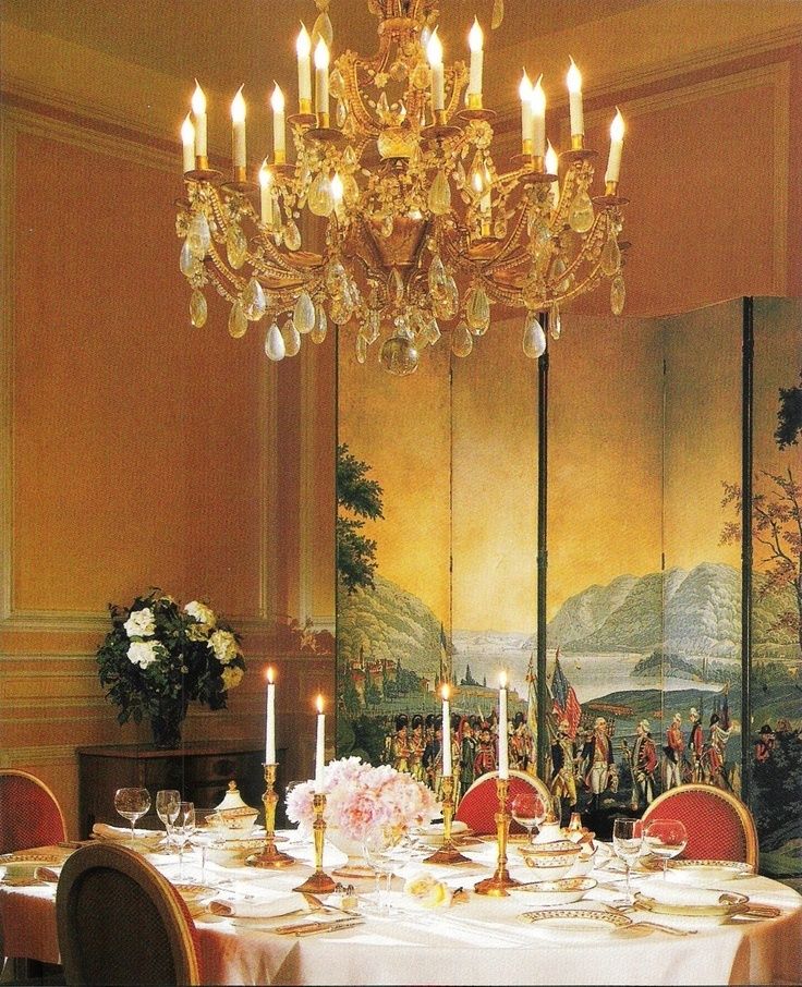
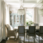
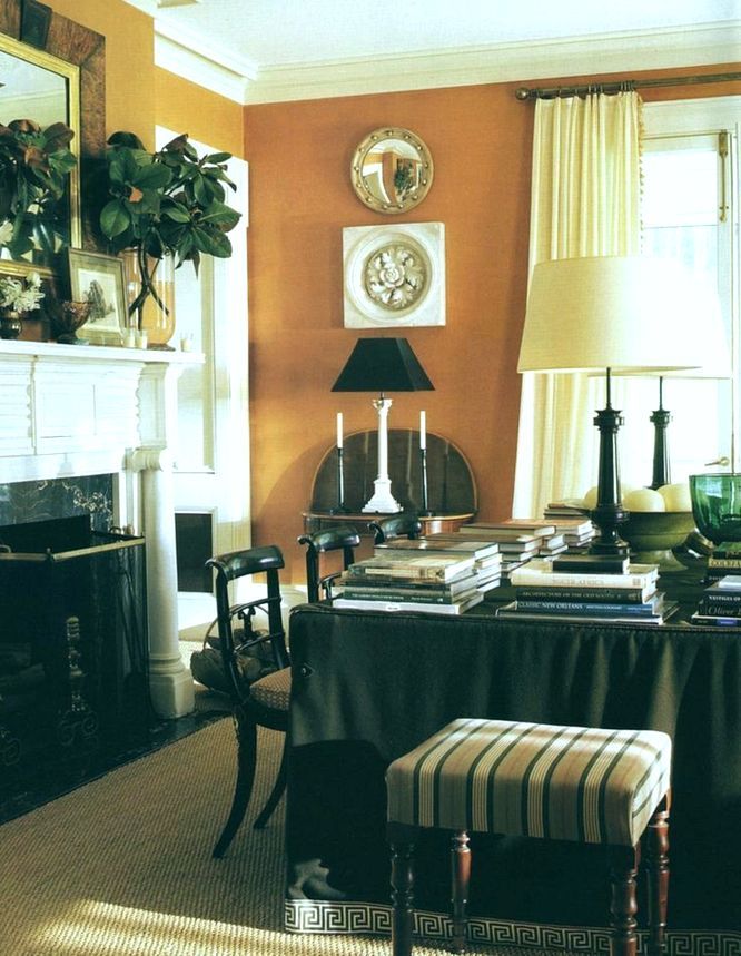
William Hodgins – Zuber screen dining room
The color? Who knows, but it looks like this.
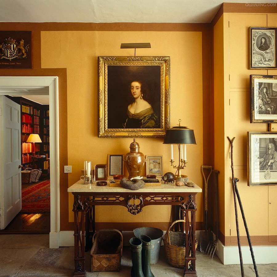
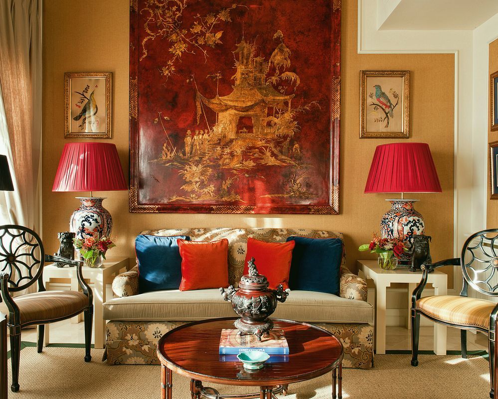
FARROW AND BALL ORANGERY
Interestingly, Farrow and Ball has archived this color. However, you can still get it.
The next three images are also in orangery.
This is one of my favorite shades of orange paint
above and below
Gil Schafer architecture and Miles Redd interior design
For more of this amazing home, click here.
Orangery is the color on all of the above.
This is not a pure orange but more orange than gold. It is warm and a wonderful choice for someone not ready to go with a more saturated orange.
Oh, if only we could truly test out a color and if we don’t like it, just flip a switch and it goes back to what it was.
BENJAMIN MOORE 166 ORANGE ICE
Orange Ice is a color similar to orangery– just a touch lighter and brighter– but ice is a misnomer. The picture is attributed to Donald Kaufman who also has a brilliant line of paint, but it’s harder to get and I’m not as familiar with it. However, I do own two of his books.
BENJAMIN MOORE 168 AMBER
This is a dusty warm, terra cotta.
Miles Redd
BENJAMIN MOORE 034 SPICED PUMPKIN
Spiced pumpkin is a color I’ve used a few times and goes up looking a bit brighter than it does on the chip. It is more rust than terra cotta and a very lovely warm, rich color.
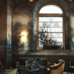
Amazing room by Studio Peregalli
I could not find a website for Studio Peregalli. They are an Italian duo from Milan, Roberto Peregalli and Laura Sartori Rimini. Their work is known internationally. I would classify it as old-world timeless. This article is a short interview with them about their process.
Sorry, at this time, I could not find out any further information about this room. However, if you know, please let me know.
If you’d like to see another cool room of theirs, click here.
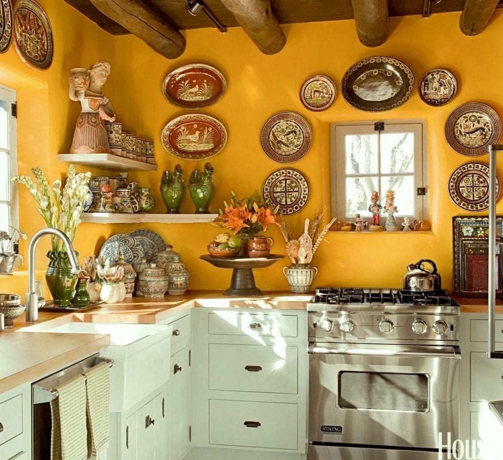
kitchen by Judith Espinar, Jim Deville, and Scott Robey. Photo Peter Vitale via House Beautiful
BM GRAND CANYON 118
This is more of an adobe colored light orange.
Makes a wonderful backdrop when used with brighter colors. And what a gorgeous color scheme here!
Miles Redd
BM BRONZE TONE 2166-30
BM BUTTERED YAM AF-230
design by James T. Farmer.
SW DETERMINED ORANGE 6635
Love that name. As you can see, determined is an orange with a lot of red in it, but still orange. I guess that’s more coral.
It’s funny that he describes this dining room as eccentric. The ONLY thing I find eccentric are the drapery rods. They are not parallel to the window as one end is attached to the fireplace wall.
Otherwise, the room is sublime! I’m just wondering if it was intentionally done that way or it’s a mistake they thought no one would notice.
Amelia Handegan
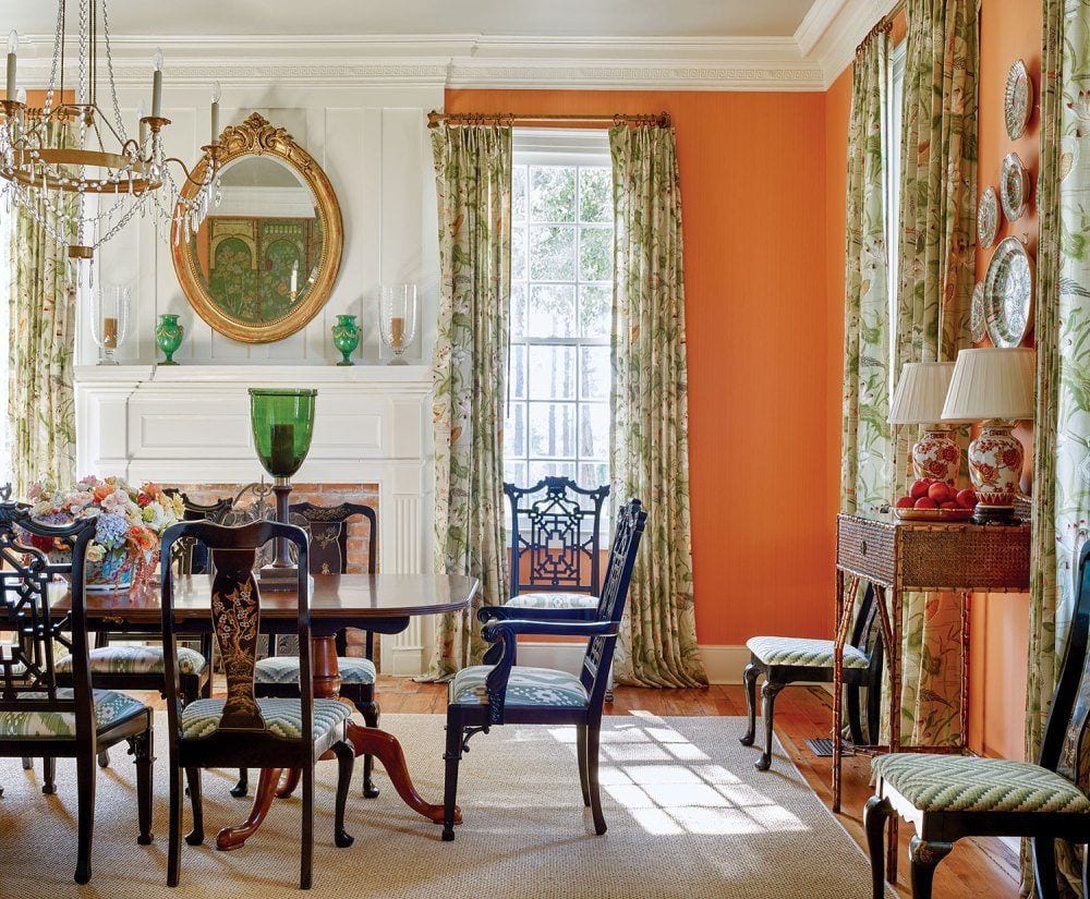
SHERWIN WILLIAMS 6647 EXCITING ORANGE
Exciting orange has a lot of life without being too in your face. I think it’s quite versatile
SW KUMQUAT 6648
Kumquat is a shade deeper than Exciting and also wonderful.
I’m going to let you in a little secret right now. I struggled the most with the SW colors. Why? Because they are all so unbelievably gorgeous! Really, I don’t think you can go wrong, but I still want to break it down for you.
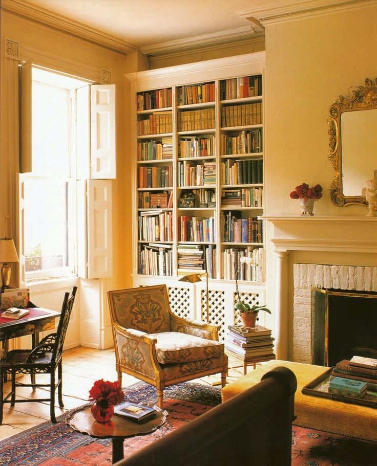
So what shade of orange is Tory Burch’s fabulous library?
Ahhh… well, of course, these secrets are not given up easily if at all. However… I have examined this one very carefully and weighed in on other factors in the photos and the hands-down winner is…

SHERWIN WILLIAMS 6887 Navel
BM ORANGE BLOSSOM 2168-30
Orange Blossom is a soft coral color. Very pretty. Vignette via James T. Farmer on instagram

FARROW & BALL 268 CHARLOTTES LOCKS
Charlotte’s Locks is a densely pigmented color from Farrow and Ball. It has more red than a true orange.
BENJAMIN MOORE RACING ORANGE 2169-10
Another lovely orange red that’s not too bright

BM PUMPKIN CREAM 2168-20
These deeper shades of orange paint look so yummy lacquered!
BENJAMIN MOORE CORLSBUD CANYON 076
This is a very soft coral. Me like.
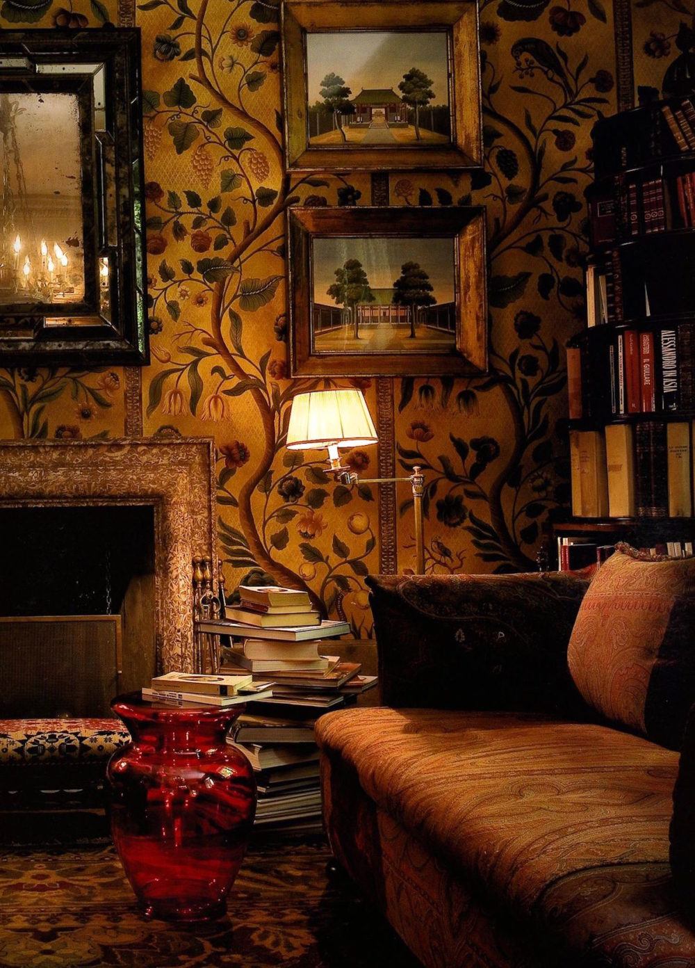
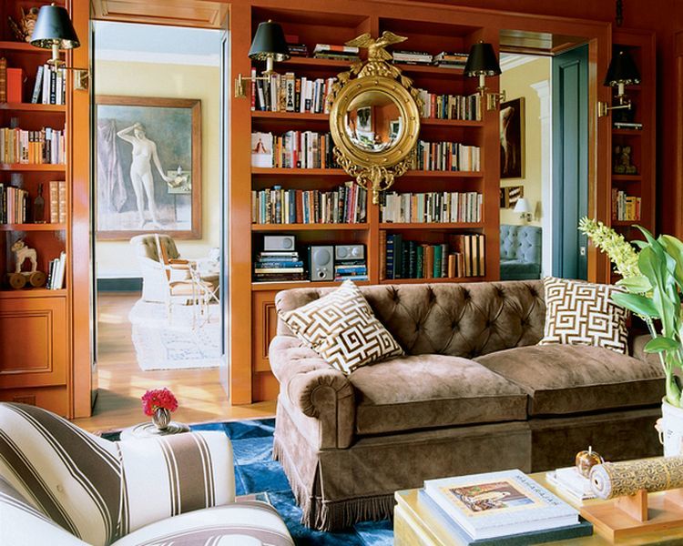
And finally our deepest hue for our 20+ best shades of orange wall paint– a rich deep saturated, warm rust. Perfect for a library or den
BENJAMIN MOORE 070 TOPAZ
This is a rich terra cotta and looks great glazed as it is here.
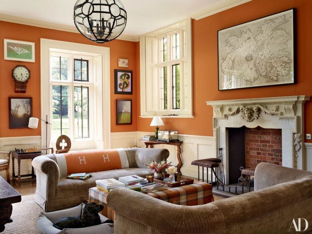
One last image from James T Farmer. I so adore his work. And, he looks like he’d be a lot of fun to work with too. The colors in this room are absolutely incredible.
If you enjoyed this post, this is one of my favorite posts about rooms with warm paint colors.
A reader wanted to know if they would look dated.
And, below is a widget featuring home furnishings with orange. Please click on the individual images for more information.

xo,

PS: Please check out the newly updated hot sales. Many fabulous sales going on this holiday weekend. And, the Serena and Lily sale is ending the 14th at 11:59PT
And, speaking of orange, a friend up in the Lake George of the southern Adirondacks invited me up for the weekend.
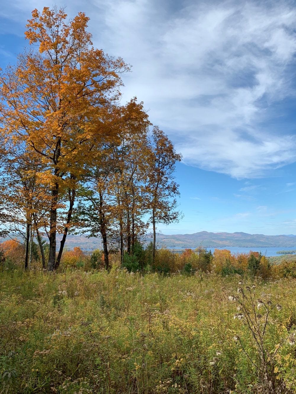
Fall foliage with Lake George in the background.
“
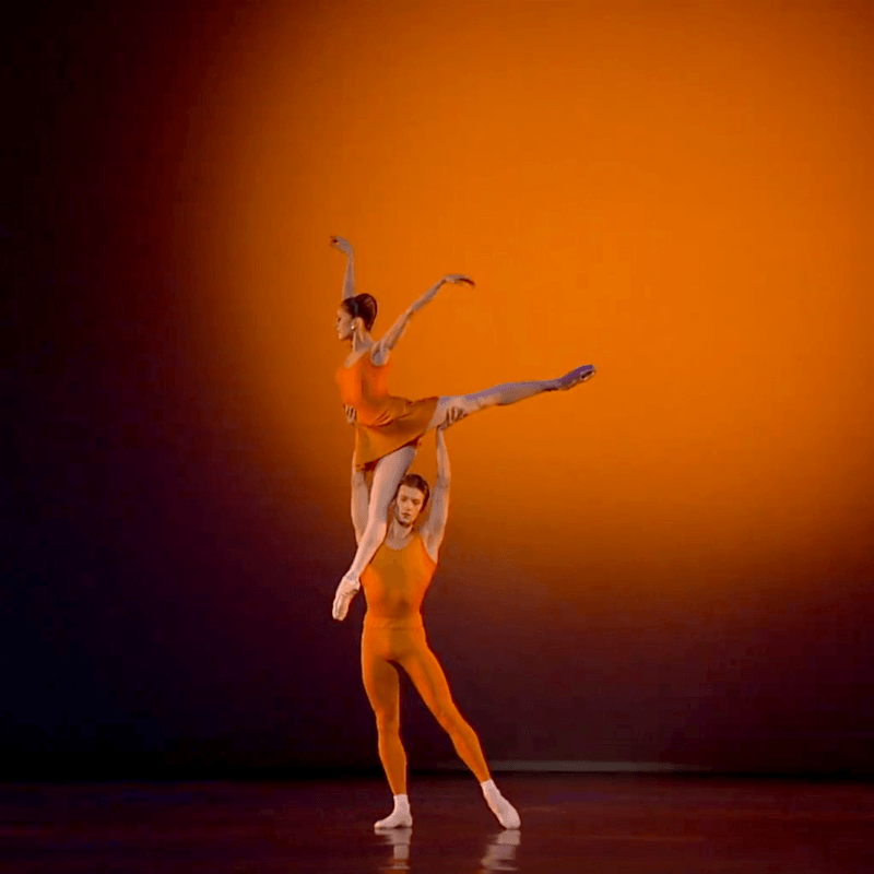
And, as promised , a cool photo of Marianela Nunez and Rupert Pennefather doing an exquisite pas de deux from Kenneth Macmillan’s Concerto.
Related Posts
 How To Style A Coffee Table and How Not To
- The 9 Best Kitchen Appliance and Refrigerator Makeovers!
- The Number One Interior Decorating Dilemma and How to Get Past It!
- 36 Cheap Sofas and Chairs That Look High-End!
- How To Mix Dining Room Chairs Like A Pro
- 9 Little-Known Paint Colors Decorators Are Obsessed With
- Please Tell Me Your Biggest Decorating Problem