Celestial wrote a comment the other day wanting clarification as to the elements that go into making BAD ARCHITECTURE.
Dear Laurel,
I love your blog because I learn so much about the totally foreign (to me) world of design and decor.
It would be really helpful for me (and maybe many others) if you could post about BAD architecture and design and why it is so.
I know that I can “feel” awful interior work when I visit the homes of many newly built (and very expensive) houses, but I don’t know WHY.
I live in a 100 year old farmhouse and it seems manageable in scope, while the mega mansions do not. You wouldn’t have to depict your readers’ homes, but those that just don’t “work” and why. That would clarify the points immensely.
Sincerely,
Celestial
**********
You know, I could devote an ENTIRE website/blog to this one topic, alone. In fact, one amazing blogger has done so.
And, I have her permission to share a couple of her images. We’ll be getting to that in a bit.
But first, let’s just talk for a bit about what makes for BAD ARCHITECTURE. And, by that, I’m talking both outside and inside.
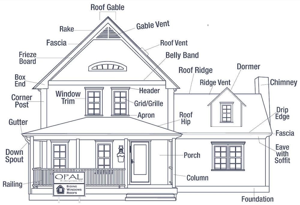
What are the elements that go into bad architecture?
Well, let’s begin with size. While size alone does not necessarily mean that the architecture is bad, it’s how the large home is designed.
For instance, below are two images taken of the beautifully restored Easton Neston estate that I took during my trip to England.
It is a magical, beyond magnificent home and grounds exquisitely decorated by Lady Henrietta Spencer Churchill who I also got to meet during our tour.
I have not published these before, because there was some question as to whether or not it was okay to do so? But, there are already thousands of images of this magnificent home on the internet, so I’d prefer to use images that belong to me, if possible.
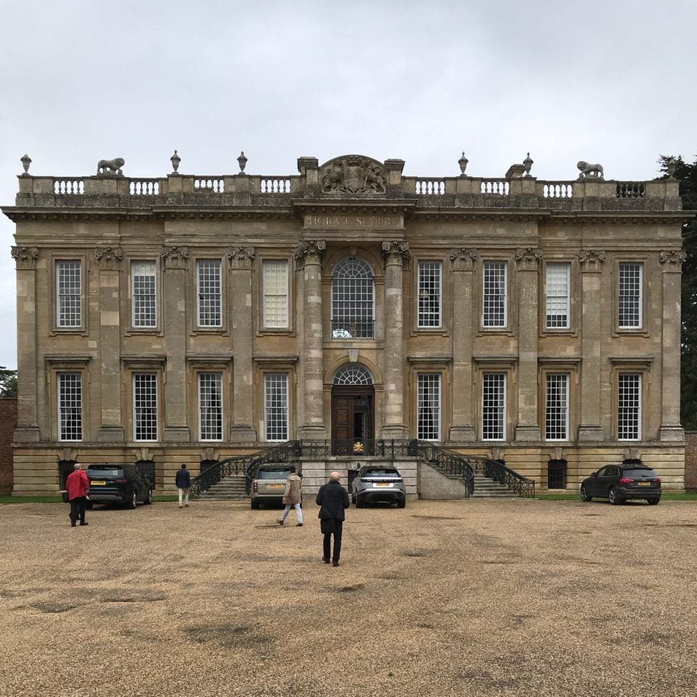
photo: me
The front facade of Easton Neston, originally built in the Baroque style circa 1700.
 photo: me
While the home is grand and very large, it is classically proportioned and in perfect scale. The grounds are also incredible.
There are some images of the interior in this post.
Okay, yes. It is in England. They don’t have a lot of snow there, so they can get away with a flat roof.
But, in bad architecture, it appears that anything goes.
And, I’m talking about the ubiquitous bastion of bad architecture
The MCMANSION
McMansions are known for having:
- horrendous proportions and scale, both inside and out. And that could mean that something is either too big OR too small.
- crazy rooflines
- giant porticos
- ersatz, fake, weird styling both inside and out
- wacko windows
- tacky landscaping
The most common theme is the arched window, door, portico on and on and on…
But, these are not the richly detailed Palladian arches, nosirree…
These are of the wimpy eyebrow variety.
There is no historical reference that I can find that presents such an arch. And yet, they are prevalent in bad architecture.
So, now, I need to share with you the blog I was talking about earlier. And, I know that some of you follow this blog, because I am positive that somebody mentioned it a while ago.
It is aptly named
The author, Kate Wagner, is SCREAMINGLY FUNNY! What she does is combs the internet for the best, no the tackiest monstrosities she can find. And then, she creates graphics with her own saucy brand of commentary.
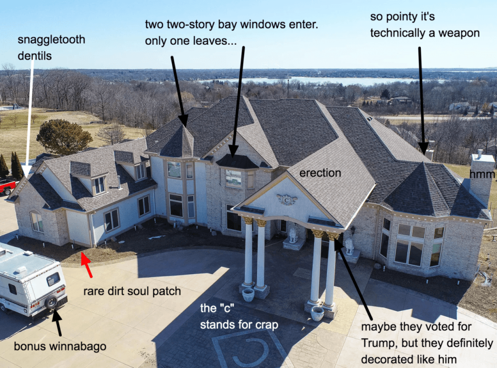
Here are two wonderfully Kaaaaarazy examples from this recent post. Kate went to Waukesha, Wisconsin for these gems. Well, she didn’t go there. She found them.
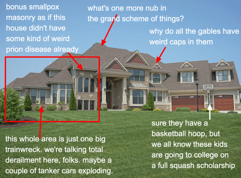
Oh, my, of course, I concur with everything Kate is saying. But, if I may add, I am counting TEN different windows in terms of size and shape. No wait. It’s 11, including the garage doors. It’s beyond insane!
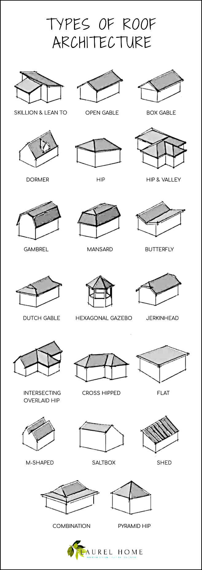
The undulating roofline, filled with both hip and gable roof styles.
A Gable roof has a flat triangle with two slanted sides.
And, a hip roof all sides are on an angle and meet at a ridge on the top.
Below is a graphic of 18 different roof styles that I made from another graphic I found here.
Above is a great example of a normal house that shows both a hip and gable roof. Note, please that there’s nothing over-scale OR underscale. Sure, this is a much smaller home. But, let’s widen the center by two and then add another side piece on the left side. We’ve now doubled the size of this home and it would still be aesthetically pleasing.
However, we need to get back to what’s wrong. The BAD architecture.
One more below from Kate from the same post as above.
Oh my stars! Please click on the link above for more commentary and more images. Of course, she has an immense volume of behemoths. And, the appropriate level of snark.
However, I have also found some un-gems (aka: bad architecture) of my own.
Yes, of course, because the economy is doing so well and the nouveau-uninformed are trying to impress, who-I-have-no-idea, (not me, that’s for sure) there is a preponderance of new and newly on the market, architectural dreck.
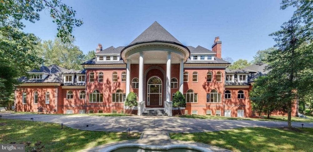
Exhibit A is a 20,000 square foot living quarters for a family of four in Reston, VA. Sorry, guys. It’s not for sale. It was built in 1996 and sold in 2015. However, in every old listing, they are calling it a “colonial.”
Generally, “colonial” refers to the 13 original colonies that formed the original United States back in the mid to late 1700s. Colonial style in the US is synonymous with Georgian style in the UK.
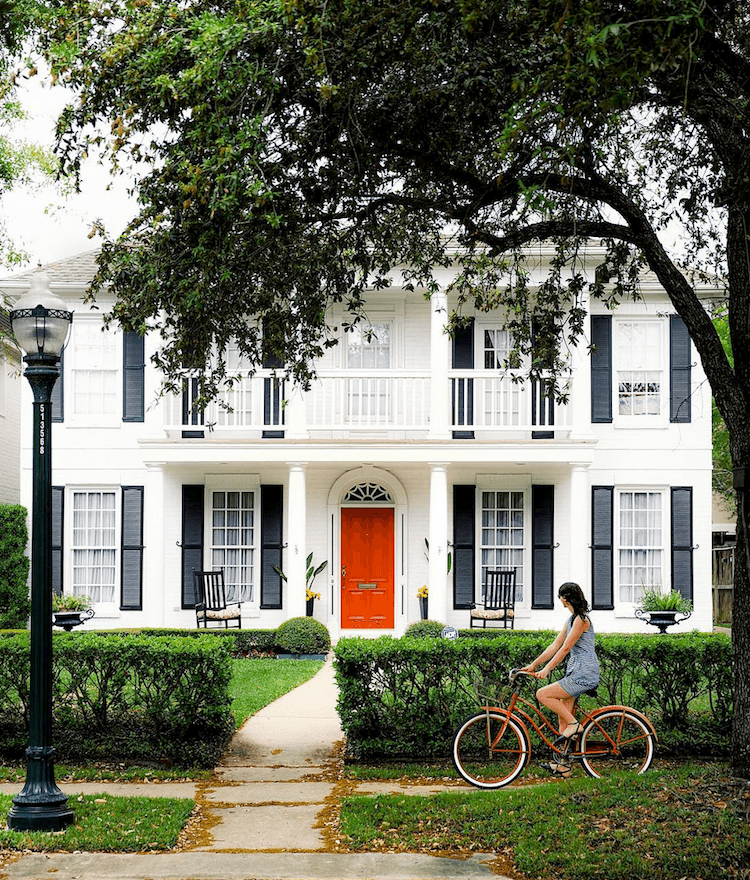
Above is a colonial. It is a traditional southern colonial white house with red door and black shutters. Do you see any resemblance whatsoever?
Yes, our mcmansion is symmetrically balanced, so we can give one point for that. But the sheer volume of windows with from what I can see, 22 arches, of various sizes and then, even more rectangular or square windows, and it’s just a huge bloody mess!
Of course, it doesn’t take a trained eye of any kind to see the ridiculousness of that absurdly OVERSCALE portico, complete with its very own ginormous dunce cap.
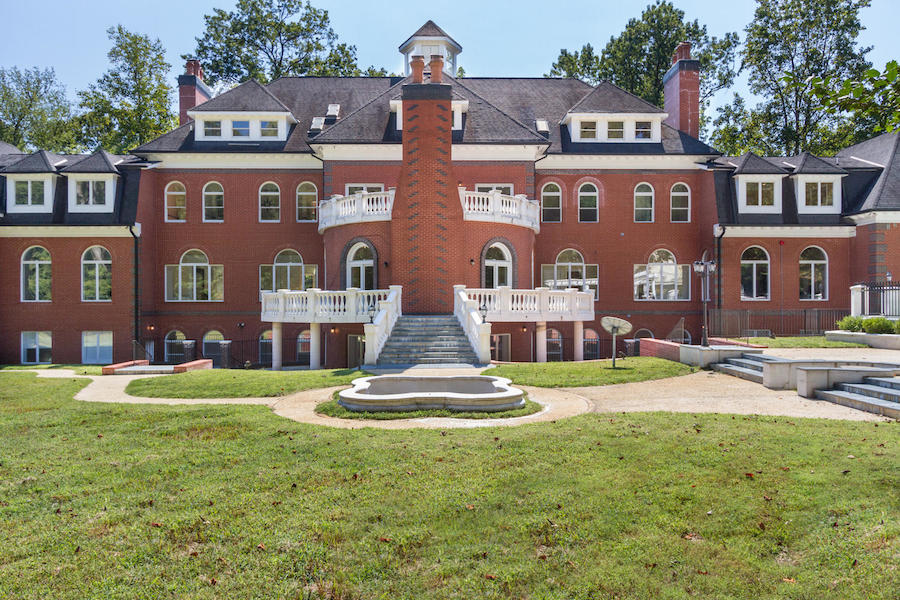
And, the rear facade. Not a tree in sight. And nary a bush, either.
But, what IS that chimney monstrosity, we have here? I’ll tell you what it is. You know, some families have a family mausoleum. Well, these folks have a family crematorium, attached to their family mausoleum.
One stop shopping.
Yes, I know. I’m as tacky and tasteless as this house! So, why are you laughing?
But, folks, it gets even better. I promise you.
Let’s go inside.
Are you ready?
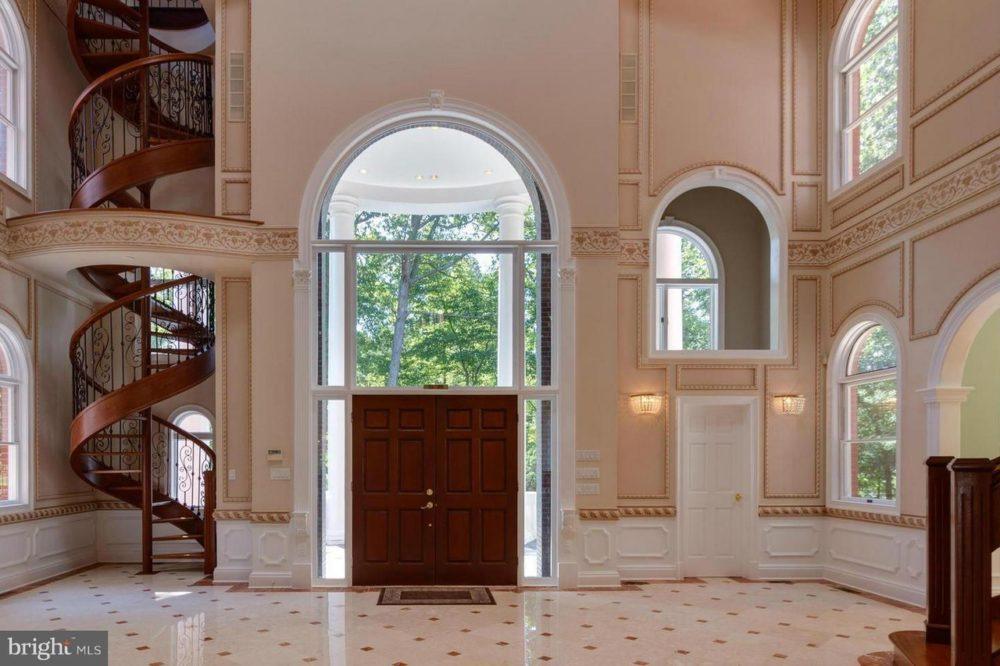
It’s difficult to know where to begin. Yes, the wall color known as Projectile Vomitus Beige hits you right between the eyes, doesn’t it?
But, let’s go from left to right.
The spiraling out of control staircase. It is complete with an absolutely adorable curlie-cue wrought iron railing. Very dainty and appropriate for this mammoth entry. :/
I am positive that vertigo-enducing-death-trap goes directly up to the mother-in-law suite.
Poor dear. Oh, I do hope that she’s not afraid of heights!
But, if she does attempt the climb, by the time, granny gets up there, lugging her suitcase behind her, she’s going to be so dizzy and exhausted; she will need to take to her bed until dinner.
hehehe. You know, I think that it’s time wordpress added some emojis so that you will know when I’m rolling my eyes. ;]
And, yes. I know that your mother-in-law is a doll. You’re very lucky.
Moving along, we come to the front door which is nearly eclipsed by that HUUUUUUGGGE arch of glass threatening to behead it.
But, the window IS in scale with the albatross portico. and the triple height entry. Good job! Apparently, the owners are ten feet tall.
To the right of the front door is another door. I am presuming that’s a closet? But what is going on above it? There’s an interior window which appears to maybe not have glass in it? In any case, it’s quite disconcerting. That’s because there’s another window going to the outside.
I don’t know where they got these mouldings.
You guys certainly can see that these mouldings are anything but classical.
My last comment is in regard to the sash Palladian windows.
[No comment.]
Please forgive them Signore Palladio. “They know not what they do.” No disrespect was meant, I’m sure. Well, I’m pretty sure. Actually, I doubt they’ve ever even heard of you. They most likely think that these windows are so-named because of the Palladium.
I shouldn’t even write that word! I do know that It’s “Palladian”— named after you, dear Signore, one of the great interpreters of the classical style.
So, please accept my profound apologies Signore, on behalf of those who don’t know any better. For more about this, (and more bad architecture) please click here.
But, we’re not finished with this entry, because the best worst is yet to come.
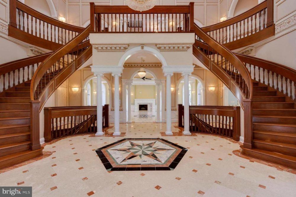
Forgive me if you have one of these. And perhaps, it is possible to have one that is classically proportioned and square. But, I find these double staircases to be the height of ostentatiousness. And, this one in particular is so heavy, so unbalanced. The over-sized railing, and then spindles of three different sizes and some peculiarly short.
Ack!
So, why oh why is there a spiraling out of control staircase when all granny has to do is walk 20 feet to go up one of two more normal ones?
Me thinks it’s because the spiral staircase takes gran up to the THIRD floor. Yes, much quieter for her to recover from her dizzying “trip.”
Yes, yes, I know. I’m going straight to hell. Fine, I’m already there, so this is good therapy for me today. (and hopefully you too!)
I really don’t want to go into it, but it’s related to the subplot in this post.
But, speaking of shitshows, let’s go into the center of this befuddlement with the columns, etc.
Isn’t that like the Greek stuff you just showed us, Laurel?
Well, in theory, yes, but not in form. There’s a sort of cornice with some bizarre dentil moulding; then, a heavy frieze being supported (but we know, not really) by itty bitty ionic columns that look like tooth pics in this space.
I am sure that they are actually normal size. But, juxtaposed against the rest, look diminutive in comparison.
This is reminding me. A wonderful reader, M was in Seattle recently in a hotel. She was lying in bed, probably trying to get some rest.
Here’s what she said:
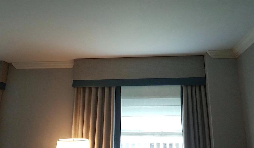
Here are pics of the moulding in my room. This isn’t right? Is it? Should it stop like this?! Please assure me I’m not crazy and this isn’t how this should look. Or maybe it is? Otherwise it’s a nice hotel.
Thanks!
M
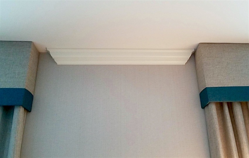 Gosh, the crown moulding is not even centered between the two windows!
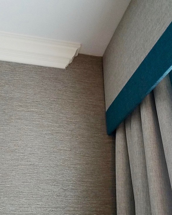
so bad
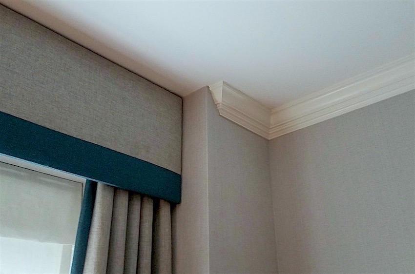 Occasionally, a crown moulding will have to stop here because the wall ends. But this one turns back towards the window.
My answer was:
“No, you are not crazy.”
If there is crown moulding, it should be going all the way around the room.
In this case, the crown moulding would act as a soffit over the window and the drapery would go behind it. There would be no need for the valance. That, I think would look strange to have the valance behind the moulding, but that would be preferable to the way it is right now.
You can see an example of the crown moulding going in front of a window in this recent post. Scroll down to the pale gray-blue bedroom by Darryl Carter. One of my favorite bedrooms!
The only other way is to hang the window treatment under the crown moulding.
Do you know, I was going to tackle another house with bad architecture? Haha. That’s not happening.
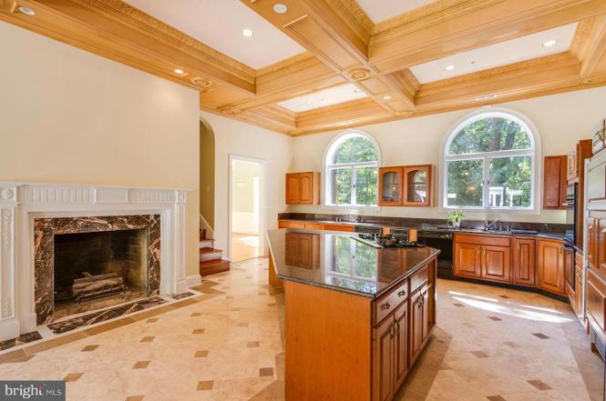
The kitchen. Okay. I don’t mind the fireplace. But, that granite is too much. The rest is problematic
The coffered ceiling hangs down at least four inches too far. It’s just too heavy and why is it stained a lighter color than the cabinets. It shouldn’t be stained at all! It should be white like the rest of the moulding.
And, the builder’s cheap cabinetry is inexcusable.
There’s another post on here some where that featured that. It’s so awful.
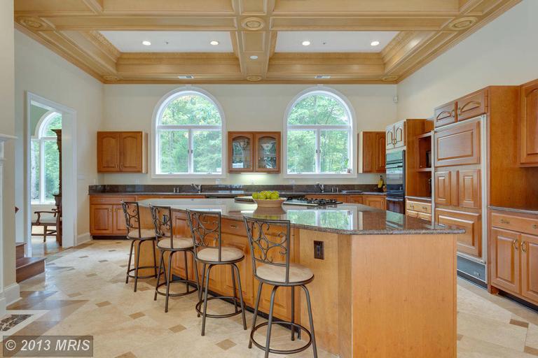
And why is the island a trapezoid? There is nothing classical about that.
However, compared to the entry, this is a gem.
Here are 20 timeless kitchens you’ll love forever.
If you guys would like, I’ll be happy to continue with the other bastions of bad architecture and hideous decorating. There’s one that’s 26,000 square feet of it. Please let me know.
In closing, I want to thank Kate Wagner of McMansion Hell for the use of her images. Please, check out her wonderful blog.
And, I’m going to leave you with one lasting impression of bad architecture run amok.
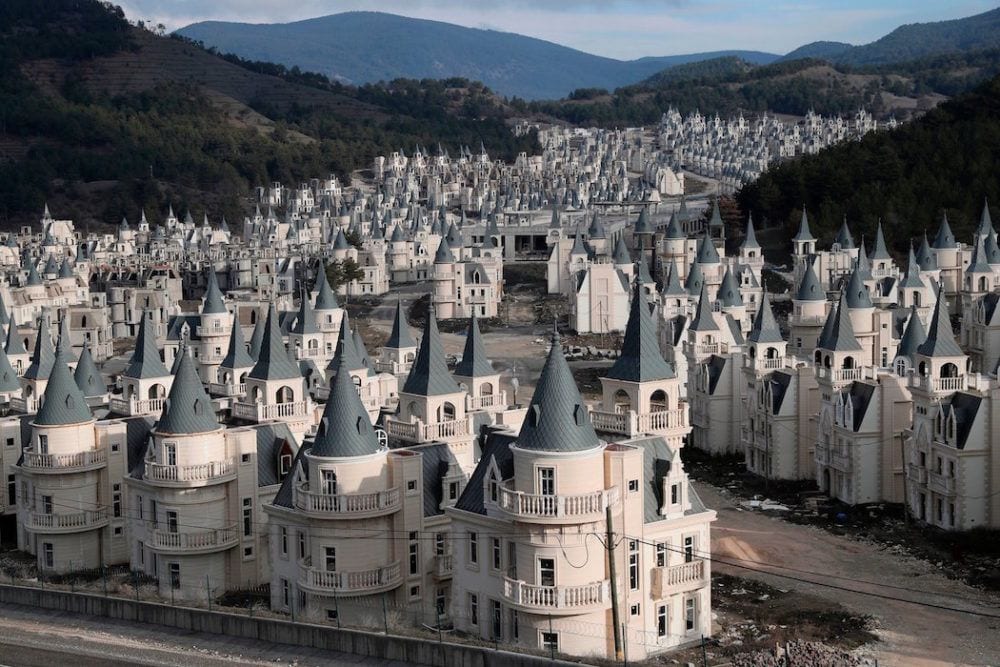
Adem Altan/AFP/Getty Images
These are known as the WTF??? Villas in Mudurnu, Turkey
WTF??? Indeed! There are several more images in the link. You’ve got to see them. This truly goes under the category of “What on earth were they thinking, smoking, drinking?” But, there are 750 of these “villas” and very few, if any of them have actually sold. They are blaming it on the Turkish economy.
Denial is a powerful defense when something is too painful to bear.
Please let me know if you’re interested in more of these architectural missteps. If you’re not, that’s okay, but please no rude comments.* Thank you.
The part that disturbs me the most is the huge sums of money spent on dreckitude that could be put to far better use, IMO.
xo,

PS: Please check out the newly updated Hot Sales and the Nordstrom Anniversary Sale Widgets.
PPS:
It is Wednesday at 6:45 PM. Thank you all for the wonderful comments. 95% of them are!
*However, three of them, (so far) despite the above warning, ARE rude and thus have been deleted. So, this is for the 5% who can’t control themselves. The rest of you, as you were.
I am only up to about 11:00 AM in moderating, so don’t worry if you don’t see your comment yet and think I deleted it. I didn’t. I’m just a little slow today.
The ones who’ve been deleted know who you are. As I have to say, too frequently, like the teacher of a small group of unruly 15-year-olds, you do not have to agree with me or like how I express myself; and, you are always free to unsubscribe. However, I am not going to have my right to freedom of speech censored!
Look, I don’t like everything I read, either. Just shake your head in disgust and move on… But, shaming people and on their own blog, no less, is really not cool! So, here’s what you need to look for.
If you are feeling in any way perturbed, annoyed or angry and then you go to write a note or an email, to me, chances are it’s not going to be appropriate and will therefore get deleted on my end. So, instead, if shaking your head in disgust isn’t enough, maybe call a friend, instead? Tell THEM what a horrid, bullying bitch you think I am. At least you’ll get some sympathy. If you send it my way, you are running the risk of getting permanently banned.
I have a zero tolerance policy for trolls, haters and bullies. Fine, if that’s how you want to be. Please take it elsewhere.
There is never any disparagement of people allowed on this blog; by me or anyone else.
Houses are things; inanimate objects. So, they are fair game. Therefore, please stop taking personally, that which has absolutely nothing to do with you!
Said always with love!!!
Related Posts
 Can This Boring Bland Living Room Be Saved?
- Beige Decor — How To Make It Go From Boring To Sensational!
- 15 Hideous Decorating Mistakes With Fabric
- How To Work With the Color Pink – It’s Not Just For Millenials!
- I Don’t Care What You Say. I NEED MY CEILING FANS!
- How To Select The Perfect Color Scheme For Your Home
- Are the 15k Window Shutters A Good Idea?