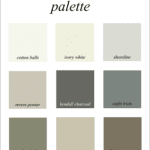
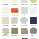
Over the years, people have often asked me…
How do you select a color scheme for your home?
That’s a very good question.
But, the answer often doesn’t come easily.
In addition, as an interior designer, coming up with a color scheme is rarely the first issue on my mind. However, I hear from people all of the time, that is the first thing they are worried about.
The most important thing is creating a space that functions optimally for the clients.
But, here is my process for selecting a color scheme.
Please note that I no longer take on new clients, but I am speaking in the present tense.
If you are doing your own house, then you are your own client and need to take these same steps and ask yourself these questions.
Where is the home located?
- Is it in a big city?
- A small town or village
- In the country?
- Is it in the mountains?
- Or, is it by a lake, river or ocean?
Where the home is located may very well have a bearing on what colors are chosen.
How old is the home?
- Is it brand spanking new?
- Or, maybe not even built yet?
- Is it fairly new, 20 years old but still built after 1985?
- Or is it an antique, early, mid- 20th century?
Different periods of history often use different colors.
What style home is it?
There are dozens of styles– too many to name.
Whenever I visit a new client, these are the questions I’m quickly asking myself. In fact, most of these I already know before even visiting the clients.
Related to style and age of the home are the “givens.” The givens are the things that cannot change.
They are elements like floors, tile, windows, etc.
Although, most of those things CAN change. But, it needs to be decided if that is a possibility. Because if its not, obviously, we have to work with what is.
Whenever coming up with the perfect color scheme, it is vital to understand that everything from the stain on the floor to the metal or plastic trim on the windows is a part of the color scheme.
It could be wood trim too. And, anything can be painted, but metal and plastic are more difficult.
I’ve been looking at a lot of high-end real estate listings recently. And, God only knows that between Westchester County in New York and Fairfield County in Connecticut, there are thousands of homes that are well over million dollars for sale. And there are hundreds that are 5,000,000 or more!
But, one thing I’m noticing that at least one realtor is doing which I think is incredibly clever, is this: They are photo-shopping some images to reflect how they would look if they were painted. And, blimey. I thought I had one for you to see and now I can’t find it. Sorry, about that.
Going back to location, style and age of the home, I think it’s pretty clear that the color scheme for a vacation home in the Caribbean is likely to be different from a ski chalet in Colorado.
But, of course, there’s also the issue of personal preference when it comes to choosing a color scheme.
However, so that we’re clear, let’s discuss the possibilities for interior color schemes. I’m saying interior because there are dozens of color schemes. Some of these I’ve written about about 5 years ago and am linking to them.
Below is a terrific video that explains the principles of color theory

Mono means one. I guess we all know that. So, monochromatic means ONE color. But, it can be variations of that one color.
This is when you have a color scheme with two or three colors right next to each other on the color wheel.
Two colors opposite each other on the color wheel, like red and green and blue and orange.
However, there are some color schemes that don’t seem to have a name.
For instance, one of my favorites is blue and white, with the addition of orange-red. It’s almost complimentary, but not quite. You can see a post about this color scheme here.
One thing I have discovered over the years is that in say an over-all cool color scheme, like blue and white, it longs to see some warm tones like orange and yellow and gold and even brown, as accents.
The same holds true for the opposite, but less popular these days, warm color schemes.
Another good rule is to run a thread of one color through all of the rooms. It can be the dominant color in some rooms or used as accents in others. This color is often red, green or blue.
What if you live in an area, but don’t like the “typical” colors associated with the geography?
As an example. Does a coastal home have to be blue and white?
Well, if your home is right on the ocean or has an ocean view and you’re constantly seeing blue out your window, THAT is going to be part of your interior color scheme. Of course, it’s water and that means that it’s going to change colors too.
I don’t think that you must have a blue and white home, but it should probably be mostly pale with shades of beige and white. However, it really depends on which ocean. Is it a rainy gray ocean or a turquoise blue ocean?
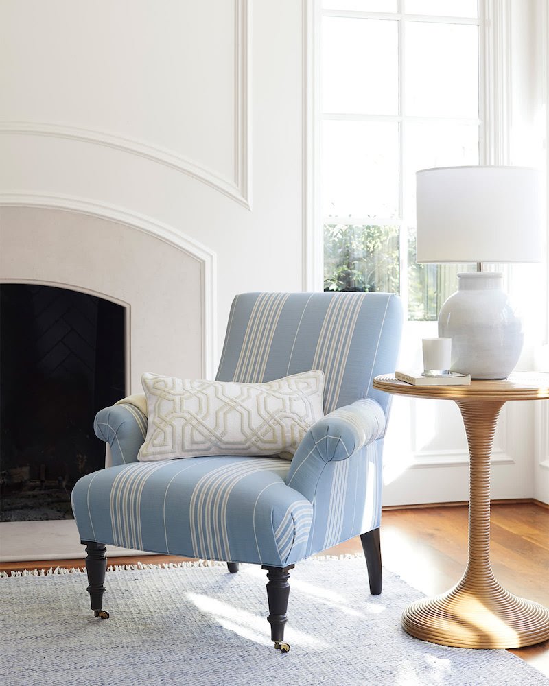
Serena and Lily does coastal so well. OH, they are having a 20% off of all of their beautiful upholstery. So, if you missed it the last time they did this, you have another opportunity until 11:59 pm (PT) on 4/29/19. Use code: ALLYOU
If you have a home that’s in a residential area in most places, you might not be bound by as many rules as if it’s in a place very specific.
So, let’s say that you are moving into a big white house.
Here’s one.
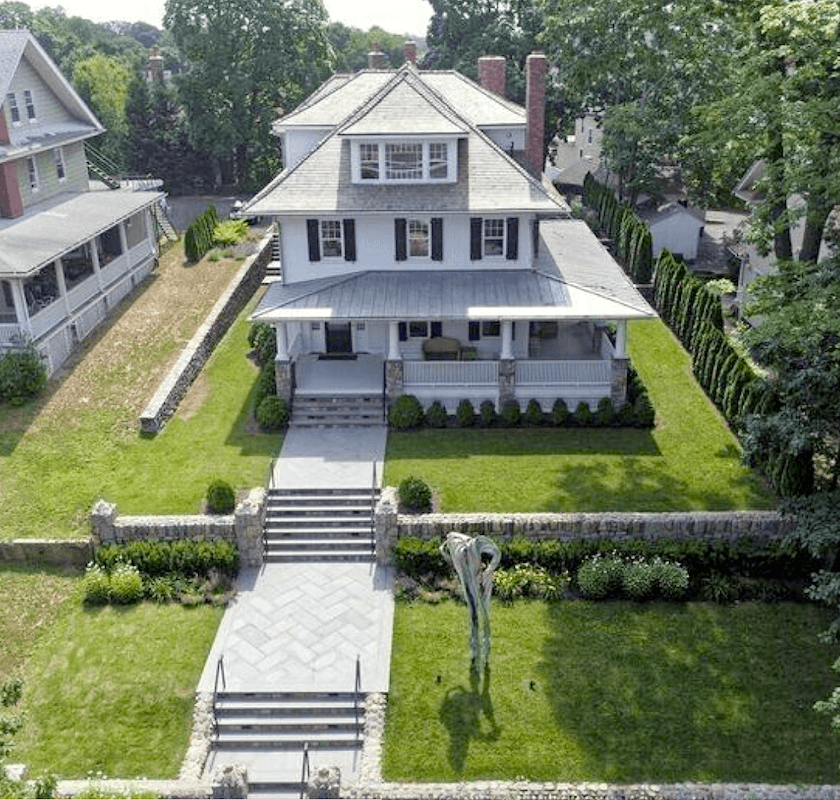
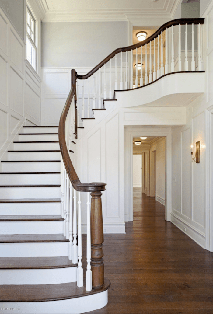
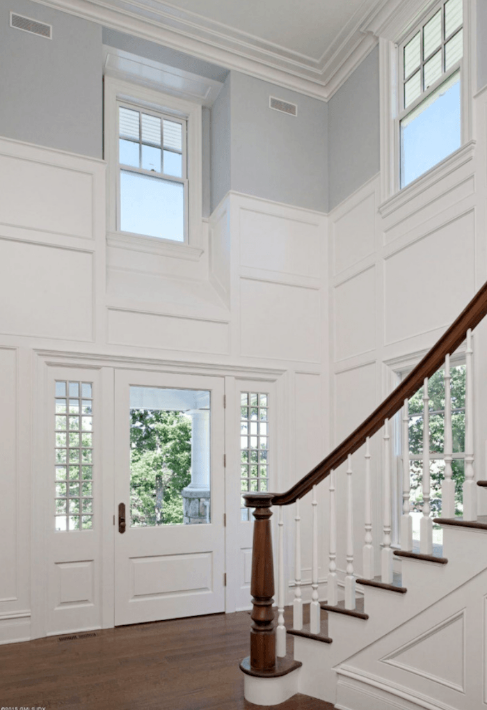
Here’s the listing for this antique craftsman style home, totally updated on sale in the heart of Greenwich, CT, on what they say is a 6/10th of an acre “OVERSIZED LOT”
for a cool $7,800,000.00
Sticker shock much? Well, this is some of the most expensive real estate in the nation.
I’m not going to show any more of the house. It’s very nice; nothing exceptional, at least, not the way it’s presented, but I wouldn’t turn it down. I chose it because it’s mostly white.
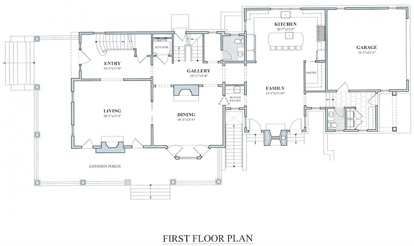
Here’s a layout of the first floor, as you can see.
You enter in the upper left corner. I would probably leave most of the walls white or the light gray they appear to be. But, a great place to use a lot of color would be the dining room. And, then I would use those colors but more sparingly in the other rooms.
Of course, this is only one possibility, but I’m trying to show how this works.
In my practice, during the first meeting after I’ve discussed at length my clients desires and needs, I come back with scale drawings of a possible furniture layout and a bag(s) of fabrics.
This is when we begin to flesh out the colors, patterns, etc.
But…
Sometimes there are already givens that make this process easier.
OR, more difficult. In fact, there have been situations that the potential clients presented to me that were so problematic, that I wouldn’t take the job. Remember Humpty Dumpty? Not everything can be fixed. Well, that is, not without spending a lot of money.
But, under manageable circumstances, the clients might own a rug or rugs they wish to incorporate. Or art.
Sometimes, they show me a room that they love or a fabric they wish to use and then we build from there.
But, what if there’s none of that? And then you feel like you’re farting in a thunderstorm trying to see which way the wind is blowing? It’s mighty difficult.
So, let’s clear the wind and clouds. haha And, focus on something we touched on in this post about a secret trick that designers use when we are at a loss.
We look for inspiration from other designers. But then, we put our own spin on it and it becomes something entirely new.
Let me show you how this works. And I am going to use some of the palettes and colors from the Laurel Home Paint and Palette Collection.
I think that you’re going to like this.
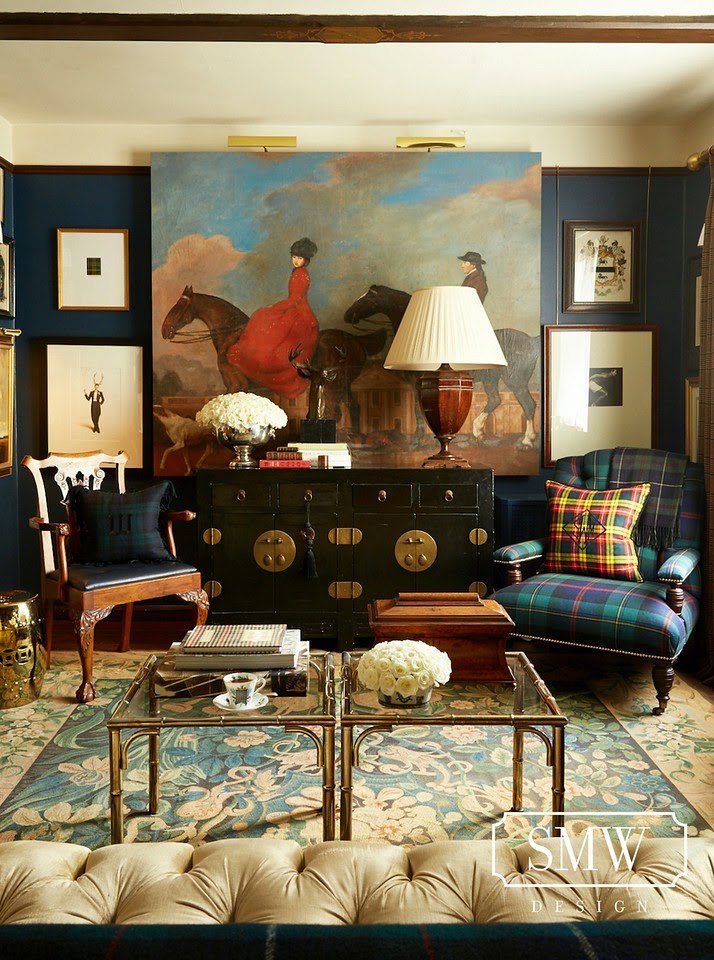
Let’s say that your client shows you this gorgeous room by Scot Meacham Wood. And says, “I love this color scheme.” Or, perhaps you’re your own designer.
We don’t know if Scot took his inspiration from the painting, the rug, or his beautiful plaid fabrics, but we can see that it all coordinates beautifully without looking too matched.
The wall color by the way is Benjamin Moore’s Gentleman’s Gray.

And yes, this is a beautiful navy with a touch of warmth and a lot of gray. But still, definitely blue.
Here’s the room again. Now watch this:


Yes, this is one of the 40 color palettes I made in 2016 and I wasn’t looking at Scot’s room when I made it. But it sure looks like I did!
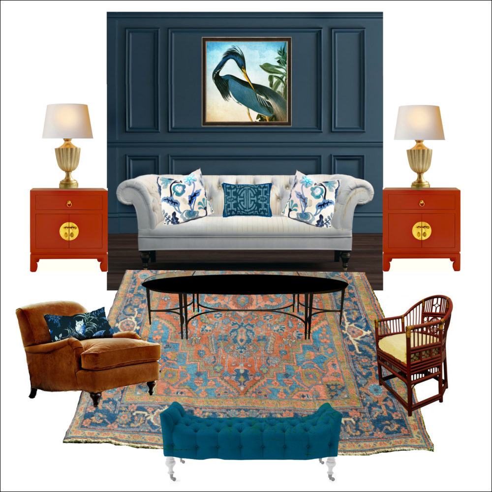
This is the Gentleman’s Gray board from the Palette Collection.
From here, we can keep going with inspiration rooms and palettes. There are other palettes that coordinate with this one as they are categorized in “palette families” in the laurel home palette collection.
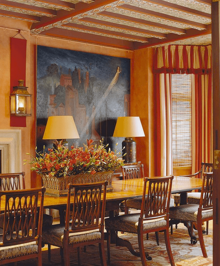
For instance, we could also do a dining room with warmer colors from the color palette
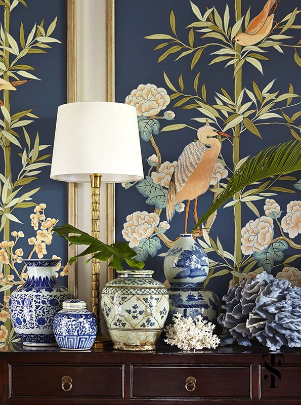
Summer Thornton vignette – Allison Cosmos artwork
We could also do an entire scheme around this beautiful artwork as Summer Thornton did. Remember this post that spawned the post about Restoration Hardware?

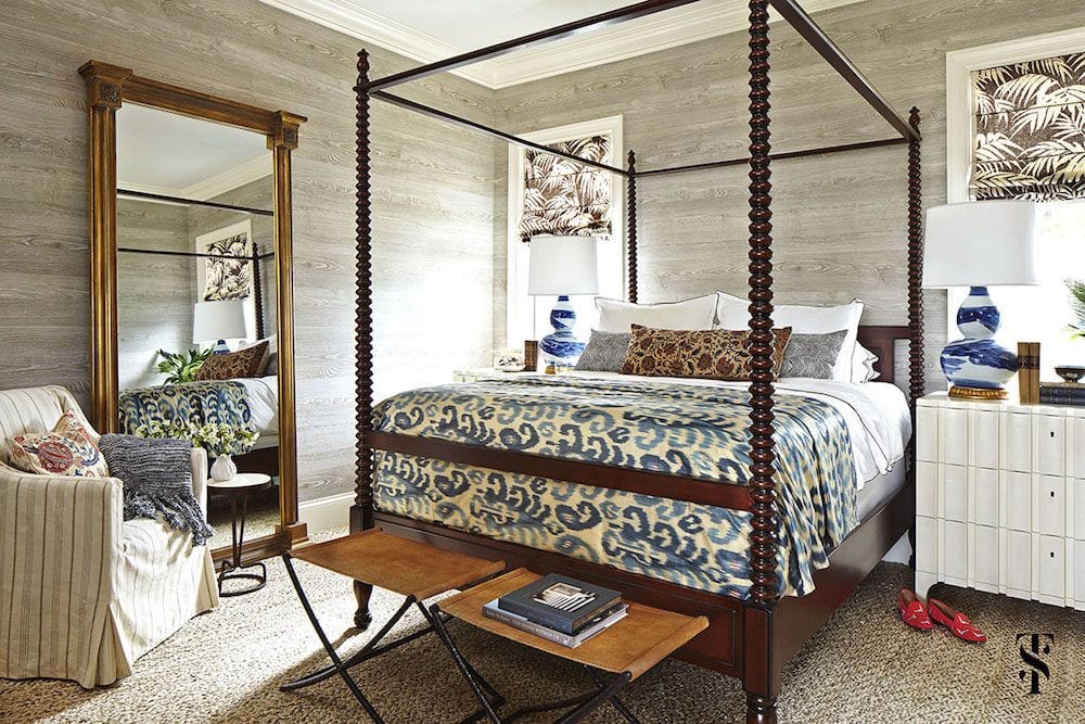
This bedroom has accents of the color scheme, but is predominantly gray or greige.

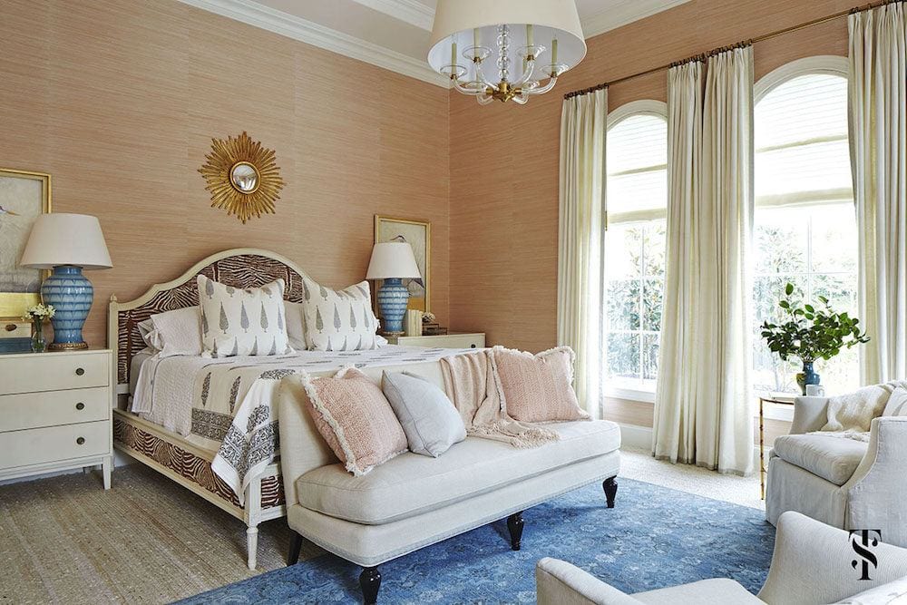
Summer masterfully stayed within the palette family to create other rooms that coordinate with the central theme. The lamps are far more turquoise than they appear here. You can see them better here. Blue is difficult to photograph sometimes.
The above room would look great with a mostly blue and white home.
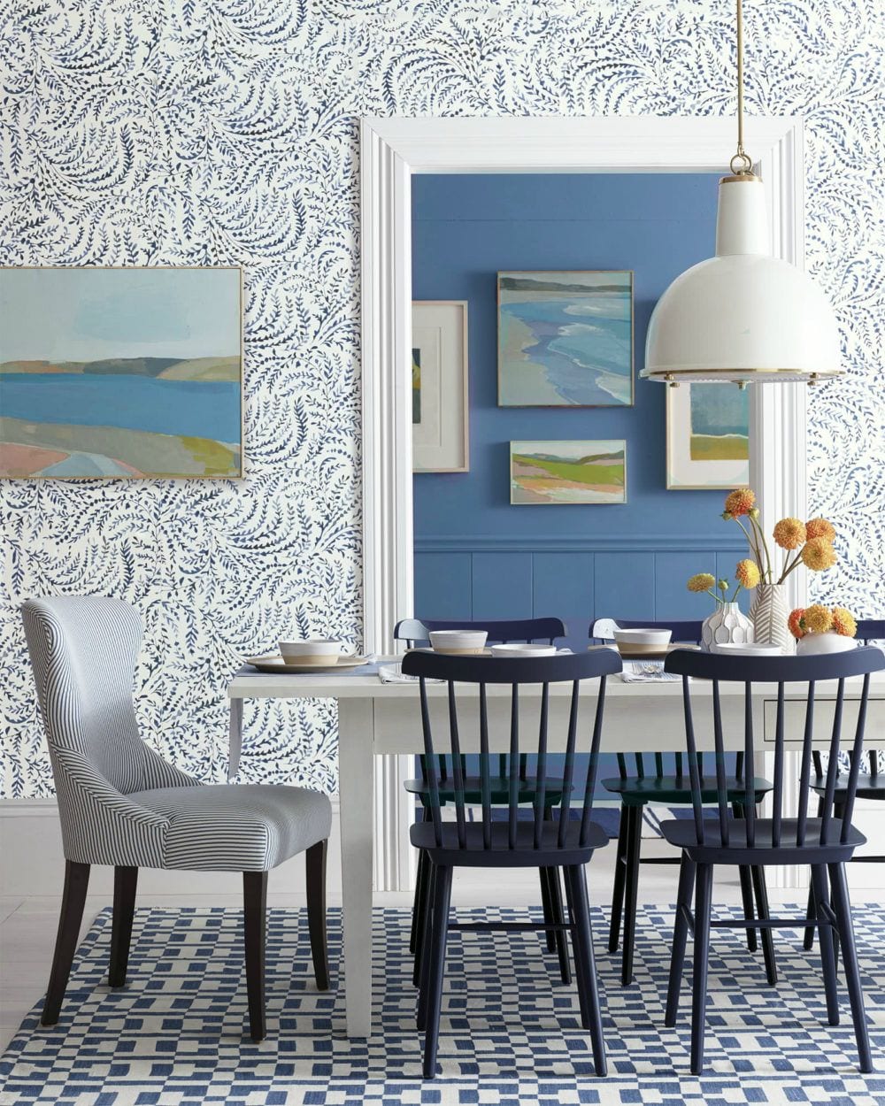
Beautiful images from Serena and Lily above and below.
OH! They just put all of their custom upholstered furniture on sale for a few days. 20% off! You can either click this link. Or you can read about it and see some of my favorites on the hot sales page.
Or, we could go more to the turquoise as shown below.
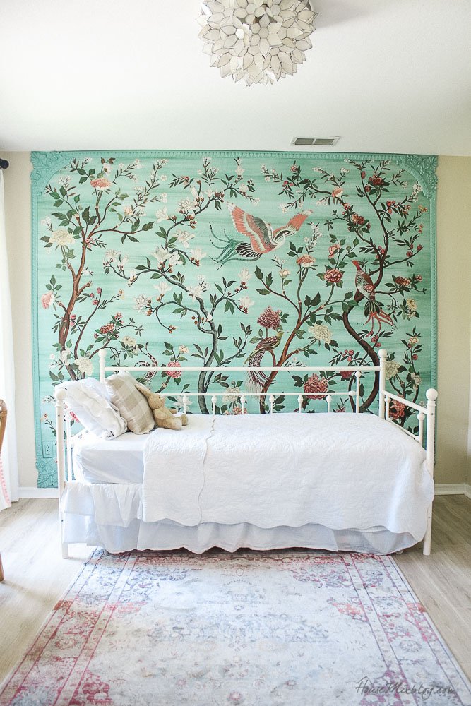
How cool is this for a little girl’s room. The mom and blogger, Kate has created an excellent tutorial for how she made the frame. You can read all about it here.
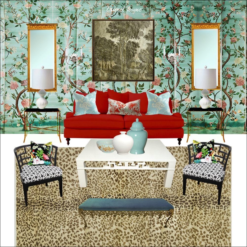
Havenview Wallpaper from Anthropologie
Remember this wallpaper that we used in this post?
I’m hoping that you’re seeing how one can take different ideas for inspiration and then take that inspiration in different directions?
Let’s do one more.
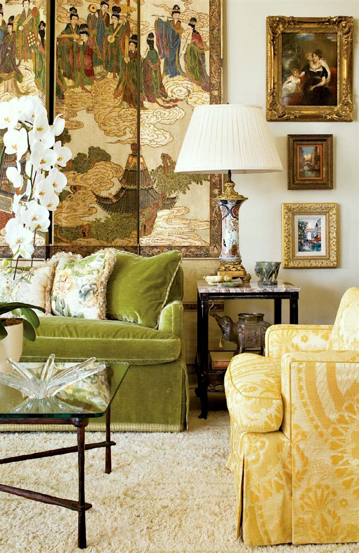
I don’t know the source of this image. It looks like it came from a book.
We can see that the beautiful Chinoiserie screen is dictating the colors in the room.

And, here’s a Laurel Home paint palette with some similar colors
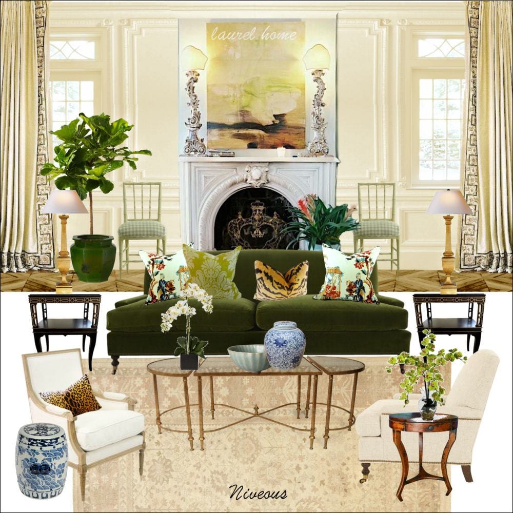
Here’s the Benjamin Moore Niveous board that goes with the palette.

And, another coordinating palette
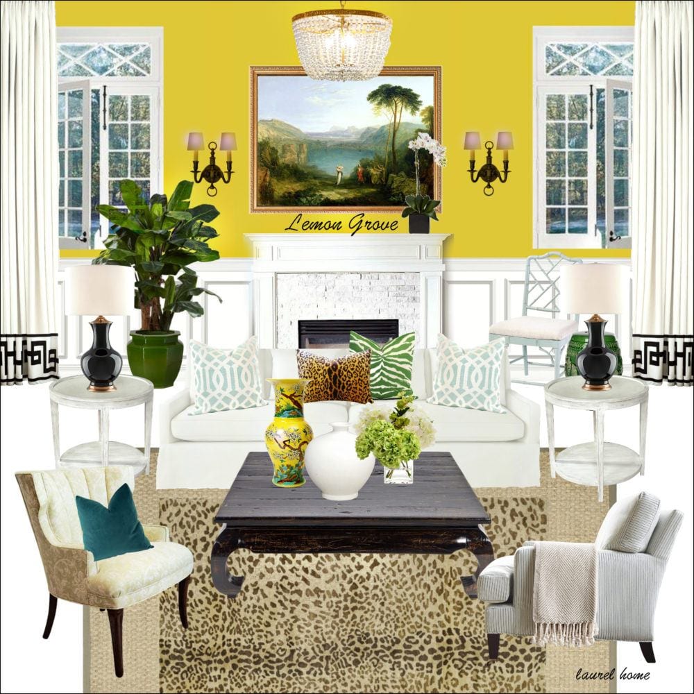
And, this is the Lemon Grove living room from the palette collection.
Well, this is just a sampling of what’s in the paint and palette collection. You can begin to read about it here, if interested. And read what other people who’ve purchased have to say.
Of course, there are dozens of ways one can come up with a color scheme. For me, there is always something that inspires a jumping off point and from there, just like a painting, we expand upon it, always being mindful of the other spaces and how the rooms all fit together.
xo,

PS: Before you go and hit the hot sales, you have to see the incredible botch job on this architectural masterpiece for sale in Rye, NY.
Related Posts
 Her Open Floor Plan is an Excedrin Headache Nightmare!
 Here it is! A Palette For No-Fail Paint Colors
 Is It Classic Furniture or Something I’ll Grow To Hate?
 20 Fabulous Shades Of Orange Paint and Furnishings
 My 20 All-Time Favorite Benjamin Moore Paint Colors
 20 Favorite Exterior Paint Colors + Doors and Trim
 The Horrid Gray Trend – Is It Finally Over?


