Just yesterday, I received an email from a kind reader:
Hi Laurel,
Love your blog and all the great things you so generously share!
Wondering what you think of the new Benjamin Moore COTY 2019 Metropolitan?
I’m thinking about it, but seeing it online and in little dabs isn’t like seeing it for real. Could you perhaps share your answer in your blog?
Many thanks,
Kristi
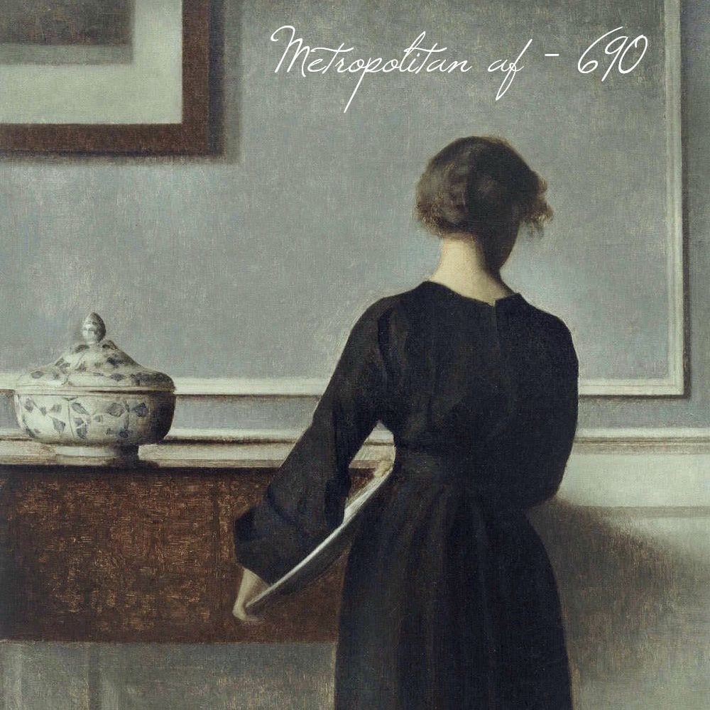
painting by Vilhelm Hammershøi
Thank you Kristi! This is a very good question for a lot of reasons because it’s a common mistake to choose a color after falling in love with it in a magazine or on a computer screen.
Invariably, the unsuspecting person is blissfully rowing away in a rowboat on a river and does not see the impending waterfall ahead when he/she asks, “What IS that paint color?”
Usually, it’s for a room that is not mine and I have no idea what the color is.
Sure, I’ve asked the “what is the paint color?” question, myself. But usually, it’s to see just how far off it actually is from what it’s supposed to be. :]
When you see a paint color in a room either in a photo or from a photo which is then shown on your computer monitor, I can pretty much guarantee that the actual color in YOUR home is going to look different.
How different?
Different enough that you’ll wonder what the hell happened.
So, when you say that you can’t tell from the little dabs you’re seeing, you couldn’t be more right. You won’t be able to tell until you actually see the color in your home and in many different lighting situations and locations in the room it’s to go in. Click here to find out the best way to select a paint color in your home.
But, here’s the thing.
The color you’re thinking of should usually be treated as a reference; a beginning point. It might be the ending point, but you won’t know that until you test it.
The reason for this (as some of you have learned) is that a color in one room that looks great might look terrible in another room. Same color. I know that some of you have mistakenly taken a beloved paint color from your old home and then used it in your new home and to your shock, it looks completely different and not in a good way.
This is why I don’t get too carried away with “undertones.” All things being equal, the undertone theory works beautifully.
Unfortunately, things are never equal or constant; not when it comes to light.
And, the color you see is always dependent on the light it’s reflecting. It is not possible for a color to look the same in all lights/conditions.
(By the way, this is in no way a disparagement or refutation of anyone’s undertone theory. I don’t have enough information regarding their teachings. It is possible, that the philosophy is the same, but expressed differently.)
Here’s an example below of what I’m talking about in my bedroom, recently painted Benjamin Moore White Dove oc-17.
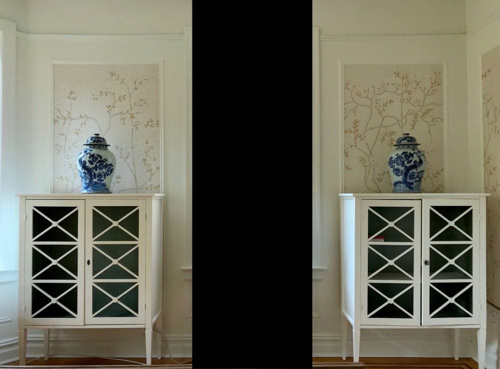
My bedroom. Please don’t ask when it will be finished. (little chuckle) There have been circumstances beyond my control and one of them is that my rep at Serena and Lily left and the people currently there don’t seem to know anything about the collaboration that they instigated earlier this year. Hopefully, it’ll get finished by next summer.
(BTW, the S&L 20% off sale is ending Monday night!)
My point in showing you this with the black 2001 A Space Odyssey monolith, lol (but it makes it easier to see) is first to show you why you need to tape your colors flat against the wall if it is the wall being painted and try the color in different areas, throughout the room.
Everything that’s not wallpaper is Benjamin Moore White Dove. And yet, the color looks quite different as you look around the image. Let’s examine this further.
The wall paint is Regal Select Latex in a matte finish. And, the cabinets and trim are the Advance Alkyd formula which emulates a semi-gloss oil finish. This is a good post about different paint finishes.
Notice first, how different the two cabinets look from each other. Identical cabinet, painted the same color and on the same wall. And yet, clearly, the color does not look the same.
Another point is that the cabinets both seem to have a little pink in them, but not any in the walls. In fact, I would say that the two doves clash a little. Crazy time! In addition, when does White Dove EVER have a pink tone to it?
The answer: In my bedroom. Sometimes. But on some walls, particularly by the closet, it looks very creamy. And usually on the opposite wall, a much cooler white.
Which is it? Warm or cool?
Both. It is dependent on the light.
I did color-correct the image to remove some of the pink that isn’t really there. This is how it really looks. At least on my computer monitor!
Let’s look at a detail shot.
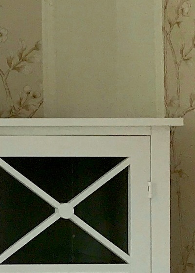
Again, yes, the wall and cabinet are the same color. AND, sometimes, they do look like the exact same color! (White Dove) But, not here.
This is why I tell you to stop driving yourselves (too) crazy pondering obsessing white or any other color, for that matter. Apparently, even the same color can clash with itself!
(yes, you can tweet that) ;]
This however, is the reason why I created the Laurel Home Curated Paint and Palette Collection. I did it to reduce the number of choices from 3,500 to 144. And, I wanted to make sure that you had at your finger tips, some of the best colors. It’s not that you can’t use other colors. But this becomes the point of reference I mentioned earlier.
But, here’s the danger when we see an image on our computer screen and see that it’s the Benjamin Moore COTY 2019 Metropolitan. If you’re waiting to see if Laurel gives you the okay, I’m sorry; that’s not going to happen, either. And, it’s not because I’m trying to hold back or be nasty.
It’s because any paint color in isolation is meaningless.
By the way, the color in the Laurel Home Collection that’s very close to Metropolitan is the Historical Color Coventry Gray hc-169. Coventry is a little deeper and has less green than Metropolitan. Actually, there are a few colors that are similar.
Benjamin Moore and others describe Metropolitan as being a gray-blue. But, if you have a south-west facing room like I have, Metropolitan is going to look pretty green, most likely! It sure did this afternoon.
However, in a low-light room, the green will probably disappear and the color may even look ever so slightly purple-ish. That’s how it looks when I look at it in my dim hall or bathroom.
How is this possible? How can a color look in some lights greenish and in some lights purple-ish or blue-ish?
As with the white dove in my bedroom, it’s how the color is reacting to the light. You can see this phenomenon in this post with the popular color, Revere Pewter.
Another thing to think about is what happens when you see a color in a magazine or online and you LOVE the way it looks in the photo. And, you’re just dying to know what that magical color is. Right?
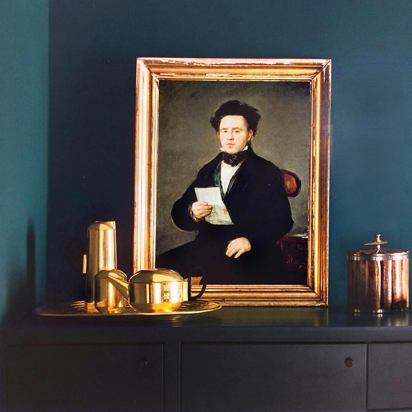
People often ask me “What is that color?” It’s pointless because I can pretty much guarantee that it’s not going to be what you are expecting. Of course, you can ask. I ask all of the time. But please remember that the color is not going to look the same on your walls.
Here’s what to do instead when you see a color that you love and would like to try out.
If you like THAT color, then go and find THAT color by matching it up, that way. For instance, in the beautiful photo above, the color to me, looks maybe like Benjamin Moore Galapagos Turquoise or maybe Slate Teal.
I would also get a pot of Benjamin Moore Twilight. Then, I would make sample boards of all three.
Does that make sense?
These are just a few of the gorgeous colors in the Laurel Home Essential Paint/Palette Collection of 144 curated colors and palettes. If you start here, you can read the intro about the paint/palette collection and then there are links for more information.
Well, Laurel. You still haven’t answered the question. How do you feel about Benjamin Moore COTY 2019 Metropolitan?
Metropolitan is a fine color. :]
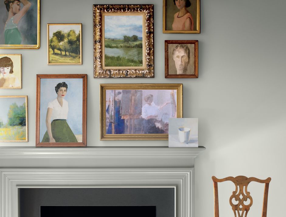
via Benjamin Moore
However, in most photos I’m seeing, the color is used in a fairly well-lit room and it is sometimes looking paler than it might in your home.

This is how dark Metropolitan is on a chip from the Benjamin Moore website
And, it would actually look darker than this in a darker room.
Actually, a lot of paint colors in photos look lighter than they do in real life. But, the color might look like the room above, if your room is getting a lot of light.
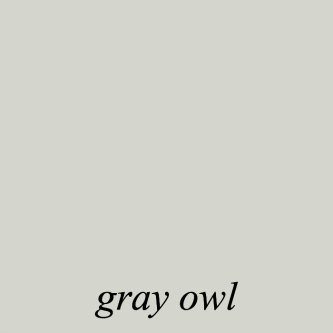
A color in the same family, that I like a lot that’s a good amount lighter is Gray Owl.
In general, when it comes to gray, I mostly prefer either fairly pale or much deeper.
But, if you would like to see some of my favorite cool Benjamin Moore cool gray paint colors, please click here.
There are also some wonderful cool gray paint colors in this post about bathrooms.
My own little bathroom is painted Benjamin Shoreline. You can see photos of how that looks here.
And, isn’t it funny, but just one month ago, I did a post asking if the gray paint trend was over?
And if you are looking for some of my favorite warm gray paint colors click here.
I know that there’s a log of pondering gray or pondering beige pretty silly. And, it’s not that I don’t do it myself. But, it’s not the most important thing. There is rarely only ONE color that will work in any one space, no matter what.
This link will take you to the MOST IMPORTANT THING you need to create a beautiful room. It’s the one thing that if you don’t have it right, no color is going to look good in the space.
There’s more to discuss regarding the Benjamin Moore COTY Metropolitan af-690. And it’s information that I just discovered– after I wrote everything above this.
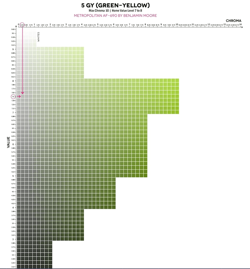
First, I found this graphic and then after putting it in a search discovered both an instagram account (@thelandofcolor) and a very interesting website, Camp Chroma belonging to color expert Lori Sawaya. I should know who she is, but I don’t believe that we’ve met, although the name seems familiar.
Oh crap! I just did a little investigating. Yes, Lori’s a subscriber to this blog and she’s also left a few kind comments. I’m so flattered!
So, if you’re reading this, “Hi Lori!” Love your blog!
She breaks it all down in scientific terms and I find it all quite interesting.
I encourage you to read what she wrote in this post about the color of the year 2019 Metropolitan.
While I do not want to get into any debates about any of this. (It’s just paint, okay?) :] I do agree with everything that Lori says. This is based on my color training in design school and years of observation and experience.
But, what I love here is that the reason that Metropolitan sometimes looks green, is because it IS green.
The green is not an undertone. It’s just a very grayed-down green. But, in some lights can also look blue-ish. And in my place, it did look purple-ish. However, it might not look that way when it’s on the entire wall.
If you like muted grayed down greens, please check out this post about these shades of green.
I hope that this post gave you some new insights that you may not have had before. Or, maybe it corroborated what you already know. I realize that choosing paint colors can be difficult. If you don’t have my paint/palette guide, then I very much recommend that you hire a color consultant to help you with this, if you’re still struggling.
To wrap up: If you did not see Friday’s post, please take a look. Because of the devastation in Florida due to Hurricane Michael, I am donating 30% of my earnings for the entire weekend to the relief effort. This goes for affiliate products purchased or any of my three guides. Laurel’s Rolodex, The Paint/Palette Collection and The Six Figure Income Blogger.
Thank you so much for your help!

Related Posts
 Is There Any Hope For A Windowless Room?
 Nine New Farrow & Ball Colors 2016 – Matched To Benjamin Moore
 How To Work With the Color Pink – It’s Not Just For Millenials!
 21 Interior Design Mistakes You Need To Stop Making
 My 16 Favorite Benjamin Moore Paint Colors
 The Best Bedroom Paint Colors You’re Probably Not Using
 Our Modest Starter Home Might Be Our Forever Home.


