Dear Laurel,
Hi Laurel!
I couldn’t help but laugh to myself this morning when I was reading your blog post. Why? Because my house ALSO makes me pull my hair out; or, at least, twirl it a lot while in deep tail-chasing thought.
How did you know?
Our house is a custom-built mid-century colonial whatever that means.
But, it’s certainly different. I’ve never met anyone else with a house anything like this. And, everyone who visits says, “wow, this is certainly a unique home.” I can’t always tell if they are just trying to be tactful, but really feel that it’s horrendous.
Below is my drawing of the living/dining areas that is causing sleepless nights.
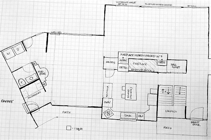
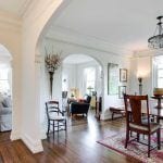
From the outside, the house looks like a ranch with colonial-styling in the middle.
And then, once you walk in, you see through to the backyard with gorgeous woods and hills—24 feet of window!
Yes, it’s gorgeous! It’s impossible to not fall in love with the view; hence, why we bought the house. Now, thinking back, just like you mentioned, with your home, it was empty.
But, we were smitten and so, we bought the house, moved in and it is only now that we realize that this unique home with the gorgeous view is impossible to furnish!
Let’s begin with the mind-boggling living room.
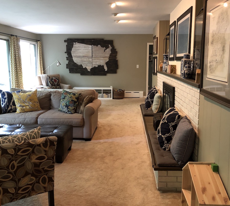
- The living room has, not one but three focal points with very little usable wall space.
- The aforementioned 24 foot wall of window is actually a 10 foot center slider door to the deck, flanked by windows 18 inches off the floor.
- On the opposite side of the room is a massive wall of fireplace with a hearth that sticks up and out 18 inches.
- Plus, the room is only 12 feet deep and if I remember correctly we need to keep 36 inches for a path in front of the hearth.
- That leaves only nine feet for seating.
- But wait! We have to be able to get out the doors to the deck.(unless we crawl over the back of something. haha.)
- Is that another three feet? Well, now we have only six feet for furniture.
I’ll stop you right there for a sec. Since egress to the deck is the only necessity and not even all year round, two feet is satisfactory. I’m presuming that no one needs wheel chair access. Therefore, you have seven feet for seating depth-wise.
There are only two walls available for a TV and I am steadfastly refusing to put it over the fireplace. But one wall, where the large piece of artwork extends beyond into the entryway, so that location is not an option. I don’t want people to see the side/back of the TV when they walk in.
I agree.
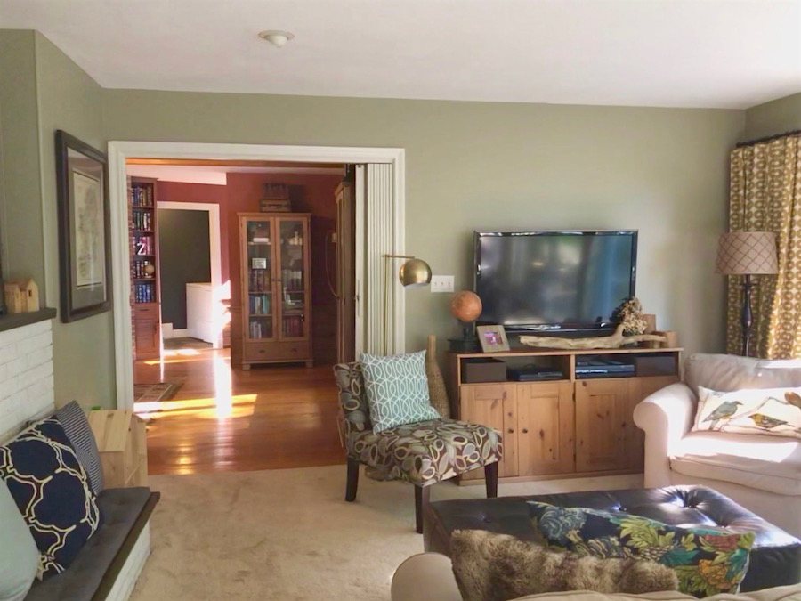
Therefore, the only other possibility is to put it on the eight foot long wall on the left, as you walk in from the dining room.
But, where to put the furniture? Which way does it go? The room is soooooooo long and narrow, and then trying to leave a 36″ for a walkway, plus two entrances, a sliding door out to the patio, and windows that leave no good space under them. Are you seeing my problem yet?
Yes, I see the issues clearly. They have not made it easy for you.
I know, I know… poor me with the beautiful view, but this room drives me crazy!
And, we haven’t even started with the dining room issues. So, let’s go over there now.
While we are blessed to have a home with three fireplaces, the one in our dining room is in fact a nightmare.
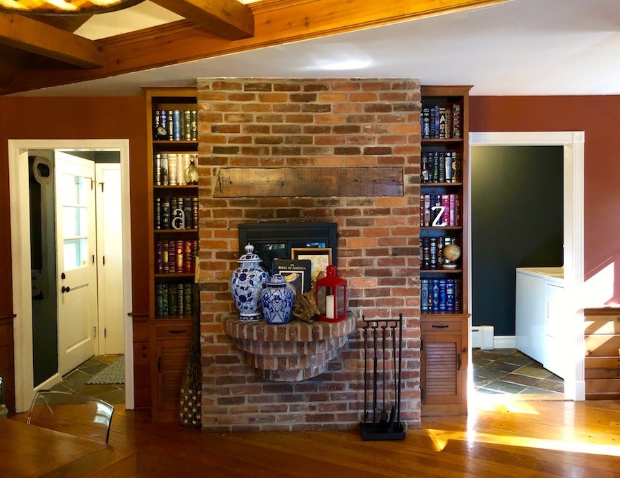
Even our mason had never seen a fireplace like it. It’s on the angled wall (Who does that?) Then, as you can see, the opening is off-center and to round-out the bizarre, there is this most peculiar, half-circular, tiered brick hearth cantilevered out from the wall.
Oh dear. That’s pretty bad.
While I love many things about our unique home, that is one issue I would be very happy to solve.
Next up in our den of the unusual is a five foot (of course, load-bearing) wall that breaks into the dining room like a cheese wedge.
Are you still with me, Laurel?
Yes, I’m here, but the cheese wedge is making me hungry. :]
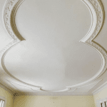
Oh, and then the ceiling changes height from 10′ to 8′ where you see that faint pen line.
How on earth do you make this look close to normal? I’ve tried to put a seating area near the fireplace, but then a dining table doesn’t really fit. And, it cuts off the walkway to the bathroom/laundry. Arrrggghhh!
Of course, we need a dining room table. But, even with a normal-sized table, there’s an awkward amount of space at the other end of the room.
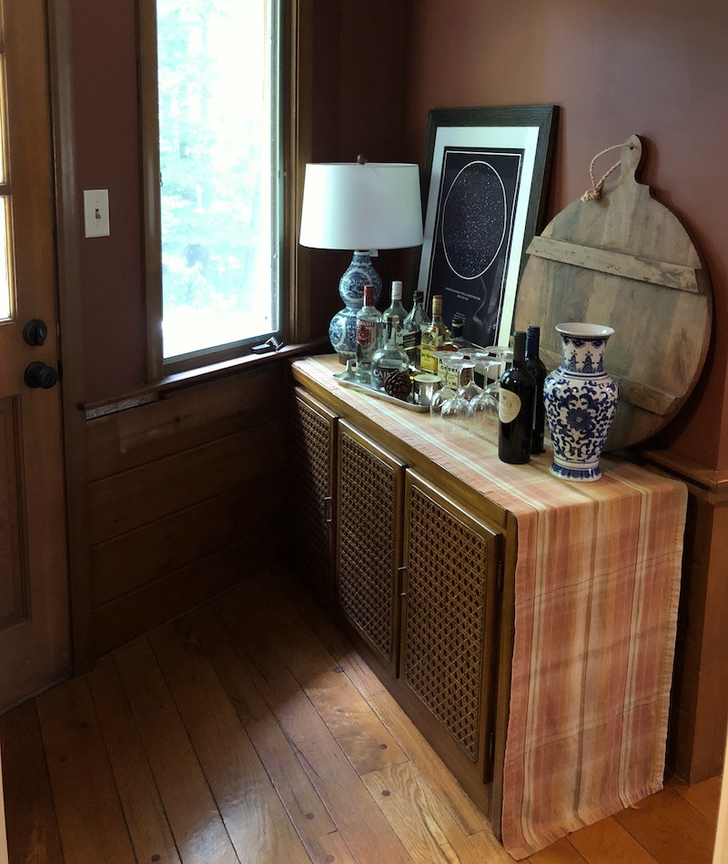
As for the cheese wedge alcove, well, right now, it’s the bar :o)
I think that actually looks rather nice.
I can’t even imagine how many emails you get, [you got that one right] :] and I am in NO WAY asking for free help. But, you asked for difficult, and THIS, Laurel is difficult. Happy viewing!
Kristen
- I hate all my living room furniture :o) It was purchased years ago for our previous condo, and since we can’t figure out how to lay out these rooms, it seems silly to buy anything else without a plan.
I’m proud of you!
I would love to chuck it all in a dumpster and start again. New furniture will happen in a year or two, once my youngest is potty trained (among other things) :o)
- The sofa is actually apartment sized.
- And the toys and play table – they are hopefully being banished to the playroom soon!
*********
Hi Everyone. Welcome to another installment of “difficult house layout.” I chose Kristen’s home this week because it is definitely one of the worst layouts I’ve ever seen. It is apparent that little if any thought was given to furniture placement and a lot of other things when this home was designed.
But thank you Kristen, for the floor plan and photos. I have a lot of ideas that I think will help make this unique home work better for your young family.
Before I get started. I did not interview Kristen and therefore, may not be addressing everything correctly. And, not to sound like some lame disclaimer, but this is not a substitute for professional advice. I am going off of Kristen’s measurements. Something I would never do for a real job. There are lots of things I can’t see.
Mostly, this is an exercise to show what’s possible, get us thinking in new and different directions, minimize mistakes and correct some other things to make this place a show-stopper.
The potential is definitely there!
One, thing that struck me that I didn’t comment on earlier is the term Mid-century colonial. If there IS such a thing, it’s not a term I would apply to Kristen’s home.
Think, Leave it to Beaver. THAT home is what I would call mid-century colonial.
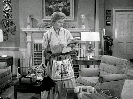
Awwww… brings such a smile to my face!
Kristen’s home may have a few Colonial or Federal features, however, from what I can see MCC is not the correct designation. This unique home is 90% mid-century modern in styling; with some rusticity which is appropriate for the beautiful wooded setting. The other 10% might be more trad, but over-all, this is a modern home.
Okay, we need to move on because there’s a lot to cover. Let’s bring that floor plan back down.
One thing, I believe that we talked about is what to do when NOTHING is working.
- Try stepping away and pretend that you are seeing these spaces for the first time and there is no furniture in any of the rooms.
- Reassess.
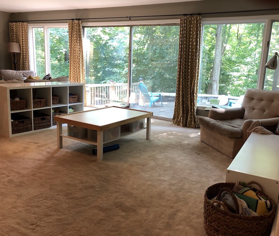
- We have a kitchen surrounded by two living areas.
- There is a too-long skinny living room.
- And, we have a too big, awkward dining area.
Now go and pour yourself a stiff piece of chocolate cake.;]
Here are my ideas and floor plan for this unique home. Please bear in mind, that there are other options, but this is good for starters.
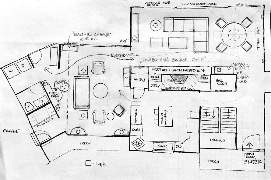
What if we moved your dining area to the entry hallway side of the living room?
I’ll let you chew on that one for a sec because I know that’s a big one to digest.
How lovely to be able to dine and take in the view. I would get a round table that extends to be able to accommodate 4-8.
But Laurel, I need to interrupt you. Two or three times a year, we need to be able to host holidays and might need to seat up to 14 at one table, if possible.
Yes, of course. I’ve got you covered.
I’m hearing that you would really love to get the TV out of the living room. Or at least not make it the main TV viewing area.
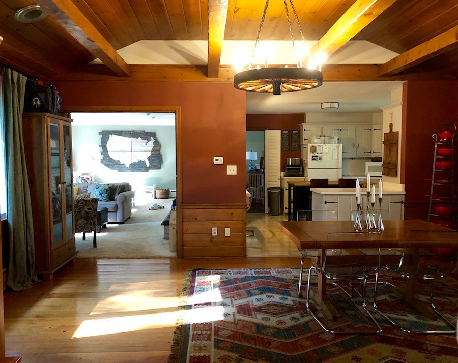
So, here’s what I think might work, but it would require some carpentry. I would extend the wall between the kitchen and the living room as you are looking into the kitchen from the dining room. It’s the wall in the middle of the image above. I would extend it about a foot to the left. (or however much is needed)
And that is because the “dining room” is going to be your brand new family room!
It is???
Yes.
In fact, when I first saw these images, I thought, why is this big room the dining room?
But, here’s what we can do. When you have a crowd for a holiday meal.
Get some folding card tables– three of them and put them together to make one long table. Add the demi-lunes to the ends. You will have a huge table. Please check this out for what I’m talking about and please excuse the plastic table-cloth. haha
Use the sofa for the middle of the table area. I would get some sort of cover for it. Pile the kids on it. They will love it. If my kids were sitting there, they would be leaping over the table to get out.
No problem!
Stick the coffee table in a corner. Use the small club chairs as host chairs. And the end tables wherever they will fit but out-of-the-way.
Now, you can host loads of people in this multi-purpose room.
For the living room, I put in a small sectional. It does not have to be a sectional, but I think that it will make a nice room divider.
The main focal point IS the fireplace. At night, you can’t see outside, anyway. But you will still see the view, in any case. If you like, you can still have a TV over a cabinet.
I’m not finished. :]
The rest of the issues I’ve noticed are elements that I think are not helping. And, I realize that these rooms are not finished in any way and that Kristen is using what she has. Also, I’m presuming that some things were there before she got there.
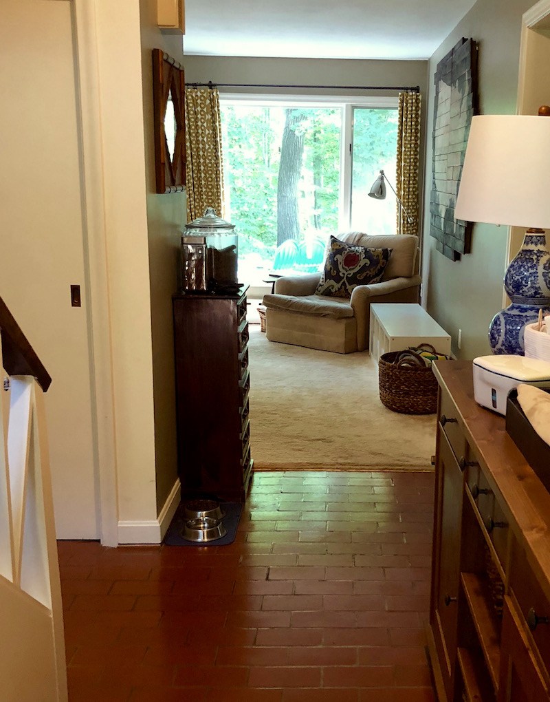
One of the most offensive things is the fireplace in the current dining room. Can we get rid of it? Please talk to your mason. You don’t have to bomb the entire thing and I’m fine with a brick wall.
It’s weird and using up valuable space.
I’m not going to address the specific furniture, but please do not overlap windows and furniture. (or doorways and furniture) I’m sure that you know that but didn’t have anywhere else to put the cabinet. I’m just mentioning it as a reminder for all of us.
I actually like the little bar area and think that’s a very clever use of the space.
It’s reminding me of Tara Sharma’s pretty bar area from this post from a while back.
I would really love to see the white not be here, above the beams. The best solution, I think, is to paint that area the same as the walls.
Kitchen cabinets. I don’t know what your plans are, but I see a rich khaki color, not white for this kitchen. That’s with the current color-scheme. If that changes, then yes, please do what works best for the new colors.
Houston, we have a problem! :]
And it’s not overlapping furniture walls and cabinets, this time.
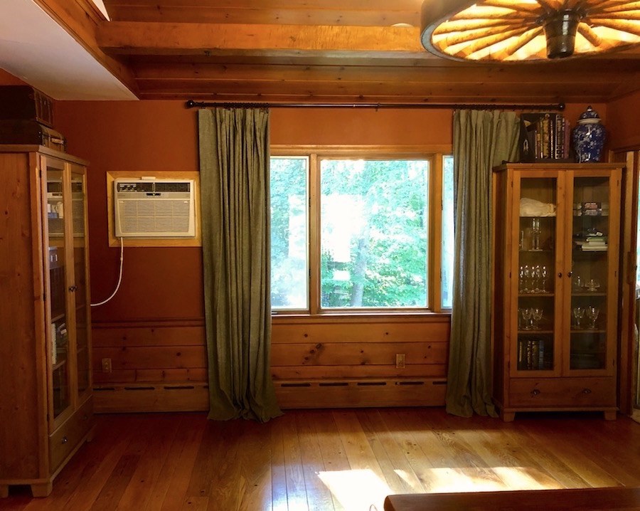
We need to take care of that AC.
Here’s an idea I discovered and I LOVE it!
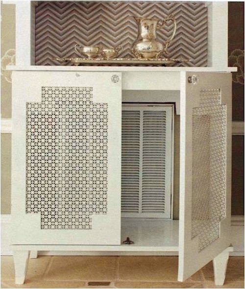 via The Sister Sophisticate blog Orginally form Better Homes and Gardens
The style of this piece while very pretty is not right for Kristen’s home, but the idea is wonderful, I think.
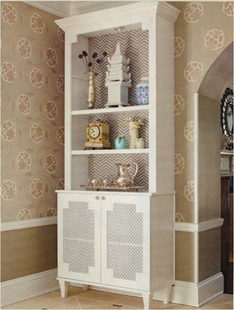
Kristen would need a full-size piece to go over the air conditioner.
If the outlet could be moved so that it is all contained inside the unit, even better!
Let’s look at the living room again
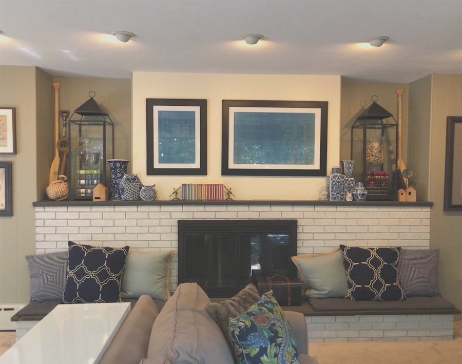
I feel that the fireplace area isn’t quite working.
First, I would paint everything one color. Yes, paint the brick too. The niches are challenging. I’ve always thought so. But I would go with less is more here. I think that there are too many disparate elements. I do love the large lanterns or whatever they are. I’m not sure what’s inside them. I think it would be cool if they lit up, somehow.
Ideally, I think that there should be one piece of art over the mantel. Or one mirror. A non-fussy mirror would be great to reflect the view.
And, I would probably not do the pillows, or maybe just two on each side. Right now, they’re a little too lined up and perhaps a little close to the firebox.
I do love the art wall on this wall.
Although there’s no crown moulding, the drapes are still hung too low. They should go up at least six inches, ideally. However, then they will be too short. This isn’t the worst thing, to keep them where they are, but raising them will elevate the room.
For more about professional looking draperies, please check out this post.
If these are new, then forget I said that. :] If Kristen wants to use these drapes and raise the bar– haha. Fine rod; then, a contrast hem could be added. Or rather, a plain linen in the background color. Since the sill is at 18 inches, then the hem should be about that height. It will look smashing.
One thing that’s bringing down this room, is the wall-to-wall carpet. It’s lacking in the sophisticated style, that I know Kristen wants.
I would put in a hardwood floor in to coordinate with the family room, if there isn’t one already.
Then I would do one area rug for the seating area and if desired, another one for the dining area.
Sea grass might be a great choice.
On the one long wall where there’s a piece of art, I think that an art wall with multiple pieces would be better. Right now, this piece is calling too much attention to itself and it’s fighting with the show-stopper behind the glass. That’s only my opinion. Art is subjective and it’s one thing I’ve always let my clients take care of, unless they want my help.
Well, those are my main suggestions.
Like I said, I think that there’s a tremendous amount of potential. And, I still think that it is best to work with a professional designer, but for now, we can see that it’s not at all hopeless!
There are a lot of design lessons in these posts; not just the difficult floor plans!
xo,

PS: If you’re interested, please check out the hot sales pages. Some sales are ending tonight.
Related Posts
 What Nobody Told You About Prepping Your Walls For Paint
- A Beautiful Home Renovation Makes Big Bucks For The Sellers
- He Wants To Keep His Big Black Sofa, But I Hate It!
- Is A Black And White Kitchen The Answer To A Mid-Century Mess?
- Help me please. My husband wants a matched set of dining room furniture
- The Wood Stain Color Is Too Red After Poly. Can It Be Fixed?
- Is Your Hardwood Floor Getting Wrecked? An Ages Old Solution