Dear Laurel,
It should really be “Oh, Laurel,”
Ten years ago, we moved into our dream home. We built it and did everything “right.” I mean, we didn’t want to muck this one up.
I mucked it up.
It’s not that I hate my home, I hate the beige decor.
Beige, beige, beige
and more beige!
My decorator INSISTED that my penchant for white would look “dated.”
Ha! If anything white, from what I can see is more wildly popular than ever; love it and I love gray too.
Love this post you did last December. This is what I wish my house looked like!
Some will say that gray is going to look dated too, but one of my favorite posts on your blog is the one you wrote about the fact that gray is an ages old classic color.
I also love the posts about the cool gray paint colors and the warm gray paint colors.
Hmmmm… Unless I missed it, I haven’t seen anything about beige paint colors on your blog. Now, why is that Laurel?
Never mind. You don’t have to answer that one. I know the answer.
It’s because beige decor SUCKS!
And, I’m a sucker for listening to that lame decorator; totally kicking myself. To make matters even worse, I can’t even go and kill her, because she passed away two years ago.
Geeezzz, I feel like a cruel, insensitive cow for even thinking that!
You don’t suppose it was the beloved beige decor that killed her do you?
Well, if it was; I’m a goner, for sure.
That is how strongly I feel about it. In fact, it’s made me feel a little ill since day one. Have you ever done something and felt that way from the onset?
Now, my DH. Bless him, however, he’s understandably getting pretty tired of hearing about my beige obsession. He thinks the house is fine and that it’s time I picked a new “hobby.” Sweet.
Of course, he’s right.
Here’s what I want.
I wish that we could have more gray and white.
Can you mix beige and gray? I doubt it.
Please, though. No judging. I’ve learned my lesson. Always follow one’s instincts.
We can’t go hog-wild with changes, but what can we do to make this look better?
Thanks,
Paige Onbayje
*********
Hi Paige,
I don’t think that all is lost with your beige decor dilemma.
Actually, in case y’all don’t realize it. Paige is another of my made-up amalgam of people. In other words, she’s a work of fiction. But, her plight is very real and not-at-all uncommon.
I so wish I could put up some images of that of which we are speaking. Blah, beige decor.
However, the blog has gotten to the point where I feel that unless I have permission, I shouldn’t use someone’s photos. Some people love their blah, lifeless rooms. And of course, would be insulted if I post them here as examples of what not to do. But believe me. They’re out there.
What usually makes it blah is that it’s a lot of the same. And usually there’s some bloated furniture involved, too.
The closest images I have are in this post about a bland living room. (not to be confused with this “Bland” home)
So, please go over and take a look and just substitute beige carpeting. Then, replace the coffee table with a banal golden oak one. Also, take out the sofa and put in a big hunk of ugly, instead.
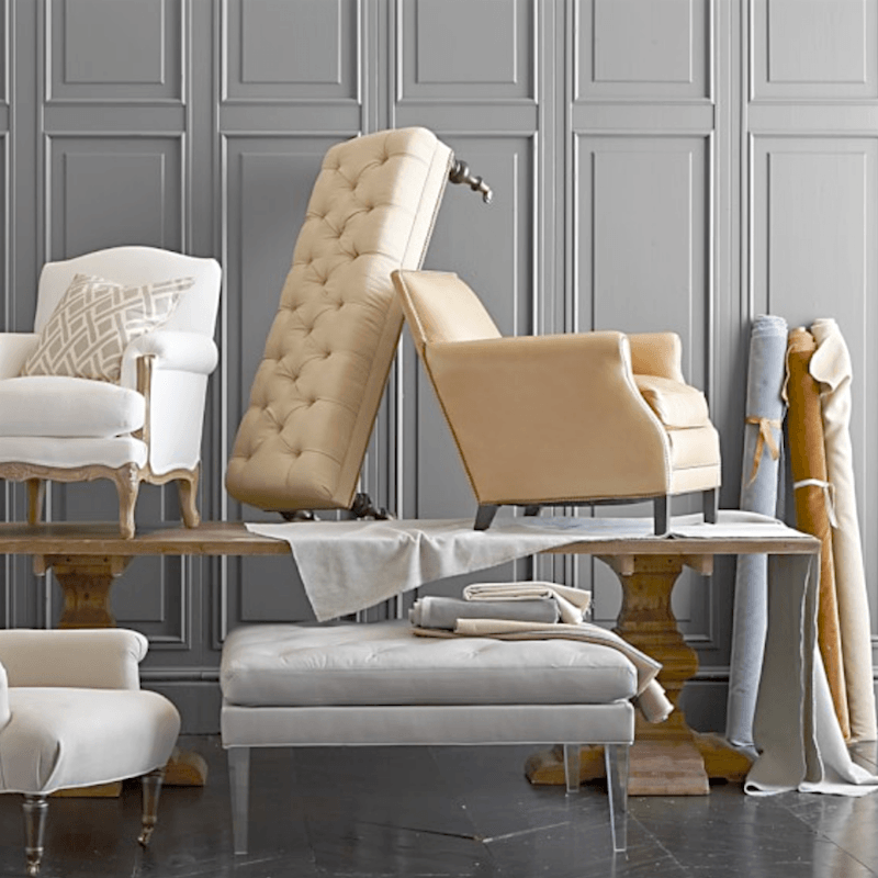
Okay, I found a pic from a furniture company. I won’t say who or where. :]
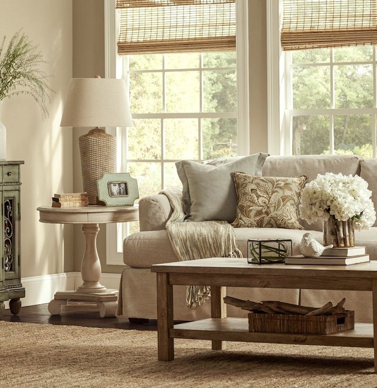
Actually, this is not the worst room I’ve ever seen. But, it is a little one note.
Okay, fine. It IS one note and it’s a flat note at that A flat B-flat! This room can’t decide if it’s going to be casual or formal. The coffee table looks out-of-place to me. I see a lot of ersatz too. But, you get the point.
Some small changes in this bland beige room would make a huge difference.
For instance, let’s say that we substituted the lamp for a blue and white Chinoiserie lamp. And, a far more stylish coffee table.
The buffet that I cropped, with all of the curlicues; that needs to go too. Love the windows, but they are crying out for some white linen draperies.
The walls we could keep.
OR change.
In fact, the walls could be almost anything!
And then, elements like the accessories can make a huge difference.
In other words, if you have a room that looks like this and you’re feeling that it’s tired, dated or just plain blah, it is not terribly difficult to make huge improvements with paint and accessories.
For kitchens that need a face lift. It depends. But, if you need to keep warmer, creams for tile and/or countertops, then don’t go TOO white with the other elements. You’ll still need to stay with a creamier tone for kitchen cabinets, most likely.
If there’s room in the budget, I find that changing the vertical in-your-face elements is far more beneficial than the horizontal counters.
If there’s an island, perhaps just change the island or the perimeter countertops, not both.
But over-all with a lot of beige decor, the problem isn’t so much the beige, I feel.
There are lots of beautiful beiges. The problem is the sameness– the lack of a beautiful, rich, complex color scheme. And usually the lack of both white and black and other dark colors.
And sometimes the lack of architectural interest.
Let’s not think just beige and gray, but other colors as well.
I also find that some gold is helpful to spice up a room.
And even in a monochromatic beige room, a shot of chartreuse or coral, dark blue— even brown can make it have more depth and beauty.
This is actually an extremely extensive subject because there are hundreds of ways we can go.
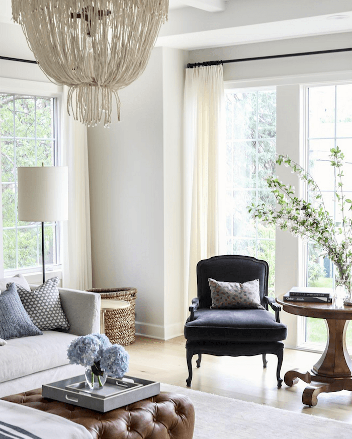
Here is a post from a while back with a similar idea.
However, please know that when it comes to beige decor, I think that beige and gray look fabulous together!
Ever go the beach on a cloudy day?
Gray and Beige. Right?
(I’m thinking beach, because I’m getting ready for a short vacay on Cape Cod this week!)
Mom Nature, is one of my favorite sources for color inspiration.
But let’s throw in a bit of drift wood, bright green seaweed, some pretty beach glass and a dead fish or two. Just kidding about the dead fish.
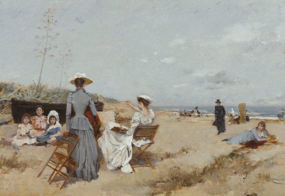
Francisco Miralles via Sothebys- Spanish Painting On The Beach
This turn of the century beauty is estimated to be worth between $20,000-$30,000.

An ephemeral excerpt from a painting at Ruby Lane Antiques– $7,250.00
Let’s look at some Gray and Beige Decor by some favorite sources and designers.
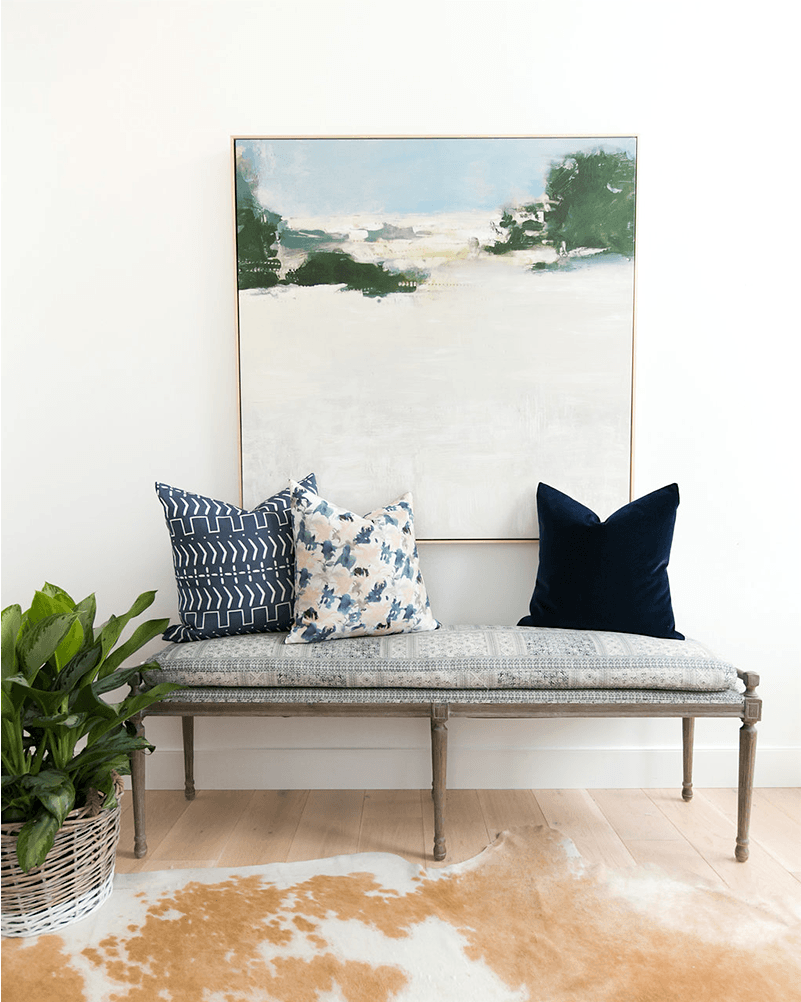
Beautiful vignette from Studio McGee. They say that they have the art piece above in their studio.
Did you know that they have a fabulous shop on their website?
Well, they do, and it’s one of the nicest collections out there, I think.
Below is one of my favorite fabrics in gray and beige.
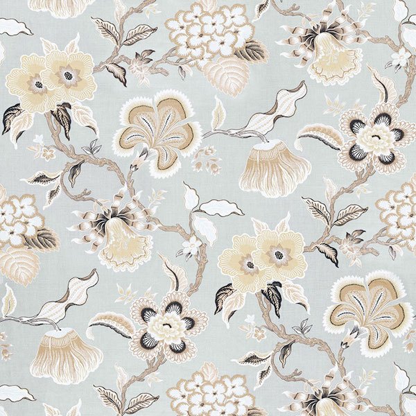
Schumacher’s Hothouse Flowers in Mineral

Here it is done up in a pillow from Spark Modern
And now for some more roomspiration (and some furniture too)
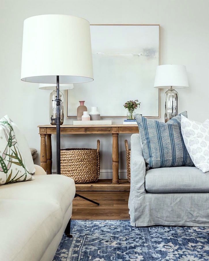
Another beautiful gray and beige room scene from Studio McGee.
When you think about it, we’re almost always working with beige or brown if we have a hardwood floor and any other wood for that matter.
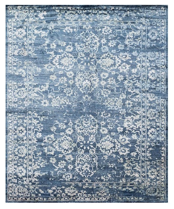 Gorgeous Miramar rug in a beautiful blue-gray that they sell on their website

Above are just a few of the dozens of rugs that from McGee & Co.
And they have a lot of gorgeous classic contemporary and new trad furniture.
It’s a little like hiring them. :]
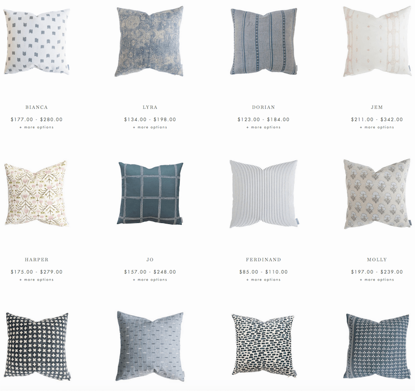
Fabulous pillows to add texture to a blah, beige room. (they have a lot more than this)
William McLure does tone on tone beige (and everything else) to perfection.
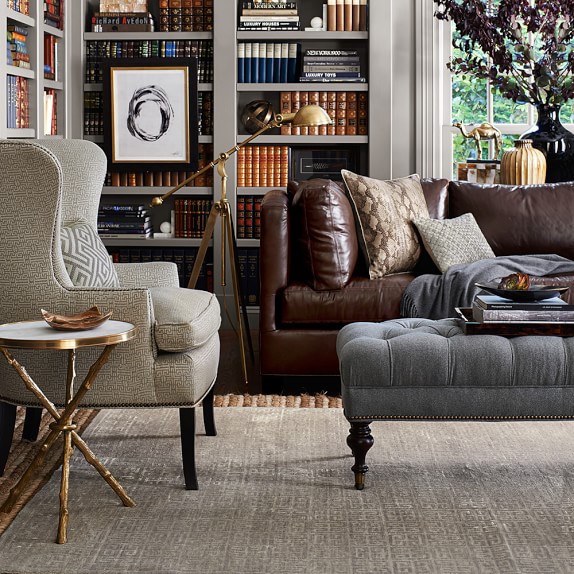
Lovely den in shades of gray, beige and brown – all furniture from Williams Sonoma Home
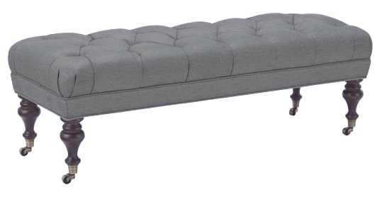
Classic gray ottoman from Williams Sonoma Home
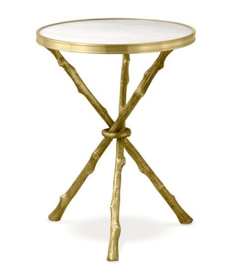 And the faux bois occasional table in gold is so chic.
I always love finding these small tables to use when there’s not enough space for something larger or next to a slipper chair.
In fact, Williams Sonoma Home seems to specialize in gray and beige furnishings!
Love Williams Sonoma Home
and they are having a 20% off sale on upholstered furniture at this time.
However, somewhere in my internet travels, I think it was on pinterest, I happened on a new firm that I then traced back to instagram.
The company name is Park and Oak. (above are the links to their pinterest and instagram)
And, the company principals are Christina Samatas & Renee DiSanto. Their firm is located in Glen Ellyn, IL, a suburb of Chicago.
I would say that their style embodies a fresh, young traditional aesthetic.
They primarily use a palette which focuses on whites, beiges, greige, cool grays, from light to dark. And a smattering of roses and purples, on occasion.
But, let me tell you are these women talented! That’s not a question. haha
Please enjoy some pics I swiped off their instagram. Please go over and follow them! (and then come right back, of course) :]
Elegant living room which beautifully combines traditional and contemporary elements. Plus pale, pale gray and beige. The wall color looks like Benjamin Moore Pale Oak. A Laurel Home Paint color!

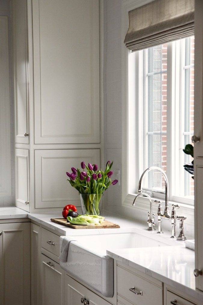
Wonderful kitchen. The cabinet color is reminding me of the DeVol kitchens.
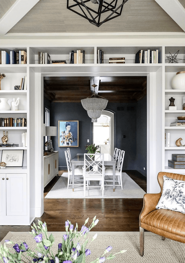
Oh, man, brilliant design! Here’s what I love. Many of you ask me how to do dark colors. Well, here’s a superb example of a home that’s largely pale colors and then sandwiched between two pale colors is the darkly enigmatic dining room. Love the Chinese Chippendale dining chairs.

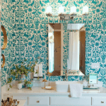
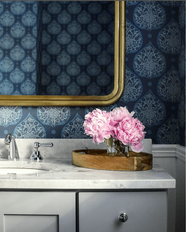
Look how the bathroom color palette below mirrors the John Singer Sargent painting above.
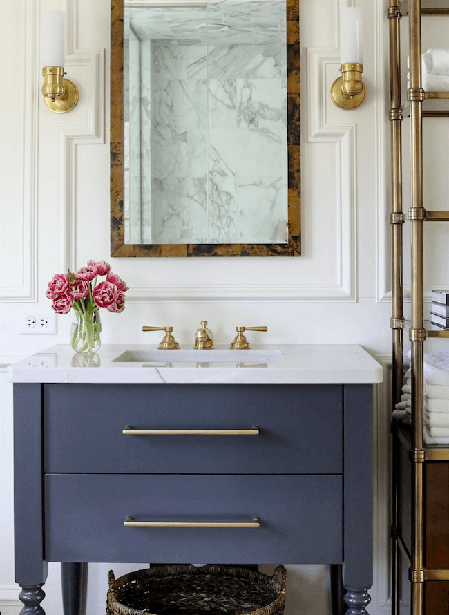
Love this bathroom. The moulding is so cool surrounding the mirror. The antique brass is reminding me of the post about door knobs. That looks like an authentic aged brass.
The moulding details add so much!
They didn’t say but this looks a lot like Benjamin Moore Boothbay Gray.

Benjamin Moore Boothbay Gray hc-165
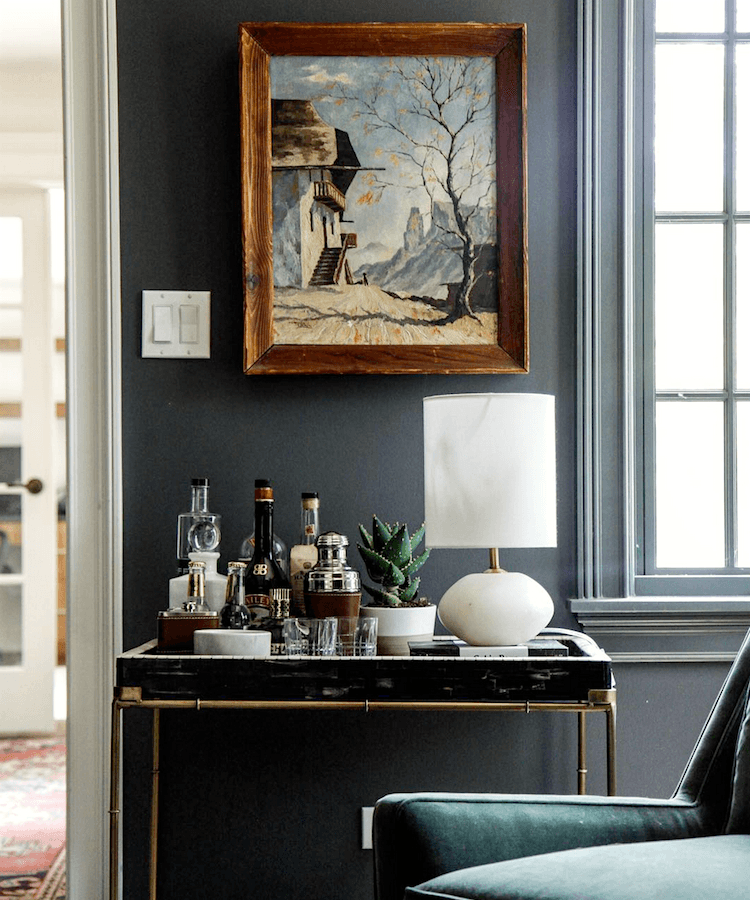
I ADORE this bar cart vignette. All of the elements of which I speak are here. And the painting mirrors the entire palette without looking contrived. Just gorgeous.
What I also love about their rooms is that they are neither overtly feminine or masculine. And that’s not always easy to do. I think that there’s an excellent balance of yin and yang.
One color that gray and beige decor love is GREEN. All shades of green, too.
Here are nine fabulous shades of green paint.
Speaking of fabulous!
Seriously. Where have they been hiding these girls?
Or maybe it’s me who’s been hiding? haha.
But, put your hand over the flowers and food. See how much that little shot of color adds?
Yes, yes, yes, I know, I know!
( and ahem…You have a little foam coming out of the corner of your mouth)
No worries, I’ve got you covered; the wallpaper info is below.
I did the Laurel method of finding products which I go over in great deal in the back of Laurel’s Rolodex. I have about an 80% success rate with it, as long as the image is clear.

Little Lotus in Ink from Galbraith & Paul
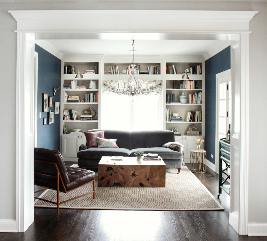
Gorgeous den. Looks like Benjamin Moore Gentleman’s Gray– another Laurel Home paint color.
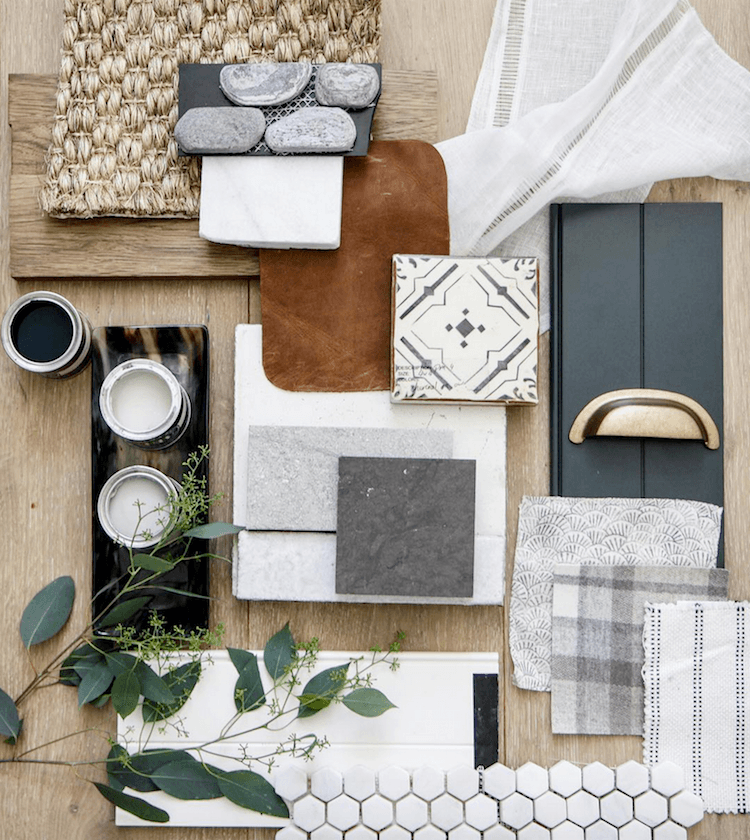
Above is a handsome flat lay of samples for a job. And that’s exactly how it’s done. Put everything together. If something’s not working, I always found that it would shout back at me.
I’M NOT WORKING.
And now for a little surprise. Last year I created these palettes for a post that no longer exists. (technical stuff)
But, here’s what I think is so cool. These palettes from last year mirror the colors used by Park and Oak Designs!
Please enjoy these three coordinating palettes using colors from the Laurel Home Paint and Palette collection. I think it’s a total of 23 out of the 144 colors of the collection.
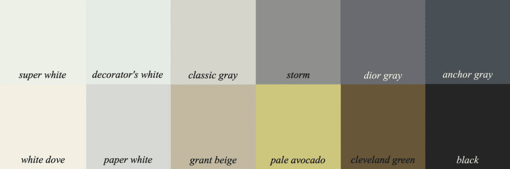
Palette number one has lots of whites, pale and dark grays, a little beige and a hit of chartreuse; plus that wonderful, warm bronze-y color Cleveland Green.
For those of you who don’t own the Paint Palette Collection. (yet) :]
The idea behind these palettes is not that you go and paint each room in your home one of these colors. No way! You might use two or three, OR you can also combine these palettes with other palettes in the same palette family. It’s all spelled out in the two-part guide which is nearly 500 pages filled with tons of info and inspo.
The palette indicates the colors that work together. They might be in a piece or art or a fabric. And of course, you don’t have to use all of them. Paint collection owners have 40 boards along with the furnishings and sources!
Palette #2 incorporates more color.
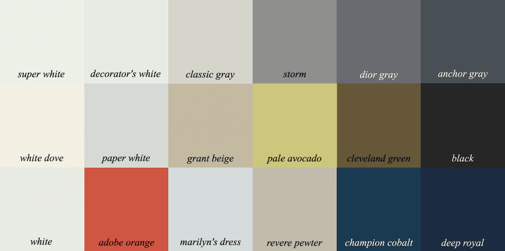
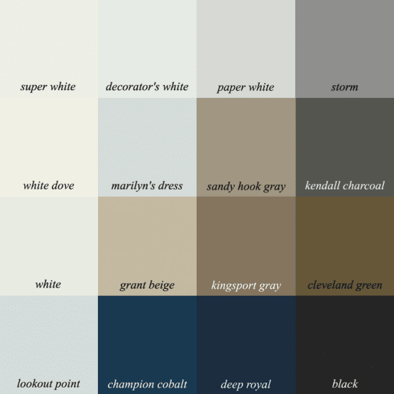
And because I love squares, here’s a square palette with just the neutrals and blues
The upshot to all of this is that beige is not a dirty word. Beige within a beautiful palette of neutrals, whites grays and blacks, with shots of other colors and gold, makes for a lovely color scheme.
And it’s possible to incorporate these colors in rooms that are currently all-beige.
xo,


PS: Please don’t forget that today is the last day of the Nordstrom Anniversary Sale.
All prices will be going up at midnight. (Sunday night at 11:59PM) Please check out some of my favorite items. You can start here and it will lead you to all. Lots of new things to see!
And also don’t forget the Serena and Lily Tent Sale. In fact, they just put their sale on sale. And by that, they are offering an additional 15% off. This too is only through the 5th of August.
Related Posts
 My Favorite Sources For A Chic, Affordable Medicine Cabinet
- Some Of Your Recent Interior Decorating Questions Answered
- What If Your Room Plan Falls Apart In The Middle?
- Can This Boring Bland Living Room Be Saved?
- Here’s How You Can Create Beautiful Rooms – Effortlessly
- Sisal Rugs Shocker + A Gorgeous Home You’ll Want To See
- A No-Fail Decorating Plan In Time for Christmas