Today, I want to go over one of my favorite topics.
INTERIOR DESIGN MISTEAKS ;]
Oops! I meant MISTAKES. ;]
Oh, we all make them. Believe me. I’ve made a lot more than 21.
Please tell us, Laurel. How many interior design mistakes have you made?
Well, don’t need to go there. haha. However, if you’d like to read about 15 truly horrendous mistakes I made with fabric and upholstery materials, please go here.
Okay, there’s a lot to cover, so we need to stop kidding around. Okay? Thanks Guys! Therefore, it’s time to go over 21 + interior design mistakes that could cause your room or space to end up being something you don’t want.
Naturally, nobody wants to make expensive interior decorating mistakes. However, it’s not always your fault. I mean, you don’t know what you don’t know.
Interior design mistake # one!
Thinking that you can do EVERYTHING on your own.
- Doctors ask their colleagues for opinions.
- Designers ask their colleagues for opinions too!
Even if you are doing most of your decorating on your own, I can’t stress enough the importance of getting a professional pair of interior design eyes on your project, and the earlier, the better. In addition, I would see if you could work with someone on an hourly basis.
Which is worse?
- Spending $2,000 for professional advice.
- Spending $20,000 or more to fix a colossal mistake.
I promise you will not regret it; unless the interior decorator is a clueless toad.
Most are not.
Many want to know how to hire a designer, so please check out:
I Think My Interior Decorator Might Be Ripping Me Off.
My Interior Designer Fired Me. What Did I Do Wrong?
Still, most of my colleagues are talented and ethical. Ask for references and look at their work first. Most designers will consult in two-hour increments. Expect to pay a minimum of $350.00 up to $1,000.00 for a 2-hour service.
Although, this well-known designer charges $2,000 for a 55-minute consult.


Yes, you read that right. And, no, I’m not going to comment further. :]
Next is one of the most common interior design mistakes.
The furniture Doesn’t Fit In The Room.
That’s because you thought you could do everything on your own. However, you plunked your money down on furniture that you CANNOT RETURN.
AND, It seems that there’s a trend for houses to be getting smaller and furniture to be getting bigger and bigger… Oh, we’ve been through this before.
And, here too, with some interior designs, you’ll regret. But, I can’t tell you how many times I’ve been in clients’ homes where the furniture did not fit in the room; or the furniture was so BIG, BLOATED and BULKY one could hardly move through the space.
OR, they couldn’t get it through the door, or, up or down the stairs.
It’s so awful when that happens.
Oh, so many interior design mistakes wouldn’t happen if only we had a thorough and cohesive decorating plan.
Walking into a furniture store without having a crystal clear BLUEPRINT for what one needs is a recipe for disaster. And yet, how many people go shopping with their floor plan and measurements in hand? A few, perhaps. But, the majority have no clue what furniture they want to get before they go shopping.
But, professional interior designers decorate their client’s homes by creating a solid plan.
Actually, it’s the same as building a home.
Your architect will draw in great detail every inch of your new home. And he’ll revise as many times as is necessary to get it right. He even has to submit his PLAN to a town, most likely.
It’s the same when furnishing your home. It’s not easy, and by making a strong plan before shopping you will avoid making a lot of mistakes.
Here is an example of the furniture-not-fitting interior design mistake that is almost not a mistake. It looks like the people found a sectional and tried to make it work in this space. Unfortunately, the doors are jammed right into the arm.
Alas, this is another situation that if they had worked with a designer, they might’ve been able to come up with a different solution for the doors, plus a few other minor details.
Above in this gorgeous library by Jeanette Whitson is a sectional designed to fit perfectly in the space. Yes, this is expensive. But, I recommend checking (and double-checking) the dimensions before purchasing.
This next interior design mistake isn’t talked about much.
But I think it’s the reason that there’s so much bad design out there. Remember the phony “French” kitchens?
Decorating your own home or someone else’s without having a basic understanding of historical styles is IMO, a very bad idea.
I believe that all great design is based on classical architecture and proportion. And, that includes modern and contemporary styles, as well. And if you’re an interior decorator, this is one of a handful of classes that I believe is super important to have under your belt.
Understanding the historical styles of architecture and furniture will give a solid foundation of understanding how to create a classical furnishings scheme.
There’s more about classical furniture here. And you will learn the difference between modern and contemporary and how to mix those furniture pieces with “traditional” furniture.
In fact, these terms are so frequently misunderstood and can be subjective. Therefore, it’s probably better to create a dialog instead of a label.
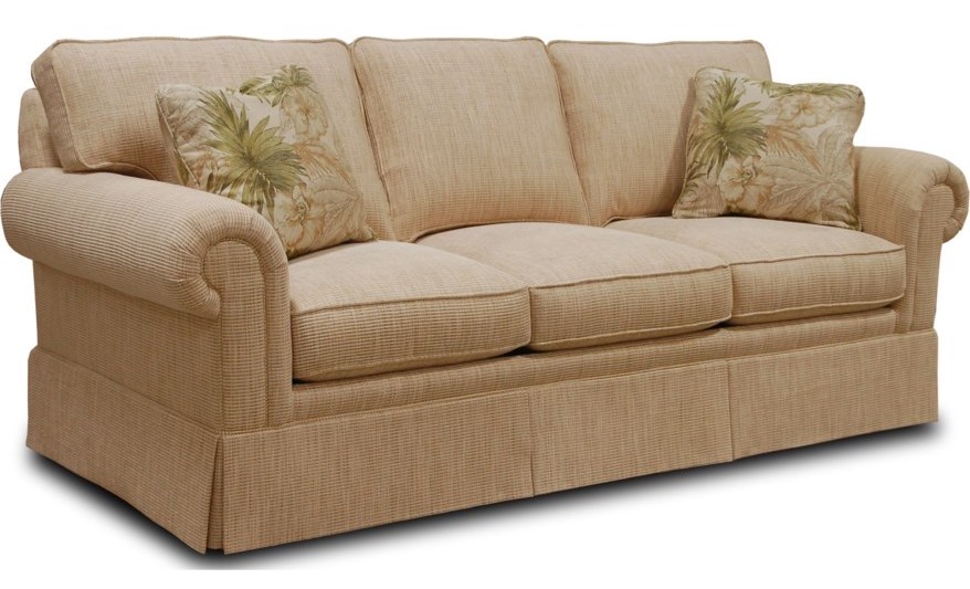
One of my biggest pet peeves is calling a sofa with a skirt – traditional. There is nothing traditional about a sofa with a skirt. And, not to say that there’s anything wrong with a sofa with a skirt. However, it’s a 20th-century invention.
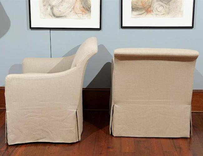
Rose Tarlow chairs with skirt
But, is it traditional? No, it’s not; these chairs with lovely waterfall skirts from Rose Tarlow are stylish and classic, yet contemporary.
 I don’t know how to classify most of the others, like the one above referred to as “traditional.” I know everyone calls this traditional. But, what tradition are we mimicking?
Below are a couple of examples of traditional sofas:
Early sofas, called Canapés (in French), did not have skirts.
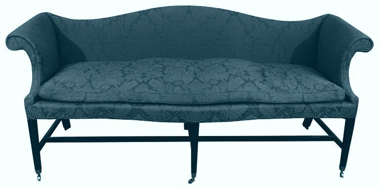
This antique Chippendale sofa is a traditional sofa.
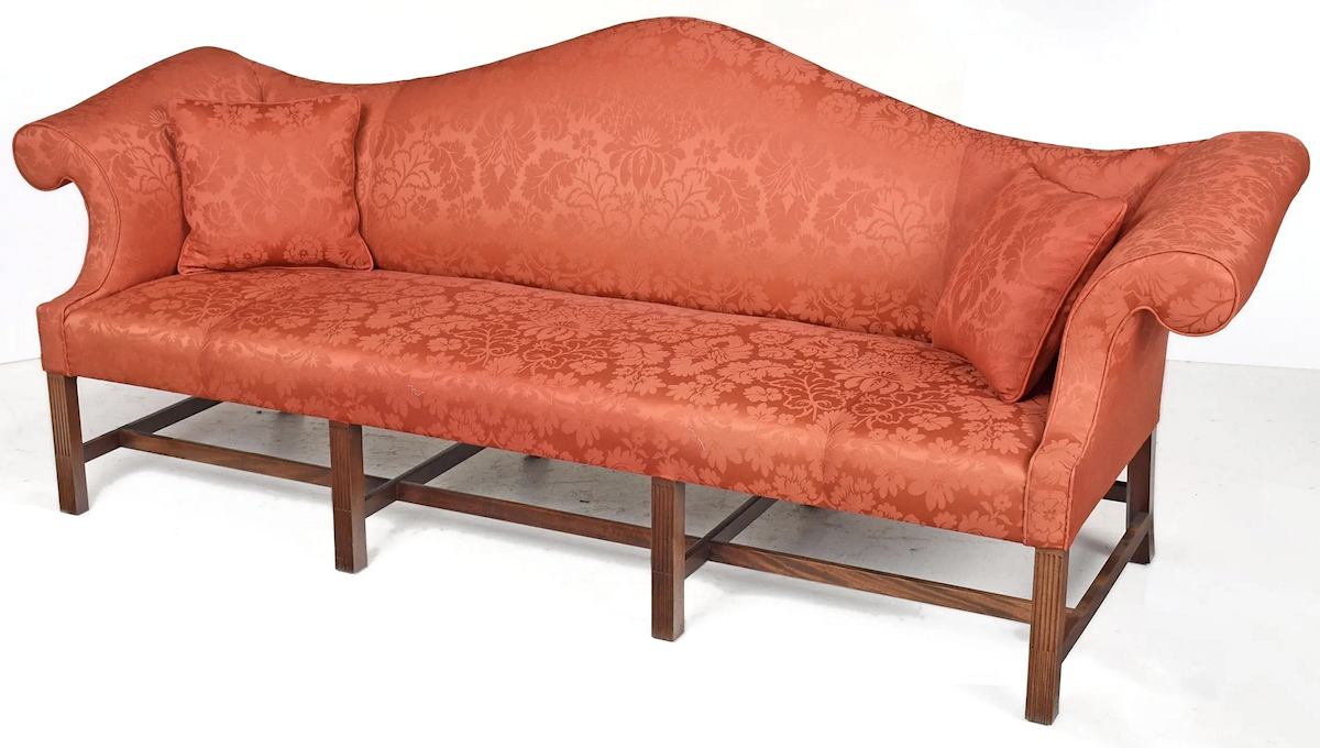
The sofa above, one of a pair, is contemporary. But, they are an authentic copy of an 18th-century Chippendale sofa. (of the period)
Understanding classical style is crucial for understanding beautiful proportion and scale, which I think is frequently missing in today’s furniture. For one of my favorite posts about classical proportions, please go here.
One of the significant interior design mistakes I have seen numerous times is not having a sense of entrance.
Creating a sense of entrance is an important design rule I did learn in interior design school. Thank you so much, dear Maggie Cohen, my space planning instructor in 1988!
Why is this photo so weird, you ask?
Long story. lol. Let’s move on…
Creating a sense of entrance is rule number one in space planning. I cannot see how to enter this space, and it might be fine if the primary entrances are from the sides of the room.
However, if the main entrance is from behind the sectional, this is no Bueno. It’s not very gracious to have to walk around a big piece of furniture to sit down.
But, the configuration must make for a good conversation grouping.
Next on the list:
You have a plan, sure, but it’s not a good plan.
Like, I’m just going to trot on over to Bob’s Discount Furniture and get me a matched set of dining room furniture for only $4,794.38 (70% price SLASH BLOWOUT SACRIFICE!), which includes FREE SHIPPING!!!
Big eye roll here. Please remember that there is no such word as FREE anything in the furniture industry, much less free shipping.
And believe me. Bob isn’t sacrificing a damned thing except for the poor trees they cut down to create this drek.
I realize that’s nasty. But, so is the deforestation of one of our most precious resources.
If your budget is meager, I fully understand. Here’s one of my favorite posts about how to score free or nearly free furniture.
I’m all for recycling furniture if funds are tight.
Just know, when it comes to decorating, I feel pretty strongly that the words “matched set” need to be obliterated from the land!
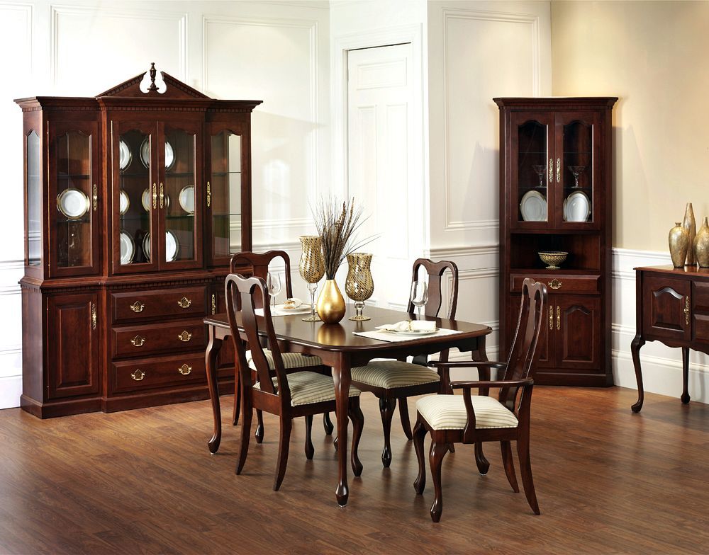
And, while we’re at it. The so-called “traditional” “Queen Anne” dining room set is NOT Queen Anne!
These are late Queen Anne dining chairs from the early 20th century. Technically, that makes them Queen Anne-style as the Queen Anne period was from 1700-1760. Still, Please notice that they are only 37.5″ high, not 45″ high! And, they are made from Burr Walnut, which is quite beautiful.
Yes, they’re a lot more money. I’m all for cheap furniture (that doesn’t look cheap). But the matchy Queen Anne-faux-style furniture in the dining room is incorrect. Of course, there’s much worse. But, my original point is no matching furniture sets, please. Remember the woman whose husband insisted that everything matches?
The best rooms look like they evolved. Right?
Well, I think so. I know; it’s not easy to do.
Here’s a formula I created recently about how to achieve the eclectic mix.
But, another interior decorating atrocity is lining everything up against the wall. That is if you have walls. ;]
Plus, we have another matched set of ersatz, fake, phony so-called “traditional” furniture.
You can see more of the same and even worse, here.
Here’s a good post on bedroom decorating ideas.
And while we should strive for a balanced, symmetrically pleasing design, too much symmetry can make a room feel contrived, stagnant, and tiresome.
I have to be careful when I put up examples of doing it wrong because sometimes it’s a fine line.
By too much symmetry, I mean like there are two of the same for practically everything. The room is like 20 pairs of identical twins!
Mirrors, lamps, sconces, chests, candlesticks, urns, chairs, occasional tables, floor lamps…
Well, what is the limit on pairs?
Good question. Maybe up to five or six, with lots of single items. If it’s an entire room, I think it’s okay to have more pairs than if it’s a smaller area.
And, also it’s good to have some symmetrical balance without it being identical. Sometimes, just mixing up the accessories is all that’s necessary. I think the post on bookshelf styling gives a good idea of how to create a symmetrical balance.
Below is an excellent example of symmetry that is pleasing without going overboard.
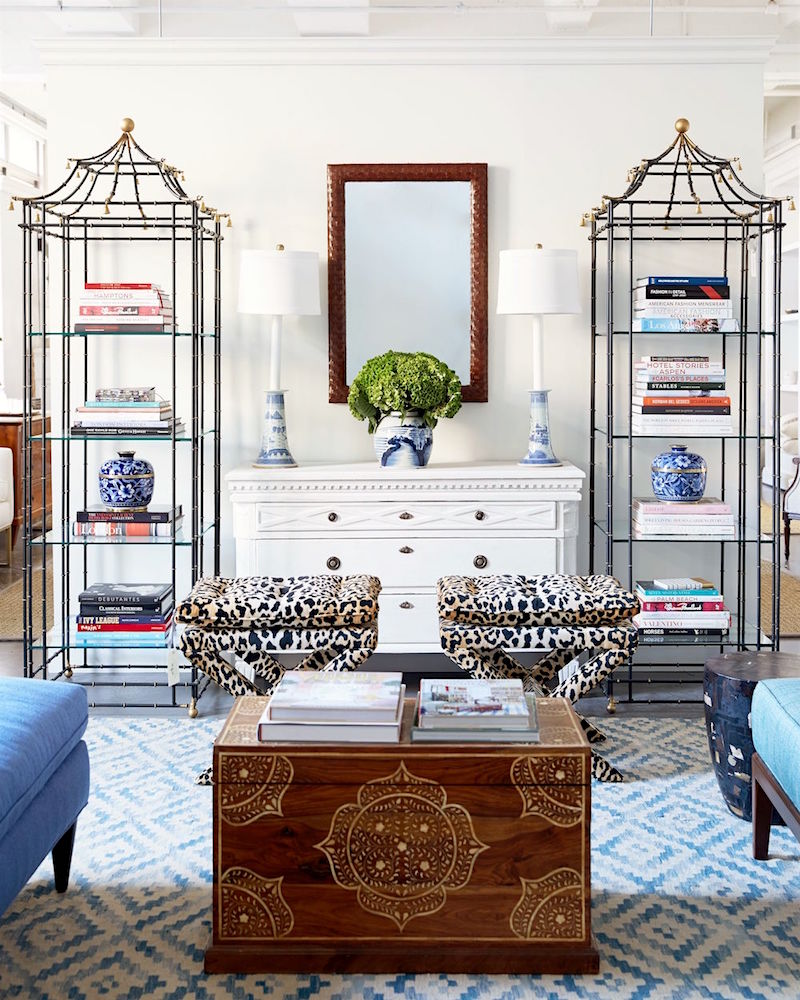
Via OKL
Here, we can see that the main furniture is balanced but different. Plus, there are a lot of single pieces as well. Those etageres are way cool!
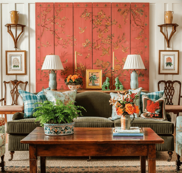
James T Farmer always gets his symmetrical balance exactly right.
Although I think it’s an interior design mistake if nothing matches. Then, it can look like too much of a hodgepodge.
For more of my furniture favorites, click here.
And, of course, check out this page for more obsessively curated furniture, lighting, and all home furnishings.
And, if you’re looking for bargains, please shop my hot sales pages!
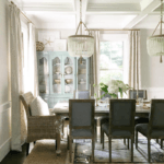
Shot for OKL in NYC on Jan 16, 2018
Story: Michael Bastian Home Tour www.michaelbastiannyc.com
Producer: Niki Dankner
Stylist: Anthony Santelli
Above is an excellent example of symmetrical balance. This is more difficult to achieve, I think. I realize that some will think this is too busy. But for this collected style, I think that it is very well done. Please also know that in photos, rooms can appear busier than in real life.
LIGHTING can present many challenges and can contribute to many interior decorating mistakes
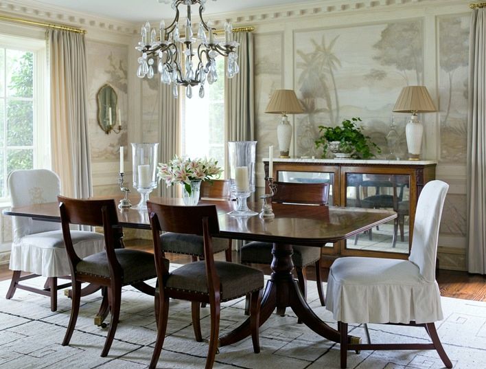
The chandelier is too big.
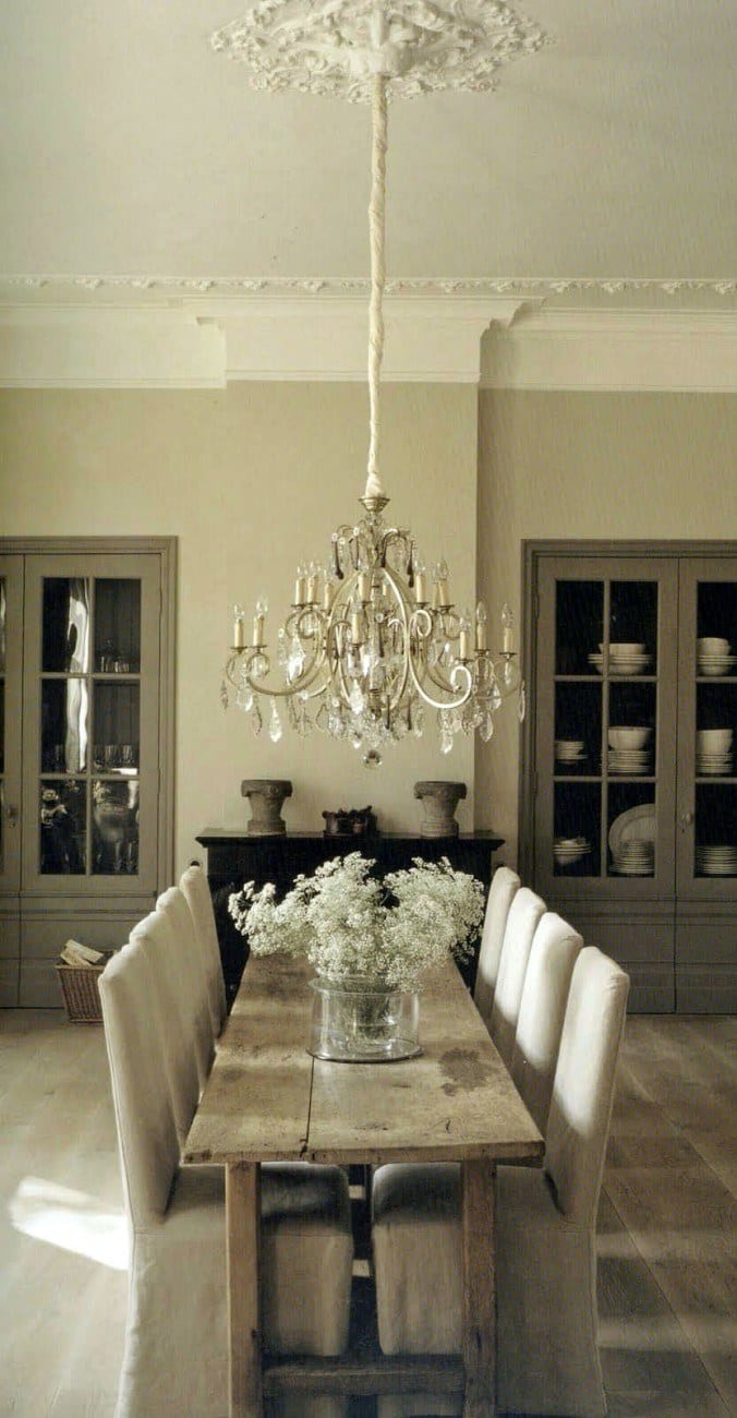
This is a pretty room, but this chandelier is way too big for this very skinny table. Actually, the table is ridiculously skinny and, in this case, probably the more significant problem!
Here are some great ideas for inexpensive but great-looking chandeliers?
A good rule of thumb for dining chandeliers: The diameter should not exceed the table’s width by about 10″ or so. Therefore, if your table is 42″ wide, I would not do a chandelier more than 32″ in diameter– tops.
This chandelier is also hung a bit too low.
A good rule for the height of the chandelier is about 30″ above the table. Sometimes it can be a bit lower. Or, it can be higher if the ceiling is higher than nine feet.
By the way, if you’re interested and don’t have it, I created a PDF guide that gives some 333 rules and tips for decorating.
I think this is too low, mainly because the guests at this table will be black and blue from knocking into each others’ knees and feet, and then they will conk themselves in the head on the chandelier. They will hate you and never come back.
In addition, you should have at least one foot between the tallest point of the chandelier and the ceiling as an absolute minimum.
So, if you have an 8′ ceiling, the maximum height of your chandelier or pendant can only be about 24″ tall. Table height is at 30″ + 30″ + 24″ + 12″ = 96″
Or, the chandelier is too small. But better too small, than too big.
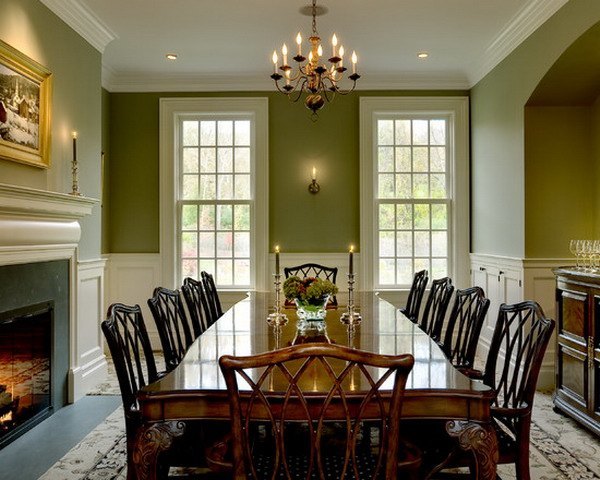
This chandelier is too high, as well. Although, I think that this is a beautiful dining room. One other consideration is room size and ceiling height. This is a generous dining room with a large table; the table is probably about 42-45″ wide.
The room height is about 9′ to the ceiling.
This chandelier looks to be about 24″ in diameter. I think that a good size diameter chandelier for this table would be an absolute minimum of 28″ (and with more going on than this, like some crystals) but more like 30-34″. It also needs to come down about 12-18″ +/-. Hard to see exactly from a photo.
A good rule of thumb to use loosely for chandelier diameter is to take two sides of the dining room and add the numbers together. For instance, 11′ wide x 15′ long = 26″ in diameter chandelier.
There’s a lot of great information in this post about chandeliers and sizing.
But, for more detailed info about this and 333 other things, please check out my 200+ page rules & tips guide.
My rule of thumb is if in doubt, scale down with lighting fixtures.
Also, please be careful with table lamps. They keep getting bigger and BIGGER AND BIGGER!!!
I now see table lamps that are as much as 34″ tall with a 20″ wide shade. There are rare exceptions, like I have a friend with a very cool classic-contemporary living room, and she has low side tables with tall retro lamps that are sensational.
But, if you have an average height end table, that is, say 27″-28″ high, and then you add a lamp that is 34,” it is probably going to look almost comical. Just be careful.
Above is a beautiful, traditional dining room that demonstrates my point where everything is just right.
by James Michael Howard. (aka Jim Howard, husband of Phoebe Howard)
This is a perfectly executed dining room. The chandelier is in perfect proportion to the room and table and hung at the ideal height. The furniture is not a matched set but looks great together as the lines and colors are complementary.
To finish off lighting, one of the worst interior design mistakes is the single flush mount downlight. This post explains in better detail why it’s so bad and what to do instead.
Lighting is everything. That’s how important it is, and if careful consideration is not given, your room is going to be a horrid place to be in, at night, no matter HOW beautifully decorated.
For more about lighting, please click to read this post as well.
And art too, for that matter. Dinky mirrors and art are not chic.
I love Tory Burch’s gorgeous painting here and the rest too.
On the subject of hanging art. There is a tendency for many people to hang it too high, and the center should be at approximately eye height. Of course, there are exceptions.
You are choosing fabrics, or carpeting, etc., in the store only. You need to look at these items in your home, in your lighting, or you might get into serious trouble.
I had a friend years ago who sheepishly told me that her new pink carpeting looked beige in the store. Lesson learned.
Speaking of carpeting.
Wall-to-wall carpeting is usually a mistake with the following exceptions.
Except for a very small room, den, or a bedroom, unless it’s something like seagrass or a cool leopard print is going to bring your room down a few notches. Now, I realize that a lot of you have wall-to-wall broadloom.
Oh, make no mistake. I had it too! For five painful years. And it was the happiest day of my life when they ripped that pink sucker up!
However, if you like it, then fine. If you’re doing it because you want to save money, I’d try to figure something else out. I would rather see a cool sealed concrete floor than a wall-to-wall broadloom.
And please watch your area rug sizes!
Most living rooms need at least an 8 x 10 rug. If you are layering, you can sometimes get away with a smaller rug. Here’s one of my favorite ways to layer rugs.
This is another common decorating mistake.
I Need To Figure Out the Room’s Theme and Then Just Run With It.
When I was having my second child, a good friend asked me what was the “theme” of the baby’s room? She was horrified to hear that I had no “theme.” You don’t have to have one either. And if you do, please keep it subtle. (very subtle)
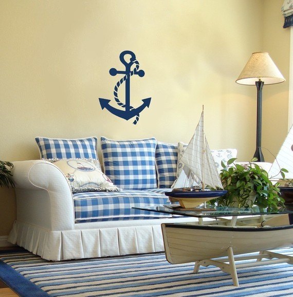
Anchors Away!!! LOL
Oh, it’s so hot, and I need the air to move, and I also need light. Here we go!
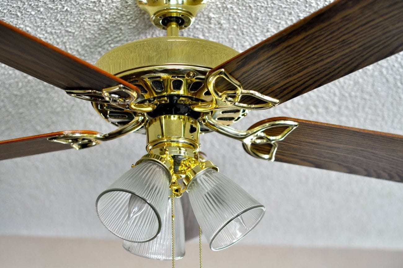
No, sorry; here we don’t go! The problem is not the fan. I love fans. And I know that my southern readers would rather stick their heads in the oven than live without their fans.
The biggest problem here is the three searchlights glaring down over the room.
They give off THE worst light. And, except for a kitchen, and small spaces like powder rooms and hallways, you don’t need a ceiling light at all.
And, even in the kitchen, you can have lamps and sconces to augment any ceiling fixtures. More about kitchen lighting here. And here is another good post about kitchen light fixtures.
Generally, if the ceiling is light or pale, I prefer a white fan.
The exception is this beautiful apartment that has a vintage fan. Fabulous!
And here is a post all about fans that I love!
Please pin to Pinterest for Reference
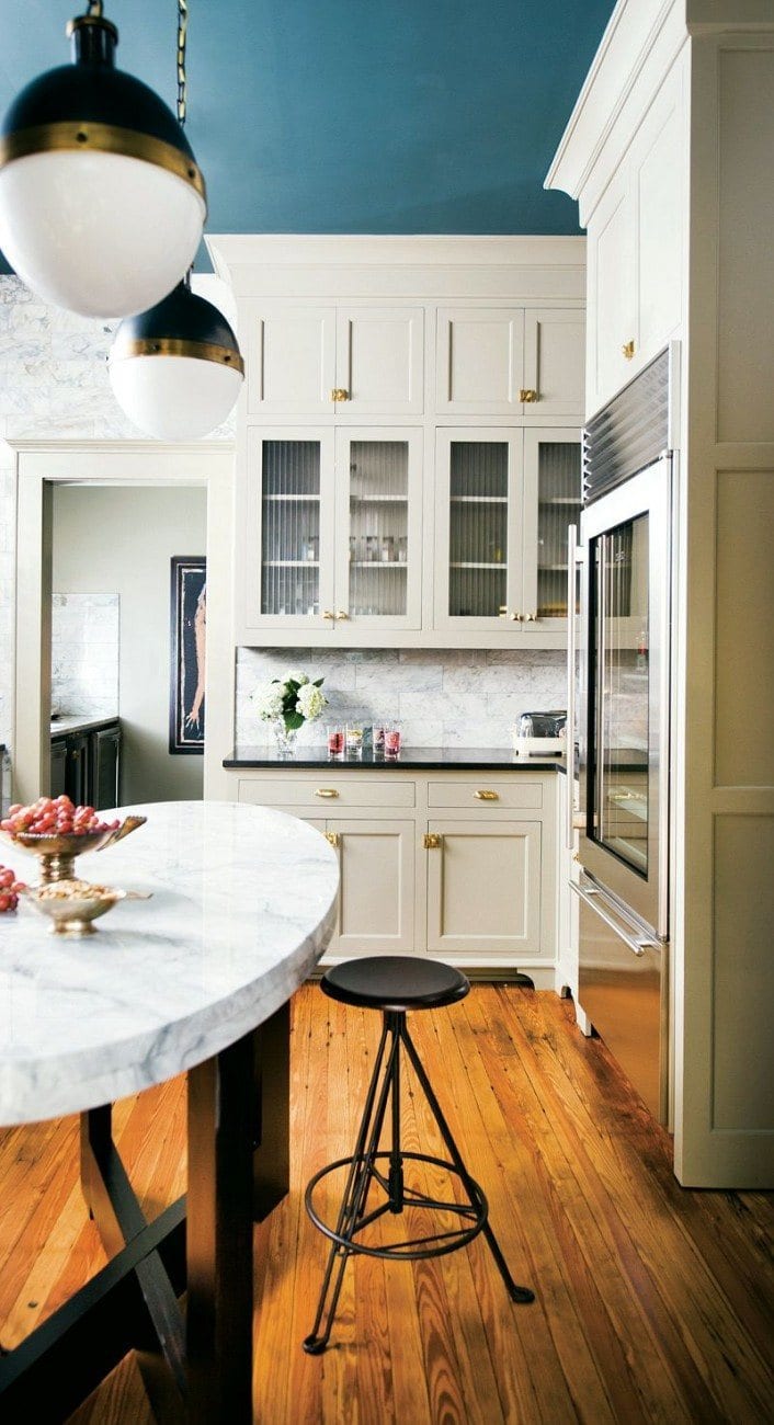
Speaking of ceilings. The belief that the ceiling ALWAYS has to be white is a mistake. It’s not the biggest mistake one can make, but you might be losing out on something special. And, painting your ceiling a deeper color will make it look higher. Dark colors recede, as we saw in this post.
Remember the fabulous shimmering ceiling in this post?
And one of my favorite posts that has lots of ideas for ceilings. Actually, wait. There’s this post too!
Oh, geeezzz. This one too.
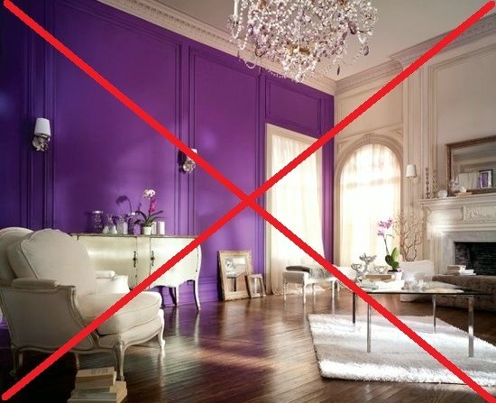
Uh oh. IF you are doing an accent wall, meaning one wall that’s either painted or papered in something that the other three walls are not, there better be a bloody good reason. And there definitely ARE some times when an accent wall is wonderful.
- When it makes architectural sense.
- A dark wall behind a TV to “hide” it. For more about ways to conceal or hide the TV, click here.
- Behind a bed in a boring boxy bedroom.
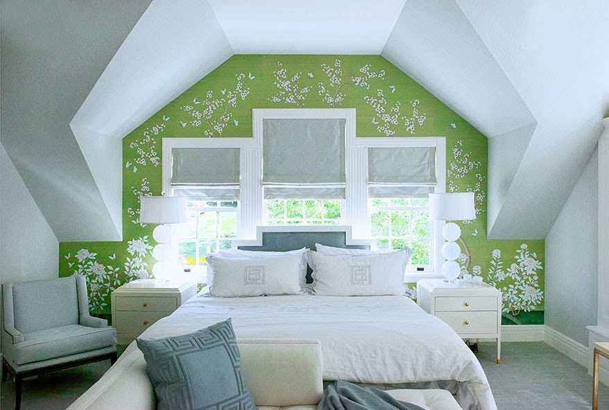
One of my favorite accent walls that enhances this bedroom so beautifully is this lovely one by Laura Tutun.

Décoration Paris appartement haussmannien-Marion Alberge
This accent wall makes good architectural sense in this lovely home.
The worst reason to do an accent wall is because you’re afraid if you paint the color on all four walls, it’ll be overwhelming.
It’s more likely to make the color MORE overwhelming to paint it on only one wall. And it may very well look like you forgot to paint the other three walls.
Some Make The Egregious Decorating Mistake of Getting Wimpy With Paint Colors.
This is why I wrote my paint guides and created the palettes.
Oh, that reminds me. One of the sweetest readers, a woman named Pinkie, who always comments on my posts on Facebook, posted a little vignette using Dolphin’s Cove. One of the Laurel Home 144 paint colors.
Hang on…
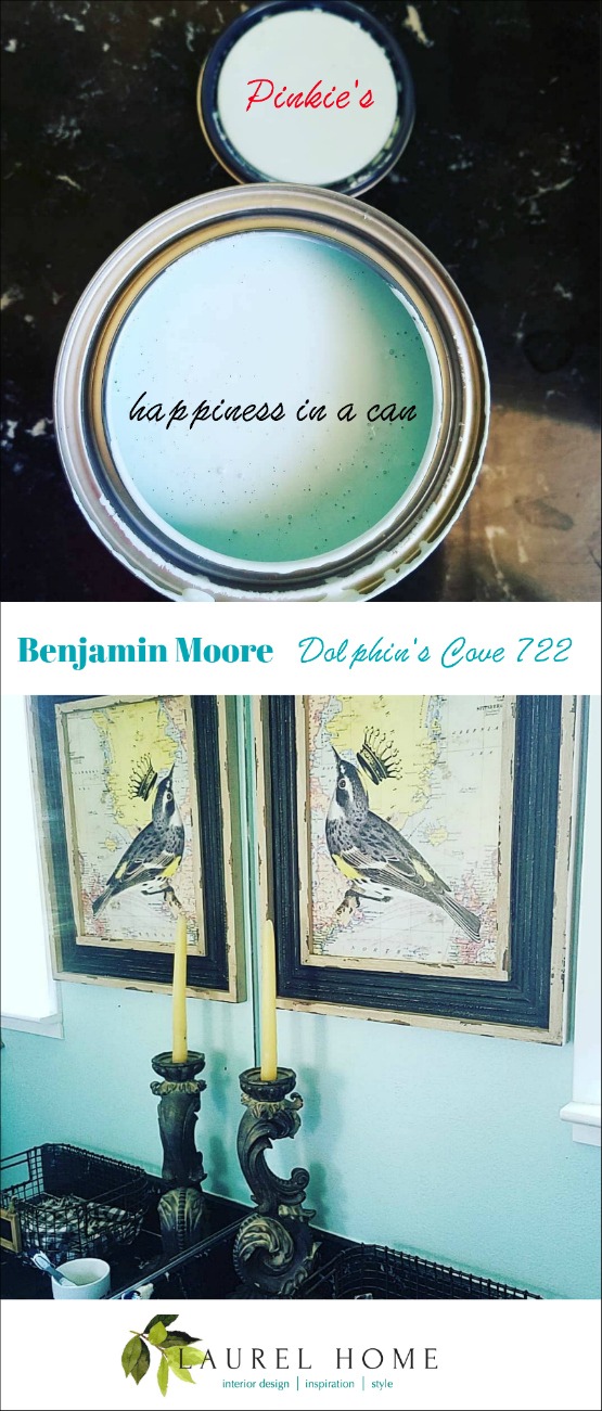
How pretty is that!
Here’s another post that has a lot of my favorite colors, and you can see how great they look in the photos, as well.
But, related to playing it safe is not knowing how to work with colors.
The ol’ Crest Toothpaste living room.
Or sometimes called “hospital green.”
Please check out this post about beautiful muted green and blue color schemes. And, you’ll find out some of my favorite shades of serene green in this range. And, here too.
Picking your paint colors first is a potential blunder you don’t have to make. If anything, you should pick them last.
Why? Because until you have a solid direction and know what the other furnishings are going to be; or, at least the big pieces, you might paint yourself into…! :]
Although, working with a wall color that ends up not being a good choice can be a real headache.
If you are moving and the previous owners’ colors make you want to hurl, that is different. But, I would still recommend working on as much of a plan as you can before selecting your wall colors.
Please pin me
Phew! That was a lot. Are you still here? I hope I didn’t kill you with all of these interior design mistakes. If I did, my sincere apologies. ;]
Well, there is SO much to creating a beautiful room; it’s a lot to digest, I realize. Perhaps bookmark this post about these common interior design mistakes for future reference.
One other terrific post is this quick start interior design guide.
***For a far more comprehensive guide; (much of the information is not anywhere on this blog.), please also consider purchasing 333 Hard to Find Decorating Rules & Tips You Need to Know Guide. It’s only $59.00 (for the time being) and over 200 pages filled with my best advice.!*** (please note this is a PDF file that gets downloaded to your computer.)***
One final thing. If you scroll back up, you’ll see a form to subscribe to the blog. The free gift you’ll receive is a PDF version of this post.
xo,

PS: Please check out the newly updated Black November, haha HOT SALES
AND, also the beautiful and extensive HOLIDAY SHOP, filled with decorating ideas and gift guides.
Related Posts
 The Best Builder Upgrades You May Not Have Considered
- The Ultimate Guide To Fireplace Mantel Decorating
- How To Mix Dining Room Chairs Like A Pro
- Club Chairs and the Newest Trend We’ve Been Waiting For
- Sophisticated Twin Beds – 20 Ideas For Grownup Bedrooms
- Steve Cordony Style And How to Get It – High-Low!
- A No-Fail Decorating Plan In Time for Christmas