The 20 Best Shades of White Paint for 2023

Hi Everyone,

Happy 4th of July weekend! Or, rather, I should say, “week,” as the 4th falls on Tuesday this year.

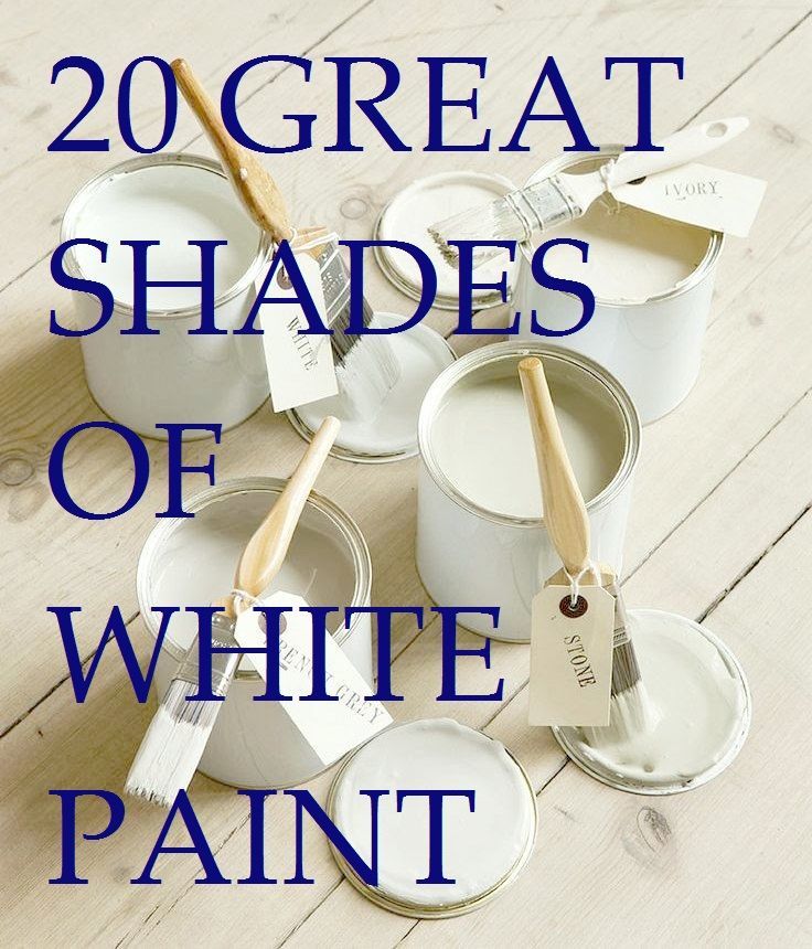
In honor of our Independence, we will talk about my ultimate list of the 20 best shades of white paint.

Get it? Red, WHITE, and Blue.


Wait, Laurel, haven’t you talked about the best white paint colors like 100 times before?


Well, I think it’s 101. ;] In fact, a lot of you reading are here because you found me looking for information about the best shades of white paint.


However, it’s been a few years since this post had a major update, so please enjoy the best shades of white paint for 2023.


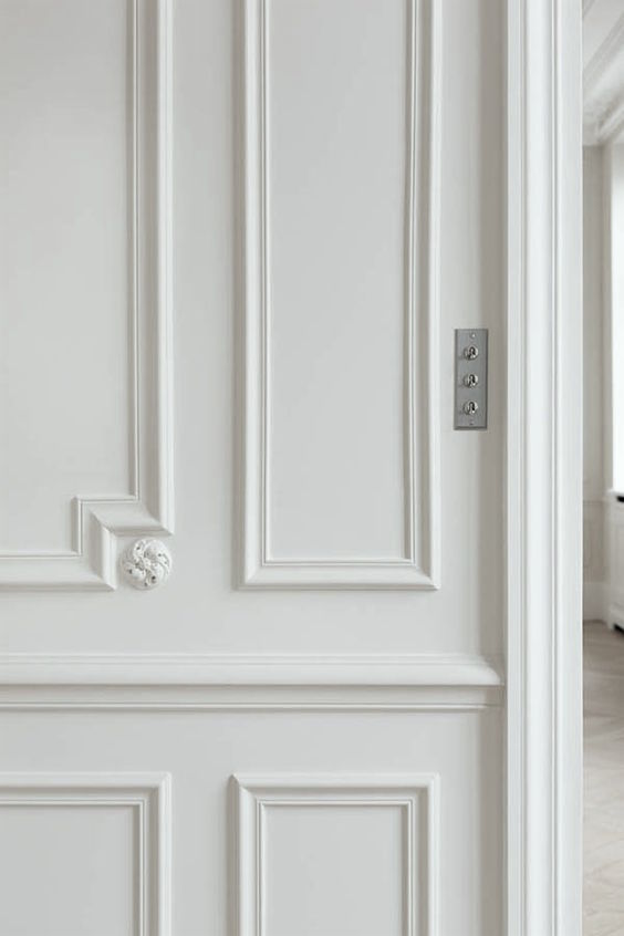
White is my favorite color. It is timeless and classic IF you know how to work with it.

However, it’s okay if you’re not into white as a fantastic paint color for your interiors. But, by the end of this post, I’m hoping you’ll see the best shades of white paint in an entirely new light.


20 great shades of white paint


Over the years, if I had to state, the NUMBER ONE ISSUE that people face when decorating their homes is:

What damned color will I paint the walls, ceiling, trim, etc.?


And, then, we go to the paint store and find that there are at least 150 colors that they are calling white. And that’s just from Benjamin Moore.


How confusing!

It is for me, too. That’s why when I find a white paint color I like, I stick with it. When I find a white paint color I don’t like, I make a note of that too.

However, some white paint colors might look horrid in one situation and sublime in another.  We’re going to go over some of that, too.

If you’re struggling, some 27 years ago, when I first chose paints for our old home), I drove myself crazy with indecision and ended up mixing two colors which turned out not-so-great, but fortune struck when my young son flooded the upstairs bathroom, and copious amounts of water poured through the ceiling.


The toilet gods Universe had given me another chance to get it right.


And this time, I did, thanks to Victoria Hagan.


victoria-hagan-slipcovered-sofa - Best Shades of White Paint - Pratt and Lambert Ancestral

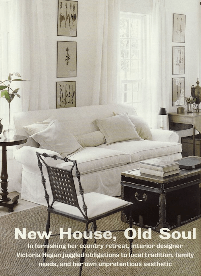
At the time, I was in love with the Hamptons home of Victoria Hagan.


Victoria Hagan - White linen gauze curtains - Neutral color scheme

Gosh, I’m still in love with it, nearly 30 years later!


Pratt & Lambert Ancestral - beautiful shade of white paint


Victoria had used Pratt & Lambert ANCESTRAL. (Above) Sold! And, I enjoyed it very much for the next 11 years until I moved out.  I also used that linen gauze from Henry Calvin Fabrics for at least a dozen clients and Roman Shades in our townhouse living room.


Let’s continue with my favorite shades of white paint.


I am sticking primarily to the best Benjamin Moore white paint colors because that is the company that reined supreme and contractors loved to use.

However, a few are from Farrow and Ball, and a couple more are from Pratt and Lambert. Both are fantastic paint brands.


I’m also sharing some rooms by designers known for using the best shades of white.


Best Shades of White Paint - 20 Classic shades designer's love!


One of the best shades of white paint– and the most popular is:


white dove - kitchen LBI paint color Benjamin Moore White Dove oc-17 - Best Shades of White Paint - 20 Classic shades

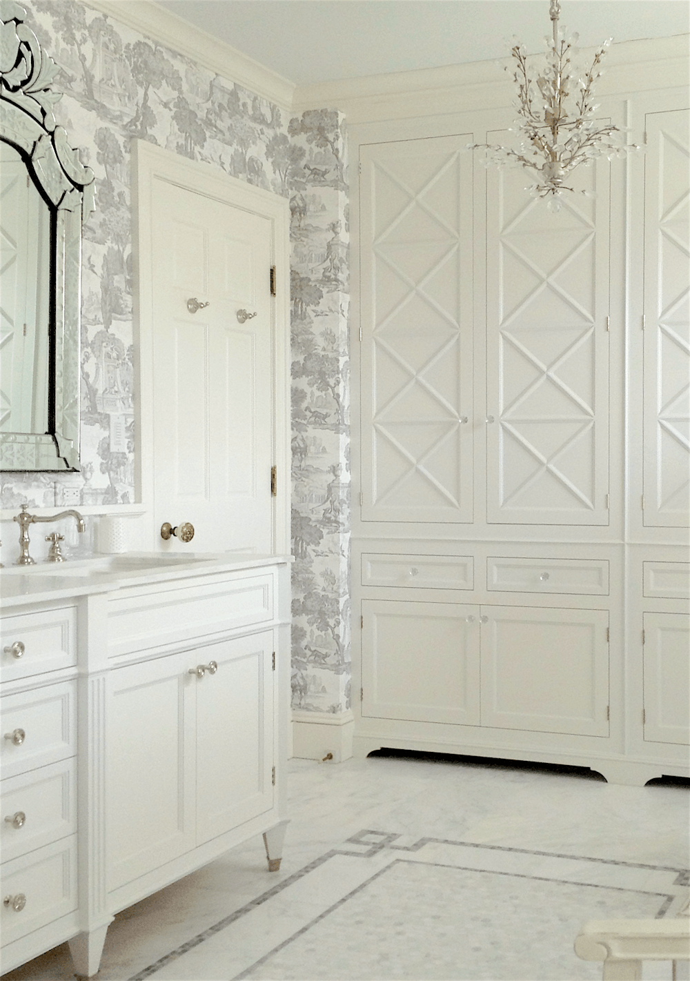
From the Bronxville kitchen we did a few years ago. This cabinet is Benjamin Moore WHITE DOVE oc-17.

Benjamin Moore White Dove


Best Shades of White Paint - 20 Classic shades - Bathroom LBI - paint color - Benjamin Moore White Dove oc-17


Benjamin Moore- WHITE DOVE oc-17


You can [almost] never go wrong with the dove. It is a soft, warm white with a touch of gray. We also did the bathroom cabinetry I designed in Benjamin Moore’s White Dove.


Above is a WHITE DOVE from Lotte Meister’s home. Photo by me. To see more of Lotte’s gorgeous home, click here.


Next up is Benjamin Moore LINEN WHITE


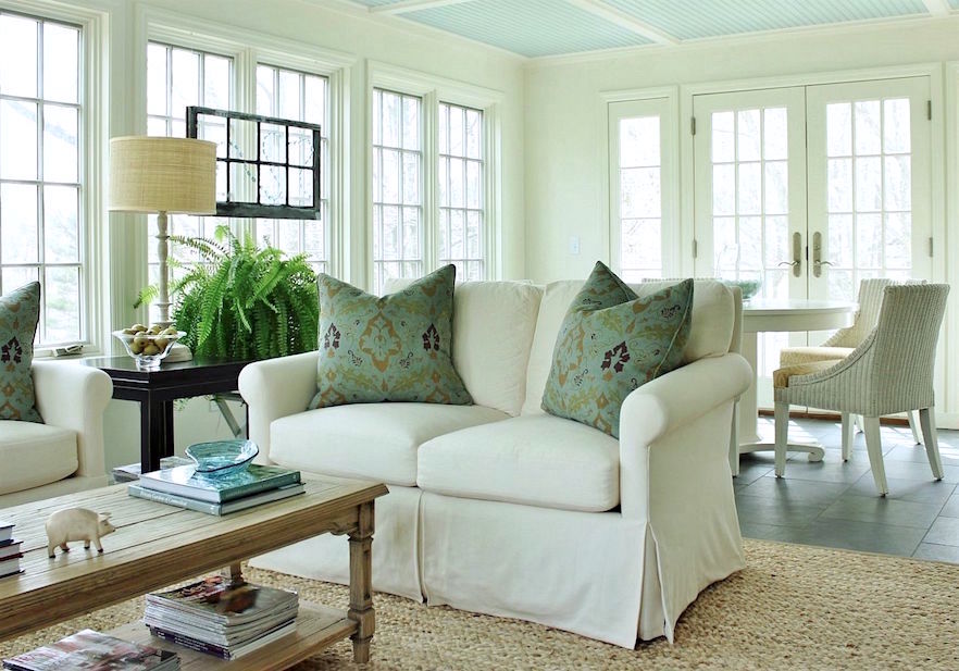
A Sunroom we did in 2010! The walls are Benjamin Moore LINEN WHITE, and the ceiling is Benjamin Moore PALLADIAN BLUE. For more great sunroom ideas, please check out this post.

And, for other beautiful ceiling colors, this is the post for that.


Benjamin Moore Linen White


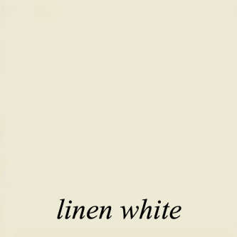
Benjamin Moore – LINEN WHITE. Okay, here’s the thing with linen white. It can be fantastic or dreadful. Please do not use it in a windowless or dark room unless you enjoy looking at muddy cream.


However, there are two conditions where linen white is wonderful.


One – a bright room, like a sunroom.

As trim with deep warm colors, browns, golds, greens, and warm reds. The gray in linen white will keep the contrast from looking too intense, yet the trim will read as a beautiful creamy white.

It also looks lovely paired with white dove for the trim if you’d like a little contrast.


However, I have discovered two shades I feel are better all-around shades of creamy white.


Benjamin Moore – LILY OF THE VALLEY905. This is a lot like linen white but just a hair brighter. I did it once in a family room full of gorgeous built-ins. I don’t have a photo, however.


Benjamin Moore Ivory White 925

But, it is close to Benjamin Moore IVORY WHITE 925. (above and below)


Best Shades of White Paint - 20 Classic shades - Benjamin Moore Ivory White 925 or Acadia White

Benjamin Moore IVORY WHITE – 925. This is the home I helped the loveliest long-distance client in 2016. It was one of my last jobs before focusing on the website. Please note that Ivory white is the same color as:

ACADIA WHITE – ac-41. For more about this gorgeous home in Kentucky, please click here.


Via Making It Lovely.

Making it Lovely is a terrific blog about paint colors and sources.


Benjamin Moore white-blush-904


Benjamin Moore WHITE BLUSH 904. (see above) The color looks ever so slightly pink on the chip (and the name also implies pink), and here too, but when it goes up, it’s lovely, soft, and creamy. It does not look pink in most situations. However, in the corners or on the crown, the pink might come out in some lighting situations.


Yet, because of its whisper of a pink undertone, this is a wonderful white with taupes, warm grays, and the challenging “pinky-beige.”


Please be warned. White Blush does not look good with a clear or bright yellow. In that case, the white will appear to be a pale beige. I know this because I goofed back in 1997. This color was specked by her architect, but I did the other colors. The client chose a clear yellow for her younger son’s bedroom. I should’ve suggested a different white for this one bedroom.


Benjamin Moore Cloud White 967

Benjamin Moore CLOUD WHITE – 967 (above) This is another pretty soft creamy warm off-white. It is quite close to White Dove, but by comparison, it is a hair more beige and grayer than white dove.

Benjamin Moore White Dove


Next up is Benjamin Moore COTTON BALLS 2145-70 or oc-122

Benjamin Moore Cotton Balls 122

Cotton Balls (above) is a another soft, warm, lovely white. It’s wonderful for walls or trim with any other color. As you can probably see, it is similar to White Dove but a hair brighter making it more versatile.

You can see more of this cool vintage apartment here, painted in Cotton Balls.

Too funny. I just realized that this is the former home of the parents of the long-distance client who used Ivory White/Acadia White in her home.

However, Cotton Balls is so close to Benjamin Moore SIMPLY WHITE that I am forced to put them in a dead tie for 1st place as the best all-around white paint color.

B Moore simply white oc-117

Benjamin Moore  SIMPLY WHITE – 2143-70 The name says it all. However, it is another white paint color decorators love for its warmth. If you recall, Simply White was Benjamin Moore’s COTY several years ago.

From the Laurel Home Paint & Palette Collection - one of 40 mood boards - Benjamin Moore Simply White oc-117


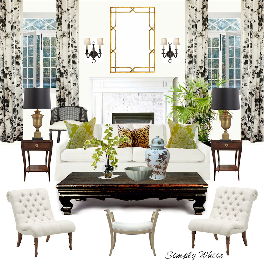
Above is one of the 40 mood boards I created with furniture sources, using the wall colors in the background for the Laurel Home Paint and Palette Collection.


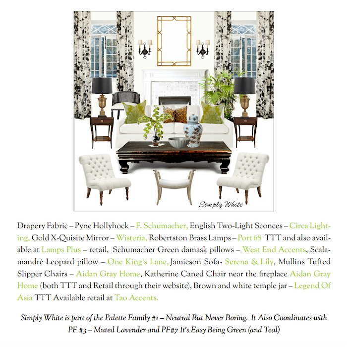
Above is a reduced screenshot of one of the pages associated with this color from the palette collection.


This is part II of the very popular guide I created, The Laurel Home Paint & Palette Collection.


I took 144 beautiful Benjamin Moore paint colors and put them into a collection with trim colors and then 40 palettes, with furniture. And more!


HOT TIP: these two whites are the most versatile in that they look good with cool colors and harder-to-work-with shades of yellow.


Benjmain Moore super white PM-1

Above, there’s another fantastic shade of white paint to include in the best all-around shades of white paint: Benjamin Moore SUPER WHITE.

Is this a cool white or a warm white? Well, it depends on the light. I painted all of the trim except for the bedroom in super white shortly before I moved out of my Bronxville Apartment. (you can see it here)


Well, let me tell you, I wish I had done so eight years earlier.


It was gorgeous in my southwest-facing apartment. It was a clean white but looked warm and soft beside the butter-yellow walls. I lightened them a shade for resale purposes. I went with America’s Heartland, the epitome of a true butter yellow.

AB Kasha

However, putting Super White in a north-facing room will look more stark and cool. But, not super-cool.

Benjamin Moore SUPER WHITE is one of Studio McGee’s favorite shades of white paint, and mine is in a well-lit room. Super White is a clean, warm white that I used when repainting my old apartment in Bronxville, NY. By the way, I just realized only a few weeks ago that all of the trim in my living room and den is painted Super White. It came that way.


This next popular color is a slightly whiter cousin of Super White.


Benjamin Moore Chantilly Lace

This is the whitest shade in my list of the best shades of white paint. It Benjamin Moore CHANTILLY LACE oc-65.

One thing I would like to mention, at this point, is I’ve noticed many super popular paint colors have equally yummy names like Chantilly Lace.

Would you like the color as much if it was called “Death Warmed Over”? ;]


Loi Thai

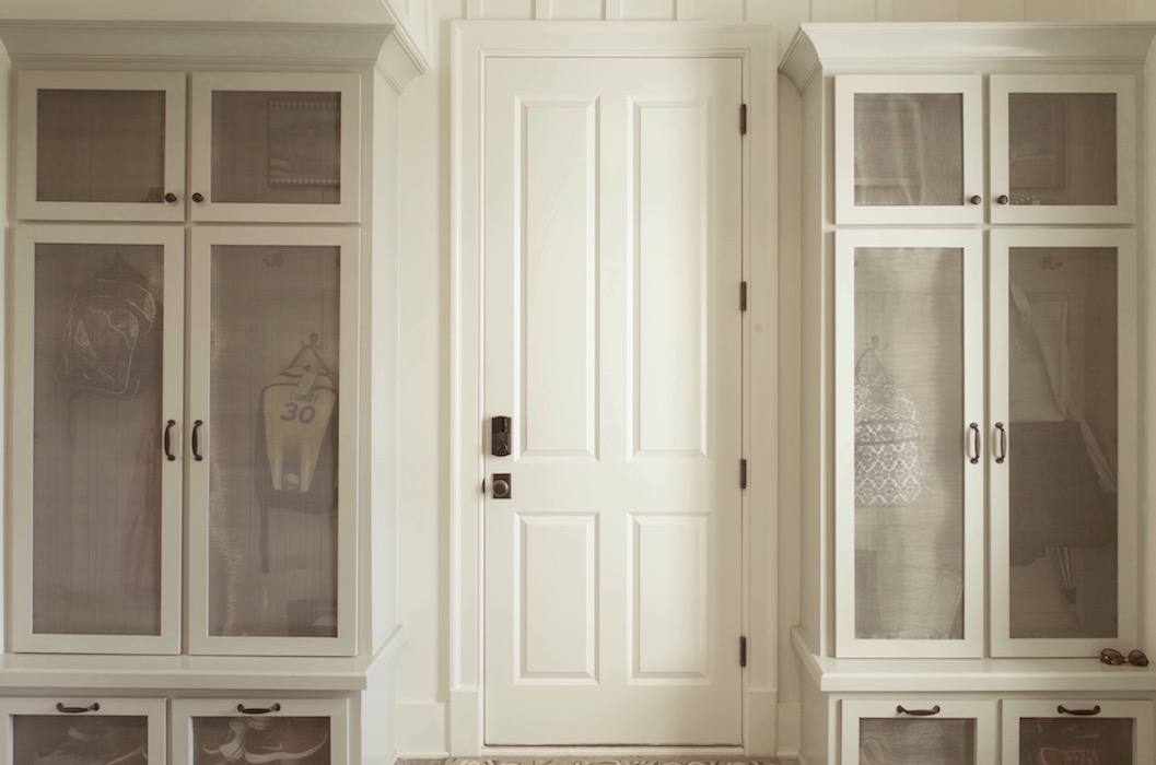
BM DECORATOR’S WHITE – an enduring classic white on the cooler side of the spectrum of whites. Please be careful about using it in a darker room, especially on the ceiling. It is better for brighter rooms, I think.


Loi recommends mixing Benjamin Moore DECORATOR’S WHITE mixed 50/50 with LINEN WHITE — This one is a little secret that’s no longer a secret.


Although I’ve never actually tried it, it makes so much sense. Dec has slightly blue-green undertones and linen, slightly gold… and together, make for a sublime creamy white.


The sublime Gerald Bland!

Remember this post where I featured his work?

And, I followed it up much later with a how to get the Gerald Bland look, here.


best shades white paint - maybe Simply White? or Farrow & Ball Wimborne White - Gerald Bland's Greek Revival country home in upstate New York

Above is Gerald’s incredible Greek Revival in upstate New York.  What shade of white is it, you want to know? I don’t know for sure, but I detect a bit of cream so it might be Benjamin Moore White Dove.

best shades white paint - fireplace mantel vignette Nancy Keyes

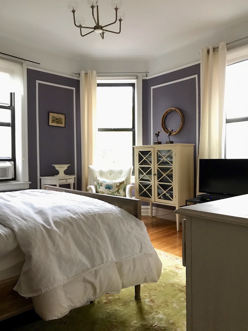
Benjamin Moore – WINTER SNOW – oc-63, a vignette from Nancy Keye’s beautiful living room


This is also known as a Darryl Carter color – SOMERSET WHITE dc-05.


best shades white paint - lovely decorating by Nancy Keyes

And, here it is again, in Nancy Keye’s Living Room.

Benjamin Moore  MOONLIGHT WHITE 2143-70 – This is another of the Darryl Carter colors for Benjamin Moore, which, just to confuse us into thinking it’s a different color, is also called Huntington White DC-02.

I don’t think BM is promoting these Darryl Carter colors these days; however, if you’re interested in a great post on “cracking the Darryl Carter code,” with the actual names and numbers, you can find that here onthe  My Knotting Hill Blog.


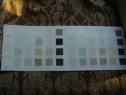
Yes, the image is intentionally too small to read. Please check out Knotting’s blog for the answers.


For more, Darryl, please click here.


Darryl Carter


Benjamin Moore PAPERWHITE. This is a cool (but not at all icy) off-white with a slight gray tint.

Below is another board from the Laurel Home Paint and Palette Collection.


From the Laurel Home Paint & Palette Collection - one of 40 mood boards - Benjamin Moore Paper White, a very pale gray but looks white next to darker colors - Best Shades of white paint
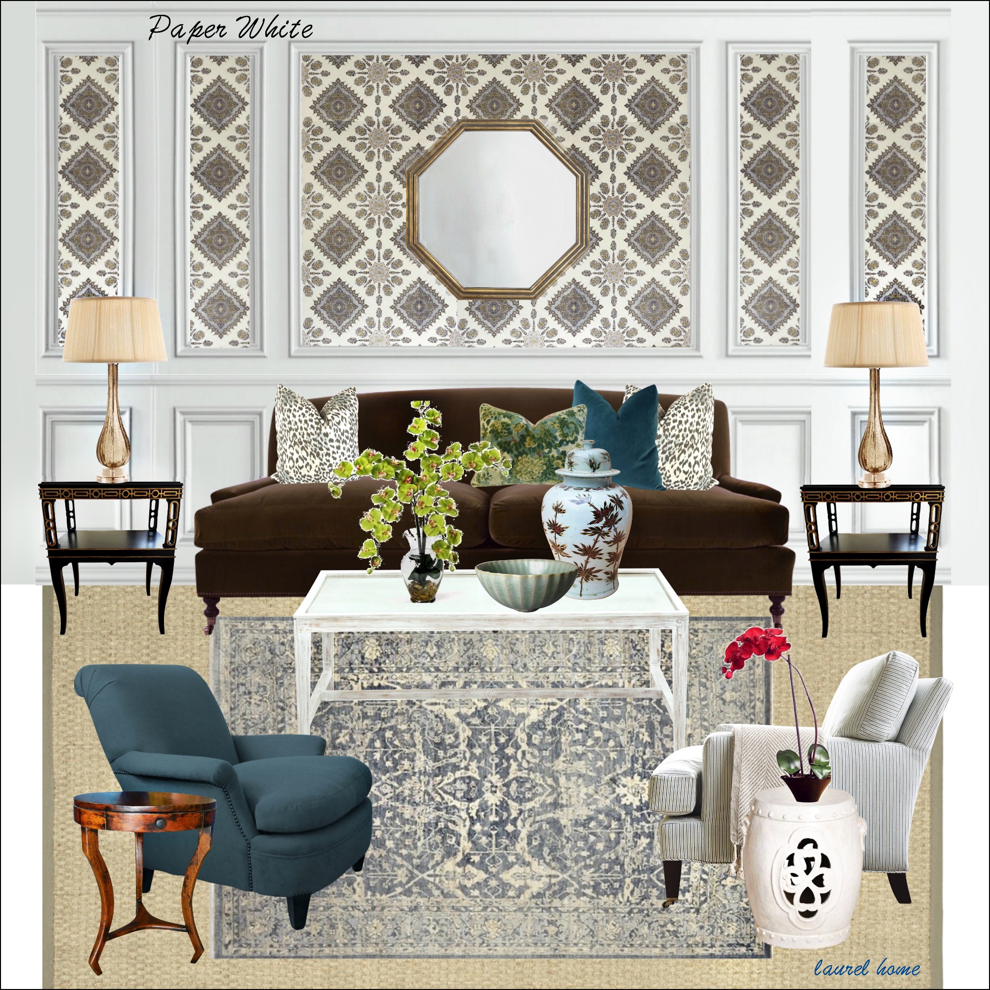
To mix it up, I used Paper White on this board for the trim. The other boards except for one or two have the paint color as the wall color.


Interestingly, another excellent shade of white paint is DISTANT GRAY 2123-70.


Benjamin Moore Distant Gray 2123-70

However, the gray is so distant it’s one of the whitest shades of white in this collection. Paper White has a touch more gray in it. Looking at plain white, (below) I can see that distant gray has a very slight yellow undertone by comparison

Benjamin Moore White


StudioMcGee-Benjamin-Moore-Super-White-Best-Shades-of-White-Paint

Studio McGee

BM – WHITE. Who knew? Their plain white is good for trim with either clear or cool colors. It does not look so great with gold. For gold and khaki, I love one of the creamier whites like linen white or Mayonnaise.

my old Bronxville bedroom, walls Benjamin Moore Tropical Dusk. Ceiling and trim in BM White

My old Bronxville apartment had BM white trim everywhere. It looked terrific on the trim and ceiling in the bathroom (with Benjamin Moore SHORELINE and bedroom when the walls were Benjamin Moore TROPICAL DUSK.


Now, for a few faves from Farrow and Ball and Pratt and Lambert.


Farrow & Ball has been featured on this blog numerous times. To see some of those posts, click here.

Their colors are magnificent and complex. If you are interested in as close as I could find alternatives with Benjamin Moore, please check out this list from 2018.


Farrow & Ball POINTING 2003 – Pointing is a beautiful white with just the right amount of cream. (I know… there are a lot of these. Don’t knock yourself out. haha.)

Farrow & Ball ALL WHITE is a crisp white that looks wonderful in more contemporary settings.

Farrow & Ball’s WIMBORNE WHITE Another lovely cream color.


Pratt and Lambert is another favorite company. They have a far smaller collection of colors than Benjamin Moore, but most are winners.


We have already looked at P&L ANCESTRAL.

Next up is:

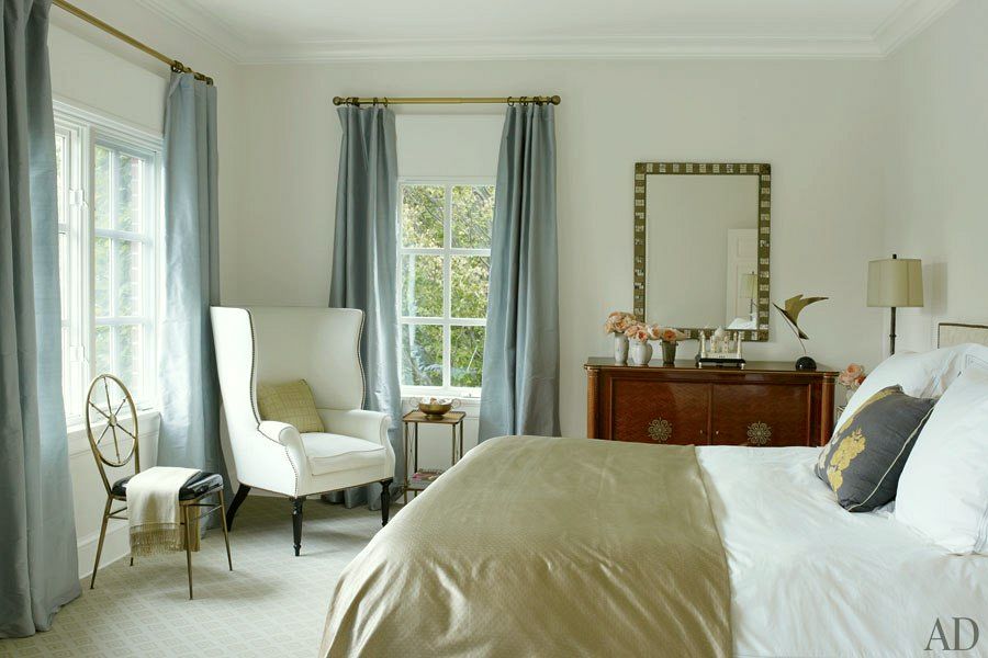
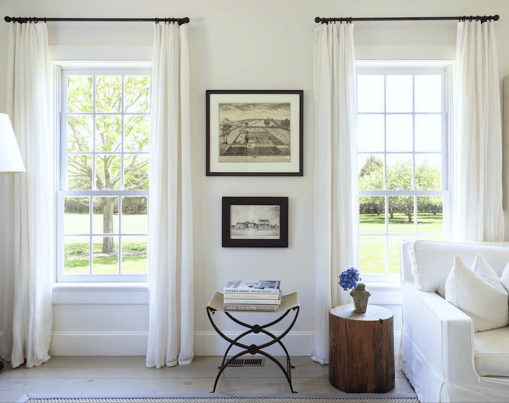
Pratt and Lambert SEED PEARL, a clean, warm white- Seed Pearl is a fave of many designers, and I know that Victoria also uses this color. She’s a huge fan of P and L. The bedroom above is another of her beautiful designs.


best shades white paint


And finally, Pratt and Lambert SILVER LINING, which is not silver. It has a bit of gray. It is very close to white dove. It’s another great one, especially for trim.


That is at least 20 white paint colors. However, I must sneak in one more, or I will get shot at Dawn.


We discussed the best exterior paint colors the other day in this post.


Benjamin Moore Swiss Coffee

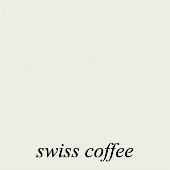
Swiss coffee is the first cousin to White Dove.  But do you see the difference?

Benjamin Moore White Dove

Swiss Coffee has more gray and, thus, could go slightly greenish in some lighting situations. Still, it is fantastic with dark wood tones as long as they aren’t too red. I prefer White Dove for its dependability. But all shades of white paint have their limitations in some situations.


The best thing to do, as always, is TEST.


And, I very much recommend the Samplize Paint Samples made with real paint. There’s no mess, no left-over paint that’s difficult to dispose of. Plus, you can reuse them over and over.


So, are there any white paint colors I stay away from?


Well, yes; however, my sucky white paint color might be someone else’s perfect white paint color.

This is my shortlist of not-so-great white paint colors that probably sound less sucky than they are.

BM CHINA WHITE. Some designers love this color; however, I think it looks dirty. But, it’s a great white for home EXTERIORS!


I did see China White in a friend’s home a few summers ago.


It is a highly changeable color. Sometimes it looked slightly lavender and sometimes like the palest dirty gold.

ATRIUM WHITE. This shade of white is known for its pink undertones. That is fine if you want a white paint color that goes slightly pink. I think this color looks best in rooms brightly lit with natural light.

BONE WHITE. No. Dirt. Yuck. Stay away! I think they finally got rid of the even more putrid Spanish White. I tried a sample once, and it looked like the dog had peed on the wall. I’m not kidding. (However, I understand it’s a great color if you’re in a stucco home in the Southwest.)

ANTIQUE WHITE. Well, if you like peach, it’s okay, but steer clear if you don’t want peach.

NAVAJO WHITE. Another one that some designers love, but I think it looks just a tad too beige-barf and neither here nor there.  However, my former neighbor had terra-cotta/ burnt orangey kitchen walls (actually BM spiced pumpkin, which I had used before and liked) and a sage-green living room and used Navajo for the trim, and it was beautiful. But the tile on the fireplace was beige.


When choosing the best shades of white paint, one common mistake is painting a dark room bright BRIGHT white, thinking it will make the room look brighter.


It often looks gray and drab because the north-facing light is blue-gray. I don’t recommend white for most dark and north-facing rooms, but I would try one without the gray if you do. Instead, warm undertones usually work best. Here’s my favorite white for north-facing rooms.


If you paint the walls white, should you paint the trim a contrasting white?


That is a matter of preference. I usually paint them the same color as well as the ceiling. However, the trim should always be in semi-gloss or satin paint. (I once went into a home where some misguided soul had painted the walls in gloss and the trim in flat.


Benjamin Moore Advance is an excellent product. It’s a water-based alkyd and does a beautiful job mimicking oil, but it’s low VOC and not oil-based.

Always be sure to test your paints!

Again, if you missed it above, I recommend Samplize self-sticking samples with two coats of paint. They carry both Benjamin Moore, Sherwin-Williams, and Farrow & Ball. For more information or to order, please go here.

By the way, if this extensive list is giving you an anxiety attack, never fear. Here are the only six white paint colors you’ll need.

xo,


PS: Please check out the newly updated HOT SALES in home furnishings and more!

This is a HUGE shopping week, and the sales are incredible!

92 Responses

  1. When we moved into our house 30 years ago, the interior was painted all one color, including the trim, in a white with a distinct yellow tint. I loved it. It was so relaxing and just a happy color. We kept the color for years but as the years went by the color changed to an ugly yellow rather than white and I grew to hate it. Still, I tend to gravitate to white with a yellowy tint when I go to Benjamin Moore but haven’t picked it as a color again. I need to paint a small bedroom and will use this as my guide. Thank you!

  2. I have lived with a country red kitchen for years with an off white creamy trim and cabinets. I still love the red but am refreshing it with BM’s Pomegranate. I love that color! I am trying to decide on a more cheerful white now but not sure if I should lean towards warm or cool. I just don’t want yellowing down the road. Kitchen faces west. I have used cotton balls on trim in the foyer going into the kitchen. Would that make a good cabinet color with the red? Thanks!

  3. I can’t remember where I found it but about 10 years ago I caught the 50/50 mix of Dec White and Linen White trick and had nearly every wall in my new construction home painted in it. However, my builder used SW paint. I thought that’s fine just have SW mix BM colors! 🙁 This was before I knew better and I have paid the price. It is NOT the same. I was told by a painter, years later, that SW base paint has more yellow in it so it will never turn out the same as BM’s whites. When choosing White Dove for a client’s lake home a few years ago I had the painter purchase an entire gallon of White Dove mixed by BM and another gallon of White Dove, color-matched and mixed, by SW….they were night and day different on the wall! SW was like smoker’s teeth yellow next to the authentic BM White Dove. I’m just glad I only messed up my own space and not a paying client’s!

  4. love the detail and thought you put into your posts…
    hoping you can suggest a BM paint for my East window facing kitchen
    Cabinets have been painted BM Chantilly Lace
    Walls are grey ( dont know the exact BM color) but it looks very lavender now.
    counter tops are graphite as is the floor
    I am looking for BM paint that will be a grey white for the walls to compliment all of this…
    any suggestions?

  5. Dear Laurel, love your blog! Constantly looking at white and other paint colors. My problem is I love so many I have a hard time deciding! I needed to find a light but not too bright color for my 140 yr old Victorian in an old community. The house doesn’t always get a lot of bright light. After looking at many colors, I decided on BM Lancaster whitewash. Bought the paint for 3 rooms ( they are all open). Soon after, I read a blog from another designer that said to not pick that color, I was crestfallen. I went ahead and painted the rooms and they look beautiful! Used white dove for trim. You don’t know until you try the color on the walls and look at it different times of the day! Thanks so much

    1. Hi Elizabeth. I’m glad you went with your instincts. The designer’s experience might be with different architecture, lighting, and lots of other variables.

  6. Hi Laurel,
    My favorite subject, “white paint”! I have shared your older post with so many people over the years and happy to see an update. Thanks for the mentions again! I still love my Winter Snow!

    XOXO

  7. I love your mood boards! What program do you use? And how do you get the fabric selections to look like drapes ( folds, etc)?
    Love your blog..

    1. Hi Anita,

      Thanks so much. I make my mood boards on Picmonkey. Everything you see is from a photograph. So, the folds are real. But sometimes I have to piece things together.

  8. Wonderful post, Laurel. I live close to a SW and a Lowes, but I happily drive 15 miles to the Benjamin Moore. You’ve guided me to paint our east facing guest bedroom White Dove (2 coats of primer + 2 coats of paint over deep, dark charcoal) and I love it! Soft & sublime!

  9. I just finished remodeling my kitchen and Samplize was a great tool in figuring out which white color would go with my gray cabinets. I ordered Chantilly Lace, White Dove, and 4 other shades of white and put them on the walls. I was a little concerned about undertones since it’s a west-facing room. I went with all White Dove, semi-gloss on the trim and matte on the walls. The whole room looks so bright, I love it and carried the color through the rest of my first floor. For the ceiling I used Benjamin Moore Waterborne Ceiling Paint. It is an ultra flat very high white and it looks stunning. Highly recommend!

    1. Hi Corinne,

      Thanks so much for sharing your experience. Years ago, in my old apartment, I was planning on putting wallpaper in the panels which I did and loved. But, I also loved the room painted White Dove before the wallpaper went up.

  10. Your wonderful list and descriptions make me want to call in the painters. a friend /decorator recommended Sail Cloth to me several years ago when we moved to a new home. I have never been quite happy with it, and it is everywhere. Sometimes it looks green to me and sometimes just drab. The deep eaves on this house keep the interiors on the dark side though we live on the coast where the sun is intense, so a shaded interior is a relief. I’m thinking the Lily of the Valley might be a solution?

  11. Hi Laurel, I’m interested in your experience with Susan S. the kitchen designer. I have a galley kitchen to redo. Would you recommend her? What the best and worst of you hiring a kitchen designer given you are already a designer. Thanks!

  12. I chose Atrium white for my guest bedroom. It is south facing and has both an east and a south window. I see no pink in it at all. It just looks warm and lovely, like it was lit from within. I chose Swiss coffee for my master which is next on our paint list. When we purchased our home it was chocolate brown, every wall and every room. It was awful but it’s such a cute home and was in great condition. We decided that paint was an easy fix but it has taken a coat of primer and two coats of paint so far for our living room, kitchen, dining and two bathrooms. The transformation is incredible though.

    1. Hi Ellie,

      Atrium is best in bright rooms like yours most likely is. But there are so many factors that can affect how a color reads in a space. But sometimes, Atrium can appear to have a pink tone. I love hearing about the transformation. It’s really true!

  13. Thanks for your list, I love reviewing posts with the many variations of one color…grays, whites, etc. (Or “color”.) I may not be alone, and perhaps your main blog readers are true designers, but for me, Benjamin Moore isn’t really practical as a purchase. It’s very expensive (and I do have a lot of walls…put the money in the house:)) and we have one retailer in our area, which is about 20 miles away. Farrow and Ball and Pratt and Lambert…ditto. It would be so great for many if eventually you could do a list with Sherwin Williams (grays, whites, etc.) since that is more practical for most. You can buy it at Lowes and in my area, at least, there are several retailers b/c the professional painters mostly buy Sherwin Williams. There are several times per year when they do sales, and my painter gets a discount, so I rarely pay full price for SW. If you don’t want to color match, and I don’t, it would be great to see some SW recommendations. I suppose no one will ever do Behr, but it’s what many buy since it is the Home Depot choice and Behr actually has a couple really good whites…Weathered White (perfect for an indoor porch or more rustic environment…has a gray undertone) and Silky White (slight green undertone that is barely, if at all there, but looks great with Revere Pewter and similar colors. Yes…I once used a BM color, Revere Pewter, but color matched and realized it was slightly off. It was still very pretty, but after another color matching experience, I will never do it again.

    1. Alas, we have the opposite situation in my neck of the woods. Benjamin Moore is plentiful and most of the contractors prefer working with it. And while I respect your opinion, it’s impossible to please everyone.

      It’s true. There are other brands, but I made a decision to focus primarily on one company and I stand by my decision because it’s confusing enough as it is and I feel this makes life easier. And that’s worth something!

  14. First of all, I adore your writing style and humor. Second, I’m head over hills for all shades and nuances of white, so the worst punishment would be choosing between one of them, so we’re on the same page about that. Thank you for this very useful and informative blog post, it was much-needed!

  15. I am so glad you added Benjamin Moore’s Winter White; we recently used it in our bathroom remodel and I’m so glad we did. The redone bathroom has a gray and white basketweave mosaic floor, grayish calacatta quartzite countertop, plain white subway tile on the bathtub surround and board and batten paneling painted Yarmouth Blue on the bottom half of the walls . Initially the designer wanted to use White Dove on the upper half of the walls and on the vanity, but I thought it might look a little dirty against the pure white tile, so we picked Winter White out of the BM color book. I’m so happy we went with the Winter White; it reads pure white in my north-facing bathroom but it doesn’t look stark or cold. It also make the color of the Yarmouth Blue paneling look fabulous.

    I know no paint is “pure” white but I haven’t been able to figure out the undertone of Winter White. I read somewhere it was lavender but I can’t really tell from looking at it.

    I’m glad paint isn’t really like husbands, because as much as I love Winter White in my blue and gray bathroom, I wasn’t faithful to Winter White when we repainted the adjoining hallway and master bedroom. I’m not really a big fan of gray and the rest of my house is painted in warm whites and cream colors. For the hallway and bedroom we went with BM Ballet White on the walls and BM Simply White on the trim. (Winter White grayed out next to the beige Ballet White and beige carpet in my hall, whereas the Simply White has a glow to it).

    I could go on and on about paint color but you get the picture. I really appreciate your blog; it’s giving me a lot of food for thought for the rest of my house, which is due for repainting.

  16. This:
    “Most likely, with practice, I’m a better writer, so hopefully, the post will have more clarity and better information.”
    Hahahaha, Laurel, you are the best. Seriously! I’m addicted.

  17. This is such a great resource and one that I’ve referred back to many times. I am planning on painting a room all the same color – trim, walls, and ceiling. Should the wall and trim be the same sheen or different? I haven’t found any information on that.

  18. Thanks for the update! I went with Acadia for interior – exterior – trim – walls – ceilings-(even on porches – don’t find that the bugs are worse). Only exception was kitchen cabinets and trim- used chantilly lace there – the result exceeded my expectations. Probably went to paint store and re-read your original guide 600 times! My house is a very small 200 year old South Louisiana cottage- going all white has given it a more current and spacious feel without losing the charm- highly recommend! Thanks again for your efforts!!!

  19. Hi Laurel! First time comment from long time reader and student of yours. Love your blog! I study each and every post. You have helped me define my tastes and update my home. The latest and biggest update has been updating the kitchen and adjacent living room which included new countertops (goodbye dark green granite) and new paint on cabinets, built-ins, doors, trim (goodbye bagel color). I purchased your paint guide, followed your recommendations regarding testing and ended up with Linen White. It needed to work with the tan/beige/cream tile that runs thru out my lower level along with lots of mahogany and various lighting situations. It’s been a perfect choice for my home! Thank you so much for your guidance, education and entertainment!!

    1. Oh, I’m so glad Jody, and yes, linen white can be a great “bridge” white to brighten up too much tan-beige. If it’s pinky-beige, then usually White Blush 904 or oc-86 is a good choice.

  20. Thanks for your advice to check out the corners before painting one wall in my living room a different shade from the other 3 walls. Since I’m definitely going to have the whole LR, foyer and stairwell painted I am not even using sample boards to test colors but painting stripes right on the walls so I can see all four walls throughout the day and night at the same time. I hope you are doing well health-wise. 🙂

  21. A really important thing to remember when using white and for any colour for that matter is to use the brand of paint the colour belongs to. The tints vary from brand to brand so asking the local DYI store to produce a colour but on a different brand is a recipe for disaster. Get it from the brand trade centre to ensure the base and tints are correct. When building our current home we specified a Resene colour however the painter had it mixed using a different more readily available brand Taubmens. Needless to say when I saw the first of the painting I freaked out, it was a very yellow white and not what I wanted. Expensive exercise for the painter as we made him replace all the paint with the specified colour. Thank you for another great post Laurel.

    1. Hi Alison,

      I see that you are in Australia, I believe. I’ve never heard of those paint brands. What you say, I believe, has a lot of merit. While it might be possible with a talented paint mixer, that is unlikely. Oh, they will say that the computer matching is perfect.

      It’s not.

      So, yes, I concur that it is always better to use the brand itself.

      IF your painter says that he can’t get that brand and it’s available to you, then what is stopping you from buying your own damned paint? Just tell the painter that you will provide the paint and ask him how much to get. The reason he won’t work with brand B is almost always because he has an account with brand A and/or a better discount with brand A.

  22. Had to laugh, your first white paint blog is how I found you! We were moving and needed to touch up the trim in our 4,000 square ft. Georgian. Due to the size and light in each room we had painted the trim in most rooms a different white and not kept a record. When we moved to our reproduction cape the ceilings needing touch up and I remembered that post and Cotton Balls! What would we do without you, Laurel! I reread all your blogs and come away with new info every time. Thank you for sharing!

    1. Thank you Cynthia! You know that old post had well over 1,100,000 page views. So, it’s how a lot of people have found me. And that’s because I decided to write the most epic white paint post (at that time) to capture the attention of darling Google. And, it worked. And then, I had to show him that it wasn’t a fluke and that’s why he sends me gobs and gobs of traffic.

      Oh dear… now I’m going on about the business of blogging. I actually quite love it!

  23. Dear, dear Laurel! You know how much I LOVE white and this is a fabulous post! Not just because you showed our house, but I love that, too! Not sure if I ever told you that our last house had a few rooms that were White Dove. Loved that and the Decorators White that we have in the keeping room now. Thanks as always! XOXO

  24. Hi Laurel, a timely post indeed, as I have some seriously OLD molasses coloured trim in a 1920 Arts and Crafts house, in a windowless central hall with walls AND ceiling painted what I think is Hawthorne yellow. OMG. Anyway, to comment on a couple of comments above and maybe offer another perspective. First, re Mayonnaise: all trim that was painted in the house before we bought it is Mayonnaise (including kitchen cabinets), and while I’m content for now to let the cabinets be (they were hand-painted, not lacquered, so can be changed eventually), after living with the other trim for several months, and knowing I have to attack the hall problem (uh, includes staircase too, which gives all the men in this town a heart attack, except my sainted better half), I’ve decided to switch to either Cotton Balls or Simply White – just trying to figure that one out now. I find the Mayonnaise is just a little too yellow, and does not give enough contrast against the wall colours I’ve chosen. That will mean redoing the existing trim, but I’m game. Comment two: Linen: a northwest facing room and a north facing room were done in Linen by the previous owner, and both are drab and gray. But in a southeast facing room, it’s pretty sweet – bright and warm. Thanks again for your great advice!

    1. Hi Paula,

      Yes, it’s true. Linen White is no bueno is a dark room. It does bring out the gray and some north facing rooms bring out the red and it goes really peachy. But, in a bright room, it’s very nice. It’s also a fabulous trim color with darker paint colors like browns, greens, reds, gold… Of course, always test!

  25. I love the idea of comparing whites with Chantilly Lace. Makes me think of how I love looking at exterior paint colors when there is snow on the ground. You really can spot the undertones (Maria Killam).

  26. Hi Laurel,
    Thanks for this update. I have been reading and re-reading your previous posts on whites and grays. I even went to campchroma.com and printed out Lori’s information on an increasing number of possible white/gray choices which was really fun but I’m getting more and more confused.
    I finally chose Paper White for my den–a darkish room with 8 foot ceiling. It looks great! Pale soft gray and with no blue.
    My big problem is the living room. It has windows east and west, has a 2 story high ceiling, is open to stairs going up and semi-open to the foyer and to the den. Also there’s a small 2nd floor level room with a balcony into the living room so all of that has to work together. I had decided on Gray Owl which looks great on 3 living room walls but on the 4th reads dark blue-green!
    Paint is so weird and hard! I’m becoming a crazy paint lady for sure! I’m thinking about doing LR in Gray Owl except for the one weird wall in Paper White. The foyer and stairwell probably in Paper White also. Have you ever seen a room with two different colors that looks good? (this won’t be an “accent wall” just trying to eliminate that dark blue-green place.)
    Thanks, Sherry
    PS. Not asking for a specific color consult. I totally understand why you can’t do that. Just what do you think about 2 colors in one room?

    1. Hi Sherry,

      That’s actually a very good question. Here’s my take on that. IF the one wall looks good with the other walls in all lighting situation, then I see no reason why you can’t paint the one wall a different shade. If it looks weird, say at night or on a cloudy day or any other time of day, it might be time to rethink that.

      To test it, make large sample boards and look at them in different lighting situations. I would also make sure that one of them is on perpendicular walls, right in the corner. The eyes tend to go to the corners and the corners are where the colors often are the strongest as they are reflecting each other.

  27. I love this review of white. Thank you. I am looking at white more and more as a place to start in my retirement home. Once everything is neutralized, I will slowly add color as I live in the space.

    Nevermind that I can’t afford a place in my dream location. I am meditating on some financial good luck.

    I read your postings and always feel uplifted both from your humor and the design itself.

    Your site has changed my taste for the better. I needed color in this cold midwest location, but I can see white, or mostly white, working in Northern California.

    I do adore other colors though, so my choices will always evolve.

    Have fun in Vegas. I am sure you will come back with exciting ideas.

    1. Thanks so much Ramona. And as you’ve grown, so have *I*!!! Oh my. I’ve learned soooooo much because writing has often forced me to examine exactly how I do something. OR, I simply didn’t have enough knowledge in some aspect or other and needed to research it to be sure I was getting it right.

  28. Many years ago I read that BM White Dove was the perfect white. The following year, when I decided to paint our dark kitchen cabinets white, I miss remembered and used oil-based SW Dover White. A very happy mistake. It’s a rich beautiful white that plays well with everything.

  29. Another gloriously jam-packed and informational post friend- so, SO good!
    The mood board you posted above that you created with Simply White *may* be my favorite ever that you have done…..
    *maybe*
    it’s SO hard to choose a fave!!
    SO excited to see you next week!!
    xoxox

  30. As usual Laurel – ❤️❤️❤️

    Thank you for this fabulous update! I have BM White Dove and Cottonballs burned into my brain! So happy the two classics haven’t changed.

    1. Everyone has their favorite shades of white paint. That’s why white paint is exactly like a husband. Once you have one you love, you don’t need to go looking for another. It was only after I started blogging that I felt compelled to start “cheating.”

      Peer pressure is a powerful thing. lol

  31. omg… I’m so ashamed. I just saw your response to a previous comment on this blog. face palm.

    Off to go read your ceiling paint post!

  32. Dear Laurel, I squealed with delight for this update!!! We’re about to start demo any day on a cute little 1950s colonial in A2, and I’ve been obsessively reading your blog and taking in all of your advice. I have a sticking point however. What about the ceiling?! I noticed in your reply to a comment on an older blog post something along the lines of “don’t worry about the ceiling, you won’t notice it in a week”. But I have angst!! I’m planning to follow your advice and use cotton balls for both wall and trim…and my current plan is to use it for the ceiling too, but mostly because the thought of picking a ceiling color overwhelms me. ¯\_(ツ)_/¯ What effect do ceiling colors have on wall/trim color..and vice versa? Should you paint the ceiling the same color as the trim? Sorry if this is a painfully novice question.

  33. For your same reasons Laurel, I would marry Darryl Carter!

    Knotting Hill blog owner is Michele

    another great post, cheers!
    Debra

  34. I love your blog! My house is a 120 year old colonial and was such a timely post for me, since I have a old bathroom, claw foot tub with a terra-cotta stone floor and white dove window and baseboard trim. I want to paint the walls a white, maybe ivory white or cotton balls. Would this look dirty perhaps next to the white dove trim?

    1. I don’t know. Why not just paint the walls White Dove? Otherwise, get some paint chips. Narrow it down and then get a few test quarts and make your boards. Look at in all lights and in numerous places.

  35. My first experience with white paint came when I wanted to paint my golden oak cabinets. I knew I wanted them white. I went to my local Ace Hardware store & sitting on their shelves were gallons of trim, door, & cabinet paint in white. I bought one & painted my upper cabinets. I was pretty happy with the color. When it was time to freshen up my baseboards I used the leftover paint. That’s when I realized the shade of white was different then my existing white trim & doors. So now I’m trying to get everything painted in the same shade of white. I had no idea that whites could be so different.

  36. Hi Laurel!

    This is the first time I have commented but just want to open with . . . I LOVE your posts! 🙂

    I was so happy that BM distant grey got a shout out. We moved into a new home recently that has new Corian countertops. I thought they were white but when I started to research paint colors for the cabinets I realized the color was a close match to distant grey. Alas, I was hoping to go with a warm paint palette in the house, but now I’m not sure if that’s possible without making the counters look dingy.

    My question is: Is there a way to bridge cool palettes with warm palettes on the same floor of a house? Perhaps by using an intermediate “skip” color? Or in this case am I stuck with cooler tones?
    I thought perhaps I could paint the kitchen cabinets in a cooler color to coordinate with the counters, but then using a warmer white in other rooms. However, we have an open flowing floor plan so I’m not sure if this will fly.

    Some other data points:

    1) We live in the northeast and the exposures are north and east facing, so predominately cool light. Another reason to warm things up a bit if feasible.

    2) Replacing the countertops isn’t in the budget.

    I think you are going to tell me to hire a decorator, but figured I would give this a shot. 🙂 I’m guessing I’m not the first person who has this question about mixing tonal lanes in the same room/open area.

    Thank you!

    1. Hi Johanna,

      I’m so sorry. I realize that you need help and don’t know what to do, but since I’m not there, it’s impossible. It might be possible to mix warm and cool tones together. The bathroom with the gray and white wallpaper that I did is an example. There are all different shades of white in there and that complexity is what I think makes it interesting.

  37. Hi Laurel –
    If whites are not good for north facing rooms, then what neutrals would work?

    Love your blog!

  38. This was a really interesting read for me as we are about to list our custom home (that we HATE!) for sale. We hired a designer when we built this home and she truly did a lovely job…with everything EXCEPT the “white” trim color used throughout the home.

    That color is Sherwin Williams Canvas Tan 7531. Oh. My. Gosh. It just looks DIRTY! It ALWAYS looks dirty. We have a ton of natural light throughout the home. Maybe that’s the problem? Perhaps it would be that creamy color I hoped for if it were darker in here.

    It doesn’t matter what color it is used with in my home. Some wall colors used are (all Sherwin Williams): Amazing Grey, Worldly Grey, Sensible Hue, Balanced Beige, Grays Harbor. These are ALL lovely colors. The Canvas Tan just ruins it for me!

    So, counting the days until we are outta here and moving into our new (old) swanky place—-WITHOUT CANVAS TAN!

  39. I love that you updated this post! Yes indeed this was the post that brought you to my world and taught me about how paint means nothing without LIGHT and SAMPLES!

    – I tried linen and ivory and all looked like sad mud in my CT north facing room— until F&B Wimborne White went up and angels started to sing.
    – the runner up was a wild lark of mixing BM Ivory and Snowfall White. It was so pretty I wanted to send you a sample on my stir stick but I thought that’s creepy.
    – after 17 swatches on my exterior I chose BM “White” and laughed at how much we can overthink these things.

    Much <3 and appreciation Laurel

    1. Hi Jennifer,

      Thank you so much for the lovely comment! I would’ve smiled had you sent me the stick. I wouldn’t have found that in the slightest creepy. Creepy is receiving a type-written three page letter on lavender stationery, no name or address, but chastising me at length for various things I’ve done or said.

  40. Thank you Laurel, for the update. I’ll bet your paint colors get pinned more than anyone else’s in the blogosphere! One question: What do you think of BM Collingwood? I have it in a good portion of my house. I also have RH Stone in the Master Bedroom which is quite close to Collingwood. The two areas were remodeled at different times, which is the reason for the two colors. Most people never notice the transition between the two. Collingwood comes off as a creamy white with gray undertones. I’ve had it for many years now, and am considering one of your white color suggestions for the next project. Will I regret going white as opposed to this subtle grayish white?

  41. Ahhh paint colors!!! Love this post.
    I lucked out 5 years ago when I chose Chantilly lace for my trim, the one paint decision I don’t regret!!! I have loved Chantilly since. We knocked down and rebuilt 75% of our house, main living area faces south east but has windows on all sides, super bright. Per your tutelage, I tested my narrowed down choices, simply white, cotton balls and my beloved Chantilly lace on multiple walls… Chantilly won each time. I think it’s the purist white paint color there is! I didn’t see any yellow or blue or green undertones just pure white each time. Since my rooms are so so bright, this was the only color that I didn’t question or wonder if it would look dingy, it’s also the color all 94437329;&4$3 of the workers at my house liked too. Haha
    Now I’m positively FROZEN, PARALYZED in my paint selection for a new pool bath and a mudroom bench. Two small surfaces keeping me up at night. Paint selection is truly truly difficult.

    1. Hi Heidi,

      Well, at least that one worked out. Chantilly isn’t in this post. The thought crossed my mind to add it in, but then I forgot. It’s very close to super white. It is a color in my paint collection, however.

  42. Always interesting to see how the different “whites” behave.
    Two remarks here: one advantage of the F&B colour card is that it isn’t a fan deck, so all the colours are on a white background, which helps to see the undertones (as Maria Killam points out) — and I like having a limited choice!
    Secondly, I notice in your photos that several of the best show the “white” with touches or more of green (plants) and black or charcoal — both the Bland pics do that — a great idea for colour combinations?

  43. Thanks for the refresh on this post. I’ve read the first one several times and this is right in time for me! I am just about to have a partition wall added for an entryway, and to repaint my living room white. (With a Palladium ceiling). I’m going to use cotton balls for all the trim in my house and I had Been thinking about China white for the walls. I’ll steer clear of that now and do either paper white or keep to cotton balls. (This crazy paint lady has one more trip for a sample).

    Thanks again, your blog really has helped me make my house a happy place.

  44. Thanks so much for this. A great guide, especially because whites are often confusing.

    I’m curious about your opinion of B Moore’s Mayonnaise, if you h ave one. I used it in the bathroom to match the older tiles, but I actually really like it’s creaminess….

Leave a Reply

Your email address will not be published. Required fields are marked *

This site uses Akismet to reduce spam. Learn how your comment data is processed.

Welcome To Laurel Home!

laurel-aarons-18th-e1456449963926

Hi, I’m Laurel, and Laurel Home is the website and blog for Laurel Bern Interiors.
I’ve been creating new-traditional interiors since 1988. The blog is where I share all.

New Edition, November 2022! Get The Indispensable Guide For 100s of Home Furnishings And Interior Design Sources That Everyone Is Raving About

laurels-rolodex-final-book-cover-master 9th edition 22-23

laurel home archives

Categories:

Please click the image below for more info about my rockin’ Interior Design Guides for 2023!

Laurel Home Interior Design Guides 2023
Amazon ad

please click below to check out my favorite decorating & design books

Laurel Bern's Favorite Interior Design and Decorating Books
Subscribe To The Laurel Home Blog And You Will Receive A FREE Guide Where I Share How To Get Your Paint Colors Right, The First Time.