Darryl Carter Did The Most Dreadful Room I’ve Ever Seen!

To be clear, it was not I who said that, nor would I ever. In fact, just the opposite.


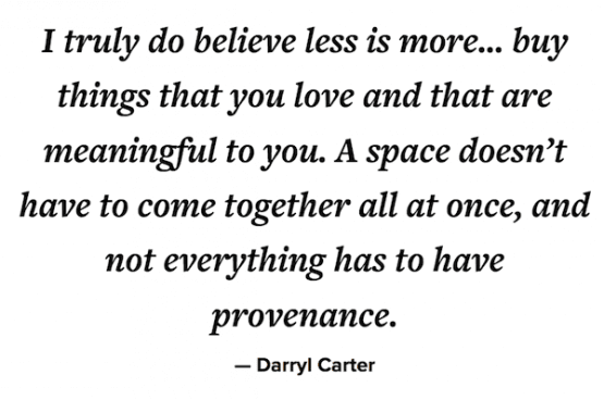
I’m horrified that someone would say anything unkind about Darryl Carter’s interior decorating genius.

Oh, Laurel, but do you have to do the clickbait?

Yeah, please forgive me; it’s part of the gig. However, I do my best once I’ve lured you into my little corner of the world that you’ll leave the table well-sated.


So WHO did say that about Darryl Carter?


Well, I don’t know who it was, and even if I did, I wouldn’t mention its name. ;]

But, rest assured, this is not idle gossip. Someone did say those words, which were relayed back to me by a designer friend I respect enormously. It happened several years ago while she was visiting the Kips Bay Showhouse. And below is what she heard in the gigagorgeous room that Darryl Carter had created.


“Why that Darryl Carter did the most dreadful room I’ve ever seen.”


Of course, it’s beyond tacky to diss someone in front of their friends and colleagues. Yeesh. Aside from that, why would they say something like that, even if out of earshot?


This is my thinking:


Darryl Carter’s genius is on a different plane than that person can comprehend.

And I think it’s because Darryl is a decorator who doesn’t “decorate.”

I mean, not in the typical “decorator” way.


You will never see even the tiniest hint of froufrou in any Darryl Carter room.


And by that, I mean, rarely is there any trim, and no or very little pattern. And usually, not a lot of color. Although, once in a while, you’ll see a pop of bright orange or yellow. And, often, you’ll see a bit of soft, pale gray-blue.

However, the rest of his palette a blend of tone on tone, white, cream, and beige. This is offset with a healthy dose of black, brown, and antique gold accents.

Darryl Carter is the master of careful editing and creating a quiet drama that is both sophisticated and chic but never pretentious. If anything, I get the feeling that he’s having a lot of fun and revels in his creativity.


Naturally, some people won’t “get it.”


To them, it looks too “easy” and like there isn’t enough “decorating.”

I’m afraid I have to disagree. Darryl Carter’s work looks easy because that is his genius. It is not easy. I am positive that he obsesses ponders each piece under intense scrutiny.


Darryl, you may recall, started his career as a lawyer. There’s a big difference in occupations. I had a teacher in design school who said if you have a burning desire to create, you must or you’ll go nuts.


During my research, I found a superb interview that Paloma Contreras of La Dolce Vita did with Darryl Carter a few years ago.


You can find it here. It’s quite delightful.


I think that it’s common knowledge that Benjamin Moore released the Darryl Carter paint collection several years ago. The colors are wonderful; however, they’re not original colors. Benjamin Moore renamed them, is all.


While misleading, I’m okay with it.


And, it’s a clever marketing ploy, for sure. Benjamin Moore makes no bones that there are duplicates in their line. What that means is the same color has different names and numbers. They’ve recently rebranded their website, and I saw one instance where they shared this information.


my knotting hill cracking the darryl carter code - Best Benjamin Moore Shades of White Paint - 20 Great shades of White Paint


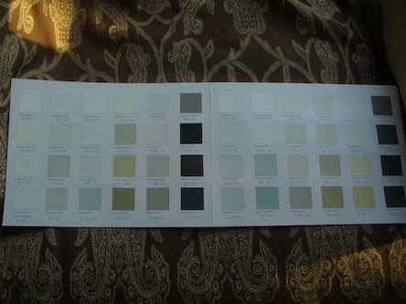
If you’d like to see, My Knotting Hill “cracked the code” and wrote a fantastic blog post about it. (you’ll be able to read her chart on her blog. :]

I discovered many of my favorite colors, and many of them are in the Laurel Home paint collection.


Dale Carter used the term The New Traditional and wrote a book with the same title.


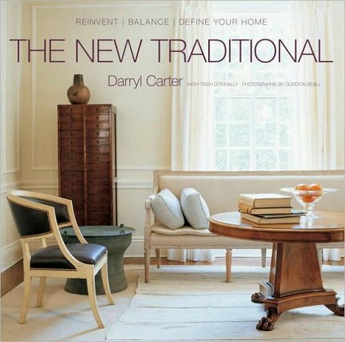
You can find the book on Amazon.

The new traditional is paired down, refined, elegant, and the essence of timeless. This pairing down of classical styling creates rooms that, while traditional, also feel modern.

But maybe that is why those women didn’t get it.

They were expecting Nancy Lancaster, and instead, they got something in a different realm from what they’re used to seeing.


So, let’s look at some of Darryl Carter’s work. Later, you’ll see a large widget inspired by Darryl Carter’s decorating.


We’ll begin with a look at Darryl’s magnificent former home in Washington, DC.


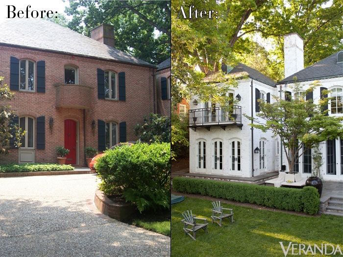
Whoa! Look at the number he did on this place. I adore the painted brick.

Or maybe it’s parged? Oh, dear. It’s late.

I know of parging but forgot offhand what the technique is. Oh, wait.

There’s a link if you’re interested.

It’s not something that’s done or very rarely in the northeast.

Remember when we discussed painted brick at length in regards to fireplaces?


Spectacular!

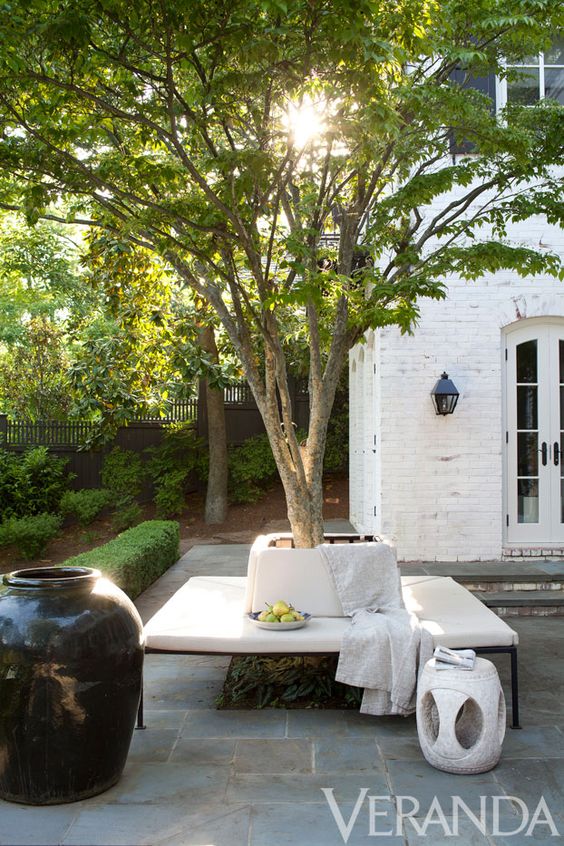
I’m unsure when, but he moved and furnished an equally beautiful townhouse clad with limestone. You can see it here.


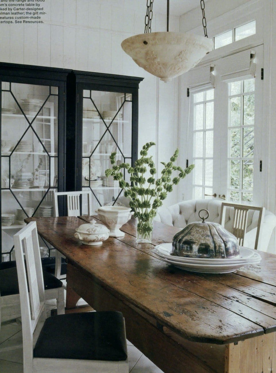
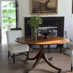
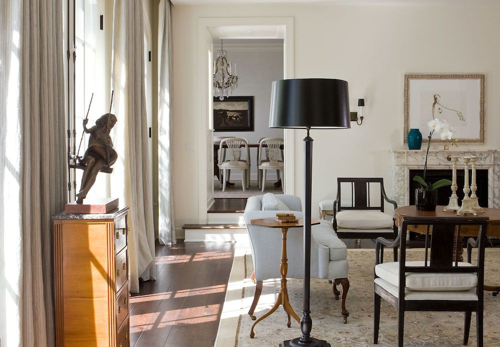
The above dining room is one of my favorite spaces done by Darryl Carter.


Darryl Carter's home with creamy warm white walls via One Kings Lane

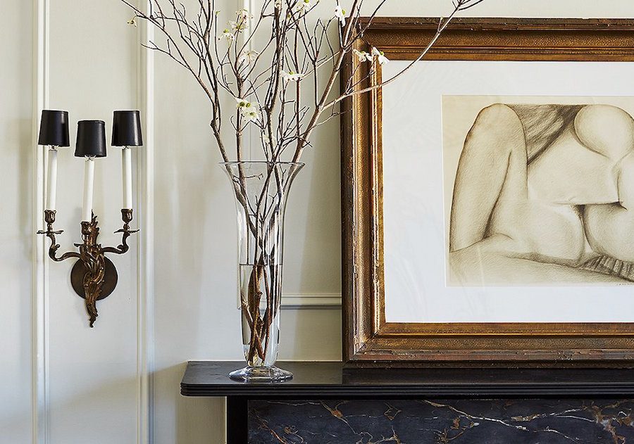
The above vignette is a perfect example of the juxtaposition of a Louis XV style sconce, contemporary art, black marble, and white walls clad with beautiful architectural mouldings.


via One Kings Lane


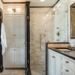
At first, I didn’t realize it, but this is Darryl’s bathroom.

Who would think to add an 18th-century gilt Federal mirror in a bathroom? Is that a real working fireplace? I don’t know, but how cool would that be?


Darryl Carter secretary in his bathroom

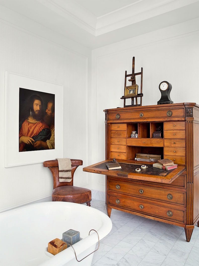
And while we’re in Darryl’s bathroom, let’s take a gander at the antique secretary on the other side of the room.

Hey, why not?

Yes, I know you’re worried about the steam wrecking it. Please, no lectures.

Thank you. :]


Anyway, I’m pretty sure that Darryl Carter has a wicked good ventilation system.


Plus, a little steam will not hurt the furniture. After all, you can put a wood floor in a bathroom. A wonderful example is the Airbnb I stayed at in North Hampton two years ago. (The pine you see everywhere else is also in the bathroom.)


Oh, this reminds me!


photo Frank Tribble via One King's Lane black and white bathroom_DarrylCarterHome_9

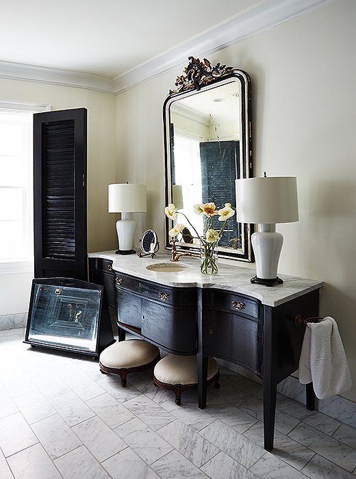
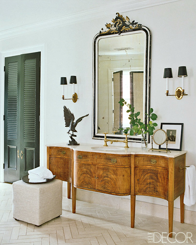
I’ve shared this wonderful bathroom several times. I adore that vanity! Well, guess what? I have a little surprise for you.


Darryl Carter bathroom before

Look at what I found? I think this is the bathroom in the older home as this image is from about 2011.


And yes, as we can see, Darryl Carter painted over that beautiful crotch mahogany.


And not only did he paint it (or have it painted), but it’s painted to look like it had been painted 200 years ago and then repainted about 20 more times over the years. Can I tell you how much I love this!


via One King’s Lane

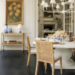
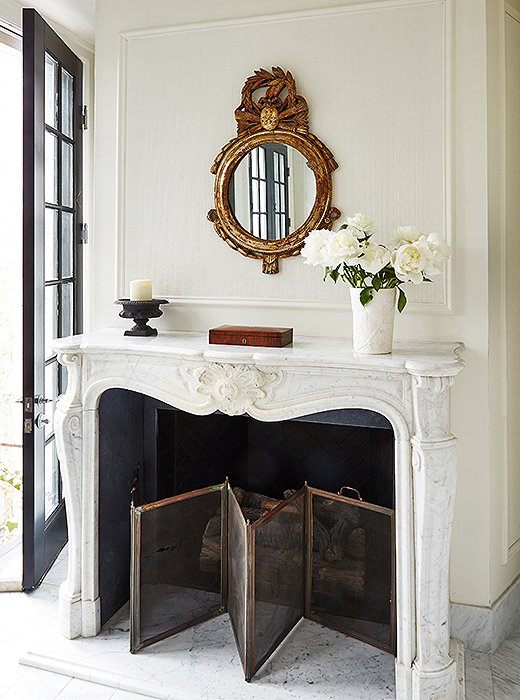
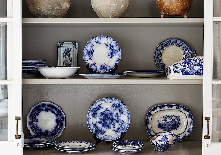
Alas, all is not beige, black and white. Darryl, too, loves blue and white porcelain.


Darryl Carter kitchen Washington DC

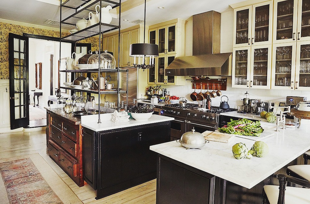
And here’s Darryl Carter’s incredible brilliant kitchen with many yellow and a toile wallpaper.

I love that etagere thing he has over the island. This is a genuine, unkitchen!


Collaboration Darryl Carter with architects Franck & Lohsen

Above and below is an incredibly elegant home that Darryl Carter did in collaboration with architects Franck & Lohsen.


Collaboration Darryl Carter with architects Franck & Lohsen - living room


Darryl Carter decorator collaboration Donald Lococo - classical kitchen


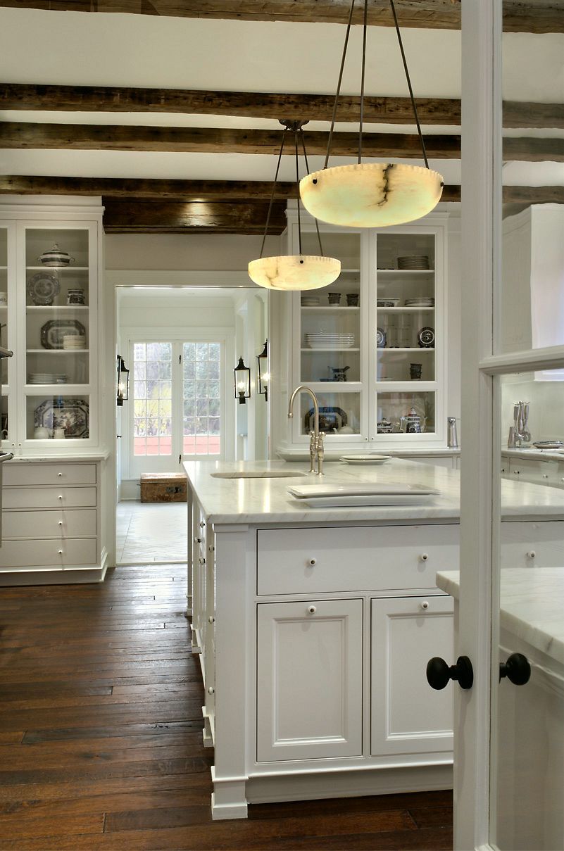
Above and below is one of the many incredible collaborations with architect Donald Lococo. I’ve shared this kitchen numerous times. It’s sublime.

Darryl Carter is a decorator who I’d gladly give the keys to my house and then come back in a year.


And now for the “dreadful” AWESOME room that Darryl Carter did for the Kips Bay Showhouse in 2014.


Darryl Carter Kips Bay Showhouse 2014


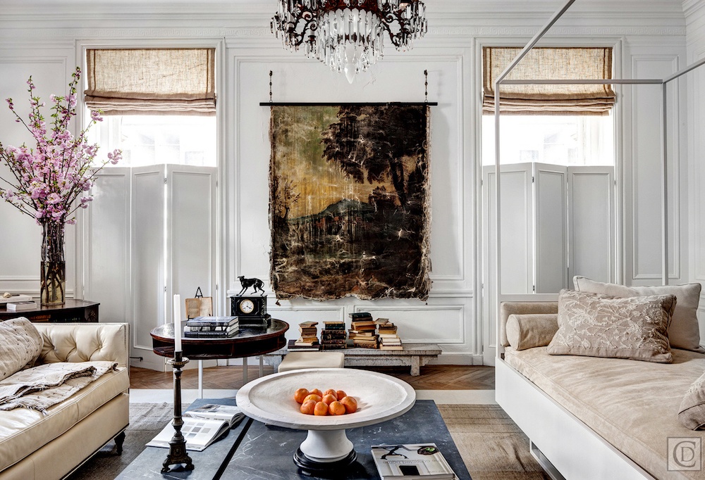
I love everything about this room.


Amen!

And now, I have done my best to channel Darryl in the home furnishings grouping below. I hope you enjoy it!  Please click on any image for more information.


You might also enjoy this post about high-low decor.


For more about Darryl Carter, please check out these posts.

And please follow Darryl on Instagram, here.

Oh, and while you’re there, please follow me. I’ve been at 19.9k followers for what seems like forever. So, please push me up to 20k. I don’t really care that much, but for some reason, other people do.

xo,

Please also check out the newly updated HOT SALES!


30 Responses

  1. Daryl. Did we meet in a freight elevator on Los Angeles aprox. 1977? You were a lawyer turning interior designer. I had just graduated from FIDIM in Los Angeles?

  2. Laurel – thank you for teaching me about Darryl Carter. Like you, I adore and admire his genius work.

  3. This are gorgeous rooms and I feel validated. I’m certainly not any sort of designer but I love linen, and dark wood, with some blue and white, all my life my rooms look like this. And I’m Southern, not MCM or Ikea/Seattle. I need serenity and I’m tired of friends and family saying “are you afraid of color?? Hardy har har“.

    I love your blog posts. I’ve said before, they’re so packed with information, I have to get out my iPad, laptop and phone to work through them. And a notebook to take notes.

  4. I too wondered about the tiny footstools in the bath… then I pictured my 4 year old granddaughter sitting on them, now they’re perfect! Thank you Laurel!!

  5. Hi Laurel.
    I love your blog.
    I buy your products.
    You’re right…Darryl Carter is amazing. I might just listen to his advice (I’m kind of hard-headed.)
    Question: In this blog, there was the beautiful black antique bathroom vanity with tiny footstools in front of the sink. Why? Do you stand on them to see yourself in the mirror? hmmmm.

  6. Laurel,

    Love, love your blog and love this post! I think you nailed it on the Darryl Carter furnishing wish I could purchase it all. I have Darryl Carters book and think he is amazing. I was shopping your post and found this. It seems like a good price probably not what you want put though I would share anyway https://www.chairish.com/product/1404468/federal-style-green-bronze-chandelier-with-gilt-swan-heads
    Thank you for your blog, I hope you never stop!!

  7. I agree that the skill in putting together these rooms is beyond obvious and they are a classic blend of neutral style. I few large bouquets of flowers would work wonders. Houses that are obviously decorated on a substantial budget and not include more artwork is a MISS. While neutrals may be tranquil, COLORS make my heart sing.

  8. Darryl Carter expresses his artistic talent through the placement of beautiful furnishings in a room. His rooms may not appeal to everyone, but he is a creative genius.

  9. Thanks, Laurel, for the introduction to Darry Carter! I enjoyed reading the interviews and what he enjoys, and could appreciate his rooms even more. His rooms remind me of still lifes…so much to see and enjoy.

    I do often wonder how long those rooms stay that way if one has a family and lots of guests…I’m always replacing my cloth tablecloths due to messy eaters, so my table arrangements are a bit like lightning…a flash and they’re gone! ( and they are quite never that spectacular!)

    When I have less activity and more tranquility, I’m looking forward to designing a spot in my house that can look as beautiful, and then I will try to keep it that way! Thanks again for an inspiring post.

  10. Please tell me more about the girl on the swing statue shown above in the elegant home photo. I am in love! Thanks Laurel.

  11. You sure lured me into this one. I love DC. He can do no wrong in my book. Lol. I hadn’t seen the OKL photo – thanks!
    P. S. It is “pared” down, not “paired” down, for future reference.
    Love your posts but there are so many pop ups and weird changes in font, it is getting really annoying to read. That is meant as constructive feedback as I’m a great fan of yours and enjoy all your posts. Xo Terri

  12. My personal design aesthetic is more Nancy Lancaster than Darryl Carter, but I can find so much to respect and admire in his rooms. The man has depth!

  13. Laurel, I had not heard of Darryl Carter, so thank you for the introduction. I loved every pic in your post. His rooms appear elegant and comfortable – like a great pair of jeans with a beautiful cashmere sweater. Cannot imagine anyone not appreciating his classic style.

  14. Laurel, as you know he is one of my top favorite decorators and can do no wrong, as far as I am concerned! As for the comments I overheard. Your comment “Darryl Carter’s genius is on a different plane than those people can comprehend”, is exactly right. You did leave out that after hearing these women, more than once make rude comments, I was curious to see what they were talking about. We walked into the room and I not only swooned but my knees buckled and Marc fortunately grabbed my arm.

    This is the most gorgeous widget page ever and there have been plenty of beautiful ones. I could see all of your examples in his rooms! I have my eye on a few things. LOVE them ALL!!!

  15. I love this style as well and would also happily hand over my home to him and return in a year! I have receiving your emails for about a year now and always find great info in them. I will head on over to Instagram and click that Follow button. I’m not sure why I didn’t think of that before. Its good that you mentioned it.

  16. Very lovely, peaceful and serene. I have started to edit my rooms to get rid of clutter. I can enjoy the pieces I leave out because there is less competition and the room is more calm. Thank you for the article!

  17. I love your clickbate, Laurel! Keep it up! 😀

    I wondered about the very short footstools in his bathroom (sink pic). Are they there to give it an additional feel of his “unbathroom”? I love the look, but wondered how they could be useful.

  18. That BM paint collection looks like every photo of rainbow eggs I’ve ever seen on farm blogs.

    But in a good way.

  19. Love the style, the calmness, the value contrasts. Not boring at all, lots of detail and texture. Thanks for the post! BTW, Northampton is one word. (OCD speller here)

  20. I truly love his style too! Each time I see it, I want to re-do my home in neutrals and put away my colorful persian rugs (found at great prices on ebth.com) and colorful patterned pillows. It is like a palette cleanser.

  21. I like his mix of light and dark, and his use of antiques. Spare without looking sterile, and every object is interesting. The dark wood “beat up” looking dining table in the first dining room shot looks a lot like a little kitchen table that I bought in Texas. Also rough hewn with lots of dings, I think it was handmade. The bottom of its single drawer was made from a dynamite box! I would love to know more about its history.S

  22. For those who are interested, in the first photo of the dining room there is a black and
    glass door cabinet – I have one that looks identical and purchased it from Ethan Allen Very good quality and I just love it!

  23. One of my favorite posts! Breathtaking, elegant, and simple. What could be better? I agree about leaving him the keys to my house! Thank you for a great article and beautiful widgets!

  24. Hi Laurel,
    Rude people make me wonder some times. His rooms are nothing if not elegant, calming, layered, sophisticated, & so beautiful. Let’s hope that person has recovered from the bad day they were obviously having.
    All of things in your widgets are wonderful. I’ll take them all, please.

  25. Hi Laurel,

    It’s a perfectly beautiful, elegant, and cozy-feeling room. I appreciate that someone of Darryl’s stature said that everything doesn’t have to have provenance. Thank you, as always, for the lovely posts–they give so many of us sheer joy in these troubling times. Have a lovely day!

  26. It’s a particularly odd comment if you look at what else is in the 2014 Kips Bay show house (quite a lot that is much more flamboyantly weird and likely to rub someone the wrong way).

    I wonder if the comment was directed at the decision to position the day bed with its canopy rails right in front of (and from some angles arguably blocking) the fireplace — which isn’t visible in this picture? Admittedly a bit of a bold design choice but certainly not “dreadful”.

Leave a Reply

Your email address will not be published. Required fields are marked *

This site uses Akismet to reduce spam. Learn how your comment data is processed.

Welcome To Laurel Home!

laurel-aarons-18th-e1456449963926

Hi, I’m Laurel, and Laurel Home is the website and blog for Laurel Bern Interiors.
I’ve been creating new-traditional interiors since 1988. The blog is where I share all.

New Edition, November 2022! Get The Indispensable Guide For 100s of Home Furnishings And Interior Design Sources That Everyone Is Raving About

laurels-rolodex-final-book-cover-master 9th edition 22-23

laurel home archives

Categories:

Please click the image below for more info about my rockin’ Interior Design Guides for 2023!

Laurel Home Interior Design Guides 2023
Amazon ad

please click below to check out my favorite decorating & design books

Laurel Bern's Favorite Interior Design and Decorating Books
Subscribe To The Laurel Home Blog And You Will Receive A FREE Guide Where I Share How To Get Your Paint Colors Right, The First Time.