Dear Laurel,
I am new to your blog and I truly love it……and your sense of humor (probably cuz that is mine!).
As it happens, I’m a realtor in Carmel, CA and there is so much bad Mediterranean/Tuscan/blech architecture and decor.
I adored the blue and white decor in the Mark Sikes post.
But here’s where I’m struggling.
It’s my home. We purchased it a couple of years ago when I was pregnant with twins and while the location is everything I have ever dreamed about. The home itself is the aforementioned dark, dreary, beige and brown drek.
The home is a 1970s split level. I want to make it fresh and current. I do like blue, but I also am afraid of it looking cold and that’s not me either.
BTW, this is not a solicitation for free advice.
Do people really do that to you?
Thanks if you feel like writing about this. That would be great.
Carmela Callie
*********
Yes, Carmela,
People do write me all the time asking and expecting me to help them– for free! It’s very difficult to work long distance, especially for free. ;] And no matter, I can’t help someone from a brief description 99.9% of the time.
Before I go on, part of this story is true. I did, just a few hours ago receive a lovely email from a new subscriber from Carmel, CA.
Okay, her name is not really Carmela Callie.
But, what’s funny is that she did want me to write about what I’m writing about.
How to Take a Dark, Dreary beige and brown Mediterranean and/or Tuscan and make it look ala Mark Sikes place with lots of blue and white decor.
Well, we’ve been through this.
But, I have to make a confession.
I am foaming-at-the-mouth batshit crazy a little obsessed with blue and white decor.
However, it’s not just blue and white.
It’s many shades of blue and many whites, and still some beiges, neutrals, black and gold. And lots and lots of white and texture.
Oh, wait. I just have to interrupt myself.
Coincidentally, I received another nice note this morning. Remember the post on Wednesday with the round dining tables? And the old Baker table I talked about that I had done two times before?
Here’s what happened. A designer read that post and nearly fell over. She had also sold that table about 16 years ago to a client. And then she went to get one for herself a few years later, only to find out that they no longer made it.
That is one of the most hated words in the English language. (well, for me, it is.)
DISCONTINUED.
How dare they!!!
Well, you know what’s coming next. Yes! She bought the table! If I still hadn’t had night-time crud in my eyes, I would’ve started crying. But I’m seriously happy for her.
Now, here’s the other thing you need to know. She got the table for HALF of the marked price! This is on Chairish.
But, here’s what’s really cool, so please listen up.
I don’t know if that works all the time, but when they say “make an offer,” apparently, they mean it. So, absolutely, if you feel that the price is a little high, then offer what you think it’s worth or that you can afford.
It’s all done online, though. You can write the vendor a note but you cannot give them your email address and they can only contact you via the site. It’s that way on Etsy too. Obviously, the companies want the business to stay on the site. And that’s perfectly understandable.
Okay. Let’s move on.
It seems that blue is in just about every interior being done today. It might be an accent or it might be the primary color. Blue is hot. But don’t worry. I do not think that blue is the new gray. lol
But here’s what I’d like you to understand about working with blue and white decor in your home.
Each room should not have the same concentration of blue and white.
In fact, some rooms don’t need to have a lot of blue in them at all.
But, some rooms could be heavily blue, or even just one room.
And, some could be mostly white.
So, what I would recommend is that the over-all color scheme of the home is actually neutral with lots of white and then blue, but as more of an accent in many spaces.
And as always, accents of black and then some gold as in metallic gold and/or brass.
Glass is nice too.
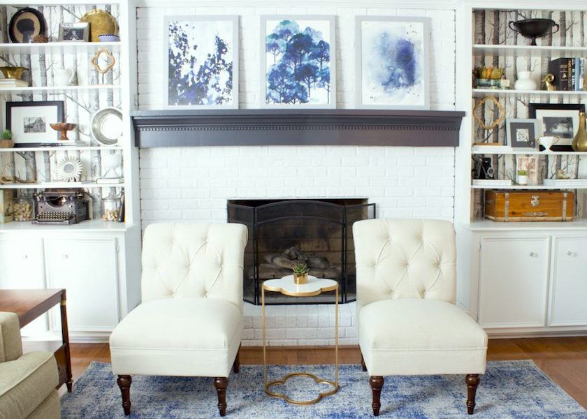
This is a lovely – young-eclectic-traditional home. (I CANNOT say transitional. not my word) There is lots of inspiration for the look that I think would translate well for Carmela on Erin’s site. Love those slipper chairs!
The lovely prints here, here, and here are from Minted which is one of my favorite sources for fresh, lovely framed art prints and more. Geezzz, there are so many great websites!
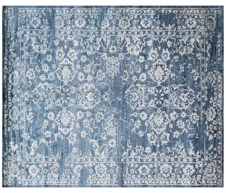 Miramar Rug from McGee and Co.
This isn’t the same rug, but it’s really pretty, I think. McGee and Co has lots of gorgeous rugs and other wonderful home furnishings.
In fact, their entire site is on target for this updated blue and white and IMO classic look.
And by updating, that means paint.
And lots and lots of it.
Yes, paint it all.
Hey, maybe even paint the stone.
And while you’re at it, you might paint the floor too.
Or not.
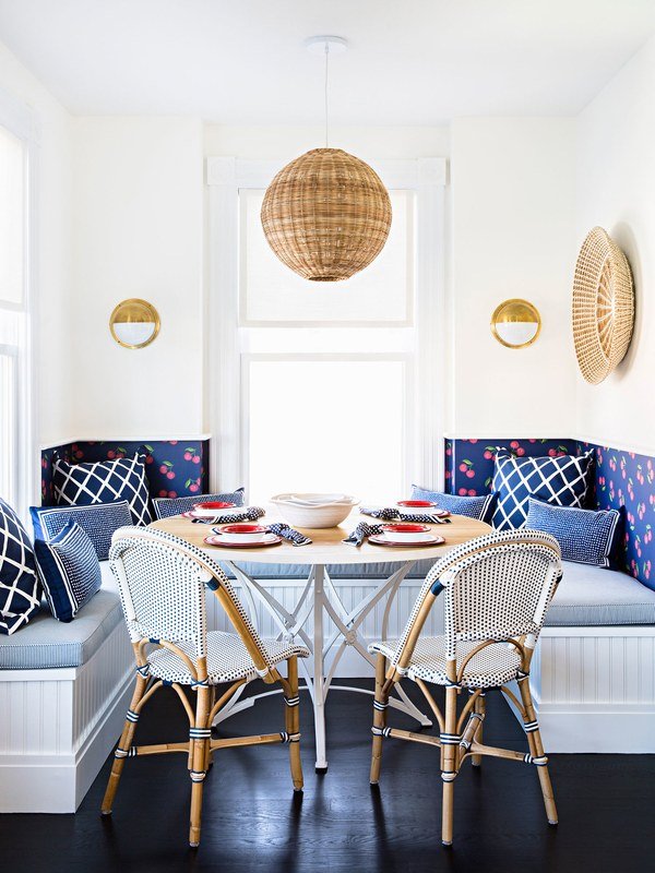
The floor might be stained a dark, rich ebony, like in this charming eating nook from Serena and Lily.
The only thing is… dang it. But the dark floors seem to show every spec of dust. Does anyone know a way to do a dark floor so that doesn’t happen as much?
But Serena and Lily are possibly even more obsessed with blue and white than I am.
But since I’ve had a love affair with S & L for nearly a decade, I guess it makes sense.
Seriously, I could’ve stopped right here with the blue and white decor,
but this is me.
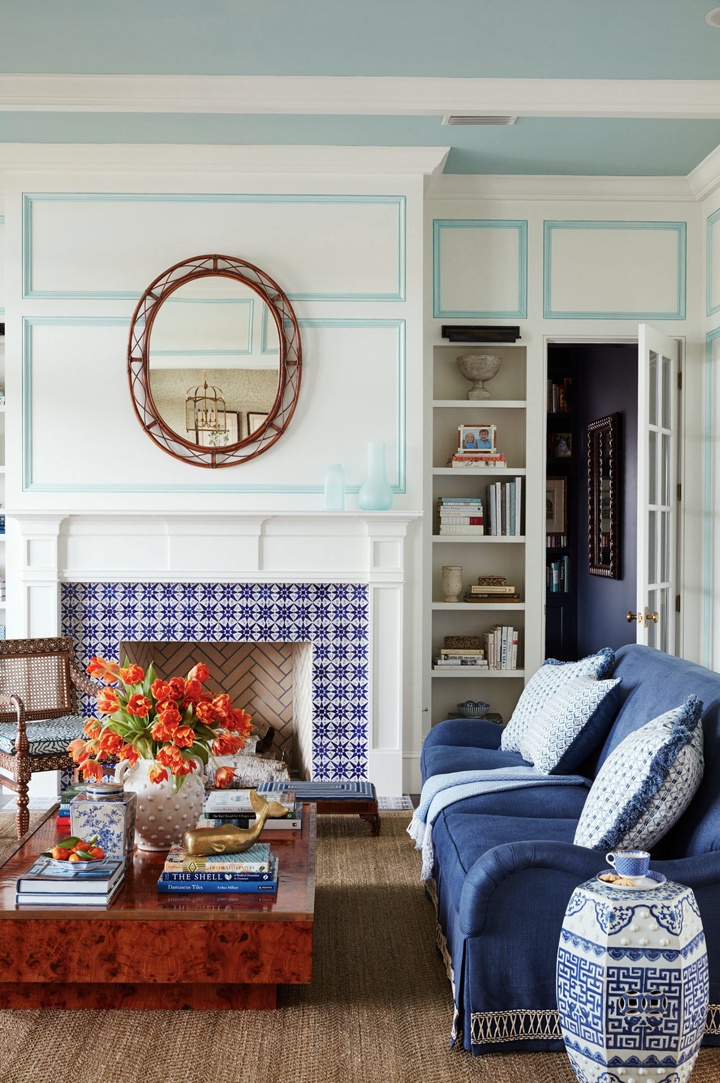
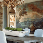
What happens when two giants of interior design and architecture, Phoebe and Jim Howard (and masters of blue and white) get together and procreate?
Well, they create one of the most talented young designers on the scene today.
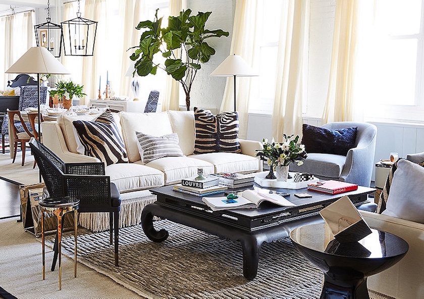
Andrew Howard. That’s his room above.
quite smashing, I think.
I love how he’s mixed in an unexpected aqua-turquoise into the mix.
I know, I know.
WHAT’S THAT COLOR, LAUREL!!!
How the hell should I know?
I mean… Sorry, I have no idea.
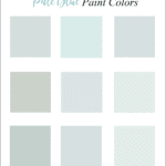
Okay. Fine. I have an idea. It might be Benjamin Moore Dolphin’s Cove which yeah… is part of the Laurel Home Essential Paint Color Collection that comes with the palette collection too–and much more!
BTW, a number of you have paint color questions.
I fully appreciate your need for help. That’s why I wrote the color guides and Laurel’s Rolodex.
These guides are the only way for me to help out with your decorating issues, short of you having to pay for me to fly out to wherever you are and put me up in a 5-star hotel with a hefty per diem.
Okay?
I knew that you’d understand. ;]
Back To Andrew’s beautiful decorating.
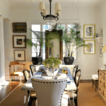
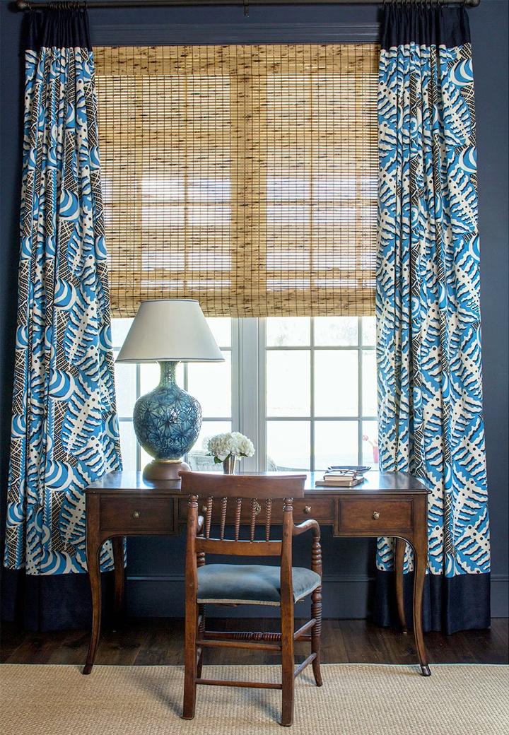
The room beyond the living room is this way handsome library/office/den/whatever.
I love the drapery treatment with the banding top and bottom.
I know how that happened too.
The intern didn’t allow for the repeat of the fabric and so, six weeks later when the workroom went to sew them up, WE get the call.
Laurel, you didn’t send enough fabric. We need six more yards.
SIX MORE YARDS!!!???
BLIMEY! Where’s that Christopher? What? he’s back in Scotland? Well, isn’t that just peachy? Gina, get Lee Jofa on the horn to overnight 6 more yards of that stuff STAT to the workroom.
WHAT DO YOU MEAN THAT THERE’S NO MORE STOCK? WHEN’S IT COMING IN?
WHAT???
IT’S DISCONTINUED???!!!
WELL, ISN’T THAT BLOODYTASTIC!!!
YES, I’M SCREAMING!!! THIS IS DISASTER!!!
I know that you designers are collapsing with shadenfreudic glee, because this has happened to all of us.
Yeah, too many times.
But oh man. I’ve got it.
“Gina, get Norbar on the phone, and please order 6 yards of Navy cotton to go with the Lee Jofa. And, when you have a sec, call Carmela and tell her that we’re doing a little something extra for the drapes that she’s gonna love. No extra charge. (hehe) And then get me a glass of chilled rose. Thanks, hun.”
Okay, I just made all of that up. Not the premise, but the rest. I am sure that Andrew INTENDED to put the border on the drapes. I do love it!
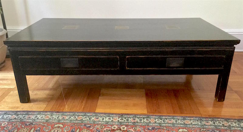
Here’s a very nice black slightly rustic ming-style table for 400 bucks. It’s more casual, but still quite cool. It would be great for a family room or a laid-back living room.
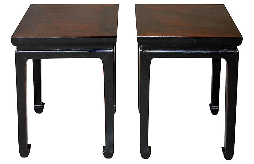
In addition, I also found these little ming end tables. (not to be used with the ming coffee table, though. Too much)
They are only 20″ tall, so a little low for a side table – unless it’s going next to a slipper chair. Then perfect. OR, they could go with an English roll arm and then do a nice tall skinny lamp.
OR, they could be used side-by-side as tea tables in lieu of a coffee table. That’s a great look and wonderful if space is a little tight.
Did you see the sale that McGrath II is having at Chairish?
(And yes, that’s their gorgeous room above.)
Their “collection” of mistakes stuff, they are trying to get rid of sell.
Wow. I’m in some mood tonight.
I’m really only about 3% serious. There are lots of reasons that we end up with stuff we can’t use. It doesn’t mean that there’s anything wrong with it. Sometimes things get ordered and then something changes and it can’t be used. Or the intern orders the wrong color-way. That sort of thing.

Or the client decides to hang her children’s portraits where these fabulous prints were supposed to go. Fine. It’s her home. I’ll take the prints! I am sure that I’ve done that too, but blocked it out! (used stuff that the client didn’t want.)

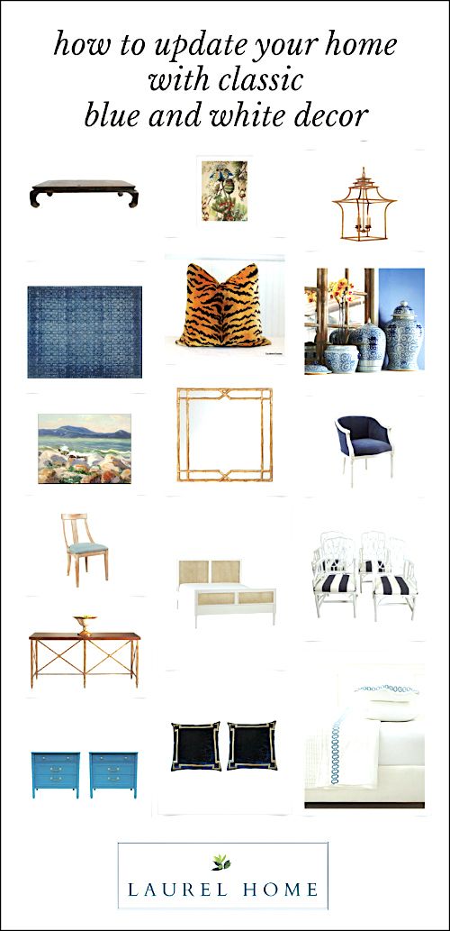
And now some beautiful blue and white decor and home furnishings.
please click on the individual images for more info.

Oh, before I forget. Please check out this week’s HOT SALES page. Lots of terrific sales going on mid-summer.
xo,

Related Posts
 Light Blue Wall Colors-Don’t Make This Mistake!
- Is It True That Dining Rooms Are Out?
- Buying A Greek Revival Dream Home Might Be A Mistake
- My Adventure to Hudson, NY and Easthampton, MA
- Help me please. My husband wants a matched set of dining room furniture
- New york international gift fair – summer 2012 – part II
- How To Coordinate Lighting That’s Smashing, Not Boring