Guys,
Oh my, before we get into the universal color, I don’t know what to say about Sunday’s post, except it was the heights of good and the depths of bad.
Most of you are incredibly kind and supportive, and I appreciate that more than I can say. However, it was a struggle to get out of bed this morning. That’s how bad the onslaught was to tear me down.
Good God for those of you ill-mannered guests. Do you go to a friend’s house for dinner after they’ve spent hours cleaning and cooking and then proceed to rip them apart? No, you don’t. You don’t, or you won’t be invited back.
Well, it’s the same here. If you don’t like my cooking, you’re free to leave.
’nuff said.
You know, some of you have suggested that I pour myself a glass of wine. But, I really don’t drink.
I mean, rarely and then only a few sips. Literally. It just doesn’t agree with me. In fact, it seems that every gentleman on match dot con loves to go sailing with a bottle of wine. Since I also get seasick just walking down the sidewalk, that’s not my idea of a good time.
So, what do I do when I want to escape?
Well, sometimes I’ll have a glass of banana cream pie. (BCP) Remember this legendary BCP? I will never forgive myself for not getting a doggie bag!
Otherwise, since I’m a computer addict, I get online and look at beautiful things like art and ballet.
Since it was a blog day, I ostensibly exercised some discipline in the name of “blog research.”
Ha!
It’s always the same for me.
Oil paintings. Somewhere around the 18th century, give or take 100 years.
I love the deep rich colors, featuring greens, gold, teal, blue, and sometimes a little red, rust, or orange.
I’ve been OBSESSED for months with these gorgeous and HUGE paintings attributed to the “Circle of Jan Van Os.” I believe that means they probably weren’t painted by him, but maybe someone who studied with him? Anyway, they are still for sale at Gerald Bland’s shop in NYC. It says on his website to inquire about the price.
And you know what that means.
It means, “If you have to ask, then you can’t afford it.”
Right?
They’re probably like $50,000.00 or something like that. Wouldn’t they be amazing in my living room?
Maybe a housewarming gift?
LOLOLOLOL!!!
Anyway, I’m too chickenshitscared to inquire. If anyone wants to and get back to me, I would be grateful. Oh gawd… imagine if like 50 of you call tomorrow. haha.
Another option to “get the look” is yes…
No, I don’t have the strength.
Let’s just say I could commission an artist to paint a copy of an art masterpiece.
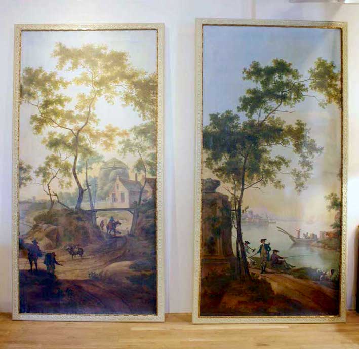
For instance, maybe a section of the two following images by Jan Both.
 Italian-Landscape-with-the-Ponte-Molle.-1640-1652-Jan-Both-oil-painting
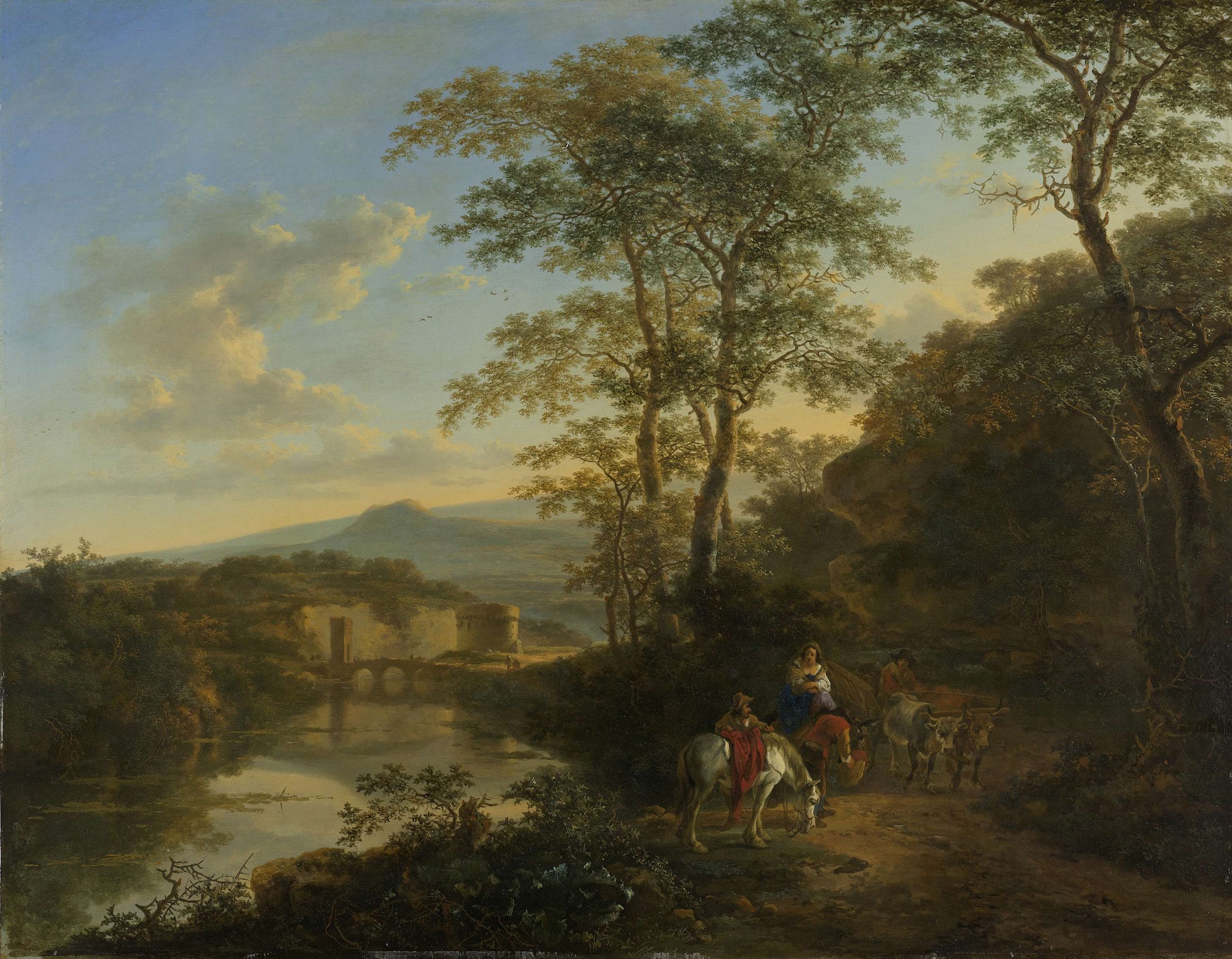
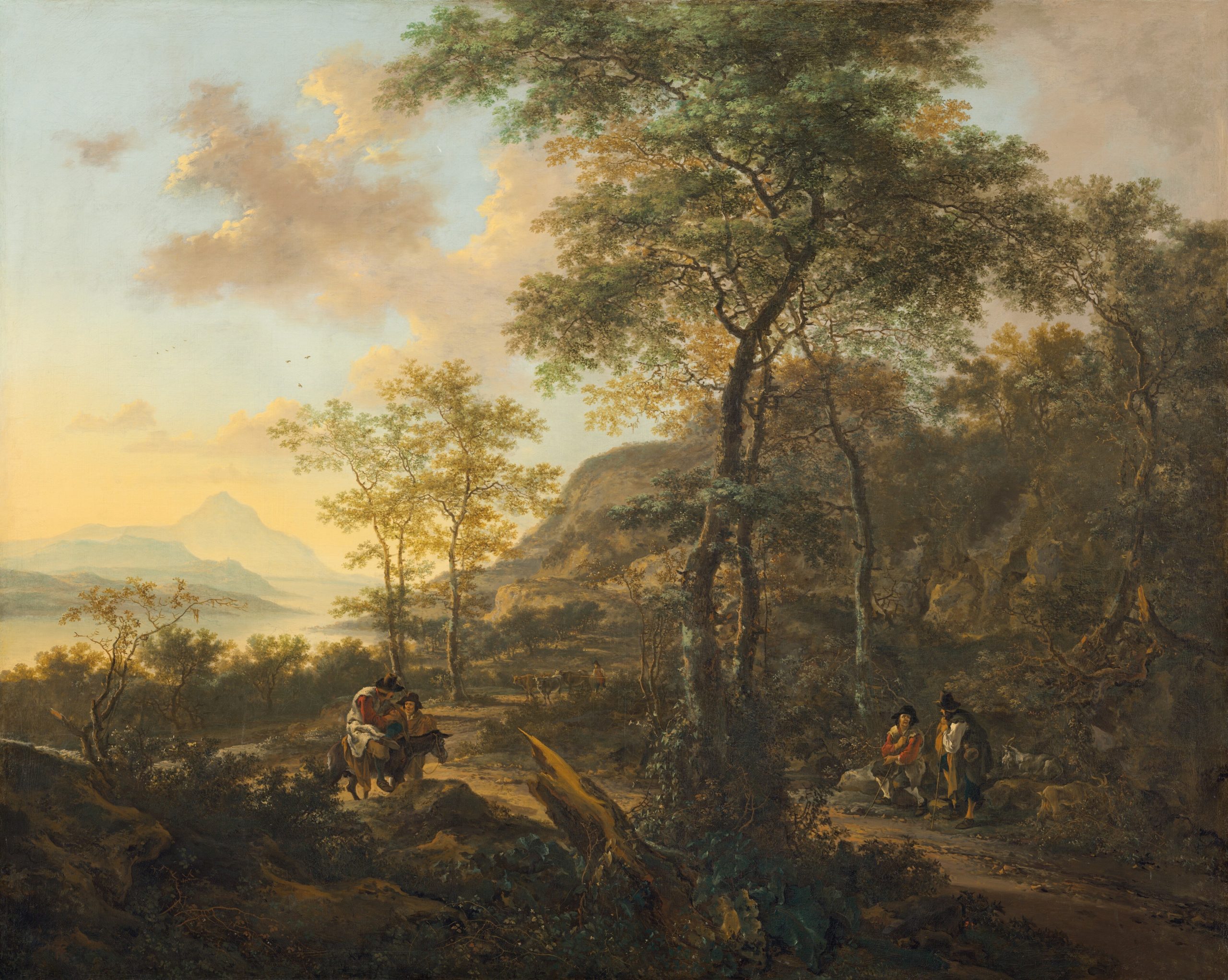 an_italianate_evening_landscape by Jan Both
It’s about my favorite color.
It’s chartreuse—everything from gold to any amount of yellow mixed with green.
Something I realized years ago is that chartreuse is truly a universal color.
If you don’t already have my paint and palette guide, you’ll learn about universal colors. And, you won’t ever have to guess what goes with what.
In fact, if you have a room that’s dull and lifeless and you don’t know how to wake it up, add a shot of chartreuse.
By the way, I was going to redo a couple of old posts. However, the first post about chartreuse was back in April 2012. No worries, I went back a while back and fixed it. It was so bad. But I don’t want to get rid of it.
And yes, Laurel Home is going to be NINE YEARS OLD!!!
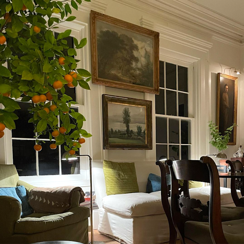
Above is a wonderful image I helped myself to from my friend, Kyle Hoepner, from his Instagram. Kyle was on the trip to Italy nearly five years ago. He was the editor-in-chief for New England Home Mag but now consults for the interior design and related trades.
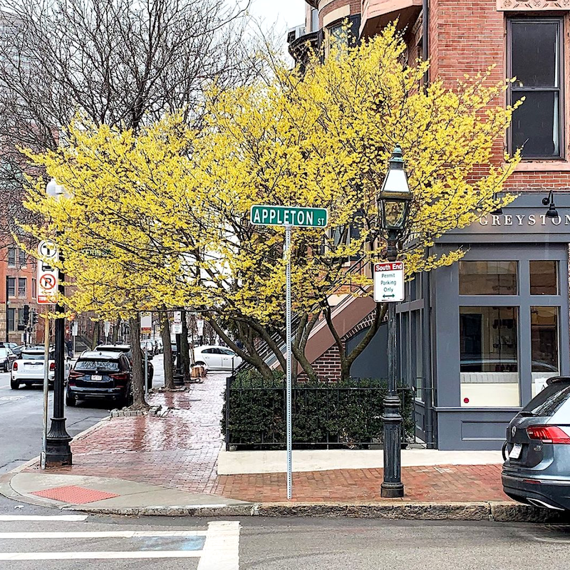
So, what IS that glorious chartreuse tree?
Well… coincidentally…

A couple of weeks ago, I walked with one of my new Boston friends in the public garden when we happened upon this foreign but delightfully fragrant tree with chartreuse flowers. She’s only been here 18 months, and neither of us knew what this tree was. So, we snapped pics, and she looked it up on one of those apps. How cool is that! And yep. It’s witch hazel.
But, you Bostonians all knew that, already.
The next three shots, I swiped from Gerald Bland’s glorious Instagram account. Please follow him if you aren’t already. If you want to learn how to put together an elegant room, just do what he does. Indeed, he makes it all look effortless. It’s not, of course.
Lucky dogs!
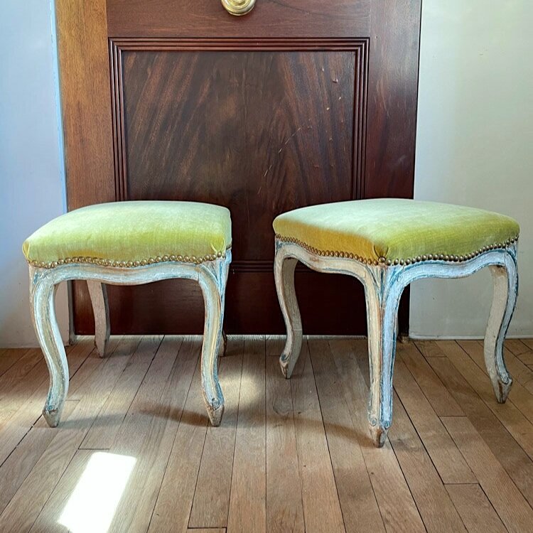
Gorgeous tabourets, they are called. We can just call them stools. (Louis XV – Rococo)). That is the same period of time as Pillement who painted the glorious Chinoiserie toiles and other paintings. There’s that yellow-green. That looks to be a linen velvet.
Oh my! Gerald has the same fabric on his pillows as is on my settee. Only his pillows aren’t horribly faded.
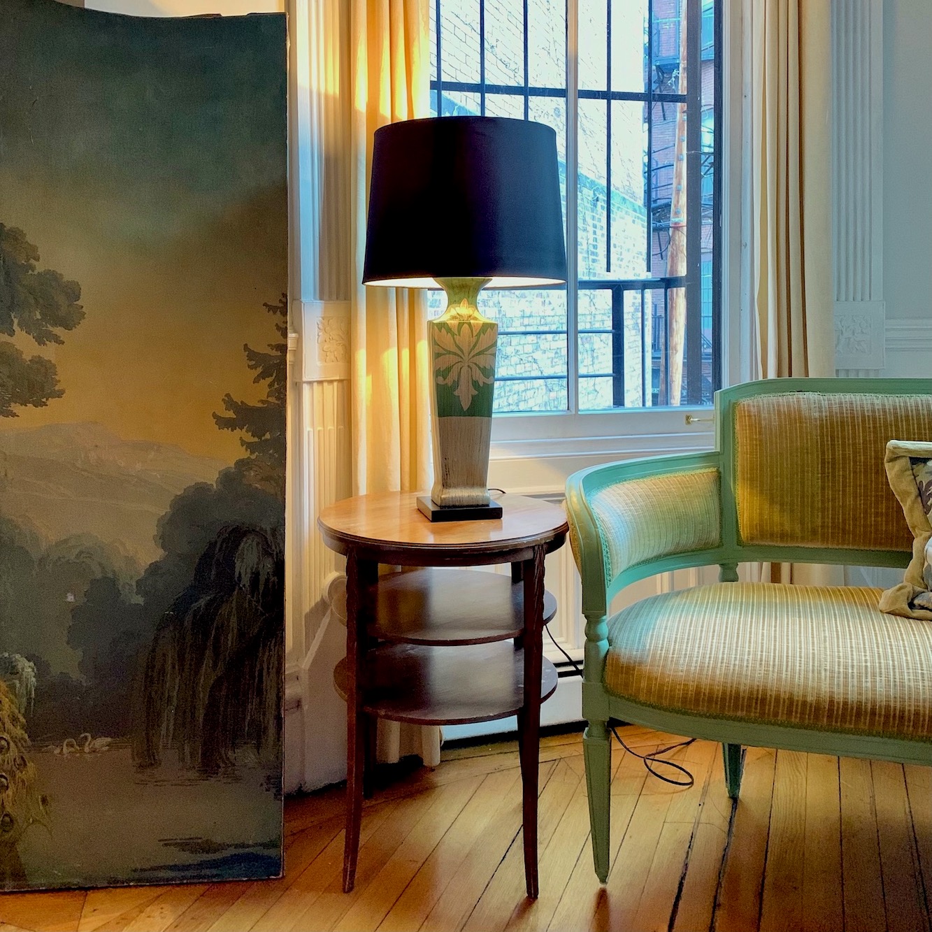
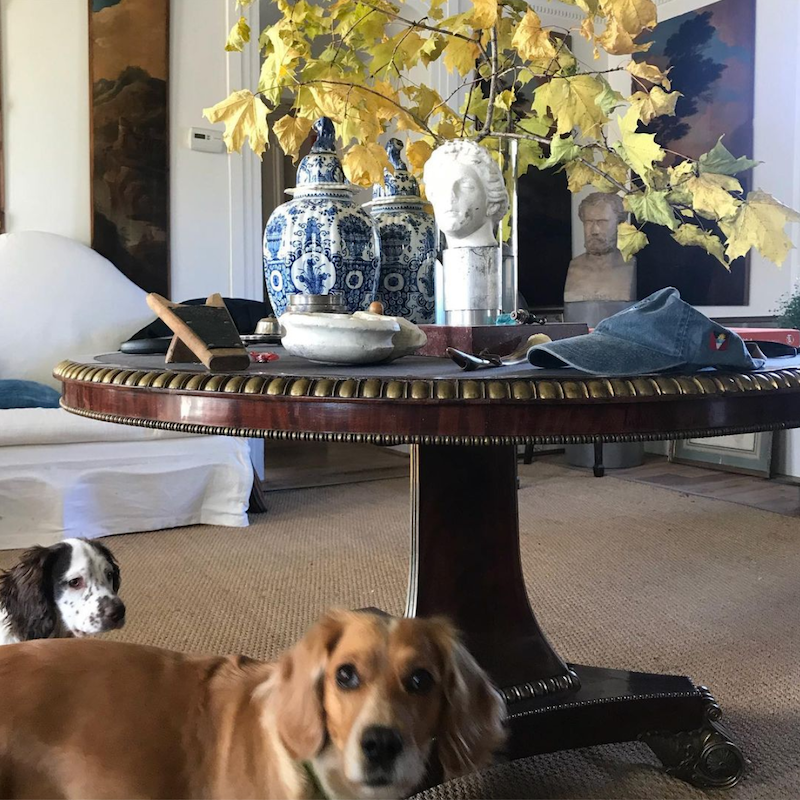
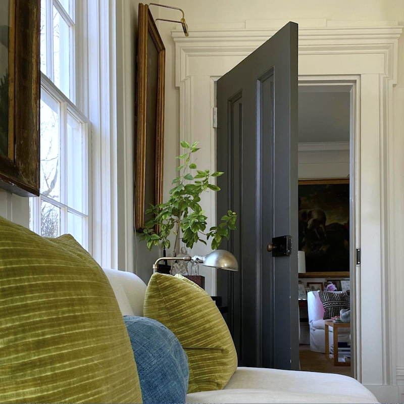
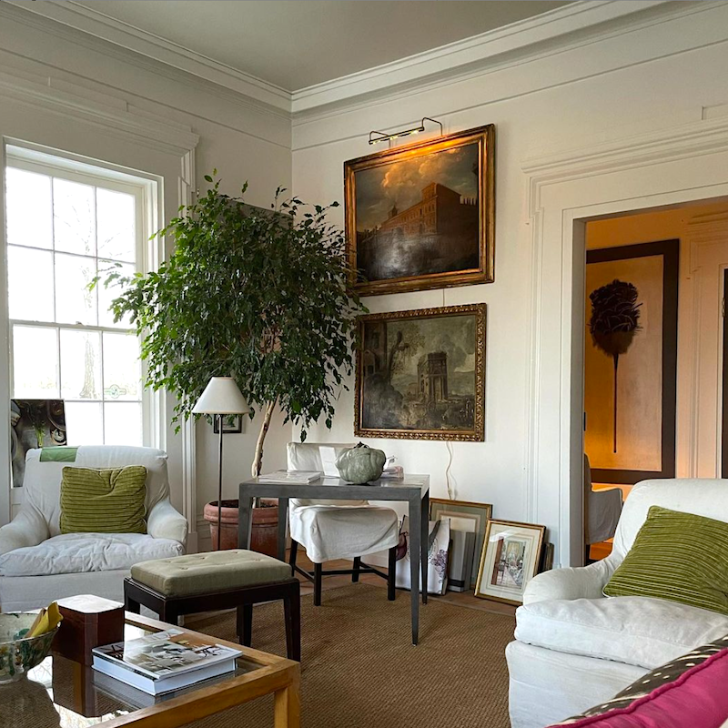
Above and below is from my new living room in Boston.
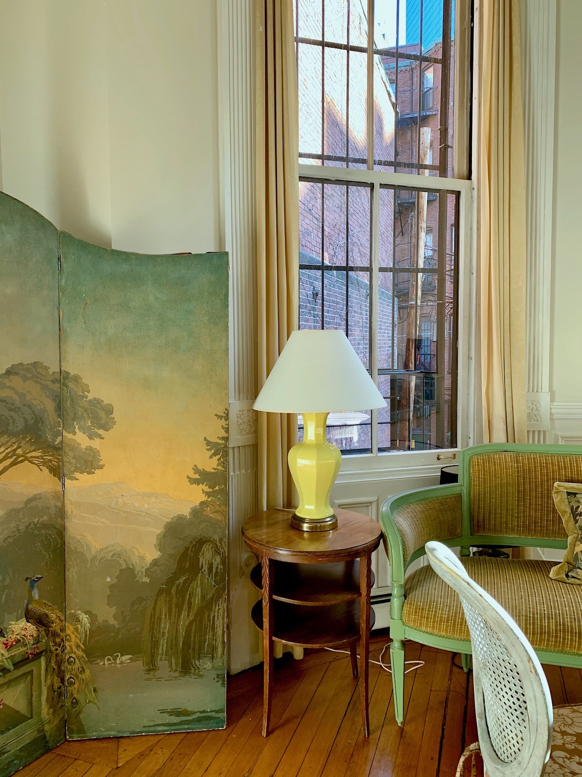 This one with the lights out is more accurate.
Oh, one more painting, and I bet very few of you have heard of this artist. I would not have heard of him, except there’s a gorgeous painting of his in the Bronxville Library.
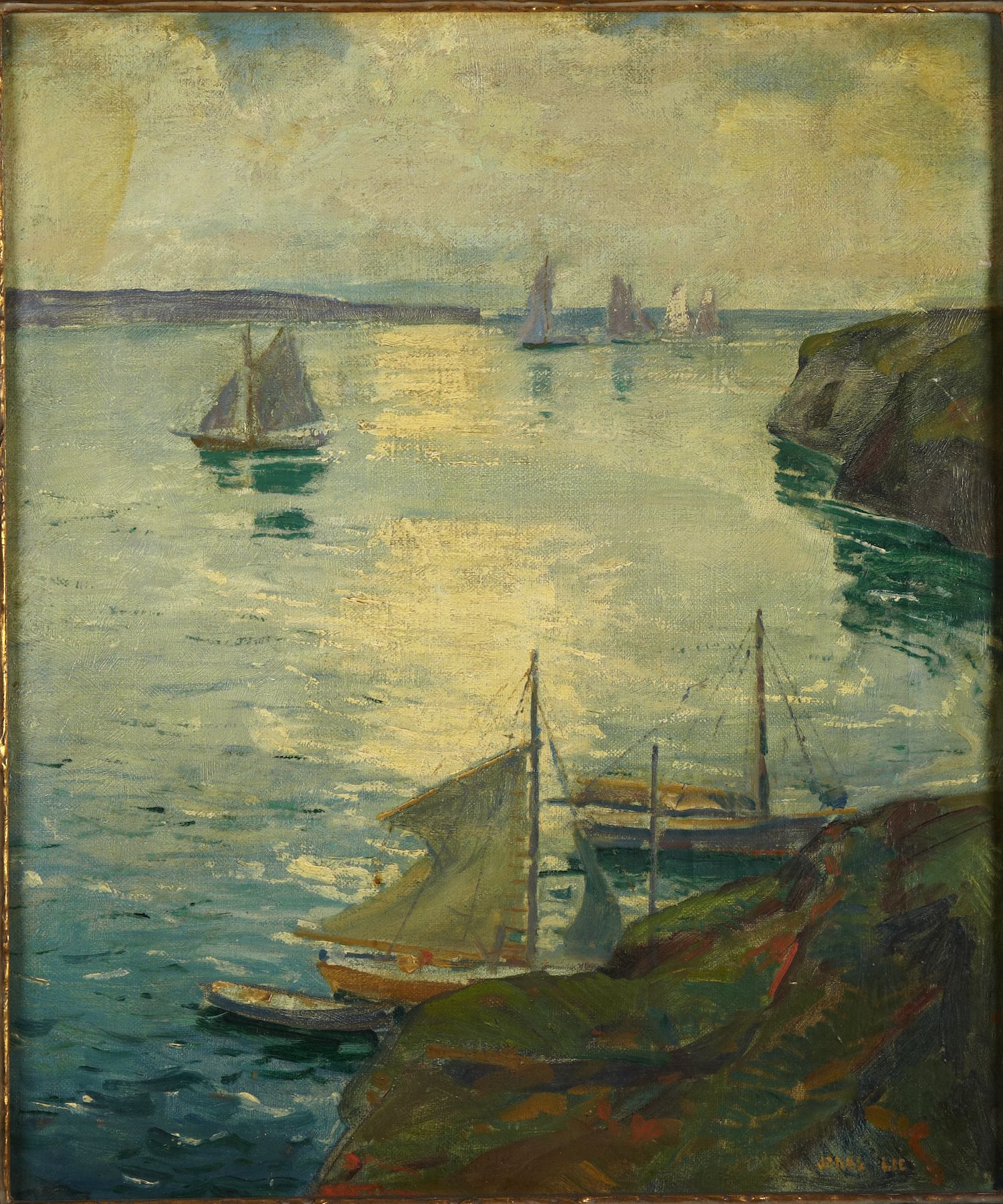
Most of his work is early 20th century. So painterly is his work. And the colors!
Back to Gerald Bland.
Remember this post about “bland decor” (not) that I devoted to him. I’m a huge fan, obviously!
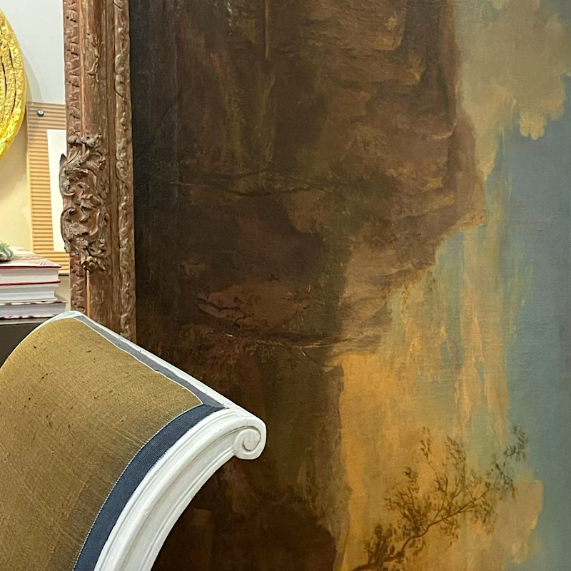
Oh, it matters not that the painting is on its side. I see shapes and the glorious colors. It’s the same with music. I don’t care about lyrics so much; it’s the melody that speaks to me.
You see, people in paintings don’t generally jump out at me unless there’s a lot of drama and they’re getting their heads chopped off or something like that.
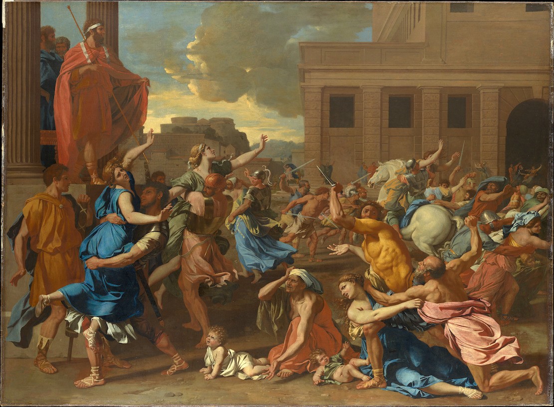
Poussin Abduction of the Sabine Women 1633 – Met Museum

Okay, there are a few exceptions. This dude I noticed. hubba hubba. Yes, please carry me off. I will see you in heaven. ;]
.
What I love about Gerald’s home is everything, but I would never have the courage to hang the art across the window frames like that. And yet, it looks perfectly correct when he does it. BTW, I do go over proper art placement in my 333 Decorating Rules & Tips You Need to Know Guide
There’s a lesson in all of this. It’s the same lesson in nearly every post.
It’s the bones. If you get that right, the rest doesn’t matter as much.
Yes, that’s some costly old art he has collected, amongst other treasures. But, there’s a relaxed old-money look that’s not easy to come by.
Ha! But, when did that ever stop me?
In the meantime, the rest of my fun was in creating another beautiful widget.
I know that I’ve been doing a lot of them recently. And yes, if you buy something, I’ll probably make a few dollars. But, really, it’s just so much fun hunting for the right pieces. I never expect anyone to get anything, but I am grateful to those who do.
The widget below features home furnishings that are in the universal color chartreuse family.
However, I added in other colors that I think all work great together. So, in that way, it becomes a palette one could use for decorating.
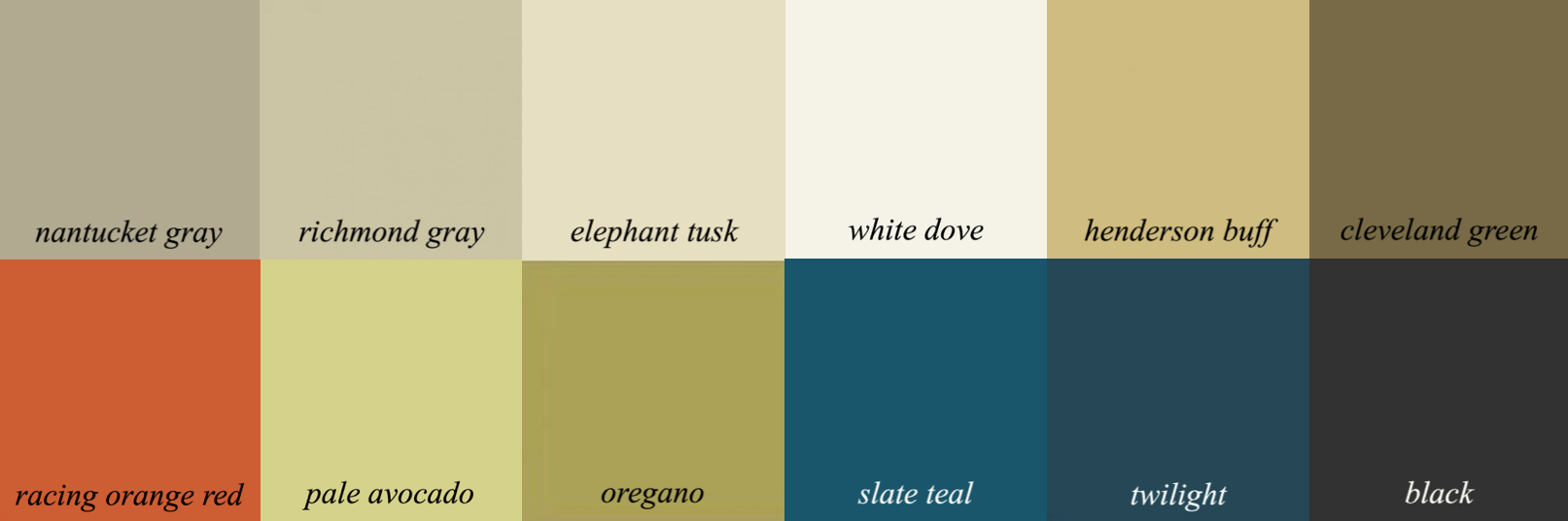
It’s a lot like my Nantucket gray palette from the Laurel Home Paint and Palette Collection.
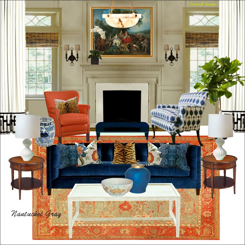 Here’s the board
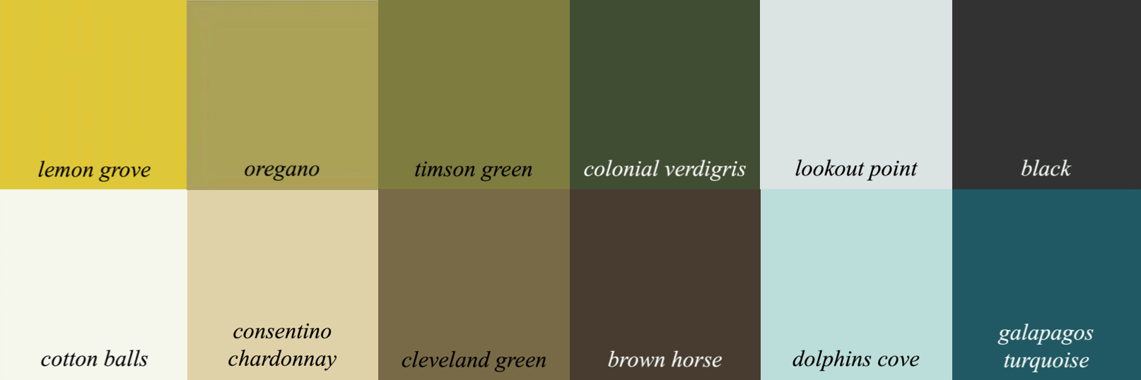
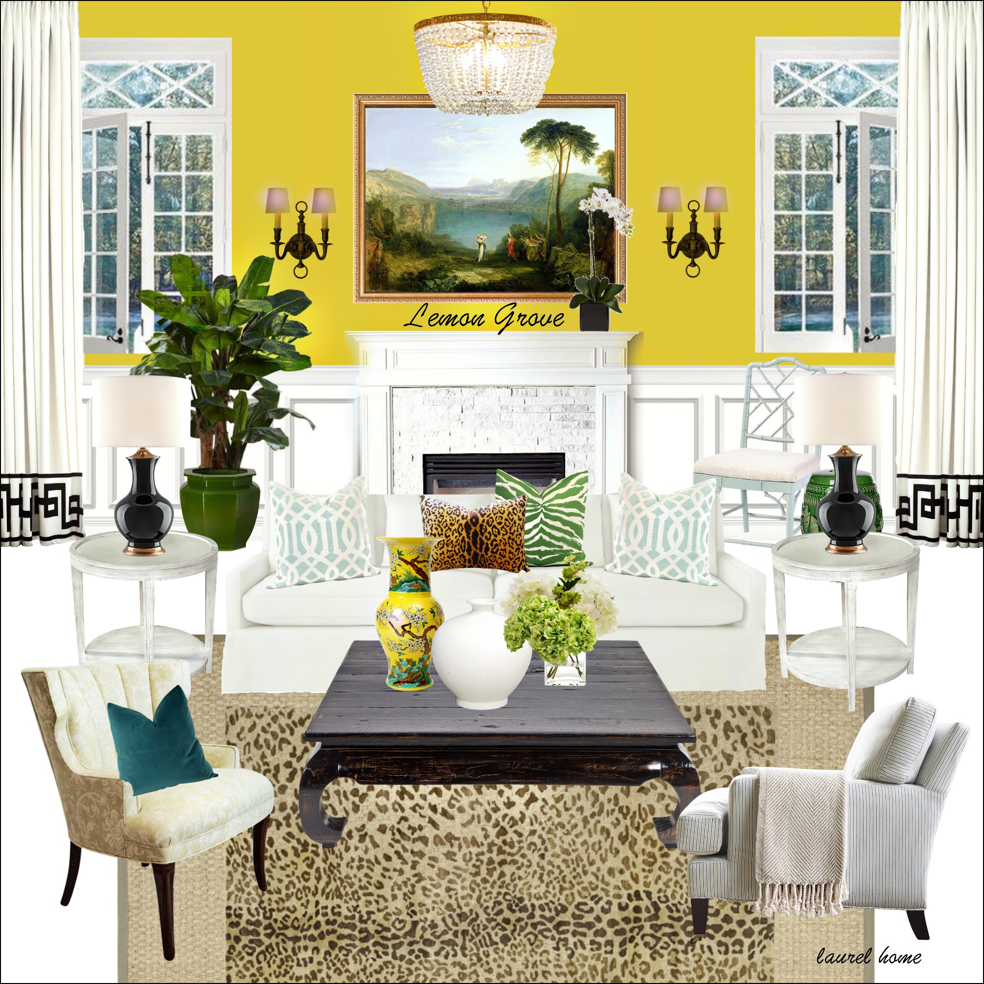
And, the lemon grove palette and also has more colors. This color is in the same palette family. All of the colors in each palette family go together. So, no guessing!
Okay, here’s the widget. Please enjoy the beautiful furnishings.

Well, that’s all for now.
Blessings to all of you!
xo,

PS: Please check out the newly updated HOT SALES
Related Posts
 The Only Six White Paint Trim Colors You’ll Need
- How To Create The Mark D Sikes Look For Your Patio Furniture
- Stainless Steel Sucks – What You Should Use Instead
- The Ultimate Guide To Fireplace Mantel Decorating
- How To Create The Perfect Summer Home
- Is The “Unkitchen” Kitchen Design Trend, Here To Stay?
- Some Unusual Renovation Ideas for a Brownstone Duplex