

Hi Everyone,
Before we get into the Color of the Year – Benjamin Moore COTY 2022.
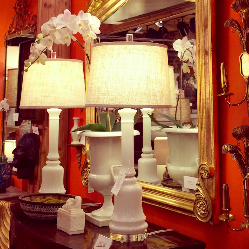
I just have to say that I’m back from a trip to New York. It was a lovely trip which I took for a bit of a break, but mostly to see the young prima ballerina, Skylar Brandt, perform the title role in the iconic ballet, Giselle.
Yesterday, on the train home, I got an email from my sister, Holly, who asked me.
How was it?
And since my internet was slower than molasses sitting on the shelf for a decade, I took the time to write her back a review which I have republished here, along with some pics I took during the curtain call.
Yes, I am aware that there have been other reviews written. However, I wrote this before I read them.
There is also a little extra treat on that page.
Okay, it’s time to discuss the Benjamin Moore COTY 2022

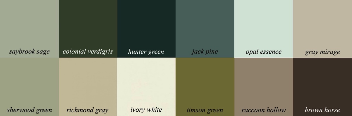
October Mist 1495
If that color sounds familiar to some of you, it’s because it’s very close to a dead-ringer for a Farrow & Ball color, Blue Gray from the Benjamin Moore conversion chart.

Blue Gray, which is neither blue nor gray, is a muted sage green. And, so is October Mist 1495.
Henceforth, October Mist is a color for the sages.
Cute little pun, huh?
In addition, for Laurel Home paint collection owners, two down from 1495 lives one of the paint collection colors often talked about on this blog;

The very liveable Rolling Hills 1497. That is a reasonably deep color.
October Mist is a mid-tone sage green.
In addition, there is another Laurel Home Paint Collection color that is very close to October Mist, and that is Saybrook Sage hc 114. We’ll be looking at that in a bit.
Okay, it’s time for some Sage Advice. ;]
Please don’t drive yourself crazy with these minor color differences.
Does anyone know why?
Yes, Cynthia.
Because of the lighting?
Yes, the lighting in your room is going to make the difference. Of course, it changes all of the colors in relation to each other.
However, below is an excellent example of the point I’m trying to make.
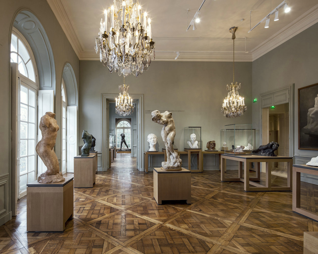
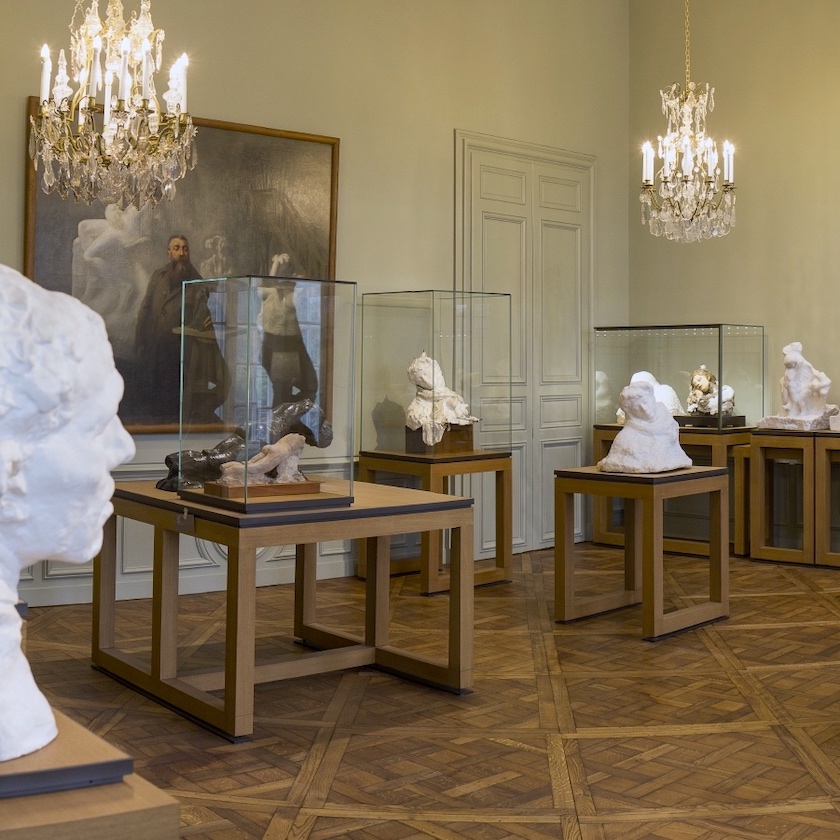
Above and below is the Musee Rodin in Paris via the living Beautifully blog. The paint color, I’m pretty sure, is Farrow & Ball Blue Gray. This color is also close to the COTY 2022 – October Mist 1495.
Above is Farrow & Ball blue-gray. And, yes, the same color can look this different in a photo and in person. We’ve discussed this in other recent posts. This is the reason why we must always test, test, test paint colors.
This is also why when folks ask me, “What is that paint color?” Well, I hope you can see why that’s problematic. Seldom does a paint color in print look like what it is.
Above is a photo with the Benjamin Moore COTY 2022 – October Mist.
Above, I color-corrected a little, so it is closer to the actual color.
Some will say that Benjamin Moore COTY 2022 October Mist is a “safe choice;” or maybe even boring.
Indeed, they also said that Simply White was a “boring choice.”
I’m afraid I have to disagree quite strongly. I think that Simply White, albeit brave, was the best color they had chosen to date.
In addition, when it comes to painting all four walls, in my opinion, “safe” and “boring” might be the better choice.
That doesn’t mean that you can’t do a jazzy color like Racing Orange Red, for example.
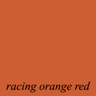
In fact, that would be an excellent accent color, say for a dining room, off of another room in October Mist.
In addition, I think that October Mist is a far better choice than the somewhat cloying Guilford Green from 2015. Hmmm… I thought I had done a post about it, but I can’t find it. Oh well, probably for the best!
Now, let’s look at the Benjamin Moore color trends 2022 to see how they did with those colors.
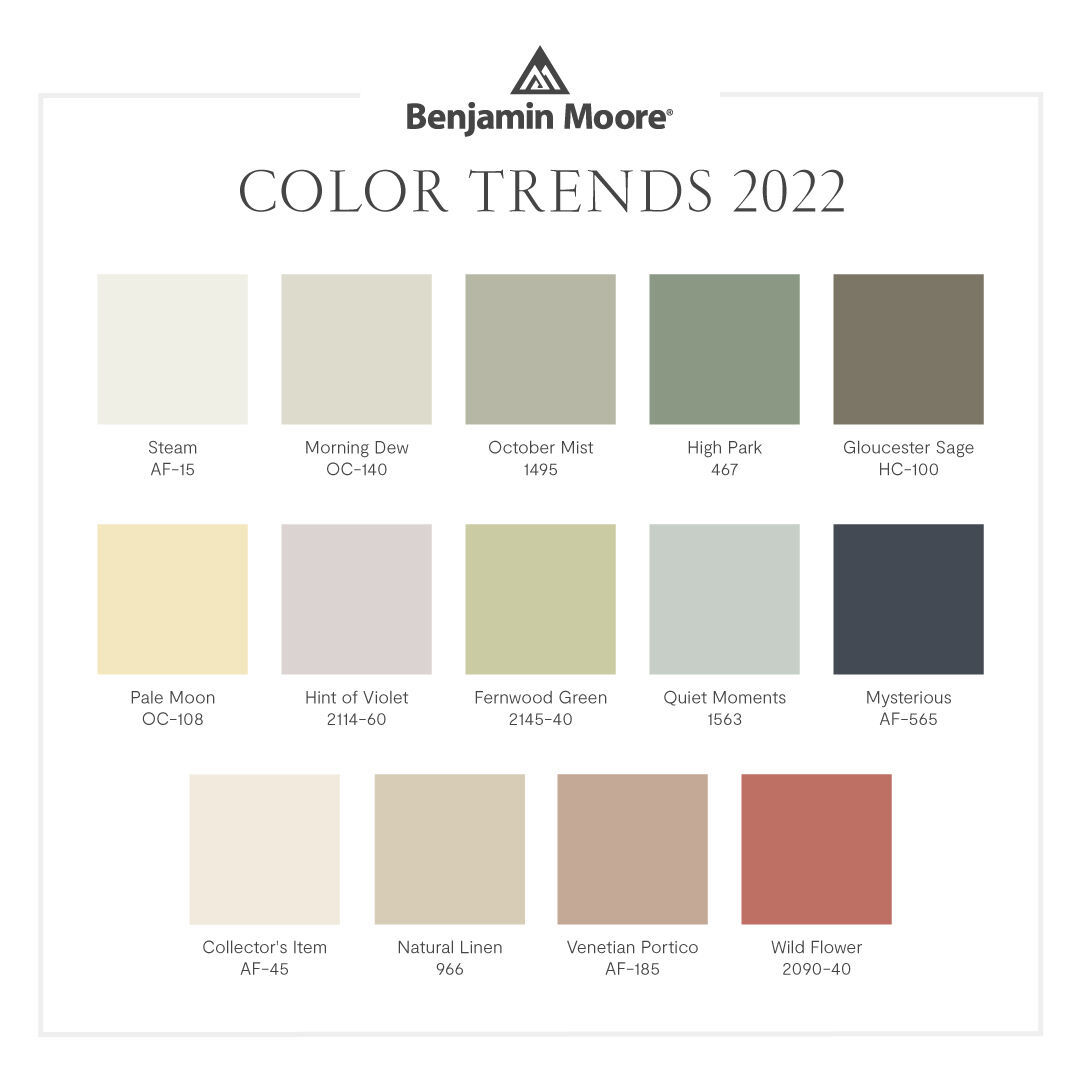 Of course, no one would put all of these colors together in one home, unless maybe in a fabric. However, I think this color palette shows a lot of thought, and it coordinates nicely with some of the palettes in the Laurel Home Paint and Palette Collection.
Below are two palettes from the Laurel Home Collection, along with their accompanying boards.
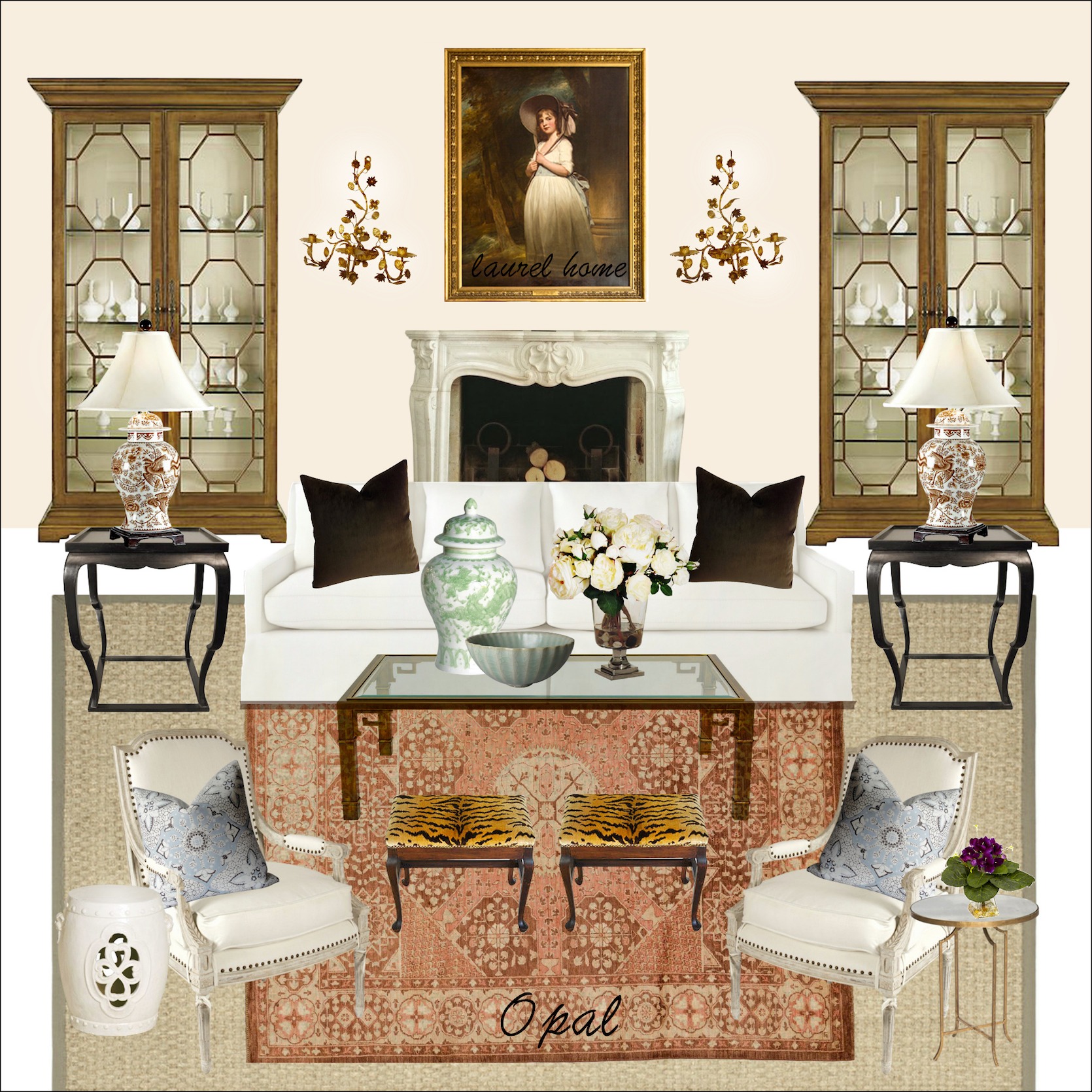
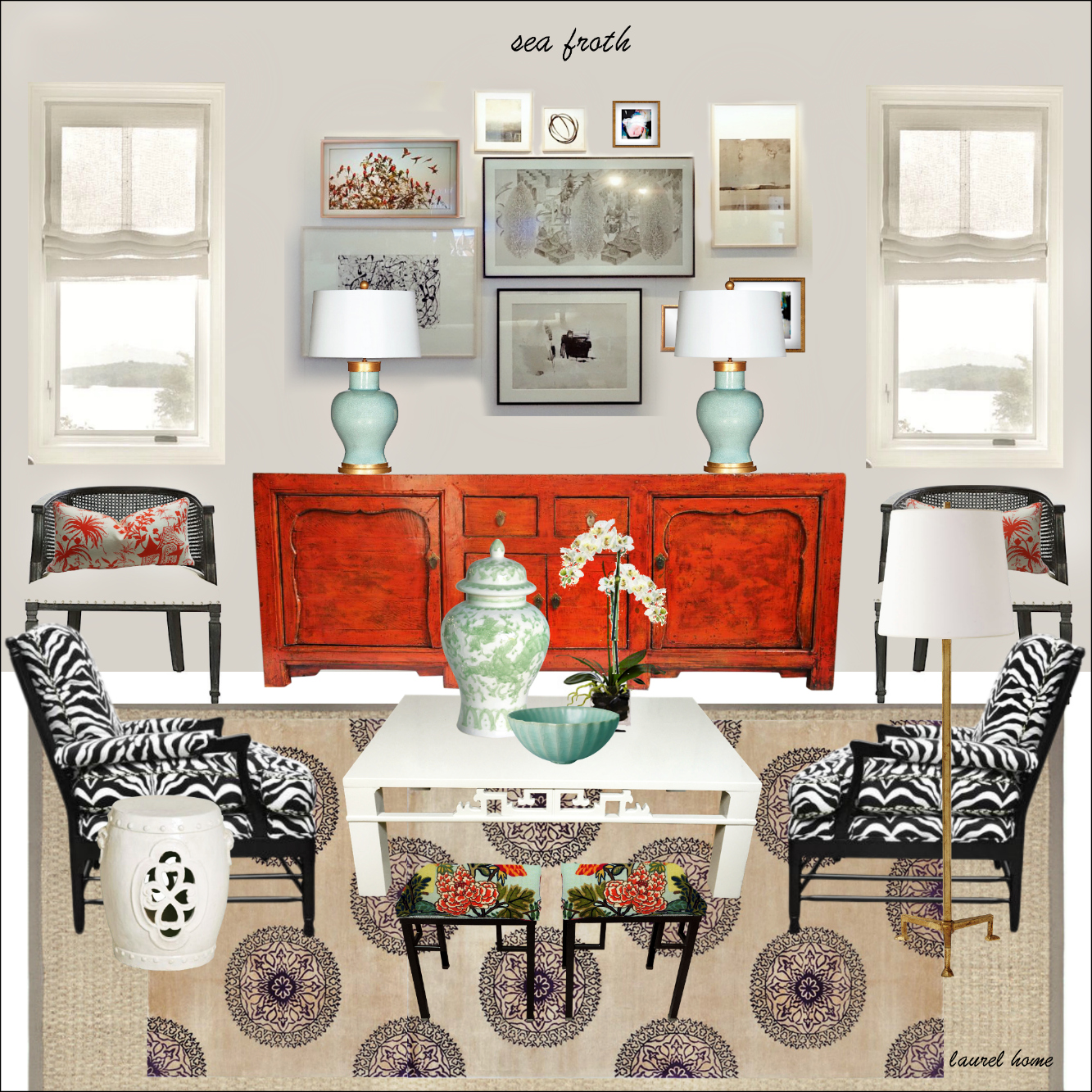
Below is sea froth, a very soft whisper of lavender in a warm pale gray. It’s a lovely color we did in a living room several years ago.
This is one of the bonus boards I created later on.
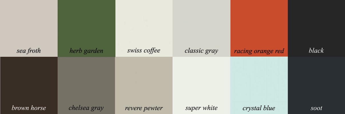
I discovered that all of the colors in color trends except for High Park and Venetian Portico have an identical or very close fraternal twin in the Laurel Home Collection.
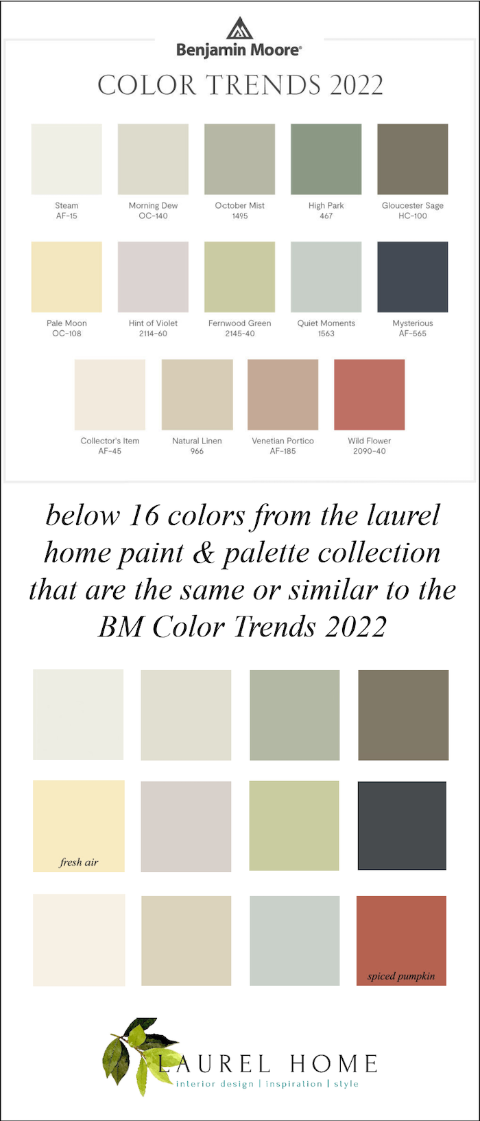
Yes, I’m going to tell you the names of the Benjamin Moore paint colors that match other Benjamin Moore paint colors. ;] (Although one of them, Quiet Moments is the same.)
The colors from the top left to right are:
Swiss Coffee, Halo, Saybrook Sage, Desert Twilight
2nd Row:
Fresh Air, Sea Froth, Peaceful Garden, Racoon Fur
3rd Row:
White Blush, Manchester Tan, Quiet Moments, (also in the trends) Spiced Pumpkin
Saybrook Sage hc 114 is another Benjamin Moore color that is close to October Mist.
Above is October Mist 1495
 Above is Saybrook Sage hc114 and one of 144 beautiful Benjamin Moore colors in the Laurel Home Essential Paint and Palette Collection
 Above is a palette I created using colors in the collection. The palettes are all of the colors in the space. They aren’t going to all be used as wall colors. You can also combine color palettes that I have separated out in “palette families.”
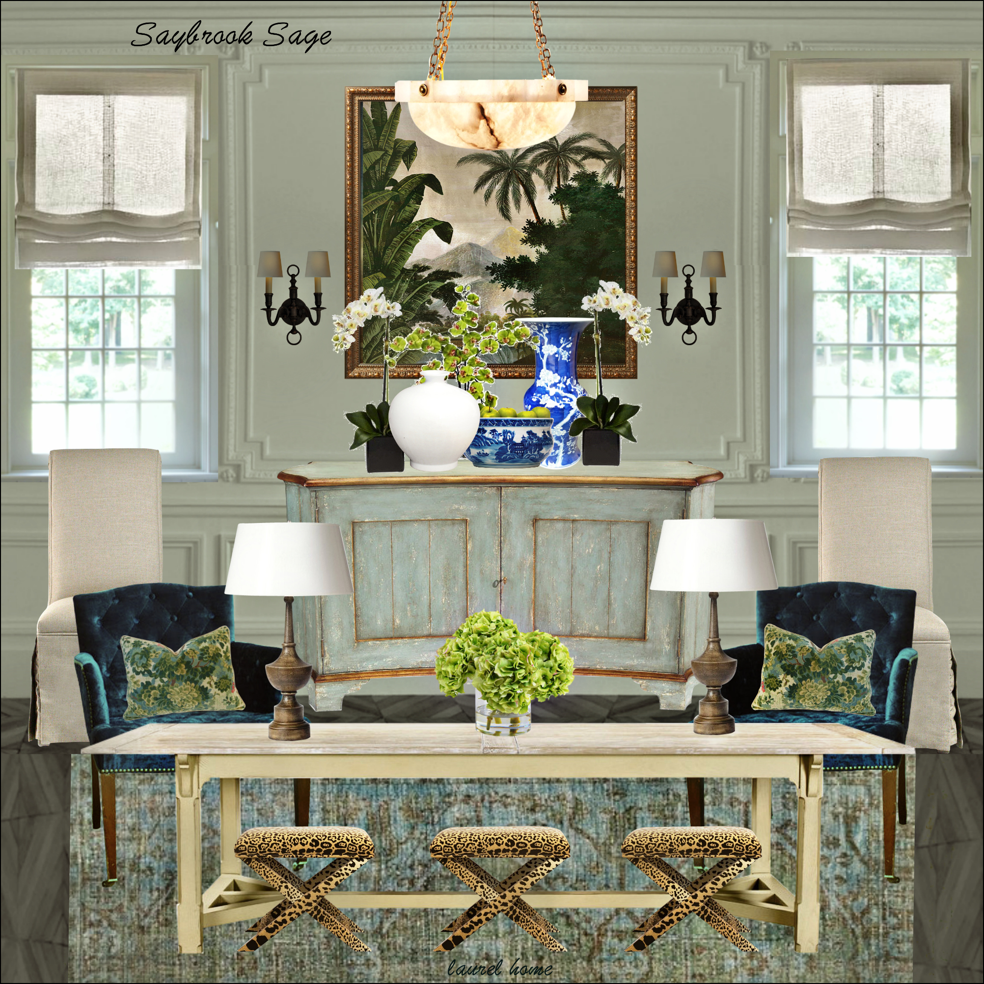
Above is a board I created with Benjamin Moore Saybrook Sage walls.
There are 40 palettes with accompanying boards and lots of other information.
You can find out more about it starting here.
In summation, I’m pleased with Benjamin Moore’s selection of both the COTY 2022 and their accompanying color trends.
And, I think it’s funny that so many colors in my paint collection are dead ringers for their colors.
Hmm… It must be a coincidence. Right? Of course, it is. lol
Please check out the newly updated HOT SALES. It’s a particularly good weekend with some surprising sales I wasn’t expecting. And, there are also a lot of new items in the widgets to see.
Also, if interested or just curious about my review for Skylar Brandt’s New York debut of Giselle, please check out this page. The first part of the page, I wrote a few days ago, talks about Skylar’s background and our connection. The new review is towards the bottom.
xo,

Related Posts
 Little Known Ways To Score Free Furniture (or nearly free)
- 20 Timeless Kitchens You’ll Love FOREVER!
- Painted Hardwood Floors – Good Idea or a Bad One?
- Small Decorating Details That Add Up For Huge Impact!
- How To Deconstruct Mark D. Sikes Brilliant Interior Designs
- 22 Living Room Lighting Rules You Need To Know
- The Number One Decorating Mistake and How To Avoid It


36 Responses
October Mist: meh.
Your boards are yummy.
Thanks for the sneak peek into your “Laurel Home Essential Paint and Palette Collection.”
Looks like you put a lot of effort and information in there, which doesn’t surprise me a bit.
I, too, have used Guilford Green. Albeit its in a powder room with white board and batten and navy vanity so there’s not a lot of it but I love it.
I enjoy reading your posts Laurel. I have taken your advice on paint colors in the past. I do however have a different opinion of Gilford Green. We used it on the walls in our garden room with Jack Pine as the trim color. It looks stunning with all our plants inside and out.
This is such a livable palette. And I love Quiet Moments – I have it in my bedroom. But here is a question, if you don’t mind. My living room has 2-story windows, outside of which are trees and north-eastern light. So cool, green filtered light. I was thinking a warm color to counteract the green, but maybe I should just go all-in and do the October Mist? Just embrace the green, or counteract it – any thoughts? Thank you in advance!!
thanks for this post. such lovely colors.
My first passion in life was ballet, then came interior decor. So, I’m thrilled that you shared Skylar with us! And more thrilled that you got a well-deserved break!!
Thanks for such an informative post, Laurel. It took me a few years of COTY to realise we were no longer talking about our mums’ talcum powder :-)And thanks too for introducing Skylar – she dances from her soul.
Thanks for sharing more of Skylar Brandt with us. It’s always fun to learn more about ballet, or listen to beautiful music, while learning about interior design. 🙂
The Opal Essence sounds so beautiful to use….Love that combo!!
I painted my interior in Simply White, which reminds me of vanilla ice cream…and have the Opal Essence ceilings through out…i enjoy these selections very much, thanks to you!
Laurel, I so enjoyed the “post within a post” on Skylar Brandt. Every line of her body when she’s dancing is poetry, and I particularly love the movement of her arms, so graceful and lyrical. Thank you for introducing us to this wonder of the ballet world.
I’m not really a gray, (grey – why is it sometimes spelled differently?), person, but these are some really beautiful grays – very pretty, calming and soothing. I have a house that cries out for warm colors. If I painted anything gray, it would look like I was living inside the Blair Witch Project, or something.
The first picture of the room in the Rodin Museum almost looks as if the walls were Venetian plastered, but I guess that is just the photograph, as in the subsequent pictures it’s obviously painted.
I am currently searching for just the right color to paint my bedroom and bathroom walls, and it’s a challenge, that’s for sure. So far all the paint samples I’ve brought home have registered as too deep in hues, not pale enough, and much too peach or pink. I’m not a designer/decorator, but always considered myself to be pretty good with color, but, my only experience working has been as a makeup artist. This is a whole different ball game.
Laurel,
Thank you for sharing information on Skylar Brandt’s Giselle performance. What a wonderful treat for you. Watching the curtain calls brought tears to my eyes! -Amy
Laurel, I very much enjoyed this review. Also, your moodboard-making skills are astounding! I can really imagine what the room would look and feel like every time! Down to the very last detail. Thank you and please keep doing what you’re doing 🙂
Robin, I live I Austin, too, and have often thought about doing something to improve the look of my exterior limestone (that is also on the fireplace). Ours isn’t orange, but more of the off-white you frequently see here, and it’s the free form stone, not brick-shaped (on a house built on the 1940s). I wonder if what you did would work on my house. . .
Hi Laurel,
Sorry, not a fan of green colors. I will always just be a blue lover. And pink! And having them combined in a space is my idea of perfection. But I can’t wrap my head around green.
Can a home have too many green rooms? Asking for a friend! Here in the NE I’ve adored many a sage with lots of cozy textiles, bronzy gold, and black and white prints. These grayish greens play so nicely with vintage rugs, red brick and darker wood floors, ie this old house. But I also have warmer and neutral greens too in North rooms. Guilford and Georgian Green. My perennial fave is Nantucket Gray in my office/sun porch/guest bedroom. I’m wanting to paint my dining room a dark green after seeing the Polo restaurant re-opening pics from NYC. Thanks for your posts, Laurel.
Laurel!! We painted our family room with October Mist about 4 years ago, and I can attest that it is a lovely color, one of my favorites. I believe I found it in one of your past color charts, so thank you! In our house, it reads as a soft, very slightly grayed blue green. It is a north facing room, but there are skylights and a large bay window area that we painted Cloud White to tie in with the kitchen. We have an aged brick fireplace with white mantle, slate hearth, dark wood flooring, and wood beam details. The October Mist really helps these details pop. The room feels fresh in summer, yet cozy in winter – never cold. I can’t do cold, sad rooms.
Glad to hear you had an enjoyable trip to New York!
… Laurel! So sorry
I am so excited! This sage/gray-green is exactly the color most of my rooms are (and have been since the mid 90s). Now I’m going to stop feeling that they must be repainted ASAP, though one room actually does need to be. And how are you doing, Lauren? Completely healed, I hope.
I like the Fernwood Green better. I don’t mind the gray/green of October Mist in the summer but not winter. The winter months are so dreary and gray in Evansville that gray/grayish walls just make it seem more depressing. I’m sure it’s just me because my BF favorite color has always been gray.
I love this color, Laurel….I picked one VERY similar called “dune’ Valspar “waverly classics” from Lowes…always get compliments! Used it throughout my condo with classic wood floors….So cool to see ‘my’ color picked at least 5 years ago as ‘color of the year’!
Nancy, in my experience Sherwin-Williams paints work much better than Benjamin Moore. Benjamin Moore has some lovely colors and nice sheens but Sherwin-Williams paints actually do a better job of coverage and look great. In the past few years they have also added a lot of new colors with a lot of depth and subtlety. You might give them a try again.
Patricia, I live in Austin and I just used tinted Romabio to whitewash my orange limestone. I tinted it to SW Shoji White and it looks fabulous and very natural. I used alabaster indoors where the sun didn’t change the color on my fireplace. Hope that helps, I’m very happy with mine.
As a multi-year reader of Laurel’s blog, may I just say that in addition to Laurel herself, I always appreciate the comments from Parnassus and GL? Particularly “mature consideration” as a reframing of “procrastination”?
Laurel, love your blog and your post about Skylar. What do you think about painting door, walls, window frames, trim the same color? Does that look weird if you paint one room say sage green and then door is grene?
Hi Laurel, LOVE, LOVE, LOVE following you and this is my favorite post so far! feel like we are friends! Former Bostonian who reluctantly moved to Long Island in 1995. It is complicated, but still trying to figure out how to move back!!! Lived in 1860 Italianate townhouse in Charlestown so I get exactly what you are doing! Today, I am walking around my house trying to figure out where I can use that fabulous “racing orange red”. Thank you for all you do!!!
Haha! I don’t have even one original Rodin.
I’m going crazy because half of our house is North facing with a long covered porch/deck and the other half is boiling hot South facing with no cover. Choosing colors is so difficult.
There are No Benjamin Moore stores here! So uncivilized. You can buy some at a hardware store where they almost always mix up the wrong color and sheen and are usually out of most bases. And it takes them forever, stop and answer the phone, etc. Remix.
And I bought both of Laurel’s paint e-books!!! It’s ALL Ben Moore. It’s making me sad for sure.
There are SW stores everywhere and I just don’t think the paint is nearly the quality of Benjamin Moore.
The only green I even like is BM Soft Fern. It’s very nice, I have used it in so many rooms. In the Pacific Northwest, where the light changes drastically every hour, it holds up.
Have you done an article on painting exterior brick? I really need some solid advice….we live in TX and looking at Alabaster perhaps (SW)….but was wondering if you had an article I could refer to your suggestions. Thank you!!
Laurel,
I do a COTY for home staging every year so I watch ALL the paint companies…and they are almost all the same color!! Sherwin Williams, PPG and Behr all have a variation of a soft green!
I guess they figured out that we are all still stressed from the pandemic and a color like “UltraViolet” wasn’t going to cut it this year!
Hi Laurel,
I have been thinking about several of your posts especially when I reread this one:
https://laurelberninteriors.com/mrs-laurel-builds-her-parisian-dream-house/
I then was reminded of the post how you wanted to change the entrance from the street of your new place to oddly enough similar to the enfilade in the above post.
What really floored me was the bedroom in the Paris place had a spiral staircase to the bedroom.
I believe we are drawn to our vision but we have to be able to See It!
As for procrastination, the joy and pride you feel through the whole process is so worth it. When things are clean, neat and orderly (contentment) it lets us appreciate the things that makes our home unique to us and realize how blessed we truly are.
Finally, I put black and white flooring in my kitchen 20 years ago and when I had this house built I had 12″ tile in my kitchen/breakfast room,laundry room on the diagonal it absolutely makes the room with white cabinets and black granite.
It is timeless and never goes out of style!
I can’t wait to see your completed dream! Times a wasting!
Cindy
When I saw the COTY choices I immediately thought these are Laurel’s colors. I am very grateful to have found your advice 5 years ago. Quiet Moments is the quest room/office. Sea Froth is a very calming MBR facing NE,Silver Marlin in the kitchen room. Again, thanks to your hard work, I love my colors. You are amazing.
Laurel,
On my monitor October Mist is very similar to Benjamin Moore’s Hazy Skies. Are they almost identical or is it just my monitor? I love Hazy Skies; I’ve used it in the entry of my prior home and the half bath of my current home. Thank you.
The B-M 2022 color trends are totally my kind of color palette except for “Wild Flower.” I think Steve Cordony would be onboard with this color palette.
Another great post Laurel! Take a peek at our “modern nostalgia” pillow collection at dovecoteHome.com for pillows we created in a palette very similar to this one! Another coincidence lol! Think you might enjoy. We think this palette is a great choice too and always appreciate your “sage advice” and inspiring posts!
Hello Laurel, I think that I get the gist of this post. In order for our paint colors to be most effective, we should have dozens of original Rodins displayed in the room. I will get started on this right away.
–Jim
Thank you for sharing the review and information on Skylar! So glad that you were able to make the trip for her exciting role debut and have a little R&R for yourself after the stresses of the last few weeks.