Do you ever look at a beautiful designer-room, say in a magazine or blog and examine it?
I mean, really examine it.
And say to yourself why it does or doesn’t work?
Well, I do that sometimes.
The other day, I found myself analyzing the beautiful work of some of my favorite designers. And I thought it would be fun to share some of my findings.
The first one is Suzanne Kasler who’s been featured on the blog many times.
There are many, many wonderful interior design lessons to be learned by looking at her living rooms!
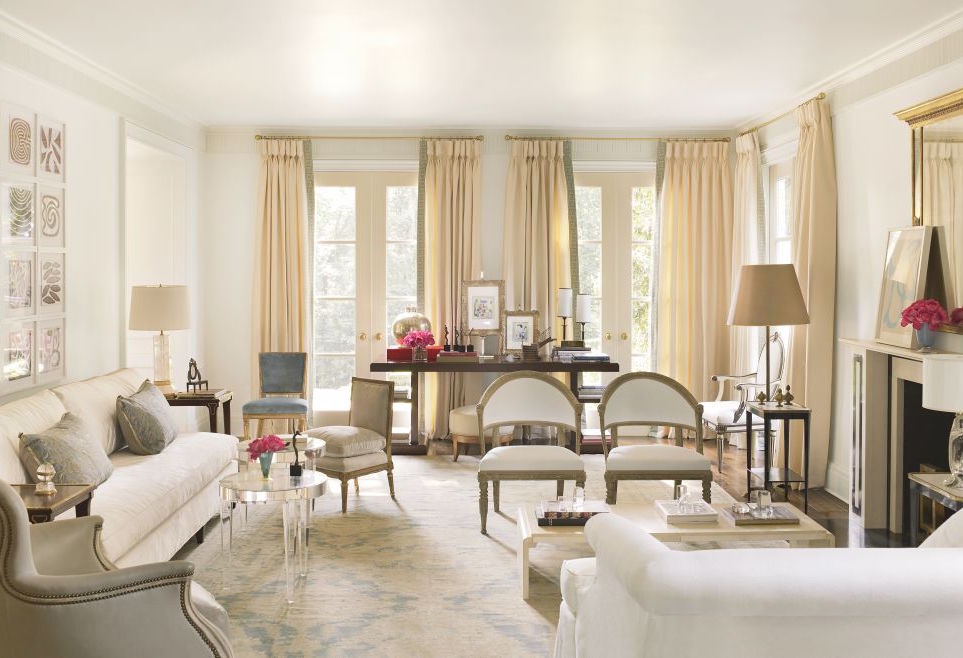
This is Suzanne Kasler’s gorgeous living room in her fabulous neo-classical home in Atlanta. Suzanne renovated this 1930’s Georgian-style home a few years ago. She enlisted the help of architect William Baker who I had the pleasure to spend three days with at the Adorno Mag tour at the Spring 2016 High Point Market.
Just one thing bugging me.
Did you notice?
The windows are off-center.
This is especially curious, because the hallmark of Classical and Neo-Classical, Georgian, Federal and the like is symmetry.

This is the front facade of Suzanne’s home.
It is perfect.
And perfectly symmetrical.
Based on the position of the windows, the living room is the set of French doors on the left. Everything
looks perfectly centered.
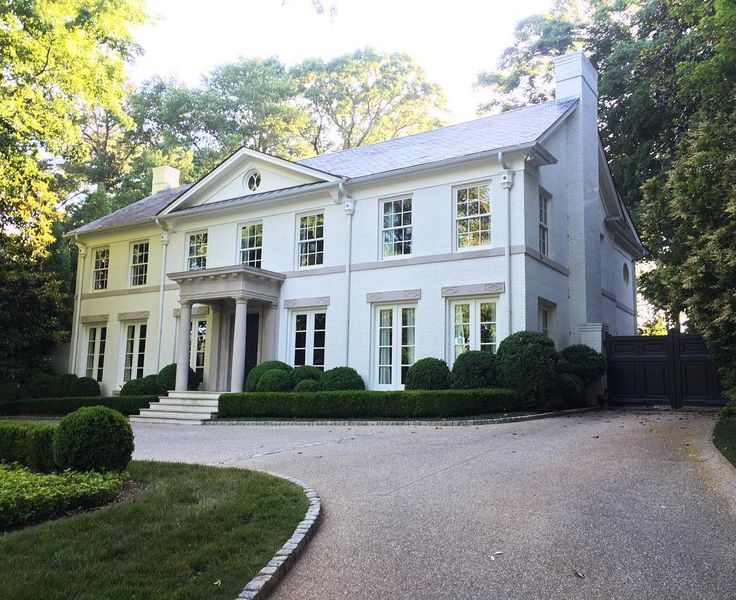
A 3/4 view shows another clue as we can see that the masonry on the fireplace wall on the opposite side of the home is quite thick.
The question, is… Could the windows have been moved in such a way that they would be centered in the room and on the facade. I don’t know because I have not seen the original home. But knowing that both Suzanne and William have a keen attention to detail, my guess was it was either sacrifice the width of the living room which would’ve been a big mistake or have the windows off-center.
Could anything else have been done? Again, doubtful.
Sometimes we can fudge a few inches by taking one pole to the very edge of the window and the opposite pole extended, but that might look funny as the drape would not hang symmetrically on the windows, themselves.
Well… that’s just the way it is sometimes. Let’s move on…
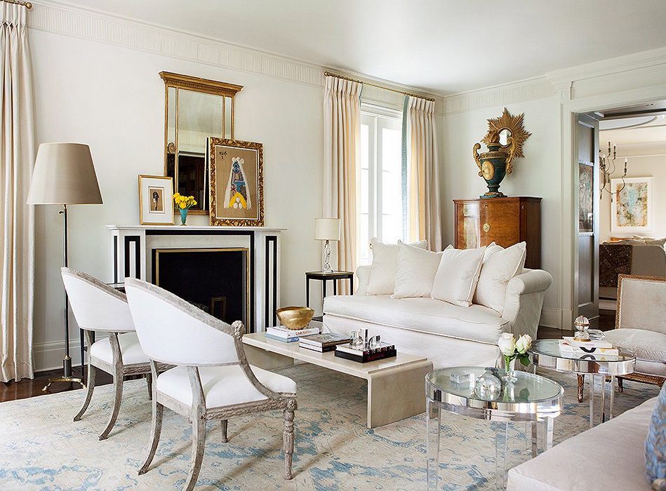
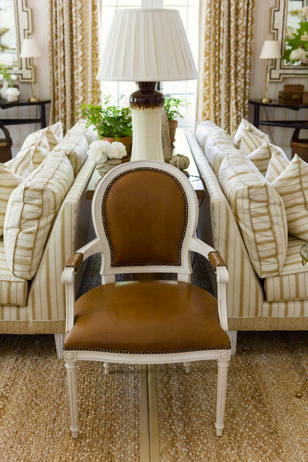
This is the same room looking in the opposite direction. I love the mix of furnishings and styles. But, what is that occasional chair (on the far right) doing on the other side of the room just sitting there lined up with the pretty love seat.
I know that Suzanne would not set up her room like this!
Going back to image number one, we see that indeed, the occasional chair is NOT there, it’s on the other side of the room! And in its place is a bergere, facing into the room which is better.
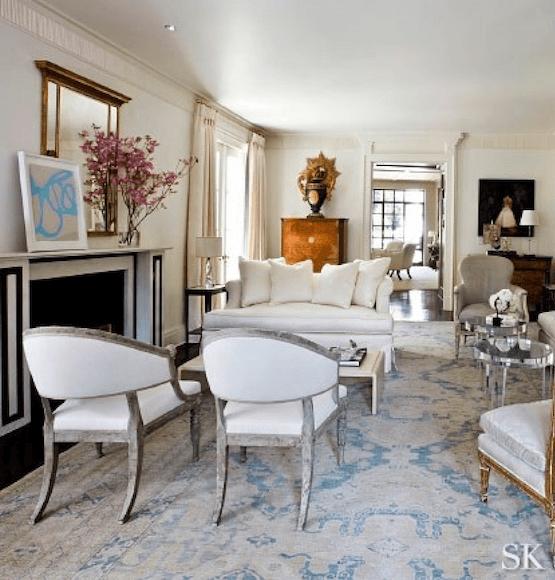
Here, from a photo in Suzanne’s portfolio, we can see that she has her living room set up with the bergere. It’s difficult to tell. There may be some distortion, but it appears that the chair is behind the sofa. That’s good. Lining it up with love seat is not good. But I’m sure that was done by the stylist and/or photographer.
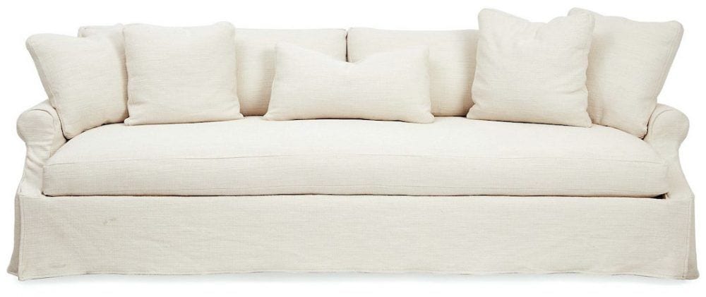
As an aside, this is not a love seat, but I found this pretty white slip-covered sofa designed by Robin Bruce on One King’s Lane. I did some research and found out that Robin Bruce is produced by Rowe Furniture. I don’t have the latter in my rolodex because I am not fond of a lot of their designs. But Robin’s pieces are quite lovely.
One of the interior design lessons here, is that images in magazines are manipulated to look good for the photo, not necessarily what they are in real life!
A case in point is that we can see that the cocktail table was moved out-of-the-way for this shot and a few other things as well. They styling is different from Suzanne’s portfolio. I’ve always loved the look of leaning art. It used to drive my husband nuts, though. However, it’s easier to make changes and is a very stylish look, I think.
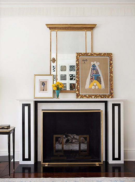
The fireplace was modeled on an 1824 drawing in the archives of Sir John Soane’s Museum in London.
One of Suzanne’s hallmarks as a designer, is her frequent use of creamy, warm, pale tone-on-tone palettes– very elegant!
There will be people who will ask me what color this is.
I don’t know that, but what I do know is that it’s usually not the color that people are so attracted to, but how it all fits together so perfectly.
I do notice that she chose ONE color and wrapped it around the entire room, including the ceiling.
Anyone else notice that there appears to be a slight sheen on the ceiling? If you decide to do this, the ceiling surface will need to be flawless or every little ding and imperfection will become very visible.
There are lots of lamps, and some near each corner like we discussed on Sunday’s post about table lamps and lighting.
There is one recessed down light in Suzanne’s portfolio image, but it is not there in the editorial images.
And why is that?
They obviously photo-shopped it out. They do that, ya know.
The other thing that she does which I love are the touches of black.
- In the fireplace
- Side tables
- paintings and accessories
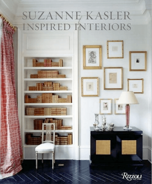
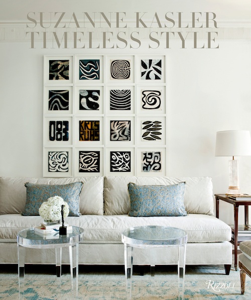 Suzanne’s Books are a must for every library
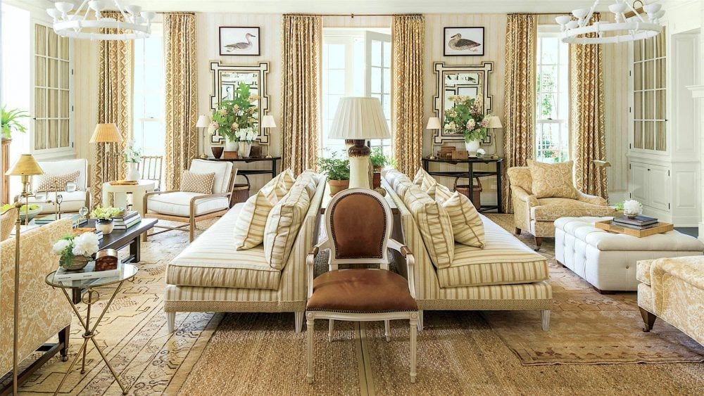
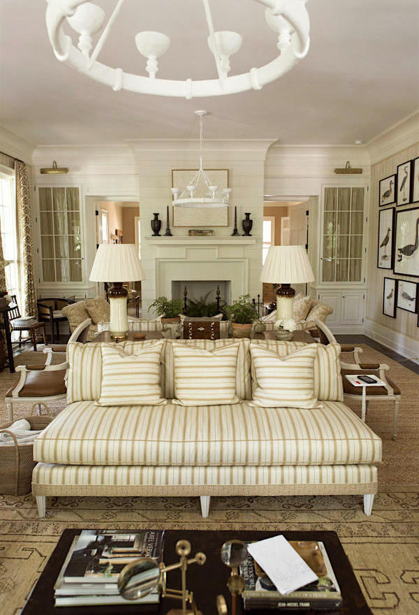
The next room is from the Southern Living Idea House and a jaw-dropping room by Mark D. Sikes.
 .
.
Each designer in the showhouse chose a room from another generation, for inspiration. Mark chose a timeless room done some 50 years ago in a similar monochromatic palette.
This is a large room and very symmetrical, in every which way. Mark intentionally played that up and put in two separate seating areas. They aren’t identical, and that is the best way to handle it. They are visually balanced, however.
Everywhere you look, there are wonderful details and it’s those details that are what make the room special.
I adore Mark’s mix of furnishings, from the layered rugs to the many versions of stripe. I believe that the bottom layer of rug is jute.
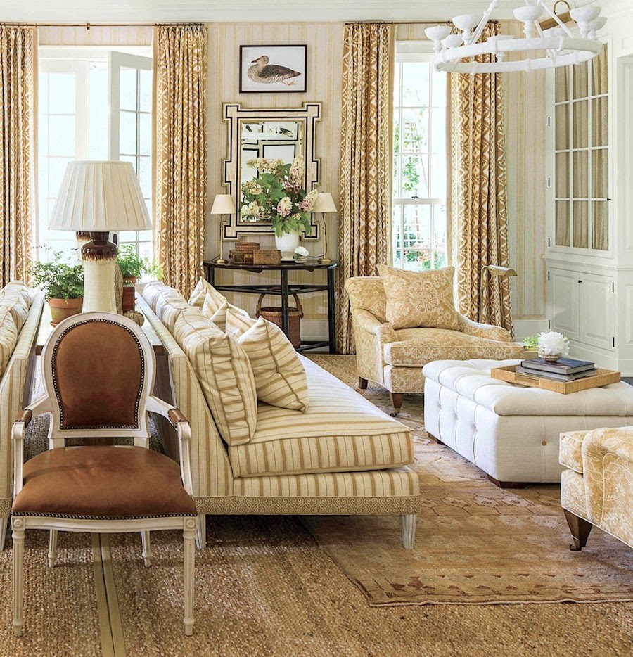
I love the armless sofas, or couches, rather. While the terms couch and sofa are used interchangeably, I learned in design school that an armless sofa is a couch. But a couch implies a more casual sofa, perhaps.
I don’t really care much one way or the other which term is used. Our cleaning lady back in the 60’s called it the davenport. :]
A wonderful detail on the couches is the trim on the bottom. No worries, I’ve found it for you. This time, it was an educated guess because one of the best collections of trims is at Samuel and Sons in New York City. (they also sell online, but they are to the trade only).
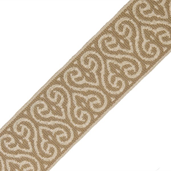
I was so happy when I found it there, The 3″ Espadrille Woven Border. It comes in a bunch of different colorways.
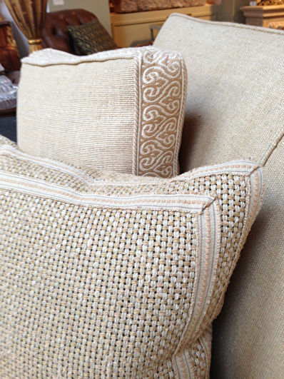
Here, they used the trim on a box throw pillow
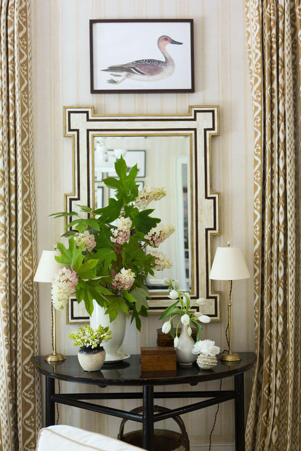
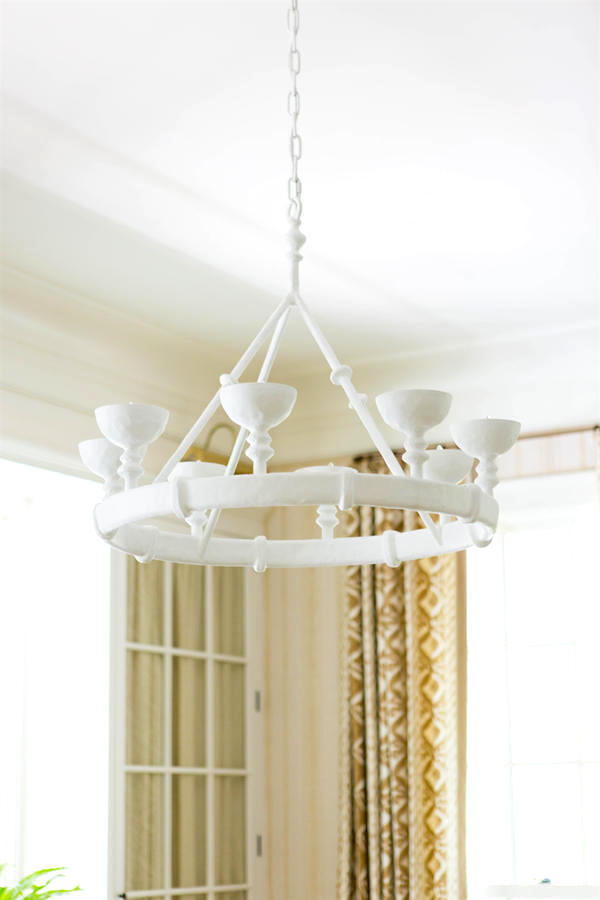
One of my favorite parts of the room is this fabulous vignette with two little lamps. While not directly in front of those wonderful mirrors, they are close enough to reflect the light back into the room.
This is one of my favorite lighting tricks.
Now about those mirrors!
I just had to find the source.
And I googled and googled and googled until I found them!
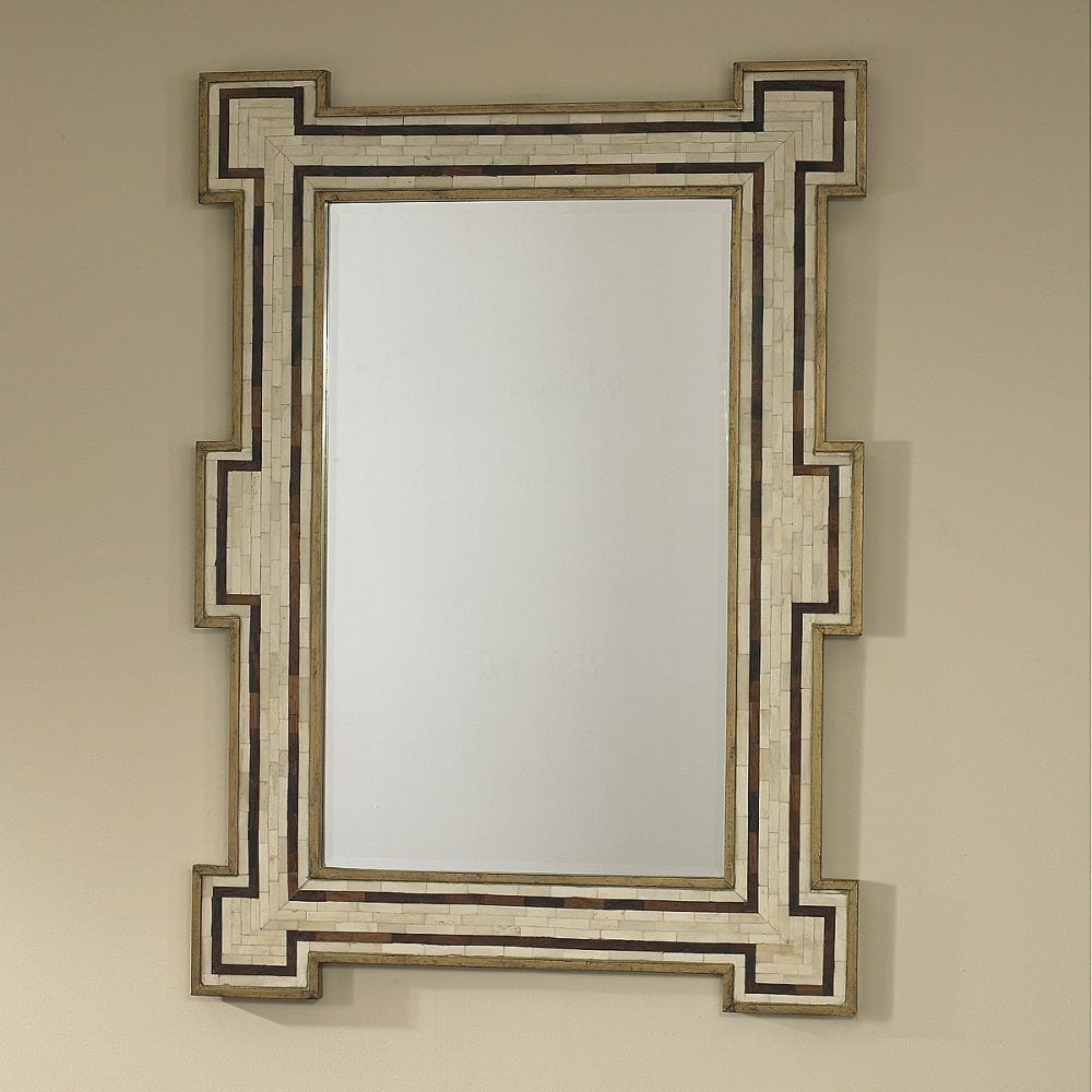
They are the Constanta Mirror from Mr. Brown Home which is in conjunction with Julian Chichester. And yes, they are in Laurel’s Rolodex! They are trade sources, but after I found the source, I found the mirror at a few places, retail.
I found it at White Birch Studio which is not in Laurel’s Rolodex. I would not purchase it from them however, because they are selling it an inflated retail price.
AKA: ripping you off.
I would get it retail the Mr. Brown Home Constanta Mirror at Candelabra (no affiliation but I wish that there was!). You will notice that they don’t have any of that crossed out “retail” price nonsense. That is almost always a sign that they’ve inflated the retail price. Tacky, n’est-ce pas?
Mark’s room is rich in detail. But, I think he stops short of making it look cluttered and contrived.
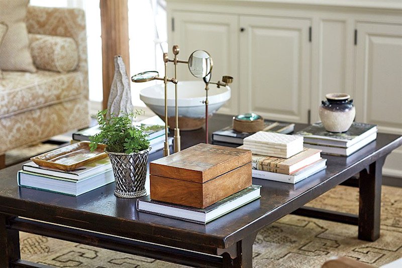
The coffee (or cocktail) table is simply accessorized with books primarily. Love the antique magnifying glasses. That’s not a bad thing to have around in case someone forgets their reading glasses! And they have a light and refreshing sculptural quality.
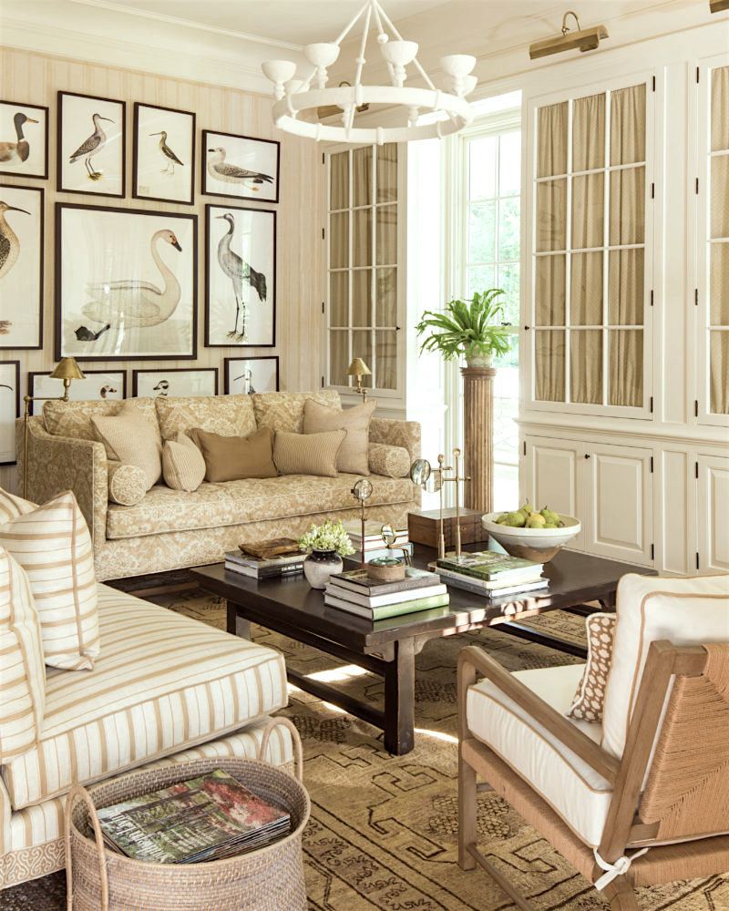
It’s the accents of white and black which keep a predominantly beige room from being blah.
I love the scale and the cups which remind me of bird nests without overtly screaming bird nest. The other great thing is that they force the light to go up which will then hit the ceiling and get bounced back down. It’s a great way to create ambient light that’s soft and won’t burn out one’s retinas.
By the way, the Southern Living Idea Showhouse is in Birmingham, AL and will be open through December 18th, 2016.
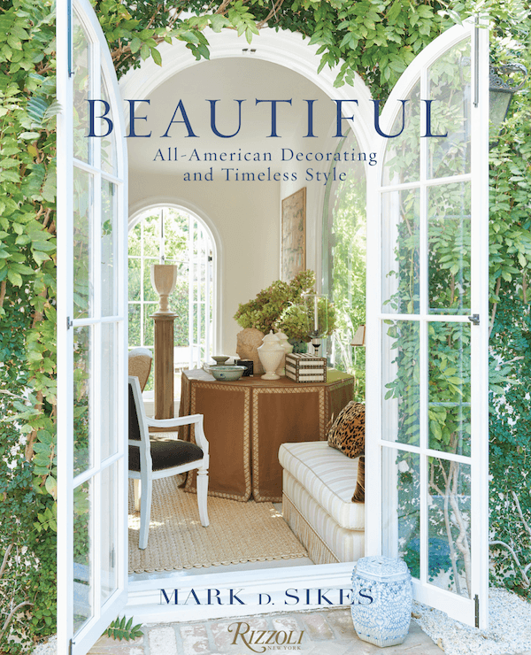 I highly recommend that you get Mark’s new book. It is exquisite!
I hope that you enjoyed some of these interior design lessons. If you like this sort of thing, I’ll be posting similar posts. I think it’s a great way to learn and take those lessons into our own homes.
I’m going tomorrow to visit my mom and sis in Wisconsin. I’ll still be around, but not quite as much. See you on Sunday!
xo,

Related Posts
 Here’s How You Can Create Beautiful Rooms – Effortlessly
- Discover the new black in interior design!
- How To Get Window Treatments Like You See In Magazines
- Here’s Why Buying Furniture Online Is A Bad Idea
- 9 Fabulous Shades of Green Paint and One Common Mistake
- Can You Use Gray Paint in a North Facing Room?
- The Virtual Alexa Hampton @ The Design Bloggers Conference