Dear Laurel,
Even the kitchen! I regret the painted tile backsplash, which ended up dictating the entire color scheme. What I really wanted was a house with lots of green and ended up with a grey and blue palette. I’m struggling with what to do to finish off the family room space. We never spend any time in here because it’s not an inviting place.
I know that the brown chairs are too big. I hate them. I’m 5′-7″ and my feet don’t even touch the floor when sitting in one of them.We hired this decorator who talked me into a lot of things I didn’t think were quite right. But she assured me that it would all be fine.
It’s not fine and now I’m kicking myself that I didn’t put my foot down. Although, I do have to say, that she did a fabulous job of the renovation and breathing new light into this dark, dreary and bizarre home.
Kathy
PS: I am not expecting free advice and if you don’t have time or this topic doesn’t suit you, no problem at all!
I was curious about this one, so I asked Kathy if she could send me a couple of photos. A few hours later, she did. Well, more than a couple, but all in one email which is fine.
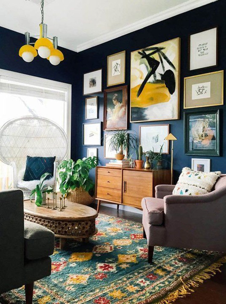
This is a seriously gorgeous home!
However, I can see exactly what Kathy is talking about; it’s not a charming home, just yet. It has the potential, but it’s not quite there.
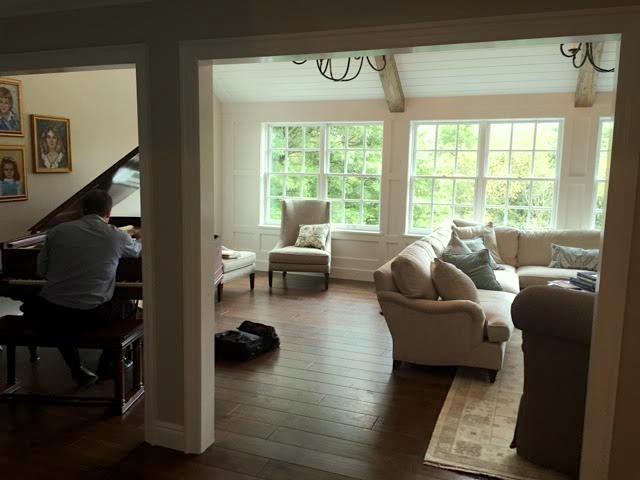
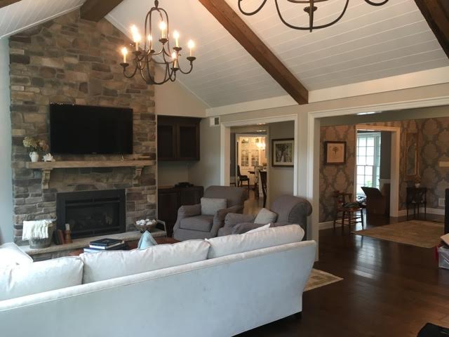
Here are some images.
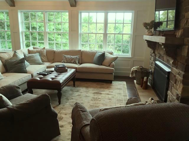
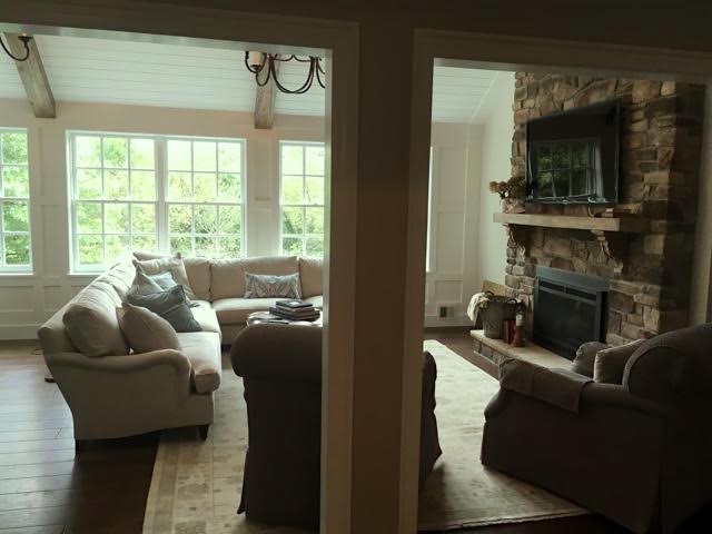
There’s a compelling reason why nobody goes into the family room. This is an issue that’s as common as cornflakes.
The room is a little sad.
And one-note.
In the key of B-flat.
B, for blah.
Why is it blah?
This room does have light, medium and dark, but too much medium and the light is only on the walls which is creating an imbalance. There’s just too much gray. And even a neutral room needs some color.
Let’s talk about what is right with the room.
I think that there is plenty that IS right and that’s the good news.
The room (and entire home) is intrinsically pretty. There are big, bright windows, A handsome and in-scale fireplace wall. Hardwood floors in a deep rich color.
The sectional is lovely too! In fact, I rather love it!
And that one is a big deal, because it’s more common that the sectional gets mucked up.
The rug is okay but a part of the one-note issue.
The chandeliers are a good size and the iron is appropriate for the rustic, casual style that Kathy wanted.
The basic layout is almost okay.
I say almost because of the aforementioned BIG GRAY-BROWN CHAIRS.
Now, let’s look at Kathy’s wish-list.
- rustic and elegant
- lots of green
- stylish and layered
I’m not really seeing much in the way of blue. I am seeing beige and gray.
But there’s no reason that we can’t add in the green. We’ll get to that in a minute.
What is a beautifully layered home?
I think it’s easier to show than try to explain. And the first designer who comes to mind who has style to burn is William McLure. Not only is he proficient and interior design, he’s a superb stylist AND an artist! A real interior design triple threat which is exceedingly rare. I am completely besotted with his rooms!
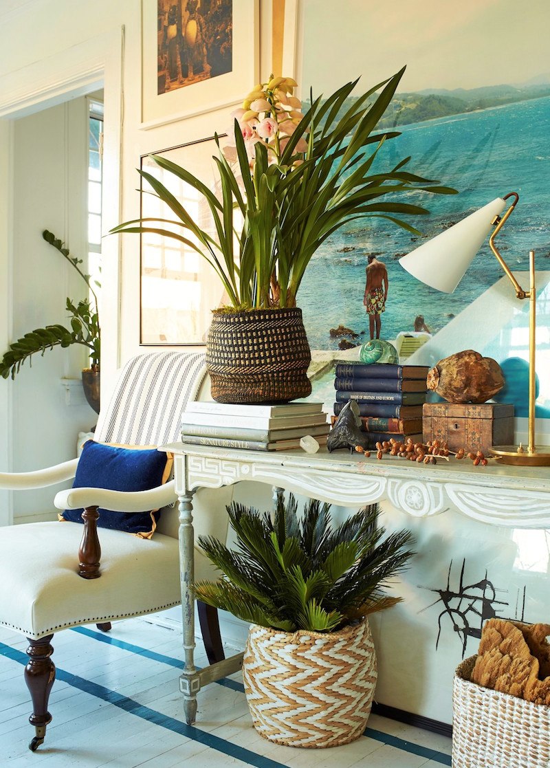
A throw on a chair and a pillow. Artfully arranged console. White painted floor with dark blue ribbon banding. Sublime!
A largely white, neutral room but not completely devoid of color. I think I just have to have a home with white-painted floors!
Books. Lots of big beautiful books.
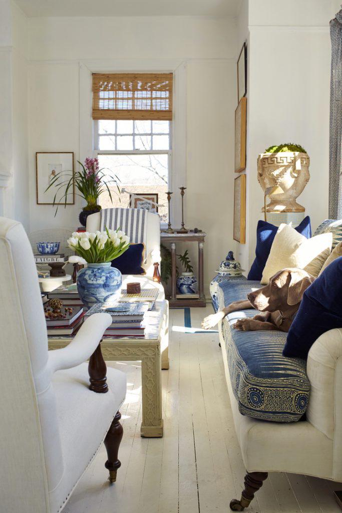
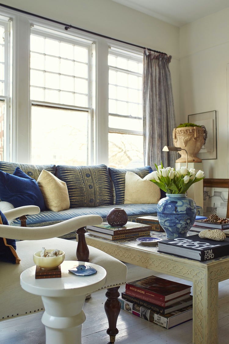
Multiple shades of one color. In this case, blue. And Chinoiserie accents! If you look at William’s portfolio, you’ll see this room in red and I think I found another iteration in navy. It seems he uses his home as a lab of sorts. Or else, he just likes to change things around a lot.
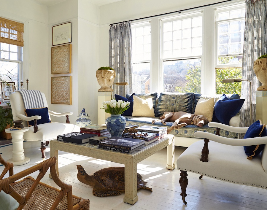
Is that a tortoise under the table? haha. Whatever. See how beautiful it is to style the coffee table with big books and one elegant vase with fresh flowers. Of course, the best accessory of all, is his gorgeous Weimaraner. Lucky dawg!
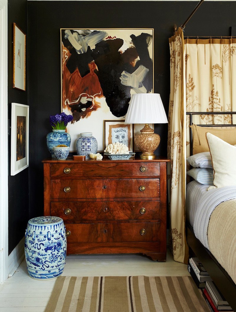
Black walls in the bedroom. But it doesn’t look dark to me. Beautifully styled chest.
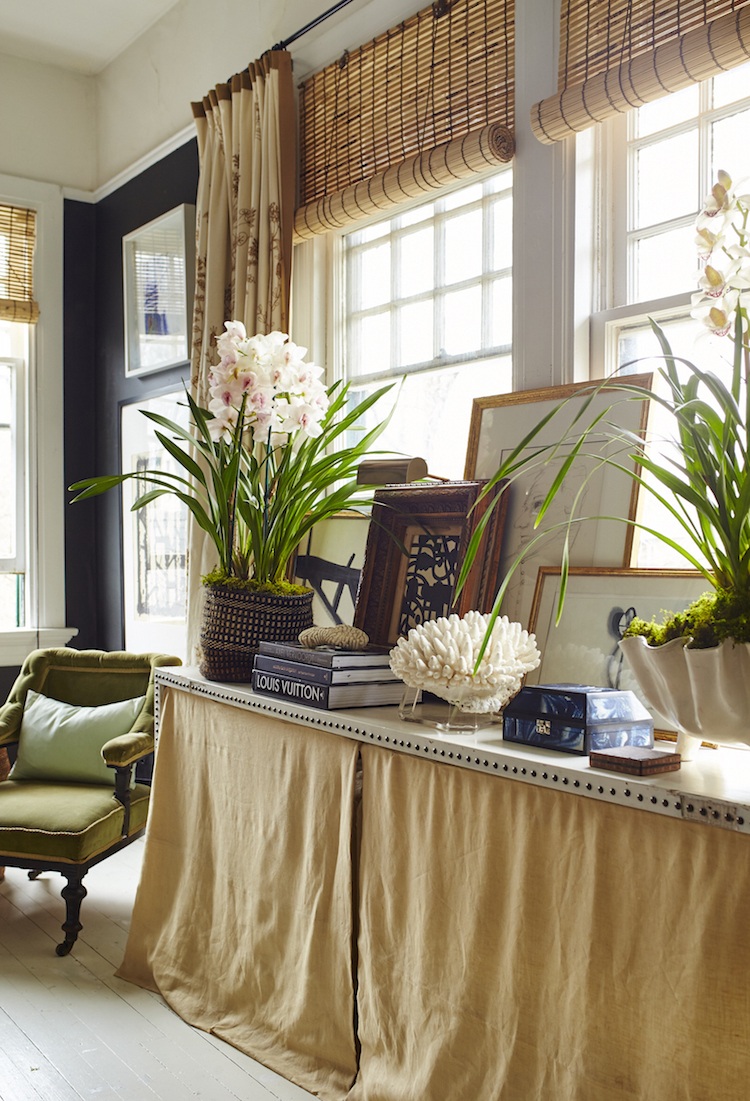
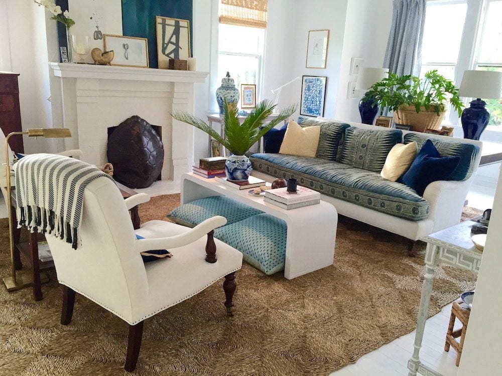
William is a master at stylish layering. And it’s one of those things that is difficult to explain how to do it. But, we can see when it’s not quite coming together.
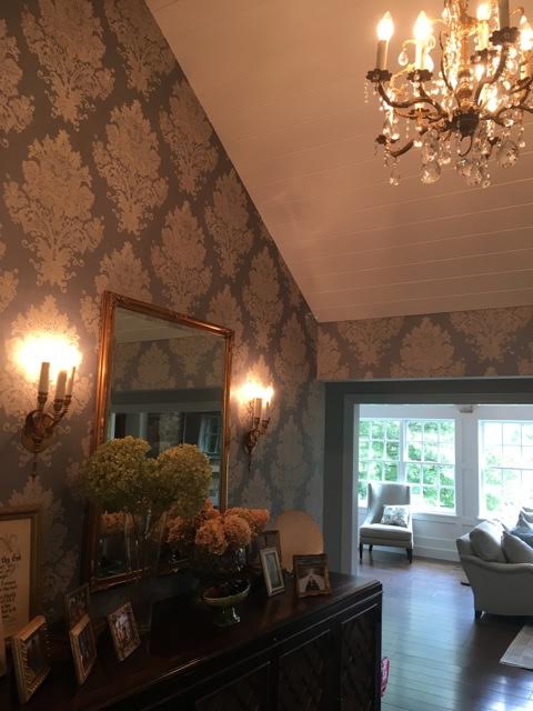
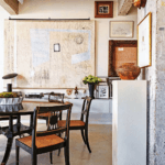
This is Kathy’s entrance. It is lovely, for sure, but one thing it’s not and that is rustic. The credenza is fine. I wish the mirror was a little larger. There is absolutely nothing wrong this, but that’s not stopping me from making some suggestions. lol
I think it would look great to create a collection of something, or use one of William’s vignette’s as a template of sorts. So, the first thing is we need to find a new home for the family photos.
I see this a lot. A lot of family photos scattered around the house which are used to decorate. It tends to look a little common. But, of course, we must display the photos, just not in the entry.
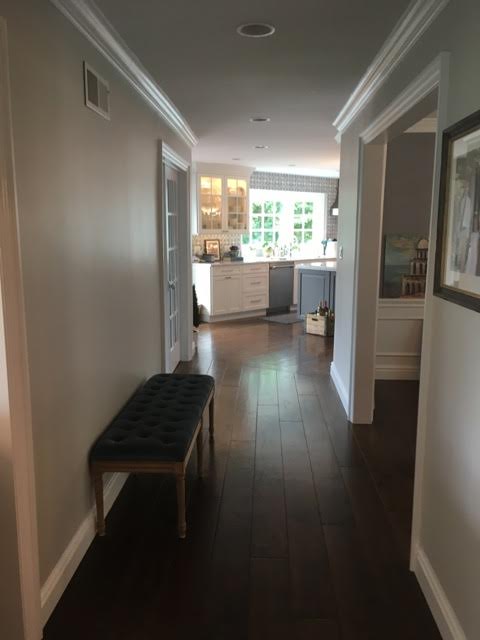
I would create a beautiful gallery wall in the hall of family photos.
Now for the great room and the need to create some charming home decor.
Kathy wrote me later and said that she thought that maybe the chairs would grow on her. No, it’s the other way around. She is going to begin to grow on the chairs. They are the number one issue. I think that she should not continue to put good money after bad, as they say.
Perhaps sell them on Craig’s List or give them to charity and take a nice tax deduction. Or maybe they could go in the basement if there’s a finished basement and they’ll fit down the stairs.
I think the chairs should be far smaller.
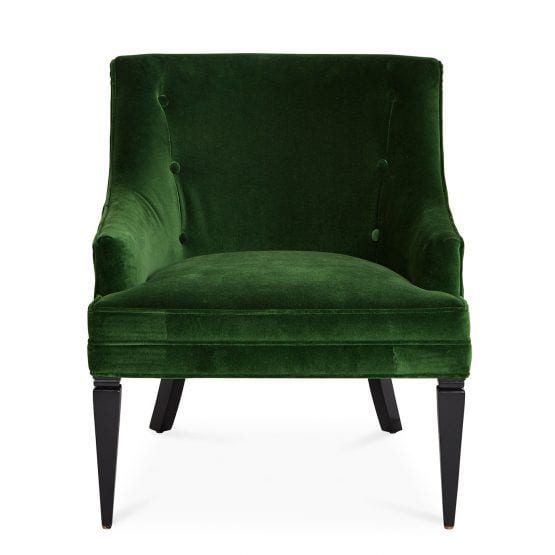
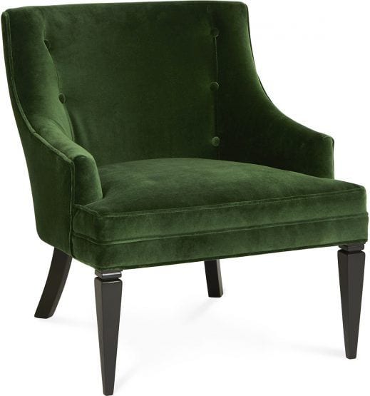
This room needs some color and I found the perfect shade of green in one of my favorite occasional chairs from Jonathan Adler. It’s available in numerous fabrics. I love this rich, deep green!
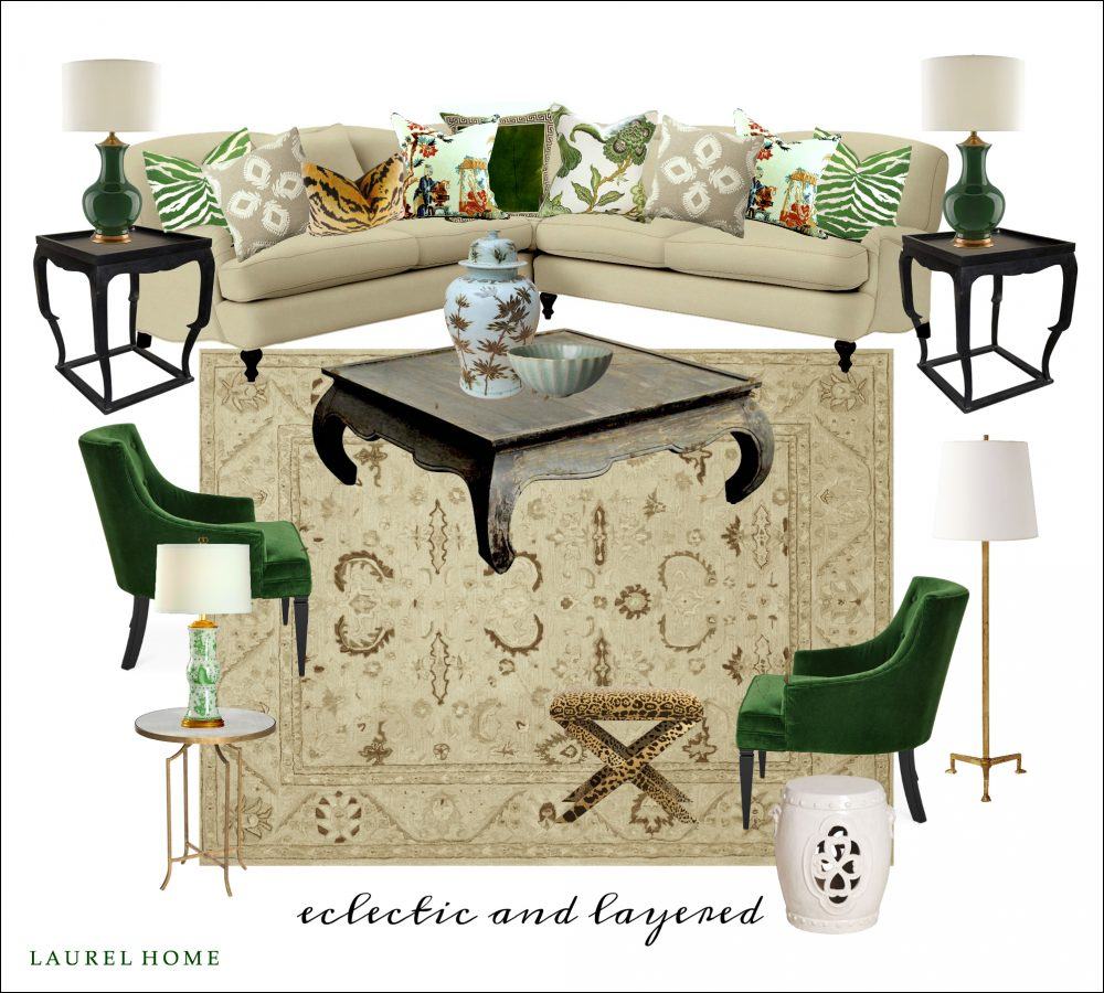
Here’s a mood board I made.
Hopefully, the mood is happier now! :]
It’s not 100% complete. This is a family home and probably there wouldn’t be as much stuff as in William McLure’s rooms, but I put in a Brown and white Chinoiserie vase and a little bowl for starters. The brown and white temple jar would also look great on the fireplace hearth as long as she doesn’t have kids as wild as mine.
I brought in more green to balance out the chairs and to bring a little life into the room.
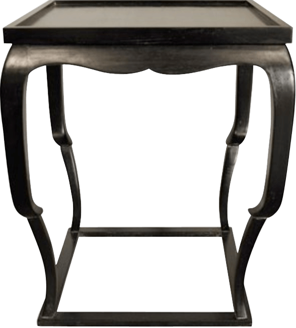
The opium coffee table is a one-of-a-kind vintage piece. Sometimes you can find pieces like that on One King’s Lane. First Dibs has them but are usually pretty expensive. Then, there’s Circa Who. And having a few pieces like that is one way to get rid of the sterile furniture store look.
The side tables are from Noir Furniture which is one of my fave sources in Laurel’s Rolodex.
I think bringing in a bit of black (and white) is important to balance out the room better.
If I had been starting from scratch, I would’ve chosen a different rug. I think the rug needs to have some white or cream in it.
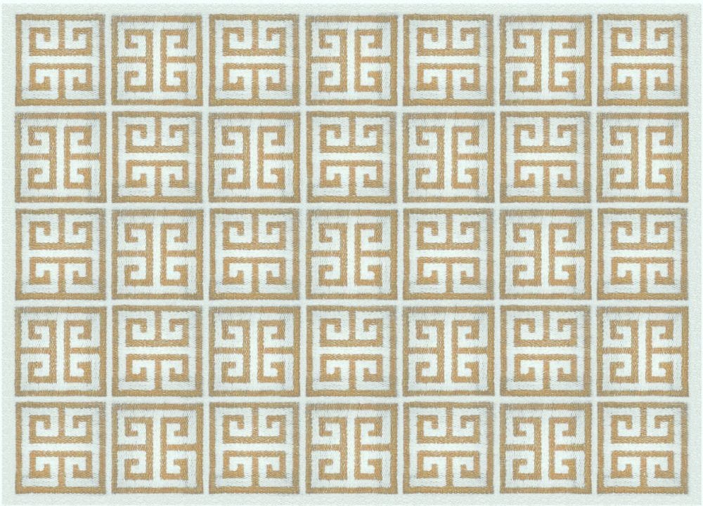
It could be a simple geometric like this also from Jonathan Adler. This would help balance out the white walls. And the geometry would add a fresh, classical element, I think. Jonathan Adler has lots of fresh, geometric rugs in his collection.

The green lamps are from Currey and Company.

I’m a little obsessed with this Sienna Brown and white temple jar from Legend of Asia. Another fave from Laurel’s Rolodex. (this one is to the trade only but available retail at various sources)
The chairs in the back, I would love to see with another pretty pillow. It could be this one.
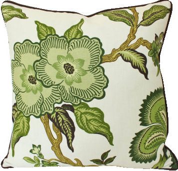
Schumacher’s Hot House Flowers in Verdence by The Pillow Studio Shop
Or another pillow with green in it.
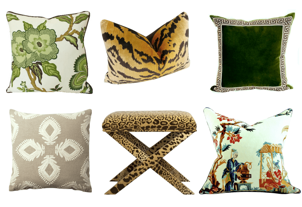
And here are some other pillows and a cool but expensive stool. Please notice that they are coordinated but not perfectly matched. We want to add some color to the sectional, but not toooooo much color!
Below are the links to the rest after the Hothouse Flowers pillow.
Beige Pillow – Serena and Lily
I can’t quite make out the entire back wall, but I would create a wonderful gallery art wall.
I’ve done a few posts about them. (I’ll put them in the related posts at the bottom of the page)
For Kathy’s gallery wall if she chooses to do that, I would have lots of neutral tones but also bring in some greens, blues and maybe a few other colors.
This was a challenging exercise. Of course, it is far easier to start from scratch when designing a home.
Kathy shouldn’t blame herself. It’s exhausting to renovate a home and it’s easy to run out of steam and let someone else take over.
No matter what she does, I don’t think it would take much to add the touches that will make this gorgeous home into the cozy, charming home of her dreams.
xo,
 PS: Some links are affiliate links meaning if you click on them, I will make a few pennies. :]
Related Posts
 50 Interior Design Trends for 2020 – In or Out?
- To Brass or Not To Brass In the New Un-Bathroom
- Finding The Elusive Round Dining Table That Extends
- How Much Does It Cost To Do A Smart Kitchen Renovation?
- Why You Should be Afraid of Eclectic Gallery Art Walls
- All About The Exquisite, Enigmatic Art of Grisaille
- 20 Breathtakingly Georgeous Ceiling Paint Colors and One That Isn’t