Recently, I received a darling email from a kind reader who is feeling anxious over her desire for a warm paint color palette.
Dear Laurel,
Right off the bat, let me say I will not be offended if you can’t address this question on any of your blogs or by email, but I gotta ask! I know enough now about you that you are very considerate and kind, but also that you are extremely busy, so please, please don’t give it a second thought if you can’t address my concern.
I have tried……so hard…..to introduce and use the more popular, cooler palettes into my two-story suburban home and failed. I have put up painted boards of various shades of warm grays and greige, gray-blues etc everywhere but nothing cool seems to work for me. Am I crazy for staying with a warm palette and not embracing the cooler shades?
I am not asking for paint advice. I would love to hear your opinion and thoughts on people with difficulty in embracing the cooler palettes. I have no confidence in design matters but I like beautiful rooms. Everything is shades of gray today in the paint world.
As I go through your lovely portfolio, I see a lot of warm colors there too, and it reassures me that I am not totally crazy in this area.
Colors you will find in my home: Ben Moore White Down, Feather Down, and Cloud White trim. Upstairs :Feather Down hallways, Niveous bedroom, a bedroom in a color almost exactly like Sweet Daphne, one bedroom awaiting a color, 2 bathrooms waiting to be remodeled with yet to be determined colors.
Oh, and I am repainting upstairs trim in Cotton Balls to give me more flexibility in wall colors ( (risky I know but I think I can pull it off because of the separation of floors).
So you see everything is a rather safe, warm paint color palette !
I really love the photos I see of the cooler palettes, but I seem to be more comfortable with my warmer neutral colors. I tell myself that it’s what I love that counts and if I ever move, I can have it repainted or let the new owner deal with it.
Will my home be dated in five years? Perhaps it Is already dated ! Does it matter?!
Remember, no problem if this is not a concern you can address anywhere in your blog. You are pre-forgiven 🙂
Best wishes as always,
Maggie
Oh, this is a juicy one. I hear many issues in this note which I’m going to address. But let’s just jump in with this one.
Will a Warm Paint Color Palette Be Dated in Five Years?
Those of you who’ve read laurel home for a while most likely already know the answer to that question.
NO!
This is what is going to look dated in five years.
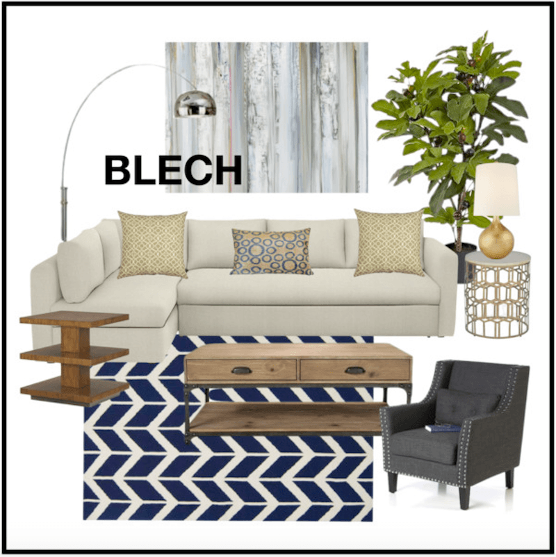
I created this “mood” board about a year ago. The mood here is BORING. I’m still seeing this look and to me, it’s already dated. It was dated the day it came out. I think in future years, people will laugh and say:
“Remember back in the 2010’s that RECESSION-GREIGE-BLECH-LOOK? hahahahaha What on earth were they thinking?”
However, there is nothing wrong with gray per se or a cool color palette. And even with either a cool or a warm palette, there needs to be a balance, most of the time. I will put some posts in the related posts that I’ve written about gray so that you can see what I’m talking about, if interested.
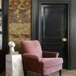
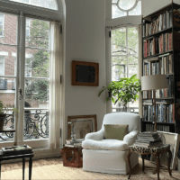
There is absolutely nothing wrong with Maggie’s color palette. In fact, I think it’s exceedingly beautiful.
And some of my favorite, immensely talented and stylish designers who love creamy whites and warm beiges think so too.
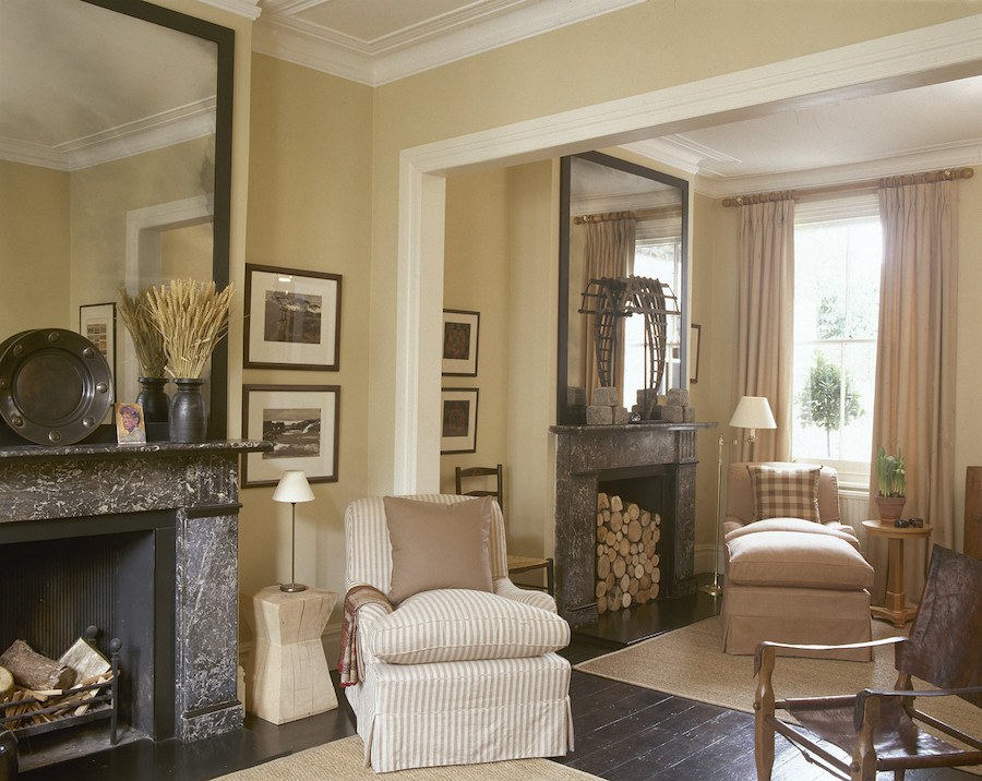
Colin and Iona Duckworth via Lonny
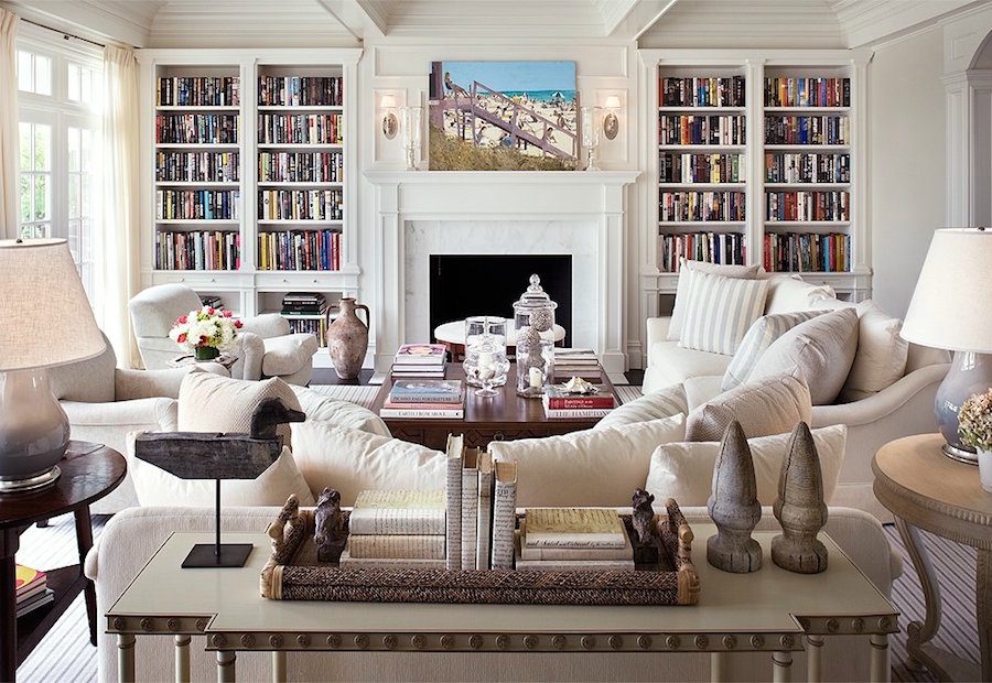
One of my all-time favorite living rooms by Alexa Hampton
Above and below by Mollie Johnson
Wonderful creamy-toned palette
These are all beautiful, warm rooms and in my opinion, the very definition of timeless.
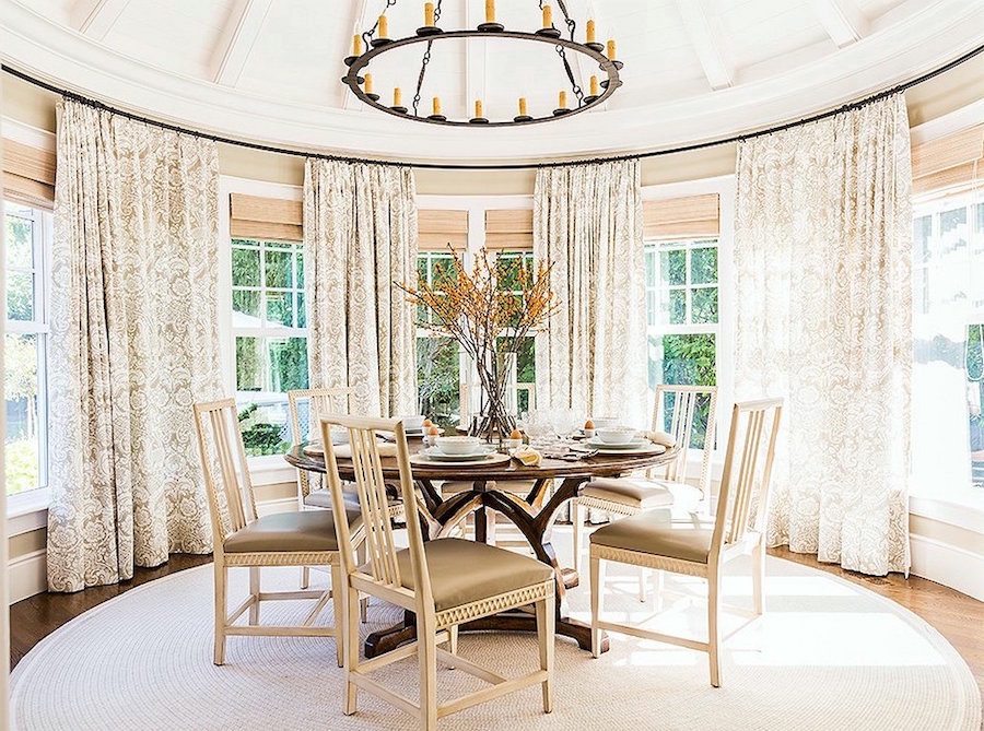
And of course, from last week, the home we did recently in beautiful creams and warm beiges
Another issue, at hand is the sheep mentality.
I am not saying that Maggie is a sheep or rather a sheople; not at all! However, her doubting herself is I believe a product of what she’s being exposed to– ad nauseam. I understand that completely. Because at times, I begin to question myself too. That is good. We should be questioning ourselves.
But there comes a time when we have to sit down and go. NO, I’m doing it my way, because that is what I like!
The problem is… and this is based on what I hear and see. A lot of people who are using gray and greige don’t really like it, but they don’t have the confidence to buck the status quo. And so, the trend takes on a life it doesn’t really deserve.
But please let me make it clear that if you do love gray and greige, there is absolutely nothing wrong with that!
What’s the difference? It’s a fine line, I think. But, if one is doing something just because everyone else is doing it, it’s time perhaps for a little self-reflection. That is, if it’s important to you. And it’s totally okay if it’s not.
And now for another big revelation about paint colors that we see in magazines and online
It’s about the photos. The photography.
At least 90% of them are off-color. And that’s a conservative number.
Digital photography has a tendency to come out of the camera either bluer, redder or more purple than it is. This was more obvious when I worked on a PC because the PC itself, read everything bluer.
But now that I’ve had a Macbook for nearly two years, I see that the images are much closer to what they should be, but not always. Photos coming straight out of the camera almost always need editing. I can tell immediately which ones have been and which ones weren’t at all or not enough.
How can I tell?
Well, when I look at a natural fiber rug and I see that it’s pink, I know that the entire image is too pink.
Some designers’ photos are always perfect.
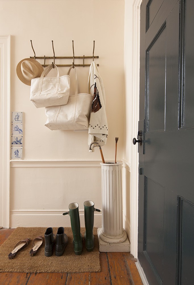
This image of a lovely entry by the immensely talented designer, Michelle Smith. The wall color is Benjamin Moore Parchment. It is one of those colors that goes yellow-ish, peach-ish, but definitely warm and pretty. Please check out the spread here in Lonny. I kinda want to be her when I grow up. ;]
And, look what arrived in the mail for me today!!!

It’s a gift from darling Gaye! And here we are under the De Hondecoeter. ;] (and yes, please notice how “lemony” my warm Hawthorne Yellow is looking in the late afternoon south-facing-always-sunny-living-room)
Gay so astutely picked up that I don’t actually own Furlow Gatewood’s book!
(Yes, I know, I know…)
I will treasure this book – forever! Thank you so much Gaye!
If you are interested in learning more about this book or purchasing it click here.
In closing. Color or colour for some of you is very personal; but there is inspiration everywhere. And chances are, the colors that you love are already being done and very well, too. Maybe not by the masses, but that’s not us!
Go with what you love!
And if you love warm color palettes, please check out these posts here and here.
xo,

Related Posts
 The 9 Most Beautiful Blog Posts on Laurel Home
- Gloppy Paint on Gorgeous Classical Trim – Let’s Discuss
- We Bought An Ugly House, But The View Is To Die For!
- Hubs Thinks Farmhouse Style Is For Farmers- Period.
- The Elegant Gerald Bland Style-How To Get the Look!
- The Magnificent Front Doors of Beacon Hill
- Can This Dysfunctional Kitchen Be Saved?