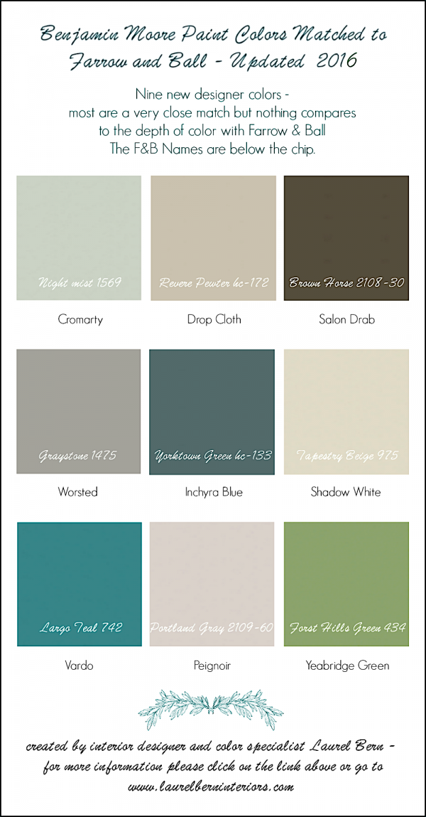
There are Nine New Farrow & Ball Colors!
Actually, they aren’t all that new. They were released in early February 2016.
However, they aren’t yet appearing in the Farrow & Ball color-chart on their website. You may recall, that I did a big color matching chart to their Benjamin Moore counterparts.
And since many of you have asked about matches for the new colors, I did the same here.
Before I go on…
Let me please add that these are the CLOSEST matches I could find. However, that doesn’t mean that they will be close enough for you or compare to the special depth one gets from Farrow and Ball.
In addition, just to make it more complicated, I have found inconsistencies in the Farrow & Ball paint chips and fan decks.
And then, comes the actual paint which as we know can vary in appearance from the chip!
Finally, there’s the lighting in your room and that too can affect the colors.
The Nine New Farrow & Ball Colors For 2016
please use the hover button in the middle to pin to pinterest
All photos not credited came from the Farrow and Ball Website.

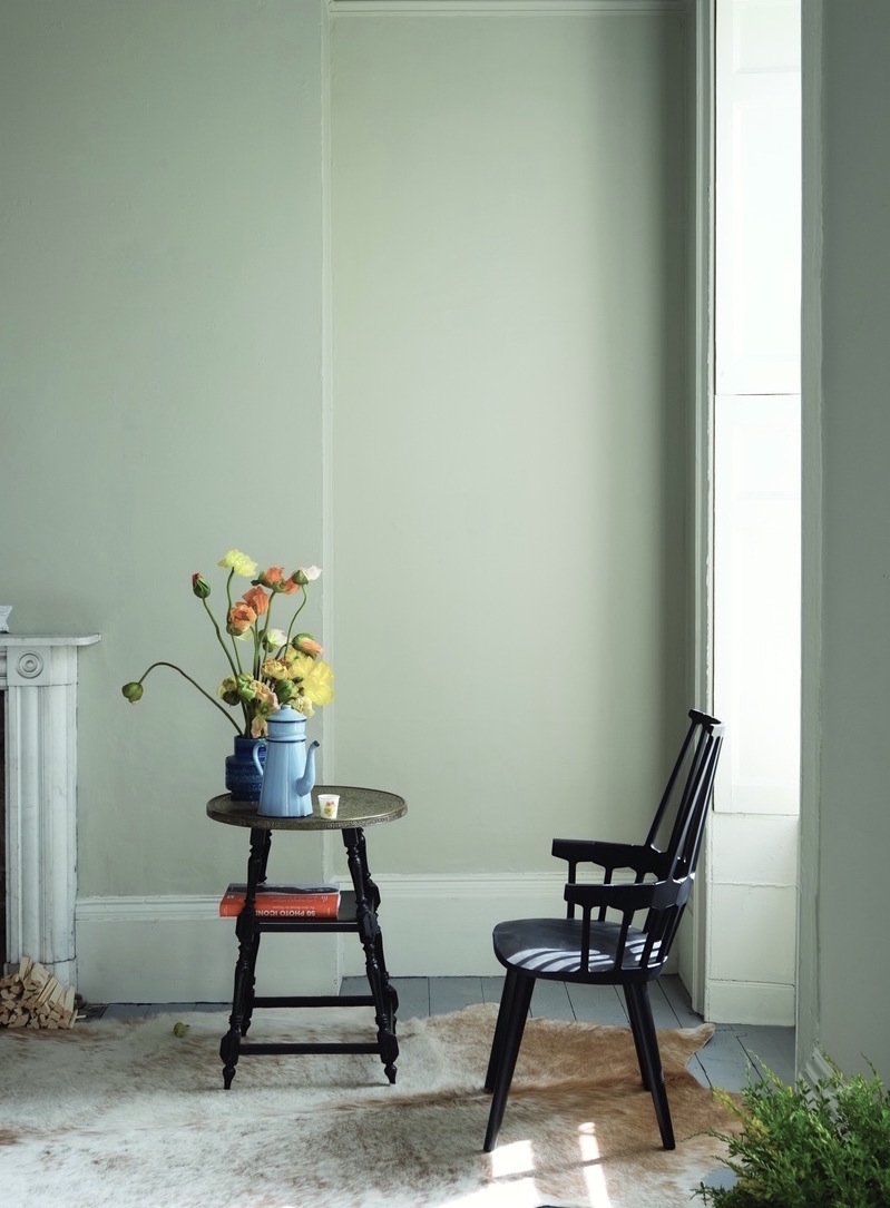
CROMARTY 285 is one of those colors that’s difficult to explain and is changeable depending on the light. It’s a gray-green-blue and I could not find an exact match. But NIGHT MIST 1569 which is a hair bluer is a gorgeous color and one I would recommend. I also recommend QUIET MOMENTS 1563.
 DROP CLOTH 283 is another one of those highly changeable colors. But it’s a wonderful, warm neutral and no one has said this yet, but I think it i F&B’s answer to the wildly popular REVERE PEWTER hc-172.
It is not an exact match. Drop Cloth is a drop greener and yellower on the chip, but quite frankly, I’m not sure if that’s necessary since RP is so lovely as is.
 SALON DRAB 290 is warm, deep brown-y-gray and very, very close to a color in the Laurel Home Essential Paint Color Collection – BROWN HORSE 2108-30
It’s a wonderful brown that doesn’t go all sticky-poopy – you know…
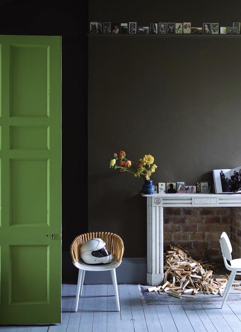
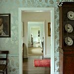
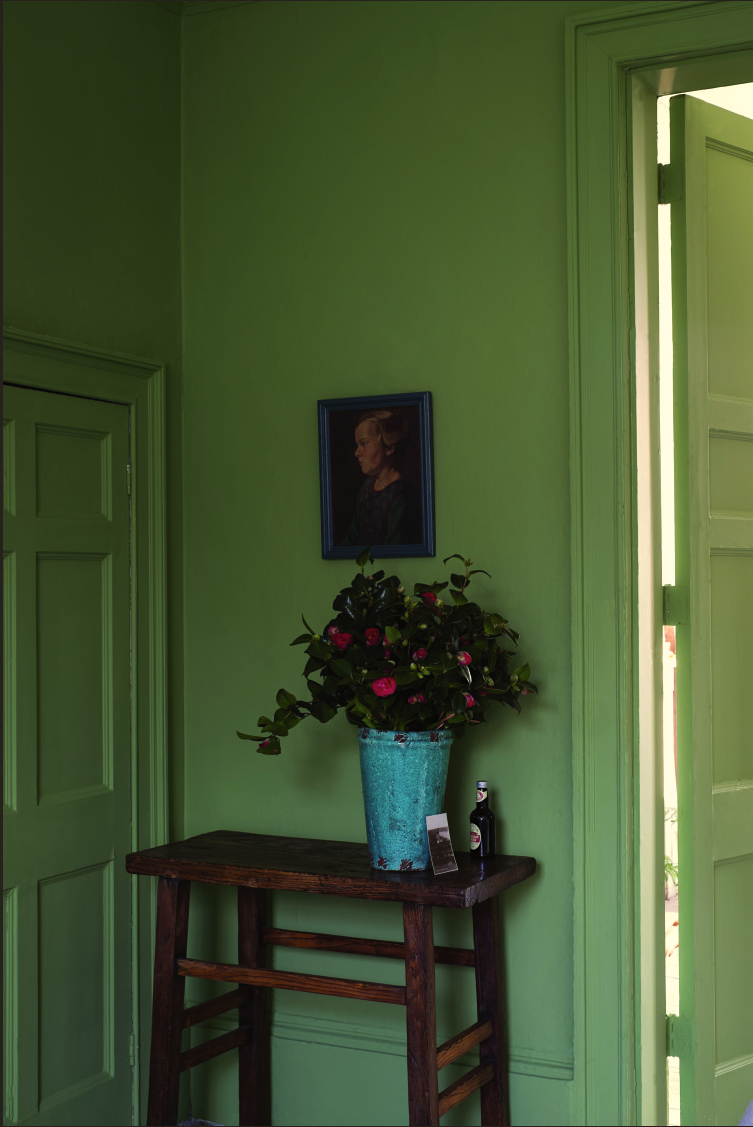
Door in Yeabridge Green
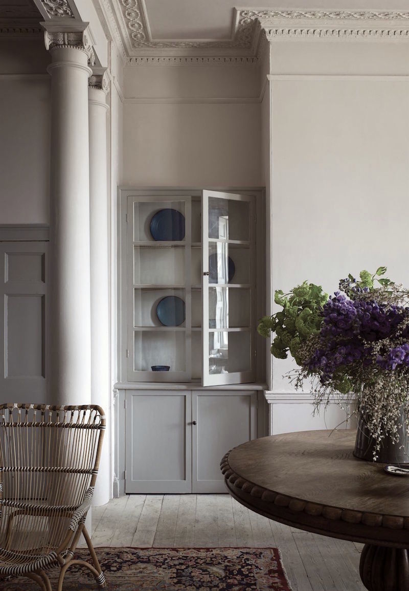
 WORSTED 284 is a lovely, rich gray, a bit lighter than the very popular Mole’s Breath. And it’s a bit darker than Purbeck Stone. It is a gray that is both warm and cool with a slight lavender undertone. Very handsome. GRAYSTONE 1475 is a very close match.
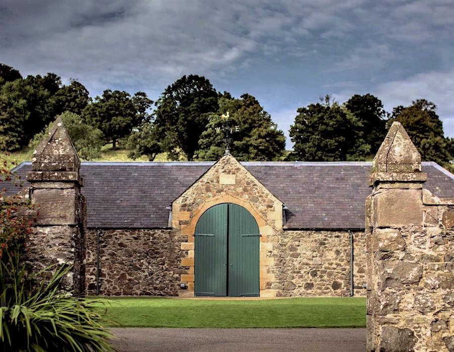
 INCHYRA BLUE 289 (pronounced CH, not K) is inspired by the blue door at Inchyra House in Scotland.
This is a deep, gray-green-blue. In a darker light, it will go more charcoal, but as you can see below, in the strong daylight, appears a lot brighter.
I struggled for a bit with the match for Inchyra. There are two that are very close. YORKTOWN GREEN hc-133 and AMAZON GREEN 2136-30. I went with Yorktown because it is in the historical collection, but you could try samples of each. Please note, that it’s possible that these two colors might be identical twins. So, before you shell out money for the 2nd test sample, ask the guy if the formula is different.
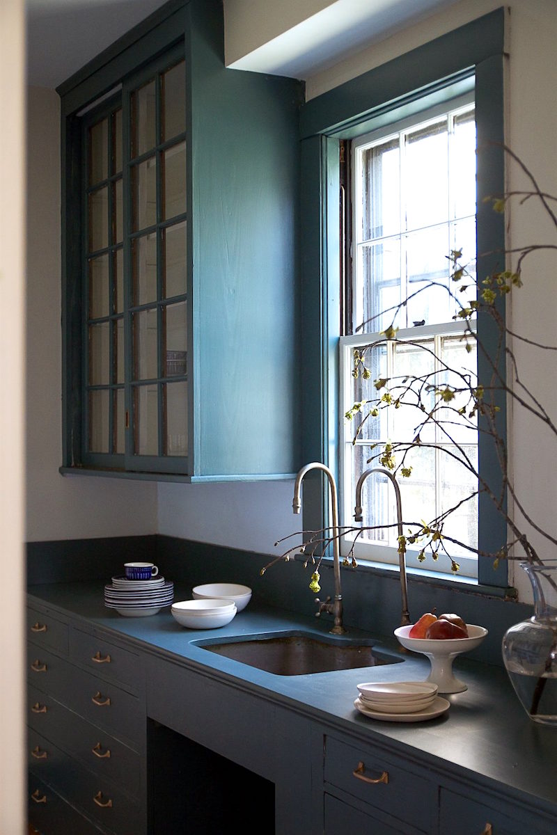
From the Remodelista blog, a wonderful kitchen with cabinets in Inchyra Blue.
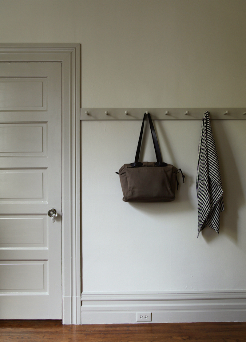
 SHADOW WHITE 282 is not white. It’s a really lovely light khaki-beige and a very close match with TAPESTRY BEIGE 975 or OC-32.
It is also shown above in the image above with the door in Drop Cloth
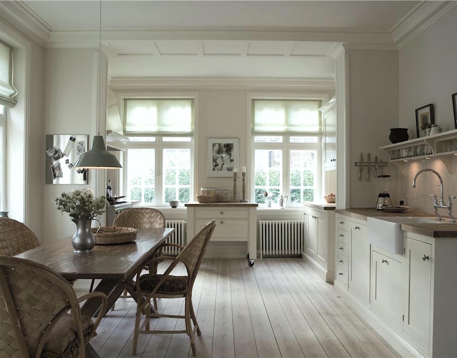
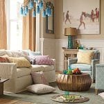
A Farrow & Ball kitchen in several different off-whites. I put this one on my instagram feed. Please follow me there if you like.
 VARDO 288 is Farrow & Ball’s very first shade of true teal and it’s a beauty. A close match is Benjamin Moore LARGO TEAL 742
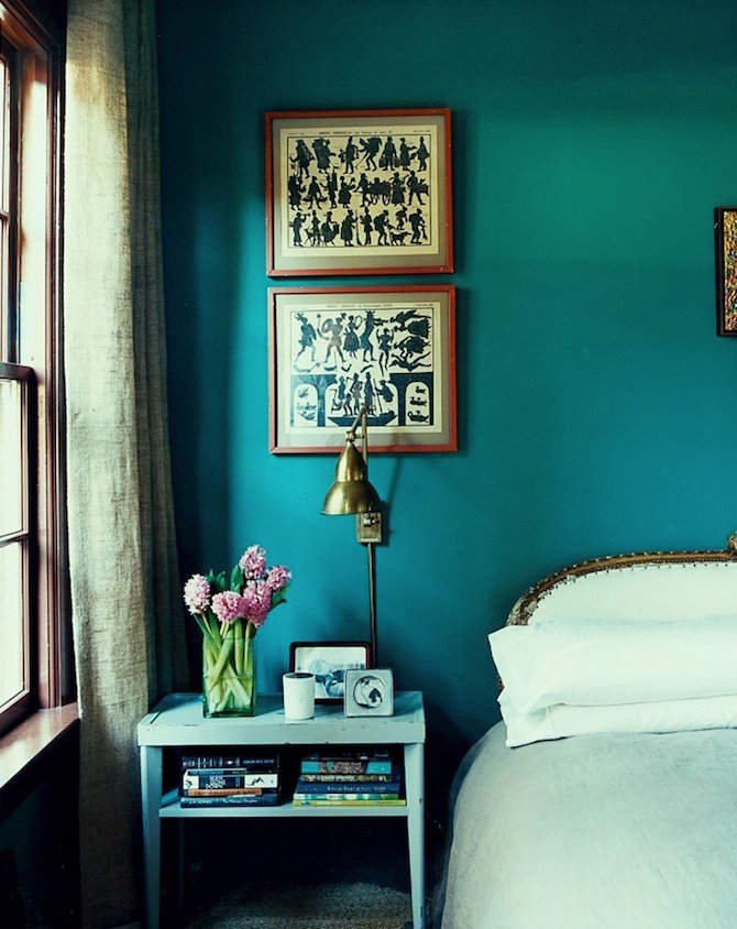
 PEIGNOIR 286 is a whisper soft gray with pink and lavender undertones. Actually, the lavender is a little more over, than under. So, if you would like to try a muted lavender it’s a great color or a great color for a little girl who would like a PURPLE bedroom and you PURPLE is going to make you gag every time you walk in. A great match is PORTLAND GRAY 2109-60 which is one up from Elephant Gray, one of my favorite Benjamin Moore colors and in the LH Essential Paint Color Collection
Walls in Peignoir and painted cabinet in Worsted.
From the New York Showroom in the D&D Building. (more in a sec) one of Farrow & Ball’s wonderful wallpapers in Peignor and I believe Shaded White. I’m not sure why the right side looks darker. Maybe a shadow?
 YEABRIDGE GREEN 286 is a wonderful Apple green. Just delightful and is very close to FOREST HILLS GREEN 433 which was on the short, short, short list for the LH Paint Collection. In fact, it was so short, that I had made a label for it, but I went with the one a shade deeper Herb Garden 434.
I spent many a sleepless night agonizing over these difficult choices. However, one of the beauties of this collection is that it is not written in stone. In the introduction, it says that it’s possible that the shade one up or down might be the better choice for you. So, we’re covered. :]
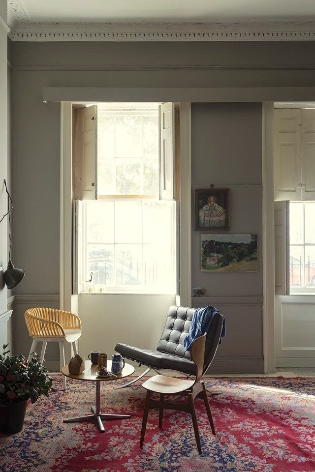
Here’s a wonderful example of a topic we covered recently where the trim and walls are the same color. Not the same finish, however.
They found this color in an old building. Me thinks this is not THE old building, but you get the idea.
The rest of the images are from an event at the D&D Building during the launch of the new colors last February. It was an all-day event. I thought, “Oh, how wonderful. I love these events. I always get to meet some fabulous colleagues…” Well, as you can see… the place was MOBBED. lol Yes, with a lot of samples, cans of paint, the showroom manager and moi.
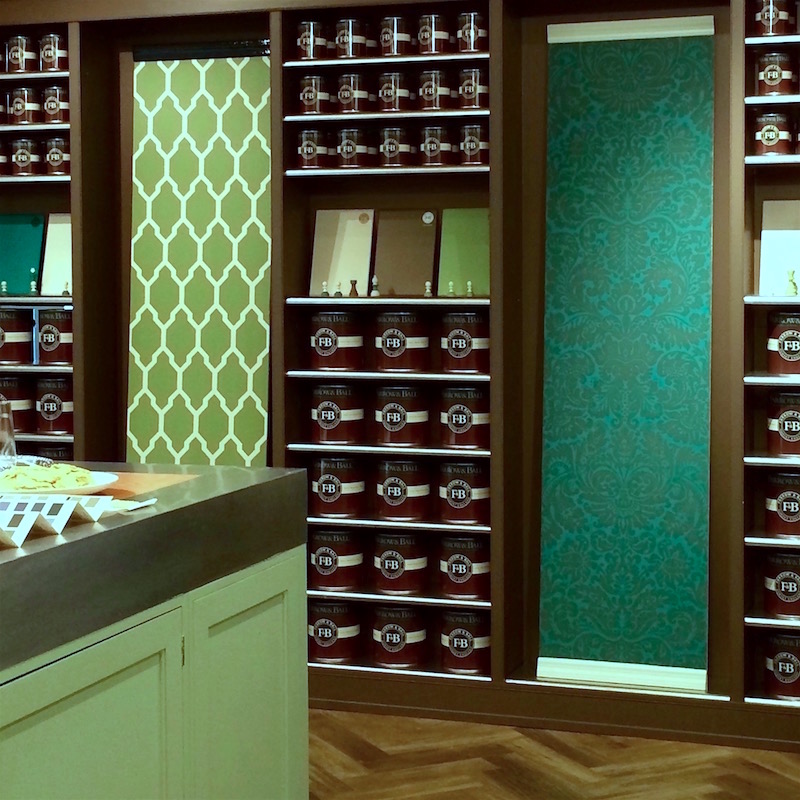
Counter and wallpaper left in Yeabridge Green. Farrow & Ball damask in Vardo and Salon Drab. Bookcase in Salon Drab.
For more color palettes with Yeabridge and/or Forest Hills Green, (and other beautiful colors) please click here and here and here
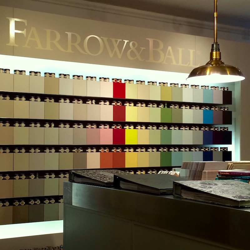
A display wall of all of the Farrow & Ball colors including the new ones.
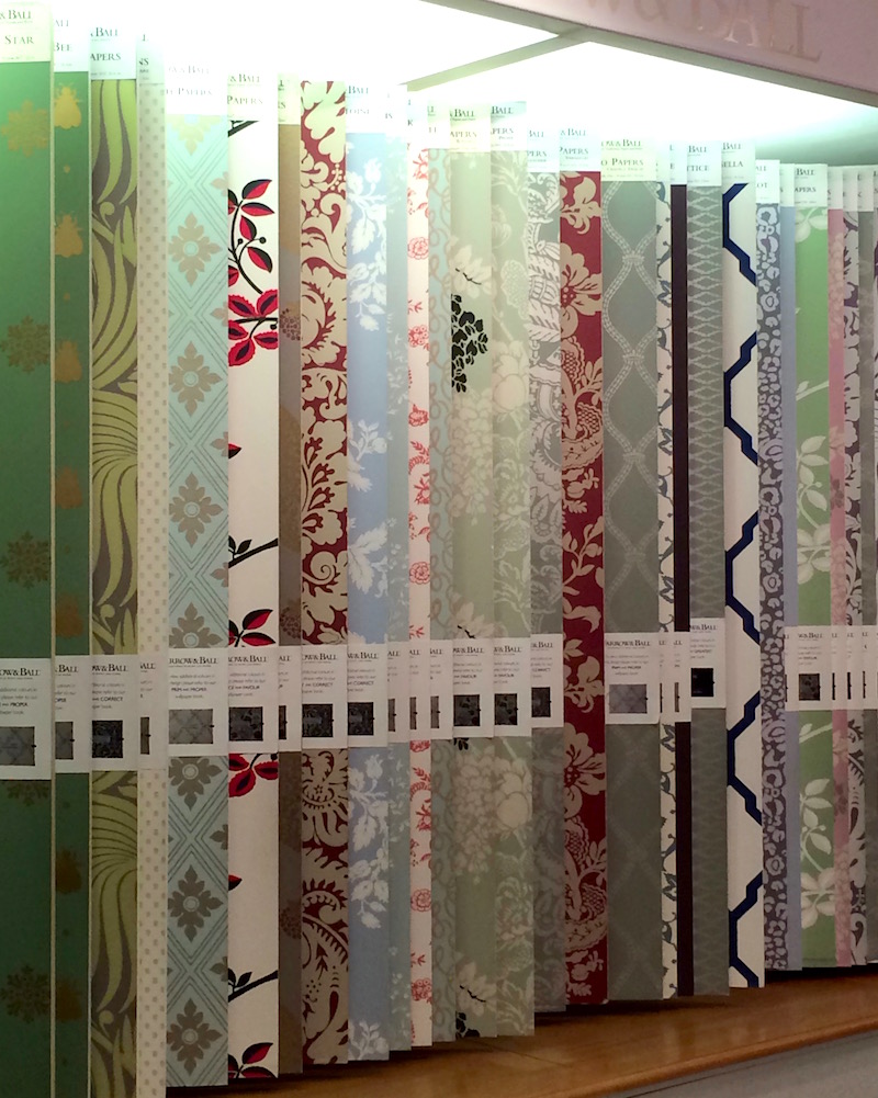
A beautiful display on the opposite wall of Farrow & Ball’s exquisite wallpapers. You can see one of my fave patterns, the Ringwold Pattern here in the beautiful Bronxville Home. (Above it’s about 6th from the left with a cream ground and black and red leaves).
And here’s the graphic again. Please pin it to pinterest and/or share on facebook and twitter.

xo,

Related Posts
 Did You Say Enfilade? On Fill What?
- OMG! My Interior Designer Fired Me! What Did I Do Wrong?
- Nine Fabulous Benjamin Moore Warm Gray Paint Colors
- 20 {Great} Shades of Orange Wall Paint {and Coral, Apricot, Kumquat…}
- The Best Bedroom Paint Colors You’re Probably Not Using
- 12 Farrow and Ball Kitchen Cabinet Colors For The Perfect English Kitchen
- What Nobody Told You About Prepping Your Walls For Paint