Dear Laurel,
It’s mid-May and we are getting to the final stages of a massive reno. The painter is on my back to give him the paint colors by next Thursday.
I went to the paint store and now I feel like throwing up. I’m not joking.
I mean, I have no idea how to come up with color number one much less all of the interior wall colors!
Ada Nauseum
Hi Ada,
It’s a daunting task, right?
Selecting interior wall colors. (and ceiling and trim colors too!)
And why is that?
Well, one issue is…
THERE ARE TOO MANY DAMN COLORS!
Is it white dove or cloud white? Gray Wisp or Pale Smoke? Abalone or Sea Salt? Himalayan Trek or Plymouth Rock?
Oh, I could go on and on and on…
Sometimes the differences are so minute that we are talking a difference of dye-lot. Yes, paints have a dye-lot of sorts which is why they say to buy all of your paint for one room all at the same time because it is unlikely to match EXACTLY if you buy it a month later.
And then there are the names.
Misleading names.
Like DISTANT GRAY which is so distantly “gray” that it’s actually a cool, bright white and not at all gray. Or, conversely PURE WHITE – which is actually a very cool blue-gray!
Or French Canvas which sounds so rich and lovely but is really a greige with prominent green undertones. It’s fine if you want a light green.
I fully get why people are so scared. Colors that look great on the chip can be icky poo when up and colors that look kinda blah on the chip can be the most glorious thing ever.
Here’s the thing that a lot of people seem to lose sight of.
Unless you are decorating a bomb shelter (raise your hand if you ever played in one as a kid)
There’s going to be a lot more going on than just the wall, ceiling and trim paint.
The wall paint is only the background.
And it’s not the only background because usually there are also windows.
My point is that your interior wall colors are not an island unto themselves.
It’s like focusing only on your hair color when you still have to figure out your clothes, makeup and jewelry.
So, my next question is…
What else is going on in your room?
In your home?
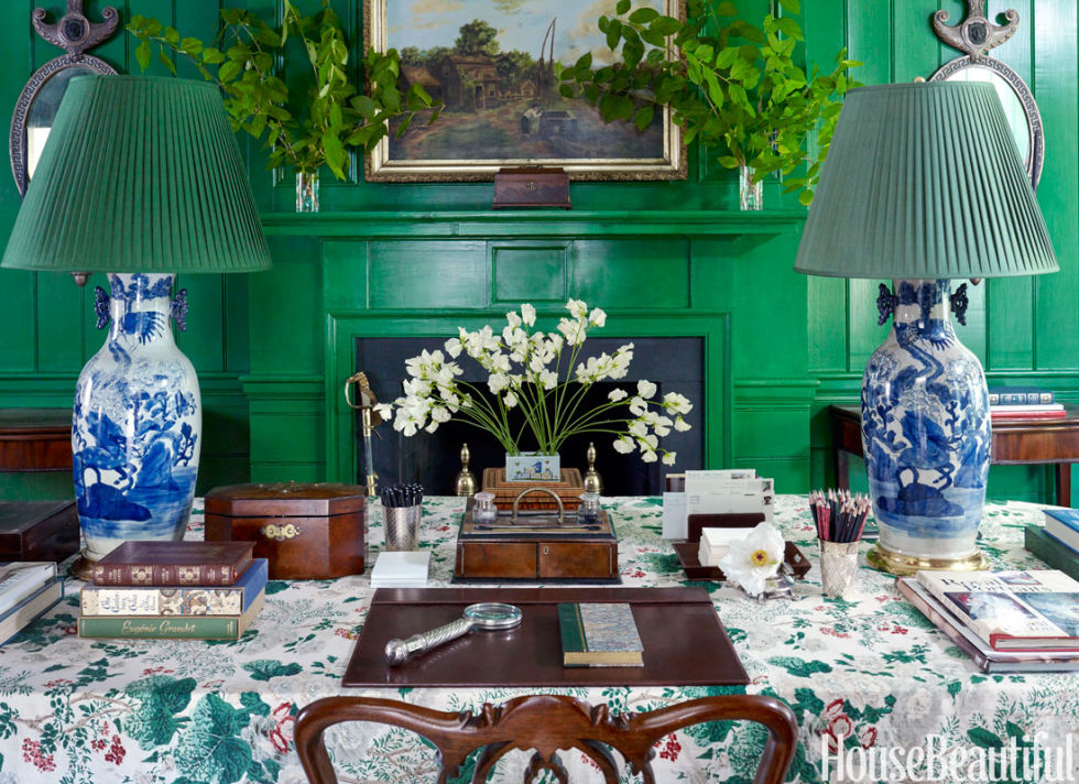
Here is a room by the amazing Miles Redd. I’m leading off with this to make what I hope is a compelling point.
That’s a pretty intense, saturated green on the wall, isn’t it? Now, imagine that the room is just painted this color and there is NOTHING else in it. Nothing.
Note: This looks to be a glaze and multi-layers of color, etc. and probably took many days to create, but let’s say that you woke up one morning and the walls were white and the painters came and you came home to this butt neked room; except for the wall color.
Pretty gag awful, right?
Yet, here the color, while certainly not everyone’s taste and one I doubt I would have picked works beautifully.
Why does it work?
It works because of all of the other elements in the room that make it a finished space.
- wonderful architectural features
- The analogous green of the plants
- The balance of brown, white, blue
- beautiful objects, mirrors and art
So, How Does One Come Up With The Perfect Color Scheme?
When I’m doing a whole-house interior design project, I like to start with the living room. The living room is generally the heart of the home. It is usually close to the front door and often there’s a dining room adjacent.
Here’s what I find the most helpful.
- First, I look at the home in a holistic sense. Where is its location? What style is it? What are the materials the home is made of? Is the home new or old.
- Second, I discuss color preferences with the client. Some love color and some prefer a more neutral palette. Some are adventurous and some more timid. I’m not going to suggest an emerald-green living room to a client that prefers something subdued.
- Third and this is the part that’s the most fun. Is there a jumping off point?
There might be a rug. A piece of art. Furniture pieces the client would like to incorporate. That makes life a lot easier.
But let’s say that this is the client’s first real grown-up home and they are starting completely from scratch.
This is when I ask them to do some research if they haven’t already. They need to begin to collect images of rooms that they like. Most of my clients have done this already.
Sometimes there is one room that the client says is their dream room. But sometimes, the reason that it’s their dream room is not the colors or furniture, but the brilliant way it was styled. Or it’s the architecture–the windows, mouldings, etc.
After the client presents this to me, I am already beginning to see the patterns. Then, I’ll work on their floor plan and at our next meeting, bring over a bunch of fabrics to see what the client prefers.
Other times, we will begin with a rug, particularly an Oriental rug. That is often our jumping off point, but it might be a fabric.
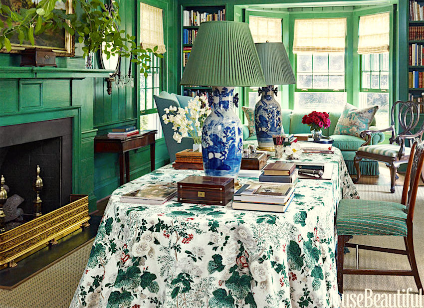
I don’t know, but Miles may very well have begun with this glorious fabric from Lee Jofa called Althea. (There is a sister fabric called Hollyhock. I always get them confused, they are so similar).
Then, he had fun with the different shades of green, added in a healthy amount of brown and the wonderful Blue and White Chinoiserie lamps to give the scheme even more balance.
Often, people contact me with descriptions of their room, like it’s east facing and is a center hall colonial, new construction. They have wood trim in the adjacent room and dark floors.
What color should I paint the walls?
Sorry for the glibness, but you tell me. What color? It is not as if us designers have a running list of colors we can pick out based on a description. We can’t. But a lot of folks don’t understand this.
The important point is:
What else is going in your room?
Don’t have any idea, but you need to paint?
Well, then, you may very well be painting yourself into…
Oh, I understand. You have a painter breathing down your neck for the colors. You just want to get it painted before you move in and then you’ll deal with the furniture. That is understandable, but you have to realize, that it is more difficult than doing it all together.
So, how can you come up with say nine (or more) colors for a good color scheme that will work with whatever you’re choosing down the road?
The same way. You must start with SOMETHING.
So, go searching for a rug or a piece of fabric you’d like to incorporate somewhere. Cut out your images and decide your style and general color preferences.
This is one reason why I came up with the 66 Universal Colors in the new Laurel Home Essential Paint Color Guide.
And before someone feels compelled to bitch-slap me (but please don’t. I’m quite sensitive, actually) and tell me that they are appalled how unprofessional I am and that I am leading y’all into a sales pitch.
Fine. Yes. I’m leading you into a sales pitch. ;]
BUT
It’s up to you. If you want some help, feel you need help, then perhaps this is a good solution?
If you don’t, then you don’t. And absolutely no worries, whatsoever. I am not expecting anyone to buy anything I’m selling! However, it’s new, so please bear with me. I promise that I’m not going to hound you for weeks on end because I too, hate that; just, until the end of the month, when the special is over. :]
There are two parts of the paint guide that are especially helpful for people who are in a bind.
There’s the 66 Universal colors that all go together. And then the trim colors that go with them.
Almost done. :]
There is a discount if you would like to buy laurel’s rolodex in addition to your paint guide. You can read all about it in last Wednesday’s post which also goes into great deal about the laurel home essential paint color collection. For more info about laurel’s rolodex, please click the link.
One last thing, because once in a while, someone doesn’t understand. These are PDF files that you SAVE to your electronic devices. It is possible to have them made into a book, if that’s your preference. Just google “how to turn a PDF into a book” and they’ll all pop up.
Again, if you’re not interested, there’s still plenty here to read and discover how I select paint colors. It’s just that the colors I’m using in this exercise are all from the paint collection.
So here’s what I recommend doing to find the perfect paint color palette.
Get on pinterest. If you like my taste, take a look at my boards, especially living rooms, make your own board and select ones you like.
Then, go to one of those sites like Decorator’s Best who are undercutting us designers (another story, but nothing I can do about that) and start looking for fabrics that you like. They are good for that. :]
If you’re a designer, you can use e-designtrade.com. It’s a to the trade resource for Kravet, Brunschwig, Lee Jofa and a bunch of other sources.
I did that and pretended that I am not me.
I pretended that I am one of you and I picked a fabric that somebody likes.
It’s a classic Jacobean print from Brunschwig and Fils.
I am going to show you how easy it is to create a paint color palette for your home from one fabric.
The beauty is… You don’t have to use the fabric, or you could use it for a pillow somewhere.
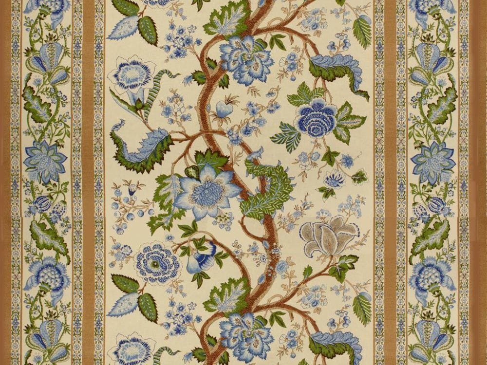
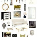
I swear on a stack of paint chips that I did not pick the colors first. But, I did find nine paint colors in the collection and almost all of them are in the Universal section that pick out the colors in the fabric.
I do advise that you get the real fabric sample before doing this, however.
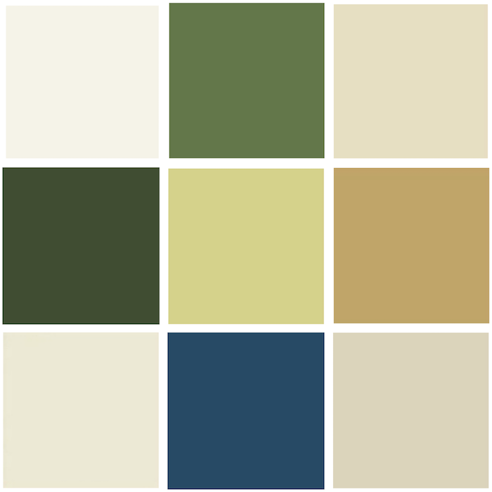
Above is our palette.
The four colors in the corners are White Dove, Elephant Tusk, Linen White, and Manchester Tan.
Now, I want you to go shopping– online.
Oh, if you are already working with an interior designer and she’s shopping, then please don’t do that, unless you want her to get uppity with you.
This is for the DIY and designers in the trade who are just starting out.
This will take a bit of time, but it’s really fun. Start putting fabrics that you like in a folder. It doesn’t have to be a lot. I did a lot, but I’m nuts. You are probably not that nutty. Keep the folder on your desktop for easy access.
Okay, here’s where it gets really fun!
I use a little program called pic monkey which is more fun than a…
It’s free unless you want to pay for the fancier stuff and get rid of the ads.
Click on the top menu where it says “Design”
Then, you will see a white square. That is your “board.” You can change the size of the board, but for now, it’s 2000 pixels x 2000 pixels which is pretty large. For instance, the graphic above is 700 pixels x 700 pixels. I made that on pic monkey too.
All right. Now, you go to the left and click on the butterfly icon. These are called overlays and essentially, that’s what you’re doing. You’re overlaying your images onto your white virtual board.
Click at the top where it says Your Own and start downloading the fabrics you’ve saved in a folder on your desktop. And then, you can also add in your paint colors to see how you like them and with which ones. Let your eye be the guide. If it looks funny to you, then it gets deleted.
These aren’t necessarily going to be the fabrics that you’re going to use. They could be, but the fact that you’ve found fabrics that will go with your scheme, you can feel more confident in your paint color choices.
But please remember to always test!
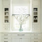
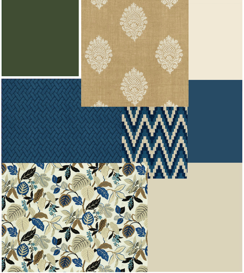
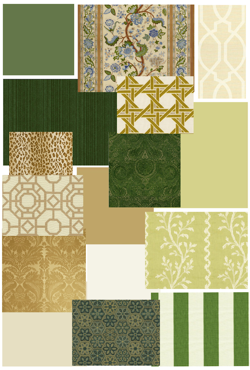 Above are the paint colors and fabrics I selected and edited for the pretend living room, dining room, entry hall and kitchen. Below, it continues into the back hall and family room.
BTW, I was having so much fun, that I created another really cool palette (well, I think so) which I want to share with you mid-week.
Hopefully, you can see how from one fabric, it is relatively easy. I say, relatively easy, because this is NOT easy. This is brain surgery, folks. But it is relatively easy to choose a paint palette.
And to facilitate this, I created The Laurel Home Essential Paint Color Guide. There are 144 colors and 66 Universal Colors. And all of the colors come with the best trim colors to go with that color.
Are there other options one could do here?
YES!
You could stick with a very neutral wall color palette and only have the color in the fabrics.
You could pick out only the green and neutrals and skip the blue.
There are lots of ways to go here.
Please remember, that I am more than happy to answer general questions that everyone can learn from, but I cannot help with individual problems in the comments.
Thank you guys so much!
xo,

Related Posts
 Nine Fabulous Benjamin Moore Warm Gray Paint Colors
- What Nobody Told You About Prepping Your Walls For Paint
- True or False? Painting Walls White Will Make A Room Appear Larger
- The secrets to creating a beautiful interior. You can do it!
- Top 25 Must See Kitchens on Pinterest
- I think I Just Made a Terrible (and costly) Decorating Mistake
- Clever Kitchen Storage Ideas For The New Unkitchen