Dear Laurel,
I’m a new reader of your blog and am enjoying it a lot. If you’re looking for a topic for a blog post, I have one. It’s about my “no-fail paint color” that was anything but. Actually, it was no-fail paint colorS!
Here’s the sad story.
For way too long, I had been pondering paint chips to select wall colors for my new home. It was driving my husband crazy. Hell, it was driving me nuts too!
One day, I found this list of no-fail paint colors. I was so excited and confidently selected the colors for my no-fail paint color scheme.
We hired the painters and then went on vacation for a week.
When we arrived home, I felt like a kid on Christmas morning. However, that excitement soon gave way to abject horror. The gray was baby blue, and the ivory was YELLOW. I HATE YELLOW!
One room was the wrong color altogether.
I looked at the can and saw that two numbers had inadvertently gotten switched around. It never occurred to me that was a possibility.
Laurel, it’s a horror show. It’s so bad; I have a good notion of giving that blogger a piece of my mind. But, what good will that do? My husband has been very supportive and said that it’s okay if we have to do some of it over. However, there goes the vacation to Cape Cod in August.
Sincerely,
Pinky Beige
***
Oh, Pinky,
I fully understand your frustration. And yes, this is an excellent topic for a blog post. Please know that I’ve made EVERY mistake, or else it’s a situation that happened to a client; or, it was something I saw somewhere else. But, yes, most of this has happened to me.
Therefore, please learn from my mistakes!
Is there such a thing as a No-Fail Paint Color?
That would be a color that looks good anywhere you put it.
Okay, there are some colors that I think look good almost everywhere. I say, “almost,” because there can be exceptions. Plus, sometimes the failure isn’t actually a failure. We’ll get to that in a sec.
So, yes, “no-fail paint color,” is somewhat of a misnomer. Sure, it sounds great as a title for a blog post. And, I’ve written a couple of them myself.
Here are nine fantastic paint colors I’ve deemed to be no-fail paint colors. However, in the post, I do go over what one needs to do to ensure that they are the right colors for you.
And, here’s another one about some gorgeous kitchen cabinet colors.
But, here’s the thing. Any paint color can fail if the circumstances are not favorable.
Therefore, let’s go over some of the common issues that can cause a no-fail paint color to fail.
12 Common Reasons Why Your No-Fail Paint Color Failed
1. The room itself, is the problem.
We’ve gone over this in dozens of posts.. In fact, in this recent post, you can find many of them here that talk about how to make your not be the problem. I’m talking about the architecture of the room. It’s why the rooms I posted on Sunday by the fabulous A+B Kasha are so gorgeous.
The point here, is if the room itself is lacking in interest, then it matters not the wall color.
2. The room is very dark.
I don’t want to get into the north-facing thing too much, but yes, it’s dark and northeast, and there’s a big hill. I would probably steer you away from a dark color– unless it’s a library and the lights will be on all of the time anyway. OR, you really love the idea of a dark, moody room, and plan on illuminating it with artificial light.
For paint colors that look great in north facing rooms go here.
3. You didn’t consider the other rooms around it.
Everyone is painting their rooms in that hot new shade of teal. Last year it was orange and the year before eggplant. Each room in your home is now a different style and color. It’s going to look odd. (duh) There needs to be a logical flow, and adjacent rooms should have a thread of one color or color family for continuity.
A good example of that is the home we did a few years ago, in Bronxville.
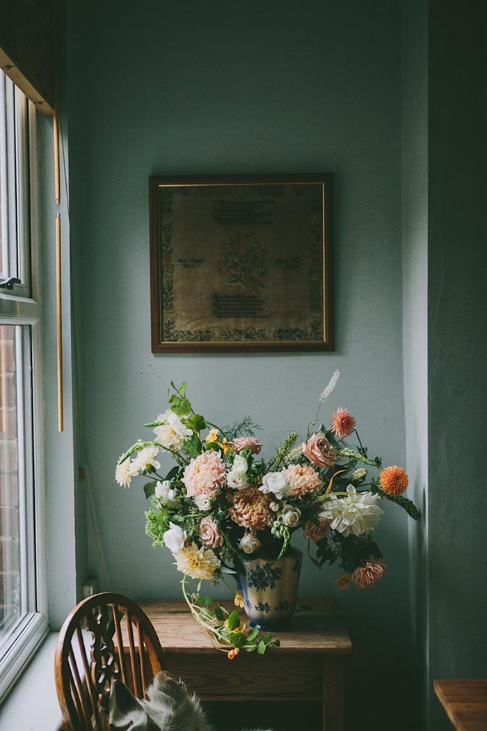
Anna Potter’s home carries through it a monochromatic green palette that I think is especially lovely.
3. The other finishes/materials in the room clash with the color.
If you have orangey-brown cabinets, you can’t paint the walls pink. Well, I wouldn’t. When figuring out a paint color, it’s a good idea to consider what else is going in the room.
Throughout my entire career I’ve been asked to recommend paint colors without my being able to see anything. A description is the same as when you describe how you’re feeling to your doctor. He still needs to see you to make the diagnosis. I have to say that virtual doctor visits are one of the best things to come out of the Covid era.
But, Laurel, we just moved, and I have no idea what we’re going to be putting in the room.
If you don’t know what else is going in the room, but you need to paint, then perhaps create a plan that you can carry out later on. Even if some things change, you will be less likely to paint yourself into a… you know. :]
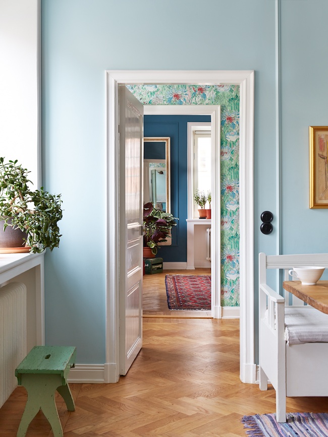
I love this enfilade where each room plays nicely off the other. By creating your overall palette first, you’re way ahead of the game. For more gorgeous enfilades, click here.
4. Like, Pinky, you read it somewhere, maybe even here. It’s imperative to always test your paint colors!
And, just because someone else likes it, If a “no-fail” paint color doesn’t appeal to you, then don’t use it!
5. You chose the color from a photograph in a magazine,
from your computer monitor,, or someplace that was not in your home, in the room it’s going in.
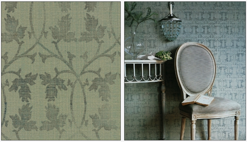
Here is a perfect example of why I would not recommend selecting a color from a magazine or website. It’s wallpaper, in this case, but the point is made. The wallpaper on the left is the SAME as the wallpaper on the right. The photo on the right was in a magazine but a head-on view. I’ve used this wallpaper and have admired it for over 16 years. Unfortunately, the color on the right is wrong!
Here’s more on the topic of paint colors that look different than expected.
6. You don’t yet have anything else in the room.
It’s almost definitely not going to look good. This relates to reason #1. You have to have other things in the room to make the color come alive. Look at how uplifting this very dark gray room looks with its bright accents.
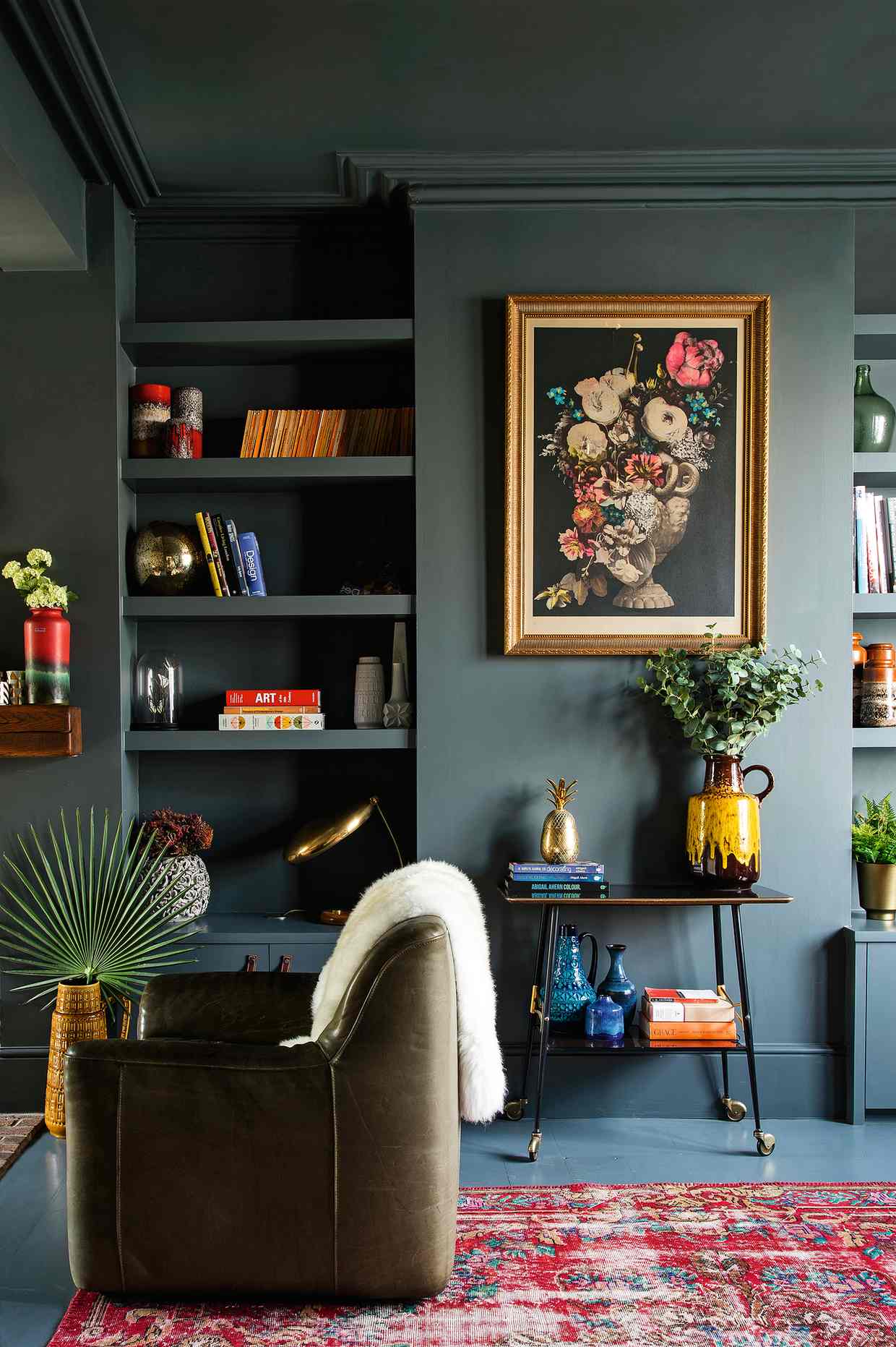
The Guardian – Photo David Cleveland
Not sure, but the color looks to be Farrow and Ball Down Pipe
Another favorite example is Ben Pentreath’s dining room which I have been IN and posted about a number of times.
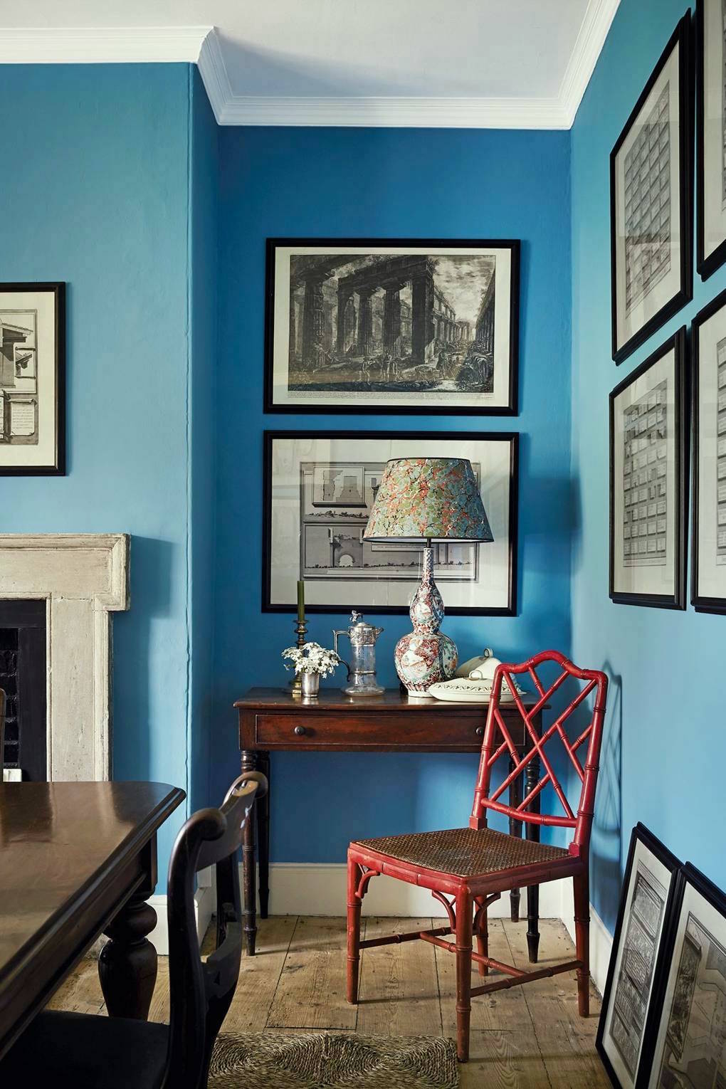
House and Garden Magazine
Notice how the addition of black and white, and that shot of red, plus the somber tones of brown wood, make this color glorious. I can guarantee however, if you walked into a room painted this deeply saturated blue, you would find it pretty intense. Here’s the post with the pic I took of this gorgeous room!
7. Because… Light is crazy.
7. I need to say that again. Light is crazy.
Remember this post where my pale gray walls look YELLOW and PINK and lots of other variations?
8. Your artificial lighting is harsh, insufficient, the wrong kind, icy, shadow producing.
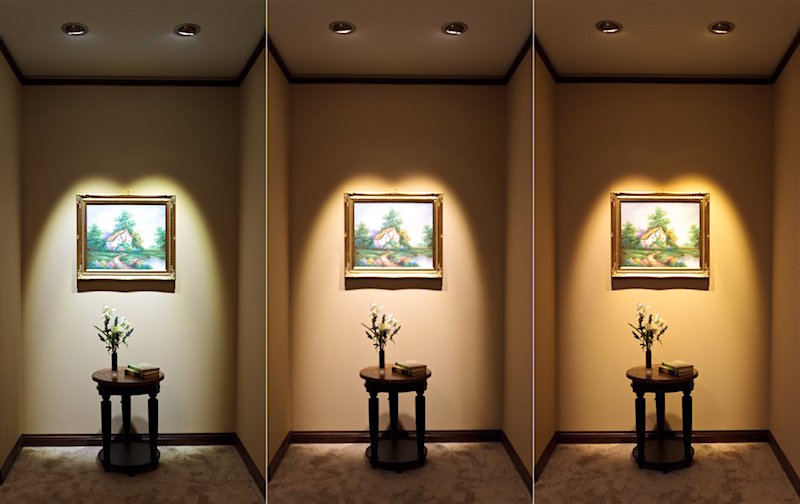
Yes, this is the same wall color in all three shots.
This is a whole topic unto itself. Here are three different types of light. I believe they are cool LED on the left, then halogen, and third incandescent. Please, do not ever use a cool LED or so-called “daylight” bulb in your home. Please. You can still get incandescent bulbs. And some LEDs are warm and not too bright.
We have also talked in many posts about lighting and how to get it right.
9. The no-fail paint color was mixed wrong.
It’s rare, but has happened to clients, twice. Please test that the color in the can is what you are expecting. Yes, and if the color has a number and a name, it’s a good idea to give them both. Sometimes companies have names that sound similar. They shouldn’t, but they do. And, of course, it’s easy to get numbers mixed up.
10. You tested the paint incorrectly by painting it directly on one wall, and then you put up a bunch of other colors next to it. Please check out this post to learn how to test paint colors properly.
11. Your room has some weird angles.
I once worked on a home, and the eating area of the kitchen had two walls at an unusual angle. The walls had already been painted. They looked so different from each other; I swore it was two different colors. It wasn’t.
12. You took the name of the paint literally.
All-to-common, Benjamin Moore and other paint companies are notorious for using misleading paint color names. For instance, many shades of green or blue are called “gray”. Or shades of gold are called cream. For help with the best shades of Benjamin Moore paint colors click here.
Here are a bunch of beautiful shades of green that are not called green.
Wall color: Benjamin Moore Hepplewhite Ivory HC-36. It’s a lovely color, but if you are expecting ivory, you might be disappointed.
And one more reason why your no-fail paint color failed which I’m sure I’ve mentioned.
13. You listened to…
your husband who insisted that the color be “halved.”
Or your mother,
child,
sister,
BFF…
Sure, go ahead and listen to them. But please do not cut your paint color in half unless you know that it is a good thing to do. At the very least, experiment first.
Well, there it is. There are many reasons why a no-fail paint color might not work out as you thought it would. Take your time. Make a plan. Test carefully, and remember, that paint colors are only one aspect that makes for a beautiful room.
Here are my all-time 16 favorite Benjamin Moore paint colors!
And if you love Farrow and Ball (I do too!) but can’t get it or can’t afford it, here is a guide to matching up the colors with Benjamin Moore.
If you can afford Farrow & Ball but can’t find it, you can now purchase it online!
xo,

PS: Please check out the newly updated HOT SALES!
Related Posts
 18 Secret Doors You Will Be Inspired To Have!
- 77 Budget Fabrics That Look Rich + Sources!
- Can You Use Gray Paint in a North Facing Room?
- Subway Tile Alternative Everyone Knows About But Me
- 20 Timeless Kitchens You’ll Love FOREVER!
- 22 Living Room Lighting Rules You Need To Know
- Affordable Bathroom Fixes With Big Impact