Page update November 2, 2022
First of all, before I get into today’s topic, the number one interior decorating problem, I want to thank you all dearly for your support and for the incredible comments I’ve gotten and continue to get.
There are a lot of you now… I mean A LOT! And I’m always shocked but grateful. A lot of you write me and I love hearing from you. And it’s almost always the same thing.
It’s your number one interior decorating problem
Drum roll~~~~~~~~~~~~~~~~~~~~~~~~~~~~~~~~~~~~~~~~~~~~~~~~~~~~
What the hell paint color do I need?
Please LAUREL!!! Just tell me! Tell me what to paint the _______!!!
I understand your pain oh so well.
That’s because I was once you. I had the same interior decorating problem.
Yes, I ran to the paint store two dozen times.
Alright. I’m lying.
It was five dozen times.
I had an entire cabinet filled with dozens of test quarts.
Oh man, I easily spent $300+ on the test quarts.
But that was 20 years ago and since then… I’ve learned so much about choosing colors.
I know that there are those that teach techniques, however, I know that it’s still difficult for many to select a color. We just want to know THE ONE! Right?
And then, as if that isn’t enough…
We’re bombarded with so-called interior decorating and PAINT COLOR TRENDS.
I did some investigating and what I’ve discovered is not only shocking but quite disturbing.
Let us begin with Pantone‘s interior colors of the year for 2016.
I know… poor Pantone. I just can’t leave them alone. Well, thank you… maybe they will leave US alone and then I will shut up. (maybe)
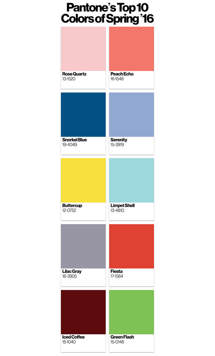
Is this supposed to be a palette?
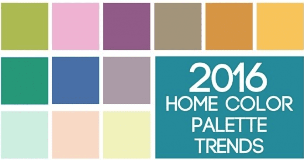
But then I found this also from Pantone.
WHAT?????????
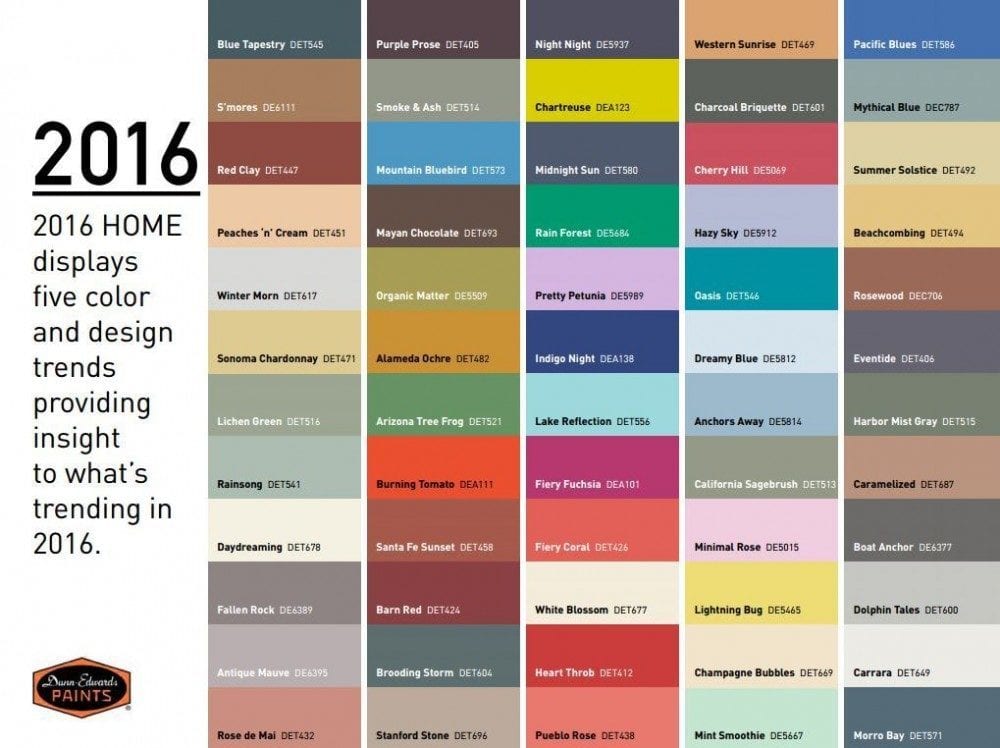
Dunn and Edwards ideas for what’s “Trending.” Obviously, that would be everything! lol
Sherwin Williams at least has some schemes that make a modicum of sense. However, we still don’t know how to use the colors. Where’s the trim color? Will these go with my wood cabinets? What about my puke beige tile. Which one will work?
 Above is Behr’s take on color trends for 2016.
Oh, I see a trend alright. The more gag awful, the better!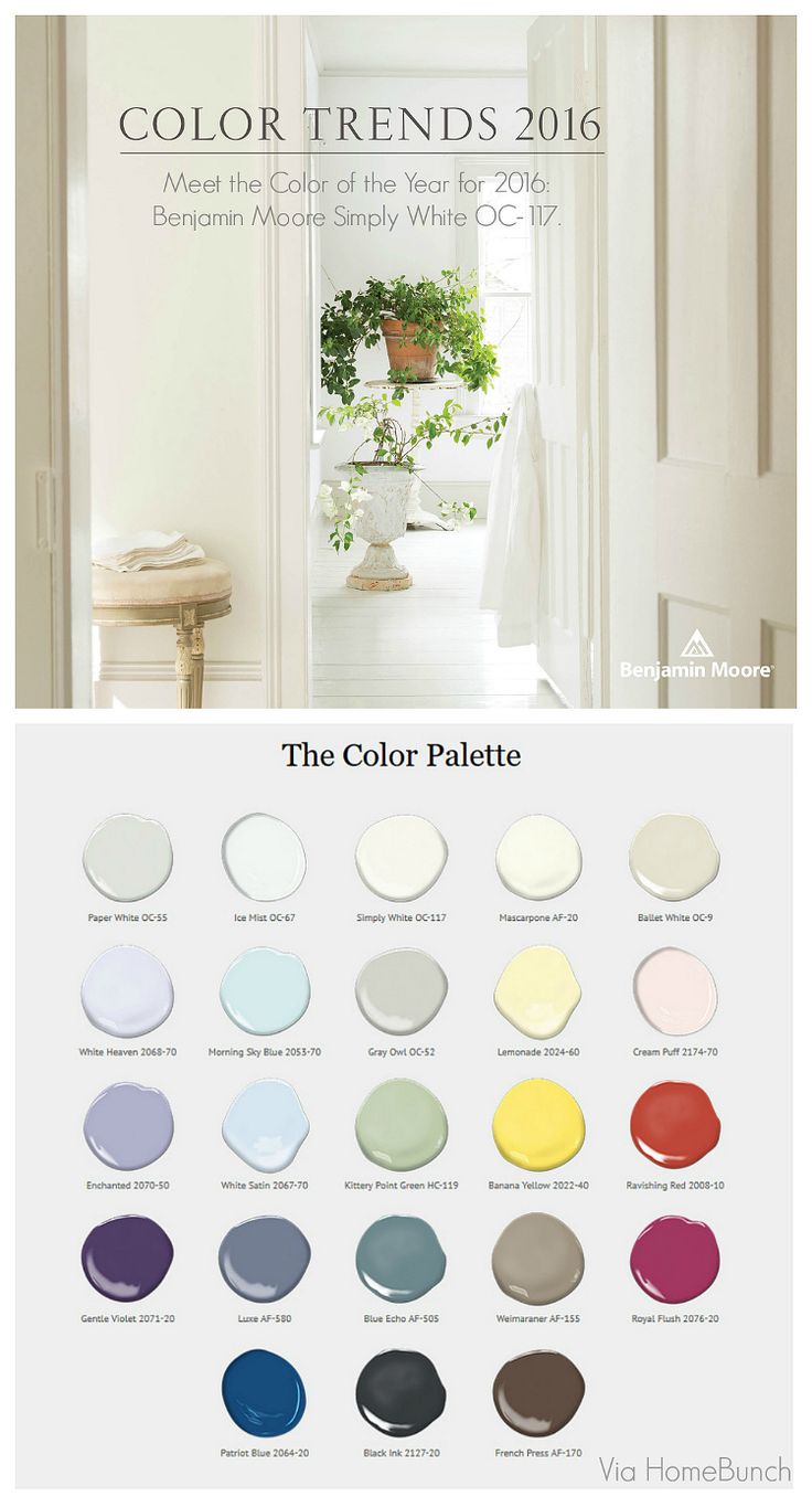 Homebunch
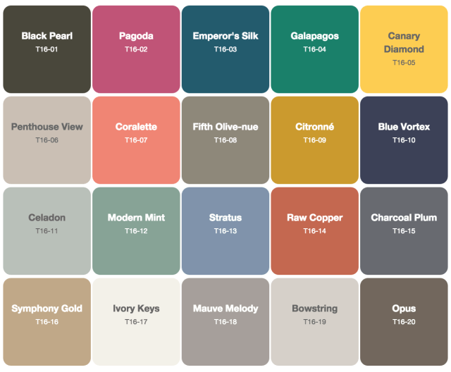
Benjamin Moore is the ONLY company that at least makes some sense and most of these are very nice colors. They are not all faves, but used appropriately, would work for me.
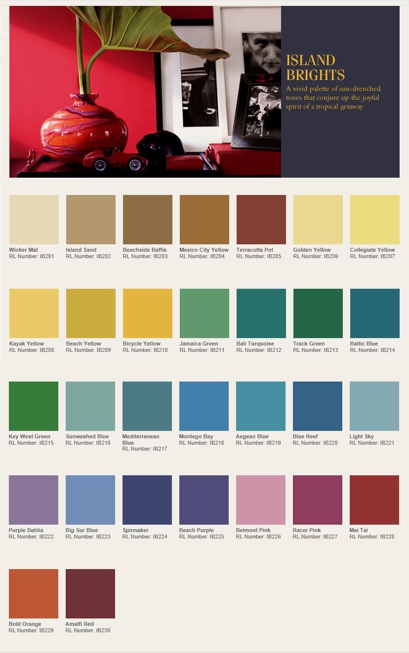
Ralph Lauren has many color palettes. This one is their attempt at garish. It’s a shame, because I’ve always been a fan of their trad old-money-type palettes and especially their blue palettes. Glorious! This one. I just wouldn’t put all of those colors together on one page!
So What is the Paint Color Trend for 2016?
The answer is clear.
Anything goes.
But does it go together?
NO, of course not!
The interior paint color trends are created by teams of color, paint and marketing specialists whose job it is to demean and confuse.
And here’s the proof, via Home Accents Today.
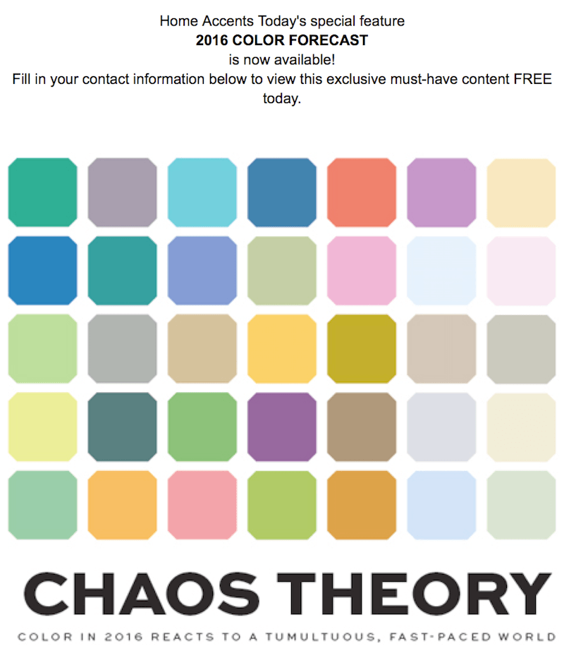
Here ya go! In fact, they are proud of the fact that they are messing with our heads. After all… it’s a tumultuous fast-paced world. Let’s make it REALLY CRAZY!!! hehehehe.
And finally. I’ve saved the best for last.
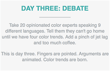
PPG AKA: a rebranded PITTSBURGH PAINTS has a wonderful PR campaign on their website where they have presented four distinct palettes.
The Odyssey Trends
The word Odyssey represents the adventurous experience in our fast-changing, unpredictable world that is keeping us excited and vigilant at the same time.
Alright. It’s a fast paced, unpredictable world and yet we need to remain vigilant. What does this have to do with paint colors? Let’s see what they came up with.
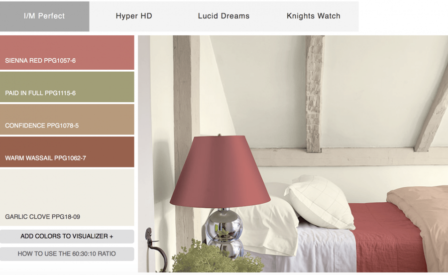 Palette #one. Not sure what I/M stands for. Instant Message? Guess they had a lot of leftover Marsala to get rid of.
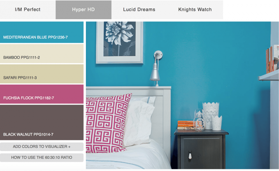
Palette #2 Yes, Hyper is a great name for this collection.
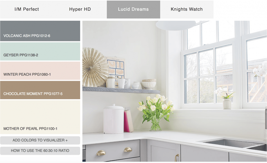
Palette #3 I’m starting to get angry. The kitchen cabinets are pale GRAY! Where is the peach, aqua and brown?
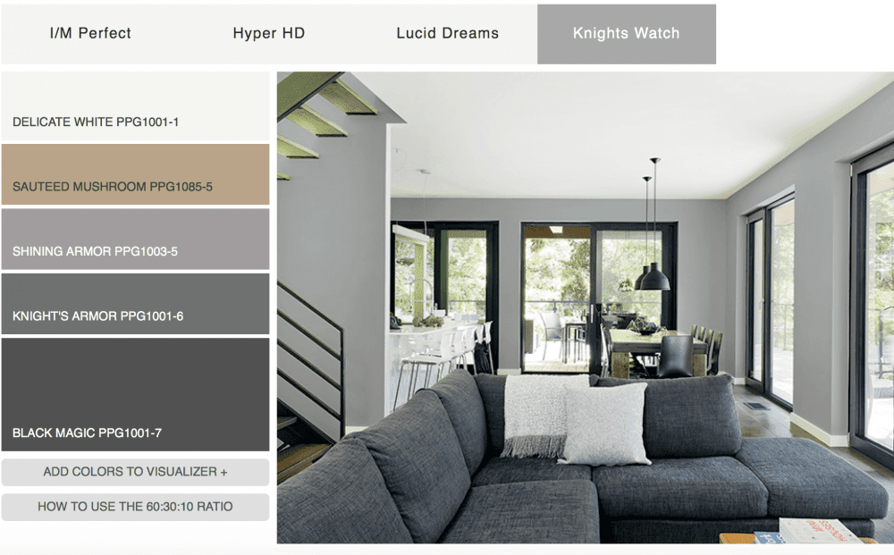
Paint palette #4 Ugh-ly, not to mention horribly dated. Ya know… I had a boyfriend over 30 years ago… in the eighties who decorated his studio apartment just like this only the walls were a deeper gray. His was cool. This is horrid. Just horrid.
In addition, the colors in the palette don’t match the colors in the images or many colors are left out.
Why? How? Who?
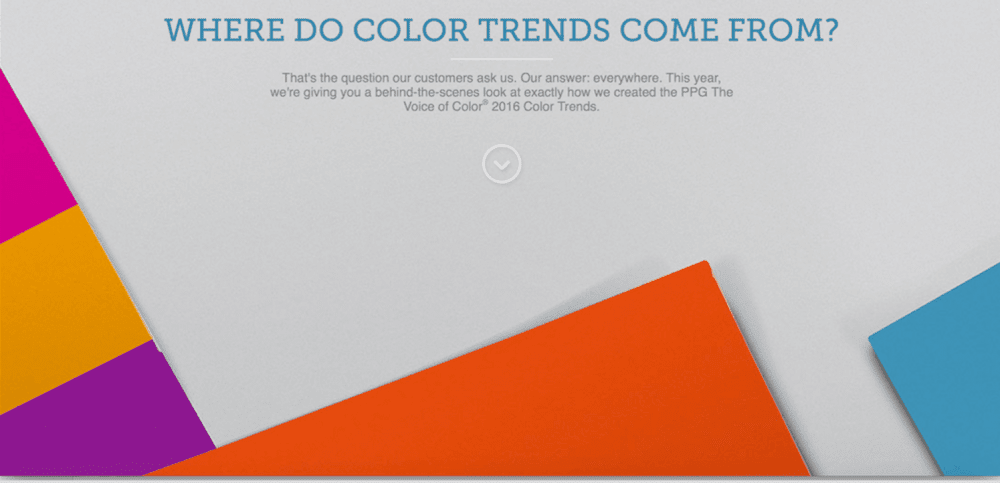
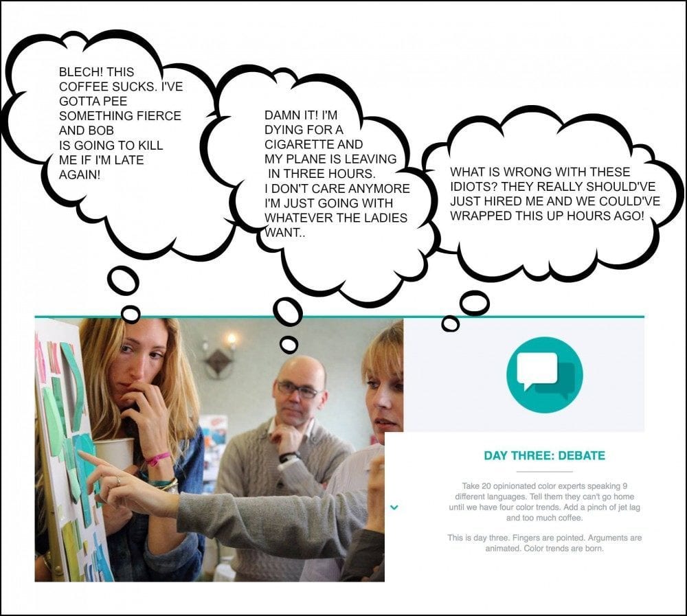
Well… thank you! The good folks at PPG actually tried to distract us from the hideous color palettes shared how these paint color palettes are chosen. You can read it all here.
(and what’s with the colors below? This isn’t funny any longer.)
Here’s my fave part.
haha! Seriously?
So, let me get this straight. Our paint color trends are decided by a bunch of sleep-deprived, jet lagged caffeine junkies, arguing in nine different languages? I mean, I’m sure that they’re all very nice, very well-meaning, very talented people.
But… 30 of them? You know what they say about too many cooks…

Can you imagine what they are thinking?
Just having a little fun.
I do feel for them.
It’s a tough job. But when you look at this cacophony of discordant colors, does it help you make a choice for your home?
Well, it doesn’t help me. It’s like Mahler, Mozart, Stravinsky, Bach, Beethoven and the Beach Boys all playing at the same time. Individually, they are all masterpieces, but together? Well, you get it.
So, what’s the answer?
Here are my thoughts.
- First of all… color trends don’t shift that much from year to year. It’s a gradual thing.
- Second, like just about everything, there are many, many styles to choose from. That right there, can dictate many of the colors.
- Third— I’ve been doing this counting interior design school for 28 years! My favorite colors then are STILL my favorites! The only difference is that I’ve expanded my appreciation for many more colors.
- Fourth, how often do you paint? Once every 5 years, 10 years, 30 years? Never? lol It’s not like you go out and get all new underwear. It’s a big deal! That’s why we stress so much.
Well… please try not to.
And, I wouldn’t pay too much attention to the marketing BS.
Sure, once in a while, they come up with something terrific. But when they do, you’ll know it! It will speak to you, not make you want to reach for a barf bag.
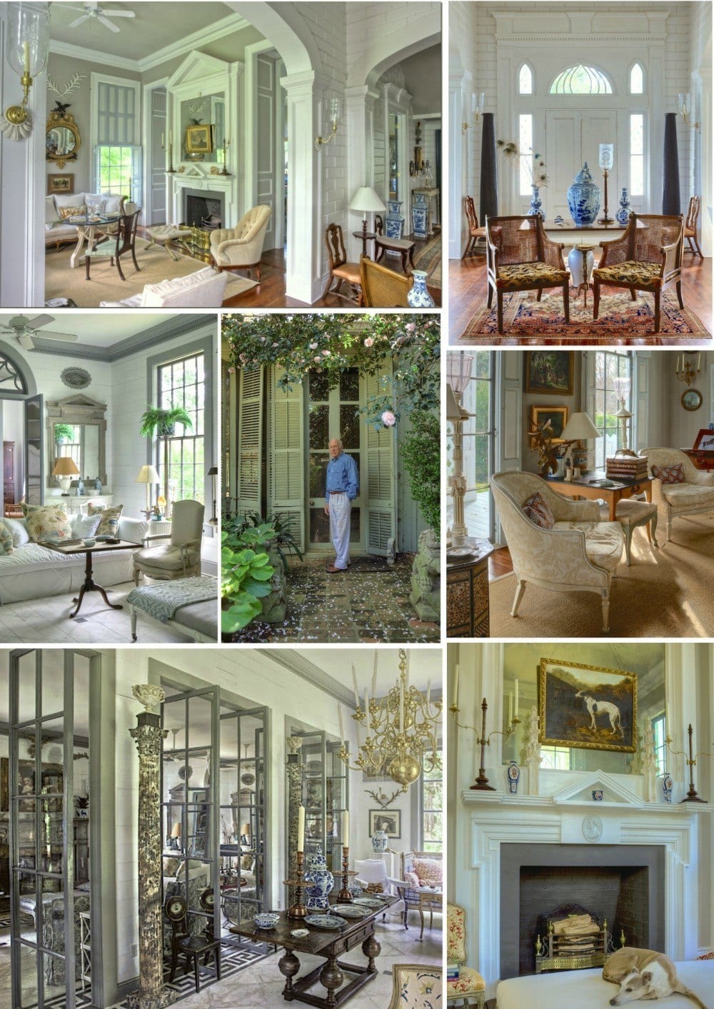
It will speak to you like Mr Furlow Gatewood’s astonishing work speaks to me and a lot of other folks too!
I made a little collage of a few of his living spaces in one of his homes in his compound.
He’s a master at everything interior design! At first glance, one sees a lot of neutral colors. And yes… it is primarily creams and grays, but look around and you will see a myriad of other colors…
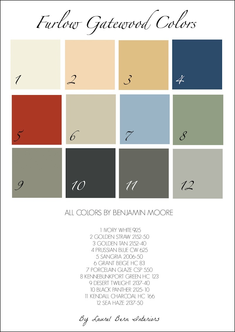
For fun and a little New Year’s presie for y’all, I made a little palette of Furlow Gatewood’s colors.
Are these his ACTUAL colors? Well, probably not. If anyone knows how to get them I’ll be your best friend forever! In the meantime, these are close enough. Not all of the colors in the palette were used as paint, but I selected a paint color that was close to the color in the palette.
These are all terrific colors! This could be incorporated into an entire home palette.
Please feel free to pin it to your pinterest boards!
This is what I’m working on for y’all.
I am working on a paint color collection that will be in palettes and will include trim and ceiling colors, woods, tile, counters, floors, and tons of other information to make choosing colors for your home–easy(ier).
There will be dozens of whole house palettes/finishes.
I did one a while back; nine no-fail paint colors. I’ve had several people write to me that they used them and couldn’t be happier!
If there’s anything else you’d like me to address with the paint collection, please let me know in the comments.
xo,

Related Posts
 Can This Boring Bland Living Room Be Saved?
- The Best Bedroom Paint Colors You’re Probably Not Using
- 20 Fabulous Shades Of Orange Paint and Furnishings
- Granny Decor Mistakes You Might Be Making!
- Do You Know What is the Most Classic Color?
- White On White Decor Inspired By Charlotte-Anne Fidler
- The Number One Interior Decorating Dilemma and How to Get Past It!