BREAKING NEWS BULLETIN: Pantone Color Of The Year 2016

Howdy Folks.  Sorry to interrupt your weekend. We have a BREAKING NEWS BULLETIN


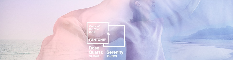
The Pantone color of the year 2016 has just been announced!


Remember just a few short weeks ago, I was projecting a clear fave for Pantone Color Of The Year?

After last year’s muddy dud, Marsala, I was so hoping that they’d come through and give us something to praise. I had so much faith that they had learned a tough lesson and would come through!

However, they are making this very difficult for us.

Recently, Pantone gave us a teaser.

pantone-colors-spring-2016-swatches-sized-w724

Since the two top paint companies chose a lovely soft white as their color of the year, I felt that a rich deep blue would’ve been a wonderful choice. And they have one right here in their SNORKEL BLUE. (name aside).

No Snorkel. PANTONE Chose something else. TWO other colors!


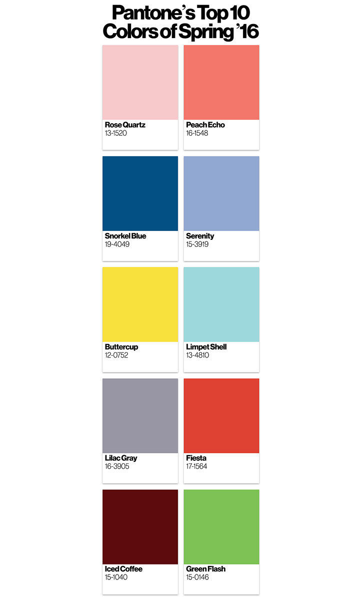
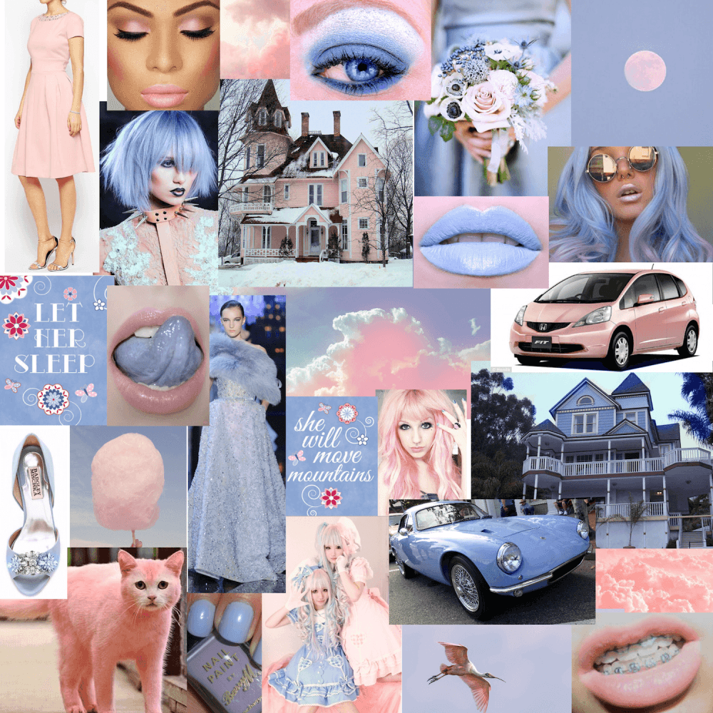
Please Meet our TWO Colors of the year!

serenity-rose-quartz


ROSE-QUARTZ

And her fraternal twin

serenity-rose-quartz copy

SERENITY

We’re waiting for the lab results to determine if baby serenity is a boy or a girl or something else.


Oh dear…

I am positive that the suits at Pantone read our blog posts.

They very much are doing their level best to P.O. us decorators. Obviously, they love it when we dish and diss and make sarcastic cracks at their expense. It gets people talking about them.

It’s not that these two colors aren’t wonderful. They’re fine. Just not together.


If last year, they gave us the color of dried blood; this year it’s a hand-crocheted receiving blanket for a transgendered infant.


If they wanted two colors, then Rose Quartz with Snorkel Blue  would’ve made a great pairing. Instead, we have a cocktail of watery pablum on the rocks.

yuck.

On Pantone’s website, we are greeted by an ethereal image of a woman swathed in a diaphanous sheath of pink, blue (and purple). I was getting car sick watching her wafting in and out of focus over a misty lake.

Pantone_Color_of_the_Year_2016_Shop_Banner


Following that, we are treated to a short video of people screaming, getting shot up, bombs going off, blood, gore, tongues sticking out. I think it was a shot of the Pantone board room while they were duking it out trying to figure which damned color to pick!

Apparently, because of our world of strife, they’ve decided that we need some soothing colors.

Thanks guys, but I prefer my wellbutrin.

I am not soothed by this hombre bath of pink and blue. I am reminded of my childhood bedroom in our 50’s ranch home in Indiana.

4001-belllemeade-bedroom


When I was just a wee thing, my mom lovingly went to the store and selected a beautiful hombre cotton of rainbow pink into purple into blue into turquoise, back to blue, purple, pink… And she made a matching dust ruffle too! At first I loved it, but over the years, the colors muddied and I grew to hate those drapes.

Pantone does not decide the colors purely for the home decorating business. There’s makeup, fashion, hair, cars, clouds, cats…

Fine.

I

Get

It.

serenity-rose-quartz-pantone-color-of-the-year-2016

Just having some fun kids…

It’s a pink and baby-blue-periwinkle world!

Notice what’s missing?

INTERIORS.

And do you know why that is?

Nobody has ever done a room in this palette before. lol

Seriously. Go ahead. look it up.

I’ll wait…

harlighthemma-kitchen-pantone-color-of-the-year-2016Harlig Hemma

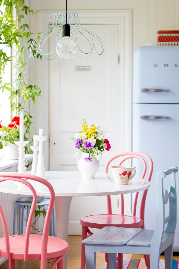
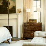
Okay, I found one. Although those chairs are a far darker pink than our Rose Quartz and there are other colors and LOTS of white!

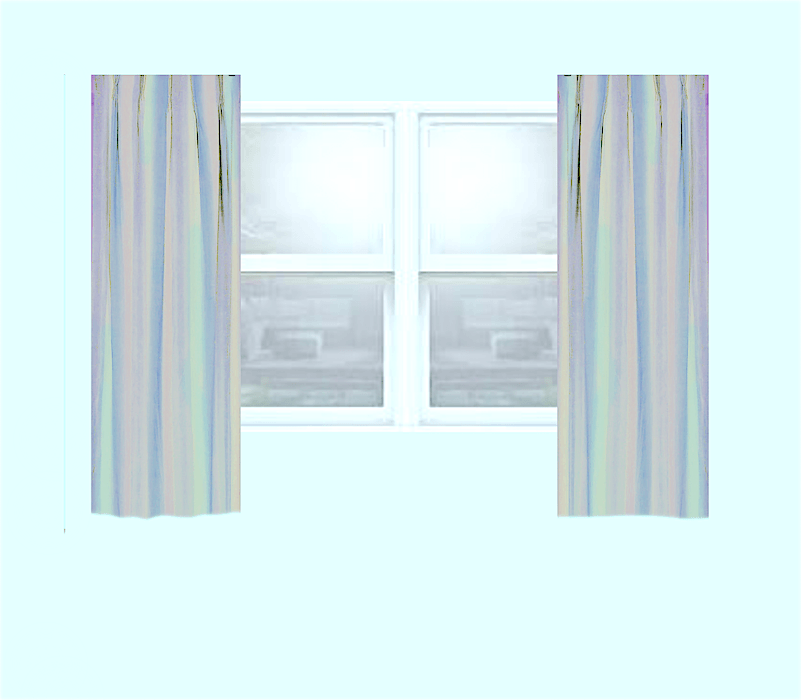
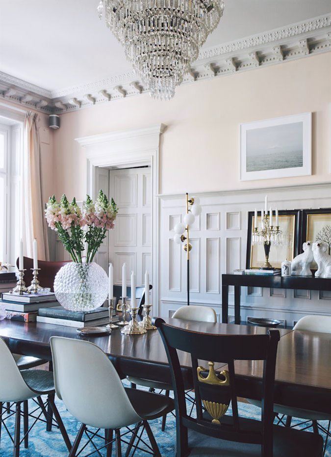
There isn’t even a lot of periwinkle out there in interiors. It’s a tough color and it’s so, so easy for it to go decidedly purple.

original-style-periwinkle-floor-tiles-pantone-color-of-the-year-2016-serenityOriginal Style

colin-cowie-wedding-hydrangeas-pantone-color-of-the-year-2016Colin Cowie Weddings

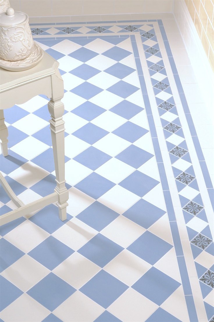
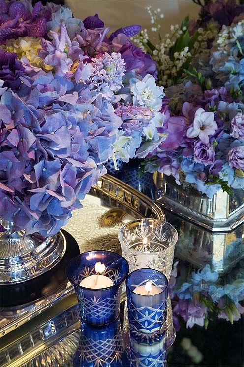
An analogous hydrangea scheme of blues and purples

hbx-de-gournay-wallpaper-panel-giesen-murdock-photo-pantone-color-of-the-year-2016Kelly Geisen | Photo: Peter Murdock

dan-carithers-vignettehttp-pantone-color-of-the-year-2016-serenityvia Lonny

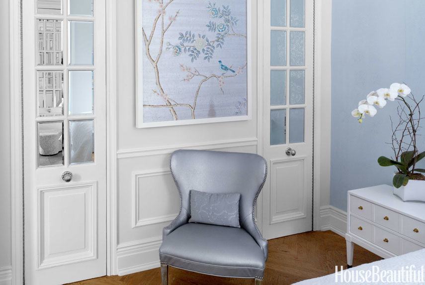
A whisper of Serenity is lovely, but please no pink unless it’s a shot of some beautiful pink peonies or something like that.

lonny-feminine-french-pantone-color-of-the-year-2016Lonny

The gray with pink is soft and soothing, IMO.

There’s more out there in pink. In fact, I did a post which features some pretty pink rooms.

apartment-therapy-swedish-pink-dining-room-pantone-color-of-the-year-2016Apartment Therapy

I’ve grown to become quite fond of pink. I would’ve been perfectly happy to have had the rose-quartz or even the serenity as the Pantone Color of the Year 2016, but together. Well… I guess I’ve made my point by now. haha!

and while we’re on pale pink, a little more news.


laurels-rolodex-final-e1442900624964


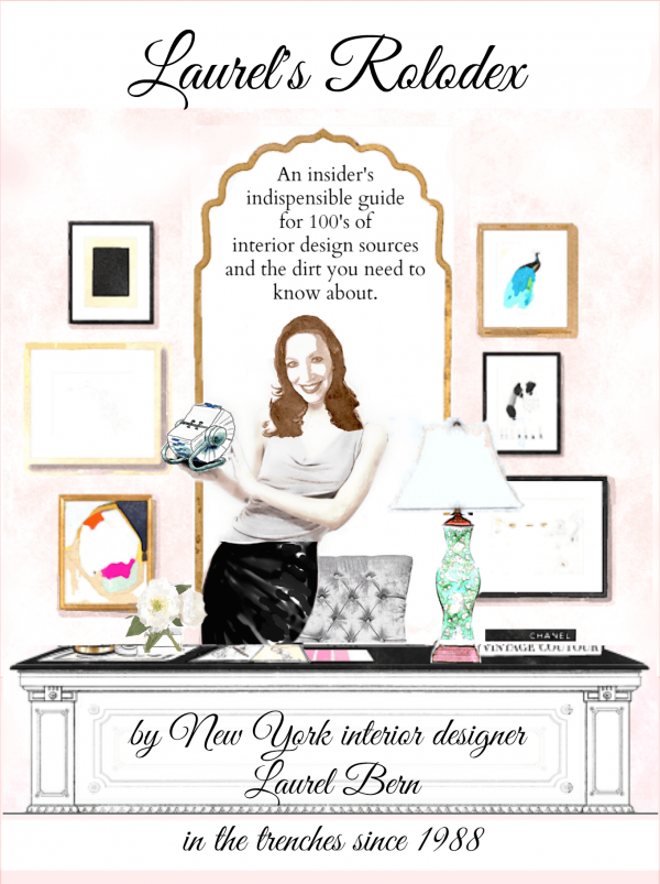
The first update for people who’ve purchased Laurel’s Rolodex was just released!

Over 40 new fabulous sources! And some other improvements to make it that much easier to find things. That means that there’s well over 500 sources with tons of info.

And now, there are over 150 DESIGNER FRIENDLY sources.

In addition, there is gifting available and you can time it to when you want your recipient to receive their digital PDF gift that’s completely secure. When you go to purchase your rolodex, you’ll see the option to make it a gift and then you can also put in the day you want it to go out. You can write a little note too!

For more info about the rolodex

click here

Or if you’d like to purchase one right now

click the button below

buy-now


As for our Pantone Muck Up of the Year, well…


d937c9c01375218313b5bd6ac19fea2c

 I guess it’s a girl after all.

xo,

LaurelPS: This is only for the .001% who feel compelled to make nasty comments. You are allowed to disagree with me–respectfully. You are not allowed to call me names and defame me or anyone else commenting on this site. If you do so, you will be unsubscribed and banned from the site forever.

This is elective reading. Don’t like me or my views, that is fine. Move on. Don’t read it!

For the rest of you… I love you all more than I can possible say. I even love the nasty people. I love them because they need loving, obviously. However, if one feels compelled to make abusive comments, unfortunately, they will have to go.

PPS: It IS transgendered!

58 Responses

  1. I’ve given up responding to Pantone’s COTY after last year. I think they are primarily looking to influence fashion and interiors just gets lopped in there as an afterthought for consideration. Marsala was good for make-up and that was about it. I think we should focus on the paint companies and their trend forcasts….because there isn’t one single male client I’ve ever had that would approve this color scheme. 🙂

  2. Haha! Pink was my second guess (after indigo/navy) but because it works so well with GRAYS not pastel periwinkle. I personally would not use it though, I had the ubiquitous pink/ mauve bathroom and BR in the 80s….also painted my LR a pinkish off white once called Pristine. Well, I was trying to warm up a north/ east facing space, So I’ve done pink. I typically steer clients towards sand, sea and sky colors and sometimes yellow or red. Besides, Men don’t usually care for pink. I will say though pink can be a lovely color for a bathroom. It’s a very flattering color for any skin tone! Again, thanks Laurel for an entertaining post. Agree that we can all just ignore Pantones Oscar color pick(s)

    1. Hi Betsy,

      Funny, when we moved into our townhouse in 1991 there was pink carpeting everywhere! Well, one bedroom was gray. Then there was pink and/or gray wallpaper in the bathrooms.

      I was the happiest girl in the world when we got rid of all of the pink and gray! However, like nearly all colors, it depends how it’s done and what else is going on. Charcoal gray wallpaper with ditzy pink and white flowers just has to suck.

  3. Laurel, you managed to turn the very underwhelming and disappointing color announcement (don’t want to refer to ‘them’ by proper name) into a witty post. The fact that your board doesn’t feature rooms is spot on. I read your post late last night. This afternoon on QVC (a shopping channel – yes this reader is that downmarket) the host exclaimed that a color choice for a tunic featured the just announced Pantone color of the year, Serenity. Yes, the color should have been dark blue, as you suggested.

  4. Oh my! For years pink and blue have lived next door to each Other, but divided be a Wall! Then one doy dear daughter decided pink Chair no longer could stay and was ousted by deep blue yogibo, ( which looks fab even with the pink) and and chair had no where to , but to pale blue room, who would have known that would be colors of the year, but it was ousted quickly since I could not stand the 2 together ! But maybe can sell it since it’s now a color of the year 🙂

    Corporate America is lost again, but your pink kitty is a little scary but cure,

    Thanks for letting us know we aren’t crazy, despite the marketing.

  5. Oh my! For years pink and blue have lived next door to each Other, but divided be a Wall! Then one doy dear daughter decided pink Chair no longer could stay and was ousted by deep blue yogibo, ( which looks fab even with the pink) and and chair had no where to , but to pale blue room, who would have known that would be colors of the year, but it was ousted quickly since I could not stand the 2 together ! But maybe can sell it since it’s now a color of the year 🙂

    Corporate America is lost again, but your pink kitty is a little scary but cure,

    Thanks for letting us know we aren’t crazy, despite the marketing.

  6. Laurel, I do appreciate your color sense, but I have a problem with the slamming of two of my favorite colors. Granted, with any “favorites” one does need to have a delicate touch in using them.

    My living room & dining room are a pale neutral tan with a delicious cream trim. My accents and furniture are what I refer to as “hydrangea colors” picked up from a Donald Vann print that features the two colors suggested by Pantone for next year, with lots of natural wood. In my little house, it works.

    I don’t believe that they are setting rules, but suggesting a change from what might have become outdated. As long as it isn’t avocado & harvest gold, I’m happy with treating their “colors of the year” as suggestions!

    1. Hi Susan, My point if it’s still not clear is that it’s the way they used the colors that I object to the most. And I felt it unnecessary to have two colors. Particularly since I don’t think they look good together as shown. However, I have posted a room that does contain them and I just posted it again on Facebook. It’s an Ashley Whittaker room and I think that it’s sublime. But what makes it so, is plenty of white, the rich chocolate browns and bits of black and beige tones. Pantone should hire someone like her!

      Here’s the link. You have to scroll down the page a while to see.

      https://laurelberninteriors.com/reveiling-the-hottest-interior-design-trends-for-2015/

      The other issue is that they are bucking the current trends as set forth by an entire home furnishings industry! That’s just not wise, IMO.

  7. Laurel,
    When I saw that video on Pantone’s site Friday, I could not believe how disturbing it was! It reminded me of that awful brainwashing video on the LOST episode where Carl was strapped to a chair and forced to watch a VERY SIMILAR VIDEO. Anywho, we obviously have similar feelings on the choice/choices 😉

    1. Hi Kristie,

      Violence disturbs me a lot. In fact, it makes me nuts that it’s okay for someone to get their head blown off in a movie, but God forbid they say the F-word!

  8. Ha Ha, GF. You are too funny! I sent you a comment/question a few week ago, asking who the Pantone people were, and how they went about choosing “the color of the year”. After reading your readers’ comments, I know I am not the only one who questions their judgement, competency and sanity, for heaven’s sake! Additionally, everyone has an emotional, experiential reaction to certain colors, and to their surroundings. Now that the internet is a part of everyone’s lives, there is SO much, (too much, really), information and resources available to people who want to put together an attractive room, I wonder if the Pantone people are that relevant anymore.

    And Nancy Robertson, whoever you are, I LOVED your comment.

    1. Hi Lisa,

      I hope I answered you. I always try to but sometimes inadvertently miss someone. I have no idea how they choose a color. I think it must all be their marketing department. It would appear that they pin up all the colors, blindfold themselves and play a kind of color version of “pin the tail on the donkey.” haha!

  9. Also, I am apparently the only one in the world who dislikes silver colored hardware and appliances. I can ‘t wait for gold to come back. However, that is going to be a problem for all the homes with stainless steel appliances. There is not a good appliance color to go with it besides black (which socks the light out of the room) or white (which can look too cheap). Maybe the powers that be will come up with brushed gold appliances.

  10. The blue & pink brings flashbacks of my childhood in the 60’s. Pastels were big but they were ugly shades. I will forever hate mint because of all the concrete block walls painted that color.

    I LOVE pale baby blue. I went crazy over it in the 80’s during the country blue phase and then the 90’s mauve and blue phase. I have painted my bedroom light blue with white trim at least 10 times and my LR/DR/kit at least 5 times when I have moved. I keep hoping it will come back – but of course nothing ever does. So Serenity might be the closest I will see but it is a little too lilac for me. I hope my next apartment will be light blue walls, white cabinets and navy blue furniture and accents and maybe a little lime green. There will be NO pink.

    I was hoping some shade of dark blue would be the color of the year. I still have not decided on dark navy vs royal blue vs marine blue for my new place.

  11. I thought you were joking about the video of violence, but I just watched it myself! Good Lord, I guess Pantone thinks they are bringing about world peace with these peculiar choices for color of the year. Actually, I like periwinkle blue, but not mixed with muddy pink.
    I DO love your blog, however, thanks for the morning laugh mixed with great decorating advice!

    1. Hi Michelle,

      I know… Oh, to be a fly on the wall in one of their marketing meetings! As I said before…They were clearly drunk on all of that left over Marsala!

      Whatever. They did a fabulous job of setting themselves up.

      I did hear one or two celebrities waxing poetic over the colors.

      They get paid a lot of money to lie. lol

    1. haha! I think that you’re right Amy, although I’m not convinced that they are even up to that. I’m trying to imagine who would use a logo in those colors though. Maybe a baby store? A tacky baby store.

  12. I am into vibrant,rich colors so naturally I hate their choices. It, in my opinion, is a pastel overload and I wouldn’t paint any of my rooms, girl or boy (God forbid) these colors. My son would kill me. Livingroom? Don’t even want to go there.

    1. Hi Trina,

      Haha! My boys’ room was a lovely soft gold. It faced northish westish but with a big hill and was always dark and the gold was warm and made a great backdrop for their furniture. (mostly from Maine Cottage). I never got tired of it!

      Quite frankly, I pay little or no attention to these trends in my practice.

      I think that pastels are fine as long as there’s plenty of heft to balance out the Easter Egg! And that means blacks and browns and more saturated tones. Gold helps too. But here it’s like my collage. It feels like a circus. In addition, many of their pairing colors are also awful.

  13. Laurel, you crack me up. I just love your wit and tongue-in-cheek humour. Whats funny is, many many many years ago, in my drapery-making days, I made balloon drapes (can you imagine) for a friend in alternating balloons of pink and blue (can you imagine). They also “muddied” over the years and every time I went there, I just wanted to rip them off the window. I wonder if she still has them hanging!

    1. Hi Susan,
      Yes, she probably does have them. haha! I can’t tell you how many times I’ve walked into a new client’s home who’s been there for 10 years living with someone else’s hideous, old drapes. (like shiny blue polyester swags and drapes hanging 4 inches above the floor. lol) Hates them. They don’t even close! They are purely “decorative” if that’s the word. :/ As soon as they come down, the entire room begins to breathe! It’s one of the easiest design fixes ever! Get rid of the crap you hate! :]

  14. You are a riot! Thanks for the good laugh. The first thing I thought of when I saw those colors the other day was a little old lady who lived up the street when I was a small child back in Paleolithic times. Her house was like an antiques store laden with heavy dark Victorian furniture, and everything soft was pink and blue. So was a lot of the decorative glassware covering every surface, along with the huge repros of “Pinky” and “Blue Boy”. Mrs. Gallahar to a T!

  15. I think Pantone loses a bit more relevancy each year. Love a touch of rose blush with grays,navy or soft greens- but these two together, just no! Thanks for your humorous spin though!

    1. Hi Mary Beth,

      I’m with you! I didn’t even touch on their palettes of coordinates! I think they just throw all of the chips into a big tumbler and whatever and then some dude digs in and picks a selection of chips without looking. haha!

  16. I stopped listening to the Pantonians years ago. When a group of aliens comes to Earth, what is one to do? One has to rise to the occasion and remember one’s Emily Post etiquette, and just ignore their intergalactic weirdness. My little Southern mama would say…… “Just don’t even look at them, Sugah Pie. Don’t even let your eyes lock with theirs. Karl Lagerfield mighta attempted some fairly chic things with Marsala, Darlin’, but then what do you expect from a man wearing sunglasses? Pink and blue gender oneness? Lawd, Sugah, just lift your chin, walk on by, and look the other way.”

    1. Jo,

      I love your southern accent! As we are on the threshold of yet another winter, I have fantasies about escaping to someplace far more moderate like Charleston or Savannah. Of course, I would want one of those sick homes with 12 foot windows. It wouldn’t have to be large, just really high ceilings with architectural grandeur, a fireplace and those killer windows.

      I’m so tired of going outside in Jan-March feeling like a million needles are stabbing me all at once!

      And the snow. The black, grimy snow!

      I’m sure if I wasn’t a hardened New Yorker, lol, I would be far more ladylike. No? Okay… maybe too late for that, but at least I wouldn’t be as crabby!

      1. Laurel,
        I can attest that living here in balmy Myrtle Beach, SC does not necessarily make one more ladylike than a hardened New Yorker in wintertime. Lol!
        However, I’m going to try to be as civilized as possible and say, “Pantone, bless your heart!”

  17. Laurel,
    The only nasty comments should be for Pantone!
    I went to look up how long Pantone has been doing ‘color of the year’…and look at what I found:

    “In October 2007, X-Rite Inc., a supplier of color measurement instruments and software, purchased Pantone Inc. for $180 million”.

    So now we know …software engineers are picking the colors!!

  18. Maybe you could do a post on Laurel’s colors of the year–what they should have picked? Then we’d actually have something inspiring!

  19. Laurel…when I came across the 2016 Pantone colors of the year,I had to go and see what was up with picking two such eww colors( even less useful than Marsala, which at least in clothing is slimming,while baby pink and baby blue will make me look fat)and found this statement given out by Pantone on their selection “Societal movements toward gender equality and fluidity’.
    Hahahaha…PC paint colors!! 🙂
    I couldn’t wait to read what you’d have to say this morning, and wasn’t disappointed 🙂

    1. Hi Dolores, Well… if they wanted to invoke gender equality, how about black and white, like yin and yang? Obviously, they are not in touch with the paint companies. Would be better if they presented a unified front. No?

      Personally, I can’t wait to dye my hair periwinkle blue! lol

  20. This is brutally blunt — but I feel strongly — these colors (separately and together) suck! I’m a fan, and user, of a very diverse range of colors but the one thing I don’t do is pale pastels. At least I liked last year’s color for clothing (but not for decorating, other than as a minor accent); with these colors there’s not even that.

    However, since this very dubious choice inspired so many humorous asides from you, Laurel, perhaps all is not lost. Thanks for providing me a ton of chuckles on a cold Sunday morning. (And I agree with you that a strong, darker blue would have been an excellent selection.)

    1. Hi Barb, (hope that I got your name right). Blunt is good! I have not used these colors either except for kids’ rooms. The periwinkle would have to be verrrry grayed down as in gray with a violet undertone. The pink they chose is a nice pale pink. I’ve warmed a lot to it in recent years as I’ve seen so many pretty and sophisticated rooms painted pink. But, in these parts… would be a tough sell for the majority of my clients. I did have one client with a pink living room. It was that way when we got there. It’s the one with the pale pink sofa in my portfolio. There’s a lot of black bright green and deeper pinks in the room too, so it’s nicely balanced.

    1. hahahaha! That is too funny, Nancy. The other thing I forgot to mention is that the color on the front of the video is a murky blend of the two colors which of course is a violet.

  21. Unlike many other troubling things that have happened lately, we can just close our eyes to the Pantone fiasco and pretend it never happened — right? It worked for Marsala. I was betting on a dark blue.

  22. I so enjoy your wit, laurel.

    To those who say the english & the americans have a different sense of humour, well

    you prove them wrong.

    I LOVE these colours but as you say, perhaps not together !

    Pastels are my “neutral” of choice.

    I could eat (anything) that photo of the hydrangeas & am pursuing them in a project I am doing at the moment.

    You are a tonic on a windy, sunday english morning. ( That’s meant be nicer than it sounds).

    Thanks for the fun. Jo.x

    1. Hi Tracy,

      Oh, that is too funny! I’m just more and more convinced that they must surely realize how ridiculous they look and that it’s intentional? I think they just want people talking and if they don’t do something weirdtastic, no one will pay much attention?

  23. Thank you for speaking for many of us who are speechless and unable to comment on Pantone’s color choices for this year. It might be time to retire this tradition based on their recent selections. How influential can their choice really be?

Leave a Reply

Your email address will not be published. Required fields are marked *

This site uses Akismet to reduce spam. Learn how your comment data is processed.

Welcome To Laurel Home!

laurel-aarons-18th-e1456449963926

Hi, I’m Laurel, and Laurel Home is the website and blog for Laurel Bern Interiors.
I’ve been creating new-traditional interiors since 1988. The blog is where I share all.

New Edition, November 2022! Get The Indispensable Guide For 100s of Home Furnishings And Interior Design Sources That Everyone Is Raving About

laurels-rolodex-final-book-cover-master 9th edition 22-23

laurel home archives

Categories:

Please click the image below for more info about my rockin’ Interior Design Guides for 2023!

Laurel Home Interior Design Guides 2023
Amazon ad

please click below to check out my favorite decorating & design books

Laurel Bern's Favorite Interior Design and Decorating Books
Subscribe To The Laurel Home Blog And You Will Receive A FREE Guide Where I Share How To Get Your Paint Colors Right, The First Time.