This post started out being about home accessories, but I had a little snafu this past week. Some of you may have seen me groaning on facebook. I spent all day contorting my body into bizarre pretzel shapes because I was photographing four rooms.
Got home and after phone calls to Canon, etc. discovered that the camera’s memory card had Alzheimer’s. The information appeared to be going in. But… nope. The camera done checked out.
Onto another topic that I hope you’ll enjoy!
I’ve been working on three new jobs since the end of summer and this is a very good one to make my point about the secret to creating a beautiful interior. This client, I’ll call her Em, actually reads my blog! Of course, she’s as nice as can be, or I wouldn’t be talking about her!
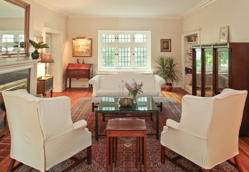
Here’s the living room done by the previous owners.
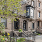
The home was built in 1916 and is an English center hall-style. It’s a very lovely, classic home in a historic district.
Before Em hired me, she had worked with an architect because she’s doing some renovations. He also does interior design. (he says) He asked her to choose a painting as the inspiration for a color scheme.
That part is wonderful!
[tweet_box design=”default”]Using art as inspiration for colors and design themes is one of the best interior design hacks ever![/tweet_box]
As it happens, Em has a doctorate in art history and she chose this lesser known masterpiece by Edouard Manet
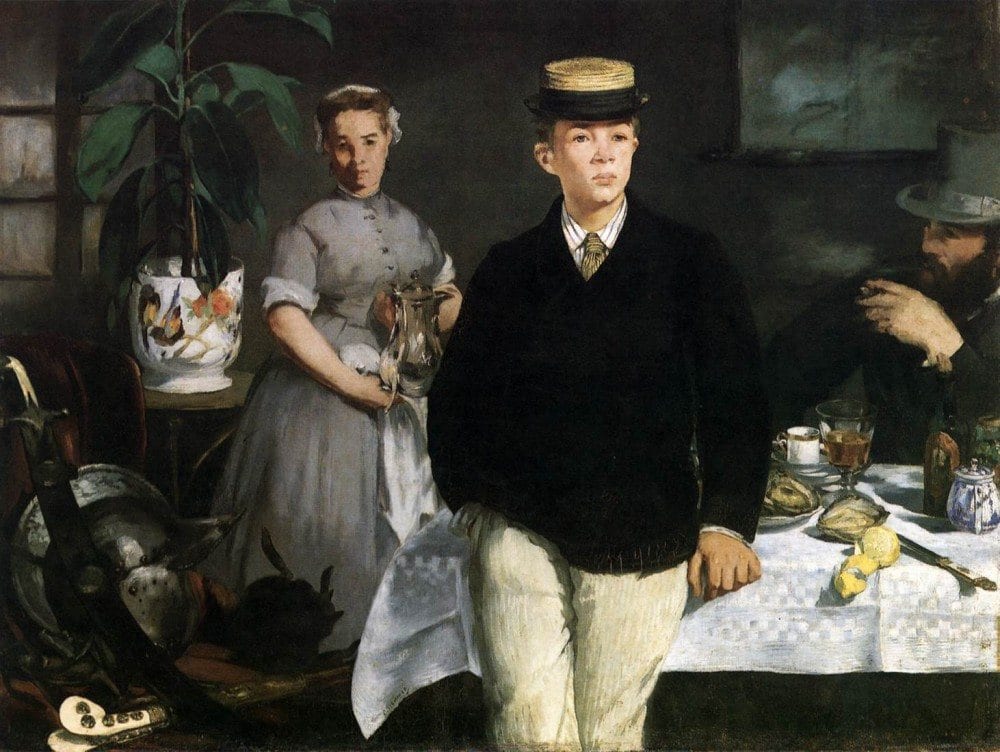
Very cool highly sophisticated color scheme.
The architect chose an awesome fabric for the dining chairs from J Robert Scott.
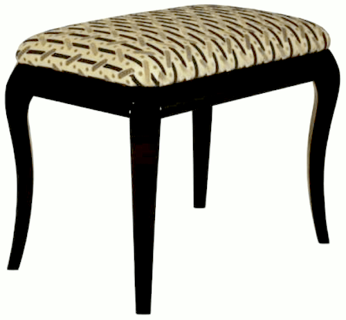
The table and chairs are traditional, so this fabric will make an interesting counterpoint. Em loves this.
What’s a little freaky, is that I did not know about the painting until the other day. You’ll see why in a bit.
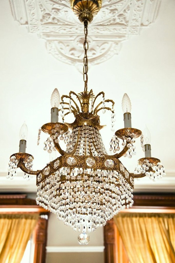
Em found this incredible Belle Epoque chandelier for the dining room. I love how it’s fanciness plays against the geometry of the chair fabric. I spent way too long trying to locate one that looks something like it.
Em’s is actually square, with crystal and antique brass or bronze. It feels a lot like this one but isn’t exactly like it.
The architect sold Em on some black velvet drapes. Here’s where it begins to fall apart.
Em picked them up the other day and they
They were made with the most humongous pinch pleats I’ve ever seen.
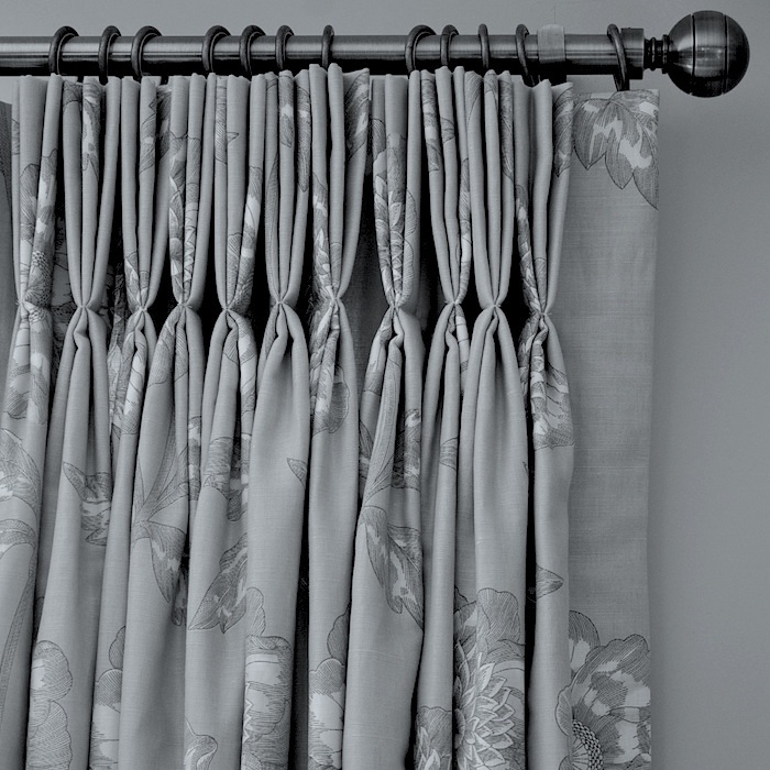
Sorry, but pinch pleats went out with the 80’s. It’s fine if you still do them, but you rarely see them in any of the high-end shelter magazines. In addition the drapes are velvet, so these pinch pleats looked like a row of hungry Sharpeis.

awwww… tho cute!
but not for drapes!
That’s problem number one.
Problem number two is like the doggie, the drapes are brown, not black. (these aren’t them. I wish they were!)
We need sheers for some privacy as the drapes are only a single panel. (mistake #3. Too skimpy for a large window)
Our sheer is black. (not ordered yet)

Oh dear. No Good. This isn’t working, but it’s not our fault!
Em wants a mix of vintage, contemporary and traditional. This is beginning to look like vintage Adams Family! lol Em agreed. We decided to do a sort of Scarlet O’Hara and reupholster two chairs with the velvet drapes.
Back to the drawing board.
Em wants a fresh look and she chose my favorite shade of white paint. Benjamin Moore Cotton Balls oc-122.
Alright. This one’s simple.
White walls. White drapes. White linen drapes. We’ll make them full enough to close so we won’t need sheers.
We had already established a color scheme of black and white, with touches of gold and neutrals. This will be better.
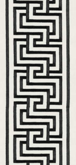
I love this tape by Mary McDonald for F. Schumacher.
The Design Process for Creating a Beautiful Interior
We’ve been working on the living room, dining room and entry for a few weeks now.
The beginning of the design process is to
- discuss, needs, wish lists, style, color and general budget. You can do this for yourself too!
- I always begin with a floor plan and once that’s approved, start to select furnishings.
- What I do is go shopping online and recently, Laurel’s Rolodex has been incredibly helpful!
I’m loving mine so much!
- I put all of the furnishings into folders and then start to narrow them down. Putting them side by side helps to visualize how they will look together.
Here’s a board I made for y’all to show you where we’re at.
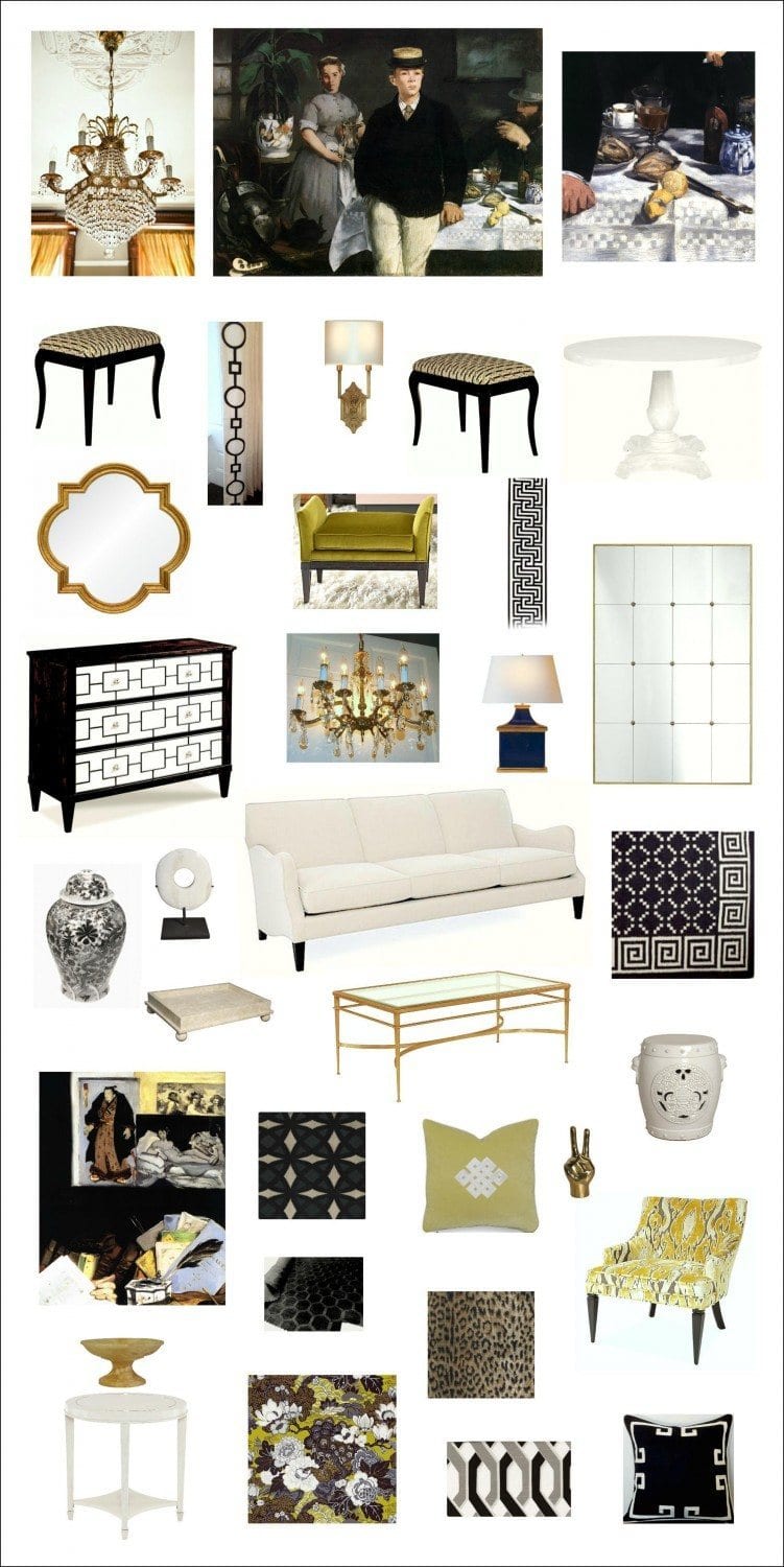
This isn’t exactly what we’re doing, but it’s pretty close. For every image you see here, there are at least three more that hit the cutting room floor. Yes, it’s a lot of work, but it’s fun work.
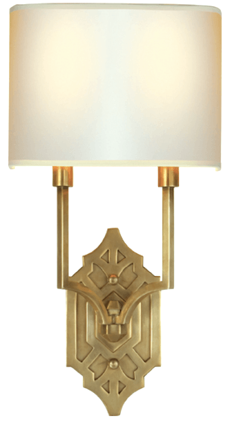
The look hearkens back to a time right around when the home was built with its Art Deco elements. One of my favorites is this interpretation by Thomas O’Brien for Circa Lighting. We’re doing Six in the Living Room and then two each in the center hall and dining room. Since all three areas are open to the other it creates a continuity between the spaces.
If you look closely, you’ll see that there are repetitions of design elements that make for a kind of dialog.
It includes color, pattern, and style. That’s what you want to go for. That is, without making it too “theme-y” or predictable.
And that is the secret to creating a beautiful room.
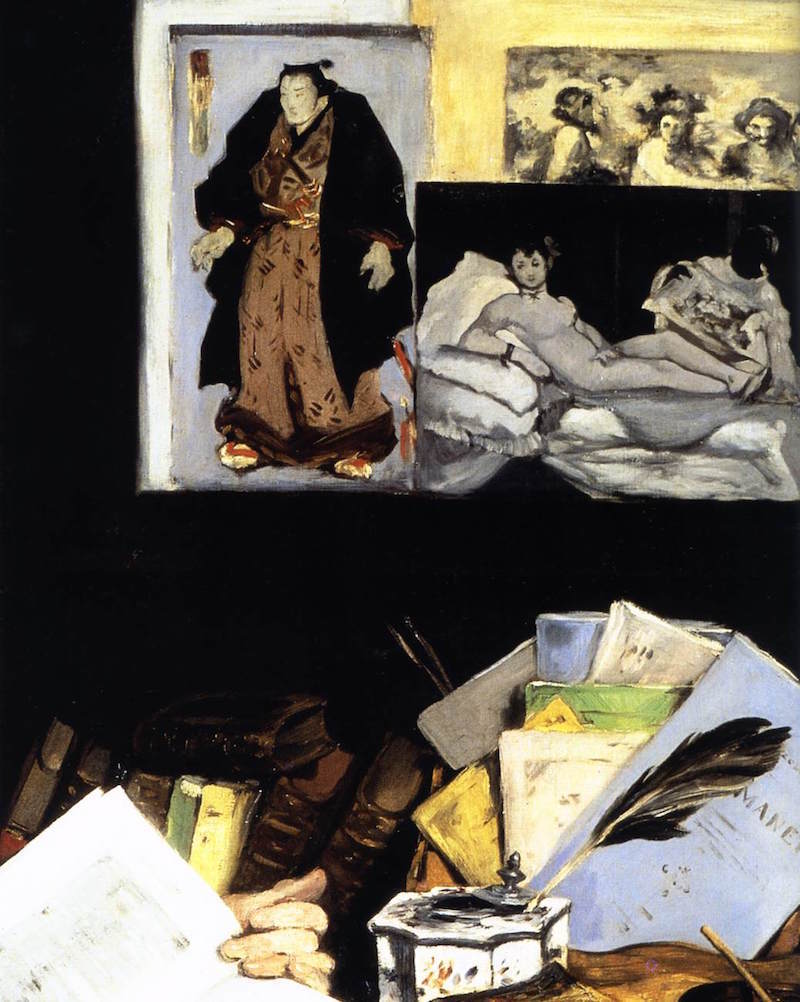
As I said, I only found out about the painting (and added another one by Manet for the board) a few days ago! Yet all of the fabrics had been selected before that.
Here are a few more detail shots from the board.
We’re going to be using the Thibaut Crypton for the two sofas in the living room! So excited about that!
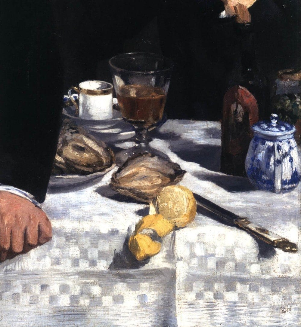
A Detail shot of the main painting
An important note is that while the painting has all of the colors, it doesn’t mean that they have to be used in the same concentration. We don’t need huge blobs of black! In addition, it’s fine to play with the colors a little. By that, use a lemon yellow and then a little chartreuse or even apple green.
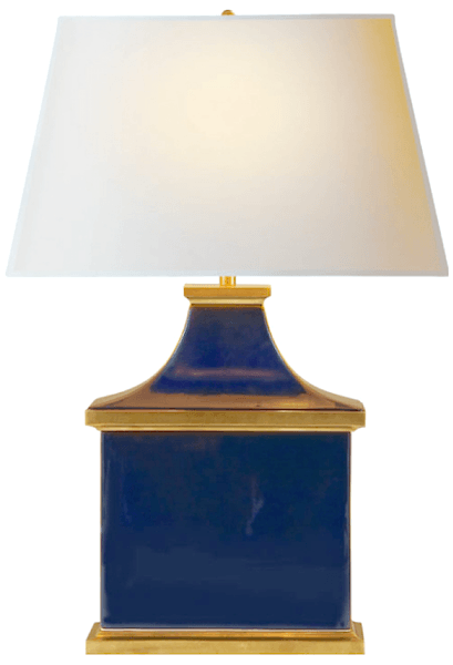
Here’s a shot of blue that’s in the painting. Love this lamp from Circa Lighting.
 A detail shot of Portrait of Emile Zola by Edouard Manet
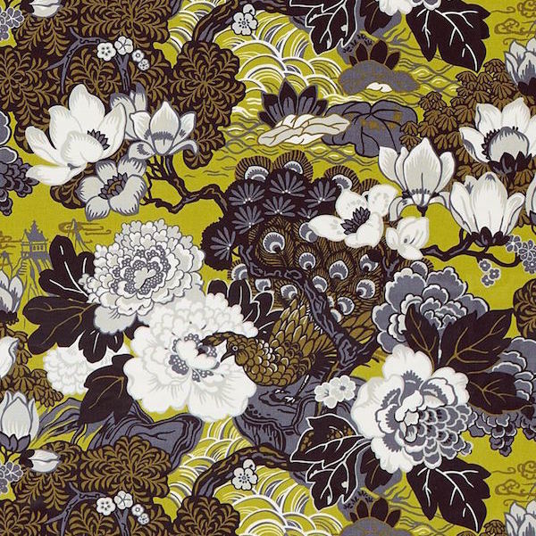
A document print from Schumacher. Shanghai Peacock. Selected before I knew about the paintings!
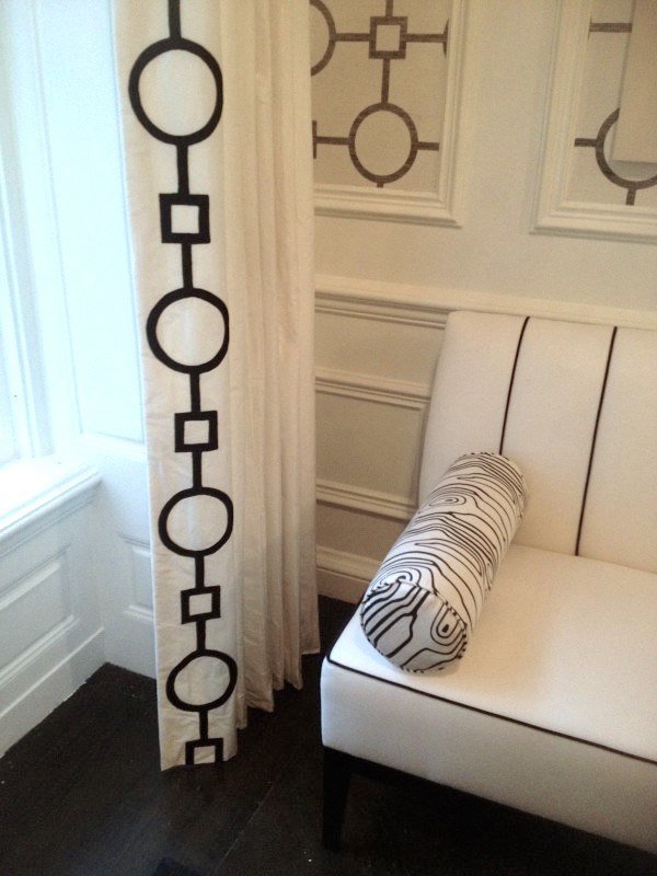
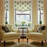
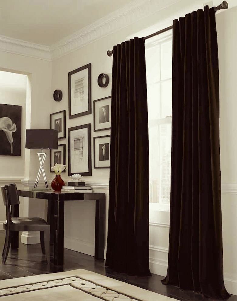
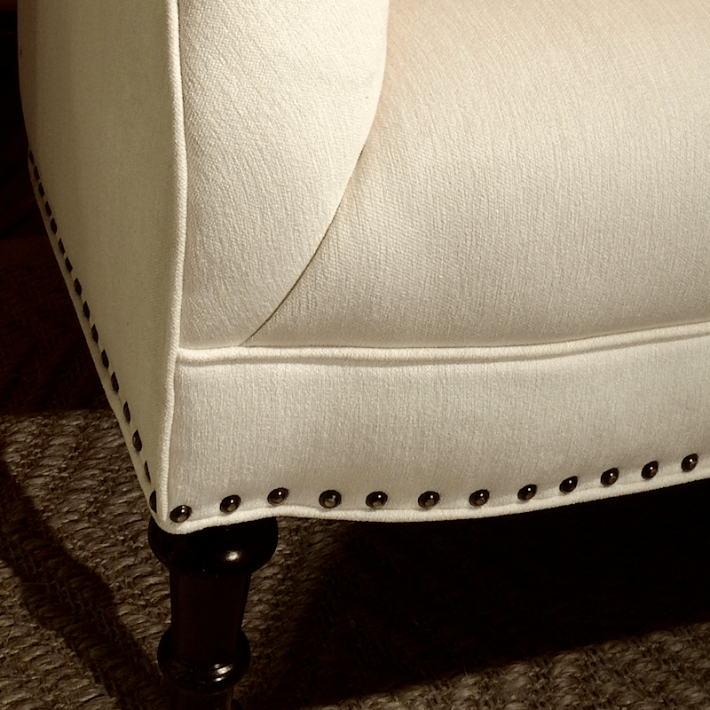
A detail shot of a gorgeous Tobi Fairley room showing a white drapery trimmed.

Peace Out!
Hey, just be glad, I didn’t put in the one called “The Finger.” haha!
Photo redo on Tuesday. Please stay tuned!
xo,

Related Posts
 12 No-Fail Classic Kitchen Cabinet Colors
- This Year I Decided To Decorate For Christmas
- Ten Colorful Paint Colors That Act Like Neutral Paint Colors
- Paint Color Myths that Help Us Make Bad Decisions
- High-Low Ralph Lauren + Decorating’s Most Dreaded Words
- A Common Renovation Mess – Can it be Fixed?
- Six Figure Income Blogger 150 Page Guide Is Here!