Hi Everyone,
Coincidentally, two readers in Florida sent me their homes this week. Both feature some bad Florida architecture. Between the two, they hit all of the cliches I’m not a fan of. We’ll get to those shortly.
Now, you lovely Floridians, please do not think I’m picking on your state alone when I’m talking about bad Florida Architecture.

Photo by Luiz Cent on Unsplash
No, I am not. However, in the last several decades, Florida has grown in population by staggering numbers. And that means a lot of new homes are being built.
Did you know that there are only three builders in Florida? ;]
- Bad builder.
- Frightening Bad Builder.
- Hideously Beyond Belief Bad Builder.
Okay, sure. There are undoubtedly some fantastic builders in Florida. I’m sure. Lots of ’em. However, it appears that 80% of the builders are building 2% of the homes.
What makes for bad Florida architecture?
Again, this isn’t only Florida. It’s widespread, unfortunately. But, here goes:
- Bad proportions. Like, really bad. Remember McMansion hell?
- Cheap or just plain ugly finishes. Or there’s way too much marble.
- Bad colors on the permanent finishes.
- A preponderance of bastardized architectural themes, such as arches, all over the place or columns.
- Doors and windows at varying heights and sizes.
- Fancy Arches, but then no door or window casings. However, there might be a crown. Odd.
- Too many doorways.
- Poor layout
- Poor flow
- And waaaaaay too open.
I’m sure I’ve missed some. But, those are the ones that quickly popped into my head when thinking about bad architecture.
Okay, here’s my problem. One of the homes presented to me is a tremendous challenge, and the other is pretty easy for me.
The challenging Florida home’s lousy architecture also features very large, hollow-feeling rooms.
That’s Flo-1. Alas, I am determined to get this out at a reasonable hour. So, this is what I’m going to do.
Today, I’m doing Flo-1, the more challenging home. My first version includes some possible architectural changes. I will also indicate possible floor plans, layout, and space planning.
Then, Wednesday, I will add Flo-2 to the same post.
By the way, that will be the first post with the new theme!
Before I begin, these lovely ladies have asked for help, not bashing. Neither home is hideous. Both have tremendous potential. Some of you might even love the houses just as they are. I would say that both fall under 1. Bad Florida Architecture. But not frightening and not hideous.
Some errors are also a function of the finishes, furnishings, and lighting.
Okay, let’s begin with Flo-1’s first email sent to me from my website.
Dear Laurel
I only stumbled across your fantastic blog recently, but I have binge-read so much of it! I especially love your space planning tips since that is currently holding me back.
I’d love to suggest a post about planning a large great room or what to do when your living spaces are TOO BIG!
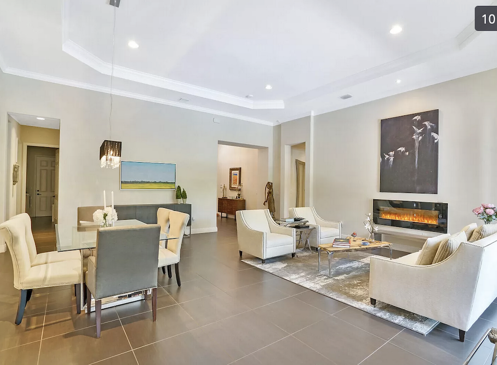
We recently moved into a new house in Florida; I desperately want to hide the dark tile that’s everywhere, AND I’m starting from scratch with furniture in the so-called “great room” that is 24′ x 22′.
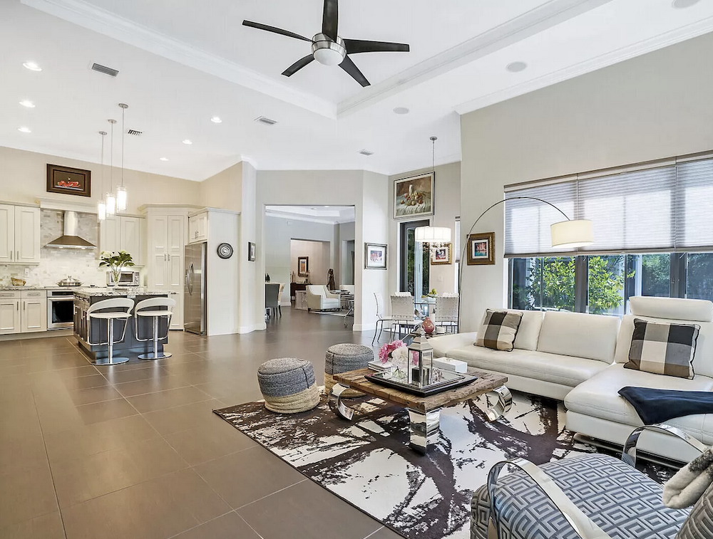
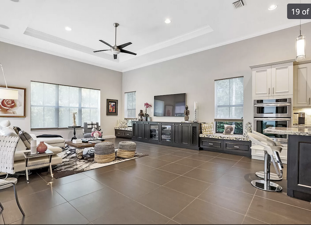
There’s also a 20′ x 18′ “family room” where we’ve put our couches and TV.
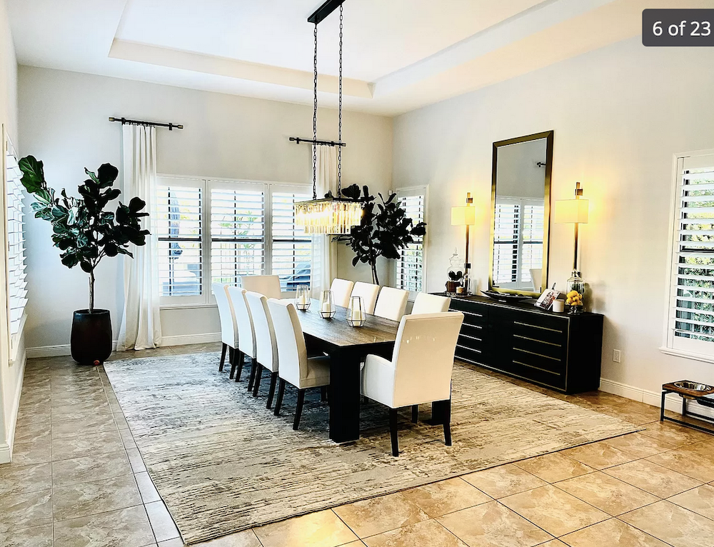
I put the names of these rooms in quotes because that’s what they’re called on the builder’s floor plan, which you can see here.
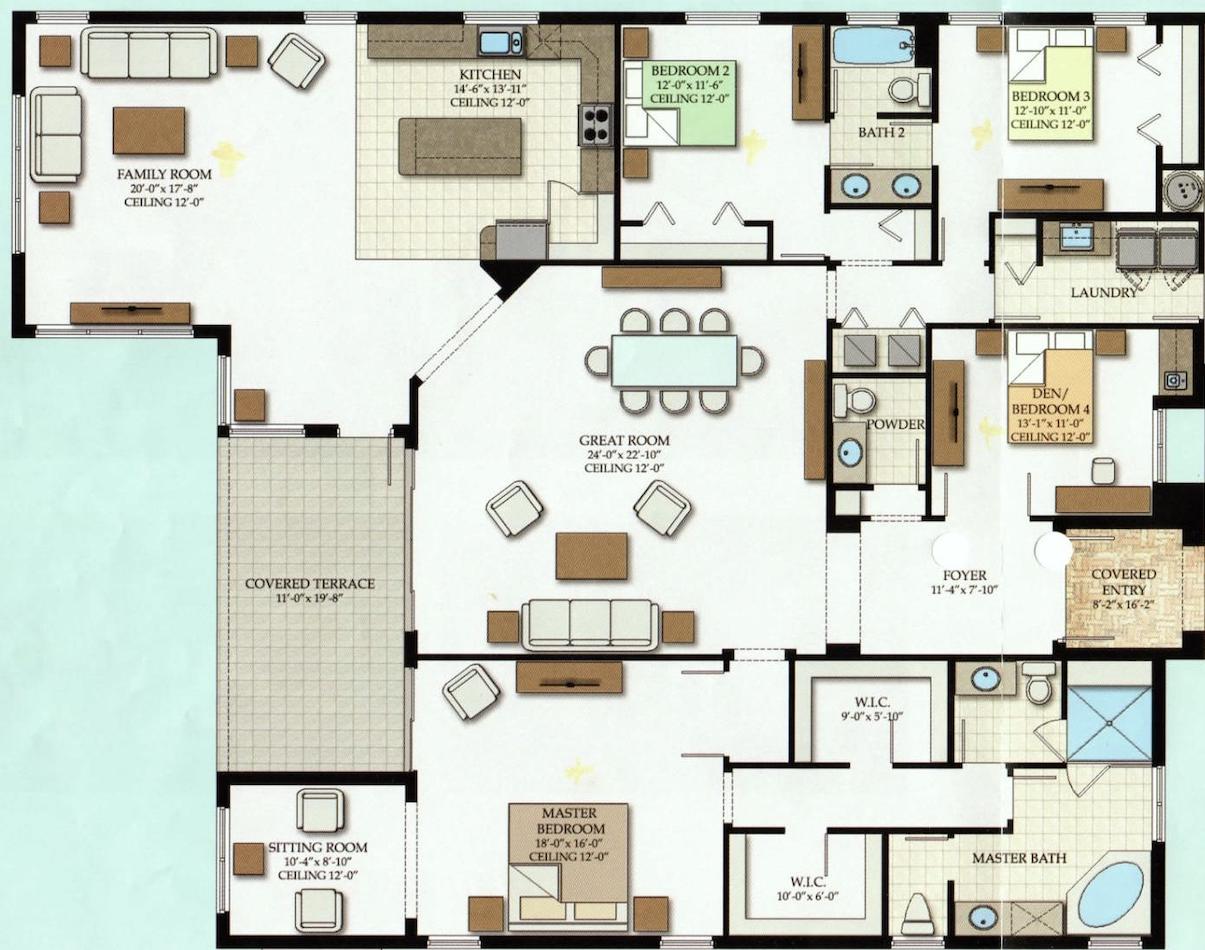
The square shape of the great room, plus its FIVE doorways, make it hard to position both a couch/sitting area PLUS a dining area. (We also have a breakfast nook open to the family room.)
I’m almost considering turning the “family room” where we currently have our living furniture into a big dining room and making the “great room” solely for sitting space (no dining).
That’s a great idea!
The current family room off of the kitchen has the best lighting and three exterior walls! However, both rooms are so huge! If we changed spaces, the dining room would be right next to the breakfast nook! Is that weird?
Ugh! I think the architect was drunk when they (HE, I’m sure) designed this floorplan.
I hope you can write a post about this because I’m SO totally lost! Thank you!!! 🙂
Flo-1
***
Oh, Flo, I feel for you. However, please know that this is by far NOT the worst I have seen. The worst I have seen needs to be leveled by a backhoe. After this first email, I asked Flo-1 if she could send some pics and maybe the real estate listing.
She did, and another lovely note. Here’s what Flo-1 said about her Florida home.
Hi Laurel, thank you for the quick response! I read your “large living room” post a few times for ideas… those were lovely, primarily symmetrical, rectangular spaces, and I was still stumped, unfortunately.
Here is the real estate listing for our house, with photos.
Interestingly, tonight I did find a house in our development with the same floor plan as ours that DID turn the “family room” into the “dining room!”
[Ahhh… the amputated curtain rods!]
I’ll have to search your blog to see if you have something about husband-recliner-alternatives!)
FYI, we’ll be replacing the broken window coverings and the glam light fixtures at some point (we’re going for more of a Spanish colonial/California mission style to align more with the exterior architecture.
That’s going to be difficult as that style is more rustic.
And we’ll also be removing the little fake fireplace on the great room wall (that rectangular black box that sticks out a few inches). Perhaps also painting the built-ins in the “family room” below our TV.
Yes, to that, if you keep them.
I’d love to get a custom-cut seagrass or carpet rug to cover that whole great room space for better acoustics and to try to lighten up that north-facing room. I think the breakfast nook area could be nice with an L-shaped bench and a simple little pedestal table… but I wasn’t sure if that would be weird next to a dining room. Maybe that area is something else entirely.
Yes, a little weird, but I have an idea.
Thank you so much for anything you end up doing with this!!!
Best,
Flo-1
***
As you can see, Flo-1 has the all-too-common bad Florida architecture.
However, darling Flo, I doubt that an architect was involved with this design. That’s right. You CAN build a home without an architect. I wouldn’t, but builders think they can do it. And, this is the result.
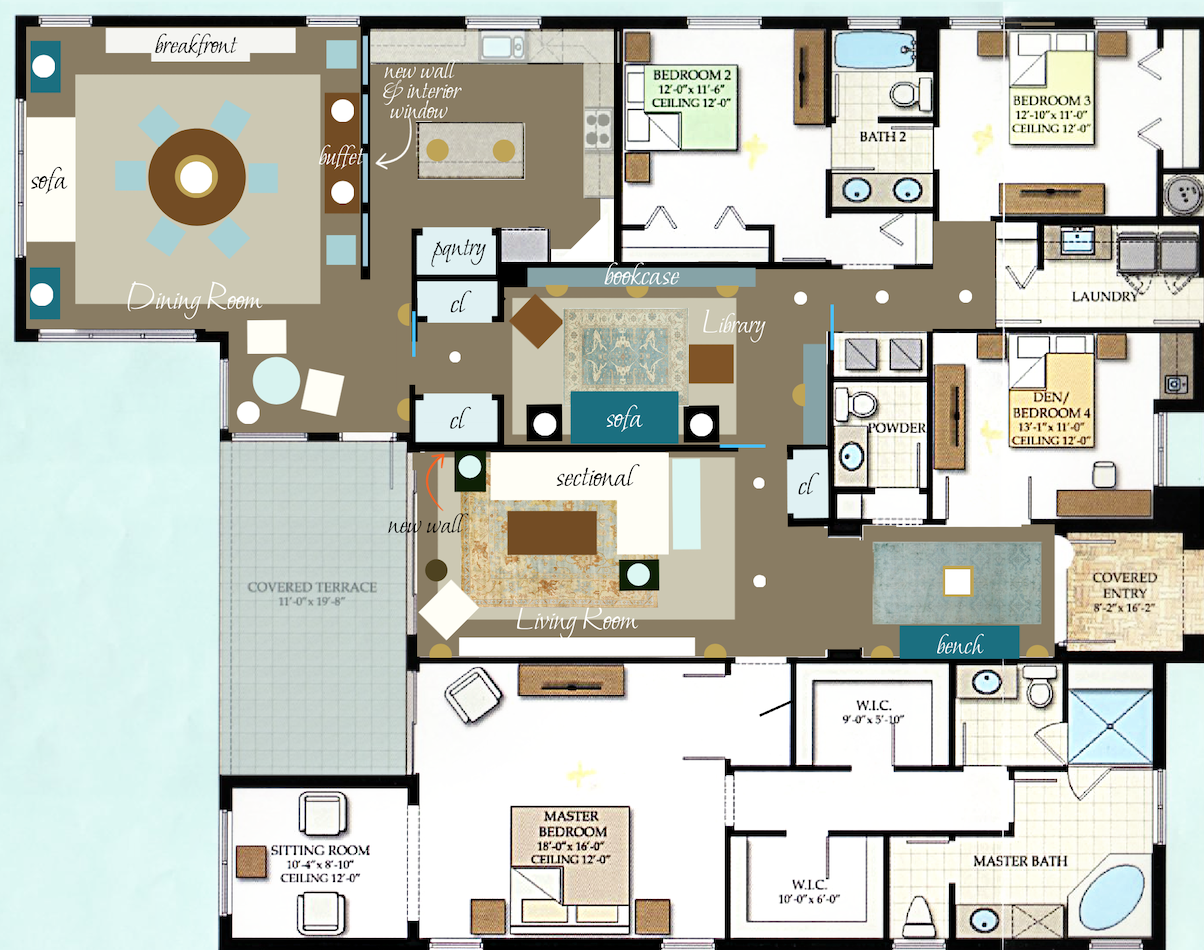
Okay, let’s look at the floor plan again, this time with no furniture in the rooms.
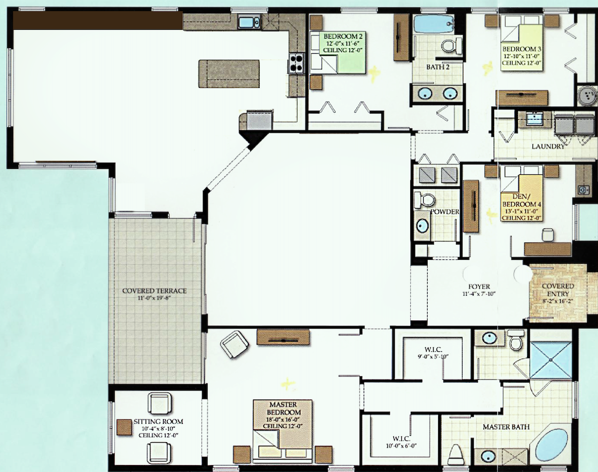
Flo and her family live in a place that requires a car. Therefore, most of the time, the family enters the home through the garage. Unfortunately, that means traipsing quite a distance to the kitchen, but that we can’t change.
As Flo said, there are a lot of entrances into the great room.
The sliding door to the outside is not necessary as there’s already a door from the breakfast nook. But, we’ll ignore that for now.
What strikes me as odd is that there’s no way to block the sound.
We will be addressing this very soon!
Okay, the next big problem is that thing sticking out and the doorway on an angle going into the family room kitchen. It provides even more empty space in one room and more unusable space in the other. I don’t see the point.
Let’s bring down the floor plan once again, and then I’ll show my changes so you can see them close together.
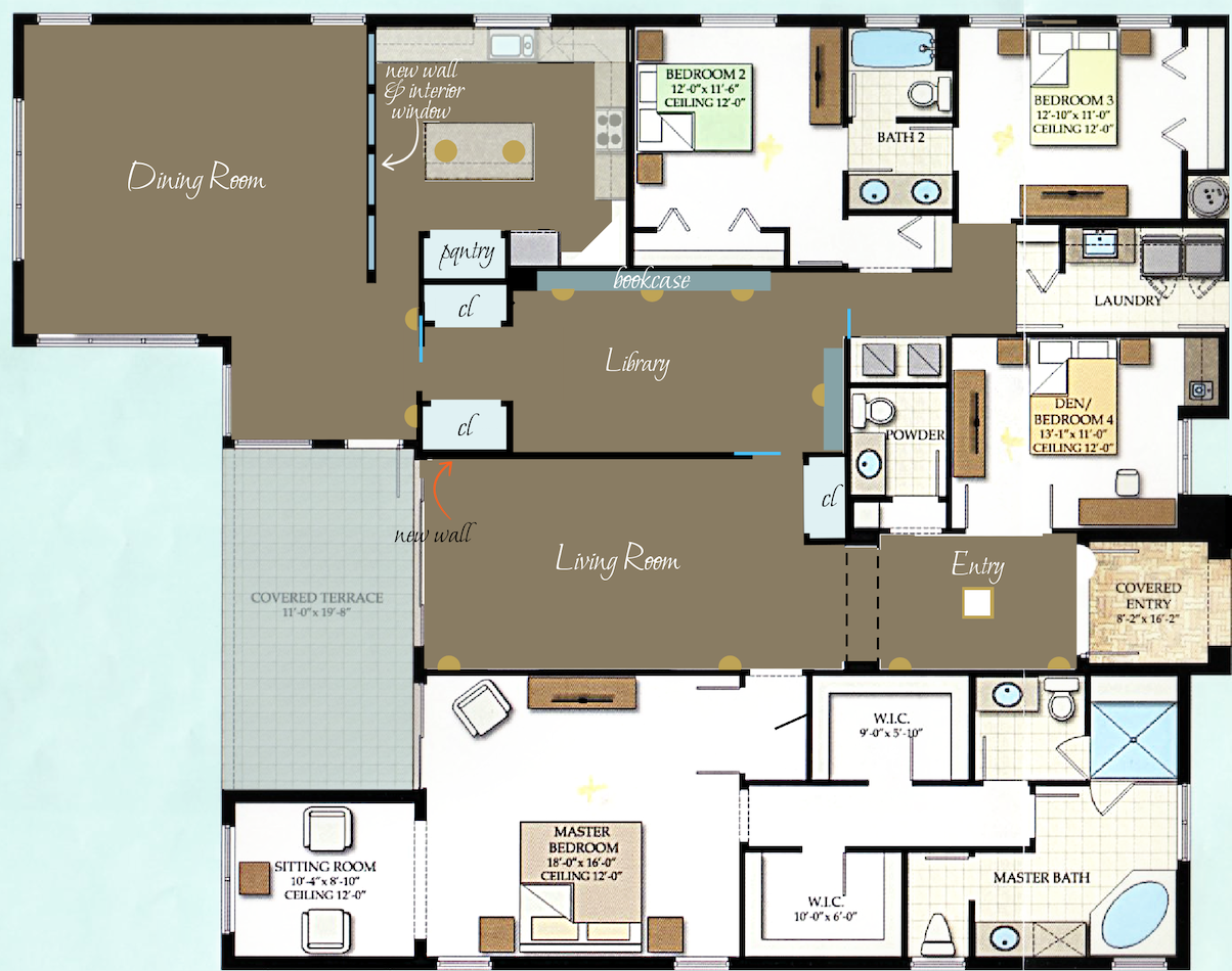
I left the furniture out of these changes. But, did leave in the attached lighting fixtures. Also included in this floor plan are the bookcases in the library.
Library, Laurel??????????
Please calm down. Thank you. :]
I added the BROWN tile floor. There’s a lot of it.
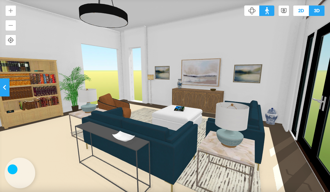
Let’s walk in the front door.
First, we come to the living room. There could be a TV here or not.
Yes, I did add a wall about 12 and a half feet back to make another room.
I envision a more masculine space with a hunky COLOR on the wall. I think this will help achieve more coziness and depth. Plus, it’s also going to help enormously with the sound issue. To further impact the sound, I added three pocket doors with glass-divided lights.
And, I added a freakin coat closet in the living room.
Considering this is a pretty sizeable home, there is a lack of storage space except for the huge master bedroom suite. Please notice that there is nowhere to hang one’s coat. Ummm… raincoat, of course. :]
In fact, there isn’t even a closet in the den/”bedroom.” But, to be a legal bedroom, at least in NY and Mass, there must be a closet. However, there IS a small sink and a bar.
Coming up is my favorite part; getting rid of that weird angle.
If there is a structural need, there is ample space to provide for that. Plus, I created a new support in roughly the exact location. And then, two more lovely closets.
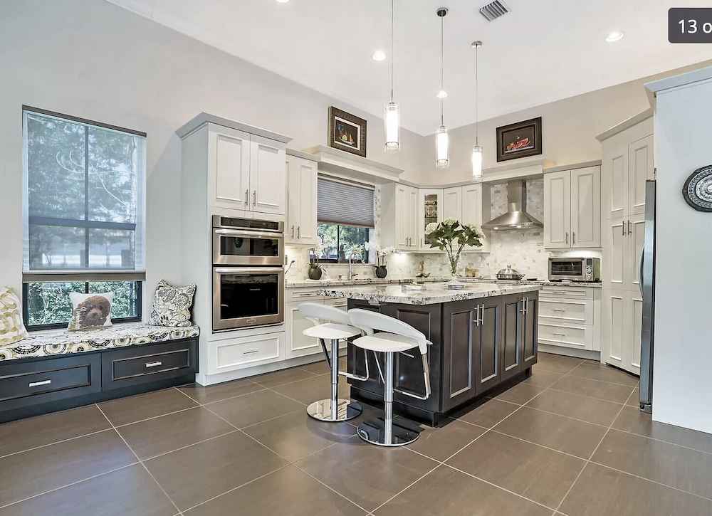
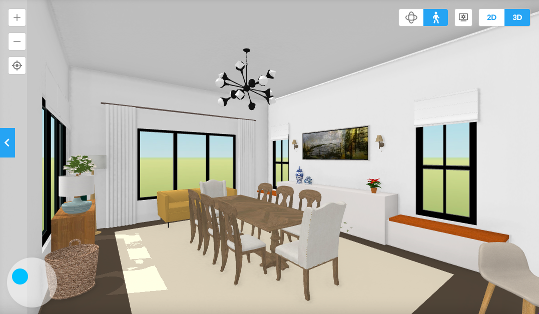
Finally, we enter the dining area and kitchen. In the kitchen, I added a pantry next to the fridge. I chopped off the end of the island. They can go on the side and one on the end if they want stools.
Then my other favorite part is separating the kitchen from the dining room.
The glass window allows for a good view. The windows could open. They need to start above the height of the buffet, so at about 36″ from the floor.
Laurel, are those walls going to work with the tray ceilings?
No, not as they are. I’m fine if some of them are filled in or adjusted. Of course, most of the structural changes are not essential.
Okay, let’s see the spaces with some furniture.
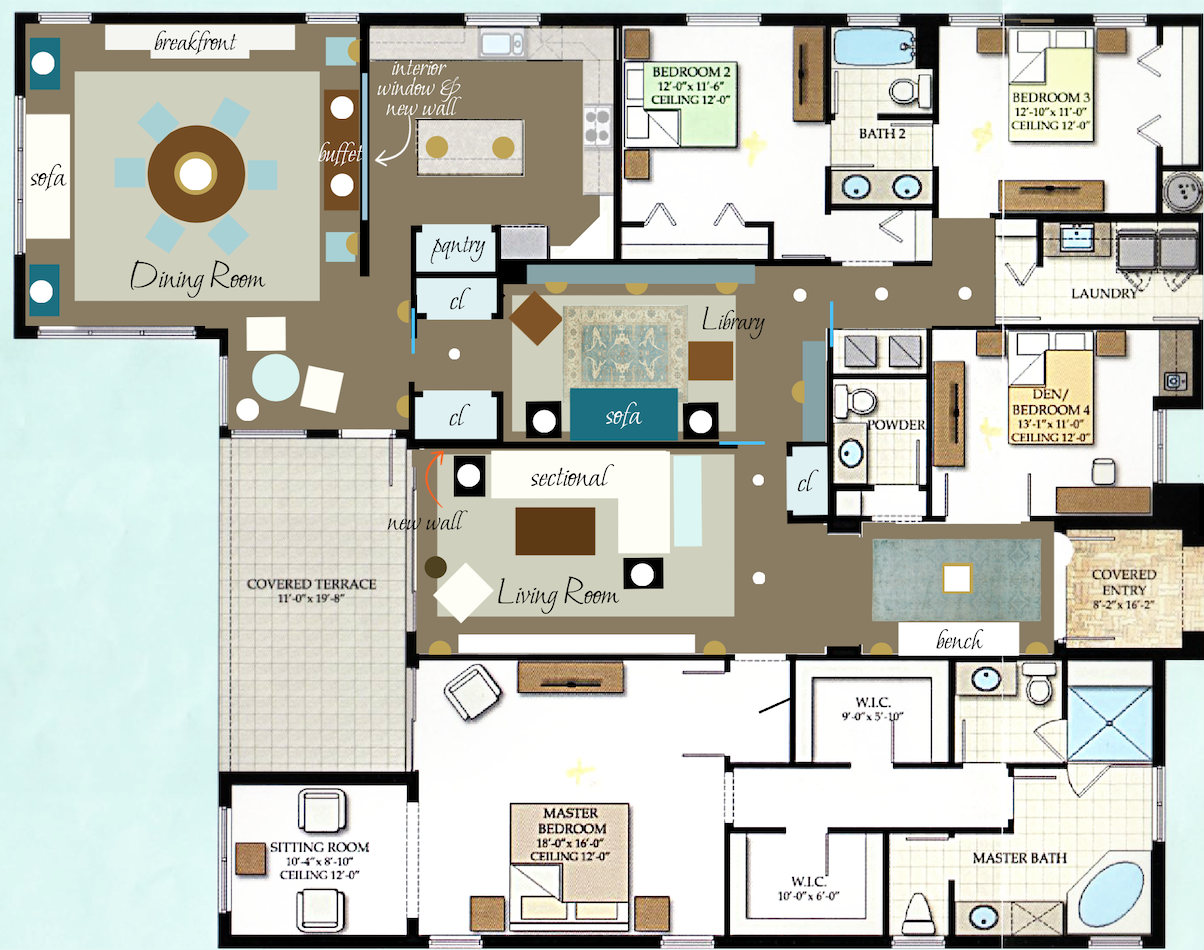
Above and below are almost the same, except there are more windows on the window wall dividing the kitchen and dining room.
And, I added another beautiful rug. in the living room.
The breakfast nook is now an occasional table 30″-36″ and two chairs which could become host chairs if the 72″ round table opens up with a leaf. Yes, the table could be a rectangle. There’s nothing wrong with that.
The seagrass in the dining room could also be installed wall-to-wall. However, it does have to be glued down in this case.
Lighting
I added a lot of lamps. And, yes, there are some stylish downlights. Recessed downlights have gotten a LOT sexier in recent years. That’s another post! But, please, a lot of the coldness is stemming from those bright WHITE LED lights. 2500 Kelvins is a good number to go for.
Laurel, what if no walls are added?
You took the words right out of my hand! ;]
Okay, we cannot have a separate library without the first wall. But, we could put the dining room in this spot, with or without bookcases. There’s plenty of room.
The wall in the kitchen could be eliminated. If the buffet has a finished back or storage on both sides, it could act as a room divider.
The one area I’m very much hoping Flo can change is the area where the closets and pantry are.
And, I also recommend adding the doors, for sanity’s sake.
Those two things, I think, will help make this (not that) bad Florida architecture become a lovely home
I haven’t gotten into specifics for window treatments and furniture. However, there should be many upholstered pieces, linen curtains with Roman shades, and area rugs.
Also, if necessary, there could be some other acoustical enhancements. That is also another post.
I hope you enjoyed this installment of bad Florida architecture; not optimal, but not hopeless!
Please stay tuned for Part II on Wednesday.
xo,

PPS: Hi Everyone – This is an update and yes, from the new theme, on Monday evening!
You may find a few things that are off, like the wonky home page on mobile. And, maybe some things are missing. All will be fixed. The biggest changes are on mobile, and for the better, I think. There are also some cosmetic tweaks I’d like to make. But overall, I’m very pleased and relieved!
Thank you for all of your great comments and suggestions for this home.
While I think the basic idea I had was good, there are some issues:
A. The living room is a tad too small
B. And worse, there’s no access to the kitchen from the living room without walking around through the library. Oops!
So, I fixed that. I was going to save it for Wednesday, but here it is.
Yes, the one window is covered up. It was in my way, and it was not necessary. I indicated the location with a thin red line. From the exterior, everything will look the same. Covering up windows from the inside is a legit practice. We did it for a couple of jobs years ago, and it allowed us to regain use of the wall. No one would ever know.
More about that on Wednesday as it ties into Flo-2.
And, about a week after this was posted Flo-1 sent me some graphics she had made. She calls it “Laurel – light.” Please enjoy Flo’s beautiful work!
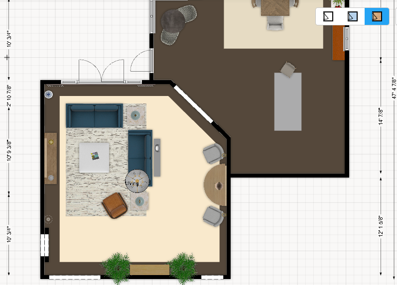
The floor plan
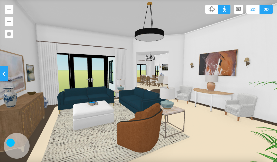
Looking into the living room from the entry
Looking back towards the entry
I think the new dining room looks fantastic! Flo loved the sofa in her favorite room. My favorite part is how she whited out the TV stand.
Related Posts
 He Wants Dark, Rustic Decor But She Really Doesn’t
- 50 Cool, Casual Dining Tables That Can Go Anywhere!
- Don’t Be Seduced By Chintz! A Personal Story
- The British Are Coming! Superb Interior Design from the UK
- Don’t Take Away Our Ceiling Fans – We Need Them!
- My 20 All-Time Favorite Benjamin Moore Paint Colors
- 20 Favorite Exterior Paint Colors + Doors and Trim