The Hidden Truth About Paint That No One Ever Told You

The other day I had a real Aha! moment. Oh, I love it when that happens! While working on the many paint posts, I’ve been looking closely at the walls and trim in my home. I’ve been noticing how the colors change with the many different shades of light throughout the day.


When I moved in, in 2012, I didn’t touch the trim or any of the paint colors.


The trim is white. Plain old white. It doesn’t ever read yellow, green, pink, purple, or blue. It is ever so slightly gray and usually warm but looks cooler in my south-facing living room. I’ve never specified this white before. It’s not terrible. With warm golds, it can look a little icy, however. It depends on the light.


desk_bronxville_benjamin_more_paint_colors_hc-4_hawthorne_yellow

See, it looks pretty white here. But, it’s not bad.

Alright, let me get to my point. The point is that if you look around you at the colors of your trim and walls, you’ll see that it is comprised of hundreds of colors. There are shadow and shade, reflection, and hi-lights. Our eye blends it all together and decides what the color really is based on years of experience.

That’s why computer-generated walls that are more or less one flat painted finish look fake.

Look. The paint companies are in business to confuse you. They make a lot of money by trying to deceive you into thinking that there’s really a difference between blah, blahhh and blah, blahhhh. The painting gurus who make money selling you books and courses in picking out the “undertones” aren’t going to tell you either. They WANT and need you to think that this is more difficult than walking across the Grand Canyon on a tight rope without a net.


The Difference In The Paint Colors Is Often Insignificant.


Or, I should say, the difference is so negligible much of the time that I promise you, you will not be able to tell the difference. One reason is, because within each color is a rainbow of colors that change with the light. Then, there’s the light itself and the shadows and reflections that are created.

Friday, I conducted a little experiment and I think that you are going to enjoy this a lot. I downloaded the Benjamin Moore Color Capture App on my little eye-phone. ;] The way it works is that you take a photograph of something and it spits back what it sees. And then along with that, a couple so-called coordinating colors.

It was a bright sunny day when I took the photos, so perfect for getting every variation of white I could muster.

But here’s the thing. 95% of the colors sent back to me were anything BUT white!

Please note that I did nothing to my camera. I did not color correct or purposely try to make things dark. Conversely, I tried to make most of the images as bright as possible!

In each of these photos, the piece of white moulding, trim or door I shot is in the middle on the bottom.  Please remember that my apartment is old. Not all of the trim is as crisp as it should be. But most of it is okay.

So, let’s just jump in here and take a gander at the first set of images via the Benjamin Moore Color Capture App.

Screen Shot 2015-06-26 at 5.29.36 PM

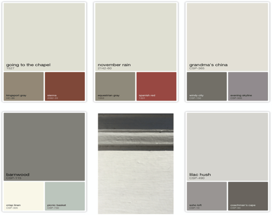
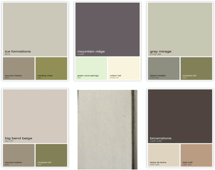
This is a window sill with shadows and a bit of the dark frame showing. The large colors are the colors that the app sees through the camera and the small colors are the colors that have been deemed to be coordinates. Some as you will see are good and some are really not good.

Screen Shot 2015-06-26 at 5.40.01 PM

Graytint which is a lovely pale gray is a good match here. However, it looks lilac here and gray tint is not lilac

benjamin-moore-gray-tint-skylight-living-room-0115-de
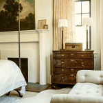
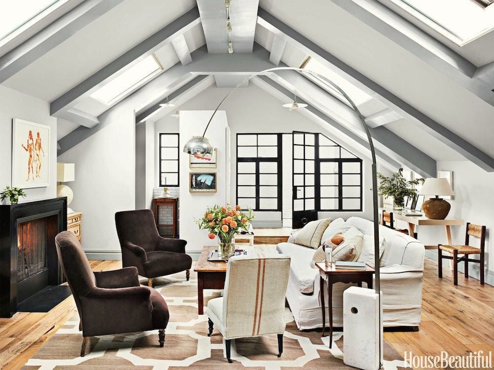
Via House Beautiful – The Home of Leslie Klotz

photo by: Annie Schlecter

Screen Shot 2015-06-26 at 5.58.23 PM

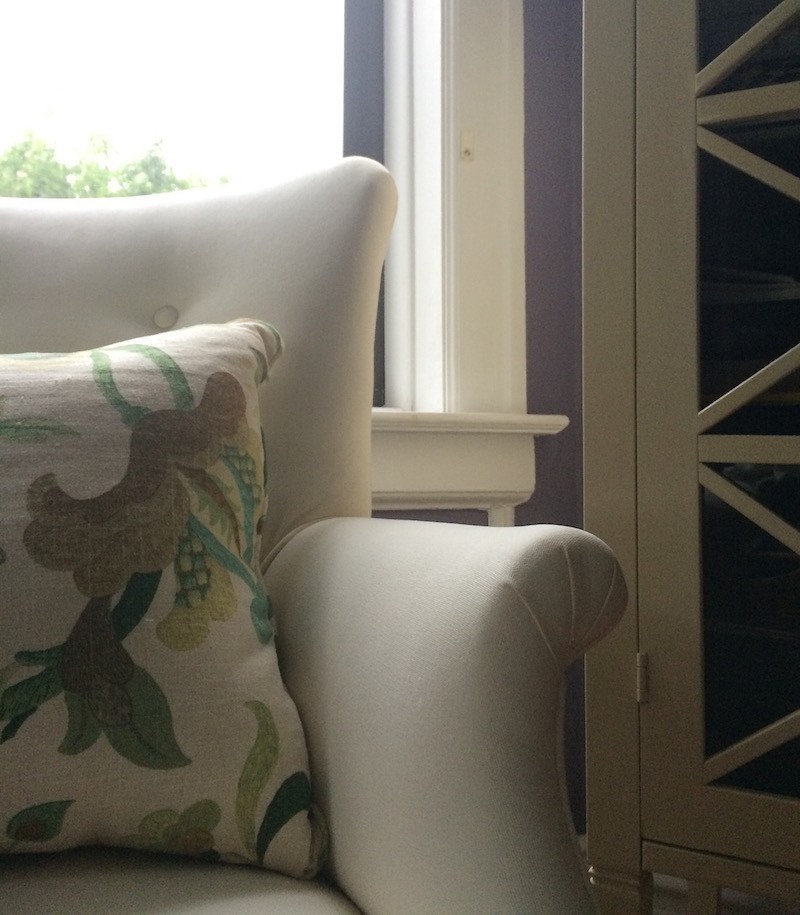
The inside of a window frame

paint colors Benjamin Moore Abalone Dransfield and Ross Masterbedroom

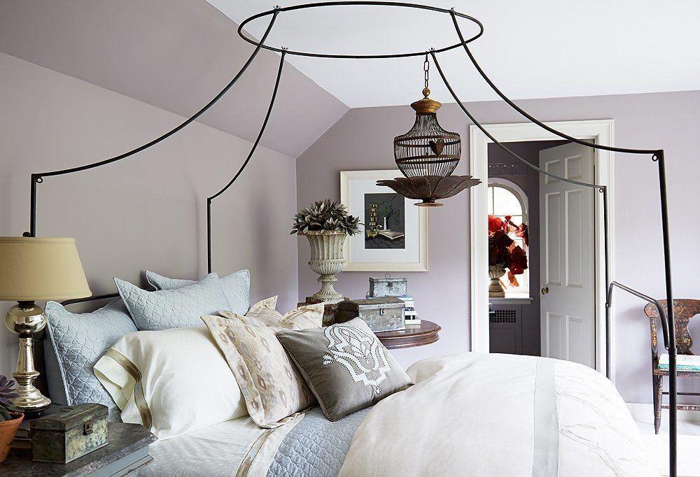
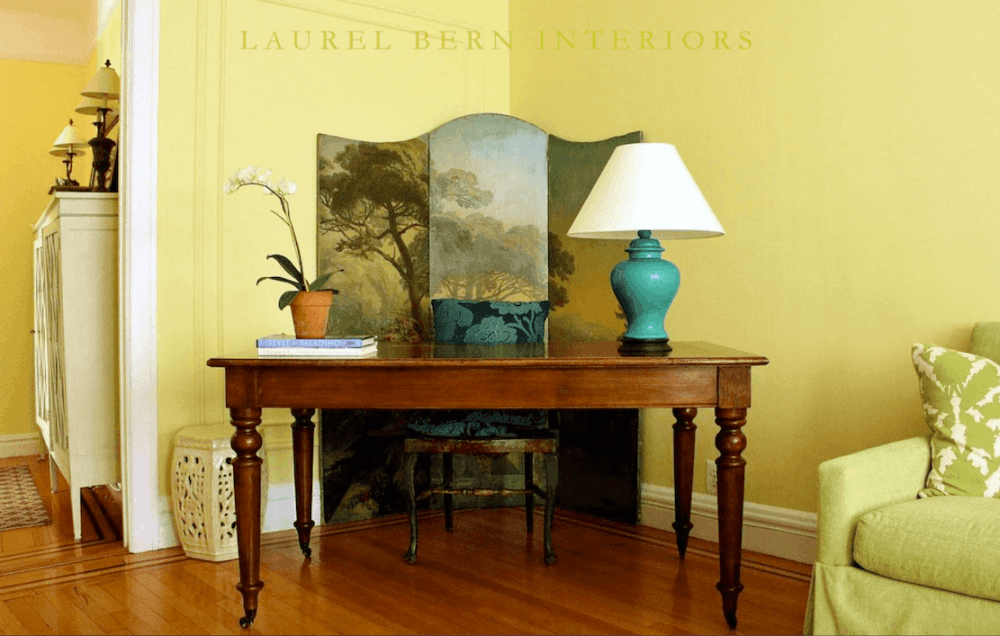
from the Home of Dransfield and Ross

photo by: Manuel Rodriguez

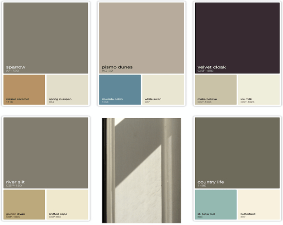
One of my favorite colors which is especially nice in a bedroom is Benjamin Moore Abalone 2108-60. It is a warm greige with slight lavender undertones but enough brown to keep it from being too sweet. Screen Shot 2015-06-26 at 5.26.22 PM

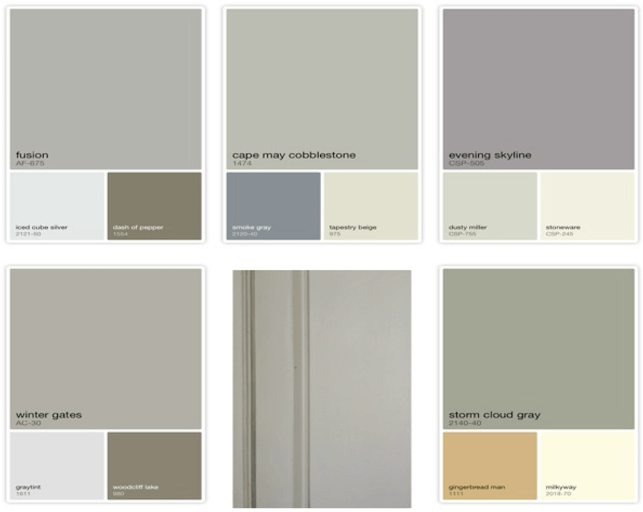
Winter Gates AC-30 is a very close match but it’s certainly not white! This is one of my favorite ones here, just not a fan of gingerbread man.

Screen Shot 2015-06-26 at 5.28.56 PM

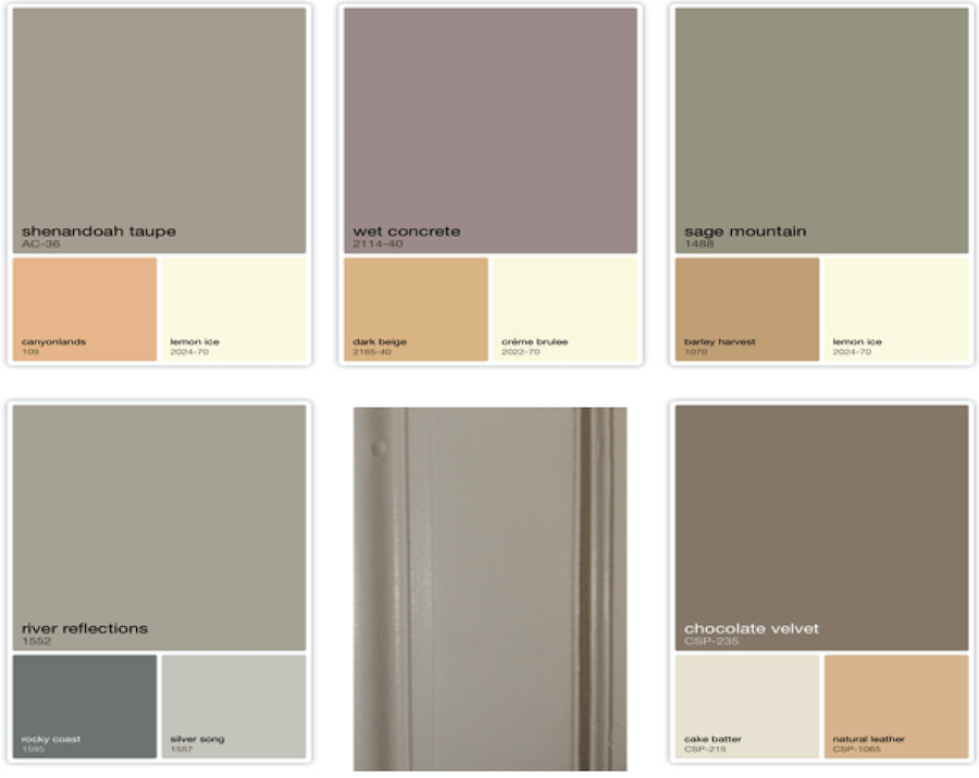
Again River Reflections 1552 is a close match. It’s a deep warm greige with slight green undertones. The golds here make me slightly queasy. How about you? Not sure why they think they are good coordinates.

Screen Shot 2015-06-26 at 5.58.54 PM

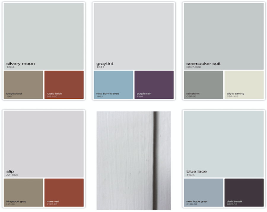
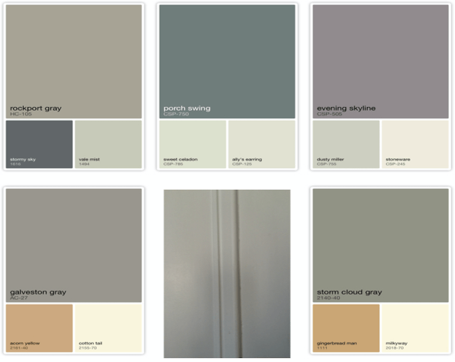
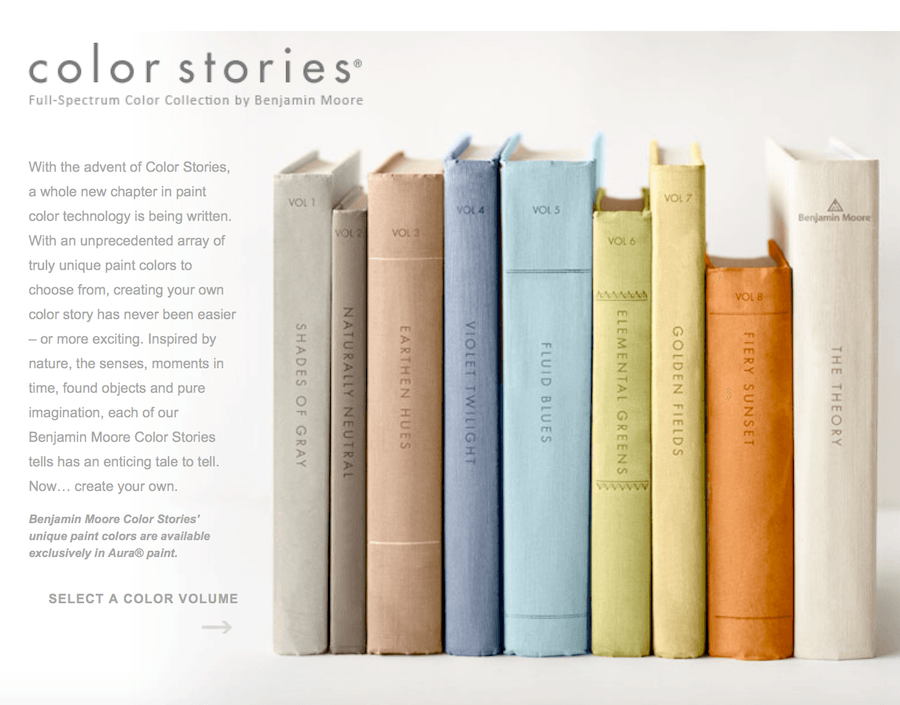
This was the inside of a window frame in a bedroom that faces SSW. It’s actually on an angle. The architect of this building took great care that every unit was created to get maximum sun exposure.

I’ve decided that I don’t really like taupe unless it’s almost brown or is veering towards purple. If it’s a pink beige. Just plain yuck. Go away! And I really don’t like pinky-beige-taupe with blue.

Screen Shot 2015-06-26 at 5.32.50 PM

I’m not sure where this is. I did take some of my front door and hall closet doors that do not have any windows nearby. Again, don’t understand the golds. There are so, so many better colors! But nearly every one of these has gold in it so someone over at Benjamin Moore loves gold.

Screen Shot 2015-06-26 at 6.03.52 PM

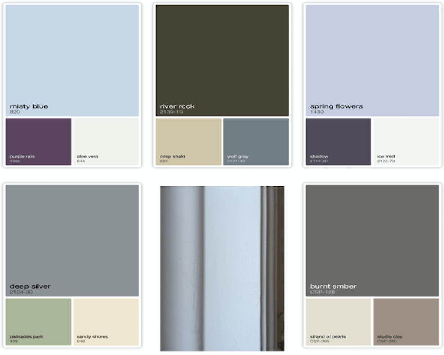
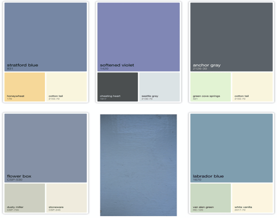
Now, we’re getting into the blues. The camera read many of these as either violet or blue.


benjamin_moore_paint_colors_tropical_dusk

Funny, but my bedroom walls are a “dirty” purple– Tropical Dusk, it’s called.  You can see a tiny strip of it next to the window casing. Lots of different whites here, which I rather like.


Screen Shot 2015-06-26 at 5.36.20 PM

I don’t know if you noticed, but the majority of these say “CSP.” That stands for Color Stories Paints. This collection came out fairly recently. They are “full-spectrum” meaning that they have no gray or black tint but are made up of 5-7 different colors.

Benjamin Moore Color Stories

They seem to be pushing these colors. The formulation only comes in the Aura. Aura is their most expensive paint. However, it is very low VOC and covers beautifully. They claim only one coat. I say it’s almost always two but not more than that.

With the old formulations, if you were painting a deep color or painting over a deep color with a very light color, your painter might need to put up to FIVE coats for excellent coverage. Well, having to order twice as much paint plus the labor costs will actually cost you far more in the end. Just something to think about when one is balking at the price of paint.


Screen Shot 2015-06-26 at 5.37.09 PM

I don’t know where this is either. But isn’t this a riot? That is a deep gray-blue. It is nowhere near close to white! It might be my front door which is indeed in deep shade with no lights on.

So what can we conclude about paint colors from this exercise?

I see two main things.

  1. One, my so-called white paint is actually many, many colors. Therefore, small differences in paint colors many not actually end up looking much different from each other once on the wall.
  2. The camera does not read the colors perfectly. I would say that it rendered the colors darker and far more saturated. So, if you are looking to “capture” a color as they suggest through the APP name, you’d be far better off going back with your fan deck and matching it that way.

“Small differences in paint colors may not end up looking significantly different from each other.”

The problem is… there is just too much choice! And that’s one of my projects. I’m working on narrowing them all down for you. In fact, I’m planning on turning it into an E-book.  I think it’s going to be pretty cool and a very useful tool.

Happy Sunday!

xo,

laurel


25 Responses

  1. Hi Laurel, Thanks for your blog – it’s been very helpful.
    I have a question I hope you can help me with. I live in a mid-century modern home with transitional decor and a big open space connecting the kitchen and two living rooms. There is a ton of light/lots of windows. The kitchen is painted in BM Cotton Balls and the ceiling and trim in living rooms in Valspar Betsey’s Linen. I want to change the wall color to something complimentary (there’s very little wall space – mostly windows). I’m thinking some shade of white might be nice, but I’d like it to be warm and cozy. The accent colors of rugs are a muted turqoise, mustardy yellow, and cinnabar. Furniture is contemporary and off-white/neutral. Any suggestions on what white color and brand that would work well on the walls? Thank you!

    1. Hi Lisa,

      Thanks for all of the info. I’m sorry but giving you a color without seeing what you’re describing would be like a doctor diagnosing an illness without seeing the patient.

      I do a lot of color consults long distance. If this is a service that interests you, please contact me to find out more.

  2. Yes, that we do agree on, my point is that undertone DOES make a difference! However, it’s very simple there are only 4 undertones to paint and everything else would be “nuance” No such thing as a purple, gray, brown, pink or whatever undertone. There is only blue, red, green and yellow. Paint is only composed of 12 colors (colorants) and all whites are not created equal. Even the slightest drop of any colorant can change the entire look! Yes, you can see a difference! This is such a simple concept that most people (even color professionals) don’t know it. Yes, I’m one of those color teachers you speak of but my goal is to teach everyone from students to clients that there is much more to color and the process should not be a secret, difficult or anxiety producing event. It should be fun and joyful! Thanks for bringing this subject up as it is near and dear to me :)I would like to invite you to visit any one of my classes at no cost because this is such an important topic for so many people! http://www.businessofcolor.com

    1. oh, I commented to this same thing on facebook. I’m sorry if I gave the impression that undertones don’t matter. Of course they do! But some colors have more surprises lurking under them than others and some change tremendously with various lights.

      To my way of thinking, light is the critical factor and since it’s not something one can exactly bottle except at night. haha, that’s what can make it confusing.

      Thank you for the offer. That is very kind of you. You have a gorgeous website! I’ve been doing this business since 1988. I know that a lot of bloggers aren’t designers and don’t have training, or 25 years of on the job experience.

      Thank you so much for your input Teresa!

    2. About the white, I chose BM Chantilly Lace for my trim and had it color matched at Sherwin Williams because I had a coupon. Several gallons later, I bought Benjamin Moore brand because it was more convenient. The difference was astounding! I had to repaint everything because the doors didn’t match. The Ben Moore was much whiter, by the way.

      I was so sick of painting by that point. Lesson learned the hard way.

      1. Hi Teri,

        Oh gosh, I’m so sorry that you had that experience. However, it is a further testament to my experience which is that computer matching is a big crap shoot; one that has the odds not stacked in it’s favor. Oh, they will say that it DOES work perfectly.

        Not arguing with the painters who make this claim. And why chance it?

        The other thing is that the dyelots can change even within the same paint company. That’s why they tell you to buy all of your paint at the same time.

        I’ve never actually used Chantilly Lace. I think that it’s too white for a lot of colors. However, I study all of this and read forum after forum about the colors and there are many who adore this clean shade of white.

        1. I am one of those people whose moods are strongly affected by color, and my rooms need to be fresh and airy feeling. I have had gray walls with white trim in every house for three decades. The Chantilly Lace is beautiful, and it matched the chalk paint I used for my kitchen cabinets (CeCe Caldwell’s Simply White) well enough that it isn’t noticeable.

          I had the same paint thing happen with chalk paint out of two different batches. I ended up repainting a whole set of furniture because I touched up with a new batch, and a bookcase was half and half. It looked ridiculous- I ran out of the first can right down the middle of the bookcase. Of course, I didn’t notice until it dried.

  3. Thanks, that’s quite a lesson. Getting wall colors right is hard enough but much easier to change than hard surfaces. Knowing undertones in counter-tops, tile, and carpeting really helps in pulling it all together. I’ve seen pink-beige walls with yellow-beige carpets and it really looks “off”. Wish I had the skill to coordinate wall colors with existing furniture so they look good together – have that “decorator look”
    Your comments about the BM Color Capture app are right on!

    1. Hi Lora,

      This is so funny, but someone just wrote me wit this exact problem. Various hard surfaces in clashing beiges. None can change and she doesn’t want beige and brown any longer. The way I do it is to take all of the samples and put them where they will be and see how they work together. People ask me how I know? It’s not rocket science. If it looks good to you then it’s probably good. But most people don’t hold up the samples as they will be in their space. They look straight down on them and that’s a mistake. The light is going to reflect on them differently. The biggest mistake is just guessing or thinking that all beiges or whites go together.

  4. I must admit you are the most knowledgable person I have ever read on choosing paint colors. I wish I had discovered you before I undertook my search our third house back. We lived for a year with paint swatches painted on every wall in every room, because I discovered quickly that the lovely green I painted on a wall in our family room turned into a frightening muddy color at night. Thus my quest for perfect color at all times of the day and many colored walls for a year.

    After that year I found colors I loved painted then sold the house used all of the same colors except the lavender ice I hated in the bedroom in our next home. Surprise! They all looked different, but whew I still loved them.

    End of story I have used all of them twice more in subsequent homes all are a surprise, but I still love them, well mostly I happily don’t hate them I just am not eager to pick colors again.

    1. Doria,

      Thank you and BINGO! You are not alone. Picking paint colors for most supersedes picking out a wedding dress in difficulty and stress level. That’s what I’m working on; a collection of paint colors that look good 99% of the time and explaining the situations that they don’t look as good in for some of them. Those are mostly at the perimeter such as the very dark colors.

      One thing I’ve always thought about is that at night… All rooms face south. haha!

      The idea here, is to give folks something concrete that they can more or less plugin to their situation without having to think or struggle too hard.

  5. Hi Laurel, First, I appreciate your opening comments re: the business of undertones and paint marketing. In trying to choose colors for my interiors, I found the vast resources and opinions offered up by the internet unnecessarily complicated the decision process. I ‘froze” and my family threw up their collective hands on my lack of progress. I found an internet tool, Encycolorpedia, helpful, but as you noted, working with a fan deck and mostly abandoning the computer was my salvation. IMHO, light and shadow are just demons that no app can adequately handle. Practical note: I have been a huge fan of Benjamin Moore Aura until recently. The last 2 or 3 gallons did not deliver. I jumped to Sherwin Williams’ Emerald and am really impressed.

    1. Hi Susan,

      Thank you so much. I don’t want to mention anyone’s name and I do have enormous respect for this colleague. I have bought the books. While what she says is not completely inaccurate, it makes it more confusing, IMO. Furthermore, oftentimes, what are referred to as “undertones” are not under anything. They ARE the color. Saying that a gold has gold undertones is redundant. Saying that ALL colors have undertones is also not true.

      My goal is to make things as simple and easy as possible.

      There are certain colors that I would caution anyone to stay away from. period. Colors with overly cool or icy undertones generally look bad. These are often but not always at the top of the strip of colors. So, I would say that doesn’t meant to stay away from the top color. I would just be especially cautious.

      Interesting about your recent experience with Aura. If you see this, I am curious if perhaps you were using a darker or lighter color than usual. Is it possible that the painter pulled a switcheroo? Oh, they do that. Well, some do. I had a bad experience a year ago with a pregnant client. I specified Regal Select which I’ve been thrilled with and is very low VOC. You can walk in the room a few hours later and not smell a thing. Well, I did walk into this job site mid-painting (client had hired a painter I had never heard of) and the place stunk to high effing heaven. And it was summer and the windows were open! hmmmm… We had a problem with one of the colors too. It did NOT match the chip. Not even close!

      Guess who got blamed?

      Have to say that I do love so many of the Sherwin Williams colors. However, I am not as familiar with them as Benjamin Moore. They have done a brilliant job of marketing however. Although, a few months ago picked up some of their brochures of paint combinations. OMG! HORRIBLE! I have no idea who’s putting that stuff together but some of them are so bad it looks like they just blindfolded themselves and stuck their finger on any ol’ color. lol

      My biggest issue with BM is that they know have some 4,000+ colors. The color stories paint colors are obviously supposed to be in competition with Farrow and Ball who has also done a brilliant marketing campaign. However, too many of the BM colors are sooooo close to other colors in the same line. I mean, a tiny hair difference. One of my fave examples of this is HC-17 and HC-22. The difference is less than a dyelot change!

      They need a new fandeck. The Sucky Compilation. This is where they can put all of their duds so that if you still want them you can get them. I really don’t think there ever needs to be more than 500 colors. But then… we wouldn’t buy all of those test quarts!

      1. Hi Laurel….first I love your blog! And I am a counterpart of yours down in Central Florida. Maybe you can answer this question–do you think Benny M corporate doesn’t know what the duds are as they are selling pigments? I’m really curious about that. One time a BM paint store told me they couldn’t possibly tell me the top 20 paint colors that they sold because of that, but come on guys, imho, you should know some of the colors customers ask for the most and the ones you mix up the most often. I would have been happy to know just what some of the best sellers were. I was knew in this market and was doing some casual research back then. SW is huge where I live now. I wish it were just the opposite because like you said we are very familiar with the colors. I am still specing BM and I know there is matching going on so I am thinking about going over to SW – even though I truly believe that overall SW quality is inferior to BennyM. The SW stores are company owned and because there are so many of them, that’s what the contractors want to use, — but consumers beware — if your contractor is purchasing your paint,SW has available sub-levels of quality that are not available to the public. And that’s how some of them make higher profits. Yes, paint colors are complicated because, Laurel, you are so right, there are just too many.

        1. Well… the dude in the paint store sounds like an idiot. Of course he knows the popular colors. Actually, you can find them on the BM website. If it’s even accurate. Who knows? Thanks for writing such a great comment!

      2. Thanks for your helpful feedback! So good to have a professional voice my thoughts about undertones & ensuing confusion. (I too bought the books!) As your post just demonstrated–the interplay of light, location & furnishings so impact the appearance of the “same” paint color!
        Here’s the thing, my house is tricky because of its orientation to light (mostly north; east and west), overhangs and a fairly open floor plan. After wanting light & bright, trying to like the current trend of gray and wanting white–I finally concluded that COLOR was my best bet. As your respected colleague–via Donald Kaufman, correctly points out, white dies in a dark room. I left the monitor, pulled out the fan decks and focused on my furnishings within each room. Drum roll, decisions happened! Choices may not be to everyone’s liking, but I’m pretty happy (and so’s my family!) I used acessories to tie rooms together instead of trying to make a single paint color work in every room. For instance, I have saturated blue walls in a room with mostly western light and blue acessories in a nearby space that has north-west exposure. Still tweaking–but don’t we all (all the time!)
        Re: Aura paint…Two years ago, I used (one coat) Aura in off-white to cover light blue and a pale creamy yellow; it was amazing.
        This past winter, I again turned to Aura and the results were disappointing. I was using Base 2 and 3; mid-tone, saturated, colors over lighter paint. I use good quality brushes and rollers, buy my own paint. No switcheroo! But it took 2 coats to get best results. With Base 3 color, I had very bad results.
        Got that color remixed in another gallon with some improvement. Store acknowledged paint may have froze in their unheated (!) warehouse.
        As I shared with Carol (below), the experience with SW Emerald was a game changer and surprising. I had low expectations going in but immediately noticed the difference. I have more painting to do :-/ I already have Aura purchased in a light base and in Base 2 from a different distributor. I plan to buy more of the Emerald for our upstairs rooms. So, after all THAT, I’ll really have an opinion!

        1. oh haha! Thanks Susan! We were writing to each other at the same time! Thanks so much for the answer. Donald Kaufman is amazing! I’ve never used his colors but have his books and learned a lot from him years ago.

    2. Hi Susan, Is Emerald SW’s counterpart to BM Aura? I thought it was Duration. Maybe I’m in the dark about this and would love to be enlightened. Thank you……..

      1. Hi Carol, My understanding is, yes–Emerald is SW’s answer to BM’s Aura. They are both primer+paint. No experience with Duration for interiors but, our exterior painter has dropped Duration for BM Aura.
        I have been a hard core fan of Aura but a recent (bad) experience with Aura had me rethink that devotion 🙂 Which led me to try SW Emerald. I decided our master bath was a good place to test drive Emerald: It was a dream! I applied Comfort Gray over a yellowy cream. Fantastic coverage. Great application & appearance. Performance, thusfar, has been excellent.
        Over time, I have found that you can get quality variation within a specific product, according to the Base and/or finish you choose. Shouldn’t happen but it does :/

        1. Hi Susan, Thanks for the response. I was interested in your answer too. Have you used BM Regal Select? It also has primer mixed in. I’ve been specking it for about 3 years now and also used it in my home and am thrilled with it. We almost got away with one coat for my bedroom. I’m not sure what the dif is between it an Aura except that certain colors aren’t available in Regal– like the new Color Stories. Oh… more confusion! I do always spec matte. Hate shiny walls unless they are intentionally glazed or lacquered which of course is an entirely different animal.

        2. Thanks for info on BM Regal Select. If I’ve used it, it hasn’t been recently. I’ll give it a look! I too like Matte/Flat but, confession, like Aura in Eggshell and Emerald in Satin. (Only a painter/designer/decorator, could/interpret that last sentence!)

    1. Hi Eileen,

      Actually it IS really fun. I think it works better if you have a photo of something where you are looking at the colors in the photo as opposed to seeing something in real life, taking an image of that and then putting it through the app. In other words, it’s good at rendering what it sees, but what the human eye sees and the camera sees are often two very different things.

      I knew before the experiment that the app would see different colors of the SAME color, I just didn’t realize how far “off” some of them would be! Actually, almost all of them.

Leave a Reply

Your email address will not be published. Required fields are marked *

This site uses Akismet to reduce spam. Learn how your comment data is processed.

Welcome To Laurel Home!

laurel-aarons-18th-e1456449963926

Hi, I’m Laurel, and Laurel Home is the website and blog for Laurel Bern Interiors.
I’ve been creating new-traditional interiors since 1988. The blog is where I share all.

New Edition, November 2022! Get The Indispensable Guide For 100s of Home Furnishings And Interior Design Sources That Everyone Is Raving About

laurels-rolodex-final-book-cover-master 9th edition 22-23

laurel home archives

Categories:

Please click the image below for more info about my rockin’ Interior Design Guides for 2023!

Laurel Home Interior Design Guides 2023
Amazon ad

please click below to check out my favorite decorating & design books

Laurel Bern's Favorite Interior Design and Decorating Books
Subscribe To The Laurel Home Blog And You Will Receive A FREE Guide Where I Share How To Get Your Paint Colors Right, The First Time.