Yuck. Loved the Wall Color Before The Furniture Arrived!

Hi Laurel,
 
I received a new sofa this morning that I’ve wanted to get for years and in a color I really love a dark graphite gray in the most beautiful Schumacher velvet. I love gray moody interiors and lean towards liking cool tones with mixed metal accents in traditional style with few modern touches.
 
I love the sofa but against my current gray-blue walls and faded gray rug I feel it’s all a bit too dark and cool. I am mostly home in evenings and in my east facing tiny living room this tends to be on the darker side. I’ve been reading all your blog posts about color and light and I’d like to get your thoughts on a suitable new paint color for my wall. I was thinking something in the lighter gray or cream tone but open to all suggestions.
 
I am a photographer as well so i understand light and how it impacts tone especially in different directions. I know my eastern facing room isn’t the best but looking to find what works for my space.
 
The photos attached were taken this morning after my sofa arrived without any other lights turned on so is the brightest it would get with natural light. My coffee table is reclaimed wood. Oh and art work is all changing!
 
Let me know if I may be able to provide any more info! I look forward to hearing your thoughts and am an ardent fan of your blog and designs.
Sincerely,
Tara


{note: I’ve done many “dear Laurel” posts. They are all amalgams of different situations and not actually real people UNLESS otherwise stated. This one’s real – and a lot of fun too!}


tara

Tara-sofa-3

Tara-close-up

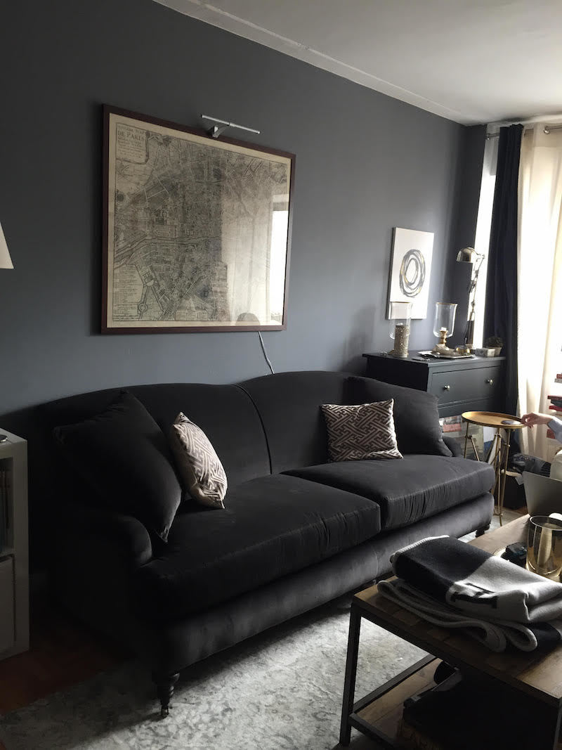
Fabulous, sophisticated room. Tara had paid for a paint consult and so I gave it due consideration and then sent her back this message.

Hi Tara,


Wow! What a handsome room! I don’t think the walls should be too pale. I love them fairly dark, but more art work with light/white backgrounds and/or mats would be great. Maybe even a really big mirror, maybe with a black frame. Or a mirror over each chest. I think that’s a matching chest on the other side of the sofa.
A very beautiful warm deep gray is Benjamin Moore Ashley Gray HC- 87.
Another color I bet you would love is Farrow and Ball Down Pipe 26. It’s a very rich sophisticated color that some aficionados go totally ape over! It is quite deep, however.
For a cool gray going more blue but  lighter than what you have, you might try Benjamin Moore Coventry Gray HC – 169. It would provide more contrast than your current color.  It’s a steely blue-gray. Not dark, but not light, either.


As for lighting. I don’t see any! I’m sure it’s there, but I would put a lamp on each chest. But, wait. I’m preaching to the choir. haha!


I hope that helps. Please let me know how it goes. Love the sofa!


One last thing. Live with it for a week or two before rushing out. Sometimes things just need to settle in a bit. I don’t think it’s terrible the way it is, but with more and different art work and a mirror or mirror will be smashing. However, if you still feel after a time that you need to tweak the wall color, that’s fine too.
best,


***********


Truth be told, I wasn’t sure if any of the colors I suggested would be better than what she had, but again, it’s not always easy to tell in a photograph.


Two days later…

I received another email from Tara. More truth. I suck with names. I have to hear someone’s name about 10 times before it sinks in and I hear from a lot of people so it didn’t register at first. I opened up the email and the first thing that hit me between the eyes was this beauty.


tara sharma photography dark smoky living room

How nice.

Someone sent me a photo from Lonny or Domino.

But then… I did a fast double take and realized that this was from TARA!

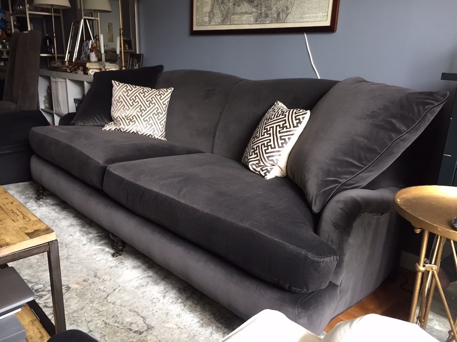
OMG!!! I couldn’t believe the transformation!

Here’s what she said:


Hi Laurel!
Thank you so much for the feedback. You were totally right haha even after two days I kind of love the existing color with the sofa. I went out and bought a huge canvas and painted a black white piece which is more graphic than I’m used to but I think it helps the space. I have another canvas I want to experiment with as well in black white and caramel tones. 
I definitely hear you about the light fixtures. I have a modern one now on the chest near the window but I have more traditional library style lights on the other side of the couch. I’ll have to play around with that. Also thinking about brass sconces next to the painting to anchor it and warm it up and give more light. I’ve attached a photo of the bar cart opposite the dark blue-green chest so that side of the room does have some warmth as well. 
Ha I should just ask if you do room consultations? This is a rental so only so much i can do I guess but hopefully that’s a lot! 
Thank you again for your feedback. Most helpful and appreciated. 
Tara

dark living room

tara sharma photography bar cart books art prints

tara sharma photography bar cart styling prints maps

tara sharma photography graphic black and white abstract art lavender roses

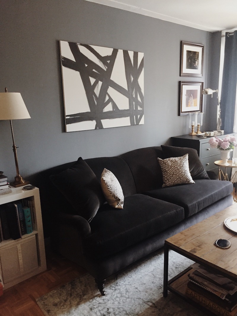
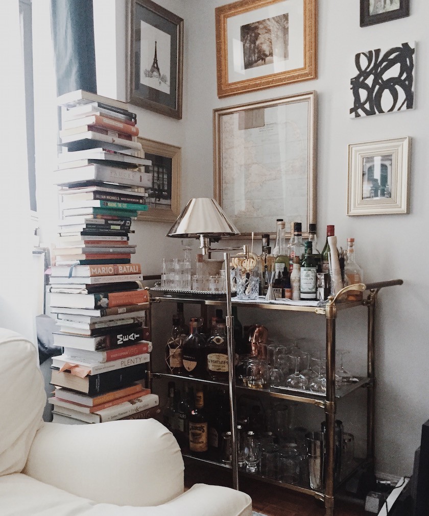
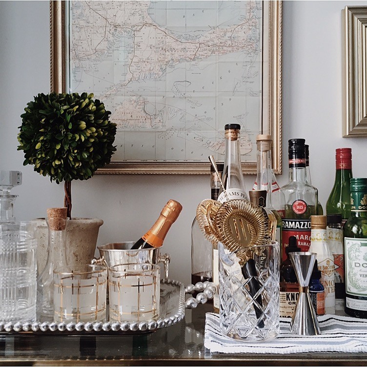
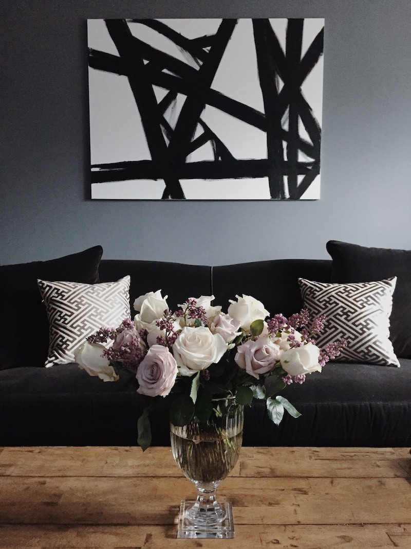
I love it all! It’s the perfect apartment for a young couple in Manhattan with elements of masculine and feminine. I wrote Tara back that she doesn’t need my help! It’s the other way around! Not only is she a wonderful photographer, but her styling is way cool!

Tara was kind enough to let me use her photos. Please check out Tara Sharma’s gorgeous photography website! Total badass!

The moral of the story is…

Painting your walls first can be somewhat of a risk, however any time you get something new, live with it for a while before jumping in and making a drastic change. I’ve seen it happen time and again with my clients and myself. Something new takes some getting used to sometimes and sometimes what we don’t love at first sight, we grow to adore as time goes on…

***OH! Please check out the new items in the shop!***

In honor of this post, I did a section on side, end and occasional tables. (yes, the terms are often interchangeable) There are 28 of them in all different shapes, colors and styles. Two of them cold go against a wall. One is a corner table.

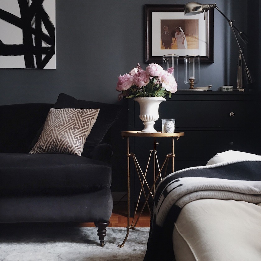
Included is Tara’s wonderful little gold table from Urban Outfitters!

xo,

laurel

14 Responses

  1. wow!!! I’m quite late to this post (a few years I think!) but came upon it as I was searching for grey velvet sofa. I just bought a ton of crushed gray velvet fabric to make my own kitchen tufted bench and was so excited buying the fabric in the shop until I brought it home and it looked completely different! But you know what, you’re right, it just takes a while to be okay with the change of colour in a room that’s so otherwise bright and white. I love the velvet fabric sofa and I’m blown away that Tara just popped out and bought a canvas, drew a few lines on it and it looks like a master piece.

  2. The room looks great! You could also pull off brightly colored cushions on the couch. Magenta would look good since it’s a dark blueish color scheme.

  3. hi Laurel,
    My NYC daughter just loves Tara’s sophisticated urban look. Do you have any pictures of her dining room? Any suggestions?
    Mary

  4. Hi Laurel,
    The little table from Urban Outfitters was spayed painted gold and many areas had missing paint. I would have repainted it but it is in a black powder room tucked under the sink so it isn’t noticeable. So, I agree, Tara had the right idea. I shamelessly copied a bathroom of Mark Sike’s. Greatest form of flattery… I am going to send him a picture and hope he agrees!
    Nancy

  5. Hi,
    I was going to comment that I liked the color of the walls as they read in the first photo. Love the dark and often like a sofa to be close in color to the wall color. The bar area is charming and all of the changes are wonderful. Perhaps the Hermes throw on the sofa would be nice, too. (Love the Urban Outfitter little table. I have one in a bathroom and it is a “find” at the price)I have recently finished a room and was really thinking about a couple of large canvases with black/white abstract. Now I have the inspiration!

    1. Hi Nancy,

      It was a completely serendipitous fluke that the little gold table was available on the shopping site. What’s even funnier is that Tara wrote me later; they were out of the gold table, so she bought it in silver and painted it gold. Yes! I would’ve done the same thing!

      The black and white cuts the darkness and gives it a shot of fresh contrast. I think for any room, some black, some white and some gold. You can’t go wrong!

    1. Thanks so much Leslie! I’ve often walked into someone’s home and thought. “Why did they call me, this is pretty terrific!” But then on closer inspection, the drapes were hung too low and needed to be lengthened and the stairs needed a runner, etc and before long, it all added up to a sizable job. It’s a little like putting a little makeup on an already beautiful woman!

  6. Wow, Laurel, that just goes to show what an amazing difference just a couple of the right small tweaks can make! Of course, it was a fabulous space to begin with–Tara has a great eye for proportion and her furnishings are beautiful. The size and scale of the black & white abstract is a perfect counterbalance to the 2 framed photographs and the gallery on the opposite wall. (I also love how she just “went out and bought a huge canvas and painted a black white piece” — like, who DOES that and has it turn out that perfectly???)
    And her event/portrait portfolio is stunning but she definitely has a talent for interiors photography as well! (Not to mention abstract painting…).

    If someone wanted you to do a similar but more extensive consult, you can do your “Home Botox” long distance, right? Especially if they need help choosing furniture–you’re already sourcing all those great pieces for your shop now, so you know what’s out there and you could link them directly to your recommendations.
    Just a thought since Tara asked about room consultations!

    (And btw LOVE LOVE the shop–what a genius extension of the blog and your website!)

    1. Hi Sandy,

      Thank you so much for this wonderful comment. I have done many long distance home botoxes and even more extensive interior design work. In fact, right now, I’m redesigning the first floor of someone’s home. I mean, moving walls. And yes, had the go ahead from the builder and engineer!

      The shop is just the tip of the iceberg of what’s available to me. I am bound by the resources that the affiliate program is offering. For instance, there’s no or very little custom upholstery on there; same for furniture. It’s all what you see is…

      The purpose of the shop is many-fold. The benefit to my readers is it shows a sense of my style and the pieces that if they went out and got aren’t going to go in ten years, “what WAS I thinking?” For instance, chinoiserie porcelain is not going out of style – ever! And with that, I have an idea for a cool blog post!

  7. Love the new artwork, makes a huge difference. But I love love love the gray velvet sofa, what brand is it? I have to own it. Thank you

Leave a Reply

Your email address will not be published. Required fields are marked *

This site uses Akismet to reduce spam. Learn how your comment data is processed.

Welcome To Laurel Home!

laurel-aarons-18th-e1456449963926

Hi, I’m Laurel, and Laurel Home is the website and blog for Laurel Bern Interiors.
I’ve been creating new-traditional interiors since 1988. The blog is where I share all.

New Edition, November 2022! Get The Indispensable Guide For 100s of Home Furnishings And Interior Design Sources That Everyone Is Raving About

laurels-rolodex-final-book-cover-master 9th edition 22-23

laurel home archives

Categories:

Please click the image below for more info about my rockin’ Interior Design Guides for 2023!

Laurel Home Interior Design Guides 2023
Amazon ad

please click below to check out my favorite decorating & design books

Laurel Bern's Favorite Interior Design and Decorating Books
Subscribe To The Laurel Home Blog And You Will Receive A FREE Guide Where I Share How To Get Your Paint Colors Right, The First Time.