Hi Everyone,
Before you say ugh! Not gray again; please try to keep an open mind about the best warm gray paint colors. Or, any gray, for that matter.
It’s not that I don’t understand. I definitely do!
Gray sucks. You’re sick of it. No.More.Gray.LAUREL!
However, the color gray is one of the most abundant colors found in nature.
- Cloudy, gray sky
- Murky, gray water
- Most stone is some gray shade, whether cool or warm gray.
- Cedar will turn gray if left exposed.
- Silver, platinum, pewter, and nickel are all gray.
Before I go on… once upon a time, there was a different post on this blog about warm gray paint colors.
It was written in 2015 and was very popular for the first few years, but over time, not as much.
So, last year, I did an update for the best Benjamin Moore cool gray paint colors.
And, last January, I updated the post asking: Is the Gray Paint Trend Over Yet?
I highly recommend reading that post if you haven’t already.
But, then I got an email from someone, and all she said was:
“NO MORE GRAY!!!”
Thank you, I love you too.
Anyway, I also wanted to update the warm gray paint color post, but not just then, so I took it down and did a technical thing nobody cares about except maybe my developer. haha
Ummm, I know I’m putting you to sleep, but for God’s sake, can you please stop snoring?
Laurel, please stop the chit-chat and just tell us the best warm gray paint colors!
Yes, of course, but, as I’ve often harped, paint colors do not live in isolation unless they’re in a fan deck. When they’re up on your walls, it’s a very different story.
Of course, I kept the old post. But, when I began to write this post, well, blimey, I couldn’t find it. Finally, I did find it in my drafts folder. I had just forgotten to give it a headline.
In the original gray paint post, I shared nine of my favorite warm gray paint colors.
However, after that post, I wrote other posts about gray paint colors, both cool gray and warm gray.
In fact, when I put the word “gray” in the search box, I found 13 pages of posts that are either devoted to gray or contain the word gray somewhere in the text. That comes to about 300 blog posts mentioning the word “gray.”
That’s a lot of gray.
However, it makes sense because gray IS the most classic color!
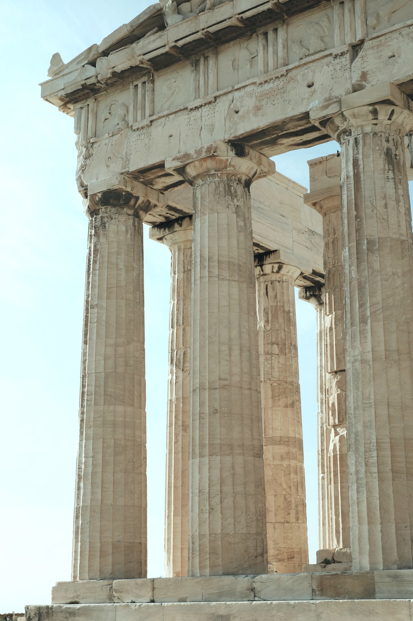
Remember ancient Greece?
Geez, Laurel, can we see something a little more modern?
Yes, of course.

Above is a beautiful image of the Pantheon in Rome. What’s wrong? You asked for something a little more modern! ;]
Guys, here’s the other thing. I’ve been living with Benjamin Moore warm gray paint colors on nearly every wall in my Boston condo for well over two years now.
Well, do you like the colors, Laurel?
No, not especially. I mean, I usually don’t notice them. They’re just kind of there.
But, in the past, I’ve lived with colors I did notice because I loved the color. My current rooms were not designed to go with the warm gray paint colors that are there. The floors are an orange-y brown which usually throws a golden/peach tone, but not always on my living room walls.
Hey, Laurel, what’s happening with the contractor?
Ummm… Yes, I’m working on it. Now, will you please stop kibbitzing, or I’ll never finish! ;]
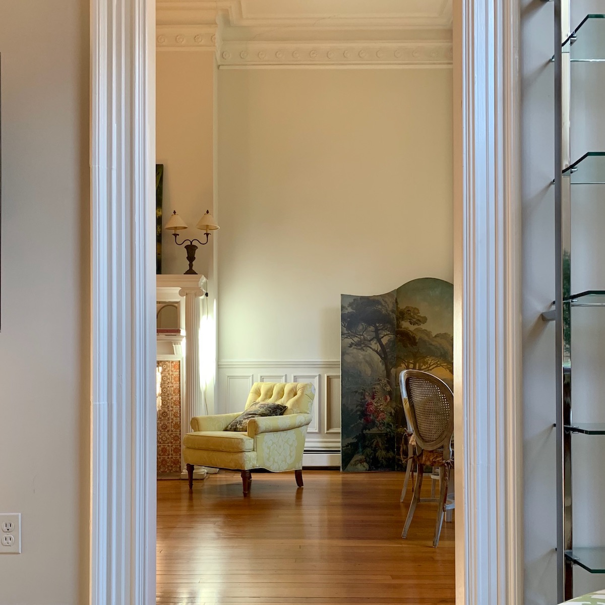
Remember this post where I showed how drastically the colors changed in the same room and at the same time of day?
Before we go on, I want us to think about:
What is a warm gray paint color?
Let’s take the color gray, which theoretically has no discernable color. By the way, that isn’t easy to do. Gray paint colors are usually a very muted blue, green, yellow/peach, or violet, and sometimes veering slightly towards beige and brown.
However, some colors straddle the line between cool and warm. Just to confuse you. haha
These days and for quite a while now, warm gray paint colors are usually called greige. Of course, that means the color is a cross between gray and beige. However, beige, too, has its variations.
For today’s exercise, I am focusing on the warm gray paint colors that go a little violet or beige-ish.
None of them go towards a cool blue.
Some of these colors might look taupe in some lights or ever so slightly green or khaki.
Again as in the previous post about cool gray paint colors by Benjamin Moore, I will focus on 9 fabulous Benjamin Moore warm gray paint from light to dark.
Later, I will have a fantastic surprise for you.
Please don’t spoil my surprise by scrolling ahead. Thank you. ;]
Nine Benjamin Moore Warm Gray Paint Colors
So, let’s begin with my living room color.
CLASSIC GRAY 1548
Wait, Laurel, I thought you didn’t like it.
I’m not too fond of it for me. :]
Classic Gray is a pale, pale gray with warm undertones. And, it’s very pretty.
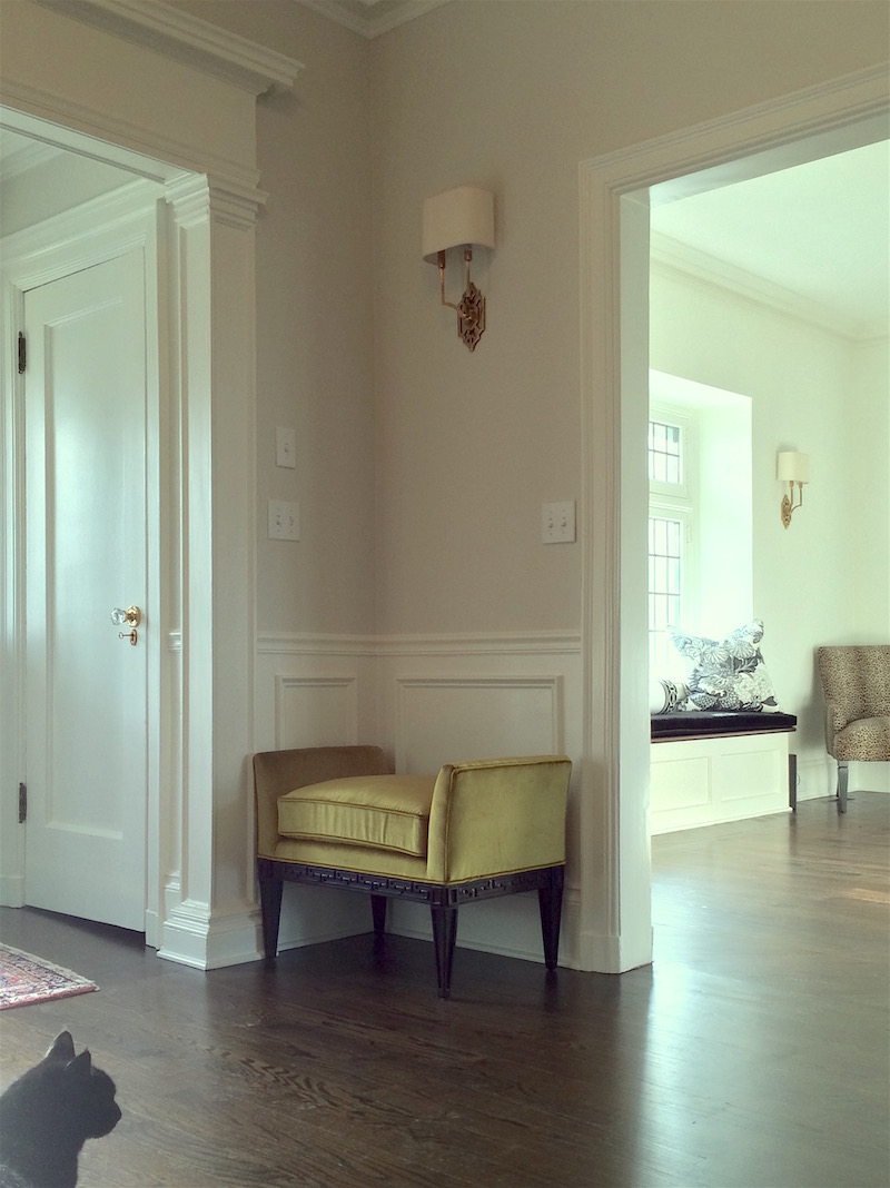
I loved it when we did it in Mary’s low-light entry. Now, that I’ve been living with it for well over two years, here’s what’s going on. It’s an immensely changeable color in my room and I prefer it in darker rooms with dark floors.
Like Mary’s lovely entry above. Yes, Mary, of the gorgeous kitchen.
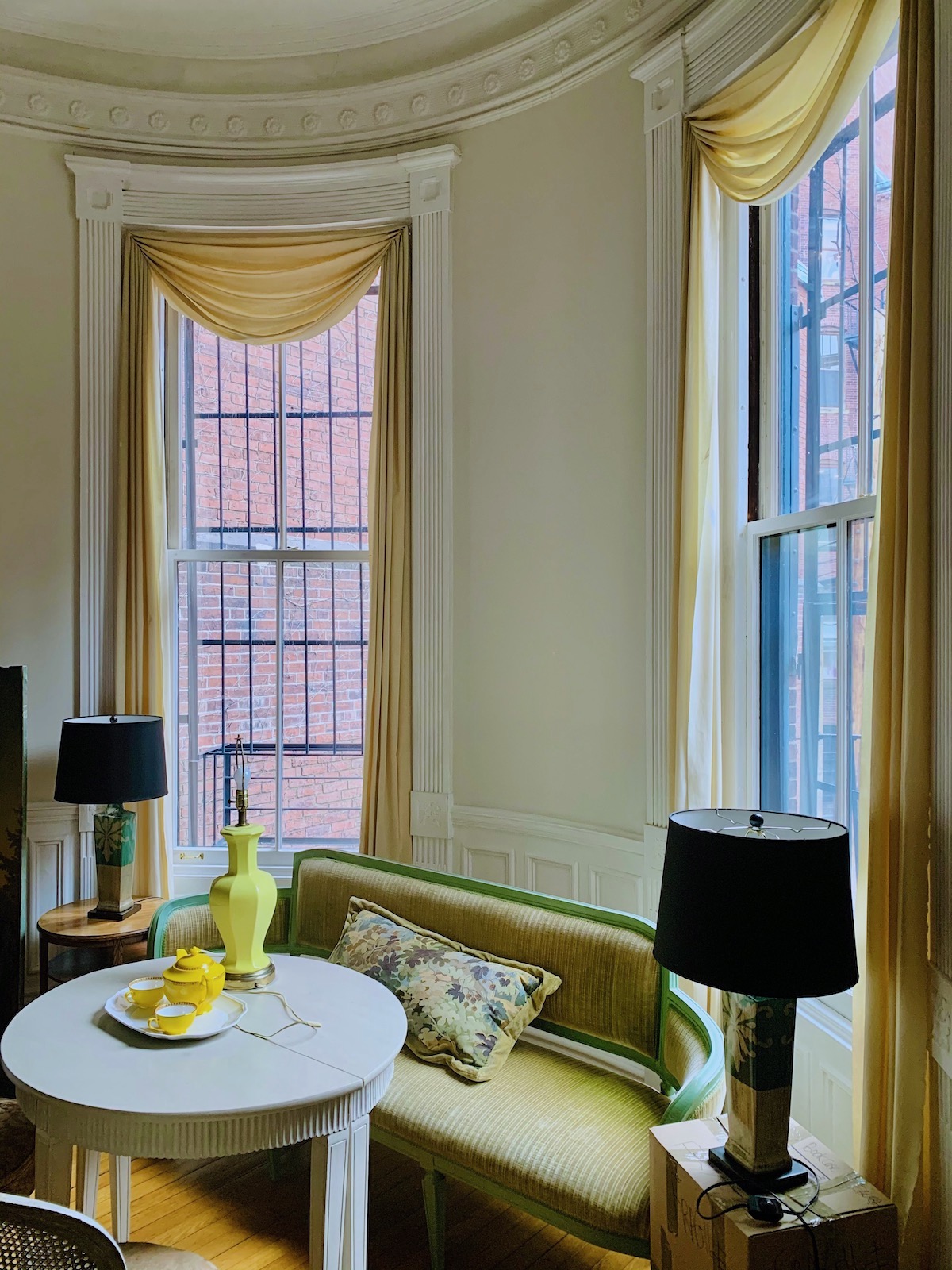
In my apartment, in the living room, there’s only one wall, and it’s on the opposite wall from the window where it looks like Benjamin Moore Classic Gray, consistently. Sometimes, it looks like a dirty cream like you see above.
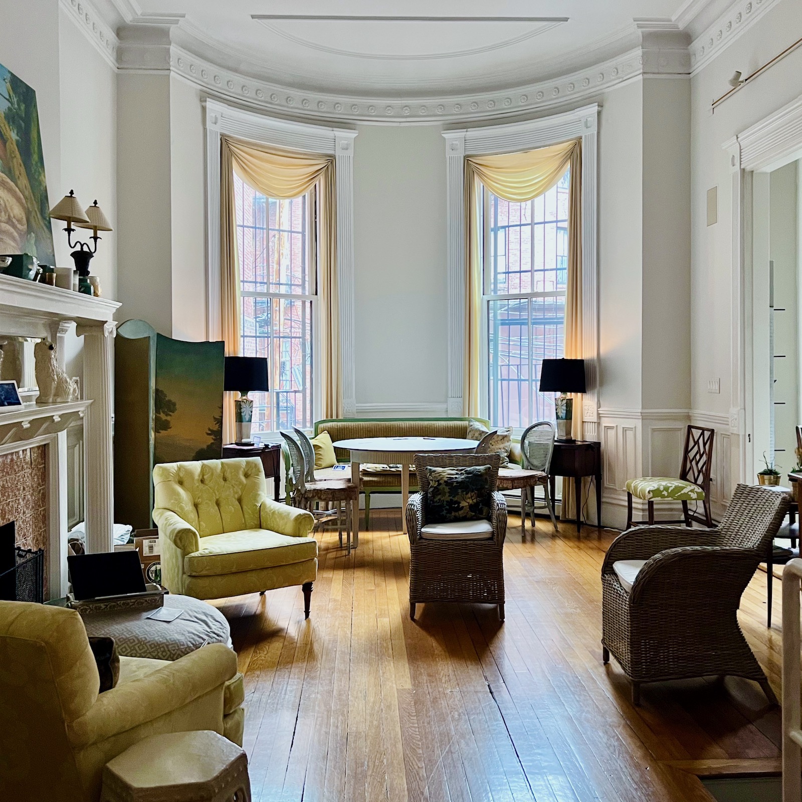
But, sometimes, it looks like a dirty shade of white.
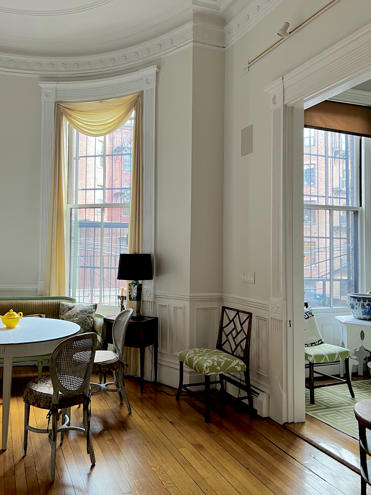
I took the above image this afternoon. It was slightly overcast outside. Sorry about the brown shade in the den. Fortunately, it’s way above eye level.
Okay, let’s move on with more of the best warm gray paint colors.
The colors below are NOT necessarily what the room was painted.
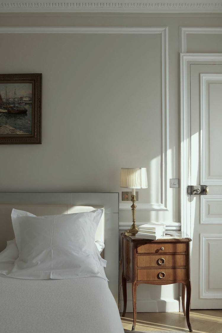
PALE OAK OC-20
Benjamin Moore Pale oak is a true greige. Again, I’ve never used it, but it’s one of Candace Olsen’s favorite colors. ’nuff said.
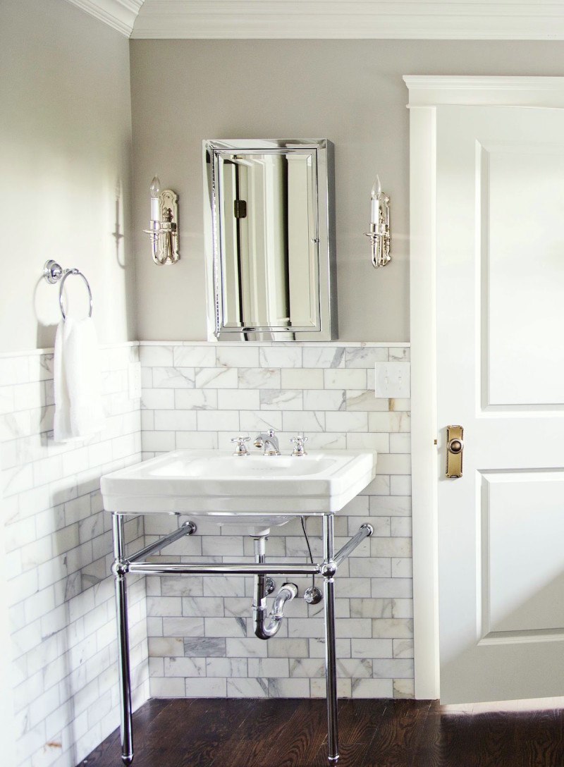
Pale Oak again in a bathroom with a deep red mahogany floor. The marble looks to be calacatta gold or something of that ilk. By the way, for those of you who know how I feel about a lot, not all, but a lot of shows on HGTV, their website is like a completely different company! It’s terrific!
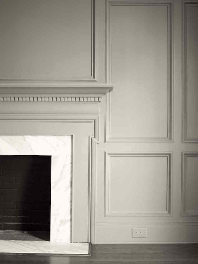
The source of this image is unknown.
These two images show one of the most popular warm greige paint colors of the last 15 years or so.
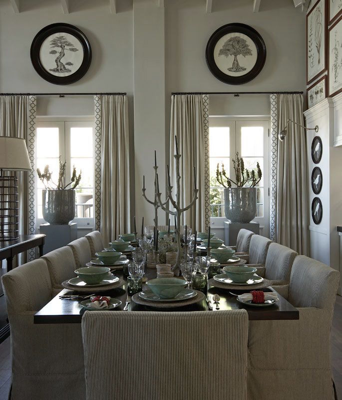
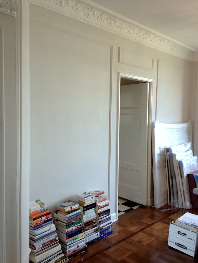
REVERE PEWTER HC-172
This is an exceedingly popular color that changes considerably with the light.
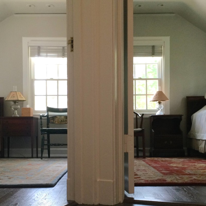
Years ago, clients painted two small bedrooms side-by-side and both Benjamin Moore Revere Pewter. The room on the left is south facing, and the room on the right is north facing. I love the color in the north-facing bedroom.
For more about north-facing paint colors, please go here.
EDGECOMB GRAY HC-173
Alright. I must admit I was a bit on the fence about this color. Sorry, but on the chip, I think it looks like cat puke. However…………………. I researched this one until the cats came home and could not find anyone who had anything but the most glowing love for this color. Anyone? Any experience?
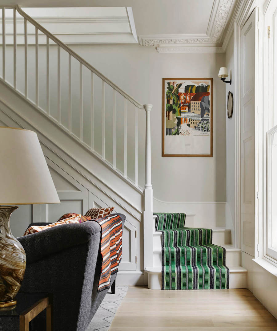
But good case in point. The chip is only a SUGGESTION. AND… never, but never look at a color horizontally. It’s going up vertically (unless, of course, duh, the ceiling), and you must stick the chip flat against the wall! For more tips on how to get the color right the first time, please look here.
I don’t know what shade of warm gray Ben used, but it resembles Edgecomb Gray.
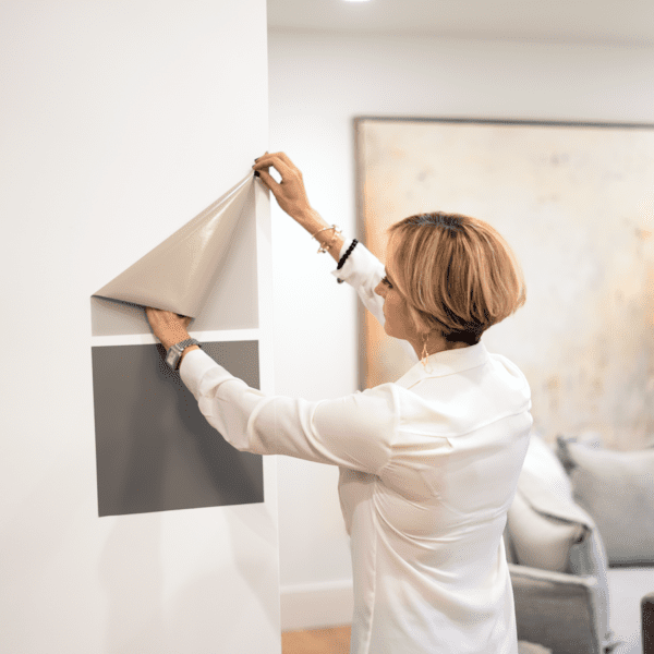
And, I recommend getting the Samplize paint samples made with real paint.
You can reposition them over and over. There’s no mess to clean up or paint all over your walls. (and clothes) It’s a brilliant product developed by an interior designer.
You can purchase your Samplize samples online here.
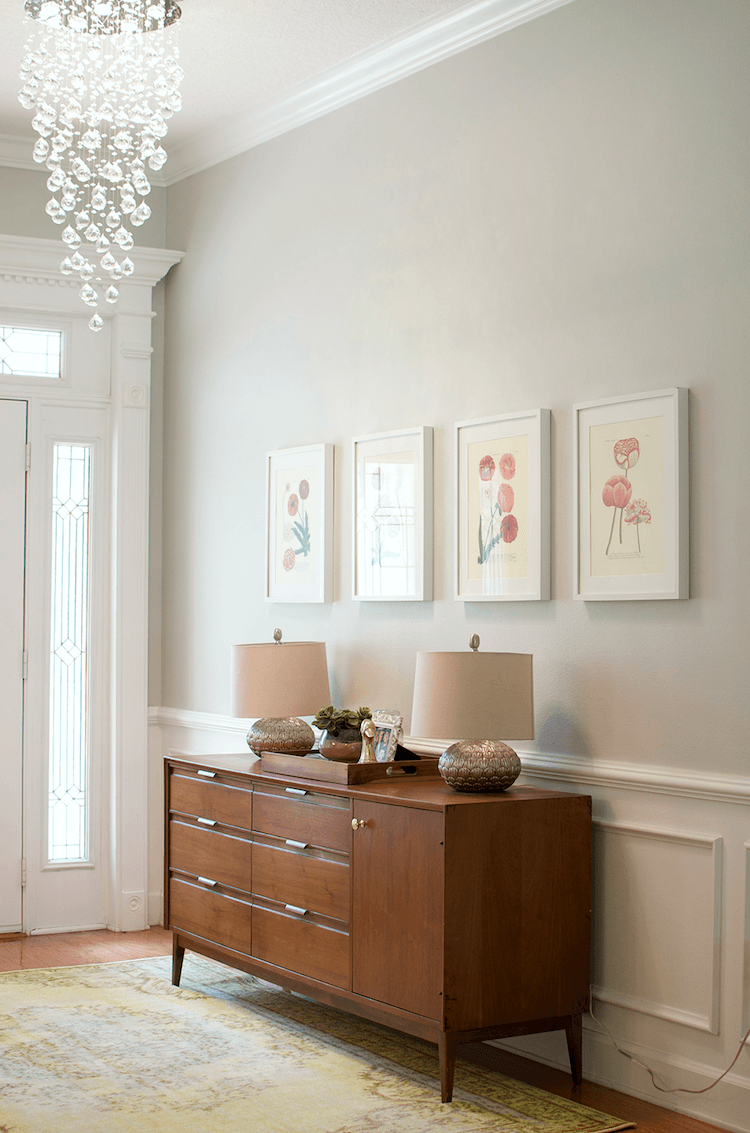
BALBOA MIST 1549
It is a touch deeper than Classic Gray. So, if you need something deeper, this might do the trick. I used it in a large contemporary home several years ago, which was lovely.
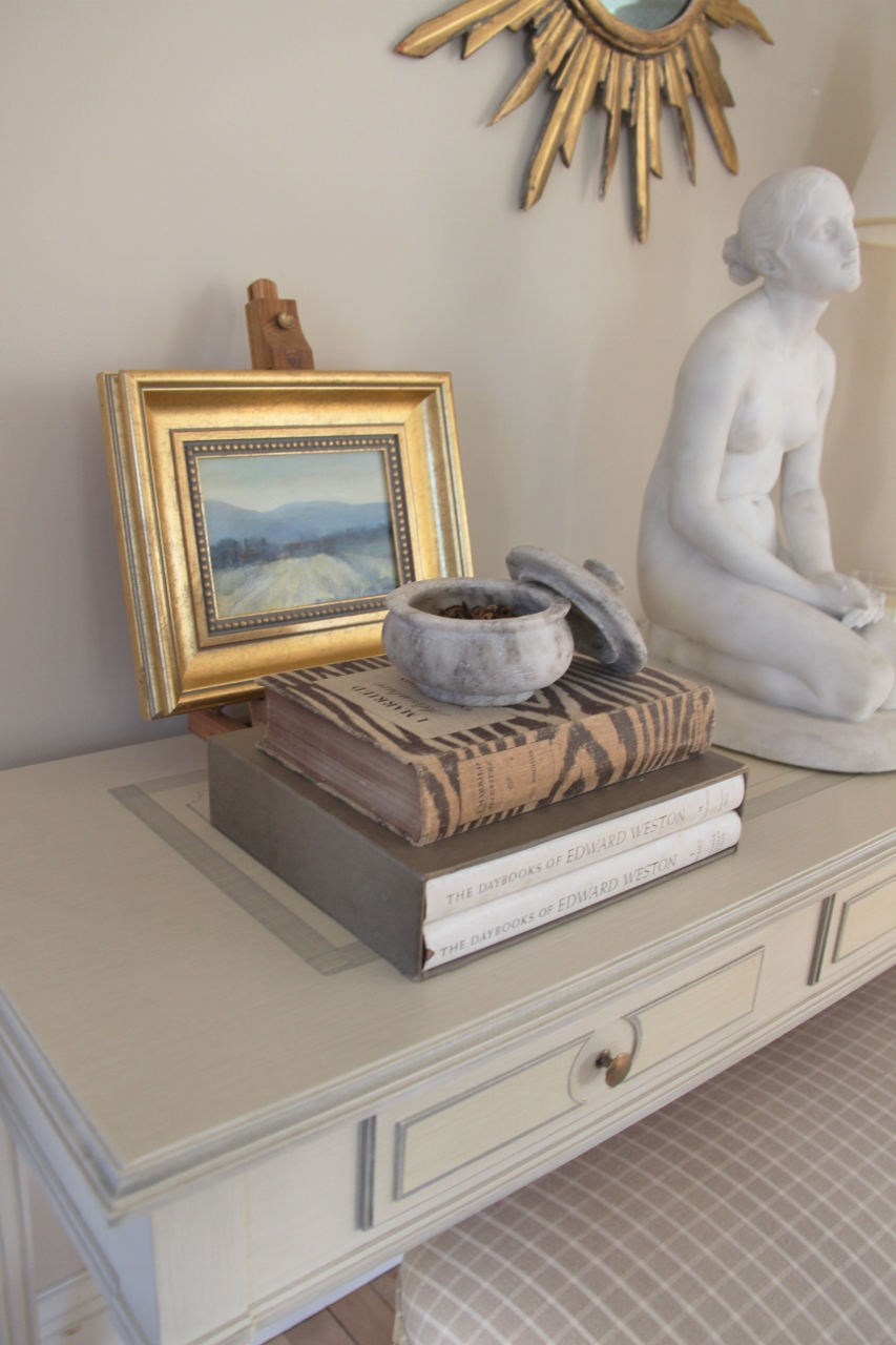
COLLINGWOOD 859
Above is an image by Phyllis Higgerson of the Henhurst Blog. I don’t see her blog any longer, however.
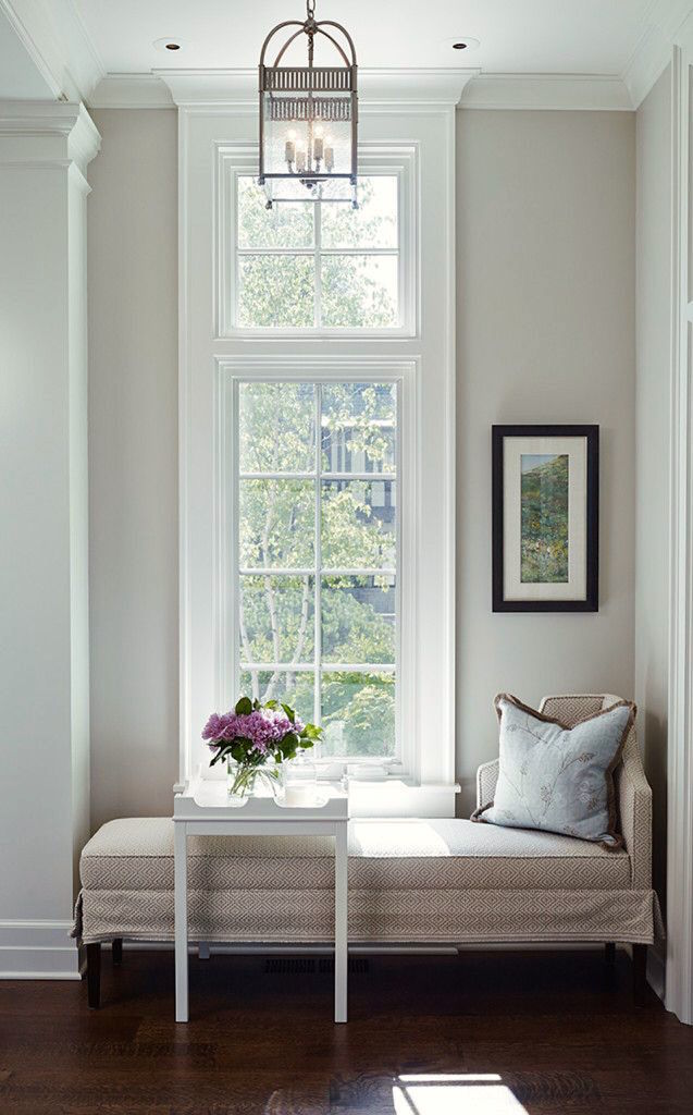
ABALONE 2108-60
I used Benjamin Moore Abalone years ago in a lovely lake home in northern Westchester County. There is a very subtle undertone of violet, but there’s enough brown and gray to keep it from ever looking purple. It’s a very lovely color. I highly recommend it.
CHELSEA GRAY hc-168
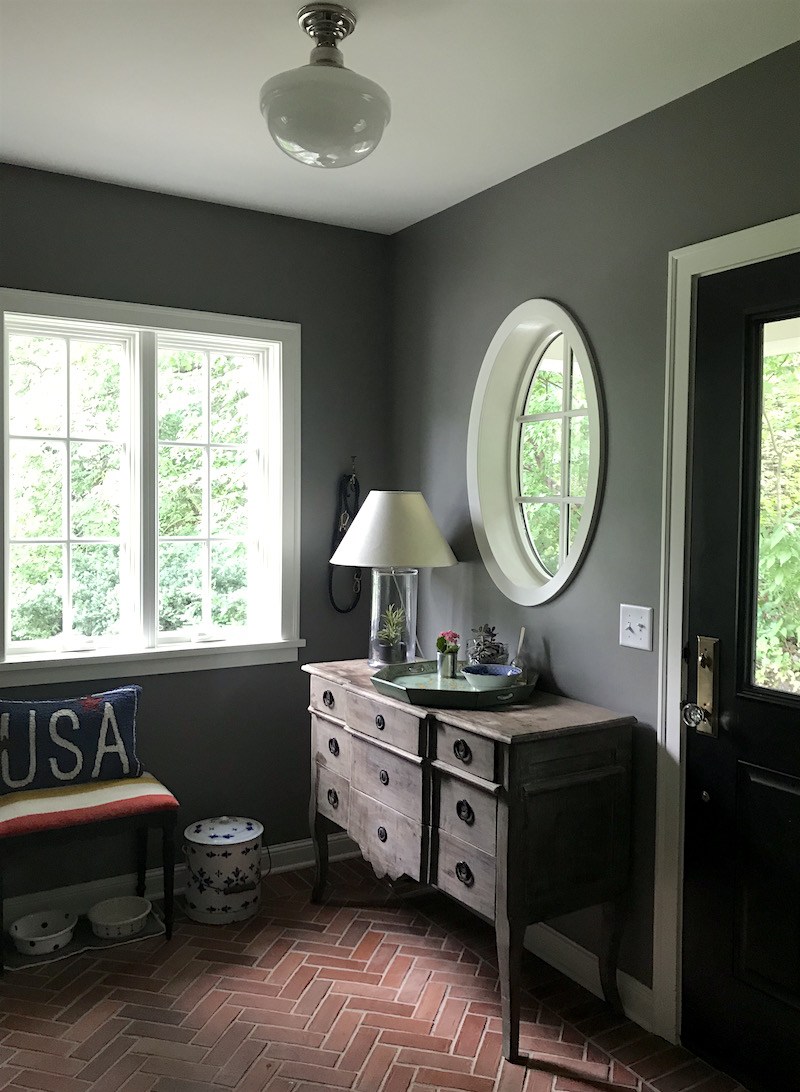
Above is a mudroom by this lovely reader from a few years ago.
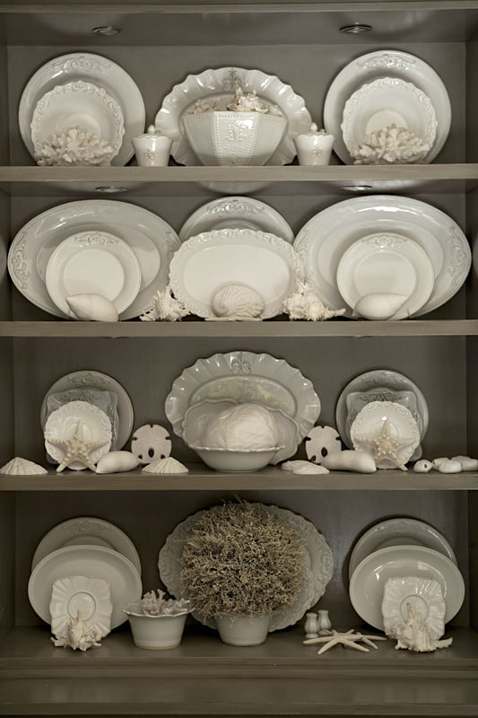
John Jacob
GRAY MOUNTAIN – 1462
I was intrigued by this rich, deep, slightly chocolatey gray with purple undertones. I almost repainted my bedroom this color, but I went with Tropical Dusk, which was very nice but more purple.
This is a wonderful color. I’ve seen it twice and loved it both times. It’s a classic, warm deep gray with enough brown in it, yet you wouldn’t call it charcoal or brown.
Now, for the special treat.
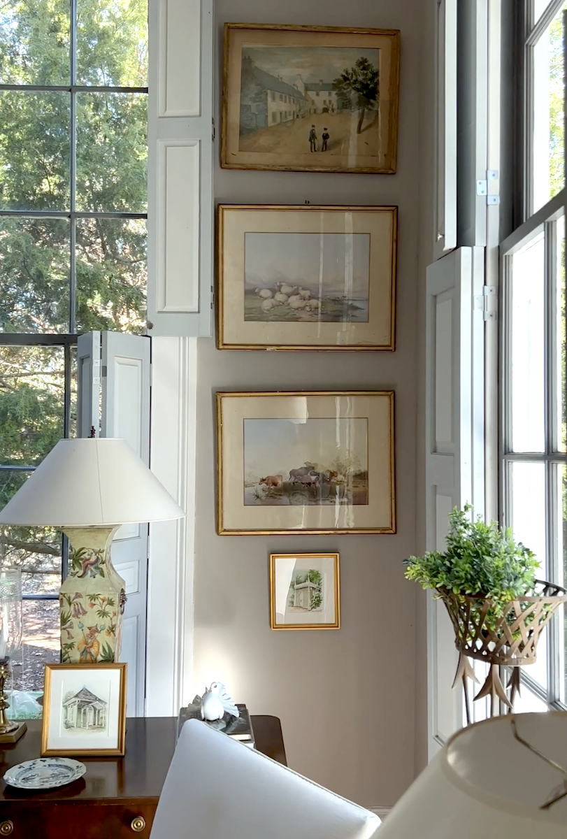
Look familiar yet?
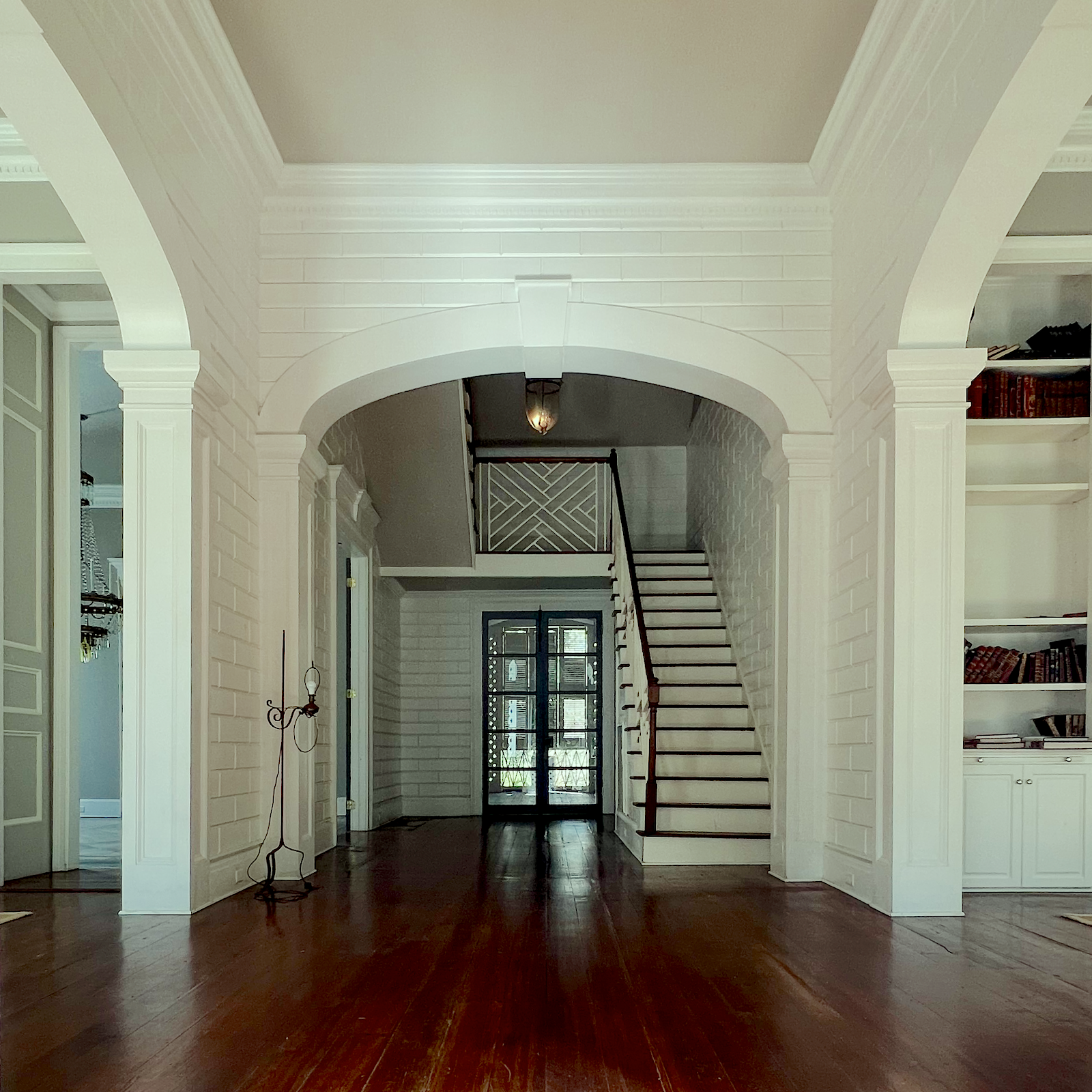
Yes, it’s Furlow Gatewood’s gorgeous home sans furniture. I know. It’s surreal and sad seeing the empty rooms. However, it also gives us a chance to learn a powerful lesson. The wall color is not the most important element. First is the architecture, and then, the furnishings.
So, if you paint a room and hate it before the furnishings are back in, it might be a fantastic color!
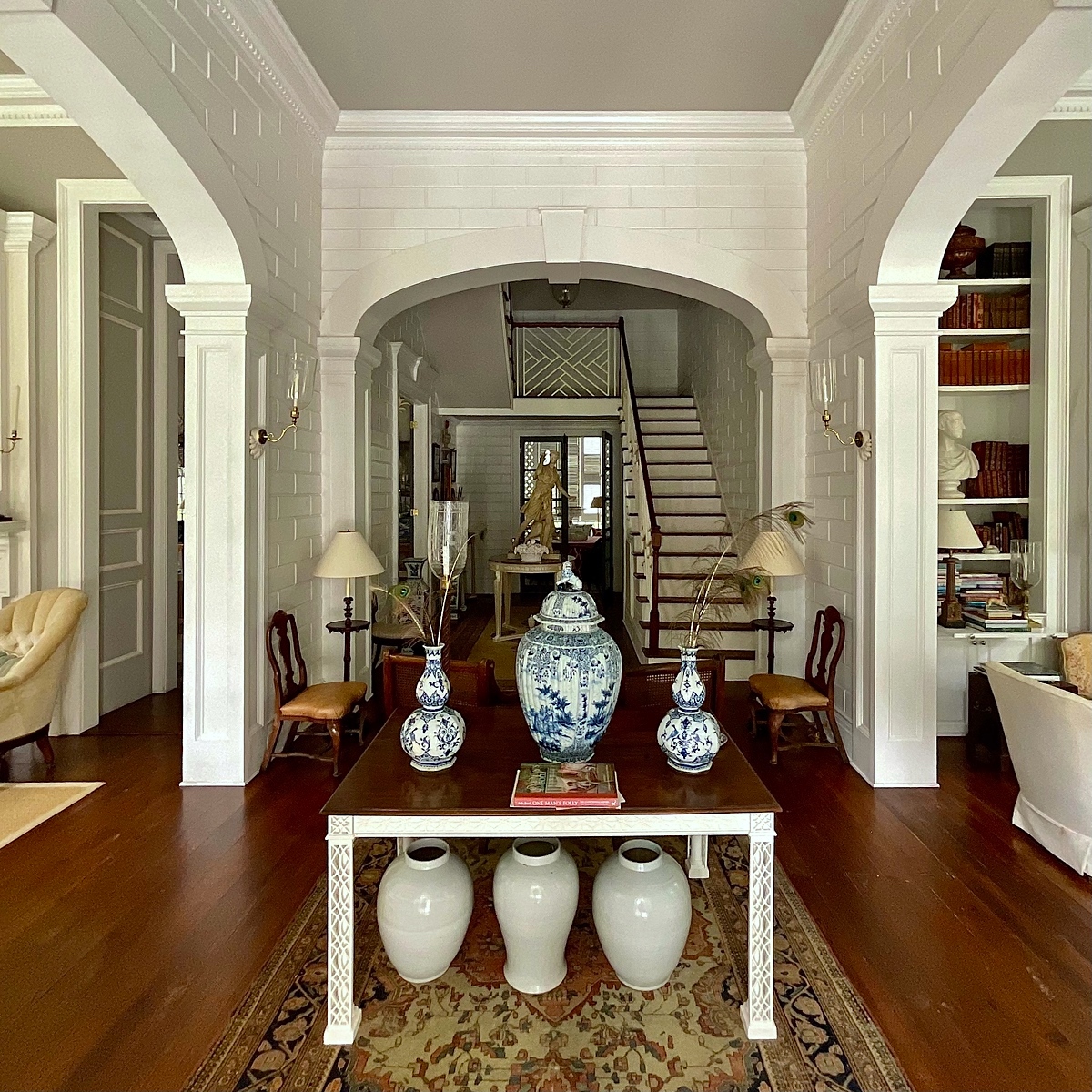
Here it is as it was a few months ago. I noticed for the first time that he painted the ceilings the same as the walls. This actually makes the ceiling seem even higher.
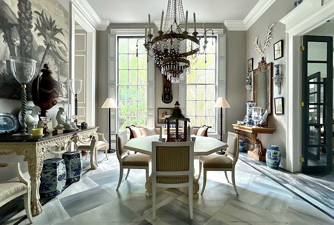
Remember this incredibly lovely dining room?
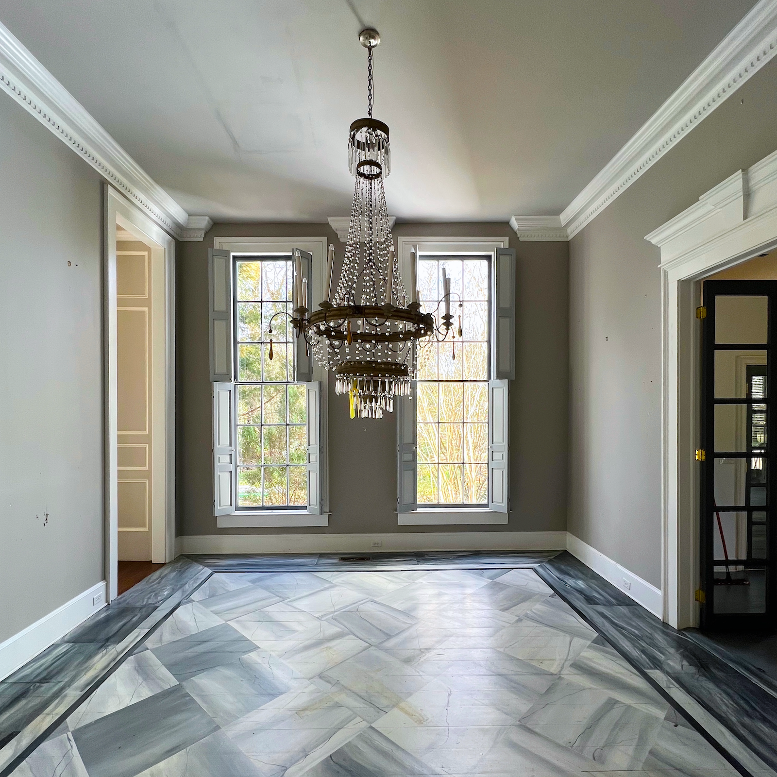
I know. Holy crap is right! There is so much I find interesting. One, is the loss of scale. These are very high ceilings. I believe they’re at least 14 feet, maybe more.
The other thing is the cold, charcoal-gray floor against the warm, medium-gray walls.
Doesn’t it clash, Laurel?
Yes, it does!
And, that’s what makes it so wonderful in the finished room. THIS was Furlow Gatewood’s incredible genius. Remember when we talked about visual tension in interiors? This is a superb example of it. If you imagine using another warm gray on the floor, it wouldn’t be bad, but it wouldn’t have this space’s interest.
Sorry, I thought I had a color for the floor, but it’ll have to wait until tomorrow because it’s dark now.
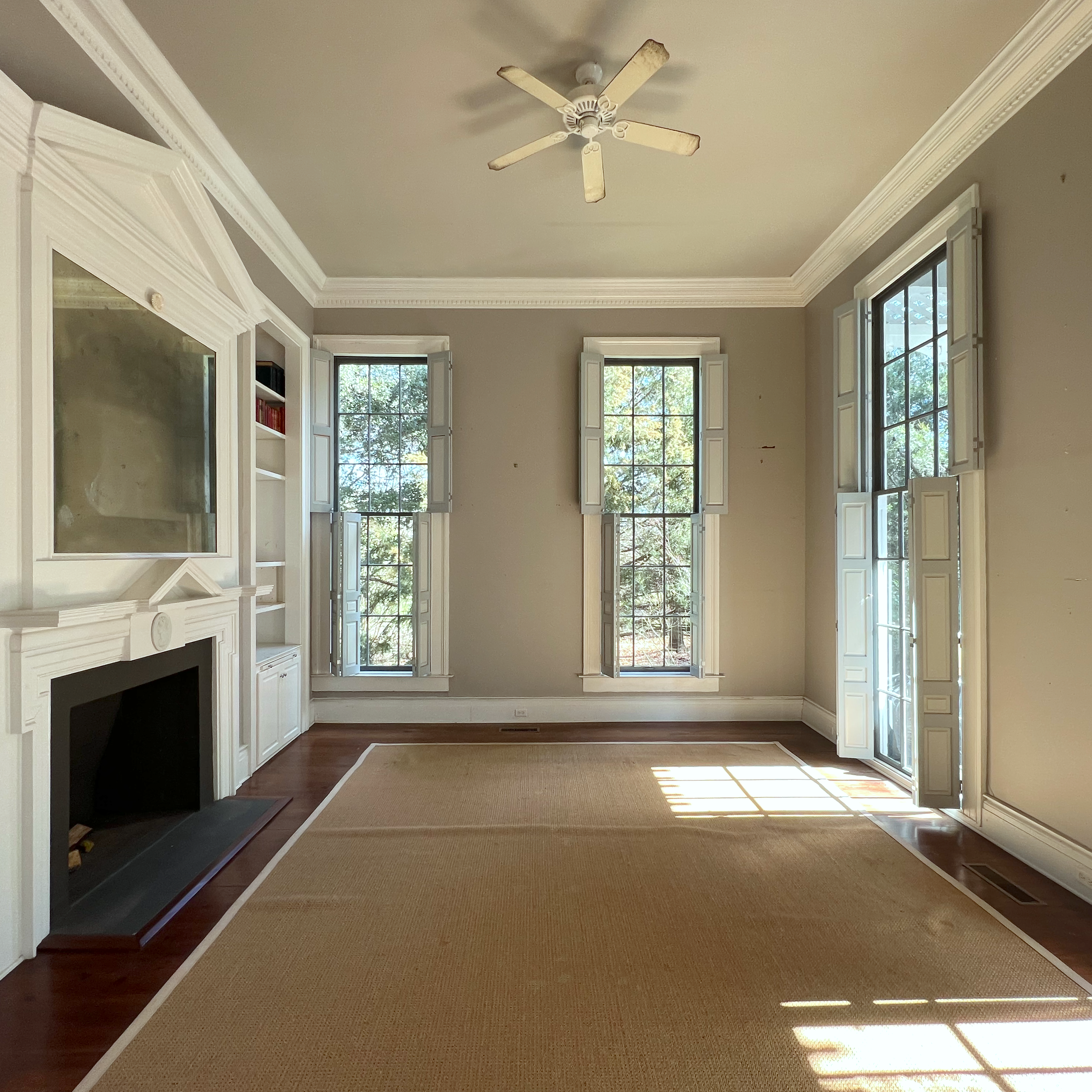
Again the scale is lost in one of the front-facing twin parlors.
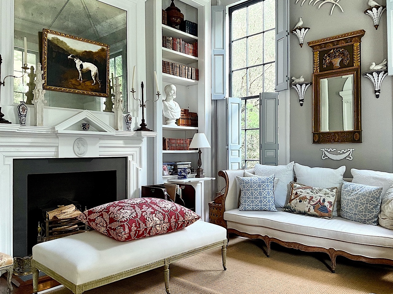
Furlow never changed the furniture scale to match the room’s scale. Like I always say. The furniture is for the people, and we don’t change size all that much. (except in December) :]
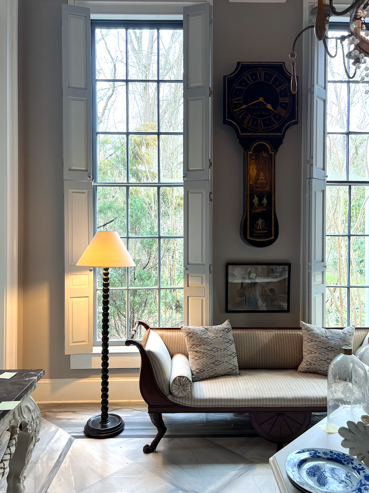
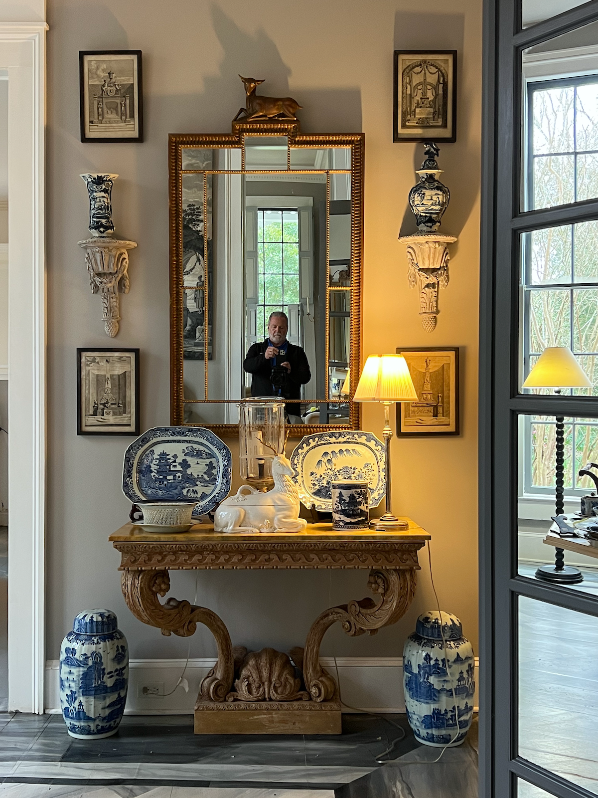
A moody vignette in the dining room. Rod Collins is such a talented photographer.
And, here he is, in the reflection. By the way, you can see hundreds of other photos of Furlow’s homes over the years taken by Rod Collins on his Smug-mug. Not only are there photos, but there are videos of the houses and also some with Furlow from a couple of years ago.
I purchased an entire folder of images for only $100.
I wish all photographers offered that. But, they don’t. Some of you may recall that Rod is also the photographer that took the gorgeous images of Iris Court, the exquisite Antebellum property in southern Georgia.
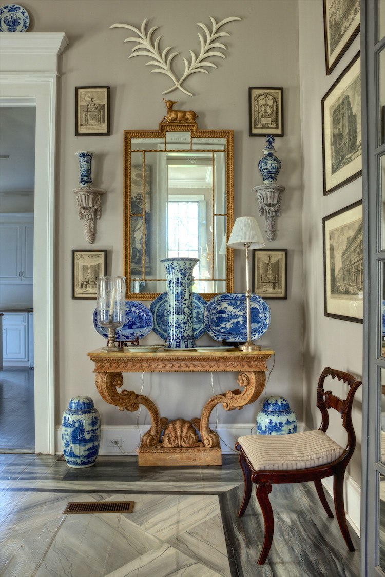
A much earlier image of the same vignette
Laurel, is Furlow’s wall color one of the warm gray paint colors on the list?
Yes, it is, and thanks to fabulous Nancy Keyes, who shared the answer years ago, I can tell you that it’s Benjamin Moore Fusion AF-675 from the Affinity fan deck. If you see a lavender undertone in some images, it’s because there is. But, if you’re in certain lighting situations where everything looks green, the lavender might not come out.

FUSION AF-675

Coincidentally, a color in the Laurel Home Paint Collection called STORMY MONDAY 2112-50 is very close, just a touch lighter.
It’s funny how many times I’ve featured another color and then realized it was the twin of one of the colors I obsessively selected for the Laurel Home Paint and Palette Collection. You can see one such post here with last fall’s newest Farrow & Ball colors.
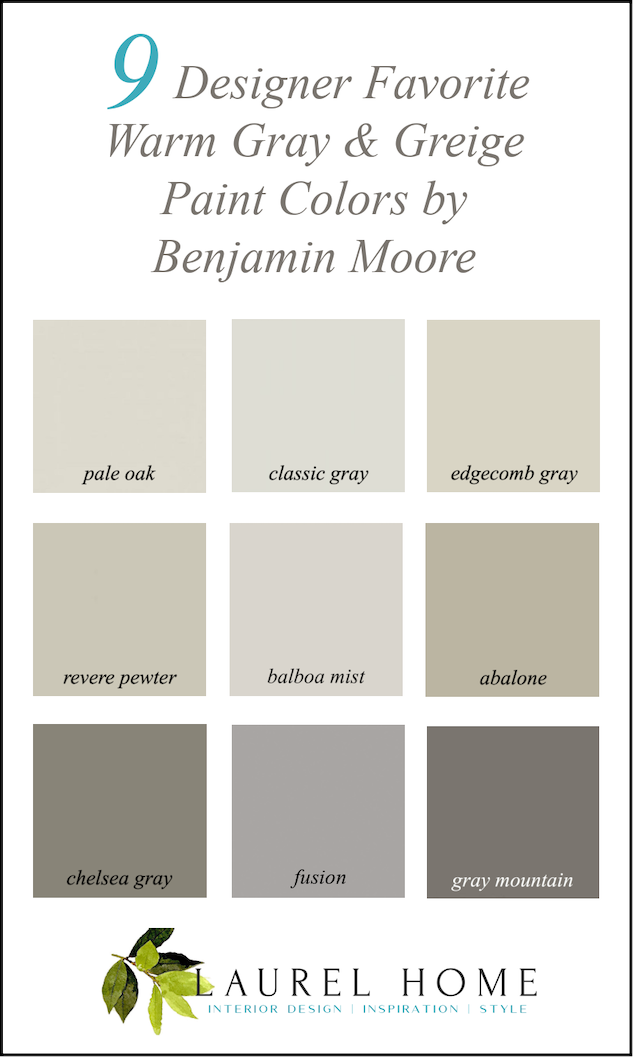
Above is a graphic of the Benjamin Moore Warm Paint Colors for your Pinterest boards
For more helpful wall paint info, please click on the following links.
The perfect white trim color for your warm gray paint color
There are also some terrific gray paint colors in this post asking the question. Can You Use Gray Paint in a North-facing Room?
Please click here if you missed the Benjamin Moore cool gray paint colors.
Do you still hate gray wall colors? I didn’t even get to the dozens of designers who often use gray and do so beautifully.
xo,

PS: Please check out the newly updated HOT SALES!
***And, also, thank you so much to those who are clicking on this Amazon Link.
All you need to do is click it and forget about it. If you place an order within the next 24 hours, I will make a small commission at no extra charge to you. If you don’t purchase anything, that’s okay too. But, your clicking the link helps support me, (and my face cream addiction) and this website that is expensive to run. Thank you so much!
Related Posts
 A Virtual Kitchen Design And The Results Are Stunning!
 Should You Embrace the Dark Side of Wood Floors?-Part II
 Important Information Labor Day 2018 (you won’t want to miss)
 Merry Christmas 2023! + Happy 3-Year Bostonversary!
 A New Career? | interior photography tips!
 A Gorgeous Modern Rental Home With A Tacky Kitchen
 Must A House’s Architecture Dictate Your Design Style?


