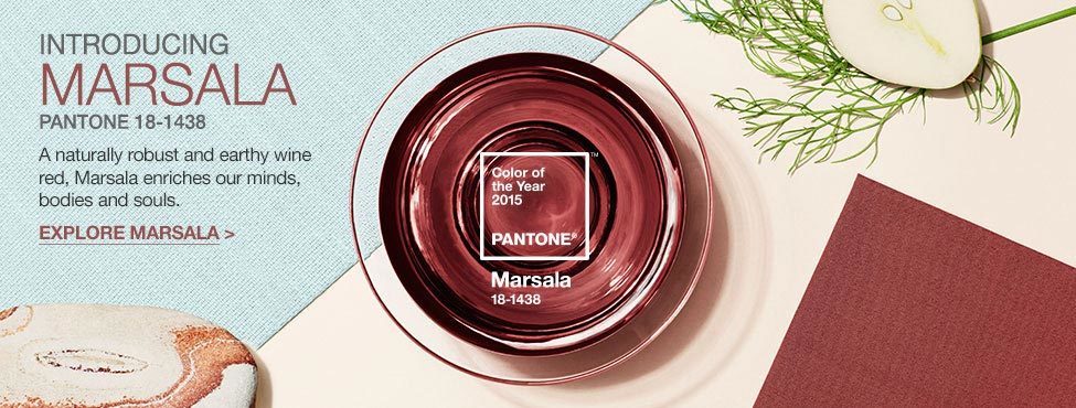
For those of you who follow this stuff, you may have heard in recent news that the Pantone Color of the Year 2015 is #18-1438 AKA:
Marsala
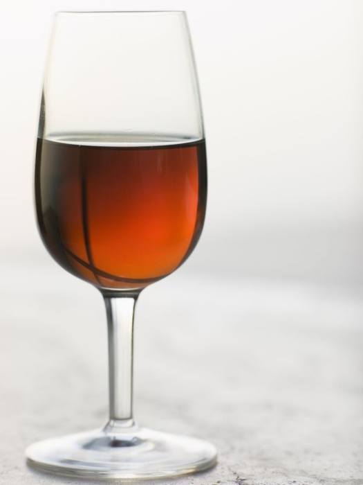
As in Marsala Wine which is generally used for cooking. [not to be confused with chicken tika masala which is something entirely different]
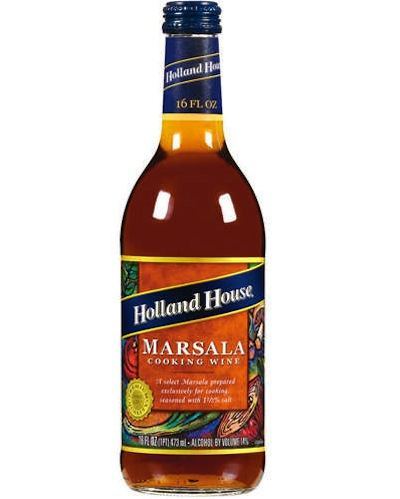
This brand is sold at Walmart and that is a fitting place to find cheap cooking wine and a color that is desperately trying to be sophisticated but falls short of the mark, in my opinion.
Lee Eiseman, the executive director of the Pantone Color System had this to say:
The color for 2015? The charismatic and highly varietal shade of Marsala; a tasteful hue that embodies the satisfying richness of a fulfilling meal, while its grounding red-brown roots emanate a sophisticated, natural earthiness. Complex and full-bodied, this hearty, yet stylish tone is universally appealing; translating easily to fashion, beauty, industrial design, home furnishings and interiors.
Fulfilling meal?
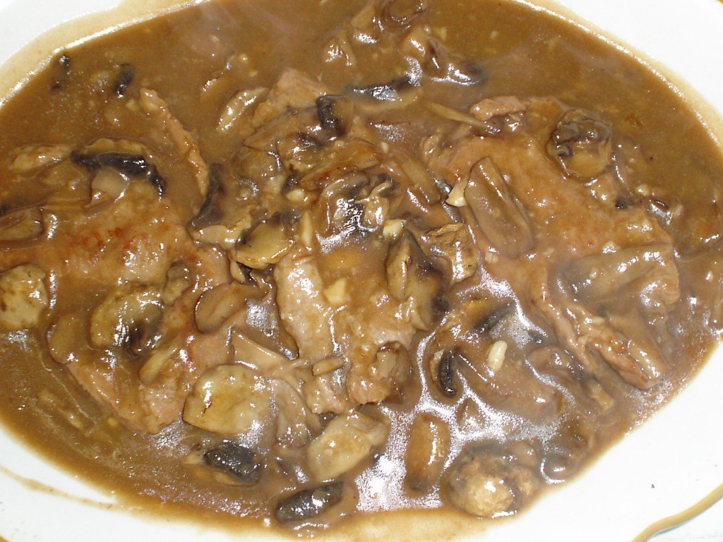
I guess it turns golden brown when you cook with it.
Hey, she can say anything she likes, it doesn’t change the fact that Pantone’s color of the year 2015 is pretty much a dud with some exceptions that I’ll get to in a sec.

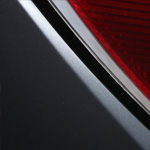
Here’s a big sample of the Pantone color of the year 2015. It’s not brown nor red, nor maroon, nor rust. It’s bordering on mauve, but just a tad too sticky. For certain skin tones, it would make a nice lipstick color..
Here are some P R shots from Pantone’s campaign.
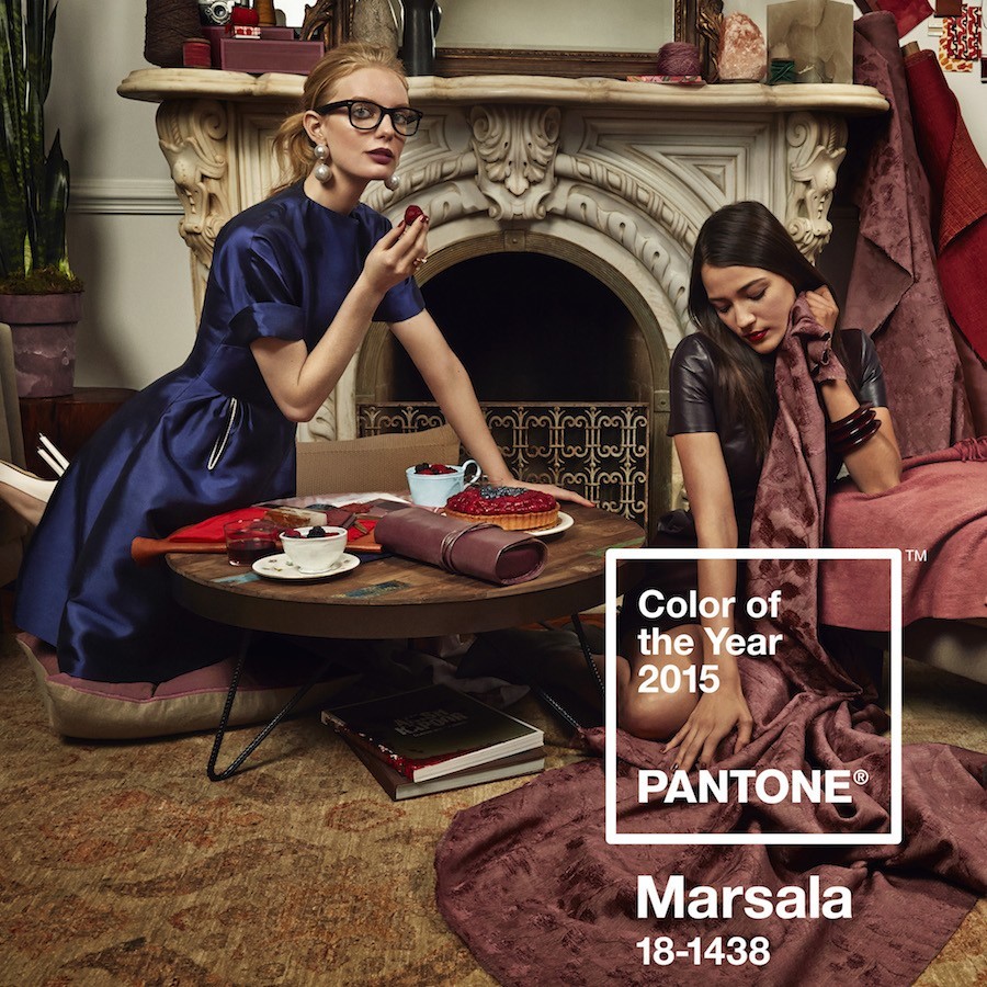
Undoubtedly, the stylist was pulling out her hair trying to make this work. Hey, maybe if we put the model in a stunning blue dress with nerdy glasses, no one will notice how barfola the pantone color of the year really is???
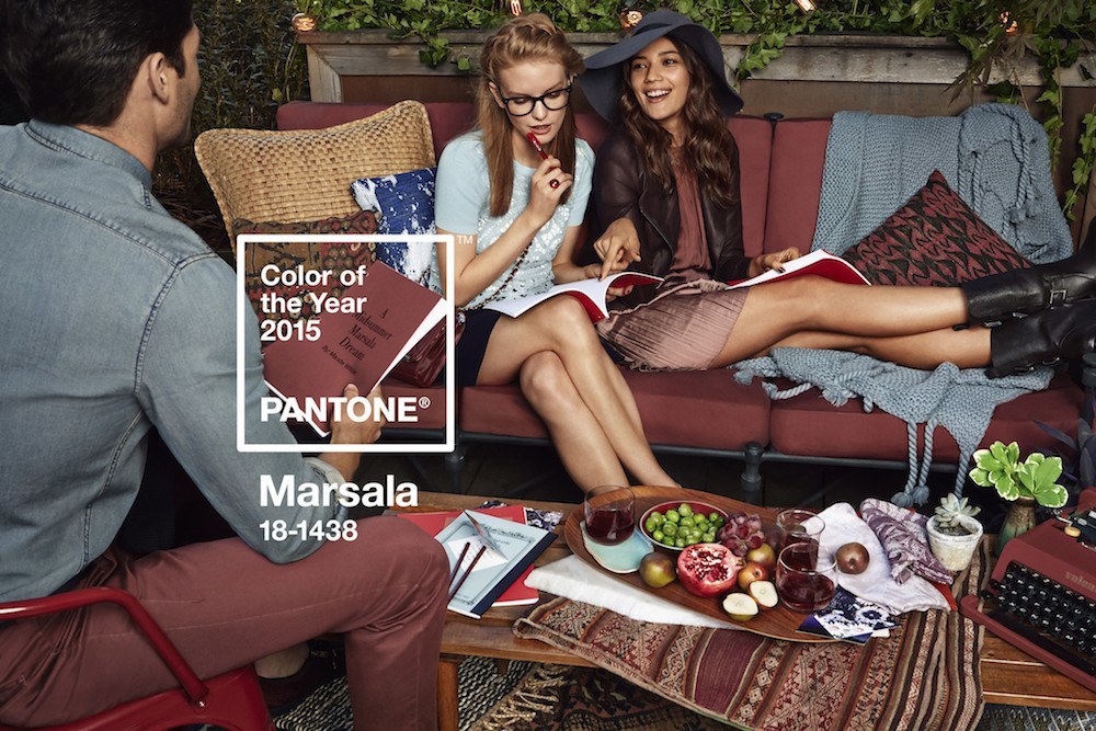
youth sells
[and Marsala does NOT pair well with the icey gray-blue! Not unless there are lots and lots of greens, chartreuse, gold, or yellow to balance it out!]
 so does sex.
However, this color is not sexy. That is unless you get off on having salami colored walls.
I’ve only been looking at it for about 3 days, but this color already looks tired, cold and dated even before the ink dried on the press release.
There’s another problem. There seem to be multitudinous variations of the “color.” And they are NOT Pantone’s color. I wish they were but they’re not.
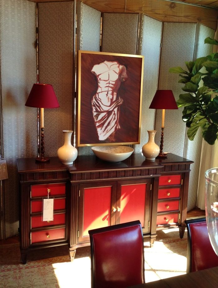
Here’s one room that is the correct color.
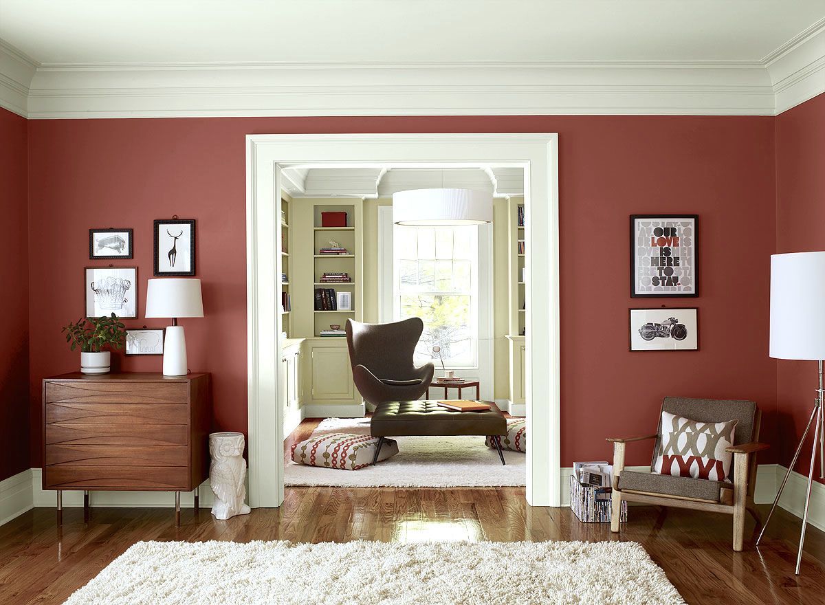
Uplifting— not. Thank God for the celery green in the next room. That is the only thing that saves this color from bungee jumping itself off a steep cliff with a rubber band.
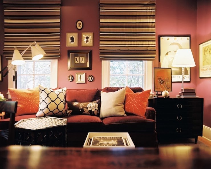
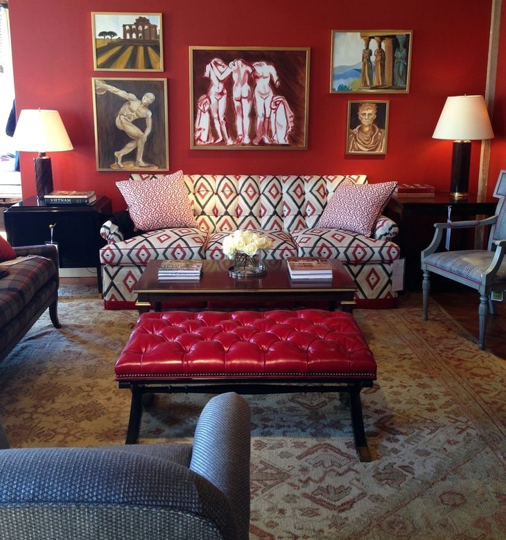
This is better, but made so because of the addition of the deep aubergine and red tones.
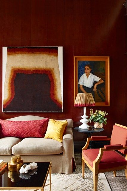
This rich aubergine wall color is being called Marsala, but unfortunately, it’s not. If it was… I would say that this is a pretty awesome color. It’s deep and rich. Marsala is wussy.

Same deal here. The rich claret reds are gorgeous, but this is NOT Pantone’s Marsala!
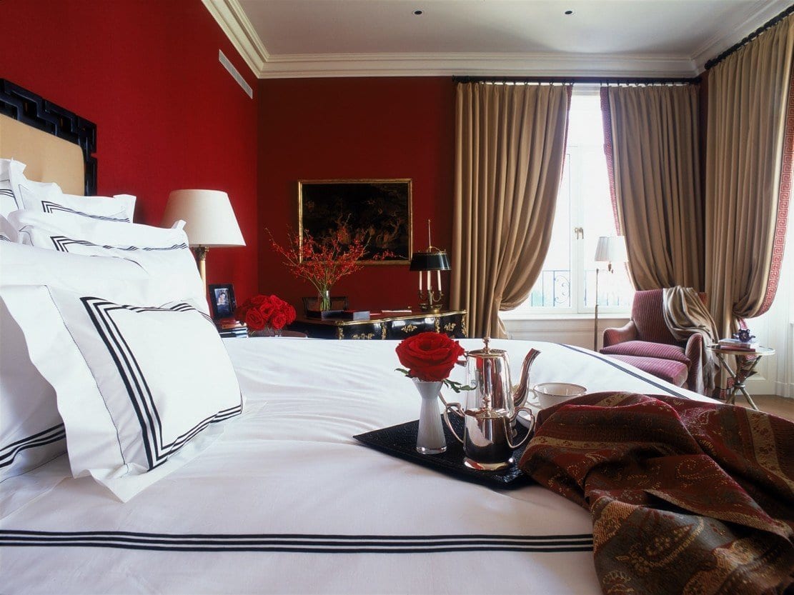
This oxblood red would’ve been a gorgeous color of the year. It reminds me a lot of Alexa Hampton’s work for Hickory Chair at the Fall 2014 High Point Market.
Below are Pantone’s recommended palettes incorporating Marsala.
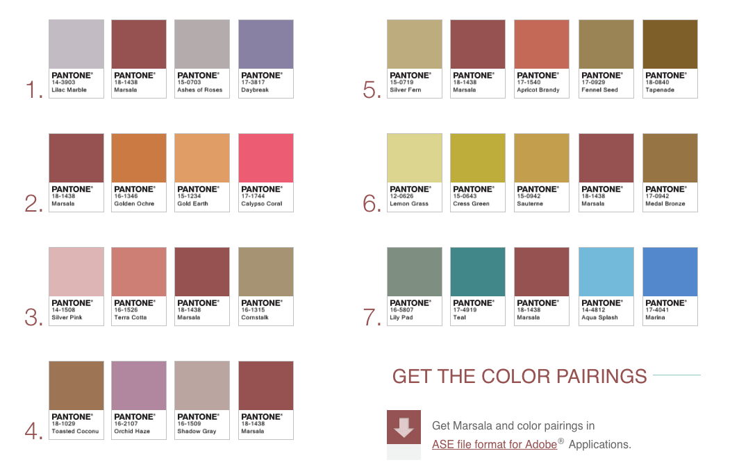
YUCK!!!
Number 7 is shockingly horrific! The only two that I think are on the way to being alright are 5 and 6. However, I think that they still need a shot of a rich red.
Conclusion.
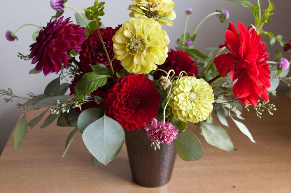
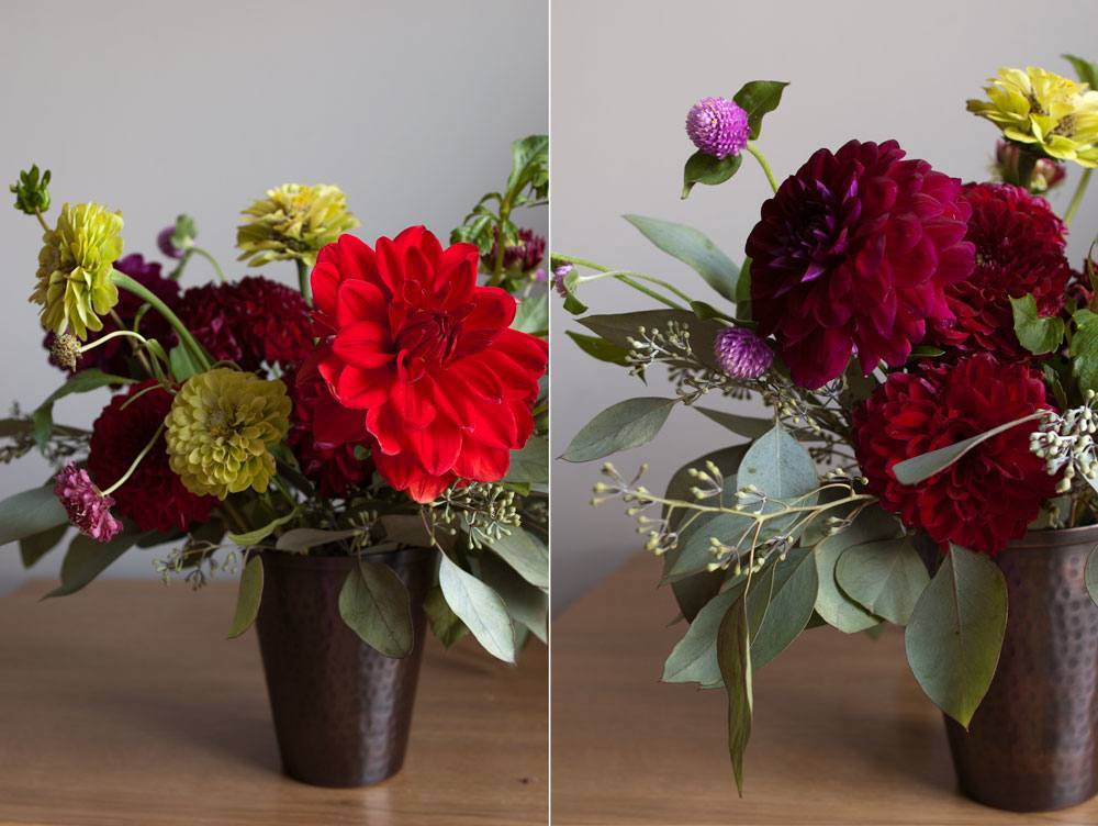
Pantone’s color of the year 2015 is a disappointment. It’s not as bad as last year’s so-called “radiant orchid,” but it needs to be paired with hues that have more chromatic intensity, warmth and saturation to keep the color looking fresh, like the floral arrangements above. Otherwise, it feels too much like a revisit to the late 80’s gray and mauve era. In addition, I don’t think that the “color of the year” should have to work so hard. Therefore, buyer beware! I like the idea of Marsala, but I would’ve gone redder and deeper with the hue and then I think it’s a better color and worthy of the appellation. But that’s only my opinion.
What do y’all think?
xo,
![]()
Related Posts
 Huh? My Interior Designer Fired Me! What Went Wrong?
- Neo-Traditional Interior Design
- The Number One Interior Decorating Dilemma and How to Get Past It!
- Home Staging Ideas You Won’t Hear About on HGTV
- I’m Dreaming of a White {living room}
- 12 Ways HGTV is Misleading Us
- The Trick to Choosing Color Schemes|Analogous Colors