Dear Laurel,
I hired a painter who came highly recommended. He brought over his Benjamin Moore fan decks so that I could select the wall colors. There are over 4,000 colors! I had no idea what would look good. So, figuring that he’s a PAINTER and he does this all the time, I asked him to help me select the wall colors.
Well, my living room is the color of cat puke.
The dining room looks like a hospital bathroom.
The white trim looks gray.
And our master bedroom is purple. I thought that it looked gray on the chip, but no. It’s purple.
How could something as basic as paint turn into such a disaster?
Patty
*********
Hi Patty,
First of all, I’m so sorry for the bad results.
Ya know, when people say, “well, it’s not exactly brain surgery?” [hehehe]
They’re right. It’s not like brain surgery.
It’s worse.
Okay, it’s not a matter of life and death, but it’s not easy picking the perfect colors.
Why is it so difficult to find the perfect wall colors?
There are so many things that can go wrong and here are most of them.
- The room’s natural light. Which direction does it face? Are there lots of trees, buildings or a hill blocking the light?
- Did you consider that light filtering through a lot of green trees will tint your walls green in the summer?
- Did you know that light has different colors at different times of the day? Sunrise and sunset have a yellow light and the clearest whitest light is in the middle of the day. Of course, gray days give off a gray tint.
- Incandescent light gives off a yellowish hue and makes colors blend together. Never choose your wall colors at night. You will have a big surprise come daylight.
- A very common mistake that people make is turning on the lights when selecting a paint color. Even IF it’s a room where the lights will always be on, it is wise to first look at the color with the lights off.
Here are Other Common Mistakes that People Make When Selecting Wall Colors
- Choosing the lightest shade of a desired color thinking that it will be less “intense.” Often, what happens is that they end up with pink, instead of red or a weird shade of beige instead of taupe, or blue instead of gray.
- Choosing a color looking down on a tiny paint chip. This would be like choosing your wedding dress from a tiny 1 x 2 inch sample of the fabric and nothing else. There is so much else going on with color and you need a lot more information before you can make the best selection. The most notable issue is the UNDERTONE color. The undertones are colors that appear when the color is up on the wall. And depending on the lighting may appear or not appear. In addition, in some lights a color could look greenish or the SAME color could look purplish. Same color. Just different walls and lighting. I have seen this time and again. One of the worst situations I ever had was a long living room which had windows facing south and then on the opposite end, they faced north. The client wanted to see a “color” on the walls. We chose a color which because of the lighting went from a warm caramel color to khaki gold-green!
- Putting up several colors on the wall and comparing them side by side. Why is this bad? It’s bad because colors next to each other affect each other. In other words. If you put red and green together— opposites on the color spectrum, the red will make the green look GREENER and vice versa. Therefore, putting a bunch of colors together can sometimes affect how we perceive a color that would not occur otherwise.
- Listening to your mother.
Remember my kitchen gone viral on pinterest? My client and I grappled with the color of the walls. Cream? Gray? Finally, it came to me. They needed to be a deep, rich blue. Sometimes walls will tell you the color they need to be if you listen carefully. :] The client’s mother was horrified by our decision. “oh, the room will look so dark.” “no one paints their kitchen dark blue.” “that’s a big mistake honey.” “who’s this Laurel Bern person?”
:]
Sound familiar? Please don’t listen. My client didn’t and you don’t have to either. [I mean, you can listen, but just say thank you.] :] Mom, as well-meaning as she wants to be usually [I didn’t say always] doesn’t have a clue what she’s talking about when it comes to her progeny. That goes for me too as I’m also a Mom. :]

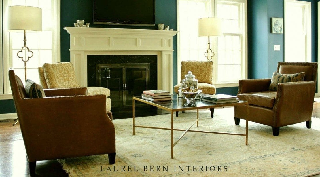

Please notice how the deep blue looks different depending on the lighting. Oh, and you want to know what the colors are? Sure. The walls are BUCKLAND BLUE HC- 151 and the cabinets, mouldings and ceiling are all COTTON BALLS 2145-70. While I will always love White Dove and Cloud White for trim, in the case of a dark, north facing room, Cotton Balls is a sure thing. It’s a very clean, non-gray but still soft white with a touch of cream. It does not go yellow, pink, green or any other color. I’ve used it with pale and dark colors and it always looks great. However, if you want to have a list of my 20 favorite shades of white, please click on the link. [more links at the bottom of the post]
- Choosing a color based on the name. Marketing BS. Yes, some colors with great names like Quiet Moments are wonderful, but others such as Ballet White are not. It should be called Grungy Ballet Floor. I just had an email from someone complaining about French Canvas. She hates it. [I’ve never used it.] Sounds marvelous, doesn’t it? I looked it up. It’s a pale gray with green undertones. If her room faces north, the undertones will not be so under. The color will look very green.
- Choosing a color based on how the color looks in a magazine or online. I always try to color correct. However, I am color-correcting to my monitor which is a PC. On my Iphone, everything looks like it has a yellow film over it! Sometimes I see a blog post with someone’s favorite Benjamin Moore wall colors and a lot of the colors look exactly the same! It’s usually an extremely vague idea of the color.
- Choosing a color in a room already painted a completely different color. If I’m doing a consult , I usually look at the paint chip on top of the white moulding. Another trick is to put up a larger piece of white poster board behind the samples you’re considering. Keep in mind if it’s a particularly bright color already on the walls, it will undoubtedly be coloring the light. In that case, it’s best to take the color in a room with similar natural light, if possible.
Other Problems When Choosing Wall Colors
- I like the color at night but not so much during the day.
Well, if you’re going to be in the room in the day and probably most rooms you will be, you have to decide if you love it enough at night to warrant not liking it during the day, OR reselect something that you like all the time.
- When I put up the samples, I don’t like any of the colors.
Could be you need to rethink the color. Maybe you just think you want a gray room, when really the color that you will love the most is brown or red or some other color.
Here’s What You Need to Do to Get the Wall Colors Right the First Time
- Research. Get online. See what other people are saying about colors. See what the hottest colors are. I am working on a compilation of the best Benjamin Moore Colors. But even with that, it’s not enough because of all of the issues above. Although, the colors that I’m going to select really do look great everywhere.
- After you’ve narrowed down your choices, go to the store and get the paint chips. Do not choose a color in the paint store! Take the paint chips home and paste them on the wall. Move them around the room. Look at them on dark days and at night with the lights on. [If you are in a hurry, you can skip this step and move onto the next one, but you might need to purchase more samples.]
- Narrow down further. Go back to the paint store and purchase samples. Some stores also sell small pieces of sheet rock. This is a great way to make a great paint sample with the actual paint. Some Benjamin Moore wall colors also come as ready-made poster board samples. And others come as small sample sizes of the actual paint that you can use to make your own sample. If you need to make your own, either use the sheet rock or heavy poster board.
- Tape your samples up directly on the wall. Totally vertically and again, FLAT AGAINST the wall. Look at them one at a time. Look at them on all four walls and at different times of the day and night.
- I also recommend only labeling them on the back so that you aren’t swayed by anything but the color.
- And finally. This may sound contradictory, but try not to over think it. Haha! I should talk! But, go with your instinct and please know that all colors are going to change with the time of day, direction the window faces and even the time of year.
If you follow this systematic approach, it will make your decisions so much easier!
Please have a wonderful weekend,
xo,
![]()
ps: If you didn’t notice above, there are many more posts about selecting the best Benjamin Moore paint colors below in the related posts
Related Posts
 14 Common Home Painting Mistakes You Might Be Making
- Here it is! A Palette For No-Fail Paint Colors
- A Secret for Creating A 25 Color Whole House Color Palette
- The Best No Fail Benjamin Moore Gray Bathroom Colors
- Analogous Color Schemes In Interiors – The Right Way
- My Top 20 Best Shades of White Paint
- My North Facing Room Paint Color Is Driving Me Bonkers!