Hi Everyone,
Yes, there’s some dreary decorating going on. Another lovely reader wrote me the other day. Only this time, a dad wrote on behalf of his son and daughter-in-law.
Laurel, what’s the mistake you made regarding the dreary decorating?
I’ll be getting to that.
But, first, I’m going to share what darling Dall had to say.
Hi, Laurel:
I Love the look of your face-lifted website! Geez, that was a lot of work you put into your Bad Florida Architecture post. You offered a plethora of wise advice.
Thanks, Dall!
Okay, I have another one for you. Our son and daughter-in-law have just bought their first house. It’s a 2300 square-foot 1961 bungalow with honey oak floors, low popcorn ceilings, and the typical L-shaped living room/dining room set-up.
It’s definitely a cute starter home.
But get this; as the kids were preparing to move from their apartment, a local major home staging company decided to go out of business and liquidate millions of dollars of high-end furniture at hugely discounted prices. My daughter-in-law and I made several trips to the sale, and she was able to furnish their entire living and dining room house.
This brings me to my point:
The furniture leans towards contemporary with a touch of industrial. Please note the Cisco Brothers reclaimed wood coffee table.
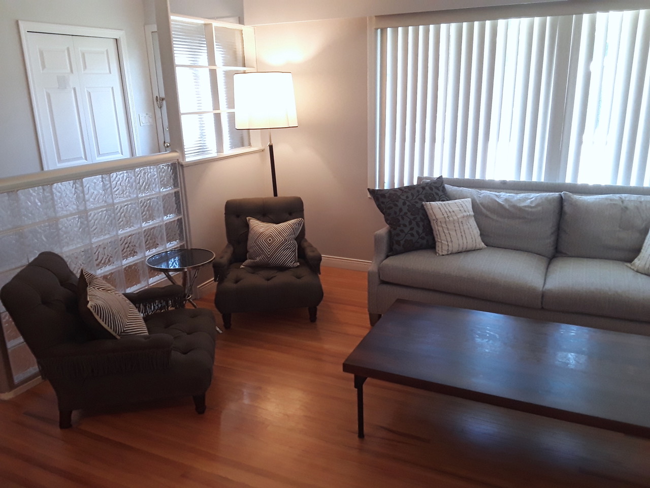
However, there are traditional touches with the Robert Abbey floor lamps, Bernhardt desk with shades of Louis XV, and the accent chairs are eclectic John Derian.
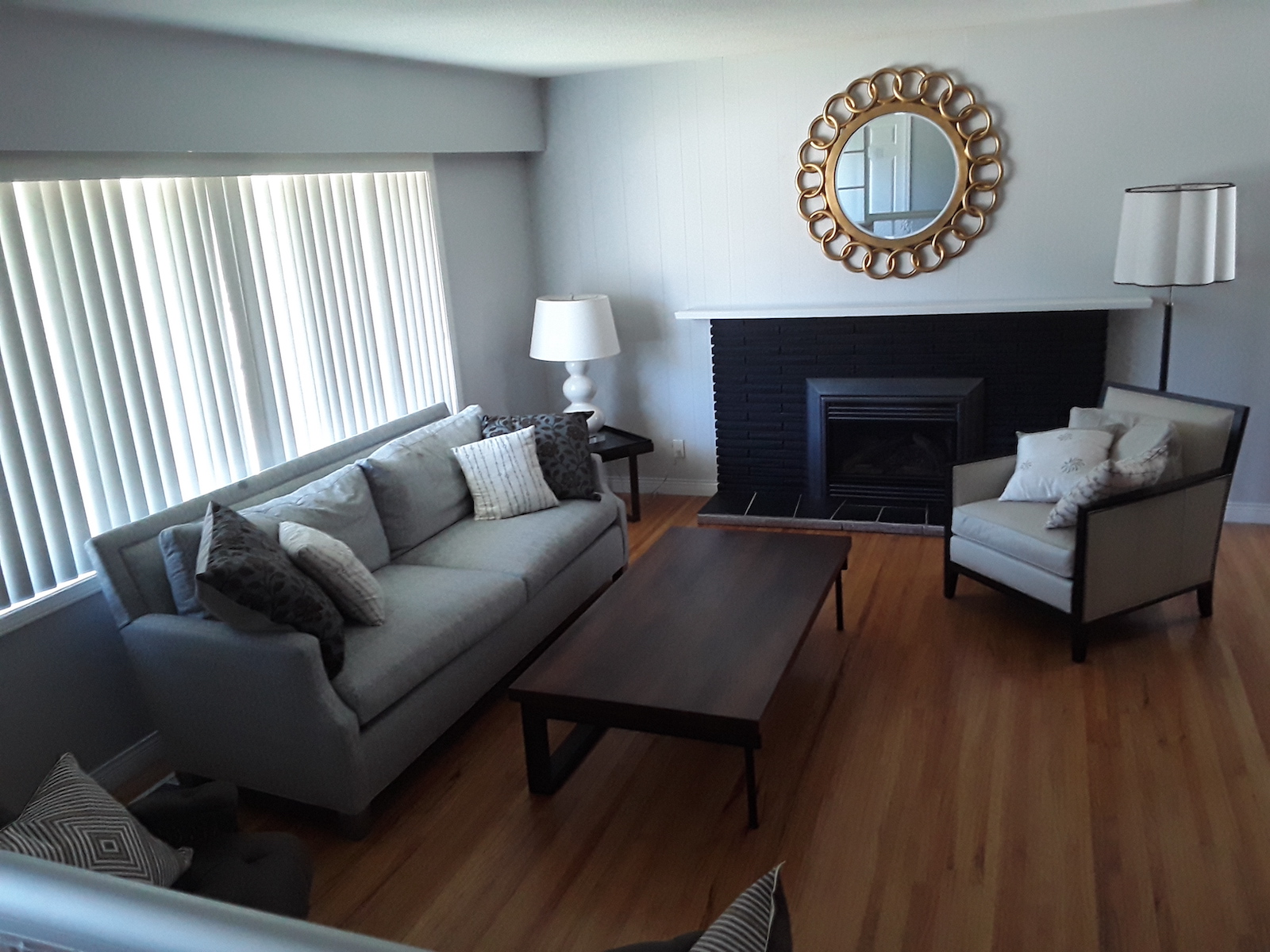
The walls are light grey, and the baseboards are white. The stone fireplace is painted BLACK.
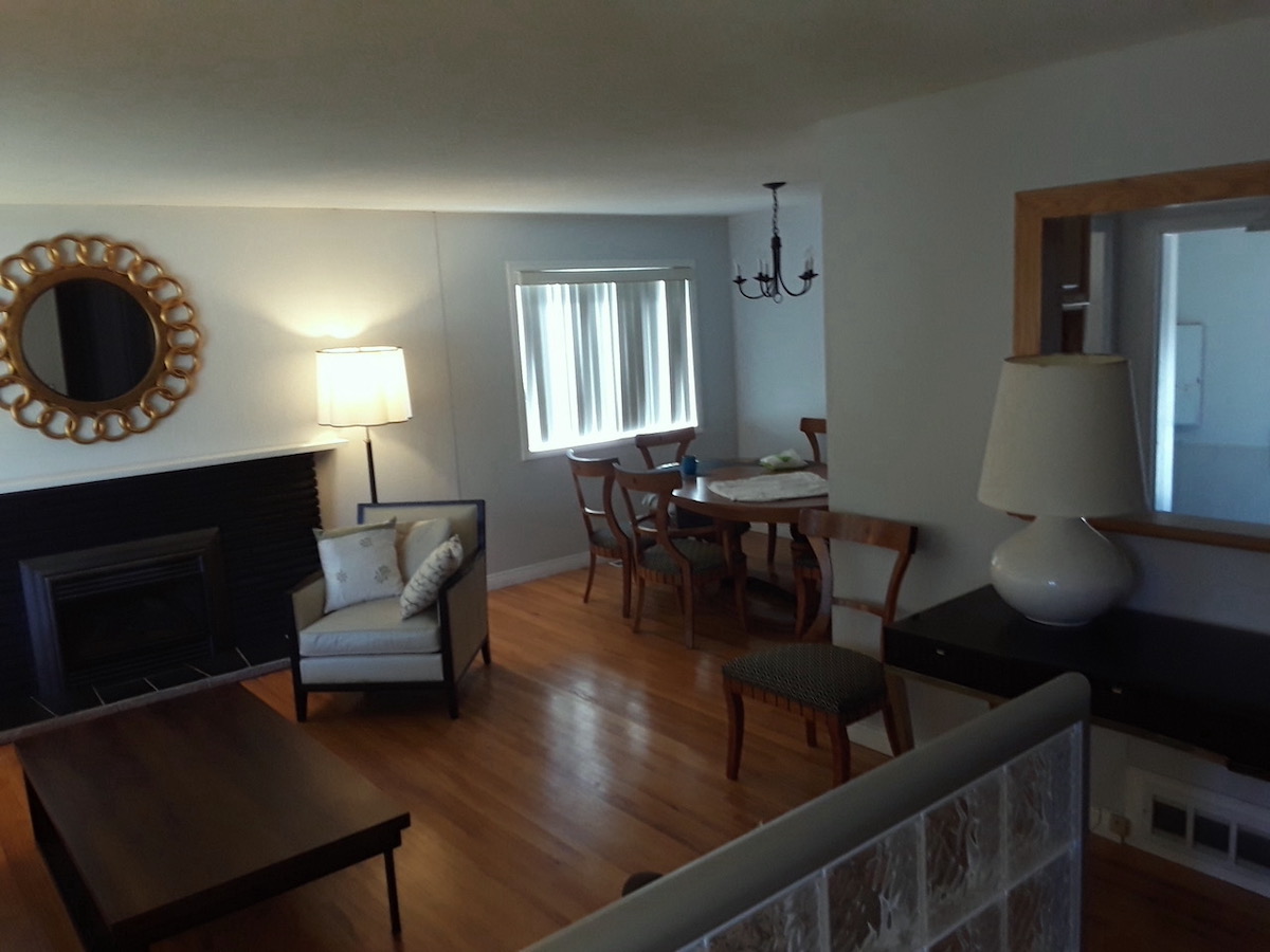
We tried to lighten things up with a gold mirror, light-colored lamps, and upholstery. I think everything suits the house, but it lacks warmth and coziness.
Of course, some decor items would help to alleviate this dreary decorating, but our “kids” are reluctant to add items because they have a kinetic 3-year-old who is faster than a cobra.

Uh-huh… I understand. Above, my boys Cale and Aaron in late 2016 (They were 26 and almost 21.) near where they were raised. I have no idea who the gentleman in the background is.
I wonder whether your readers would be interested in this situation and whether you might wish to address it in a post. I’ve included a bunch of photos.
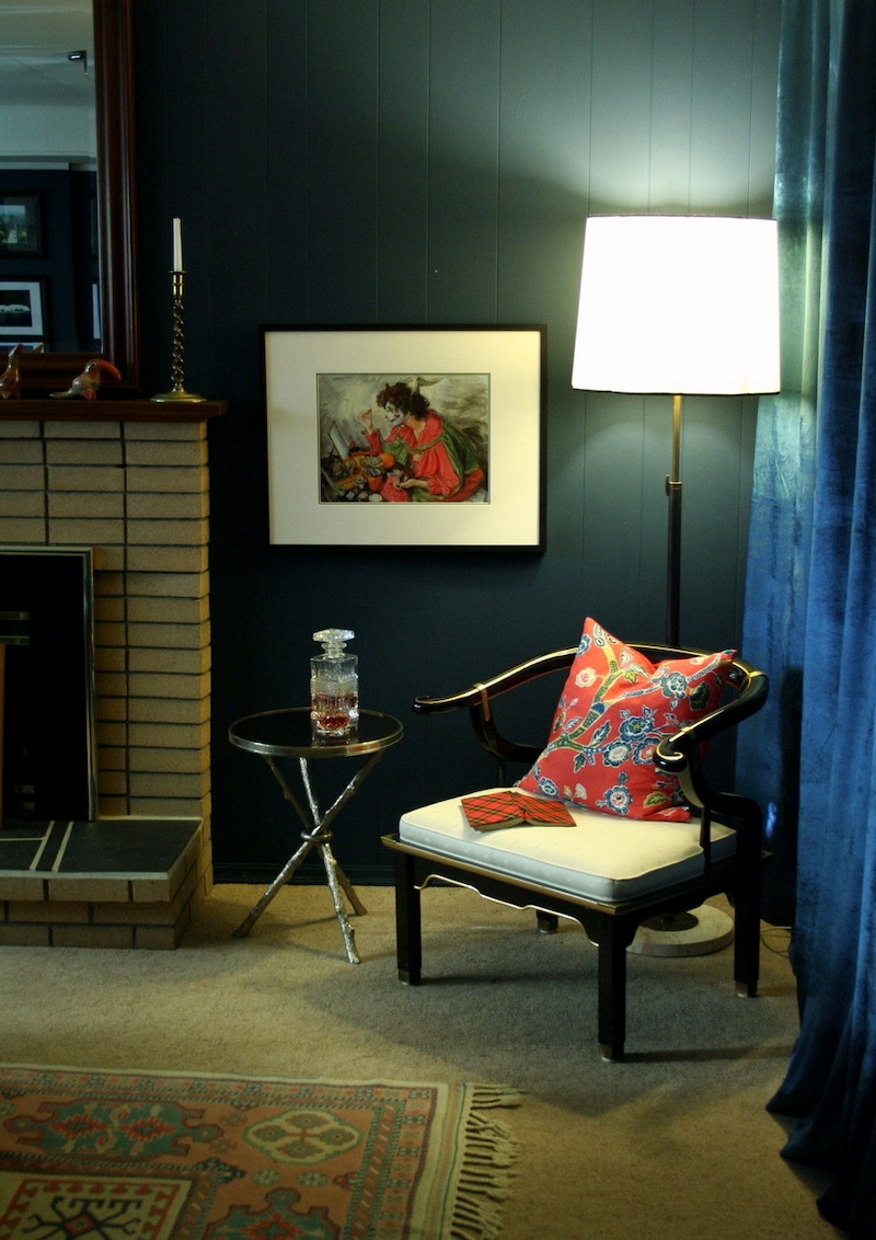
On that subject, I continue to tinker with the “Twilight Room,” having obtained a pair of James Mont-inspired Century Furniture lacquered Chinoiserie chairs, a Global Views “Twig” table, and a brass Robbert Abbey lamp. A vignette photo is below.
Thank you once again!
Sincerely,
Dall
PS: I’ll understand if you can’t do this as a post, but I thought it might be fun.
***
Oh, what a lovely vignette Dall did! I found myself thinking about this challenge.
Right away, I knew that the kids’ room needed a killer rug and probably a much darker wall color.
It reminded me of my Amherst Gray color board; that’s one of 40 palette boards in the Laurel Home Paint and Palette Collection.
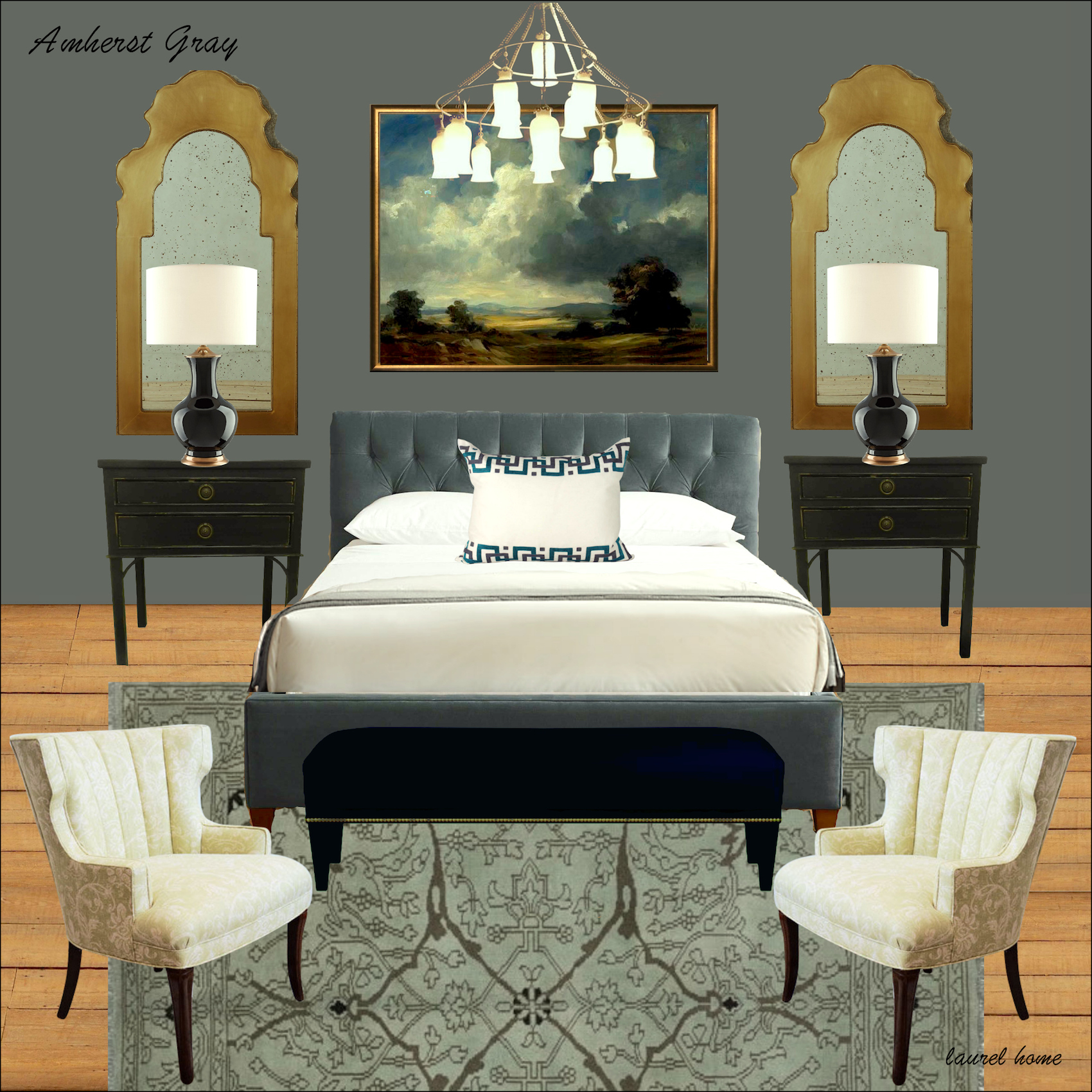
This is an excellent example of how a darker room doesn’t have to be dreary. It’s about the balance. What’s missing in Dall’s kids’ room is that there’s a lack of warmth and contrast. Plus, I think there’s a little too much black. However, even putting some books on the coffee table and some other low unbreakable items, like a tray and a small box, would go a long way towards breaking up the heavy dark table.
There’s nothing seriously wrong with this room except for one thing.
The vertical blinds are one of my intense dislikes. Vertical blinds say 70s insurance company in a strip mall.
What I find interesting is that this is some seriously sophisticated furniture for this young family. I rather like that.
Another cool thing is that the Lee sofa is the same frame as the Serena & Lily Grady sofa you can see below!
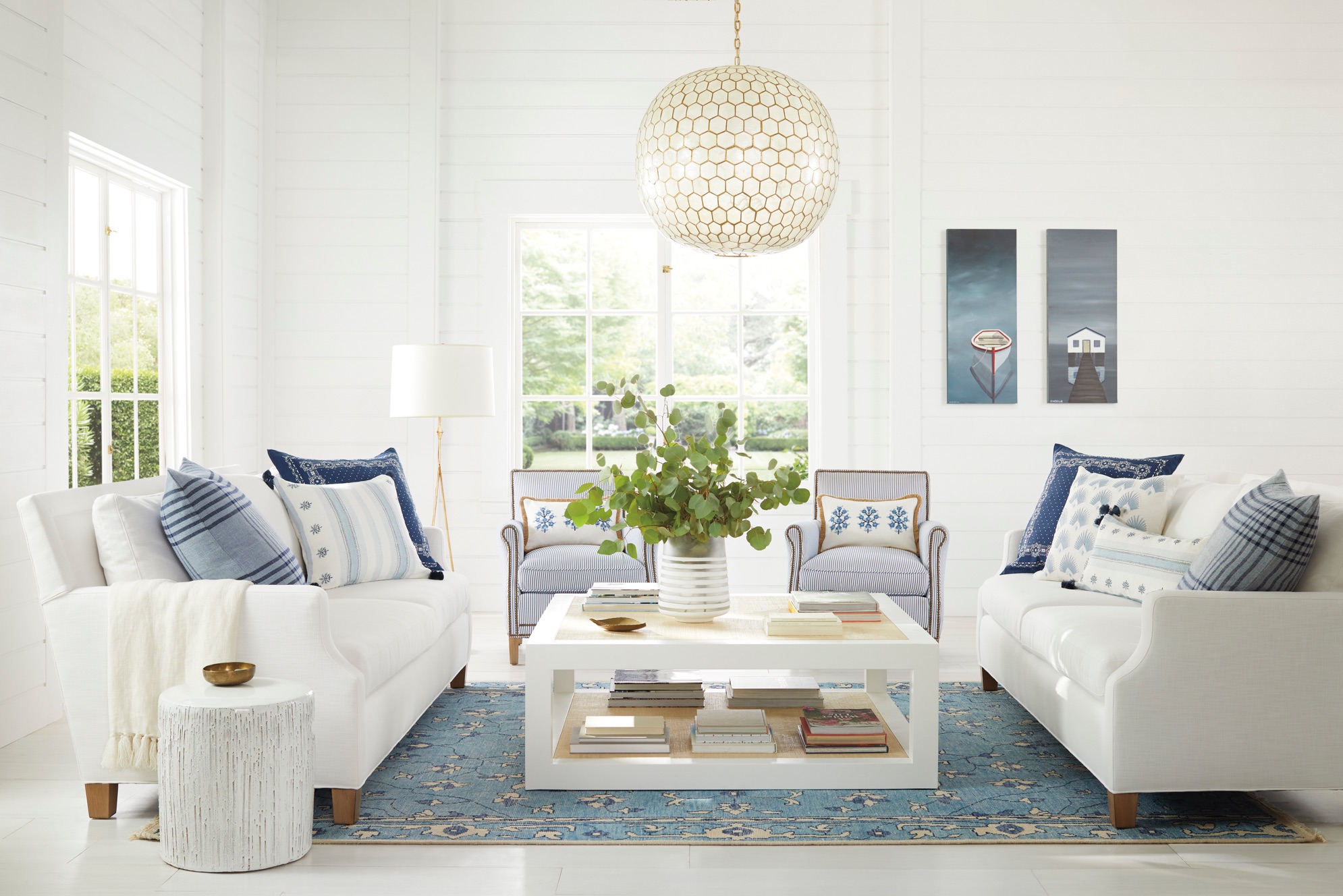
Please check out Serena & Lily’s 20% off sale this weekend. I believe it’s ending Monday.
Okay, here’s my mistake: dreary decorating aside, you would think I would know better by now. But, I don’t. ;]
In this case, I spent about four hours today obsessing over which gray I would use for the board. Instead, I should’ve just started making my board on Picmonkey, like I always do.
It’s really terrific to be able to see everything in one place. If one doesn’t have access to the actual room, doing a consult virtually is best done with all the significant elements in one spot. When I began doing this for clients in about 2011, decisions were made much more quickly.
So, what happened today is when I finally decided on a wall color, I realized it was too heavy for what I had in mind. It wasn’t making the dreary decorating any less dull.
Therefore, I had to spend another hour experimenting with colors. If I had done that, to begin with, I would’ve saved three hours.

The color I ended up with is not dissimilar from what’s there, but maybe a shade deeper. The color is Benjamin Moore Eternity af-695, an ethereal gray with blue-green undertones. It’s also a Laurel Home Paint and Palette Collection color.
In the meantime, I found a fantastic source on eBay that has super inexpensive and beautiful hand-knotted Oushak-style and other oriental rugs. The 8 x 10s are between $777.00 and about $900.00!
Please note that this guy has a rating of 100% and with hundreds of happy customers. I’ve heard of fake reviews on Amazon, but I don’t think people can do that on eBay. I hope not, anyway.
The other thing bugging me is the dinky, cheap chandelier. It reminds me of the HGTV staging cheap chandeliers they always used. It’s not up to the level of the rest of the beautiful furnishings.
Therefore, here’s my process for fixing dreary decorating.
While there’s nothing terrible here, the room lacks those mid tones and elements that add warmth. It’s also lacking in color. Most rooms are dreary before the accessories are added.
Looking at the furniture, particularly the dining set, reminds me of art deco. So, I found some cool chandeliers on Chairish that I thought could work with that style.
Please click on any image for more info.


Now, for the rug, I love the Oushak-style rug with the grays, cream, and bronze colors. That will go in the seating area and will add a lot of warmth and interest.
The rugs below are also strong contenders.
Please click on any image for more info.
Please also check out the Hot Sales Rug page.
In the meantime, Dall had no idea what I was up to and coincidentally sent me another email yesterday with a rug his D-I-L has selected. It is nothing like any of these. It’s a contemporary abstract design.
It was then that I knew that Dall’s D-I-L was going to hate the direction I was going in. lol But, then, I thought. No, I’m going to do this post, anyway; my way. Maybe when she sees the board, she’ll change her mind; perhaps she won’t, that’s okay. However, it might inspire some of you guys for your rooms.
Oh my! I have to interrupt myself.
I heard from Flo-1 yesterday, and you will not believe what she did. I don’t have time to share it with you today, but I will add it to the post for Wednesday.
You guys are so talented!
Let’s keep going.
Below is the board design in progress. Please note that this is not the room layout. But, I do it to get in as many elements as possible. I like to put the furniture in an approximation of perspective.
Picmonkey now has a feature that lets you take out the background, and it’s surprisingly accurate 96% of the time.
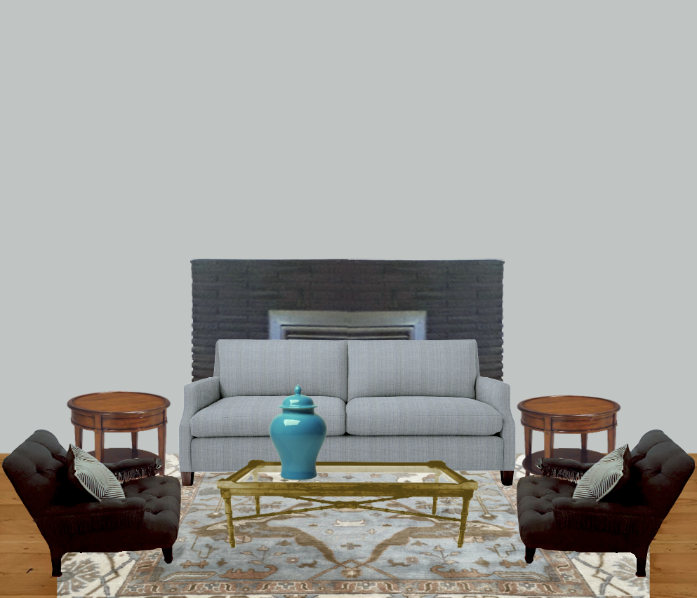
I think the space is looking better already.
My plan was to follow the 80/20 rule.
In this case, 80% of the room is contemporary and 20% vintage.
And, there’s another 10% that’s Chinoiserie.
I don’t want the room to be too formal. However, the dining room furniture and upholstery also indicate a space that’s not casual, either.
What about the coffee table, Laurel? Why did you change it?
I changed it because I think there’s too much black, and I also think the style of it is not in keeping with my overall design plan. Of course, it could be worked in.
Does the room HAVE to have 20% of another style that’s different from the main style?
No, you don’t have to do anything. ;] However, when looking at many designers’ rooms, I find that my favorites almost always do a blend.
In addition, I think that a painting over the fireplace would work better than a mirror. That will also add some beautiful color to that focal point.
By the way, there is a little art widget on the vintage HOT SALES page. I borrowed one of the paintings from there. ;] I did have to make it larger, however.
I changed both the end tables and the coffee table to vintage pieces. The lamps are vintage, too.
For more classic vintage end table and lamp pairings, please go here.
The chinoiserie design isn’t everyone’s taste; I know that; however, I love the colors and how it brings in an element.
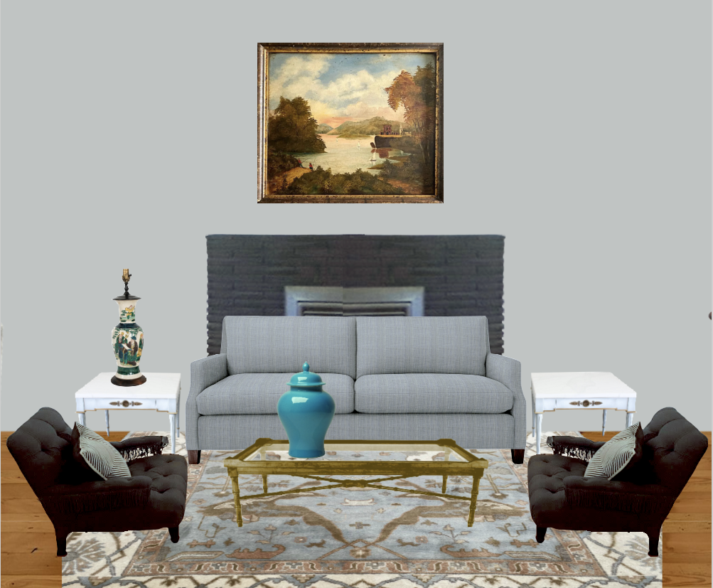
The painting works nicely, and I love the shot of turquoise on the Chinoiserie ginger jar.
I played around with the lamps trying others, but I came back to these.
Wait, Laurel? Did you forget about the three-year-old?
Are you kidding me? I haven’t forgotten. I’m still suffering from PTSD on account of my hellions.
The fragile porcelains are because I get sadistic pleasure from watching other parents suffer. That’s all. ;]
But seriously, I got Cale into Martial Arts when he was five.
He did it for ten consecutive years, took a break for about ten years, and returned to it in his mid-twenties. He’s 32 now.
Yes, I had him when I was eight.
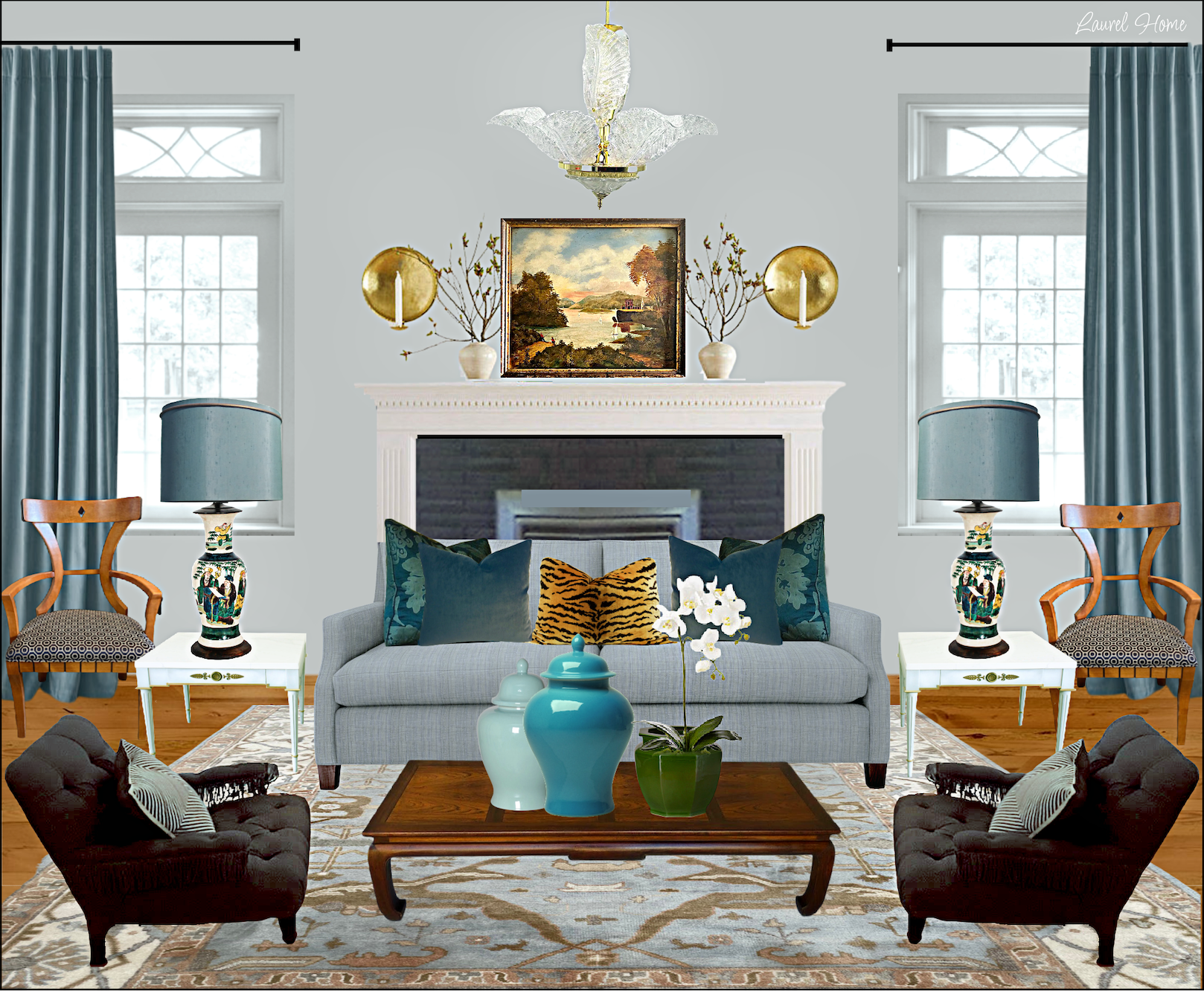
Okay, where were we? Oh yes, the coffee table. I think it’s quite cool, but not in this room, necessarily. I feel that the coffee table has gone too far and besides, we need something with stained wood tones. (although Dall sent a better image later, I see it is dark brown, not black.)
So, I found in my library a vintage Ming-style coffee table, not too heavy and not too delicate.
All that’s left are the pillows, more fragile porcelains, and window treatments…
And uh oh. Can you guess what’s wrong?
Well, Laurel, there aren’t any windows.
Not now, but there WILL be windows. Unfortunately, they are not like the windows in the house, but it’s the concept that matters.
Laurel, sorry for interrupting, but the glass block? Don’t you think that’s contributing to the dated, dreary decorating?
Yes, I do, and I’m sure the homeowners would like to fix it, but it’s not a priority as they have their hands full at the moment.
I think it might be possible to sheetrock over it. But, I’m not sure if that’s doable. So, we’ll ignore it for now.
Okay, here’s what’s bothering me, and I bet some of you are too polite to interrupt. ;]
Yes, indeed. The fireplace surround. I don’t mind that they painted it black. However, I feel there’s way too much of it, however. It’s a big black thing, and it’s not adding much to the space.
It wouldn’t be too difficult to do a mantel over part of the stone.
So, let’s look at my finished plan to fix some dreary decorating.
If that fireplace vignette looks familiar, it’s because it is.
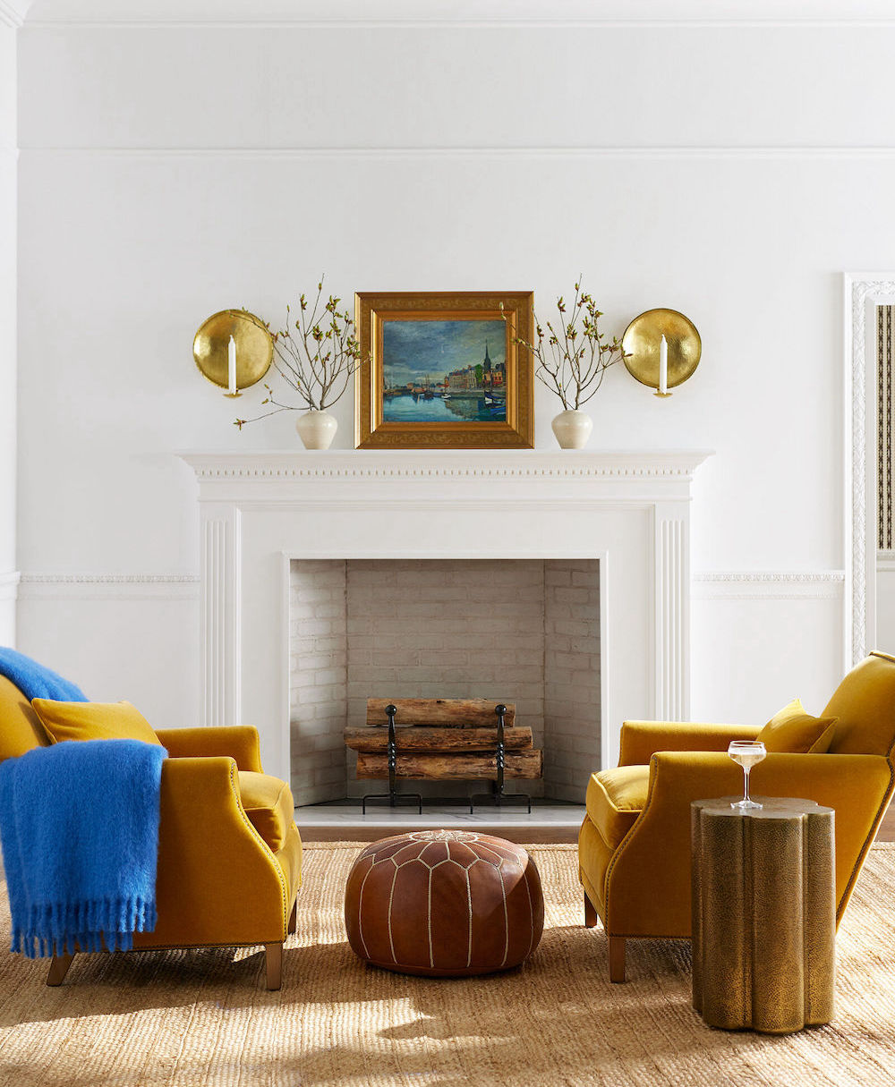
From Serena & Lily. I love those gold Canyon chairs!
Okay, I hope you enjoyed my fix for some dreary decorating; that isn’t terrible by any means, but it just needs some finishing touches.
Of course, there’s more than one way to do things. I could sit here for a month and make a different design idea.
Please don’t make me do that, though. haha
Thank you Dall, for sharing your kids’ lovely home and yours, as well.
I hope everyone’s having a wonderful long holiday weekend!
xo,

Related Posts
 Six Drab Paint Colors – Should You Try Them?
- Gray Walls? The Perfect Color Palette To Make Them Sing
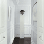
- A Long Narrow Hallway – Help For A Dark Scary Mess
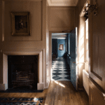
- Dark Rooms – Are They Handsome or Depressing?
- Your Home Office Could Be Dangerous For Your Health
- Crown Moulding and Why It’s Driving You Nuts!
- Bookshelf Styling-The Ultimate Guide with Templates!