Third in the series on freshening your home for the new year is paint. Wall paint, specifically. Over the years, I have had more clients come to me in a dead panic over this subject, than I care to count. Often, they have just moved or are about to and have to paint everything even though they have no idea what else is going in the room. That is another subject. But for our purposes, since this is a refresh, we’ll say that your room is more or less done. However, the color never worked for you because…
- it looked great on the chip, but when it went up it was a completely different color.
- it looked great in the store, but when it went up it was a completely different color.
- I’m afraid of really “strong” colors, so I chose a color that is several shades lighter than what I wanted and now it looks like I have Crest toothpaste all over my walls
- I painted one wall, the color I like as an “accent wall” but it’s just not working.
Right. It’s not working because it looks like you forgot to paint the other three walls, or ran out of that color and went with something else. I bet that’s how the ol’ “accent wall” got started. They ran out of paint. Please, this is very important and I am going to say this as kindly as possible.
DO NOT PAINT ONE WALL AS AN ACCENT WALL.
Why? 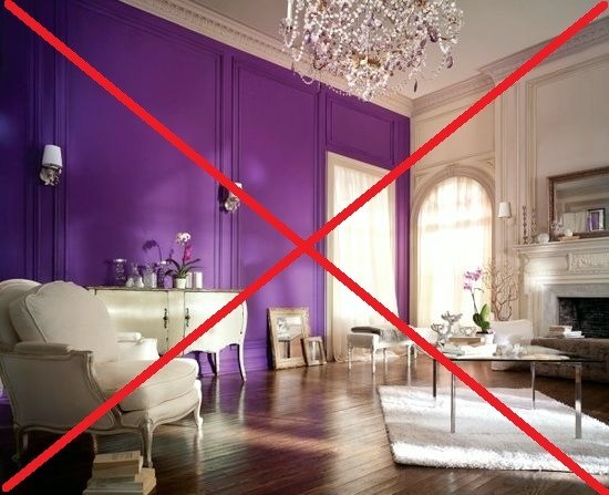
Ugh. What a crying shame. That’s why.
Alright there are some exceptions, which I will go into in another post, but if you have fairly normal walls and room shapes, please, don’t do it. It is never a mistake to paint all the walls the same color. If the color is so gag awful (pls see above) that you only care to see it on one wall, please choose a color that you love.
Alright, now that I’ve told you what not to do, here’s what you should do.
Hire me. haha! However, if you don’t want to do that and want to venture out on your own, here are some tips that I’ve learned over the years.
But before we get started a quick questionnaire about wall paint. Did you know…
- North facing rooms have grayer, cooler, darker light and it does weird things to paint colors?
- Paint colors often have undertones of a different color that are not readily seen in all lights?
- Choosing a paint color at night with only the lights on is not a good idea?
- Dark colors actually make a room look LARGER? They make the walls recede, just like dark pants make your legs recede. Same principal. What dark colors do, however, is absorb the light, so the room will be darker, but sometimes that’s very nice.
Now, that I’ve made you even more nervous, I’m going to give you ten colors that are almost always a sure thing, no matter what. (Of course, there are many, many more, but the idea is to cut through to some of the best). These are all going to be from Benjamin Moore. I do like some other companies as well, but BM is readily available and has some wonderful colors; thousands actually!
One rule that always works well is to think “sky.” After sky… think water and earth.
The colors of sky, water and earth— nature, go with everything, don’t they? Mom nature is the most brilliant designer ever!
After that, go to the Benjamin Moore Historical colors. There is a reason why they are “historical.” :]
Here are some colors that I have used and/or have seen and liked. (Please always try your color of choice out first, either on the wall or a piece of sheet rock or cardboard taped directly to the wall. And look at it on all four walls and at different times of the day and night.)
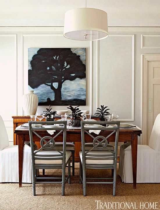
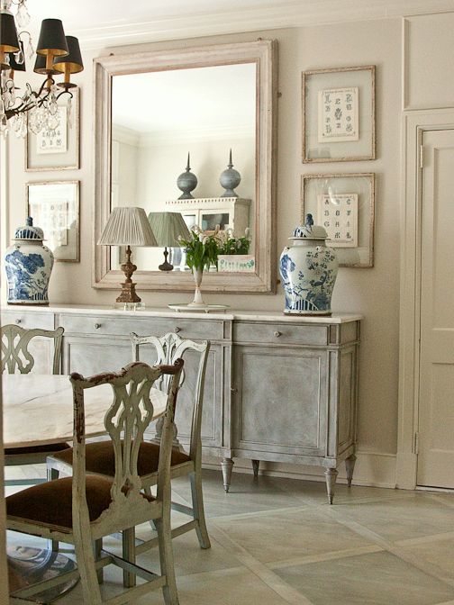
All photos via pinterest unless otherwise stated.
Benjamin Moore 2145-70 Cotton Balls. This is a very clean, fresh, warm white. It’s one of their most popular whites.
Benjamin Moore 1471 Shoreline. Pale grey is very hot right now, but it is also a classic color. Shoreline, is a pale complex grey which seems to change shades very subtly throughout the day. I painted my bathroom this color and I’m a very happy girl!
Benjamin Moore 2108-60 Abalone. A wonderful, warm, neutral, not beige, not grey, but a combo of the two with a subtle lavender undertone. I just did it in two bedrooms. One faces north and one faces south. It looks sensational in both rooms; very versatile!
Benjamin Moore HC-168 Chelsea Gray. This is a very sophisticated dark, warm gray with a hint of taupe. Brooke Shields used this color in her New York apartment.
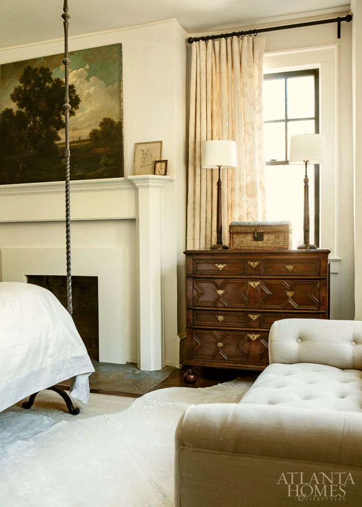
Benjamin Moore White Dove trim with Linen White walls. These are in their standard white collection. Linen white looks its best in a well-lit room.
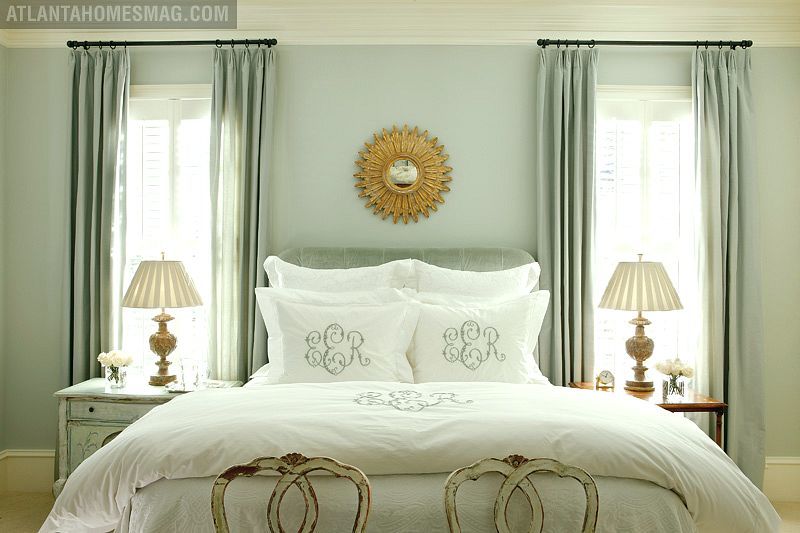
Benjamin Moore 1563 Quiet Moments. This is an extremely lovely light blue-green with just enough grey to keep it from looking like toothpaste. If you want to try a more grey tone, 1598 silver lake is also very nice.
Benjamin Moore 2152-70 Mayonnaise. This is a lovely classic cream which looks good in north or south-facing rooms
This is Benjamin Moore HC-169 Coventry Gray. This color goes with EVERYTHING. It is a medium gray with blue undertones.
Benjamin Moore, HC-172 Revere Pewter. There are paint aficionados who claim this to be THE perfect color. It is a warm grey with olive undertones. It also goes with everything!

For the more adventurous, this is Benjamin Moore HC-166 Kendall Charcoal. Alright, I have never used this color before, but for everyone who’s ever used it, they have fallen madly in love with it. I could see it in almost any room. It is dark, warm and rich and makes a wonderful background for art.
Please notice that I stay away from “color of the year” gimmicks. The colors here are colors that you can live with and then you can ADD the color of the year!
My final word, today is about white.
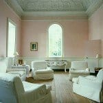
White is a color, too! And for me, the most beautiful of all. It is never wrong to paint your walls a lovely white with a touch of cream or grey. It’s classic and goes with everything.
Stay safe and warm if you live in the frigid zones!
![]()
related articles


Related Posts
 How to Furnish a Sunroom + What To Avoid
- Rethinking Pink | tell me what you think
- Buying A Greek Revival Dream Home Might Be A Mistake
- A Fabulous and Rare Upholstery Sale by One Of my Favorite Vendors
- She Fears Her Trendy, Painted Antique Table is a Mistake
- The Killer Spiral Staircase Alternative You Will Love
- Window Panels Have Her Stumped, But It’s Actually The Least Of Her Problems